Built with Lovart
Off Register: Misaligned Print Magic

Révolté


OFF REGISTER — Beauty in the Misaligned Plate
A print studio brand built on the idea that warmth doesn't come from polish — it comes from the half-millimeter where the plates don't quite line up.
THE BRIEF
The ask was open: build a brand for a physical product, make it warm and human, make it genuinely original. No category, no client, no constraints — which is its own kind of hard brief. Most "warm and human" briefs land in the same place: soft pastels, rounded corners, a friendly wave of a wordmark. I wasn't interested in that version of warmth.
I wanted a warmth that came from somewhere unexpected — not from softness, but from the visible evidence of a human hand doing imperfect work. Print production gave me that. Anyone who's stood next to an offset press knows the moment a plate lands a fraction off, the ink bleeds past the edge, and the sheet still gets used because it's close enough, and it's beautiful anyway.
THE APPROACH
I started with ten divergent directions — a full spread from acoustic domestic memory to salt-worn coastal materials — because I didn't want to default to the first warm idea that came to mind. CMYK and ink bleed wasn't on that first list. It came later, as a direct request, and once it was on the table it was obviously the strongest option: it's warmth with a mechanism behind it, not just a mood board.
The insight that made the system click was treating misregistration as the brand's central metaphor rather than a surface texture. Off Register isn't a brand that looks distressed for effect — it's a brand built around the idea that the press is a collaborator, not a tool, and collaborators don't do exactly what you ask. The name does double duty: it's a literal print term, and it's an emotional one. Closeness that's slightly imperfect reads as more human than closeness that's exact.
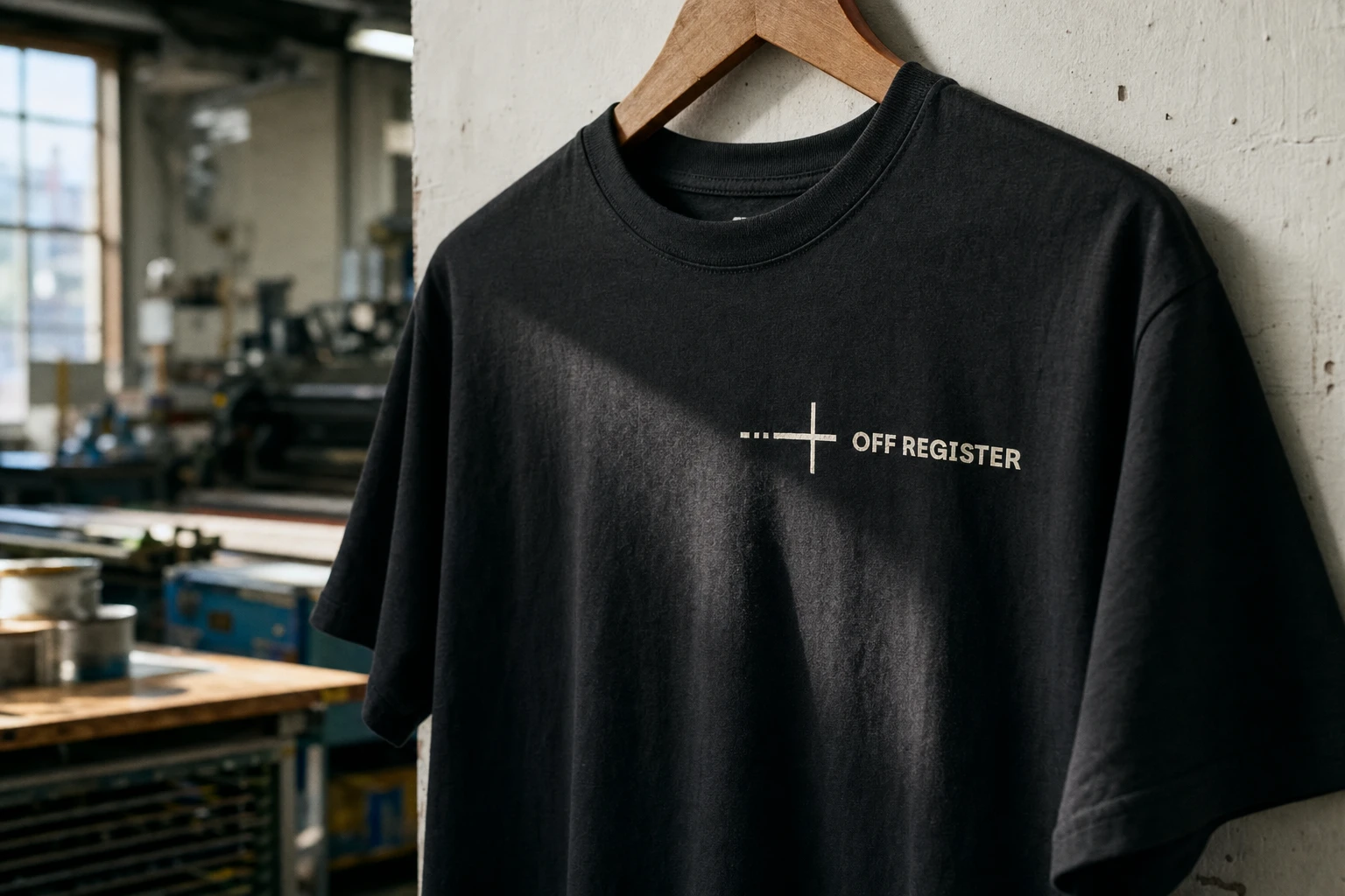
The logo carries that idea in one gesture — a registration cross where the dashes on the left resolve into a solid line by the time they reach the crosshair, like a plate finally landing true. Paired with Parkinsans, a bold and rounded grotesque, the wordmark stays completely legible and confident, so the concept lives in the mark, not in a distressed typeface fighting to be read.
THE WORK
LOGO AND MARK
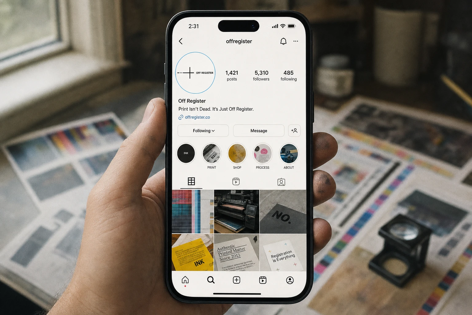
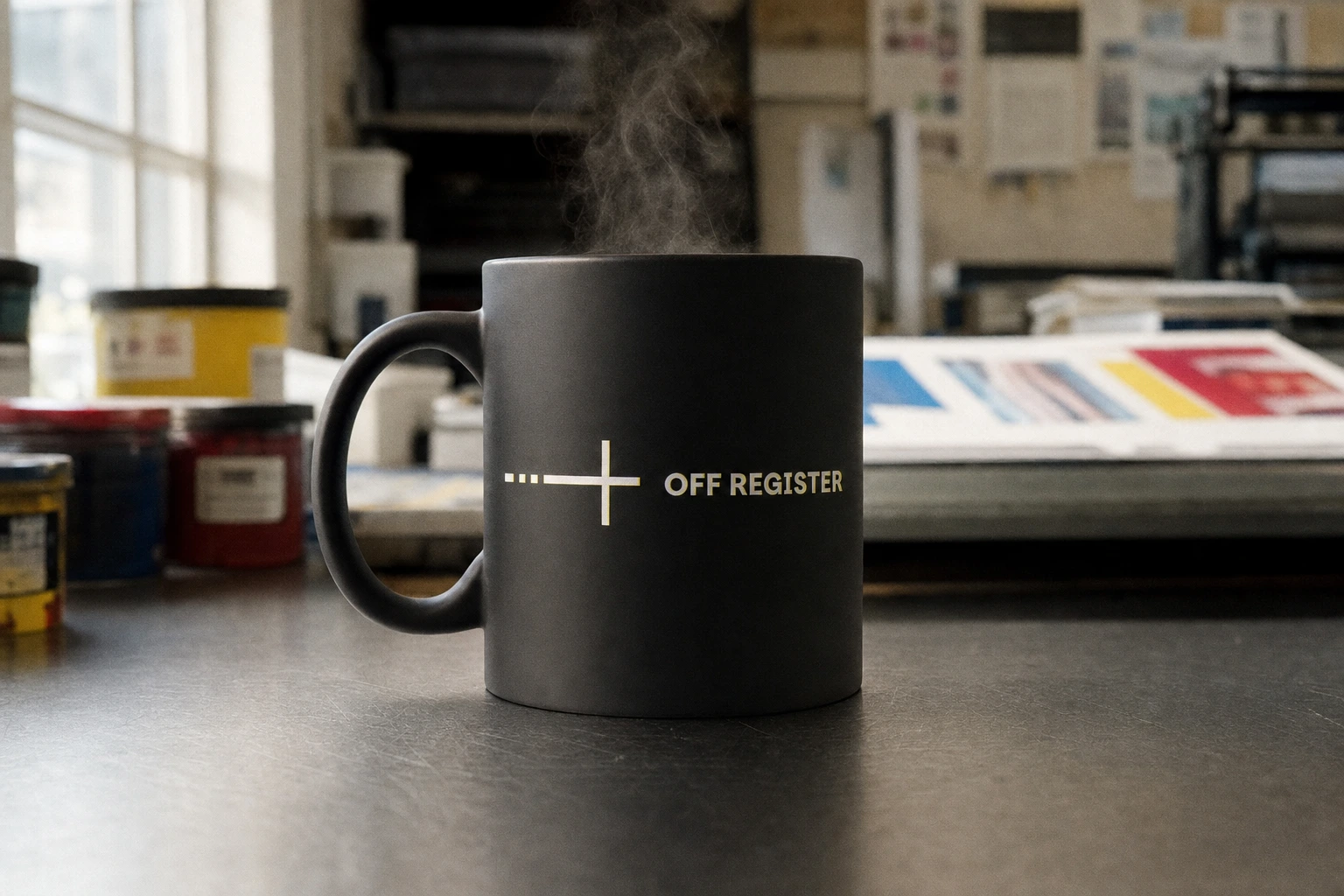
A registration cross built from a dash-to-solid gradient, paired with OFF REGISTER set in Parkinsans bold. The mark works standalone — enamel pin, app icon, Instagram avatar — and always at full fidelity, reproduced pixel-perfect across every touchpoint rather than reinterpreted per surface.
COLOR SYSTEM
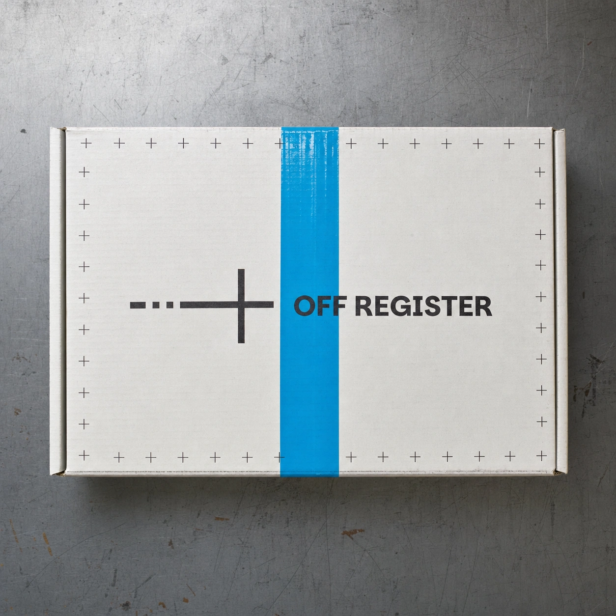
True CMYK primaries used unevenly, never as a balanced four-color mix: Process Cyan 00AEEF, Process Magenta EC008C, Process Yellow FFF200, Key Black 231F20, against Bleed White FDFCF7. Color bars, tape strips, and packing tape become brand devices in their own right — see the shipping mailer, where a strip of cyan packing tape crosses the box like a color proof.
PACKAGING
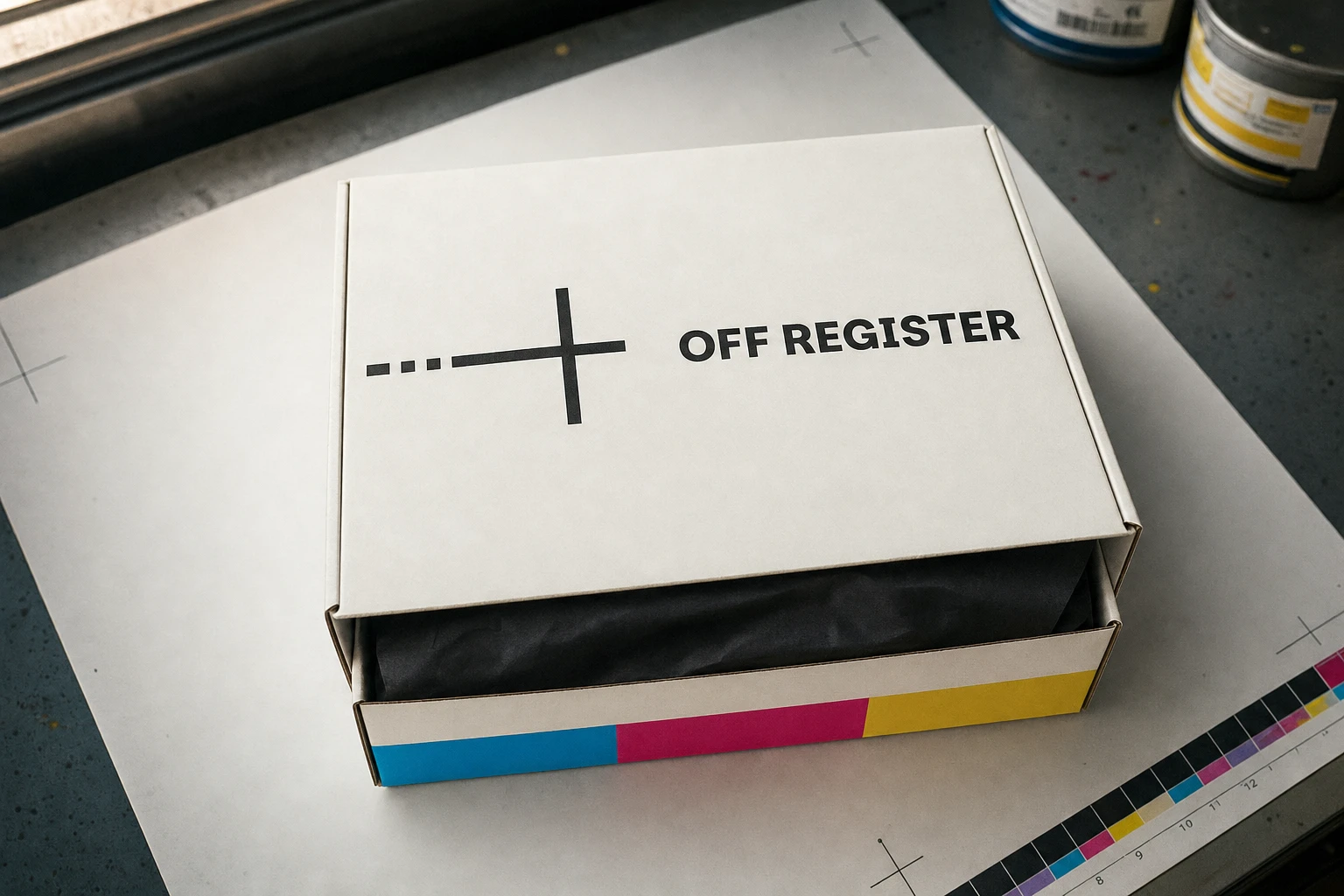
The shipping mailer and product box both use the registration-cross border as a repeating perimeter motif, with a CMYK color bar running along one edge like a fresh pull off the press. The box interior reveals black tissue paper, keeping the unboxing moment tied to the print-shop palette rather than breaking into generic gift packaging tropes.
PRINT COLLATERAL
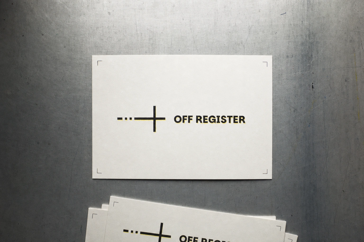
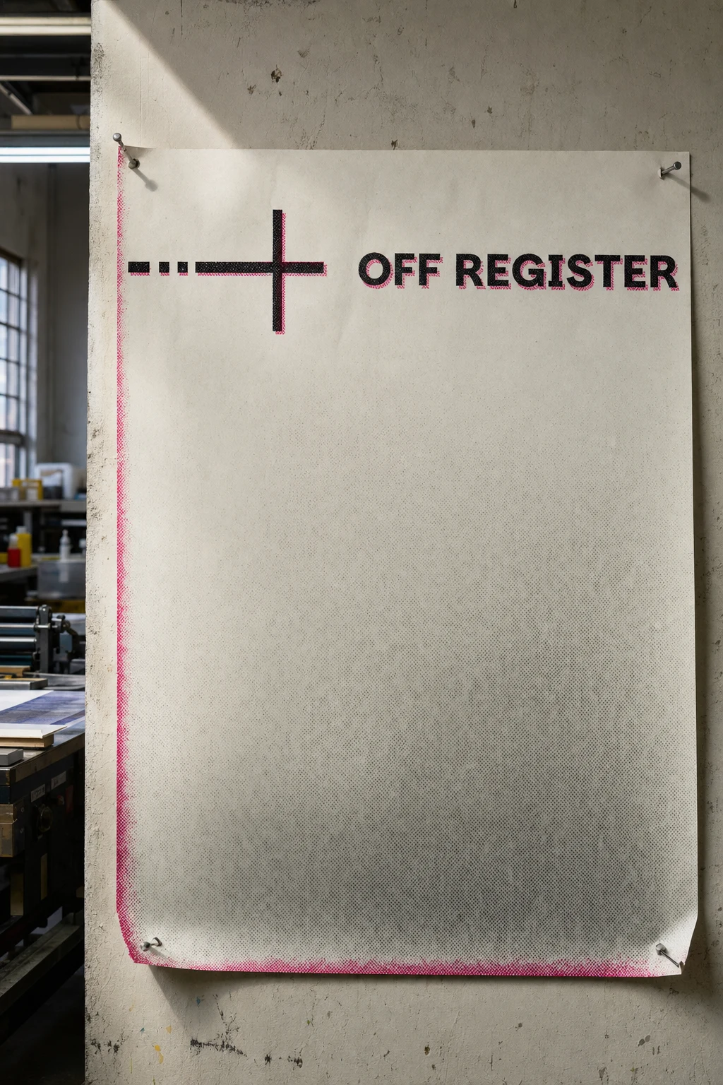
Business cards, letterhead, and postcards all carry a deliberate one-color ghost — a magenta or yellow echo trailing the black key plate by half a millimeter — executed consistently enough to read as a system, not a mistake. The riso-printed poster and the dark-mode reversed card extend the same logic into looser, more experimental formats.
DIGITAL
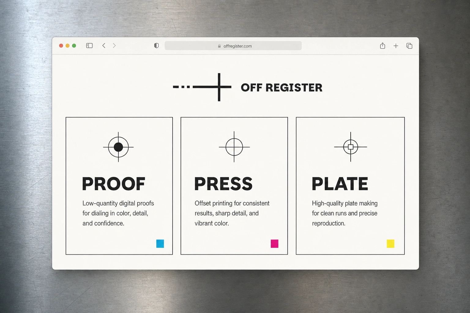
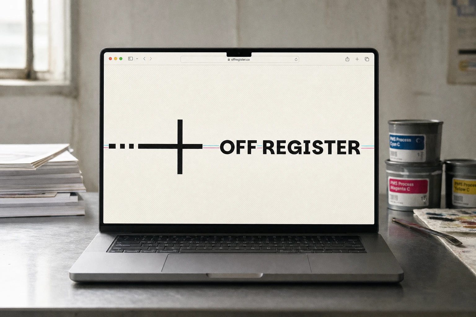
The homepage hero and app splash screen both center the logo against faint halftone texture, with the CMYK palette doing the work a gradient normally would — a loading bar rendered as a printed color strip rather than an animated fill. The three-tier landing page cards (Proof, Press, Plate) use flat, hard-edged card styling with no drop shadow, so the UI itself reads like a proof sheet rather than a soft SaaS template.
MERCH
Tote bag, t-shirt, mug, and enamel pin all carry the mark at a single fixed scale and placement, with a one-color misregistration ghost as the only variation between pieces — consistent enough to feel designed, varied enough to feel handmade.
SIGNAGE AND OOH
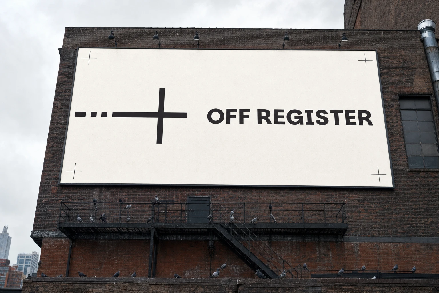
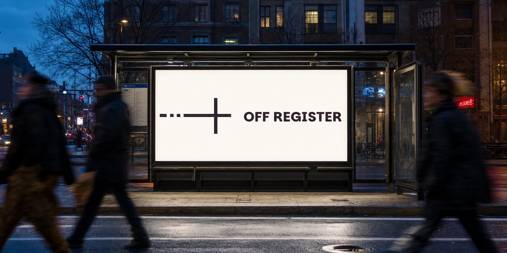
The storefront sign and hanging banner both use the registration-cross corners as literal hardware — crop marks doubling as the actual sign frame. The bus shelter and building-side billboard placements push the system into real environments at scale, holding up as crisply at pedestrian distance as it does on a business card.
CAMPAIGN PHOTOGRAPHY
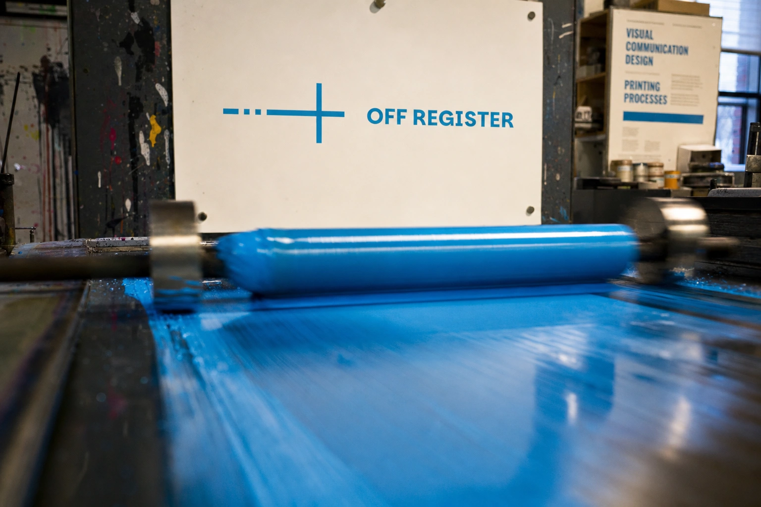
Three process shots capture the brand's central metaphor literally in motion — a magenta plate lifting off a sheet mid-print, an ink roller still wet and glossy, hands aligning registration crosses on a light table. These aren't lifestyle shots dressed up with a logo; they're documentation of the actual mechanism the brand is named after.
THE RESULT
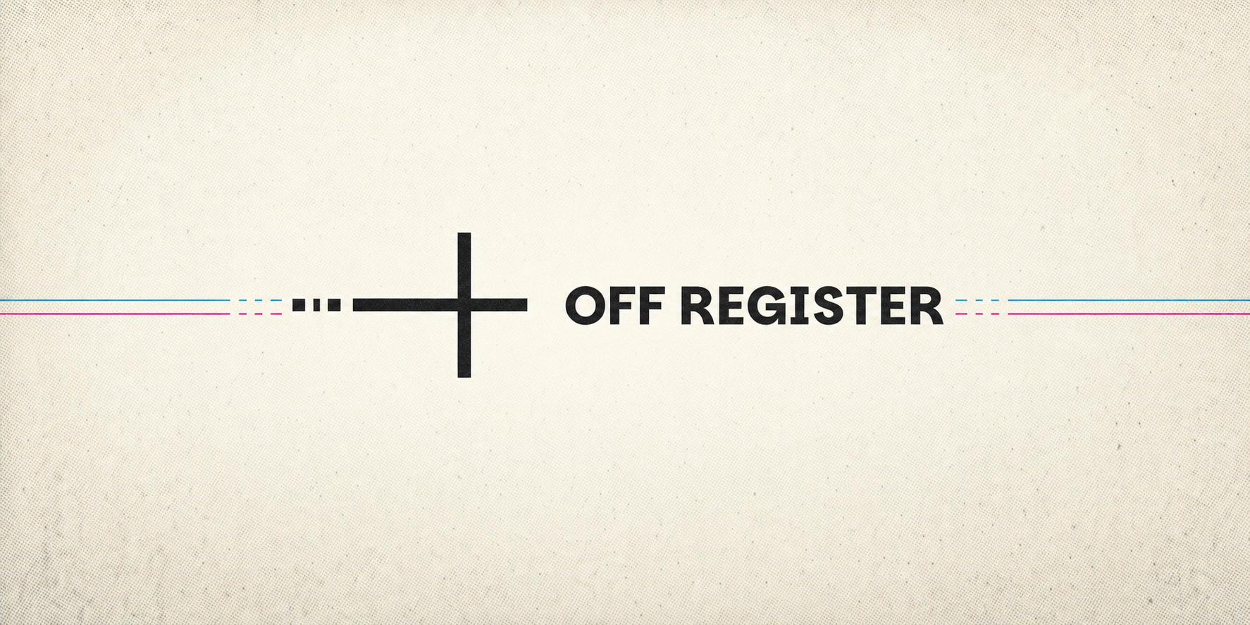
Twenty-five mockups across packaging, merch, print collateral, digital, signage, and campaign photography, all built from a single fixed logo asset without a single surface feeling templated. The strongest proof of the system: the registration-mark icon holds up completely on its own — on the enamel pin, on the Instagram avatar — with no wordmark needed for it to read as Off Register. That's what a real identity does. It survives being cropped.
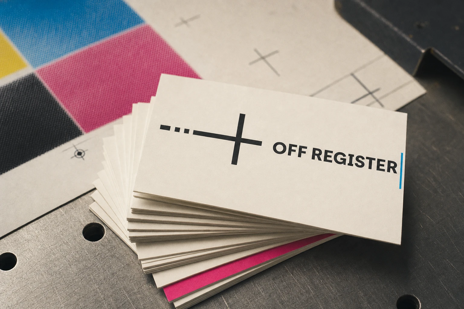
Révolté — revolte.design
Project: Off Register
Year: 2026
Scope: Brand Identity, Packaging, Print Collateral, Web Design, Signage, Campaign Photography
Industry: Print / Physical Product
Like this project
Posted Jul 16, 2026
A print studio brand where the warmth lives in the half-millimeter a plate misses — misregistration turned into an entire visual language
Likes
3
Views
47
Timeline
Jul 3, 2026 - Jul 16, 2026