Built with Lovart
EXQUIS Brand and Campaign Development

Révolté


EXQUIS — Three Hands, No Conversation
LOGLINE
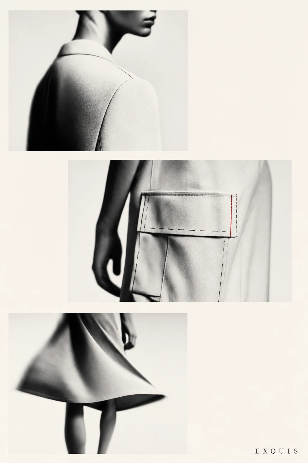
A couture concept built on a rule I stole from a parlor game: three designers build one garment, none of them see what the others are doing. I designed the system that makes the collision look intentional.
THE BRIEF
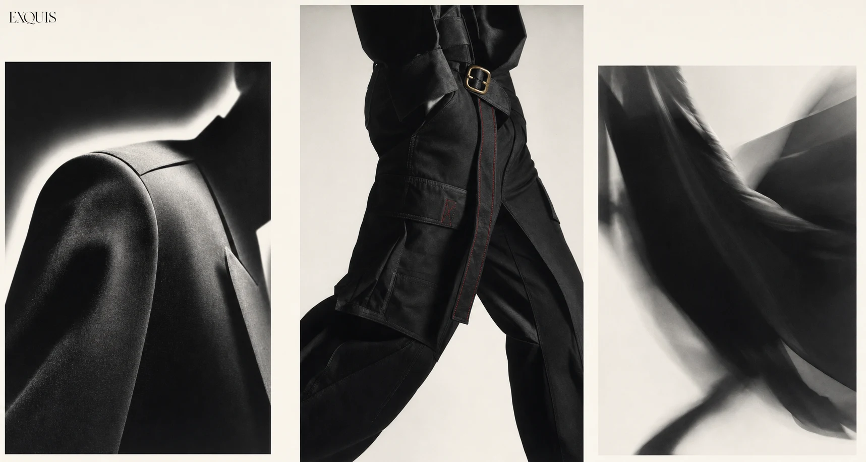
I wanted to build a fashion brand for my portfolio that didn't rely on a single point of view to feel confident. Most couture branding sells you the genius — one hand, one vision, one signature. I wanted to sell the opposite. The exquisite corpse game the Surrealists played in the 1920s — fold the paper, draw your section, pass it on, never look — gave me the structural idea. What if a couture house ran on that same rule. Three anonymous designers, each responsible for one third of the garment, never communicating.
The hard part wasn't the concept. It was making the collision feel designed instead of accidental. A blazer collar that doesn't agree with the cargo pocket below it, which doesn't agree with the draped hem below that — if I got the system wrong, it reads as a mood board, not a brand.
THE APPROACH
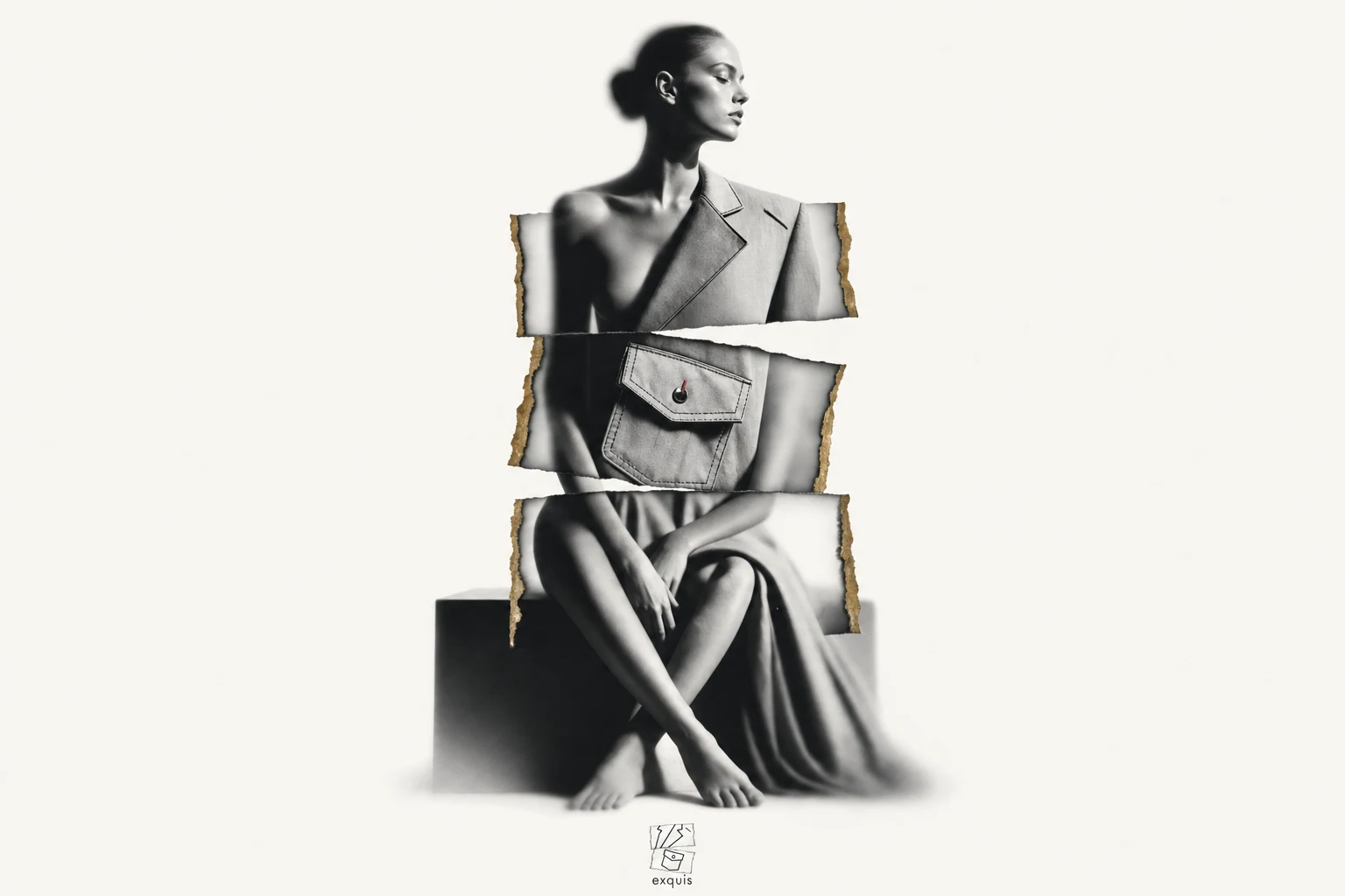
I started by trying to soften the clash — matching color values across all three "designer" sections so at least the palette held things together. It made the whole thing feel apologetic. The tension was the point. I dropped the instinct to reconcile and instead built rules that made the disagreement structural rather than decorative.
The unlock was the three-typeface system. Instead of picking one voice for the brand and softening the rest, I gave each of the three fictional designers their own typeface — a transitional serif for the tailor, a tight grotesque for the architect, a loose script for the vandal — and never let them share a sentence. That single rule, applied everywhere from the logo to the campaign layout, meant the fracture wasn't just visual, it was structural. The brand doesn't resolve its own contradiction. It just states it clearly and moves on.
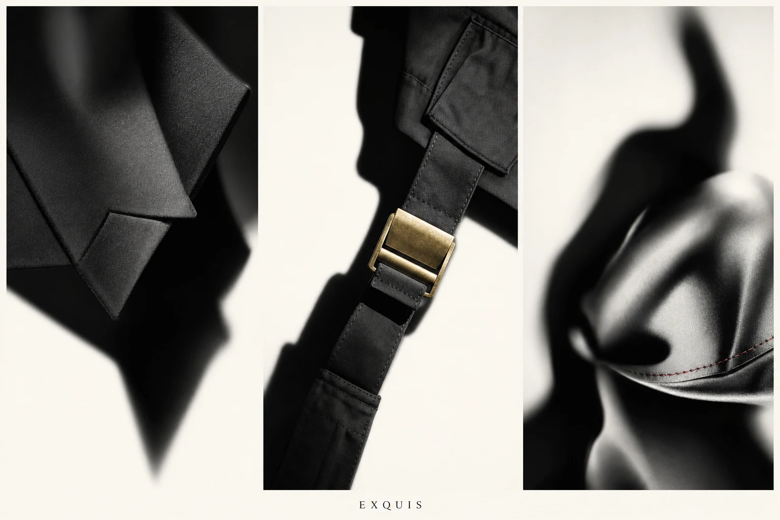
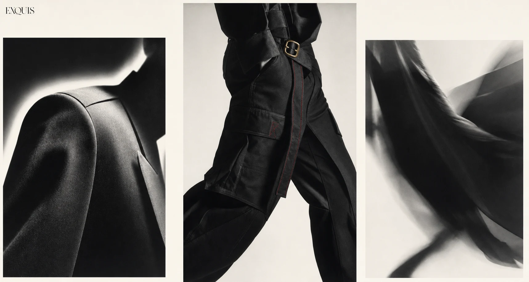
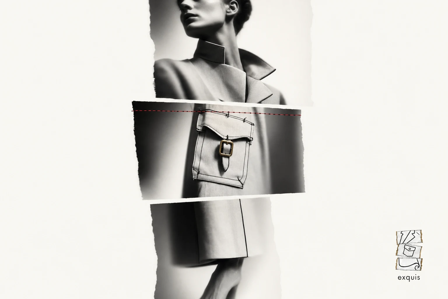
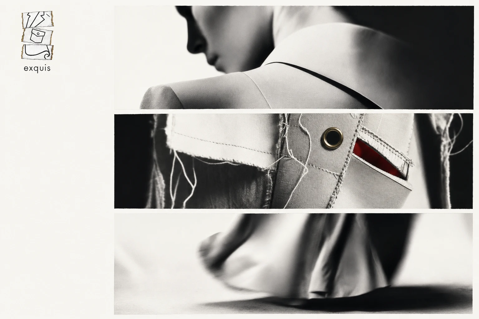
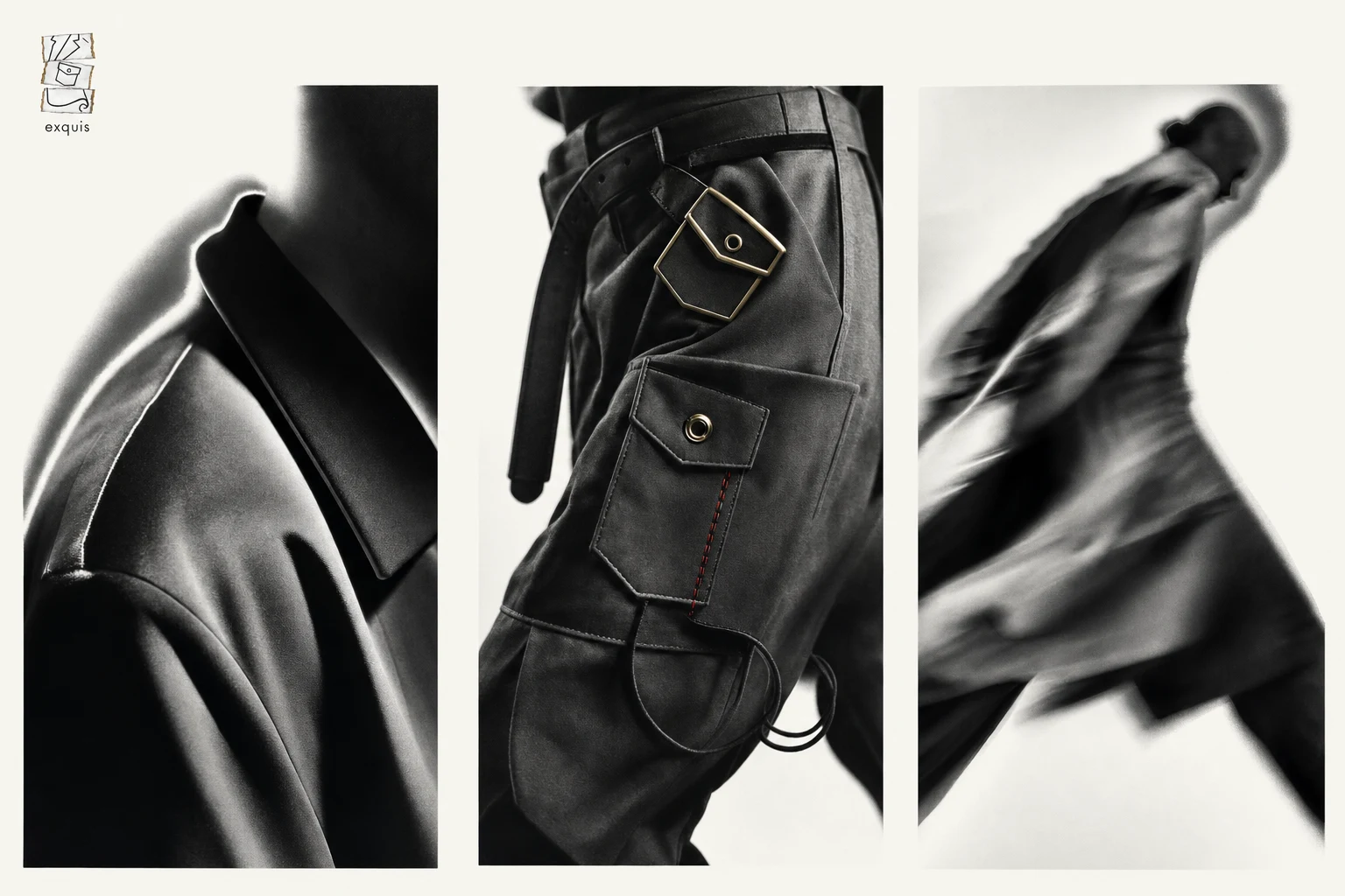
Once that rule existed, the photography followed the same logic. Every campaign image had to be built from three panels shot at different focal lengths, so even the photography refused to feel like one continuous decision.
THE WORK
LOGO
The final mark is the Exquisite Corpse Fold — three stacked torn-paper panels, each holding a single fragment of unrelated garment linework: a lapel and collar in panel one, a cargo pocket with a button in panel two, a draping hem curl in panel three. The panels sit at consistent width but with torn, deckled edges in Aged Brass
#9C7A3C, so the mark itself looks assembled rather than drawn. A lowercase "exquis" wordmark in the grotesque sits beneath, keeping the type calm while the mark stays loud.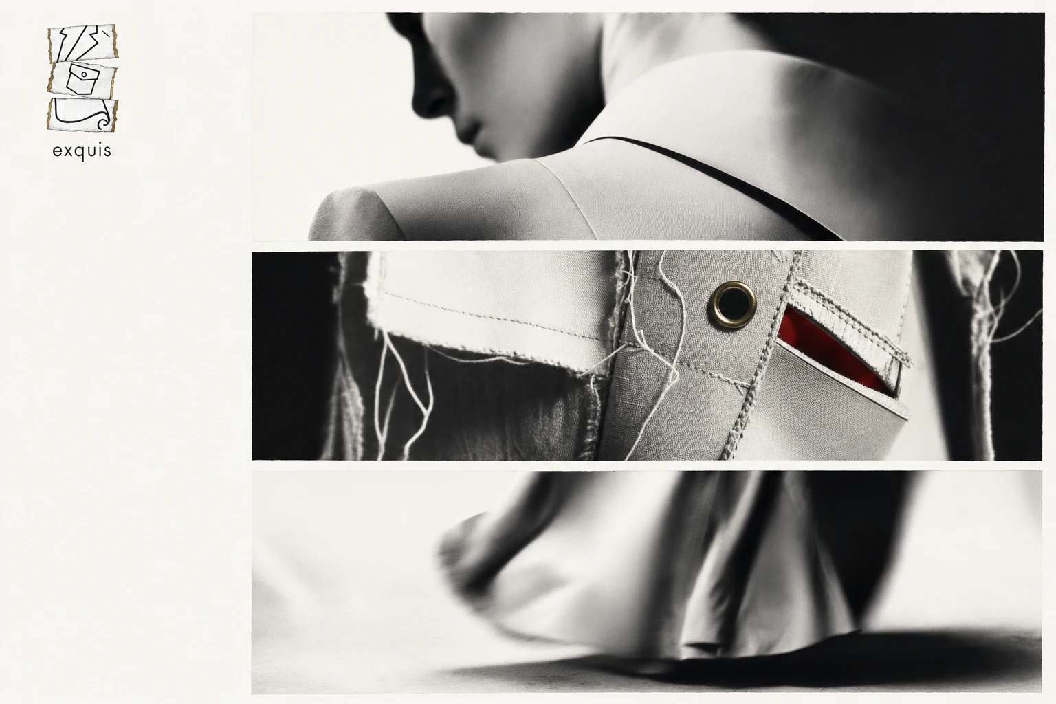
TYPOGRAPHY SYSTEM
Three typefaces, one rule: they never appear in the same sentence. A transitional serif carries anything referencing craftsmanship or heritage. A tight, cold grotesque handles anything structural or technical. A loose, slightly unhinged script is reserved for garment names and margin notes only. The result reads like three separate hands wrote the brand without checking in with each other, because that's exactly the premise.
COLOR SYSTEM
Paper White
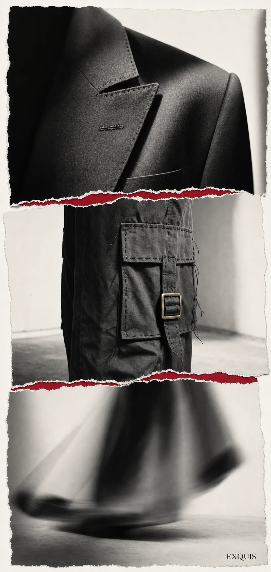
#F4F1EA and Ink Black #1C1C1C carry the brand's full weight. Surreal Red #C81D3B is rationed to one appearance per image, always at a seam or a torn edge, marking exactly where the collision happened. Aged Brass #9C7A3C lives only in hardware and torn-paper edges, giving the system a sense of age and object-hood rather than digital polish.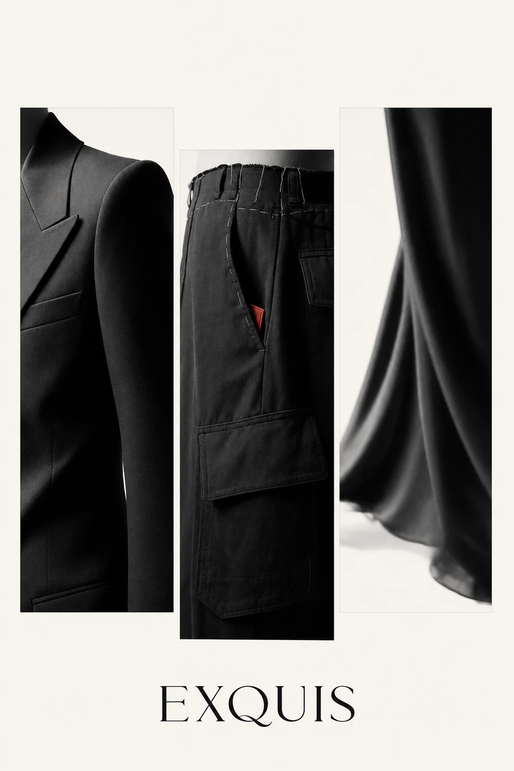
CAMPAIGN PHOTOGRAPHY
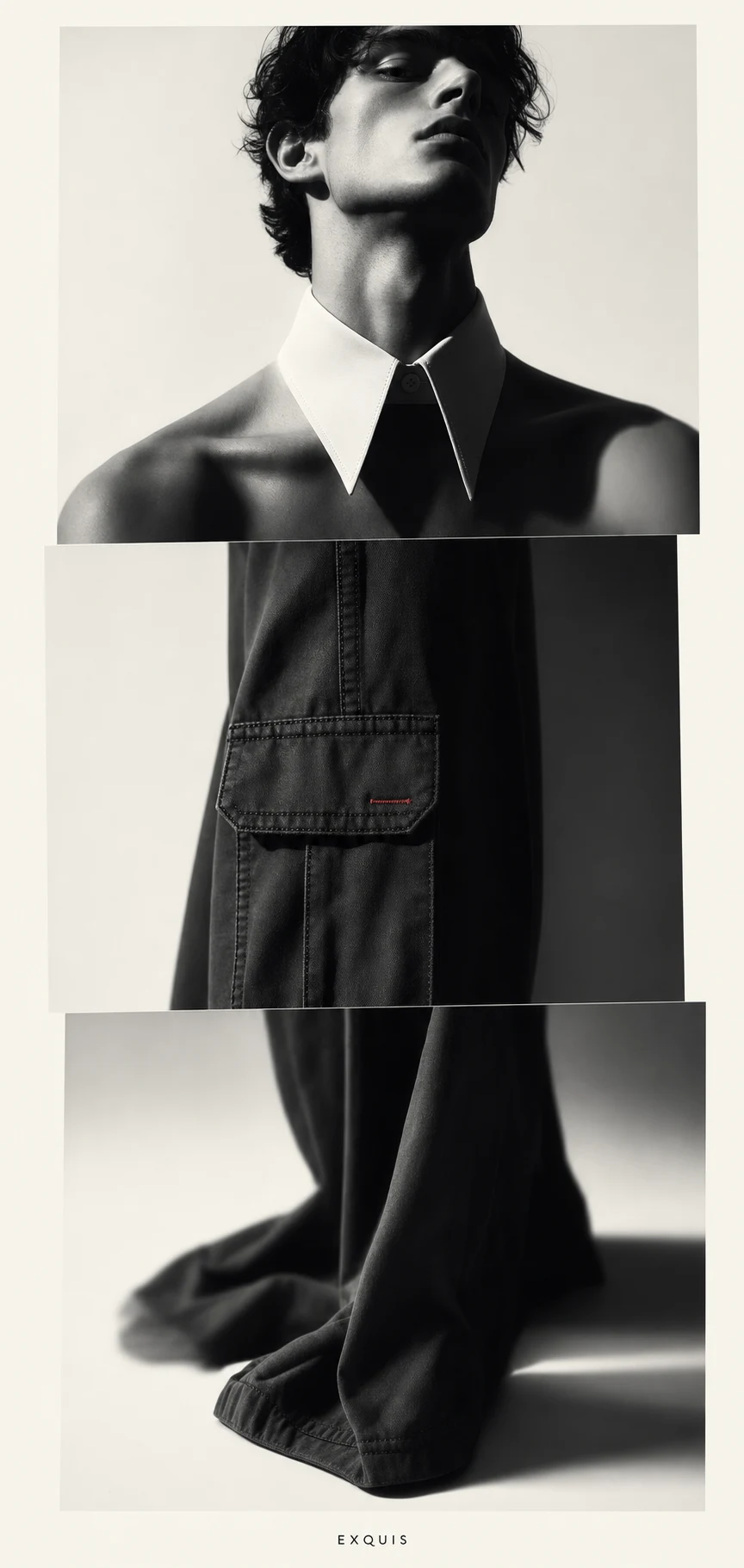
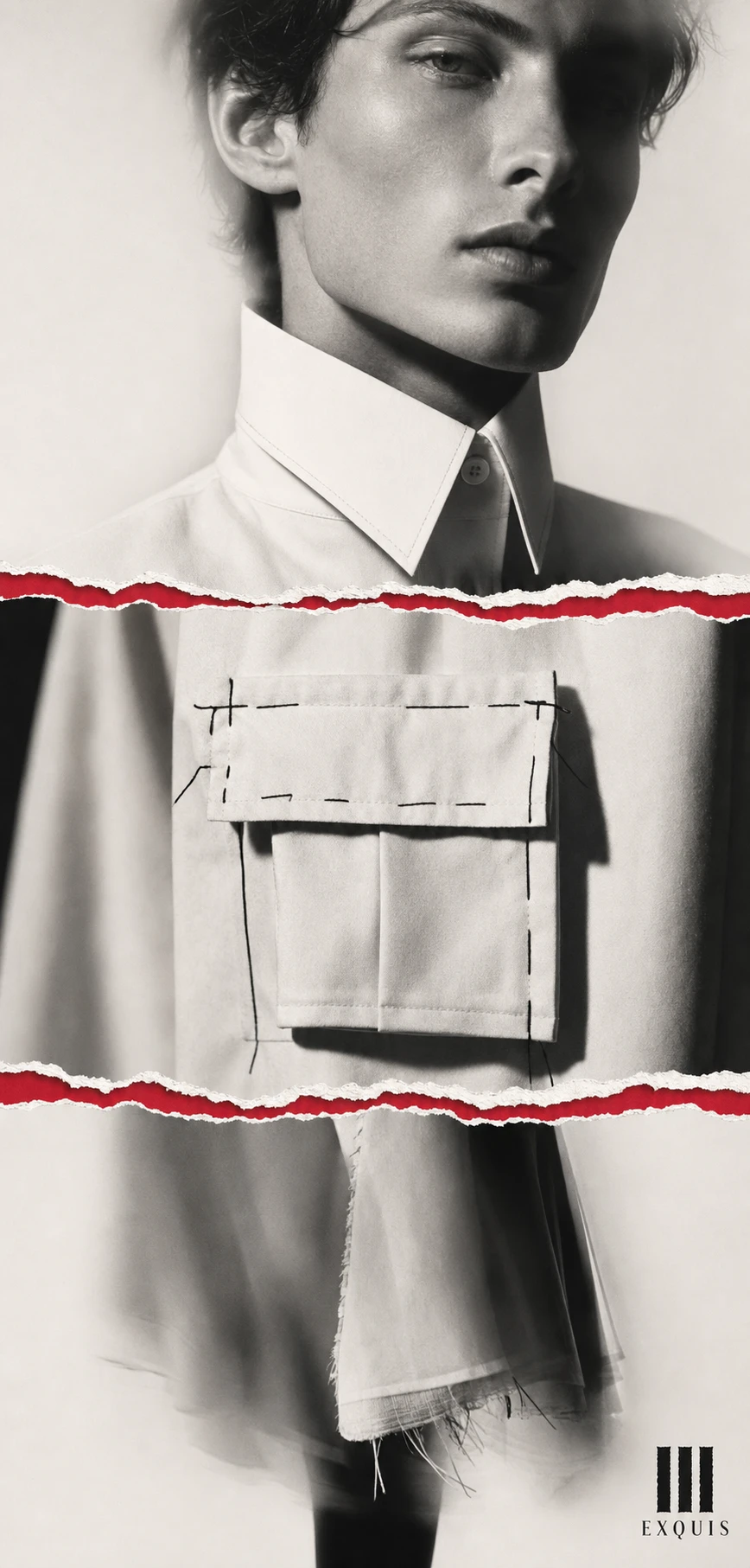
Twenty campaign visuals, shot in the visual language of Man Ray's photograms — hard directional light, deep solarized shadow, soft-focus bleed at the edges. Every image is built from three disconnected panels, each captured at a different focal length so the composition never resolves into one continuous body. Basting stitches and raw selvedge edges are left visible in Ink Black thread. The first ten visuals lean into softer, more romantic studio poses; the final ten push toward a colder, architectural minimalism — tall, composed models, faces cropped or turned away, posture doing the talking instead of expression.
THE RESULT
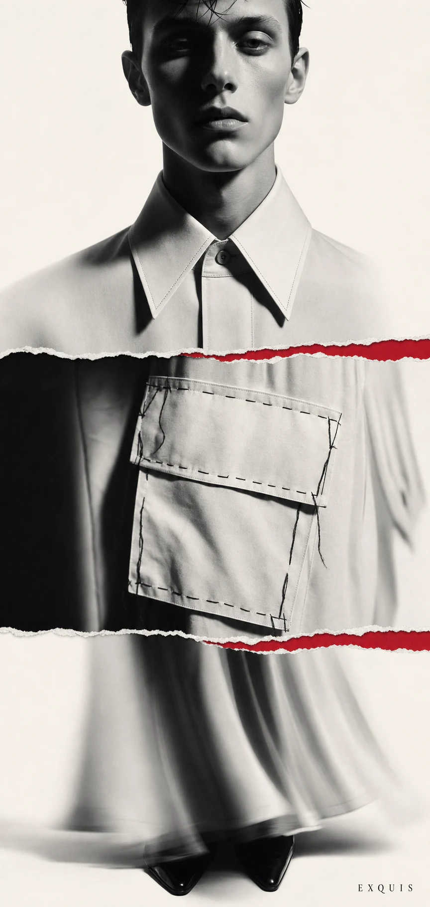
EXQUIS now has a complete, self-consistent identity system and a twenty-image campaign that reads as one coherent brand built entirely out of intentional disagreement. The three-panel logic holds across the logo, the typography, and the photography without ever needing to be explained in a caption — which was the actual test. Next step is building out the case study presentation and, if the concept keeps earning its place, a landing page that carries the same fractured-panel logic into a scrollable format.
Révolté — revolte.design
Project: EXQUIS
Year: 2026
Scope: Brand Identity, Logo Design, Typography System, Campaign Photography Direction
Industry: High Fashion / Couture
Like this project
Posted Jul 7, 2026
A couture house where three designers build one garment blind,the collision is the brand, not the flaw
Likes
1
Views
19
Timeline
Jun 30, 2026 - Jul 7, 2026