Built with Lovart
GLOSS* The World seen twice
Révolté
GLOSS*
Overview
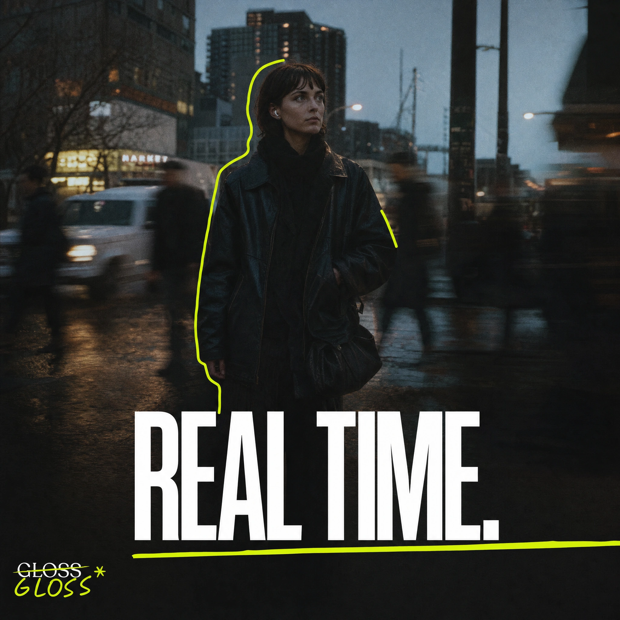
GLOSS* is a speculative lifestyle brand built on a single visual argument: the world is more interesting when someone draws on it. The entire identity system is constructed around two simultaneous registers — documentary photography and hand-drawn illustration — that operate in the same frame without hierarchy. Neither explains the other. Neither wins.
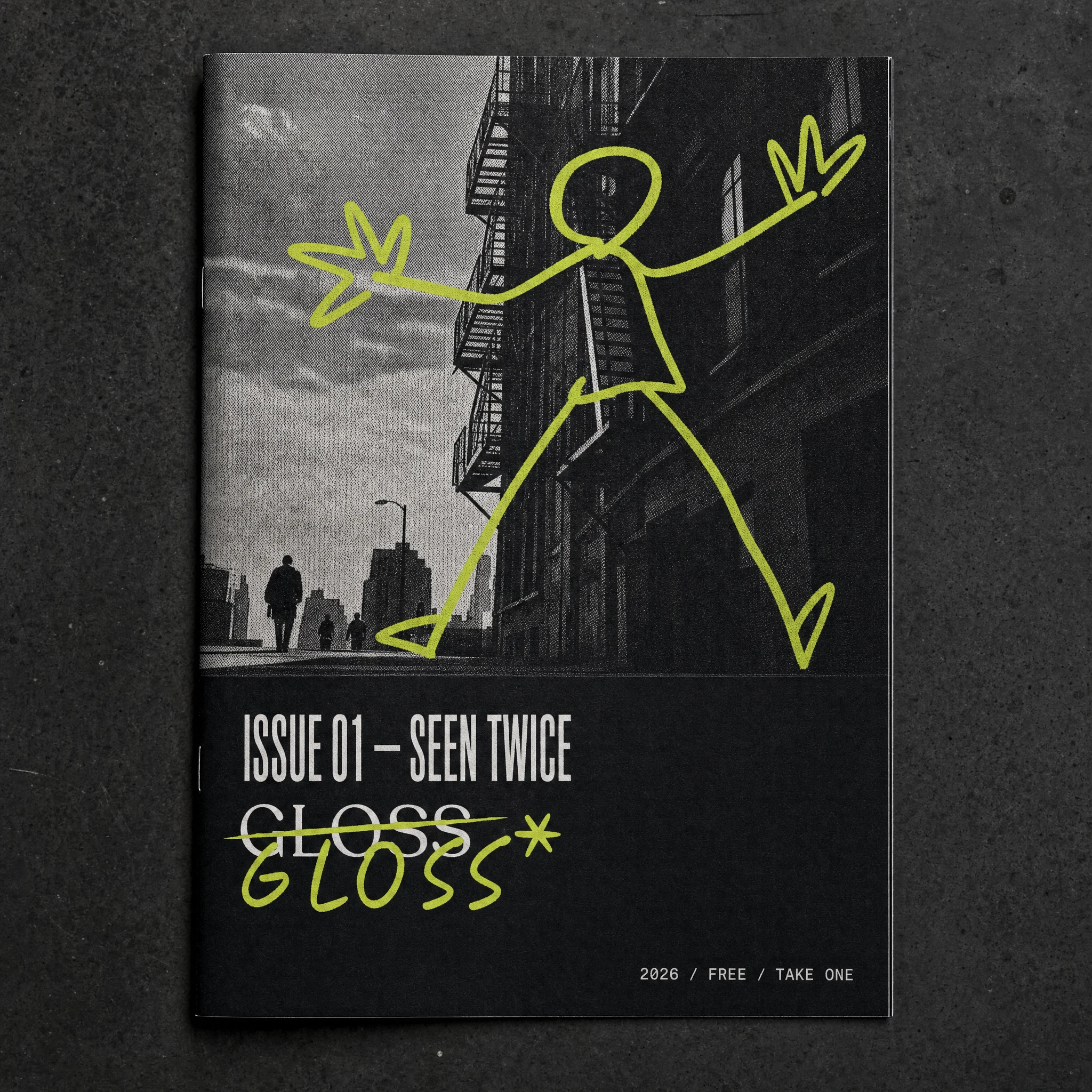
The brand name carries its own logic. GLOSS: the surface reading, the polished version, what you see first. GLOSS*: the annotation, the correction, the asterisk that says there's more to this. The logo embeds this tension directly — the primary serif wordmark struck through, the hand-lettered version written underneath it in
#CDF41D. The identity doesn't present itself. It revises itself in front of you.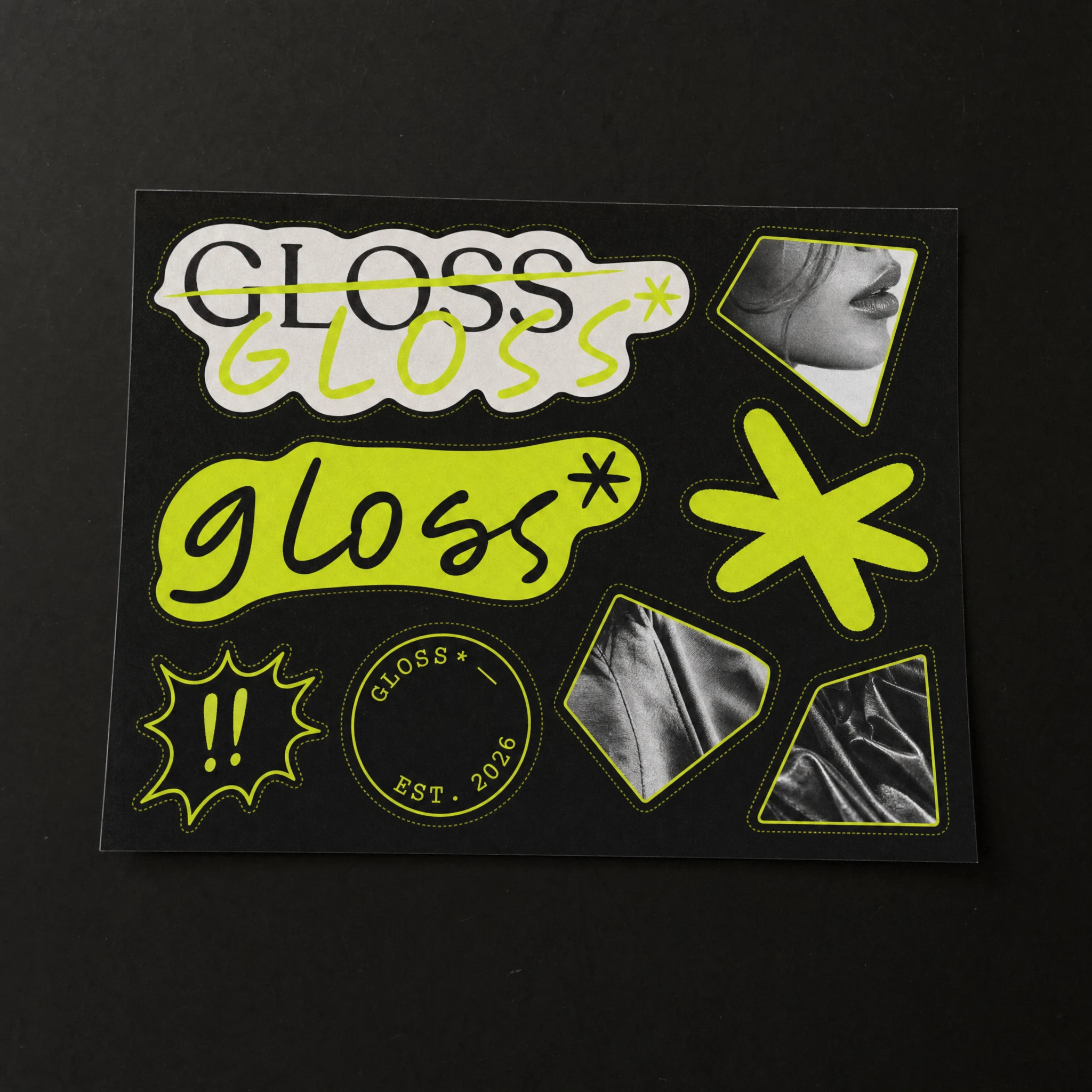
The Design Problem
Most lifestyle brands choose a register and commit to it — either the raw documentary world of real photography, or the expressive world of illustration. The brief for GLOSS* was to refuse that choice. The brand needed a visual language where the drawn and the real were structurally dependent on each other: where removing one layer would break the image, not just reduce it.
The additional constraint: a single chromatic color.
#CDF41D — a high-frequency acid yellow-green — would carry the entire illustrative voice. Everything photographic would remain monochrome. The color would function as attention, as gesture, as the brand's hand reaching into the real world.Identity System
The logo operates in two modes. The primary double-register mark — white serif GLOSS struck through by a diagonal
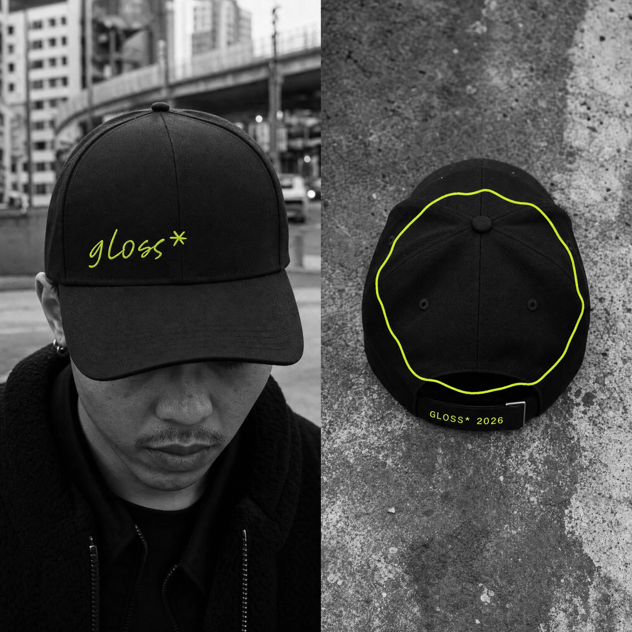
#CDF41D line, with the hand-lettered GLOSS* written beneath — encodes the brand's entire concept in a single lockup. The secondary mark is the lowercase gloss* in the brand's handwritten script: faster, more intimate, used on small surfaces and in social contexts. Both marks share the asterisk as a recurring symbol — the brand's punctuation, its signal that something has been noted.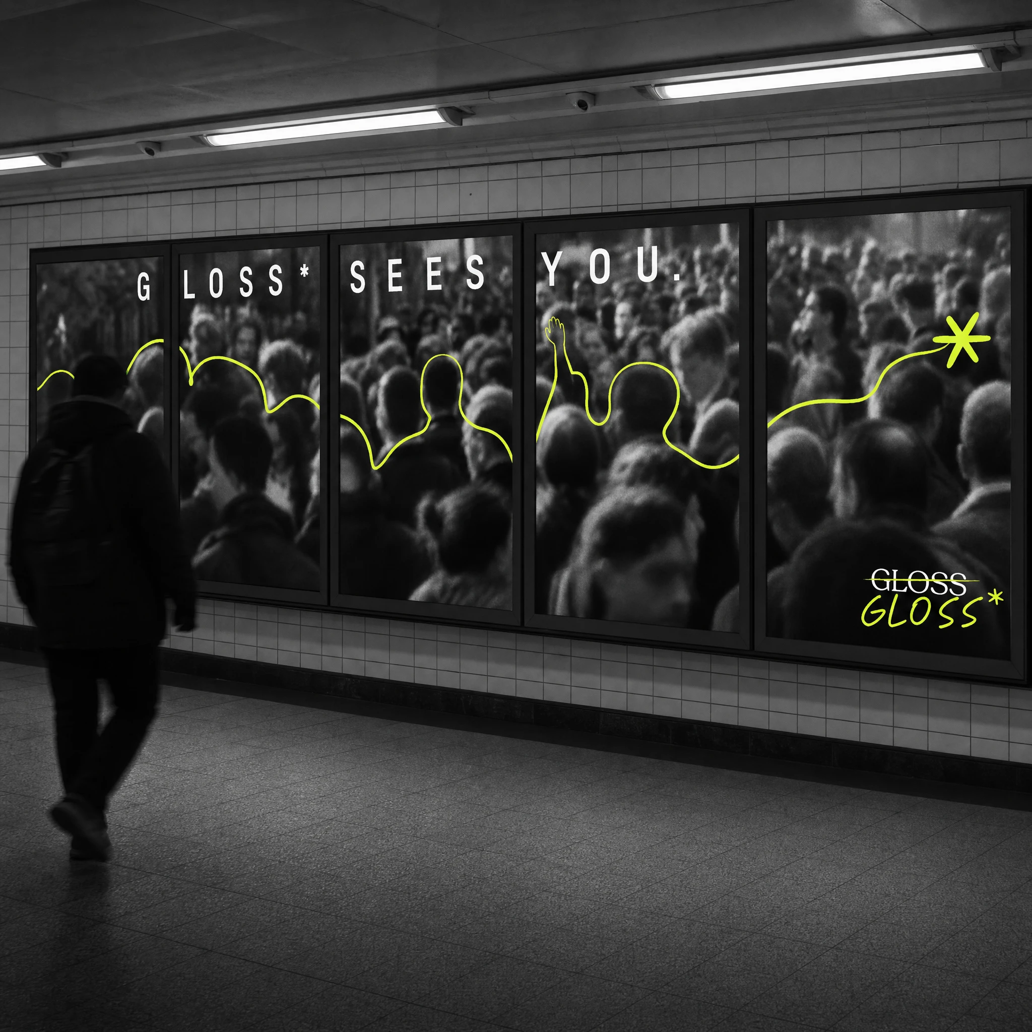
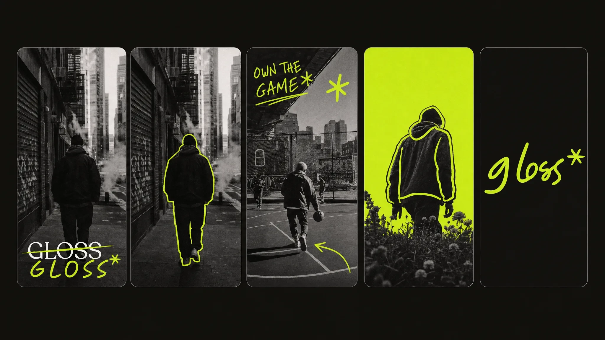
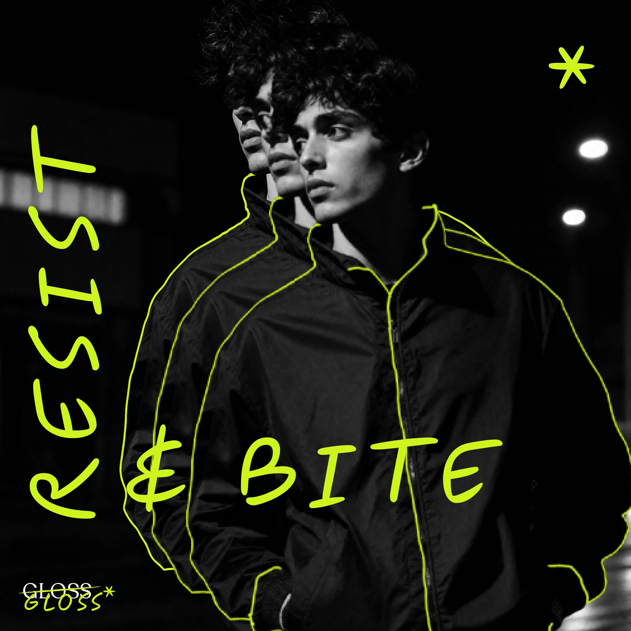
The illustration system works across two modes: contour (a single continuous
#CDF41D line tracing one specific element — a jacket seam, an ear, a silhouette) and gestural (full mark-making, figure drawing, flora, aggressive fill). The brand decides which mode a given surface demands. A watch strap gets one quiet line across the wrist. A campaign hero gets full eruption from the ground up. The same hand, different pressure.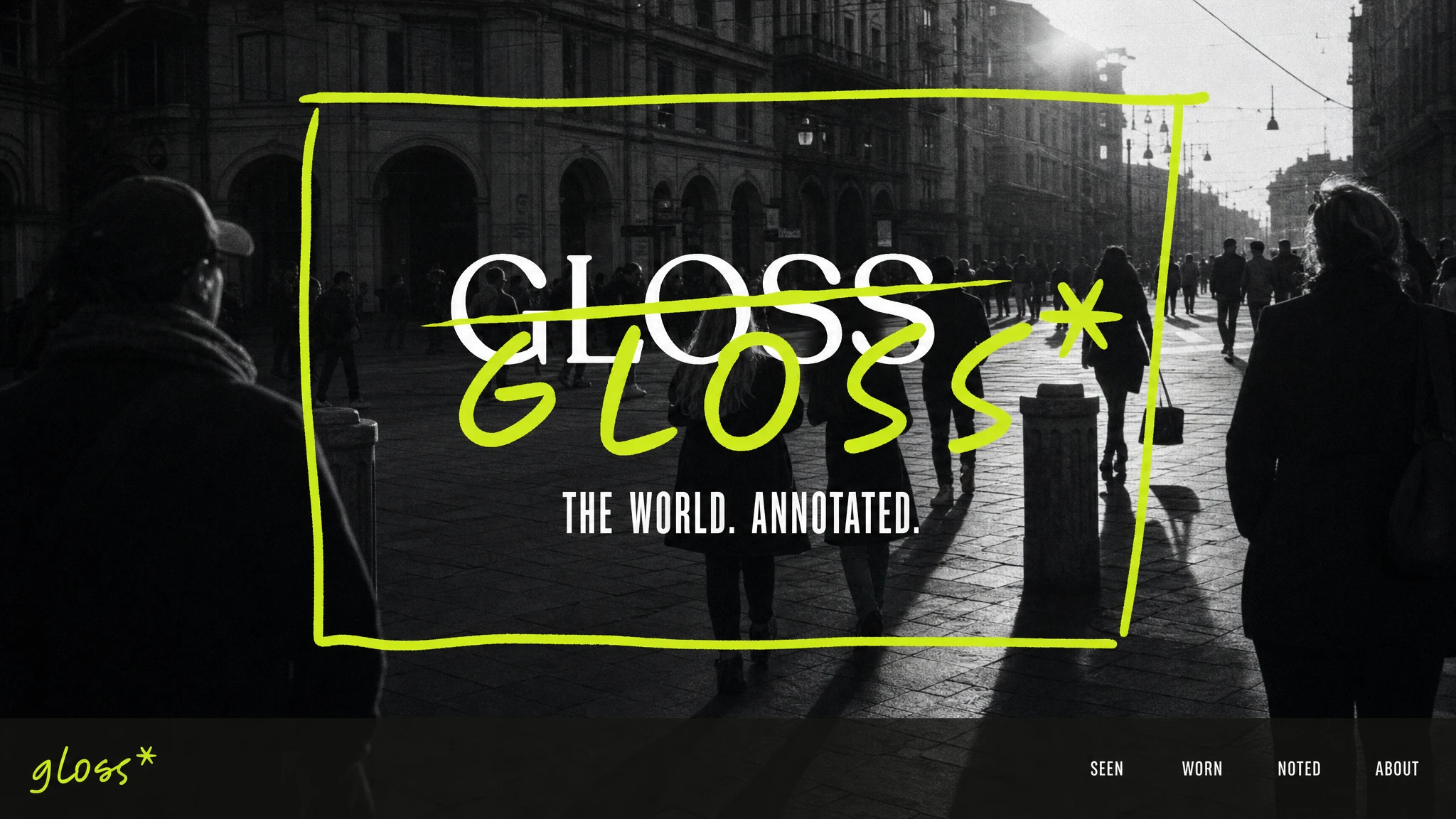
Typography is deliberately simple: a condensed grotesque for headlines, a humanist grotesque for body copy. The type never competes with the illustration. It sets the frame that the illustration breaks.
Campaign & Touchpoints
The campaign language runs on three lines — SEEN. BUILT. HELD. — each a one-word annotation of an ordinary urban moment. The flypost series translates this to street scale: a standing figure outlined in one
#CDF41D loop, a doorway extended into impossible space by geometric line, a coffee cup framed in a hatched burst of yellow-green. Three posters, three illustration modes, one city wall.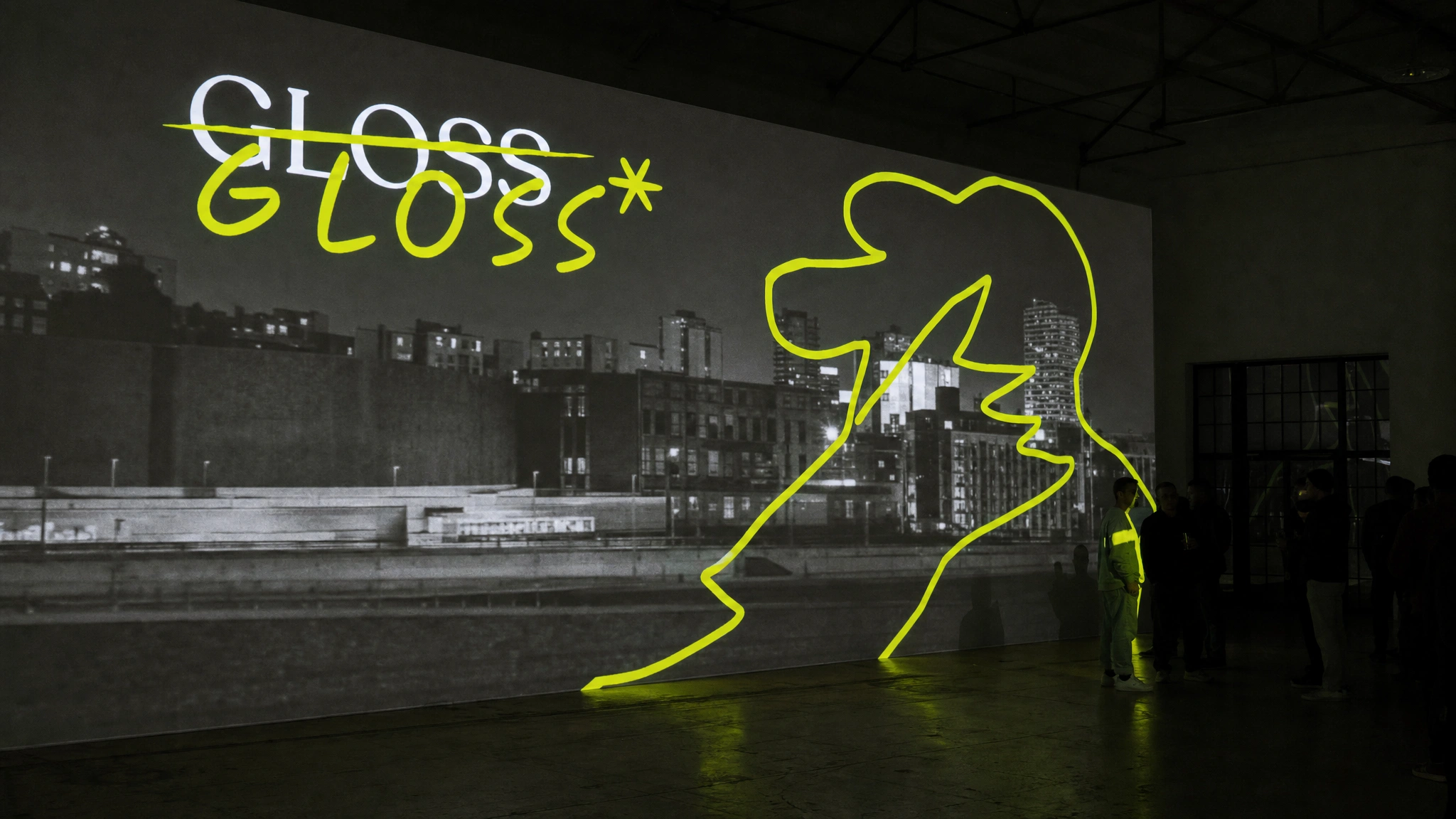
The OOH system scales the contour logic to infrastructure. The subway takeover runs one unbroken
#CDF41D line across five sequential panels through a real crowd — entering the left panel, weaving between figures, finishing with a large open asterisk on the right. A single gesture across twenty meters of tile. The brand's handwriting at architectural scale.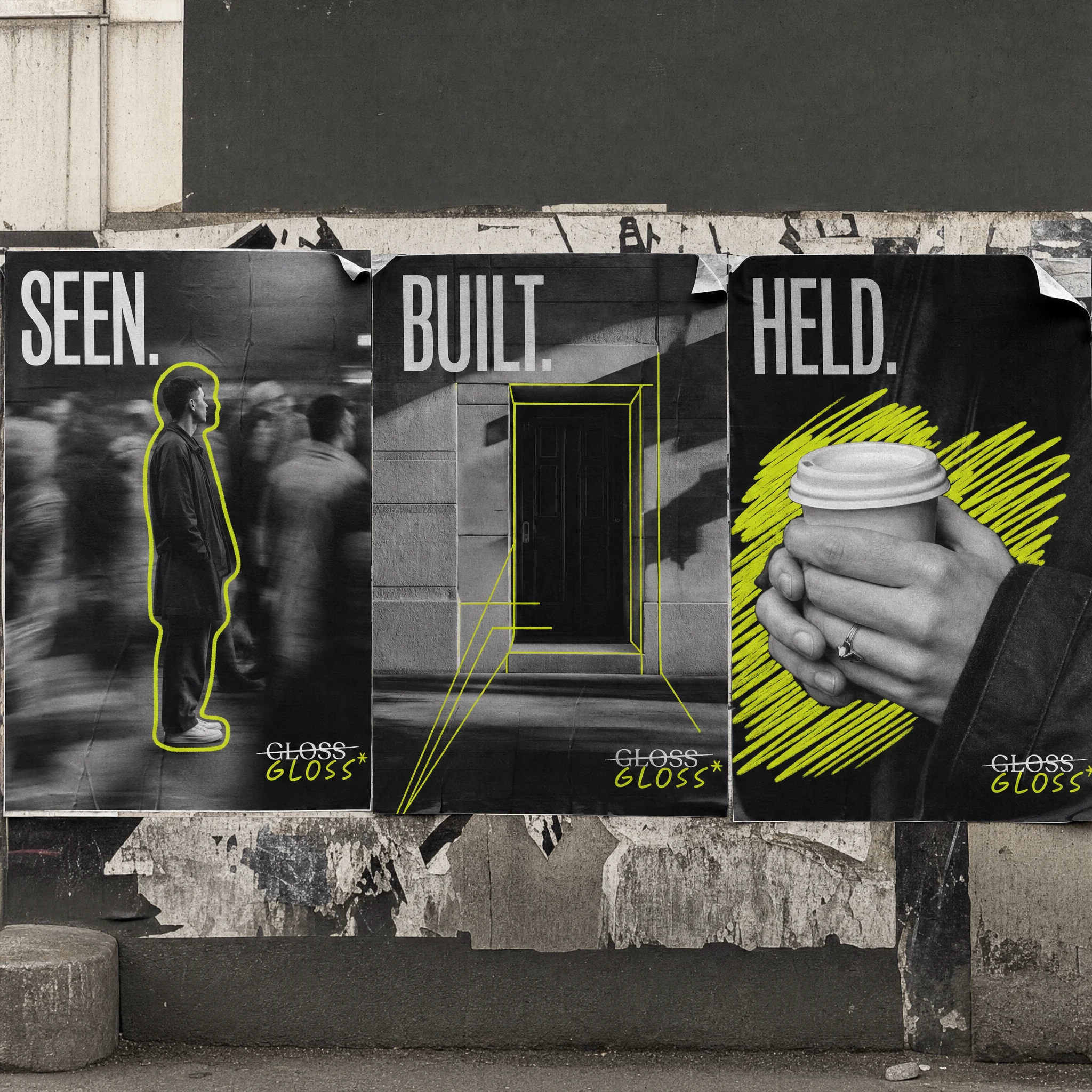
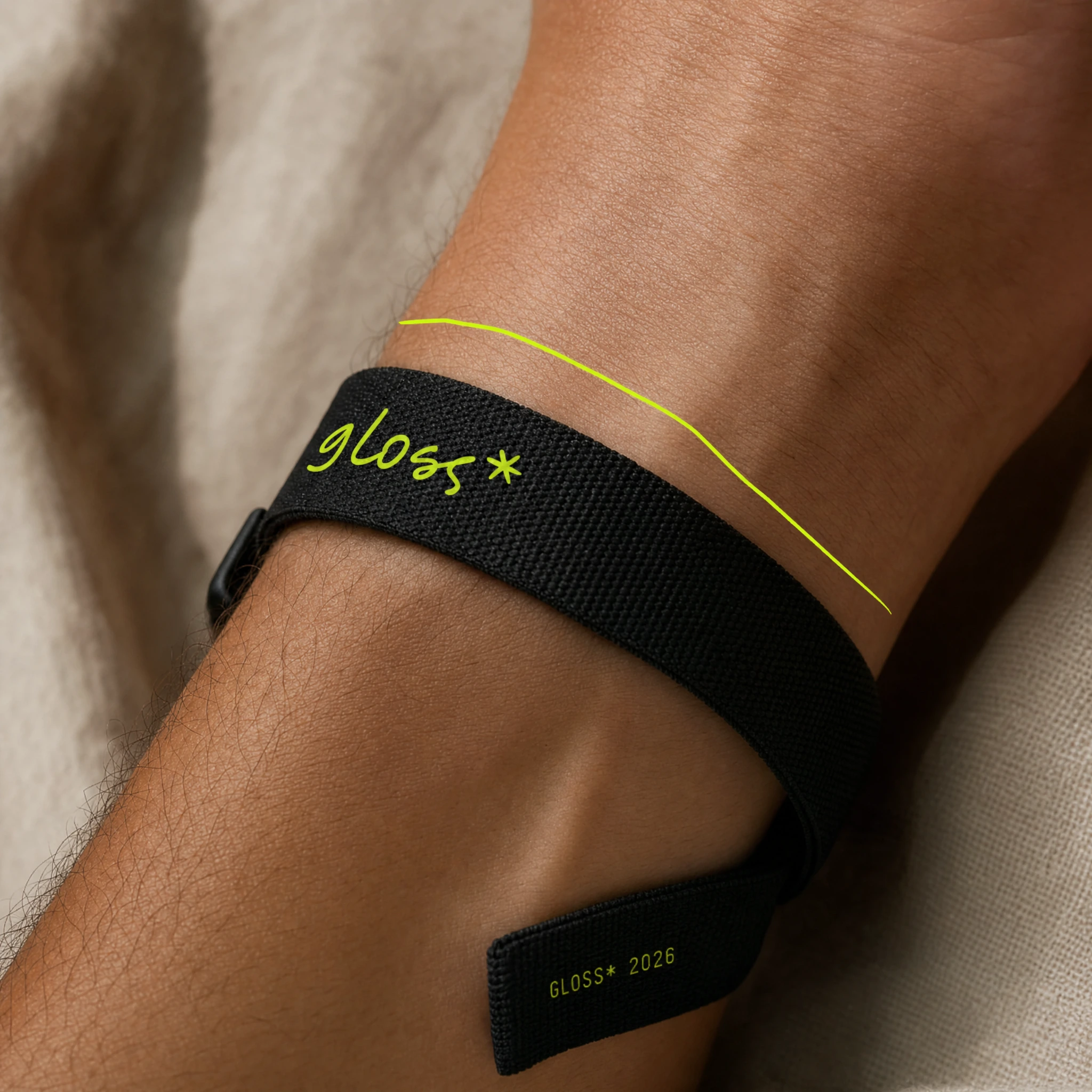
At the other extreme: a watch strap. One thin
#CDF41D contour line drawn across the wrist above the strap, as if the brand traced the wearer mid-movement. The most minimal execution in the system and one of the most precise.The app UI brings the visual language into digital product. Bold
#CDF41D color-block cards, near-black ground, hand-drawn asterisks breaking outside card boundaries, monochrome photography embedded as content. The interface feels like a design object — a brand that knows it's being looked at.What the System Proves
GLOSS* is a test of one idea at full pressure: that illustration and photography are not media to be combined, but registers to be played against each other. The
#CDF41D line is never decorative. It's always doing something specific — selecting, tracing, amplifying, or contradicting what the photograph shows beneath it. When it works best, you can't imagine the photograph without the line, or the line without the photograph.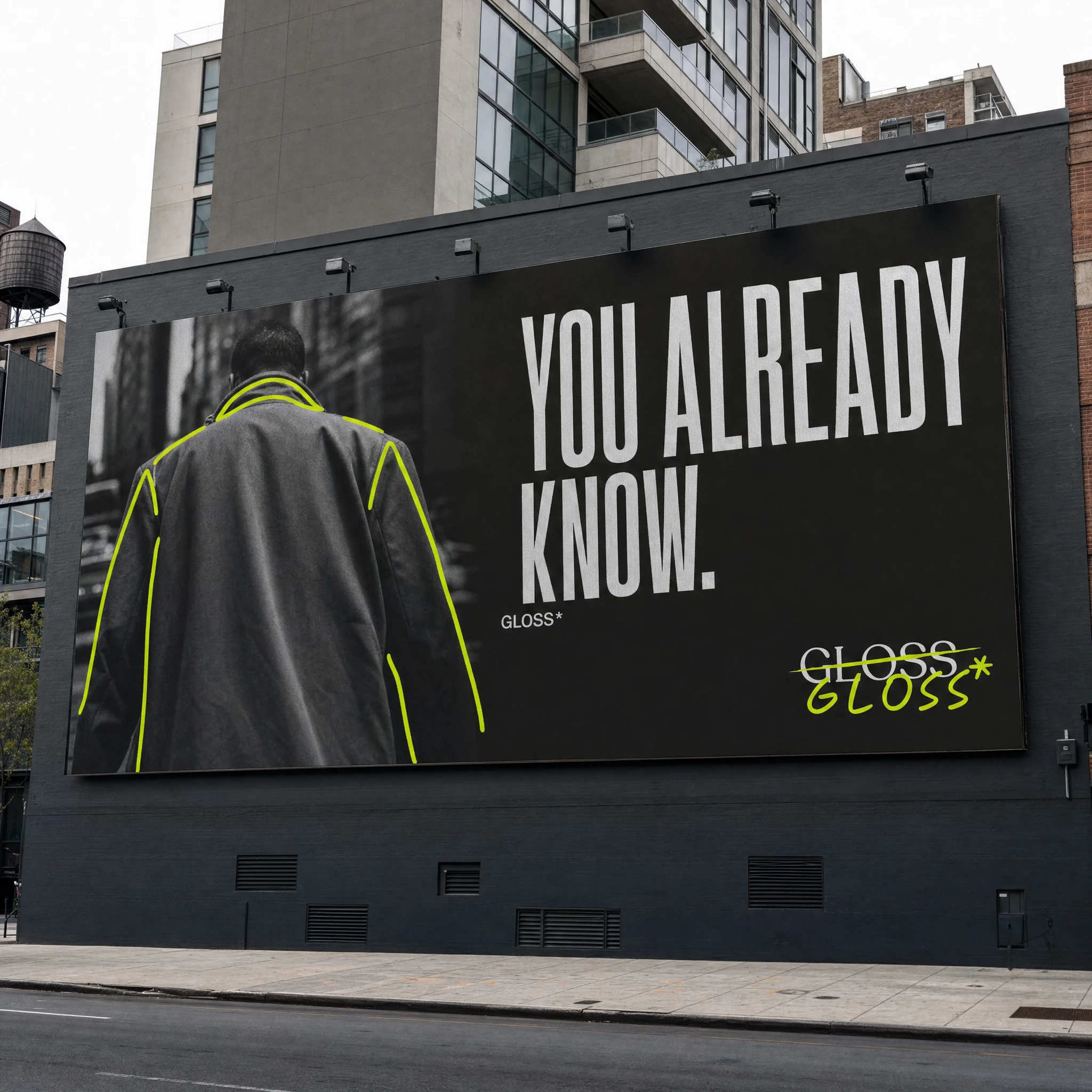
The brand's tagline — THE WORLD. ANNOTATED. — is the system's thesis statement. GLOSS* doesn't document the world. It reads it. And the reading changes what you see.
Deliverables
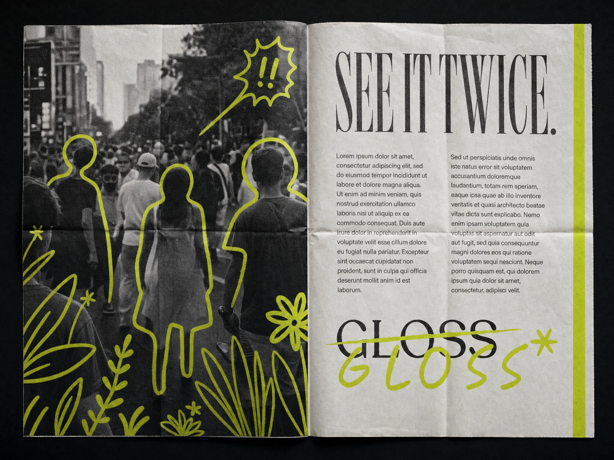
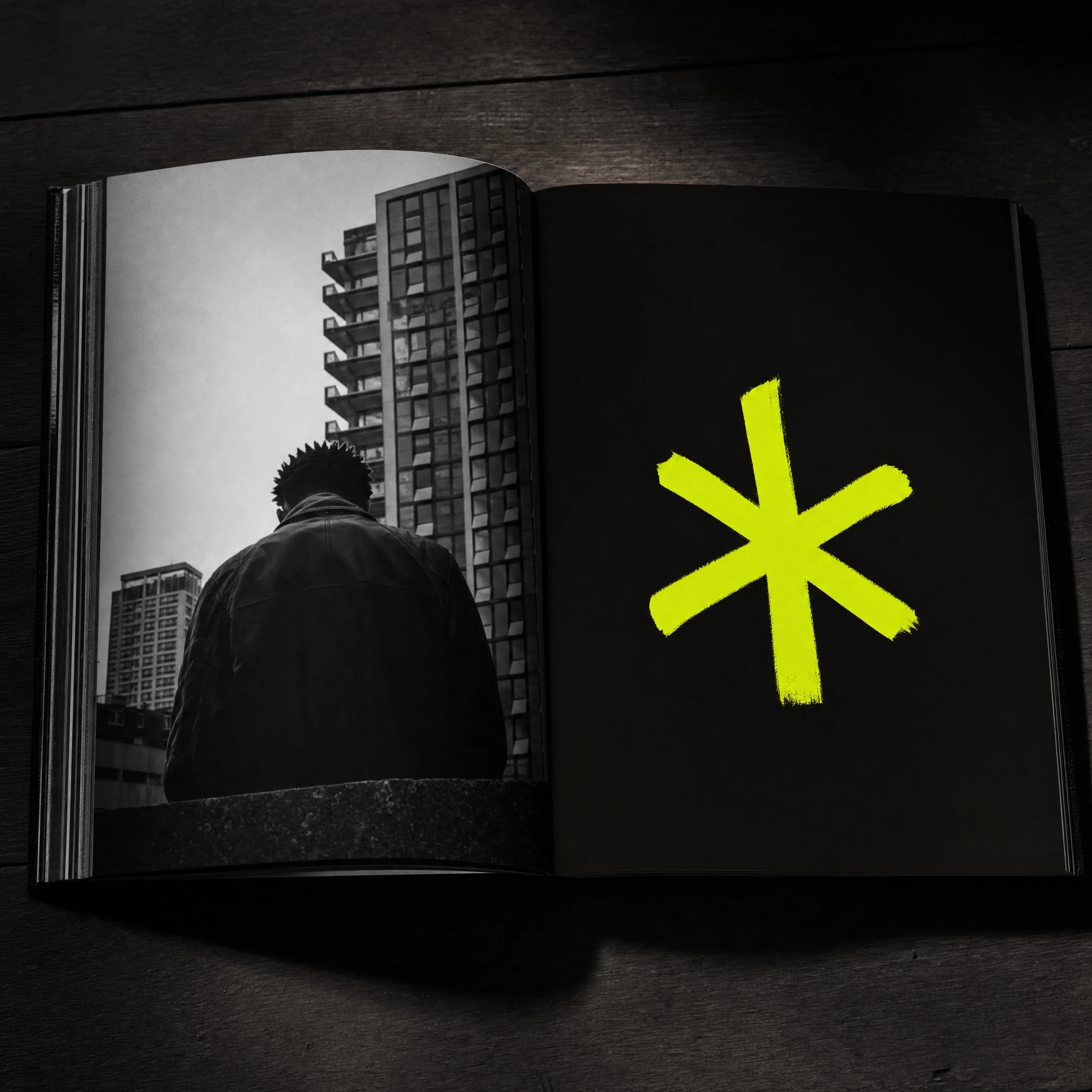
Brand identity system — logo (primary + secondary), illustration system (two modes), color system, typography, brand voice. Campaign suite — three-panel street poster series, OOH billboard, subway tunnel takeover, campaign film still. Print — zine/risograph, newspaper broadsheet insert, vinyl record sleeve, coffee table book. Digital — website hero, landing page cards, Instagram carousel, social square, app UI (two screens). Merch & objects — hoodie, long-sleeve shirt, cap, tote bag, watch strap, fragrance bottle, packaging tape, sticker sheet. Environmental — storefront window vinyl, projection installation.
Like this project
Posted Jun 12, 2026
GLOSS* — a lifestyle brand where #CDF41D illustration annotates real photography. One line. One color. Two registers that can't exist without each other
Likes
2
Views
24
Timeline
Jun 1, 2026 - Jun 12, 2026

