Built with Lovart
ARCA — The Archive Is Alive
Révolté
ARCA — The Archive Is Alive
A DAM platform for creative studios that didn't want to feel like software. The brief was infrastructure. The answer was an institution.
THE BRIEF
Arca is a digital asset management tool for creative studios — the kind of product that lives in the background of a studio's work, organizing years of files that would otherwise rot on dead hard drives or scatter across a dozen services nobody remembers paying for. Most tools in this category compete on features. Arca asked a different question: what if the archive itself had a point of view?
The tension I was working with was fundamental. DAM software has no visual tradition worth inheriting. The category is dominated by enterprise-bland UI, neutral palettes, and the implicit message that the tool should be invisible. Arca wanted to be the opposite — a brand studios would be proud to be seen using, the kind of thing that shows up in a flat-lay or a studio tour without explanation.
The scope was total: logo, identity system, UI, and a full campaign. I treated the campaign as the primary deliverable. An identity without a campaign is a logo. A campaign makes the brand legible in the world.
THE APPROACH
The first instinct was institutional — museum, archive, library. That held. What I kept coming back to was the specific emotional weight of things almost lost. Every creative studio has a version of the same story: the drive that died, the project folder that never got backed up, the campaign that exists now only in a client's memory. That's not a product problem. That's grief. Arca was the answer to that grief — but I didn't want to say it like a startup. I wanted to say it like a building that's been there longer than you have.
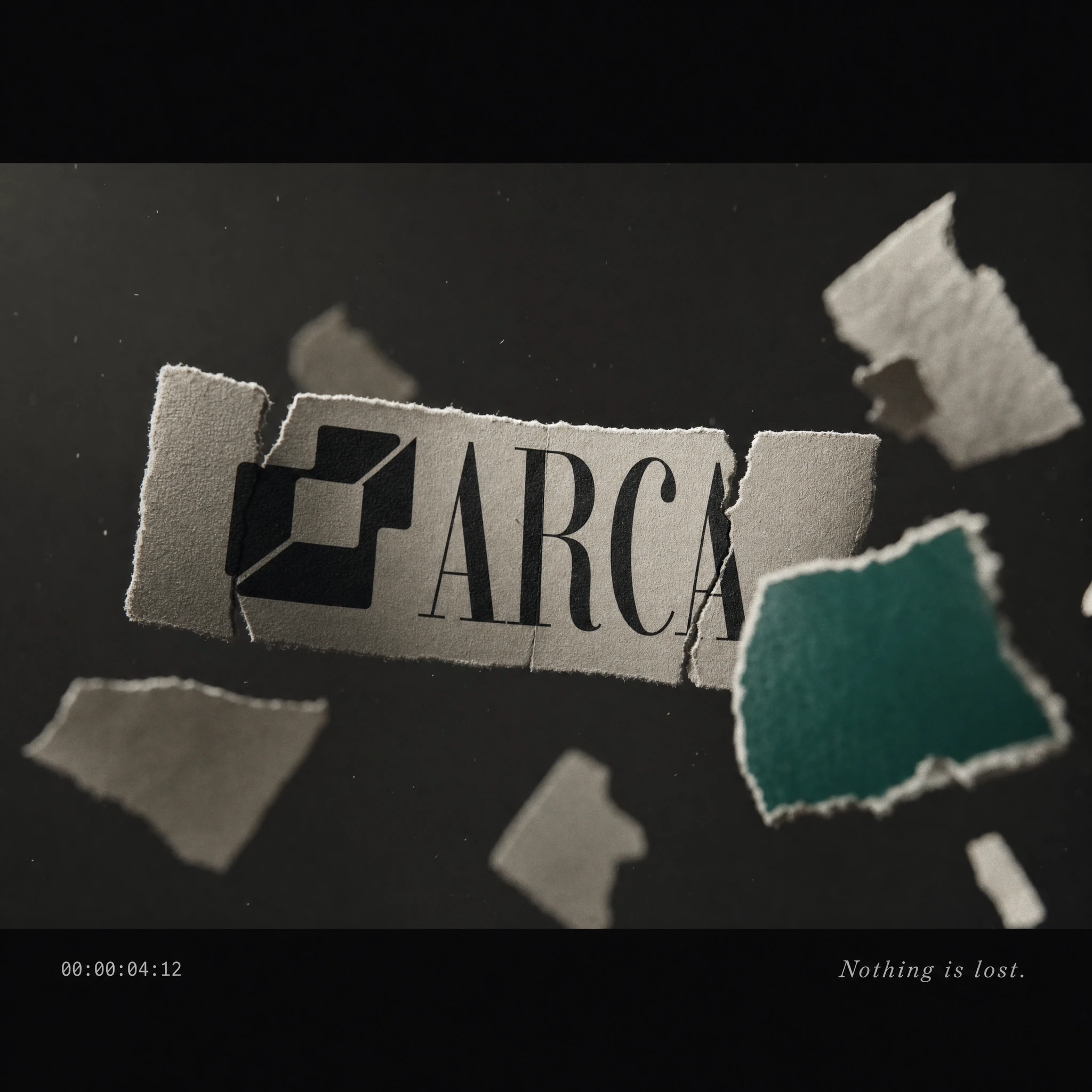
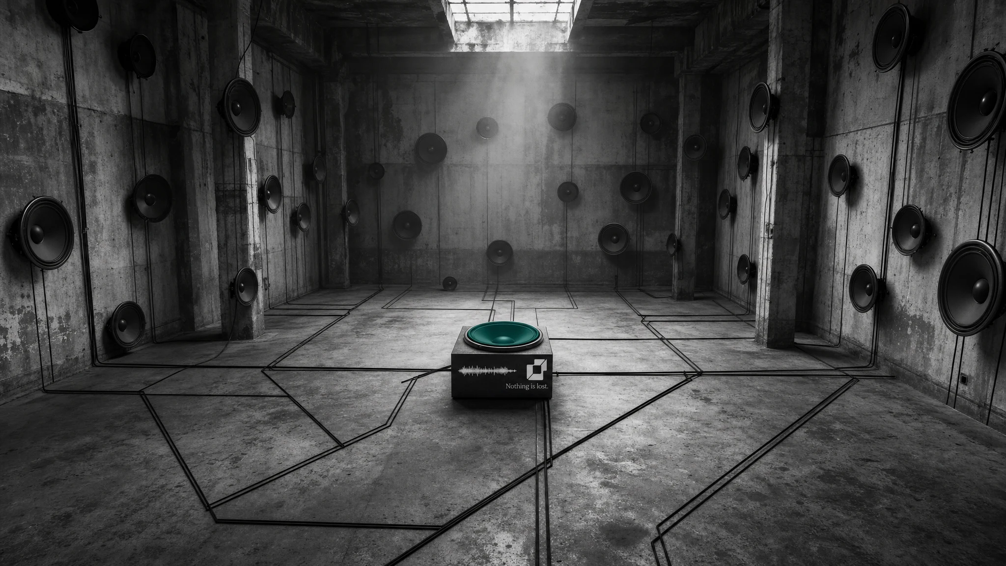
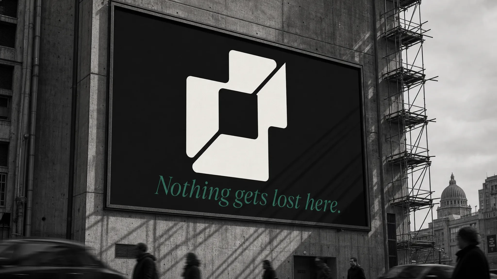
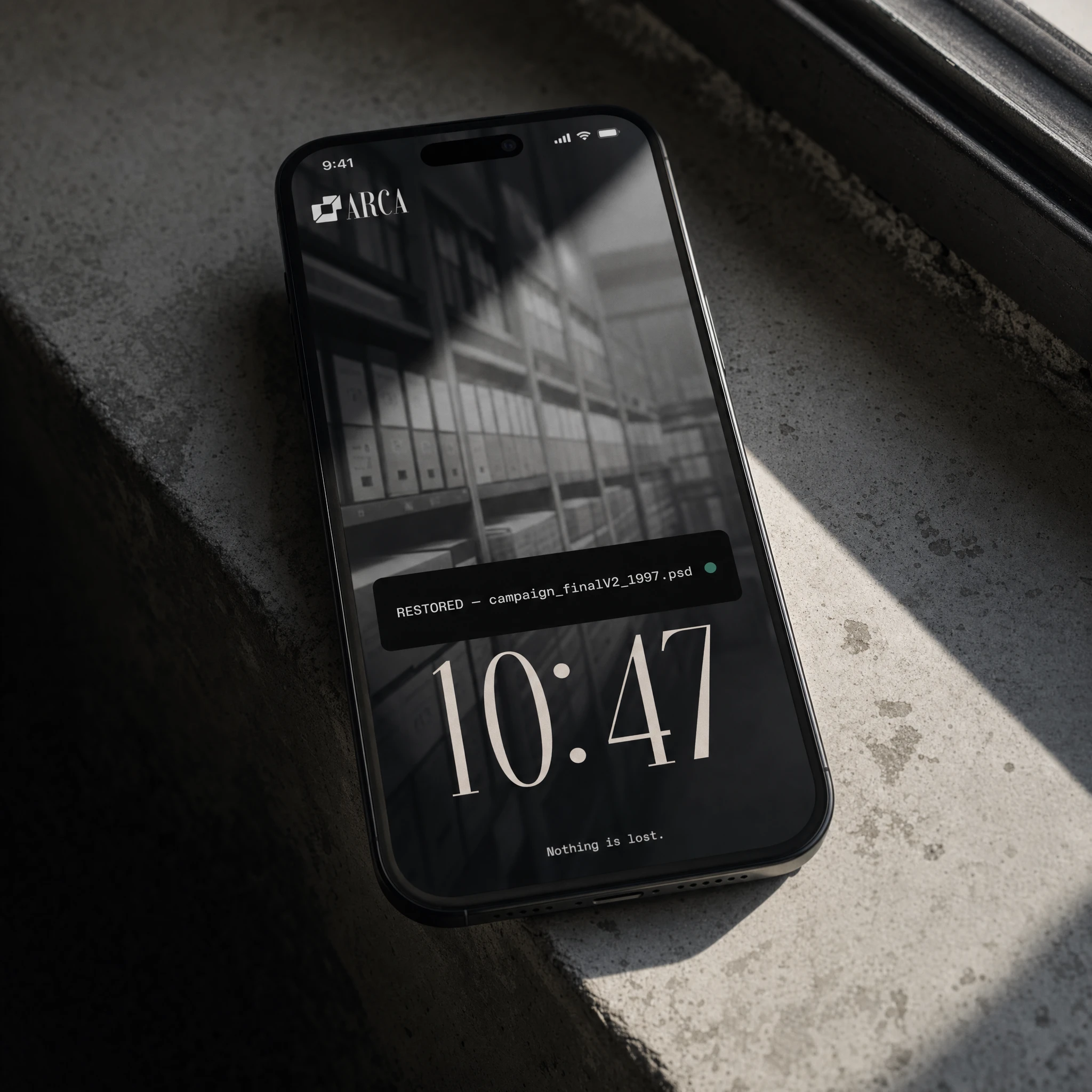
"Nothing is lost." came quickly and stayed. Three words that work as claim, as comfort, and as provocation. They're confident without being aggressive. Earned without needing to prove it. I built the entire campaign around that line and treated each visual as a different angle on the same idea: the moment of recovery, always marked by one thing — the Smeral accent.
The color decision was critical. The original direction used Electric Lime, which read too digital, too current. I switched to Smeral (#1B6B5A) — a deep oxidised teal, the color of archival ink, of verdigris on copper. It anchors the brand in material history without sentimentality. Used exactly once per visual, it marks the recovered moment the way a highlighter marks the one sentence that matters in a hundred pages.
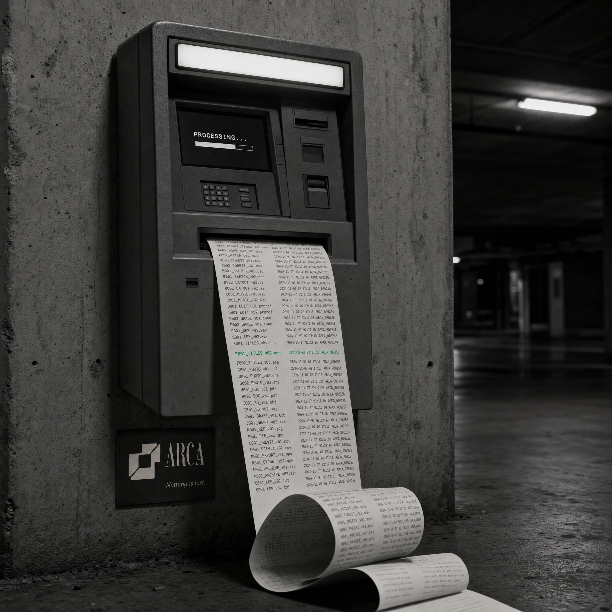
For photography, I rejected anything lifestyle or ambient. Everything is B&W or deeply desaturated, lit with a single hard source — raking light that creates deep shadow and blown highlights. The images feel documented, not shot. That distinction matters. Documentation implies permanence. Permanence is what Arca sells.
THE WORK
LOGO AND MARK
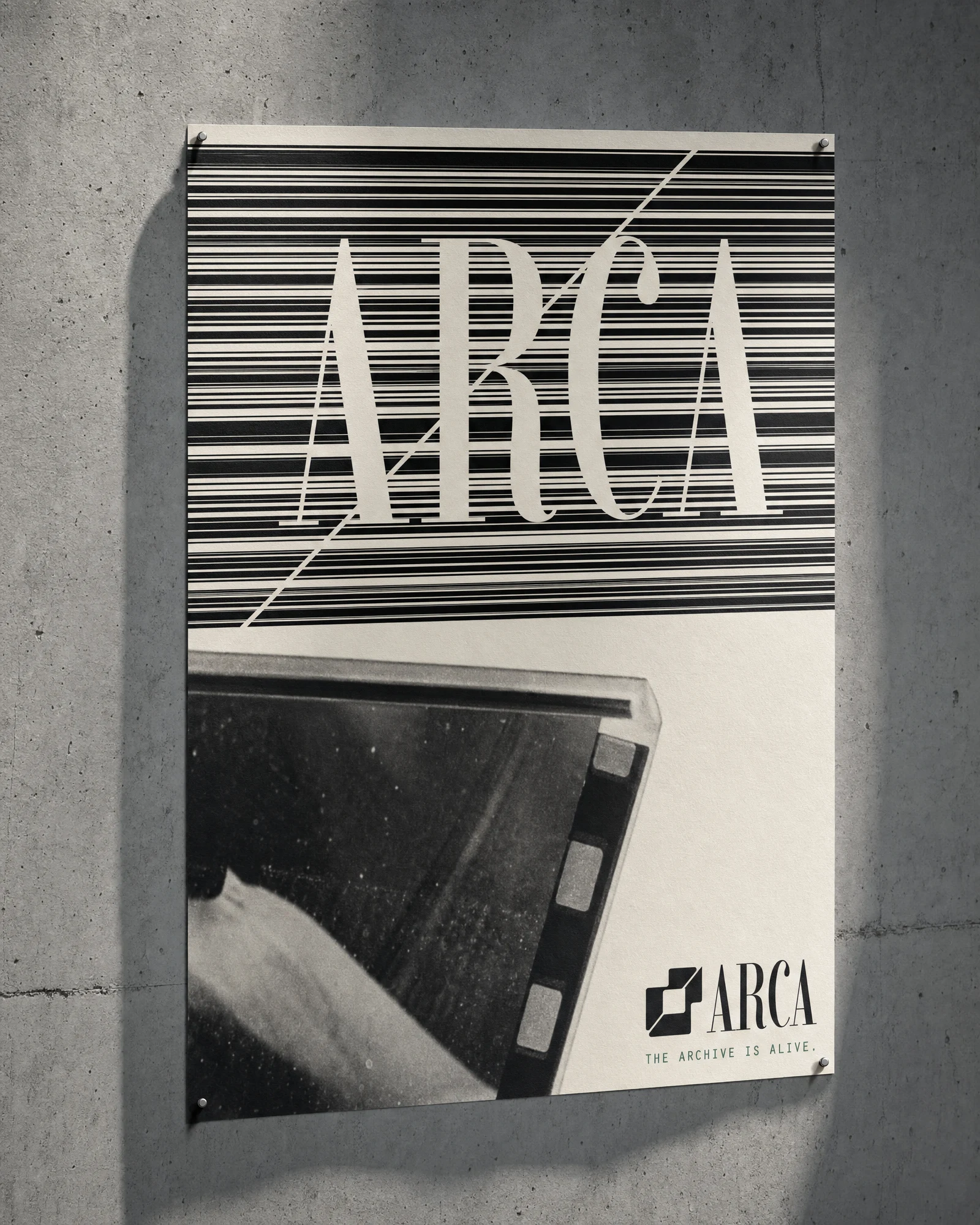
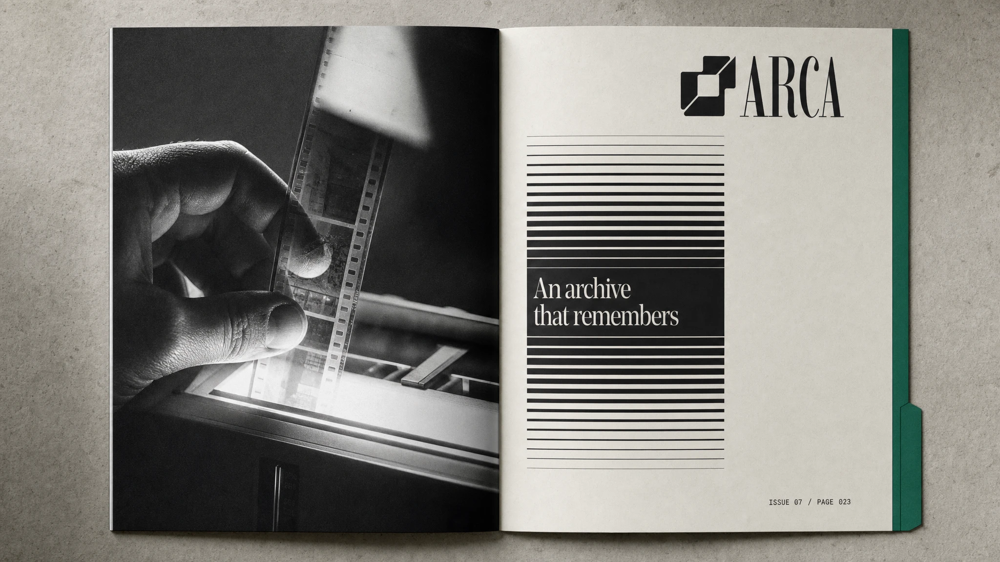
The mark is two overlapping rounded squares cut by a diagonal — a form that reads simultaneously as a file stack, a window frame, and a layered archive. The diagonal is the brand's key detail: it appears in campaign posters, scaffolding wraps, neon installations, and architectural interventions. It's not decorative. It's structural. The wordmark is set in Imbue — a high-contrast didone with the weight of institutional type and enough elegance to sit beside photography without competing. The pairing of the geometric mark and the editorial serif creates the central tension of the brand: precision and warmth, system and memory.
IDENTITY SYSTEM
Ink Black #0D0D0D as the primary surface. Bone #F0EDE6 for all reversed applications. Concrete #B0A89A for mid-tones. Press Gray #2A2A27 for deep surfaces. Smeral #1B6B5A as the single chromatic accent — never used for decoration, always for meaning. Imbue handles all brand display. Compressed monospace handles all metadata, file paths, timestamps, and system text. The split between the two typefaces mirrors the product itself: the emotional layer and the functional layer.
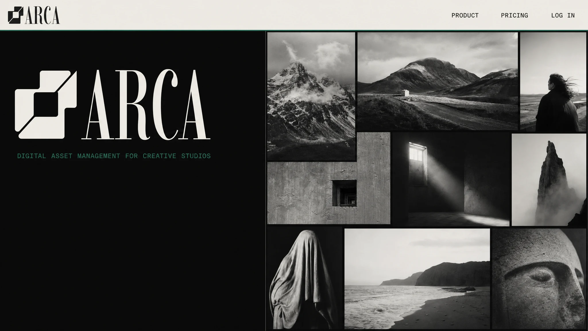
UI DESIGN
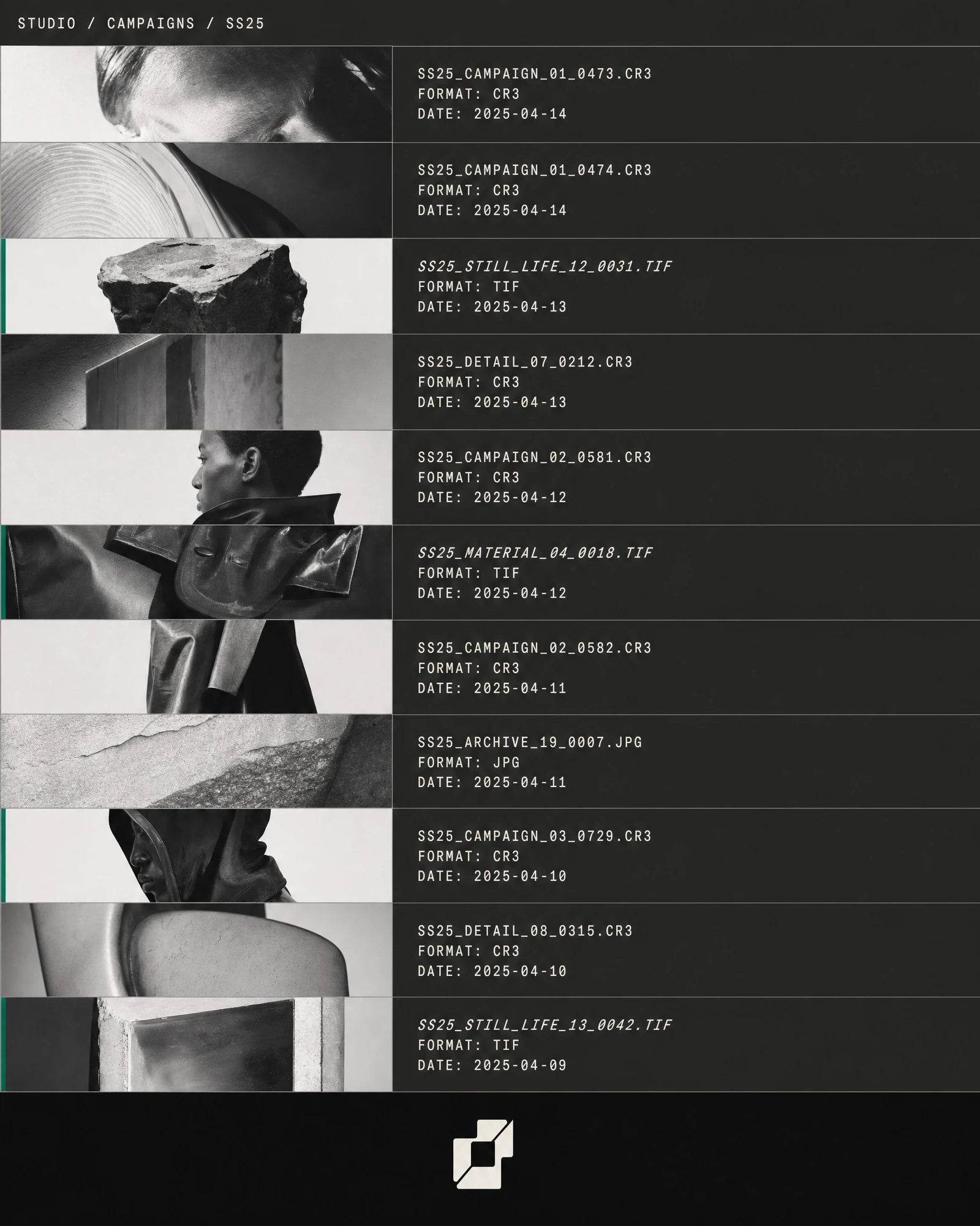
The homepage splits vertically — full black left column with the logo at institutional scale, contact-sheet grid of nine B&W thumbnails on the right at 2px gutters. No hero copy. No CTA. The product communicates what it does by showing it. The mobile app runs in press-gray (#2A2A27), with assets displayed in a dense horizontal banding list — not a grid. Each row is full-width: thumbnail left, filename/format/date in compressed mono right. Rows modified recently carry a 2px Smeral left-border. Every third tag is highlighted with a full Smeral background. No rounded corners. No shadows. The UI reads like a film archive manifest.
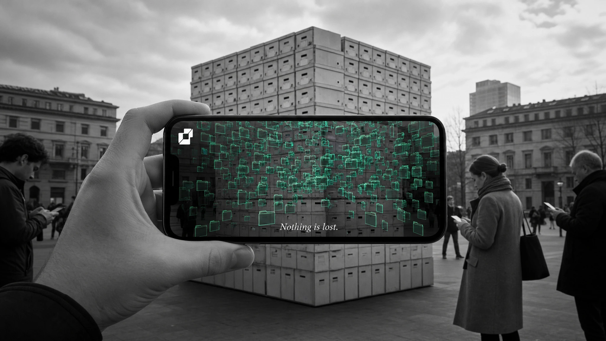
CAMPAIGN — "NOTHING IS LOST."
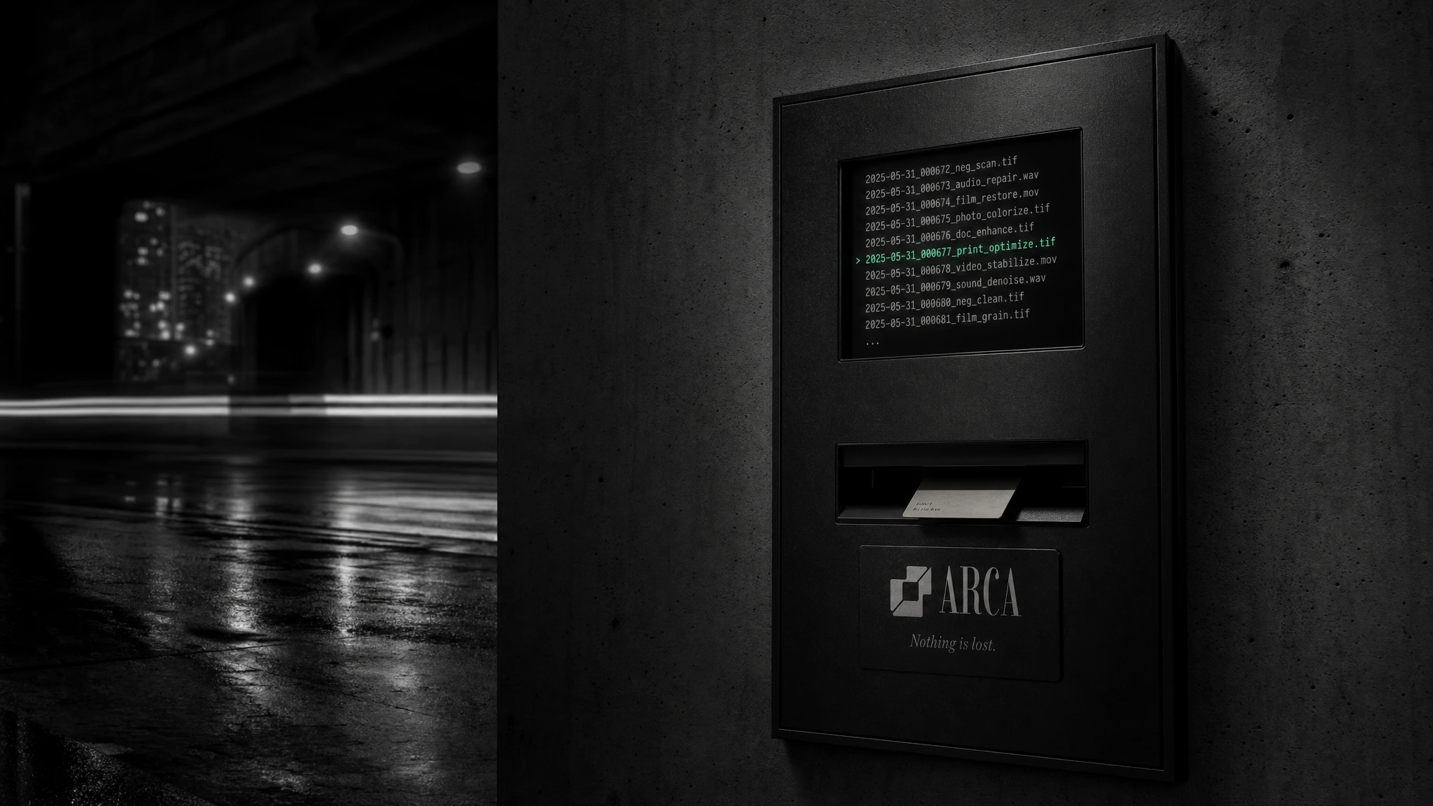
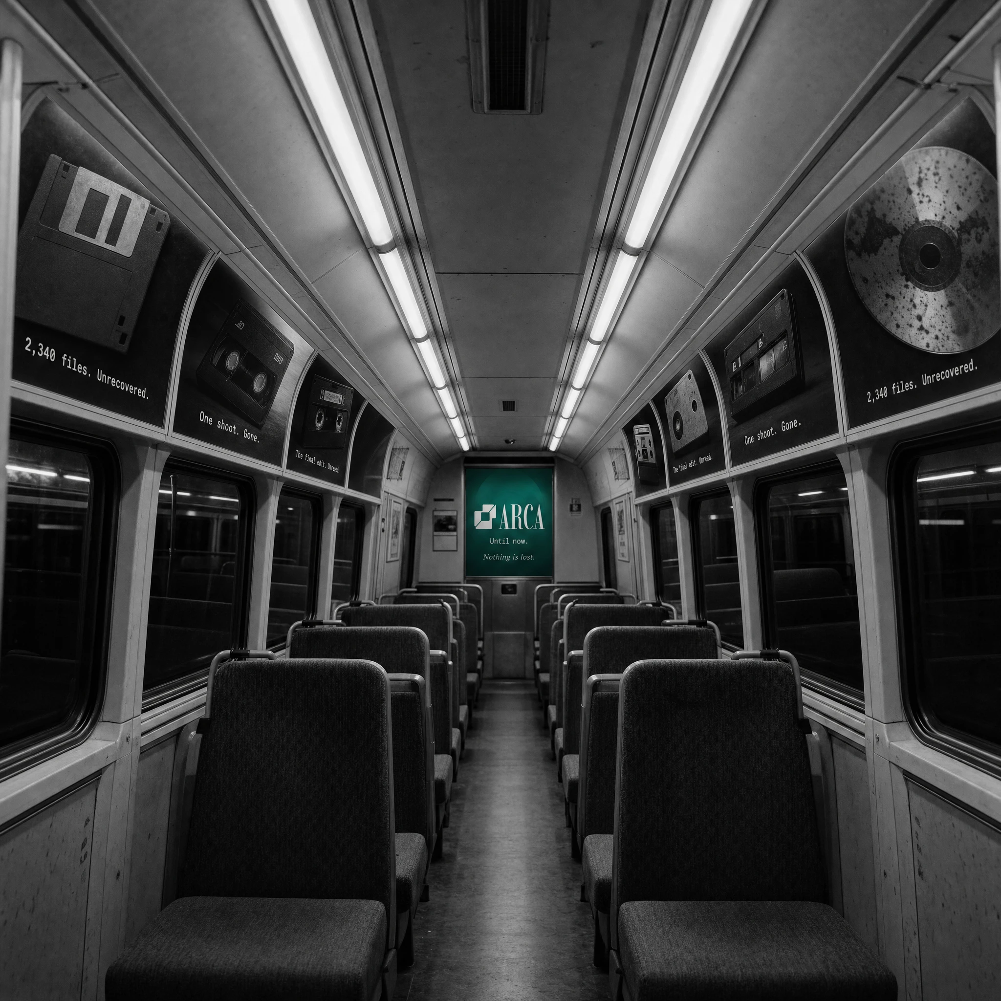
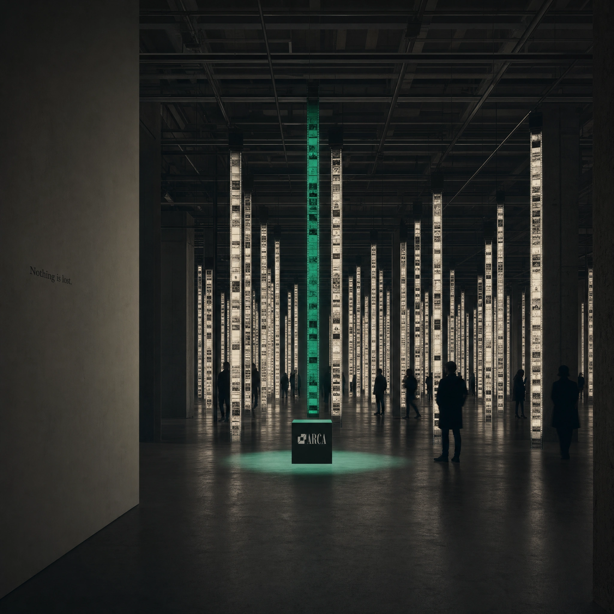
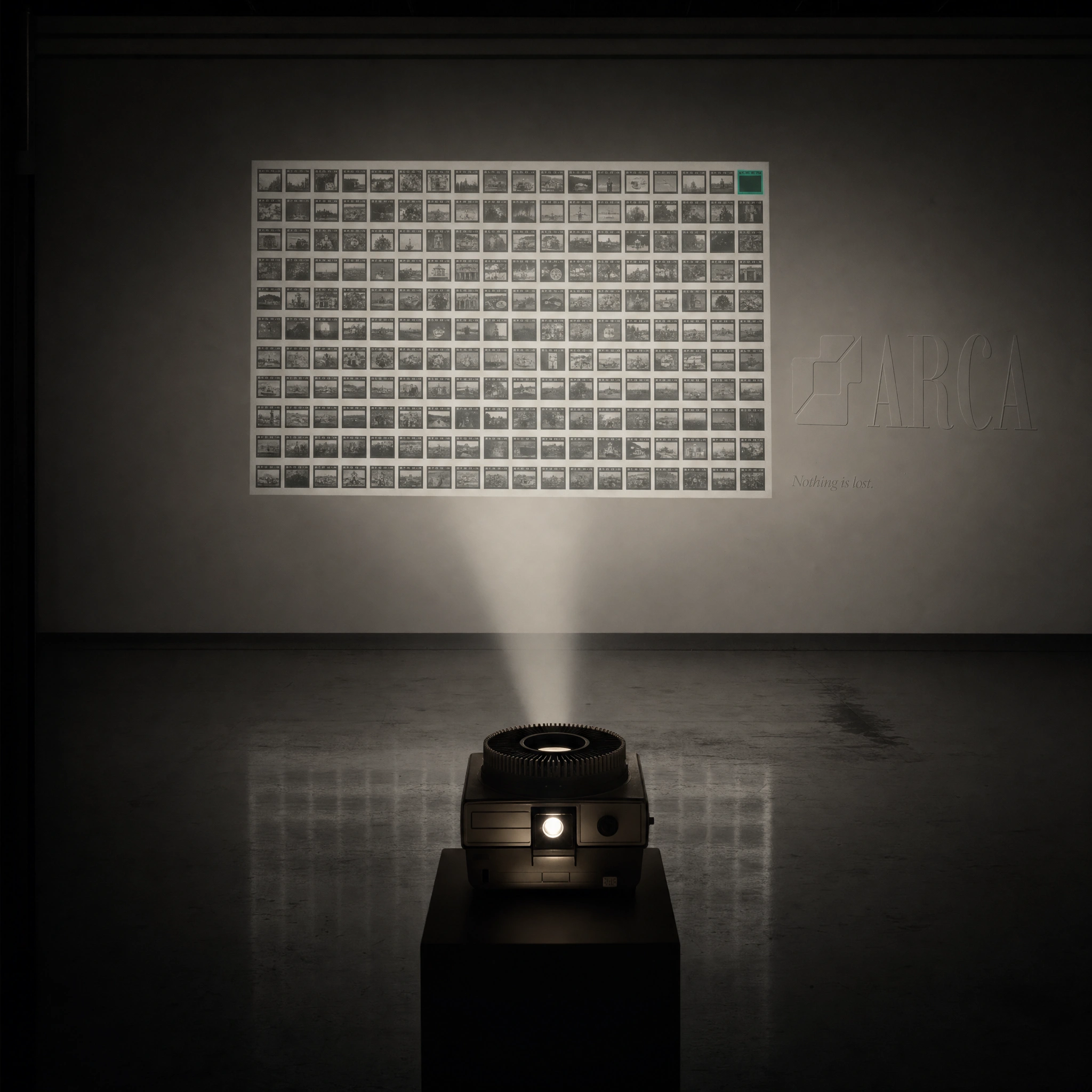
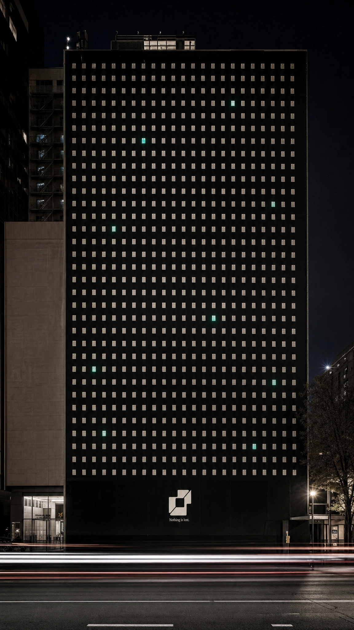
Thirty-plus executions across every format and surface. Each visual contains exactly one Smeral element — the one recovered thing. A single glowing frame in a contact sheet on a subway platform. One Smeral row on an airport arrivals board showing NOTHING_IS_LOST / NOW. A building wrap at night where hundreds of file-unit windows glow bone-white, and eight or nine glow Smeral — lit from within. A redacted incident report, every line blacked out except three: "Assets recovered: 100% / Method: ARCA / Nothing is lost." — the campaign line appearing in Imbue italic, the only non-monospace type on the page, the one thing that survives the redaction.
The guerrilla work went further. A dead-drop USB embedded in a concrete wall, the Smeral LED the only colour in the frame. Barrier tape strung across a wet cobblestone alley, bone-white, repeating ARCA — DIGITAL ASSET MANAGEMENT — NOTHING IS LOST in compressed mono. A vending machine dispensing archival retrieval reports at night, the one highlighted filename in Smeral. A classified-ad newspaper page, dozens of lost-and-found entries, one circled in hand-drawn Smeral ink: "FOUND: everything. — ARCA."
The scan-line banding system — borrowed from a Tama Art University poster reference — runs through posters, tote bags, and video stills. The wordmark knocked out in white from dense horizontal black bars. Letters existing as absence. Data density as beauty.
THE RESULT
Arca ended as a complete brand in the fullest sense — identity, product UI, campaign, environmental, guerrilla, and installation, all governed by a single idea and a single colour rule. The work holds together across 30 executions without any execution feeling like a variation on a template. Each one is a different entry point into the same world.
The campaign line "Nothing is lost." operates at every scale — whispered in Imbue italic at the bottom of a full-page print ad, and implied across the entire facade of a building at night, hundreds of lit windows and eight of them green.
That's what I was after. A brand that communicates the same idea whether you're looking at it from a moving train or holding it in your hands.
Révolté — revolte.design
Project: Arca
Year: 2026
Scope: Brand Identity, Visual System, UI Design, Campaign Direction, Environmental Design
Industry: SaaS / Creative Tools
See more at revolte.design
Like this project
Posted Jun 15, 2026
DAM platform for creative studios. One campaign line, one colour rule, thirty executions — all asking the same question differently
Likes
1
Views
18
Timeline
Jun 5, 2026 - Jun 15, 2026