Built with Lovart
FOVEA, Streetwear Brand Identity
Révolté
FOVEA
Speculative Brand Identity — Season 01
The Brief
Most fashion brands want to be seen. FOVEA was built on a different premise: what if the brand was the one doing the looking?
FOVEA is a speculative streetwear identity developed entirely in-house at Révolté. No client. No guardrails. The brief was self-imposed and simple — build a brand where the camera is not a tool of aspiration but an instrument of documentation. Where wearing the clothes makes you a subject, not a model. Where looking too closely is the point.
The Concept
The name comes from anatomy. The fovea is the point of sharpest vision in the human eye — the small pit at the center of the retina responsible for high-acuity focus. It implies intensity, fixation, the biological compulsion to look until something yields information.
That single idea generated everything.
FOVEA treats garments as specimens. Campaigns as documentation events. Wearers as subjects under active observation. The brand doesn't sell aspiration — it catalogs existence. Every image is a record. Every frame is evidence.
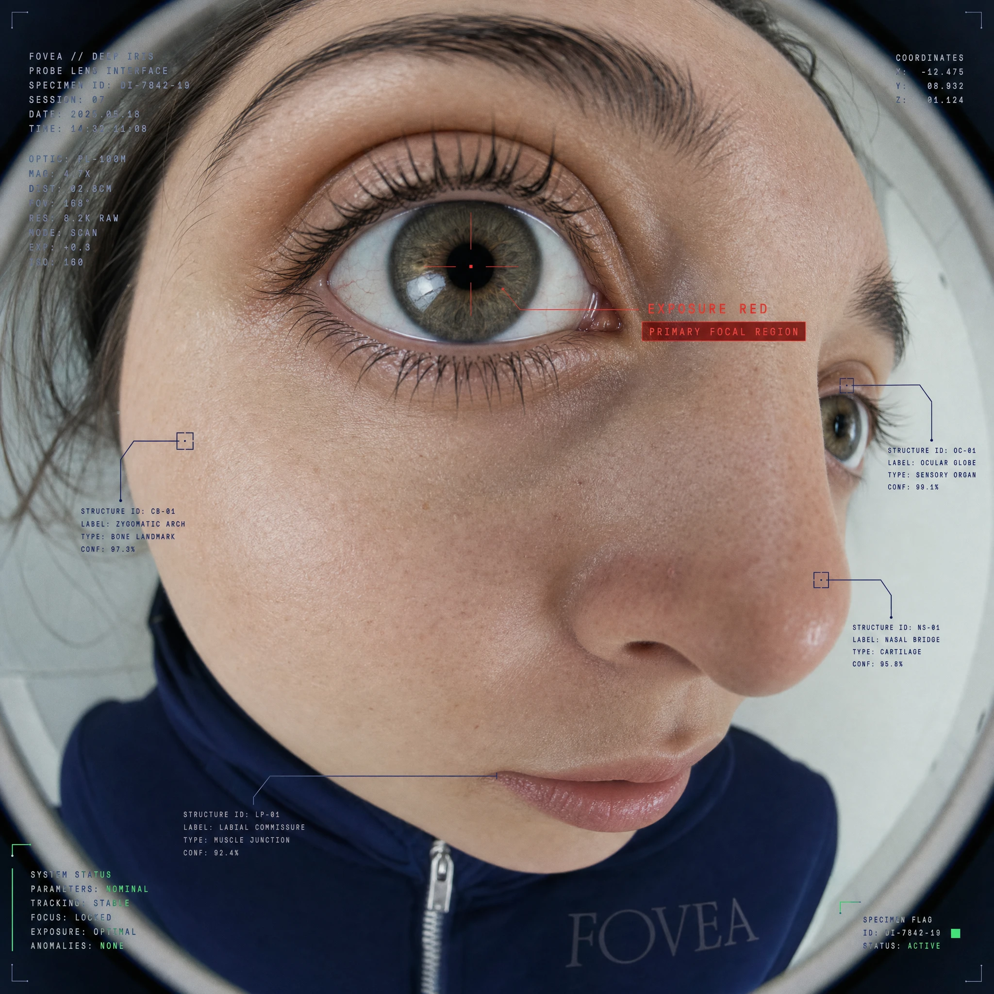
The aesthetic anchor is the lens itself: fisheye distortion, hyperzoom telephoto compression, extreme wide-angle barrel curvature, probe lens proximity. The camera doesn't flatter. It documents. Bodies become strange under these optics — beautiful and wrong simultaneously, which is exactly where the brand lives.
Identity System
The visual language was built around four components that function as a single interlocking system.
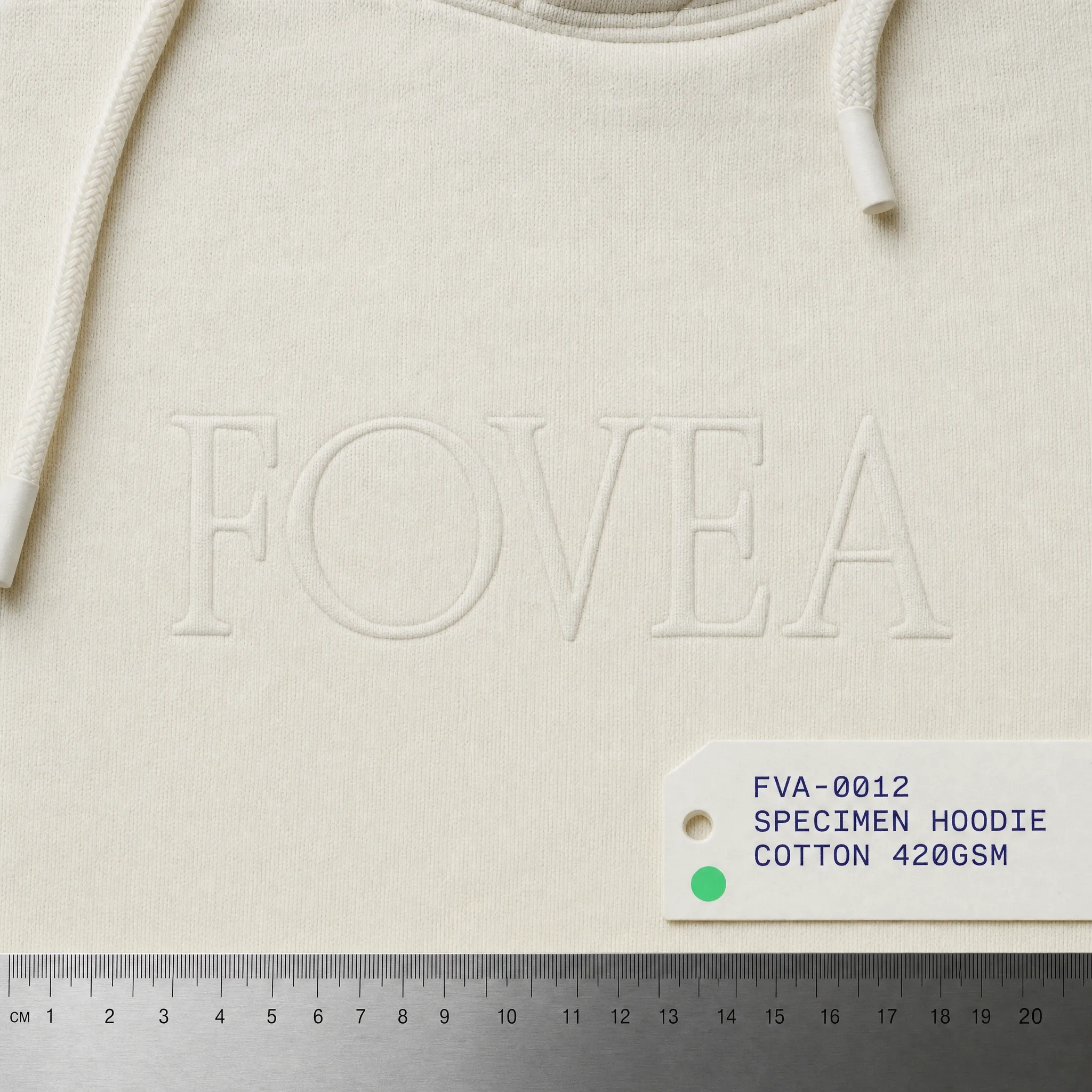
The wordmark is set in a transitional serif — institutional, legible, clinical. It reads like the name of a facility rather than a fashion label. Applied large it's confrontational. Applied small it's a manufacturer's mark. Both readings are correct.
The color system runs on four values. Lab White
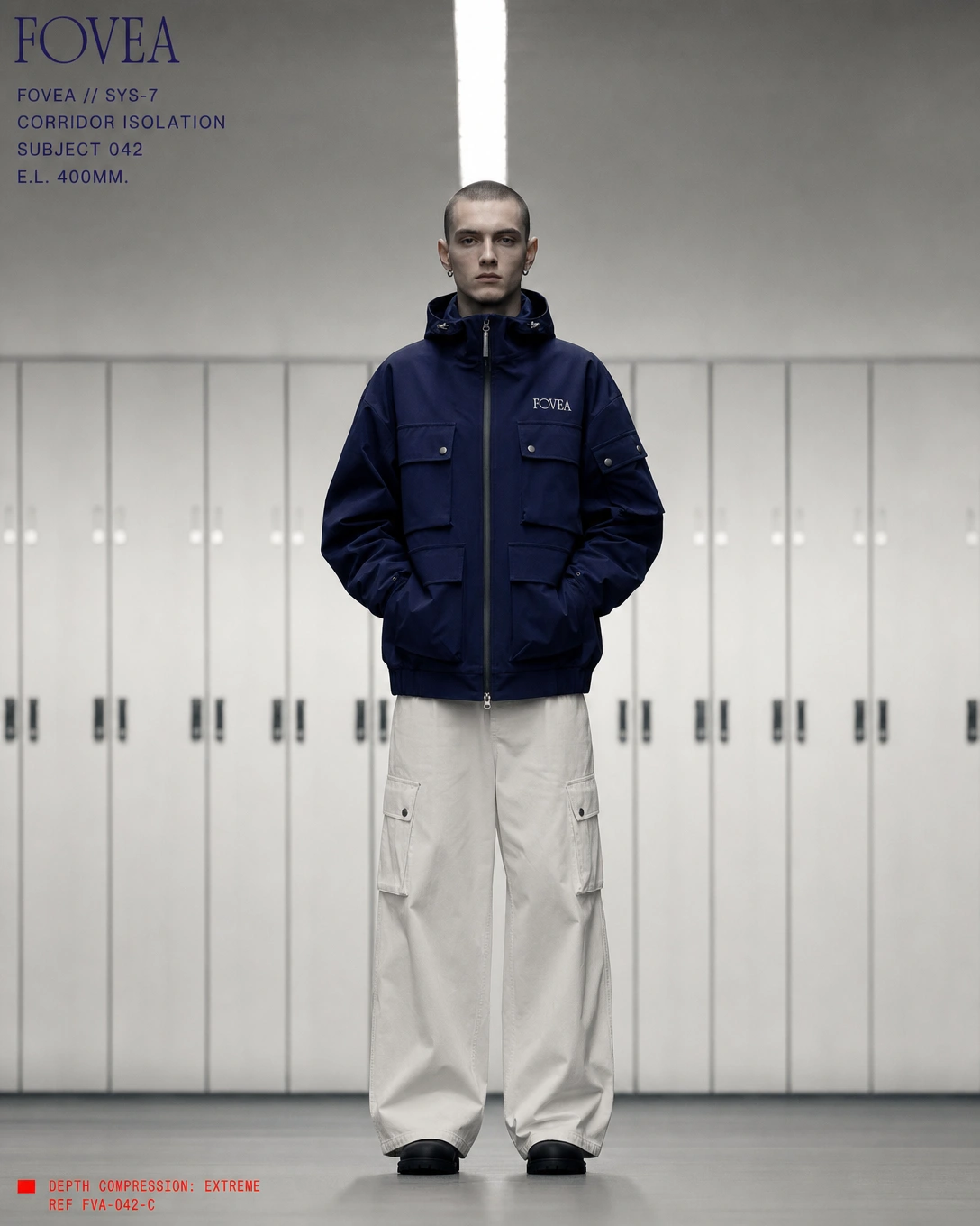
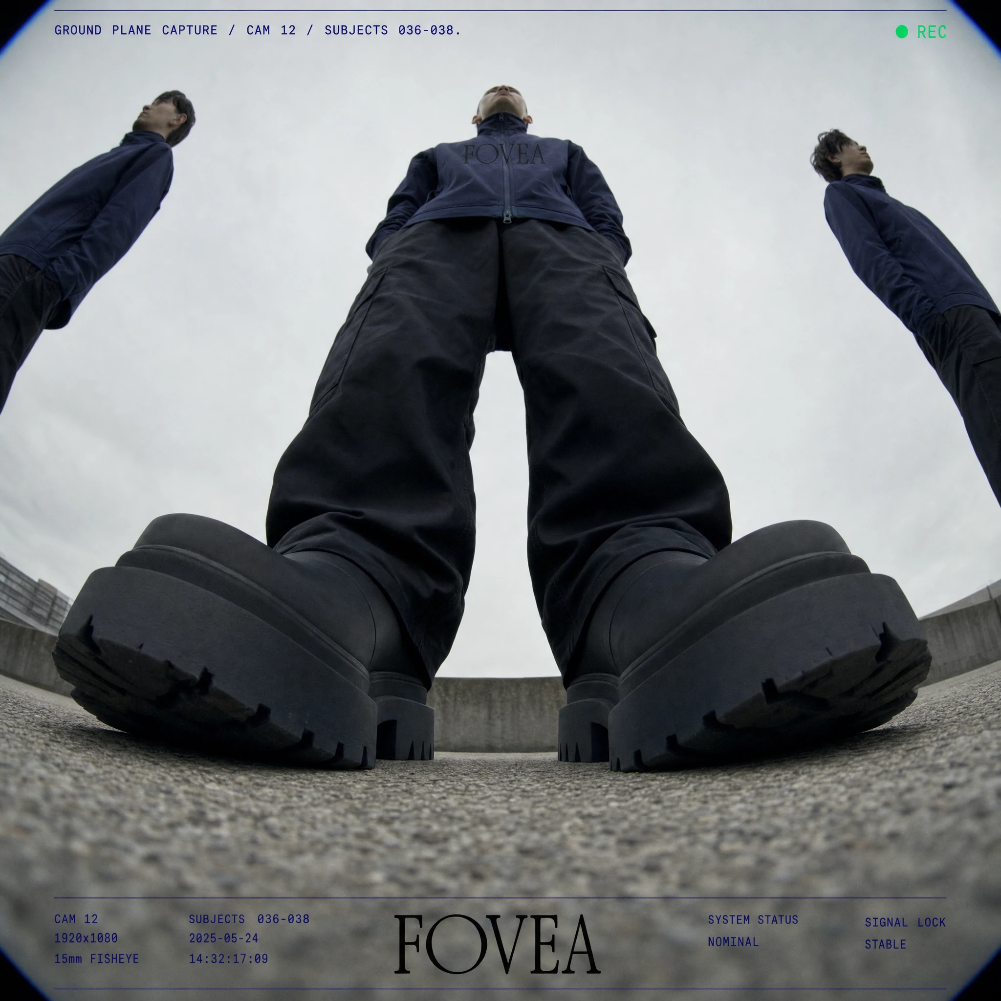
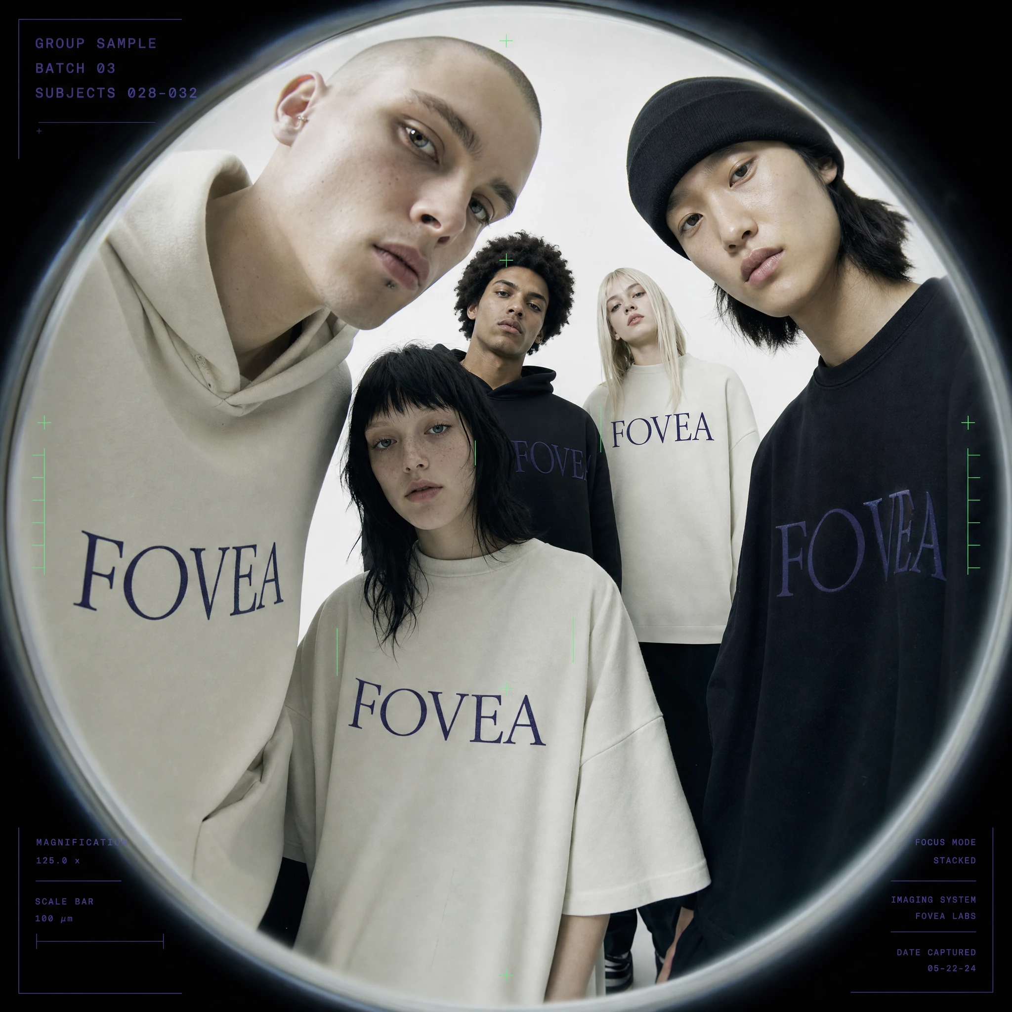
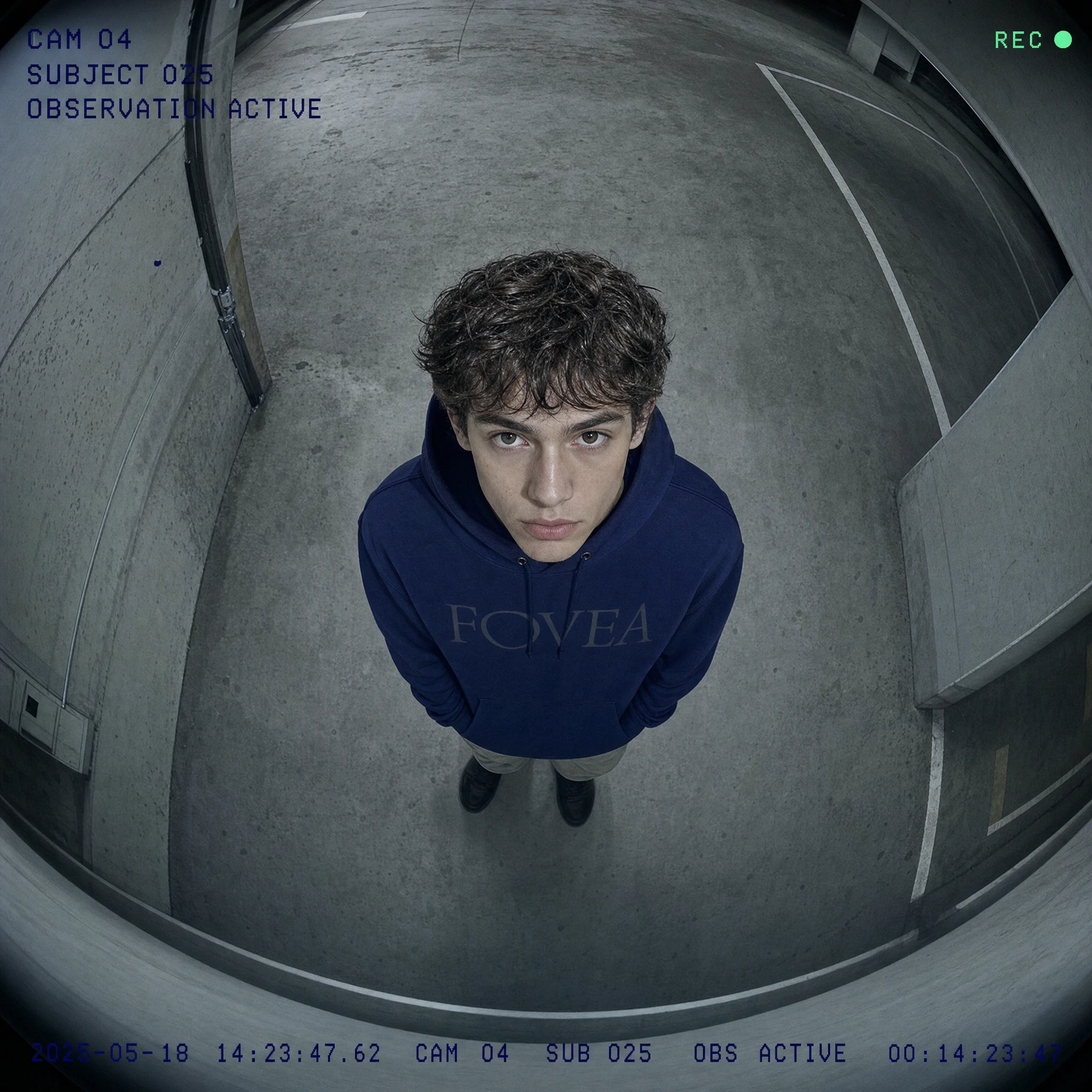
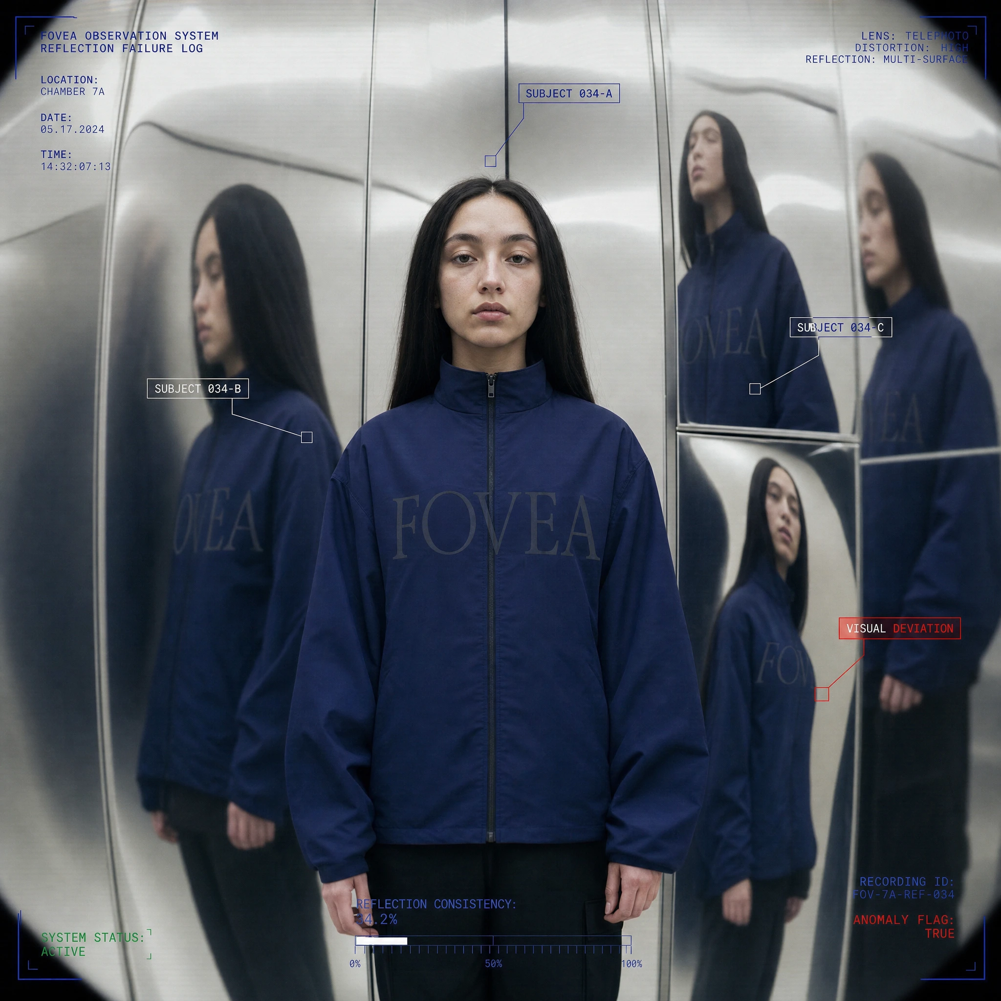
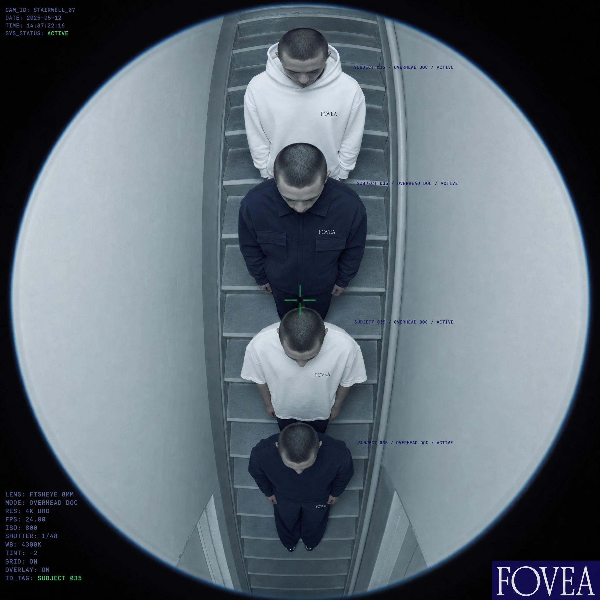
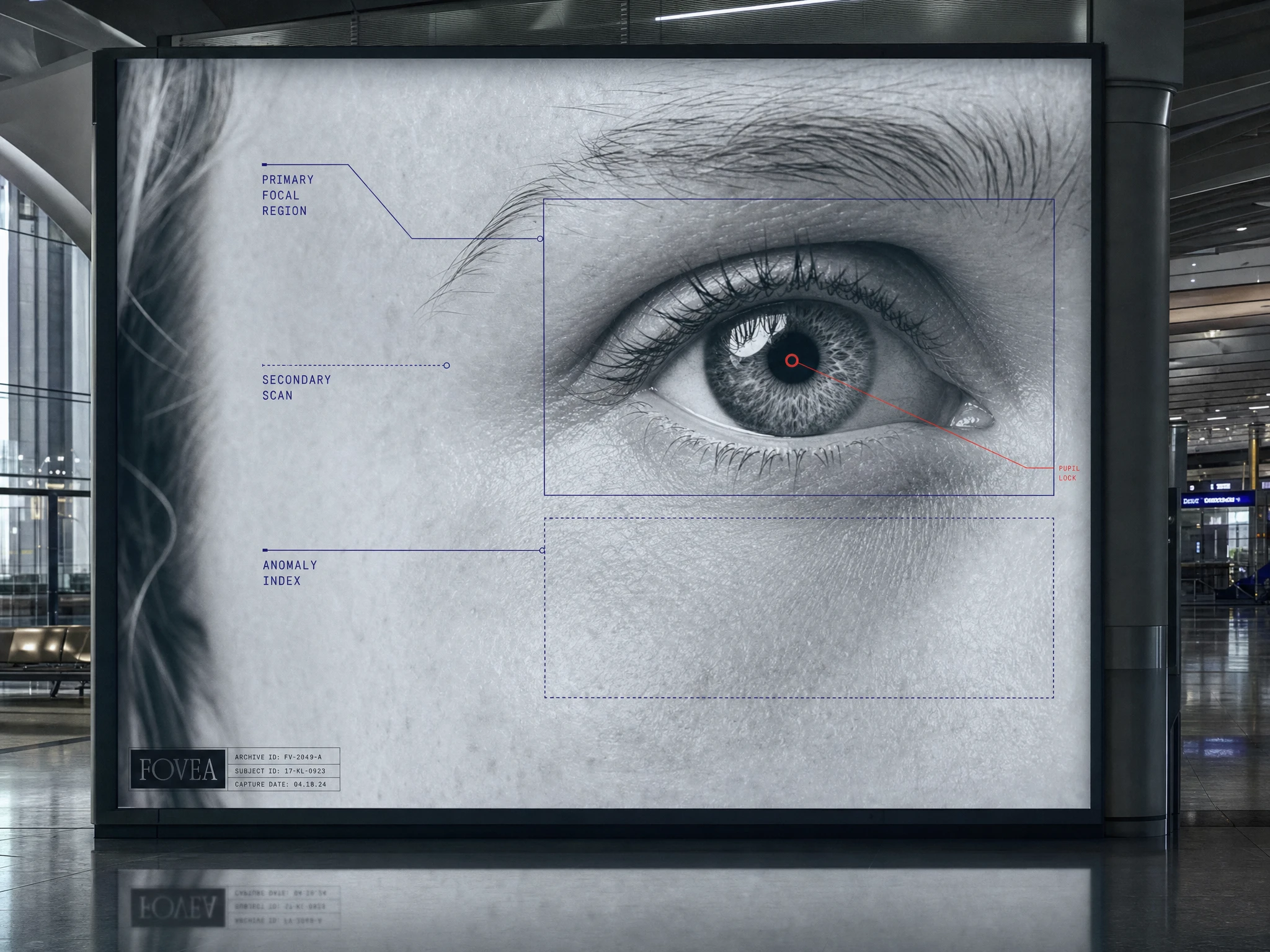
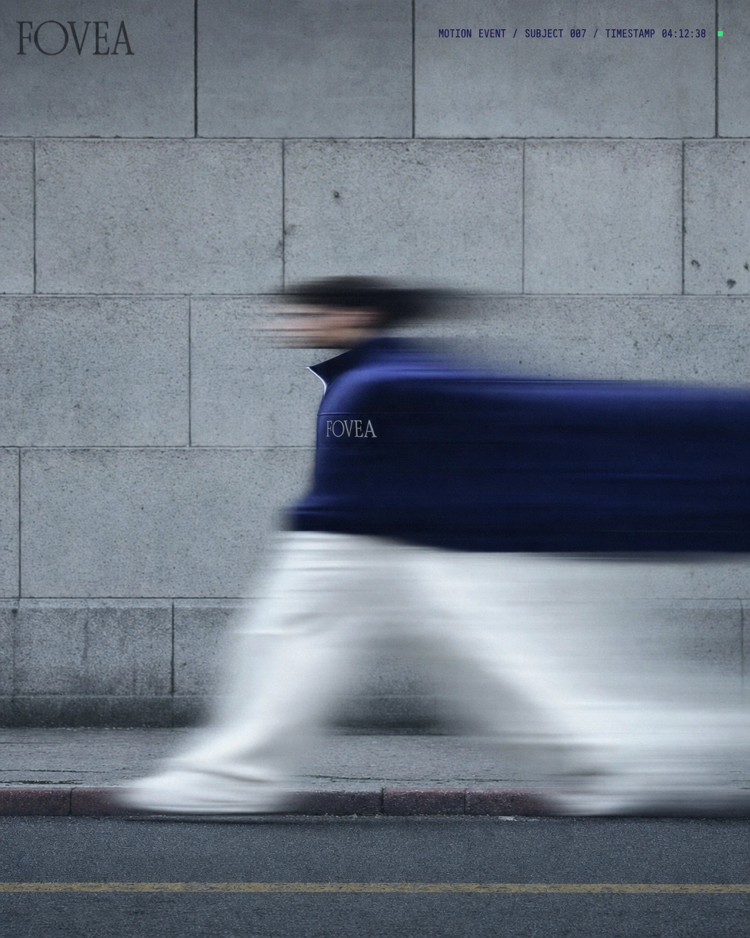
#F2F0EB is the primary field — warm, slightly off, the color of examination paper rather than pure white. Deep Iris #1A1464 carries all structural information: type, overlays, data fields, the wordmark itself. Specimen Green #4AE08A appears exclusively as an active status indicator — a single dot, a zip pull, a crosshair — never decorative. Exposure Red #FF2B2B is reserved for anomaly flags and critical system states. When red appears in a FOVEA frame, something is wrong. That tension is the brand.The data overlay system is the third component — a consistent metadata language applied across all campaign imagery. Camera IDs, subject numbers, timestamps, system status, anomaly flags. Applied in Deep Iris tight monospaced type at small point sizes. The overlays turn every fashion image into a surveillance record. They also give the brand a voice without requiring copy.
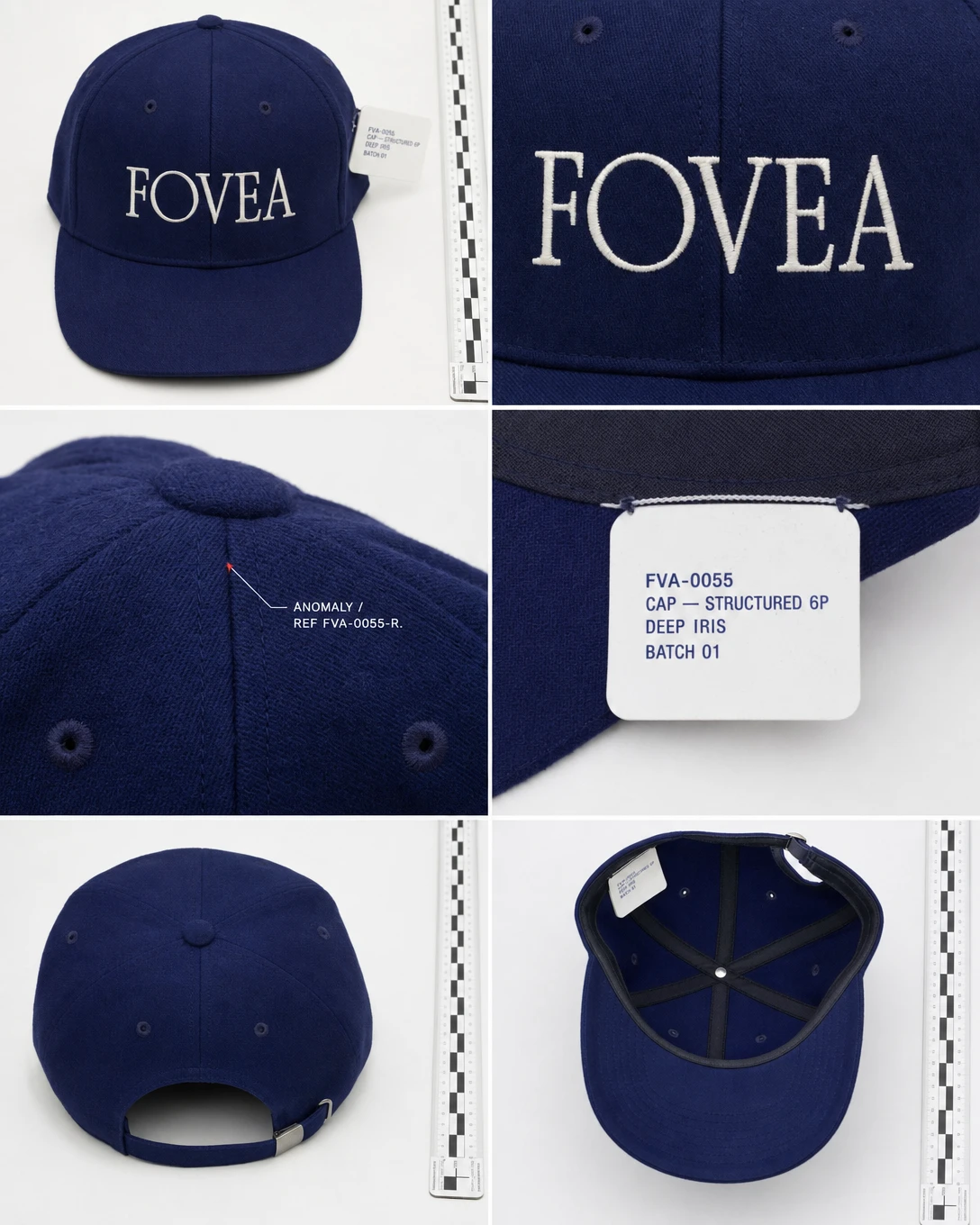
Specimen numbering — the FVA-XXXX system — runs across garments, tags, packaging, and campaign images as a continuous serial logic. The same number on the swing tag appears in the campaign image. The garment is the specimen. The wearer carries its reference code.
Campaign and OOH
The campaign was built in three distinct registers.
The documentation register covers macro product shots, swing tags, and flatlay work — fabric weave at extreme close range, the anomalous red thread as a found error, rulers at frame edge, examination trays. The garment as evidence before it is worn.
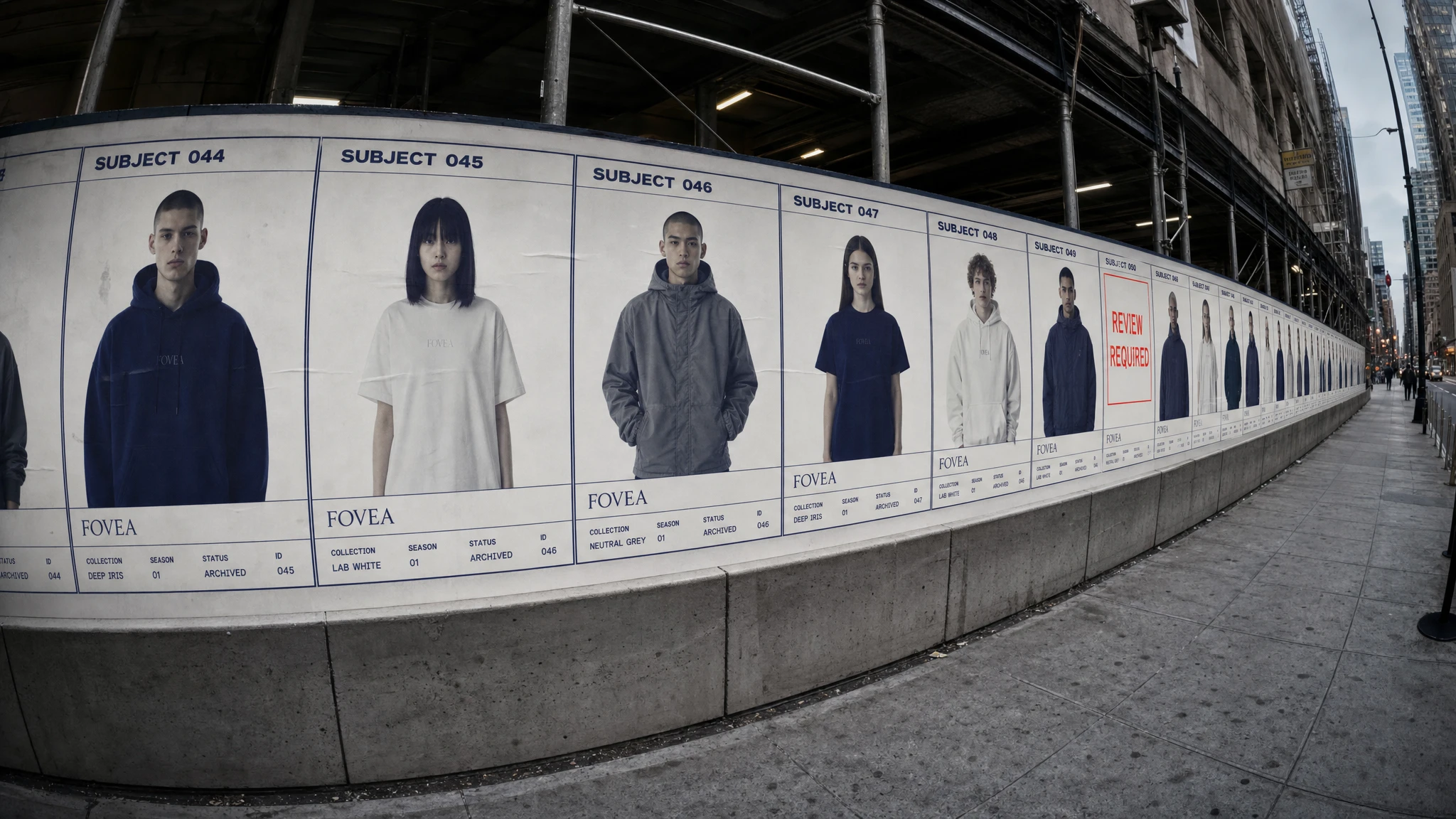
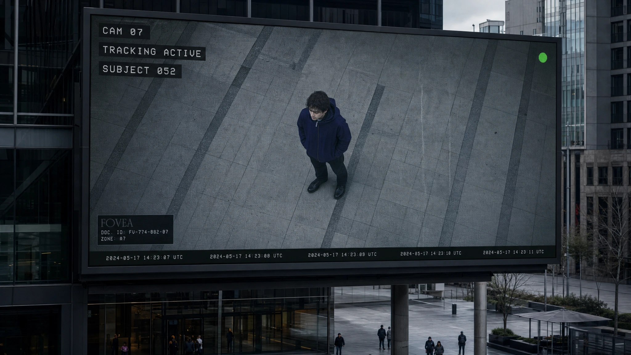
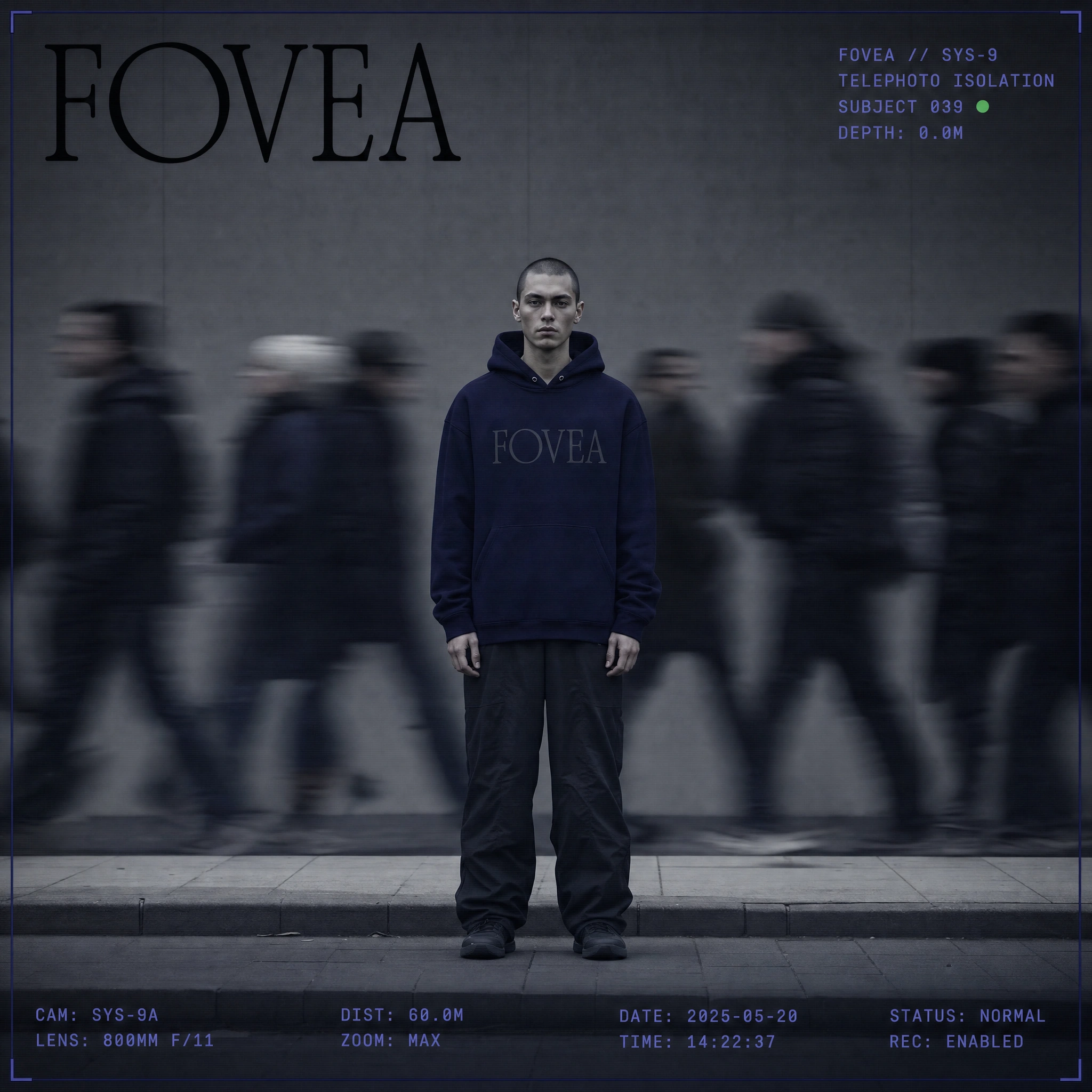
The observation register covers model work — fisheye surveillance angles, overhead drone documentation, hyperzoom compression, probe lens proximity portraits. Models as subjects: static, expressionless, enduring the lens rather than performing for it. The stairwell vertical stack, the ground-plane emergence, the reflection multiplication, the telephoto street isolation — each image proposes a different way the brand's gaze might operate.
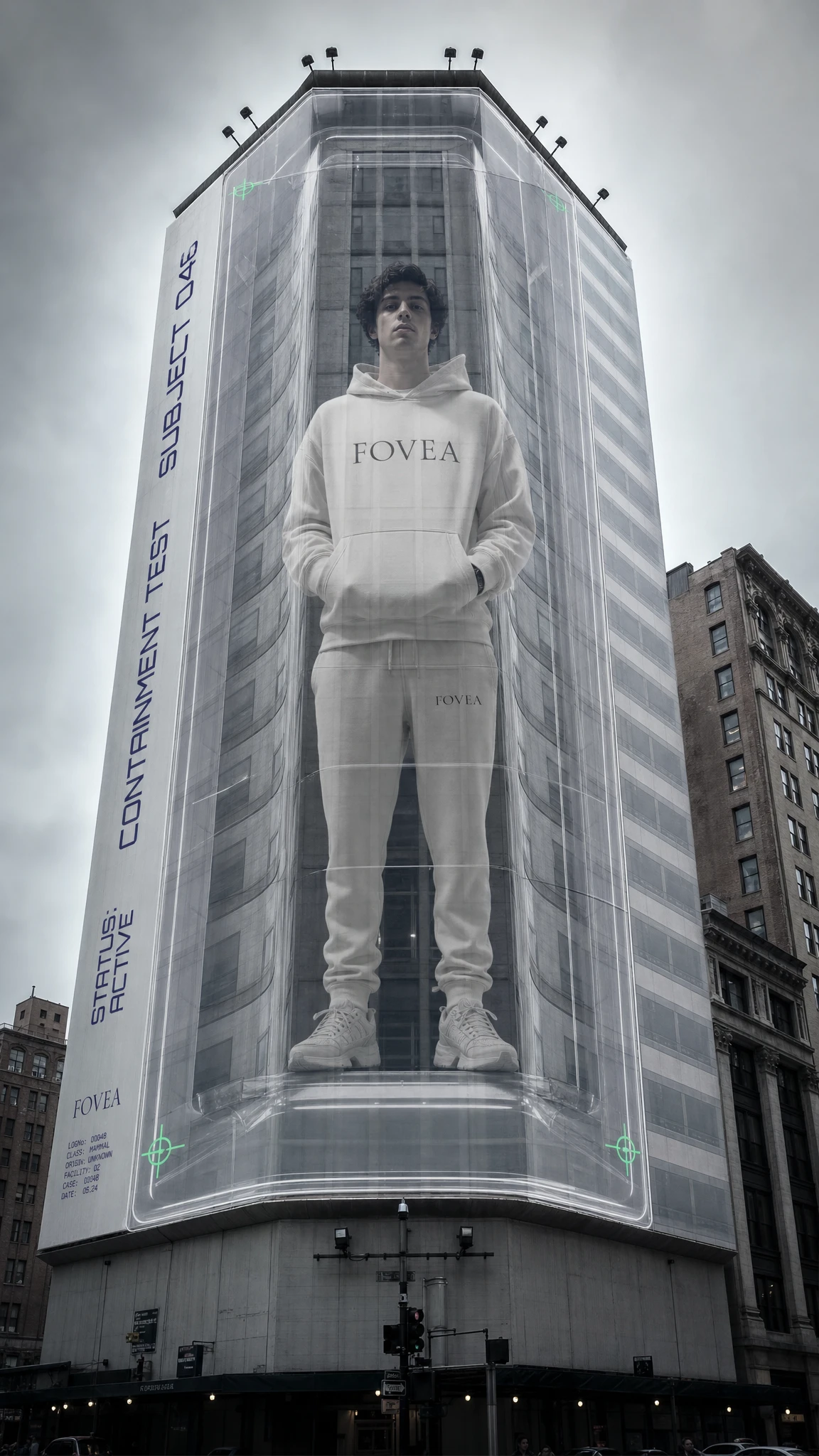
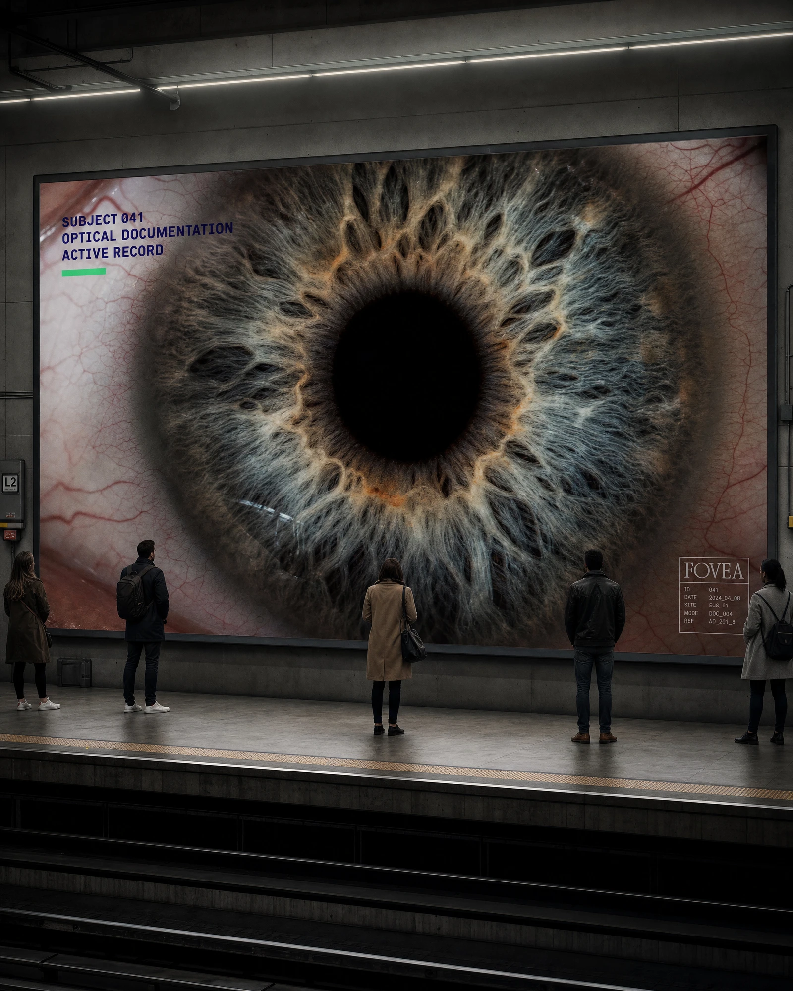
The OOH register escalates the logic to city scale. The construction hoarding turns a full block into a specimen archive — subjects catalogued in sequence, shrinking toward the horizon, one panel flagged REVIEW REQUIRED in Exposure Red. The building wrap contains a single subject inside a transparent chamber fifteen stories tall. The metro platform runs a hyperzoom iris at billboard scale, small figures standing before it in the dark. The digital billboard renders overhead surveillance footage as advertising. At city scale, the brand's premise becomes genuinely unsettling. That's the intention.
Packaging
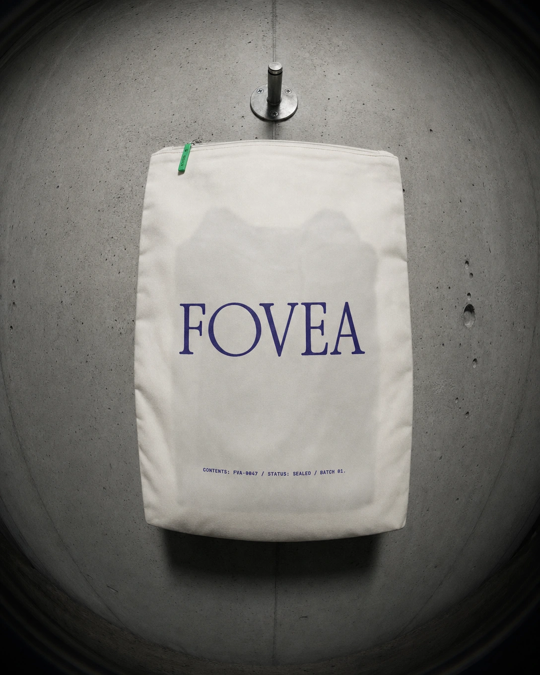
Packaging was treated as an extension of the documentation system rather than a brand expression separate from it. The shipping box carries the specimen data strip along its longest edge — FRAGILE — OPTICAL CONTENTS / DO NOT COMPRESS — and a single Specimen Green crosshair sticker as the only embellishment. The garment bag hangs from an industrial hook, the ghosted silhouette of the hoodie visible through the canvas. The swing tag reads like a lab report. The UV marker pen in the examination tray is not decoration — it is a cataloguing tool. Everything that touches the product behaves as if the product requires careful handling, as if it is evidence.
What This Project Is
FOVEA is a proof of concept for what brand identity looks like when the conceptual premise is total — when it generates not just a logo and palette but a complete operating logic for how every touchpoint should behave. The lens aesthetic is not a style choice. It is a position: seeing is an act of power, and this brand holds that power without apology.
Speculative. Fully developed. Available for the right collaborator.

Like this project
Posted Jun 11, 2026
Developed FOVEA, the fovea is the point of sharpest vision in the human eye — the small pit at the center of the retina responsible for high-acuity focus.
Likes
2
Views
10
Timeline
Apr 13, 2026 - Jun 11, 2026

