Built with Lovart
RUÏNE: Demolished Luxury Brand Identity
Révolté
RUÏNE — Demolished Luxury
A music label built on one premise: prestige and decay are the same thing. No aspiration. No polish. Just the aftermath of something magnificent — and a visual system designed to live inside that gap permanently.
THE BRIEF
The brief I gave myself was a provocation. What does a label look like if it refuses to chase relevance, refuses to perform vitality, refuses to position itself as current? Most music brands are in a permanent sprint toward now. I wanted the opposite: a brand that had already arrived somewhere, and that somewhere was falling apart.
RUÏNE is a speculative music label identity — demolished luxury as a design philosophy. The premise came from a specific tension I kept returning to: the most prestigious materials in the world (marble, silk, gold leaf, velvet) are also the ones that decay most dramatically. Cracked marble. Flaking gilt. Tarnished mirror. There's a grandeur specific to things that were once exceptional and have since deteriorated. RUÏNE lives there.
The scope was deliberately total — identity, OOH, event collateral, editorial, press materials, print. I wanted to stress-test whether a single conceptual rule could hold across every touchpoint, from a wheat-paste street poster to a foil-stamped stage pass.
THE APPROACH
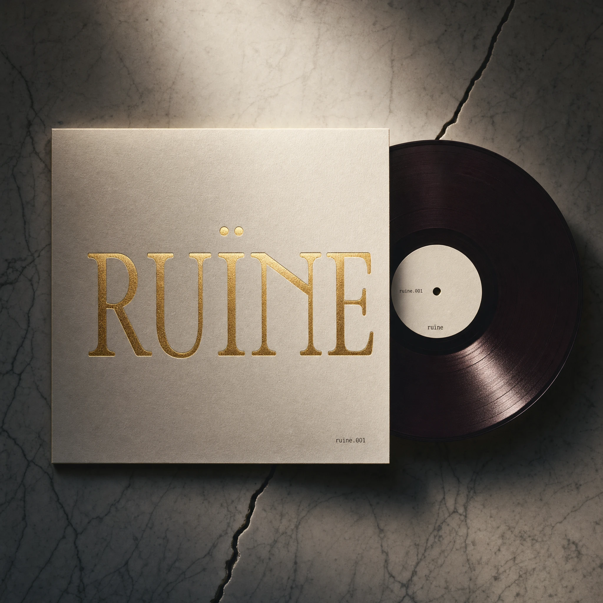
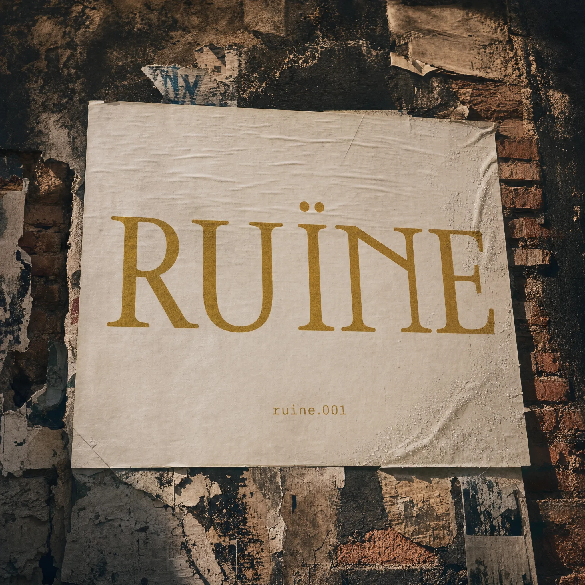
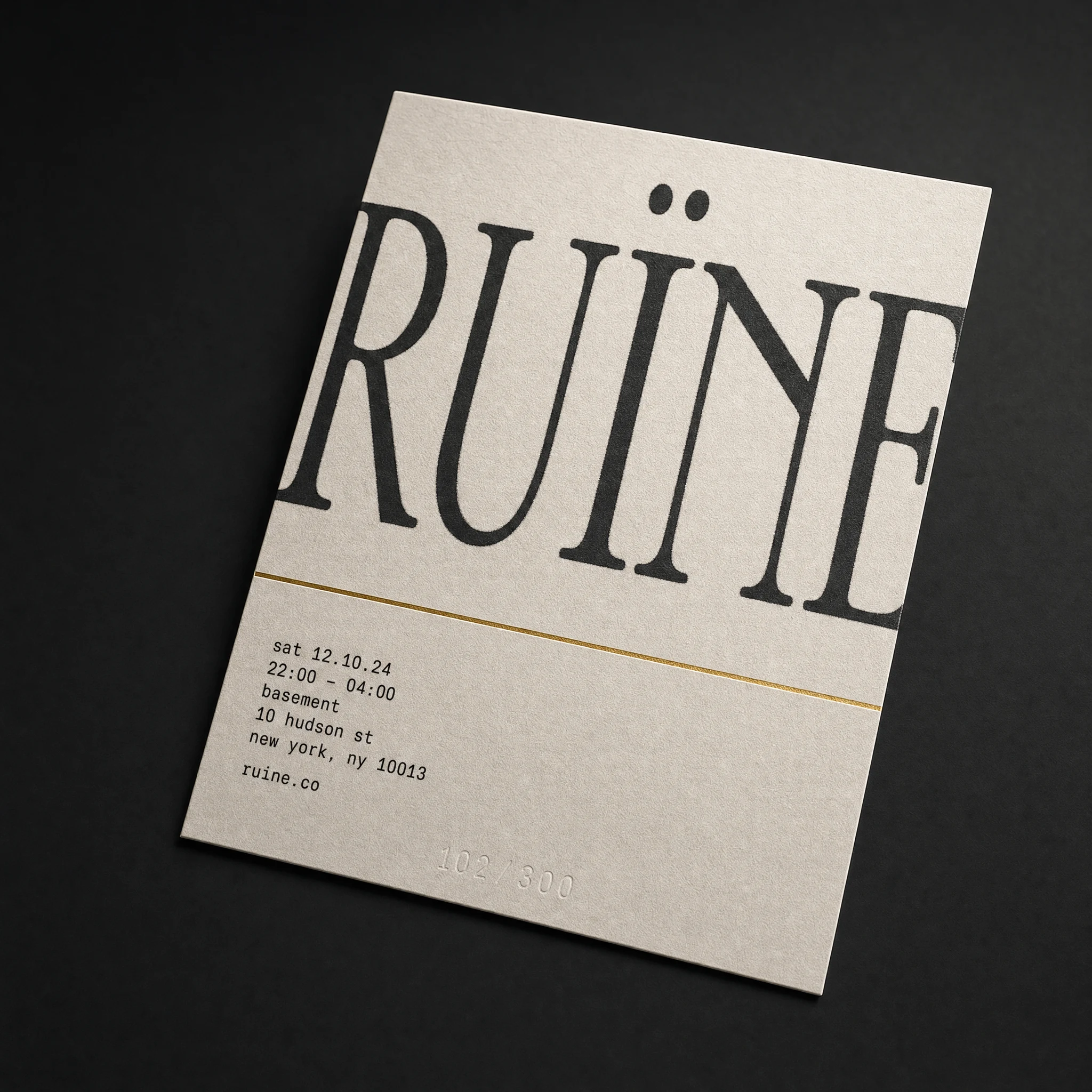
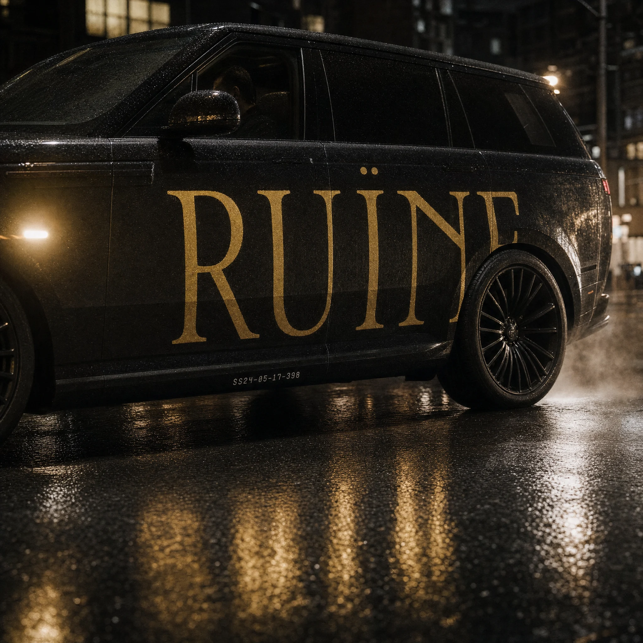
The first thing I locked was the typographic logic, because with a concept this strong the type either carries it or collapses it. ZT Bros Oskon 90s was the decision that made everything else possible. The typeface has the high-contrast hairline structure of a classical didone — dramatically thin strokes, flared serifs, maximum tension between thick and thin — but with a 90s optical distortion in the letterforms that makes it feel wrong in exactly the right way. Like the type itself had warped with the building. Set in Roman Gold
#B5922A, it doesn't read as elegant. It reads as something that was.I rejected the obvious move early: no black-everything, no subcultural goth signaling, no distress-for-distress-sake. The decay here had to be warm. Everything in RUÏNE's world was once inhabited — it's aftermath, not darkness. That distinction shaped every color decision. The palette pulls warm gold out of deep shadow, kills the midtones, and lets things either glow or disappear. Crack Shadow
#2B2B2B is charred, not void. Dust Pink #C9A9A6 is mineral staining, not pastel. Oxide Green #4A5C4A appears only as something that happened to a surface over time.The layout logic followed from the concept. If the brand is about asymmetric collapse, the grid should feel like it's leaning. Massive type on one side, void on the other. White space used like silence in music — as compositional weight, not absence. I pushed the typography to architectural scale in the OOH work and let it fragment: the triptych's center panel bleeds the wordmark off all four edges. The metro tunnel repetition reads as liturgical, not promotional.
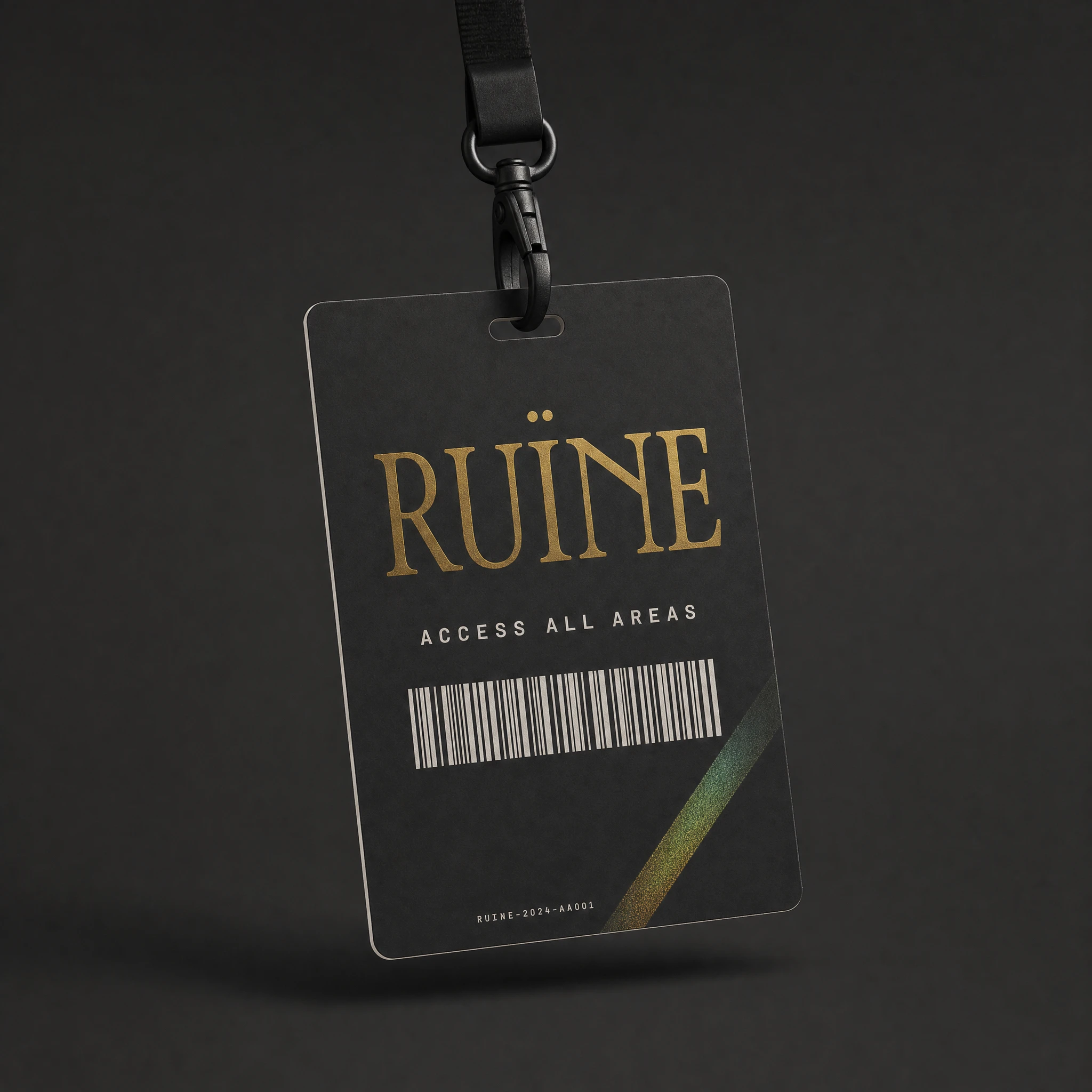
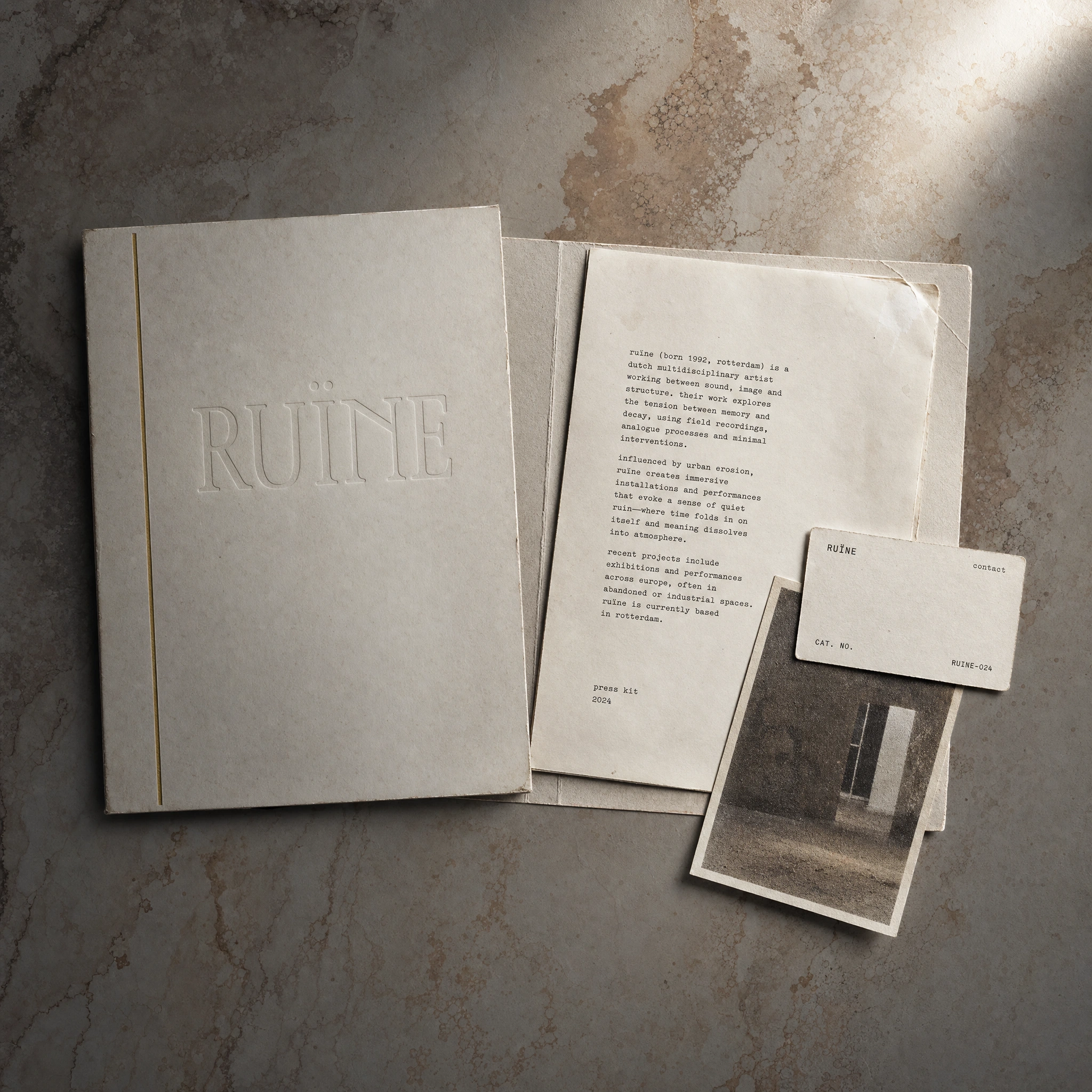
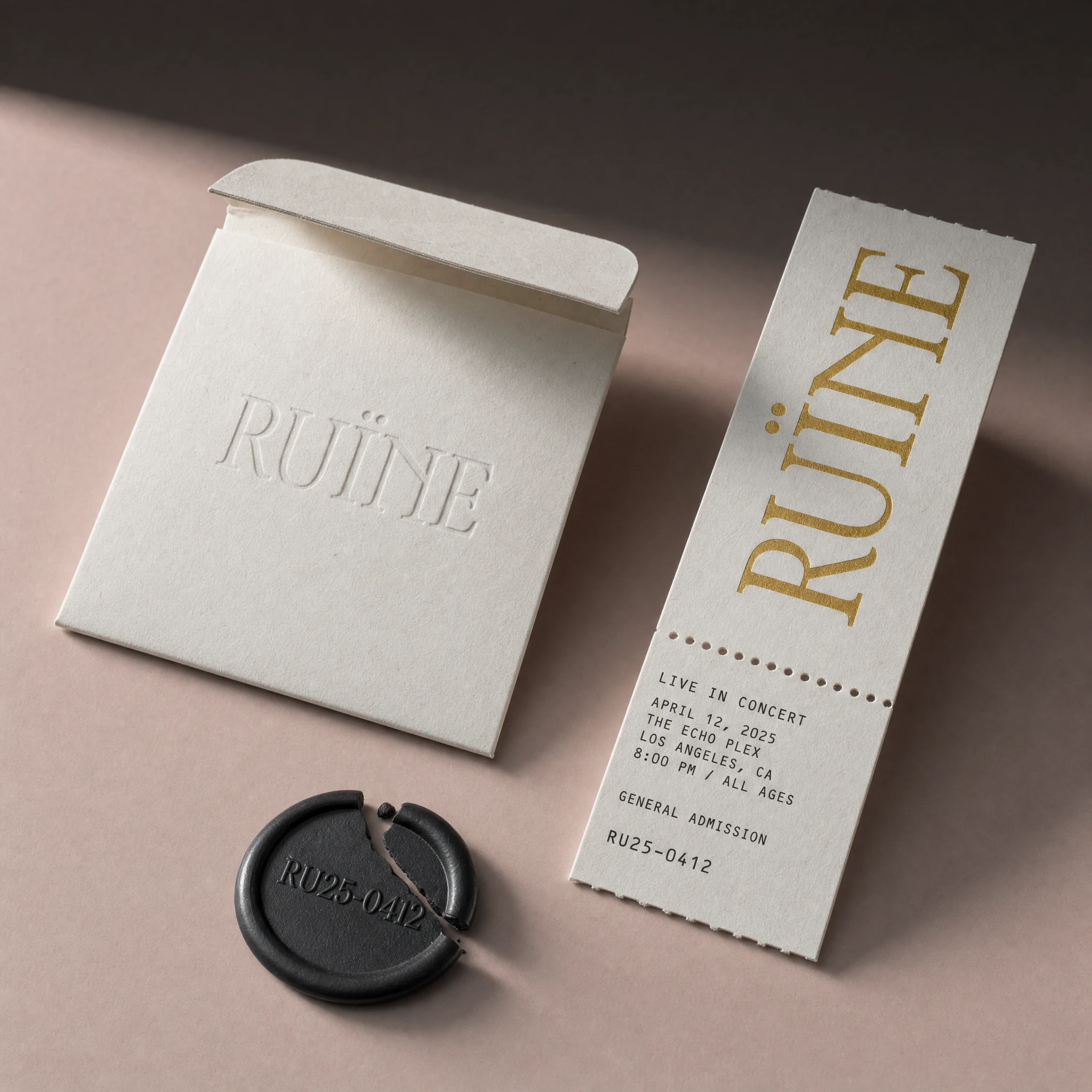
For print and event materials, I worked with the physical properties of the brand's world: blind emboss on heavy cotton stock so the wordmark registers as relief before it registers as type. Foil stamped in Roman Gold — never flat, always textured, always rendered as something that has a surface. The ticket and envelope set is the most concentrated version of this: the envelope carries the wordmark debossed without ink, pure surface relief; the wax seal bears a catalog number impressed into dark wax, broken clean.
THE WORK
VISUAL SYSTEM
The system runs on two typographic registers and nothing in between. ZT Bros Oskon 90s at display scale — wordmark, campaign headlines, any moment where RUÏNE is declaring itself. Courier Prime at caption scale — catalog numbers, artist metadata, event details, legal text. The gap between the two is the brand's primary tension: luxury and infrastructure, ruin and record. No mid-range type exists in the system.
COLOR SYSTEM
Five colors. Vein Marble White
#F8F4F0 as the primary ground — the surface everything else decays against. Roman Gold #B5922A as the only accent that matters — never flat, always printed as foil or rendered with surface texture. Crack Shadow #2B2B2B, warmer than pure black, closer to charred. Dust Pink #C9A9A6 for secondary surfaces, mineral staining, aged plaster tones. Oxide Green #4A5C4A used sparingly — tarnished metal, the color of neglect, never a design choice.OOH CAMPAIGN
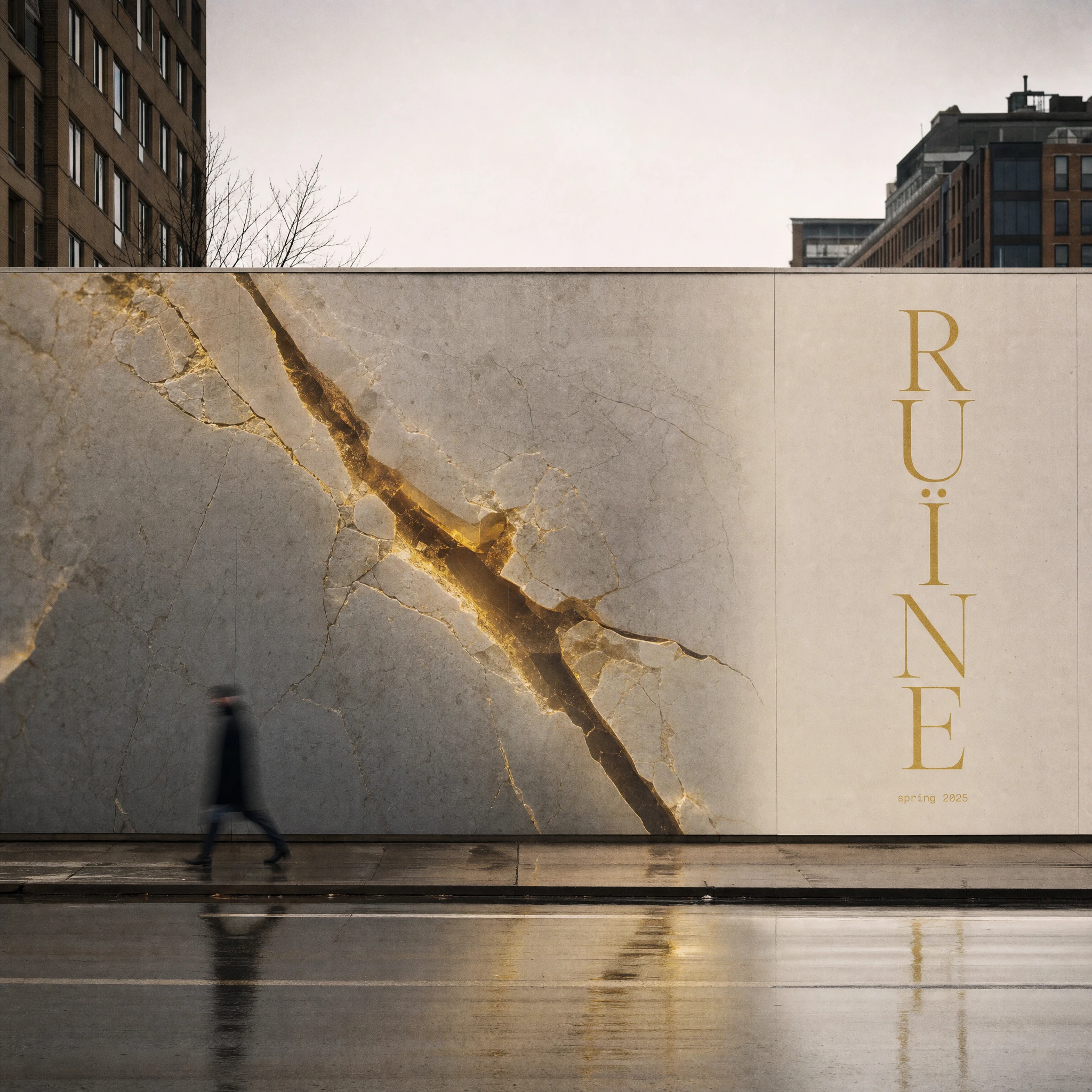
The campaign operates at two scales: monumental and intimate, simultaneously. The metro station takeover repeats the wordmark identically across every platform panel, receding into perspective — obsessive, liturgical, zero supporting information. The construction hoarding splits two-thirds campaign image (cracked marble, gold pooling in the fractures) against one-third wordmark set vertically in Roman Gold. The window installation puts the brand behind glass — frosted vinyl over a curated interior of marble fragment, silk, damaged gilded frame — the wordmark visible through its own reflection. The projection mapping pushes the concept furthest: the wordmark fragments across a brutalist facade, the hairlines interrupted by window recesses and concrete joints, the ï sitting above the roofline and projecting into open sky.
EVENT COLLATERAL
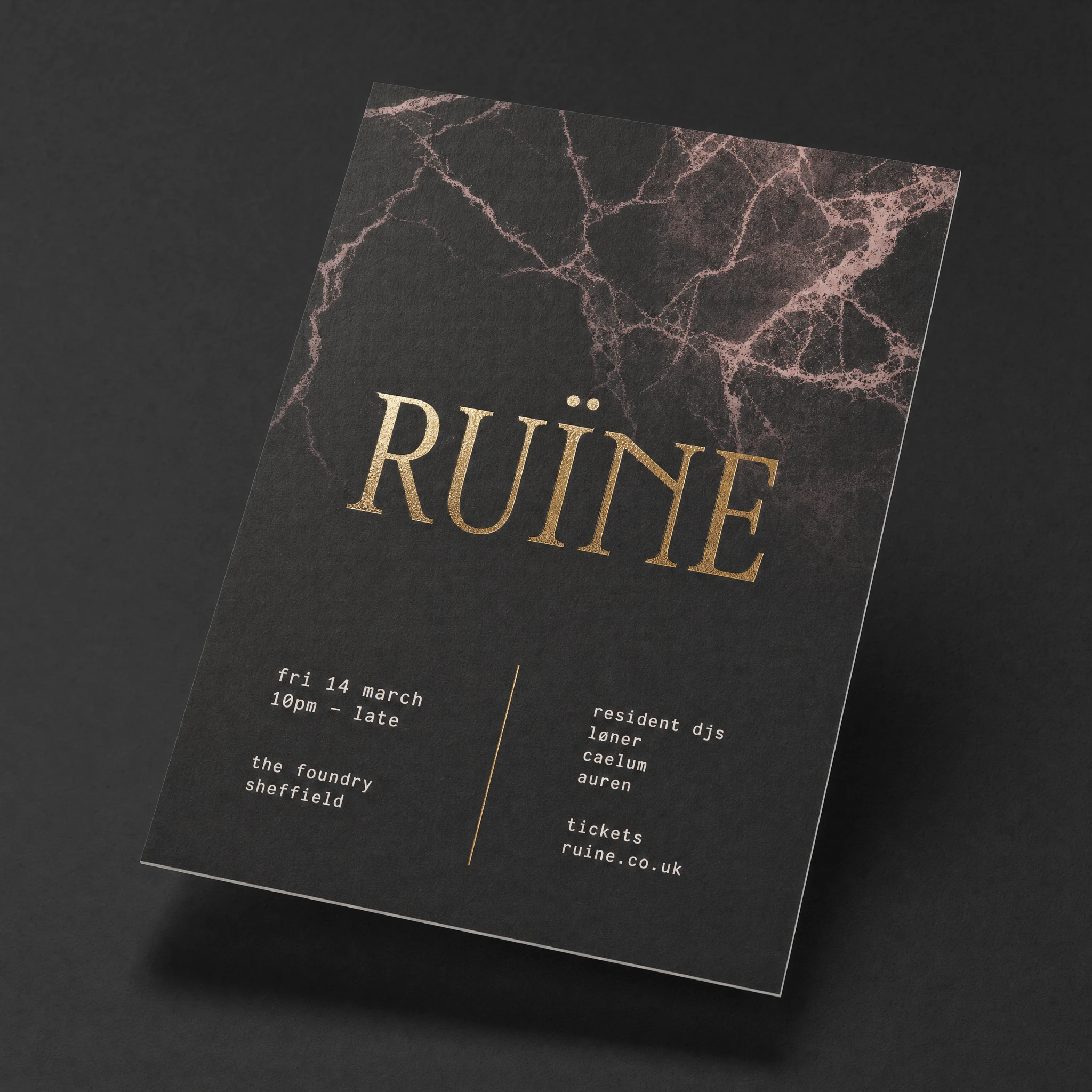
The flyer system runs three variants: the matte black A5 with cracked marble texture printing into the upper half and gold foil wordmark at center; the marble white A5 where the wordmark bleeds off all four edges, printed so large the letterforms lose legibility at the margins; and the landscape DJ announce card split by a single gold foil vertical rule. Each carries event details in Courier mono lowercase, two columns, no hierarchy beyond the rule. The stage pass is dark board, satin gold foil, holographic security stripe shifting between Oxide Green and Roman Gold. The ticket and envelope set is the quietest piece in the collection — blind emboss, gold foil, broken wax seal — three objects that together feel like evidence of something private.
EDITORIAL
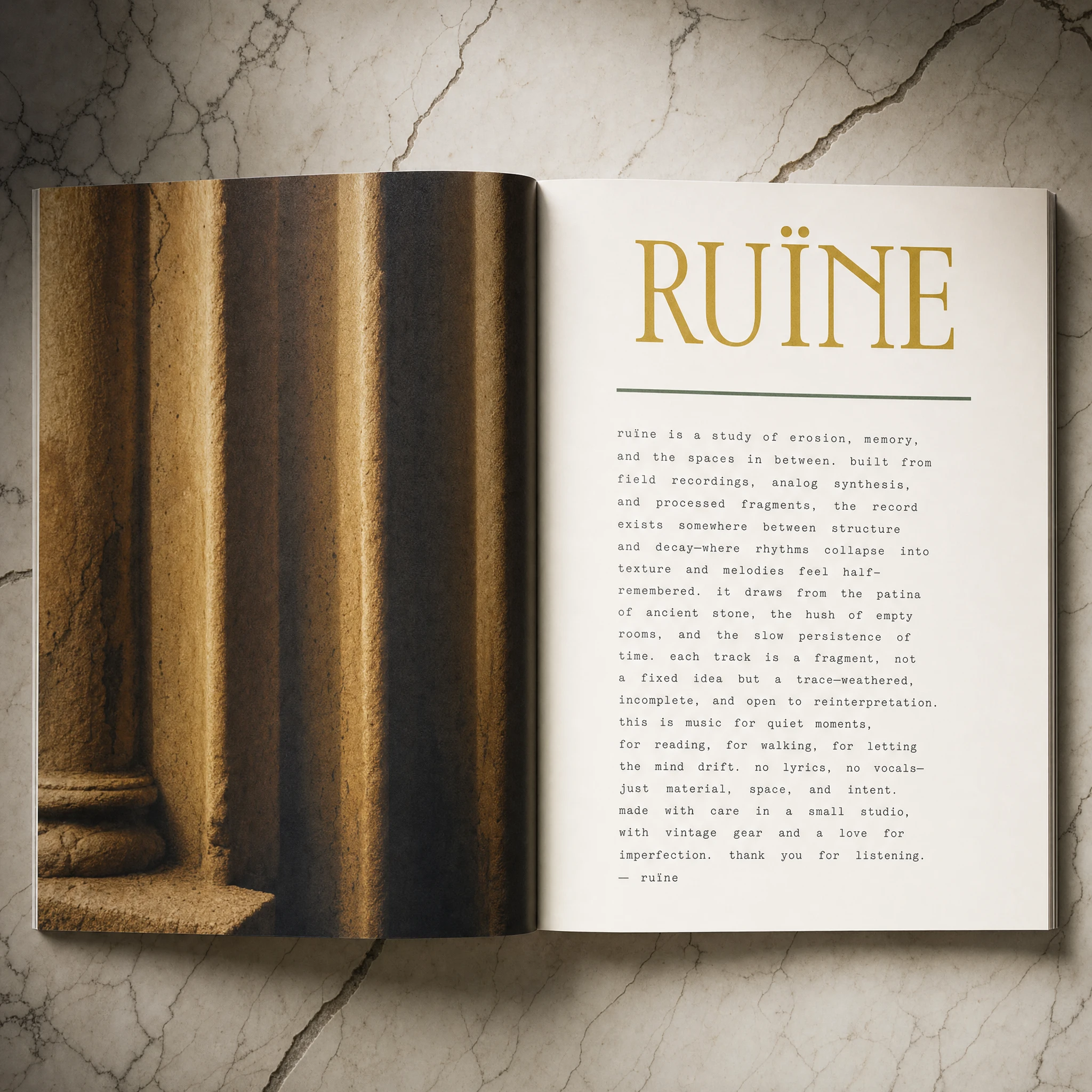
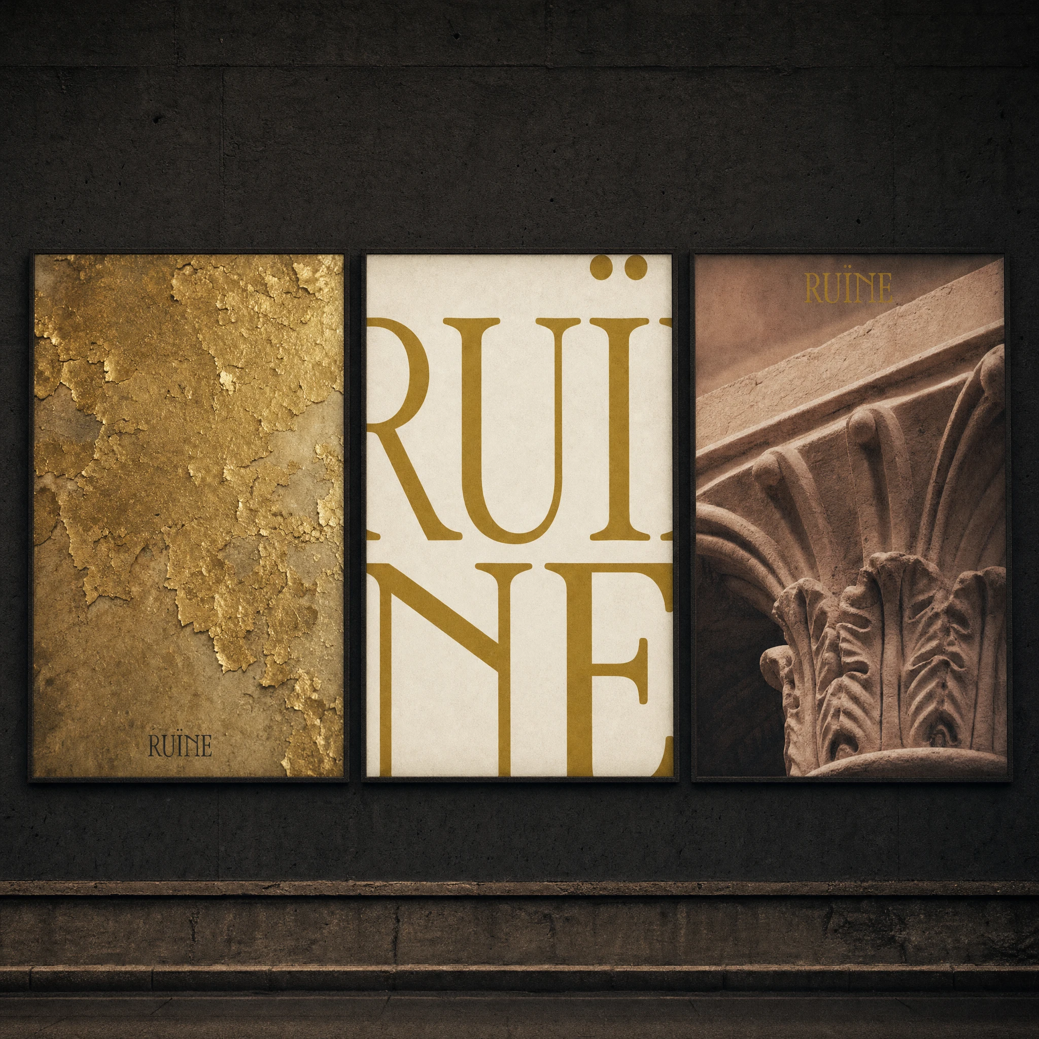
The editorial spread uses the Doric column detail as a full-bleed photograph — the fluting photographed tight enough to become abstract, Roman Gold warmth glowing in the shadow channels — against a pure white text page with the wordmark set in Roman Gold above a single dense block of Courier mono body copy. No paragraph breaks. One thin Oxide Green rule dividing headline from body. The spread photographs at a slight angle on cracked marble, ambient room shadow pressing in at the frame edges.
THE RESULT
RUÏNE is a complete brand system for a label that positions destruction as its highest value. Every touchpoint holds the same logic: the brand is always already in the room, and the room has seen better days. The system scales from a foil-stamped envelope to a projection across a city block without diluting the premise. That was the test. It passed.
The work lives as a speculative case study — no client, no compromises, no brief to negotiate. Just the question: what if a music brand was designed the way ruins are documented? With care for what they were, and without pretending they're still standing.
Révolté — revolte.design
Project: RUÏNE
Year:2026
Scope: Brand Identity, Creative Direction, OOH Campaign, Print Collateral, Event Materials, Editorial Design
Industry: Music / Culture
See more at revolte.design
Like this project
Posted Jun 23, 2026
Demolished luxury as brand philosophy. A music label identity where marble cracks, gold flakes, and prestige decays — by design
Likes
0
Views
15
Timeline
Jun 10, 2026 - Jun 23, 2026

