IRONGRADE: Brand Identity Development & Website
Révolté
IRONGRADE — Certified by Design
A robotics hardware brand built from a single premise: beauty is a byproduct of engineering, never the goal. The identity is a specification system. Everything in it functions or it gets cut.
THE BRIEF
I gave myself a brief with no client attached. That's usually where the most honest work comes from — no one to manage, no compromises to justify, just a problem worth solving.
The problem was this: industrial robotics companies don't have brands. They have logos slapped on spec sheets, trade show banners in corporate blue, and product photography that looks like it was shot in 2009. The sector produces some of the most visually compelling objects on earth — machined aluminum, anodized housings, hydraulic cable routing, grade plates riveted to orange structural plastic — and then buries all of it under generic sans-serifs and safety-grey palettes.
I wanted to build a brand that looked like it was designed inside the factory that makes it. Not a brand inspired by industrial aesthetics. Not a brand that references machine culture from a comfortable distance. A brand that is the machine — where every typographic decision is a specification, every color is a functional marking, and the logo reads like a part number stamped into a housing.
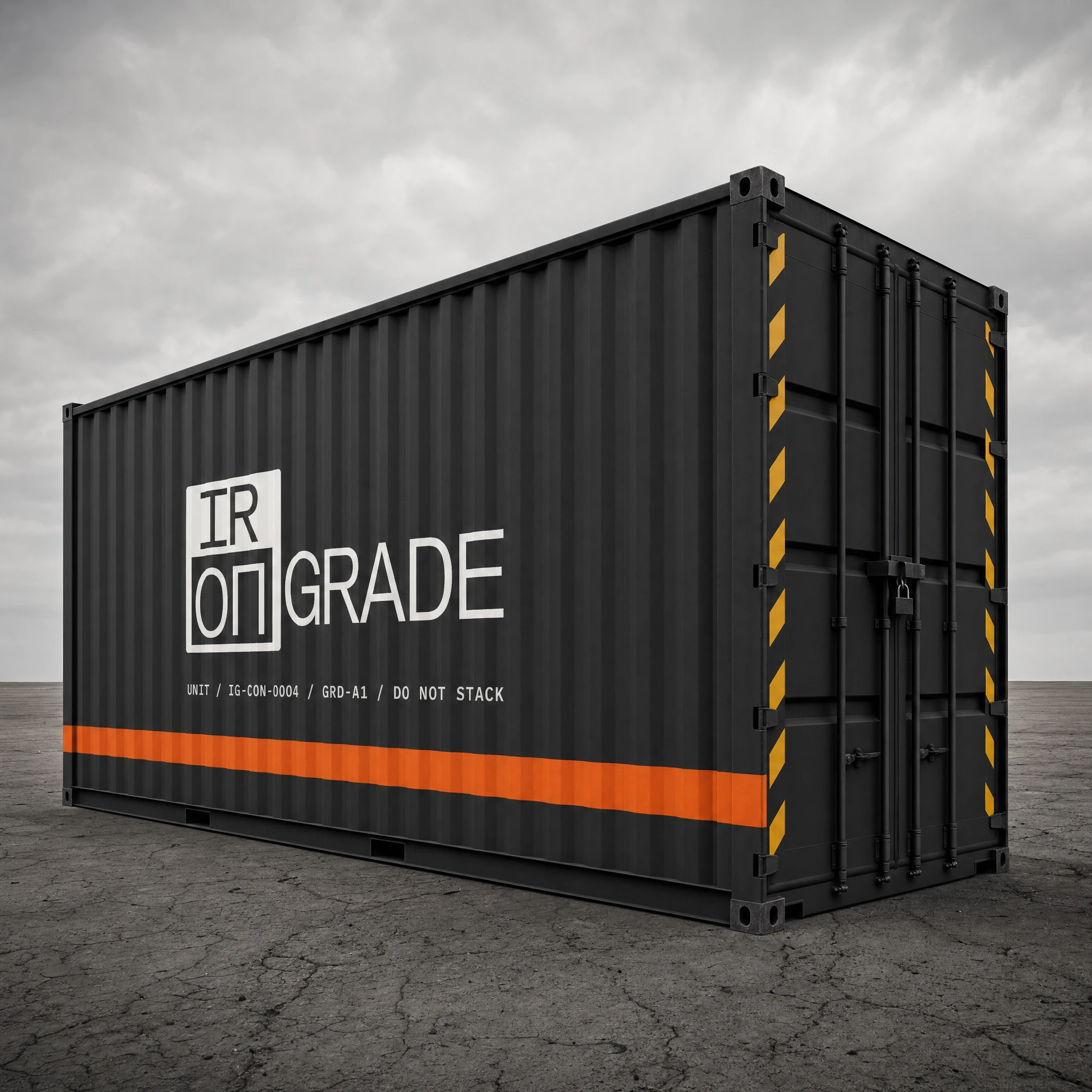
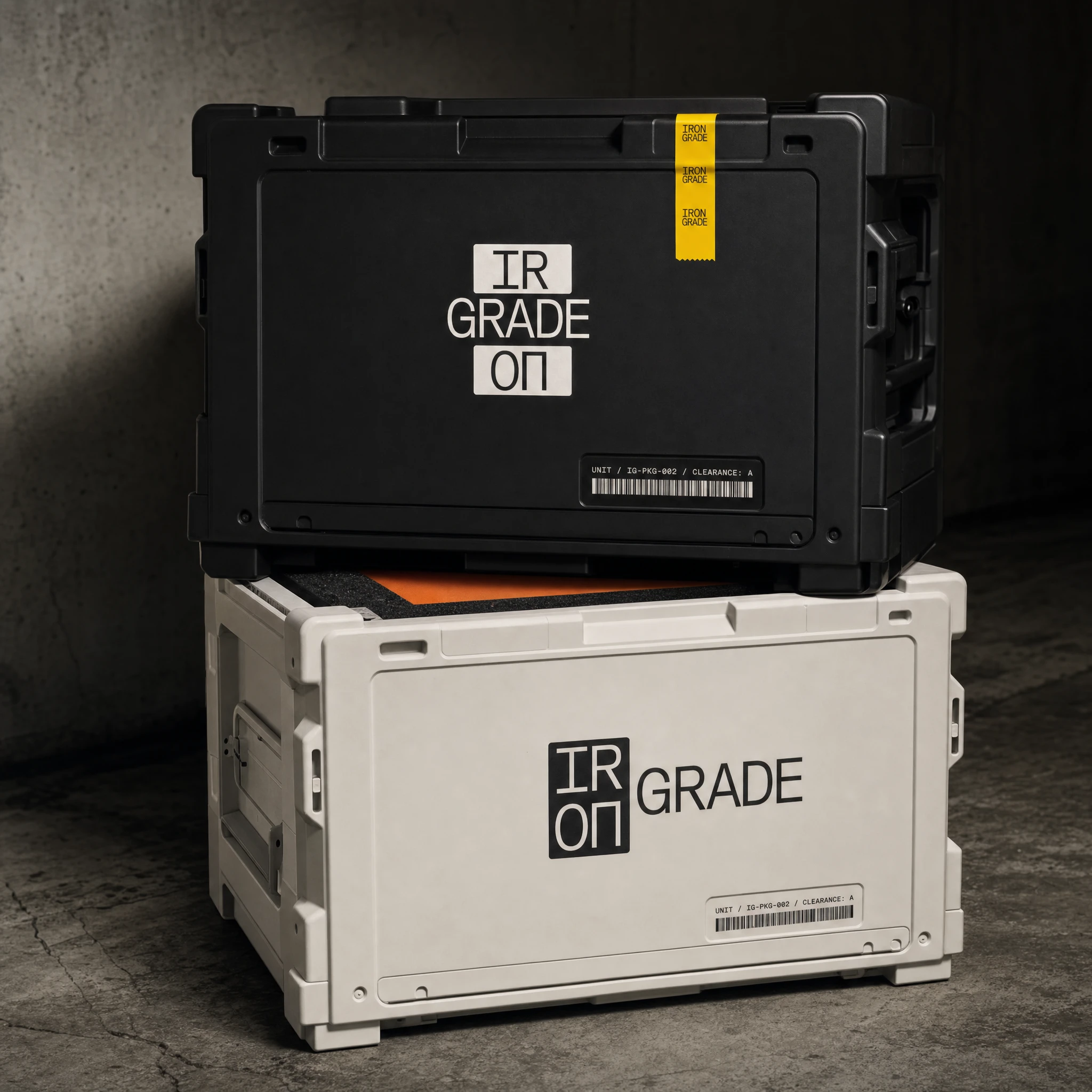
The company is IRONGRADE. It builds autonomous robotic systems for heavy industry. Grade-A certified. 480KG max load. Ships in Void Black transit cases with orange foam interiors and yellow tamper tape. You don't buy IRONGRADE. You deploy it.
THE APPROACH
The first question was the name. I ran ten directions — from cold abbreviations like MSKL and NVL SYSTEMS to more mythological territory like FORGEBORN and DREADNOUGHT. What kept pulling me back was the idea of grading as a system of authority. Material grades. Load grades. Operator clearance grades. A grade isn't a score — it's a certification. It means something passed a test that most things fail.
IRONGRADE. Iron as material, as weight, as permanence. Grade as classification, as hierarchy, as proof. The name reads like a part code and a promise at the same time.
The logo followed the same logic. I didn't want a wordmark — wordmarks are for brands that want to be read. I wanted something that functioned like a stamp. A mark applied to a surface to certify what's underneath it. The solution was structural: split IRON into IR and ON, stack them in two rectangular boxes, run GRADE as a solid wordmark beside it. The [IR/ON] box mark works at 6mm on a grade plate and at 800mm on a shipping container. It reads like it was designed by an engineer who had one very specific problem to solve and solved it completely.
The color system was the easiest and hardest decision simultaneously. Safety Orange (
#FF5F00) was obvious from the first sketch — it's the color of things that matter in industrial environments, the color of housing panels and warning zones and foam case interiors. But obvious is dangerous. I had to earn it. The orange doesn't decorate the brand — it dominates the product. It's the color of the machines themselves. Every other color exists in relation to it: Void Black (#0D0D0D) as the base, as the shadow, as the packaging substrate. Hazard White (#F5F0E8) — warm, not clean — as the label surface, the spec sheet stock, the silk-screen color. Raw Steel (#B0AFA8) as the secondary surface, the neutral that says "this was machined, not designed." And Grade Yellow (#F5C400) used once per composition, never twice — the single caution mark, the tamper tape edge, the anodized stripe on a business card.Typography was a spec decision, not an aesthetic one. Orbitron for display — it has the technical angularity of aerospace lettering without tipping into sci-fi pastiche. IBM Plex Mono for all data, serials, and labels — every grade rating, every part code, every operational spec is set in Plex Mono because monospace is the native language of measurement. Barlow Condensed for everything functional — navigation, body copy, CTA buttons — compact, legible at distance, zero personality of its own. The system has three registers: monument, data, function. Nothing crosses between them.
THE WORK
LOGO SYSTEM
Two locked variants. The stacked mark — [IR/ON] over GRADE, both elements in rectangular boxes — is the primary application for surfaces, products, and large-format contexts. The horizontal mark — [IR/ON] box left, GRADE wordmark right — is the navigation and documentation variant. Set exclusively in Orbitron Bold. Zero border-radius on the boxes. The mark is always reproduced from the master SVG — never redrawn, never approximated. At 6mm on an aluminum grade plate it reads as a stamp. At 800mm on a shipping container it reads as ownership.
COLOR SYSTEM
Five tokens, strict hierarchy. Safety Orange (
#FF5F00) leads — it appears on product surfaces, gradient fills, and the right half of every split composition. Void Black (#0D0D0D) is the ground — packaging substrate, backgrounds, the space between everything. Hazard White (#F5F0E8) is the surface for all text applications — warm enough to read as physical material, not screen. Raw Steel (#B0AFA8) is the secondary neutral — used for spec annotations, secondary type, material callouts. Grade Yellow (#F5C400) is the single accent rule: one appearance per composition, maximum. It marks caution zones, tamper seals, anodized stripes, and warning indicators. Never used decoratively.TYPOGRAPHY SYSTEM
Three typefaces, no overlaps. Orbitron Bold handles all display and identity applications — wordmarks, section headlines, stat numbers, product names. IBM Plex Mono handles all data and labeling — serial codes, grade ratings, spec values, part numbers, compliance annotations. Barlow Condensed handles all functional UI — navigation, body text, CTA labels, wayfinding. The system is deliberately industrial in its logic: display says what it is, data says what it does, functional text tells you where to go.
MOCKUP SYSTEM — 20 EXECUTIONS
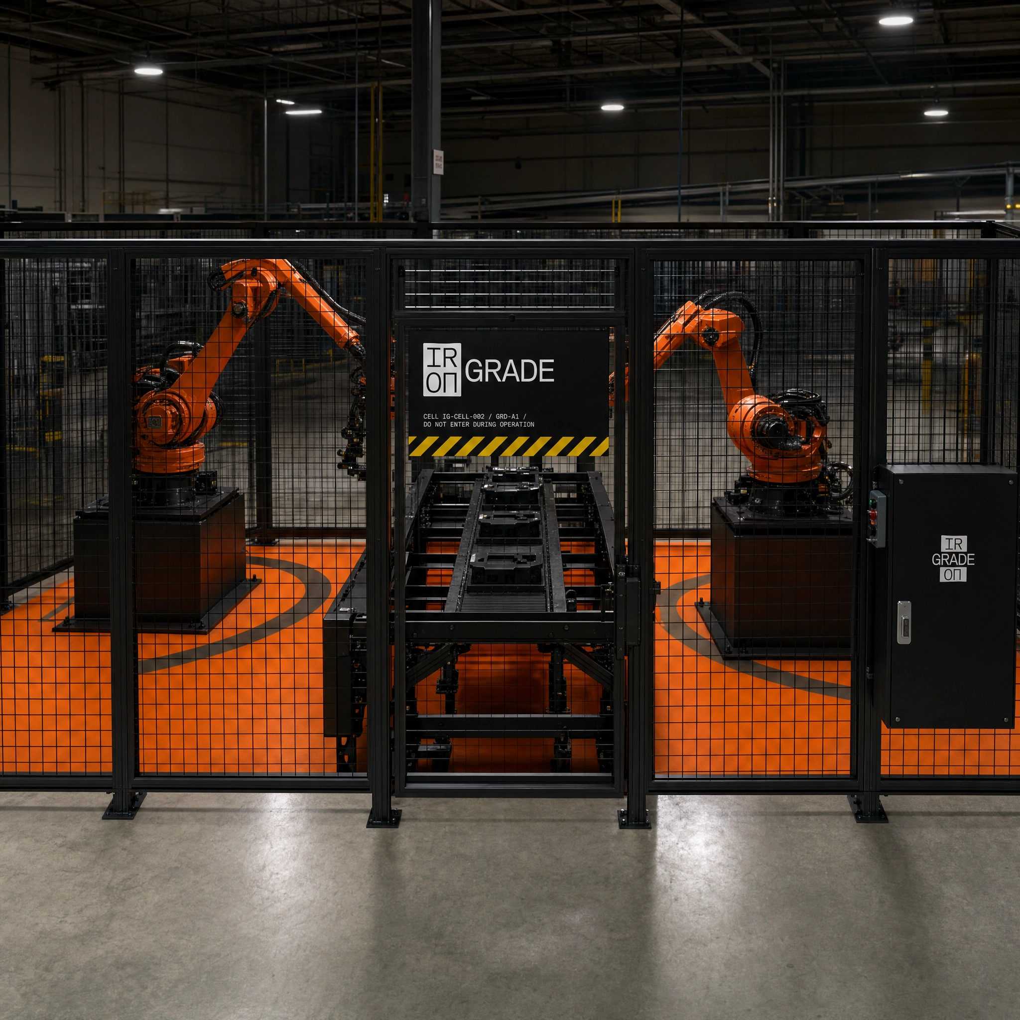
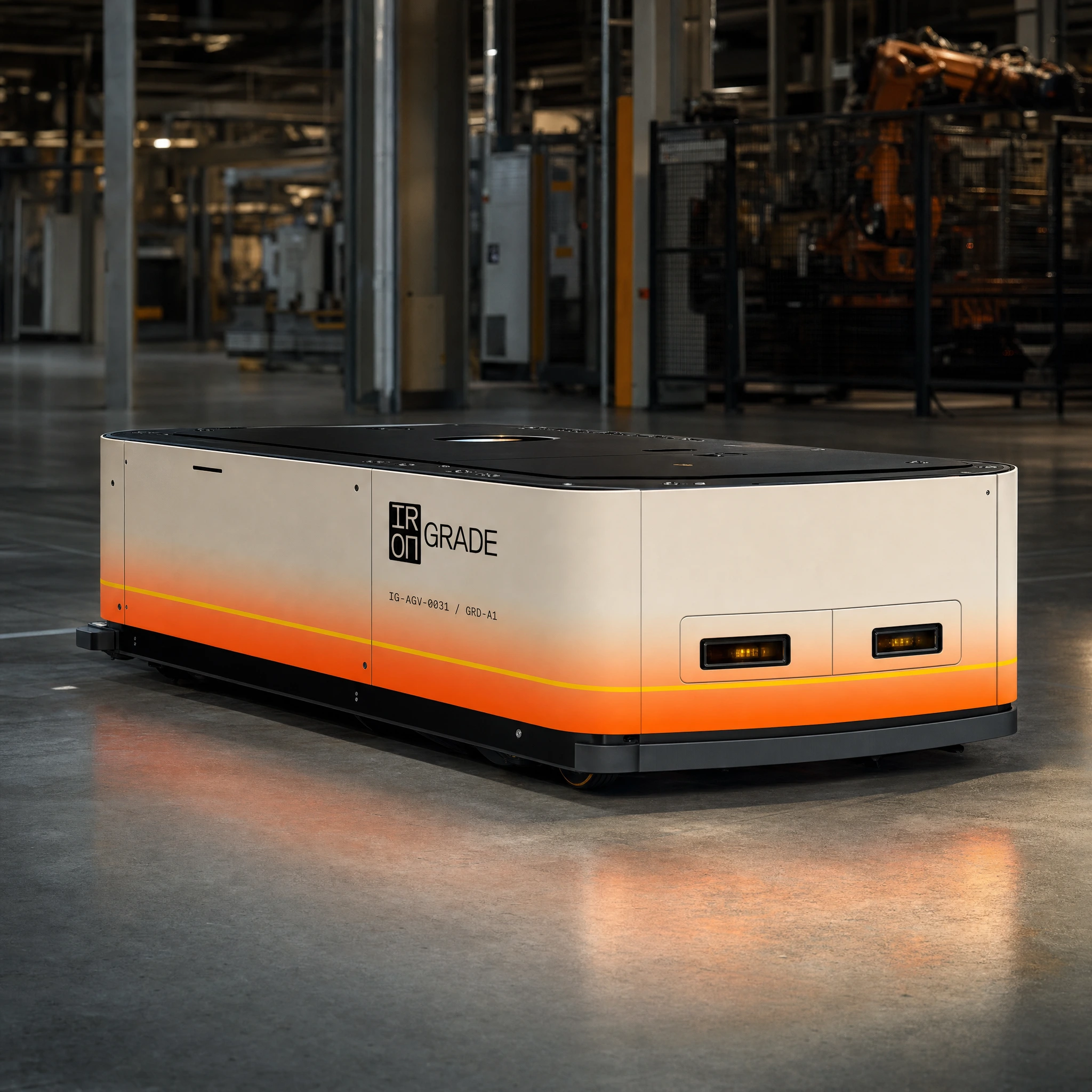
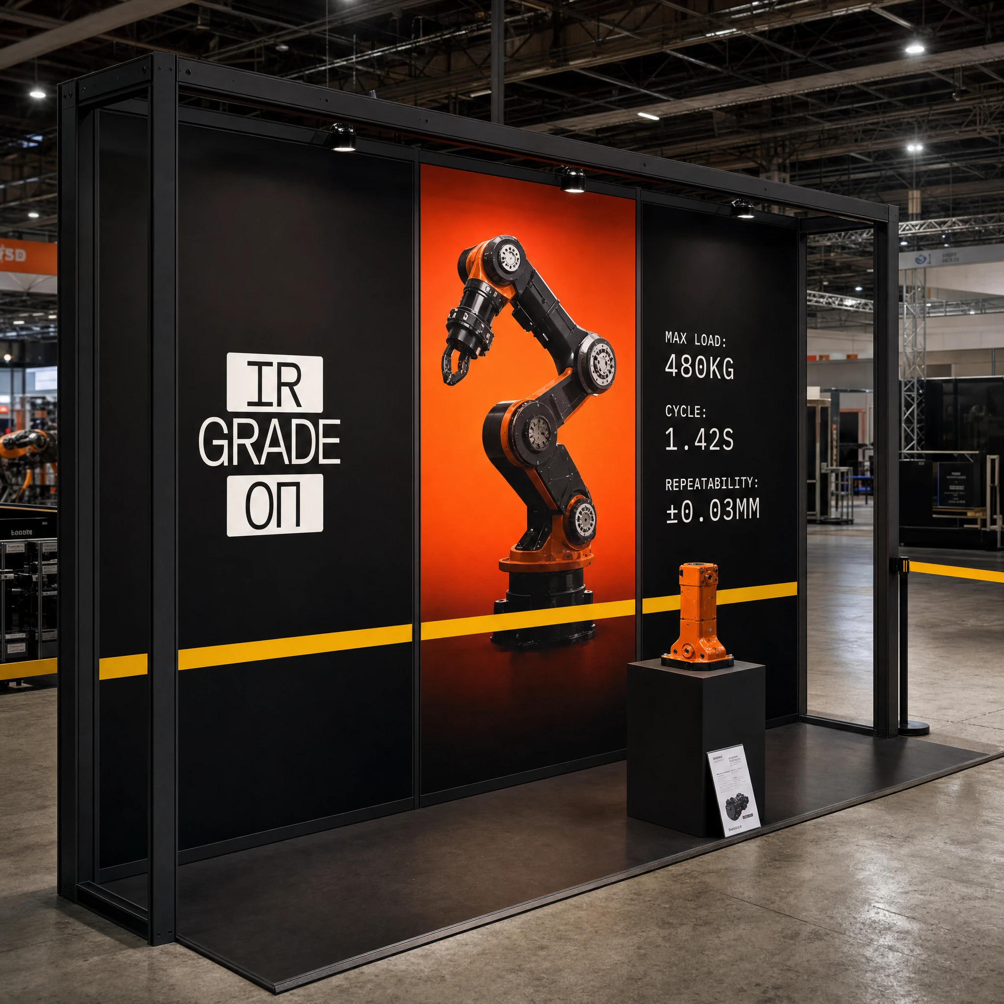
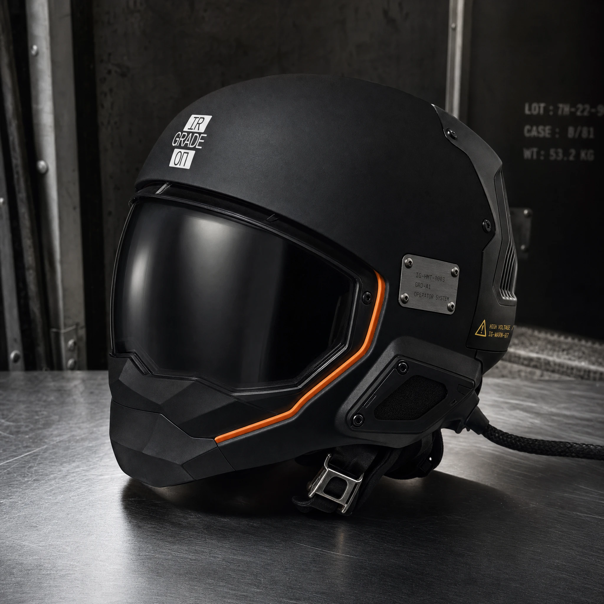
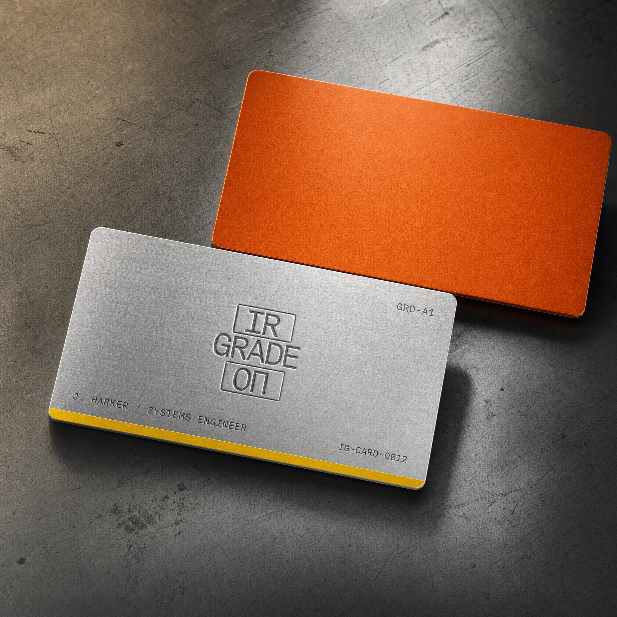
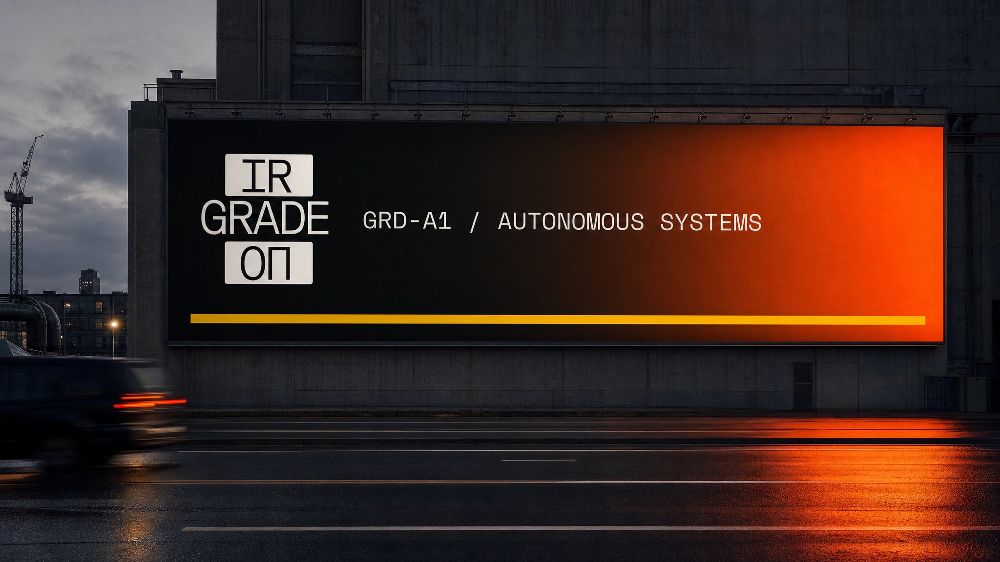
The identity was pressure-tested across twenty physical and environmental applications: robotic actuator component close-up with laser-etched logo and riveted grade plate. Hard-shell transit cases — Void Black exterior, Safety Orange foam interior, yellow tamper tape. Operator workwear — Void Black canvas jacket, orange lining, yellow sleeve stripe, embroidered horizontal logo, woven grade patch. OOH billboard on a brutalist concrete building at dusk, wet road reflection, Grade Yellow rule the only warmth against the gradient. Product specification poster on uncoated Hazard White stock, dense two-column spec data, fine-line orthographic drawing with orange callout lines. Factory wall signage — powder-coated aluminum panel, Safety Orange bottom rule, electrical warning sticker at corner. Full AGV fleet vehicle livery — warm cream to Safety Orange gradient along the lower chassis, yellow pinstripe at gradient boundary. CNC-debossed brushed aluminum business cards — orange anodized back face, no ink, the deboss catches raking light as a relief shadow. Facility security corridor — continuous Safety Orange wall stripe, Void Black aluminum directional panels at 4-metre intervals, single-point perspective vanishing into darkness. Full robotic cell installation — two Safety Orange arm units mid-cycle inside black steel safety fencing, orange floor arc markings, cell control cabinet with stacked logo decal.
Every application was built to one constraint: if you removed the logo, the brand should still be identifiable. That's what a specification system does. The identity isn't applied to the brand world — it's embedded in it.
LANDING PAGE SYSTEM
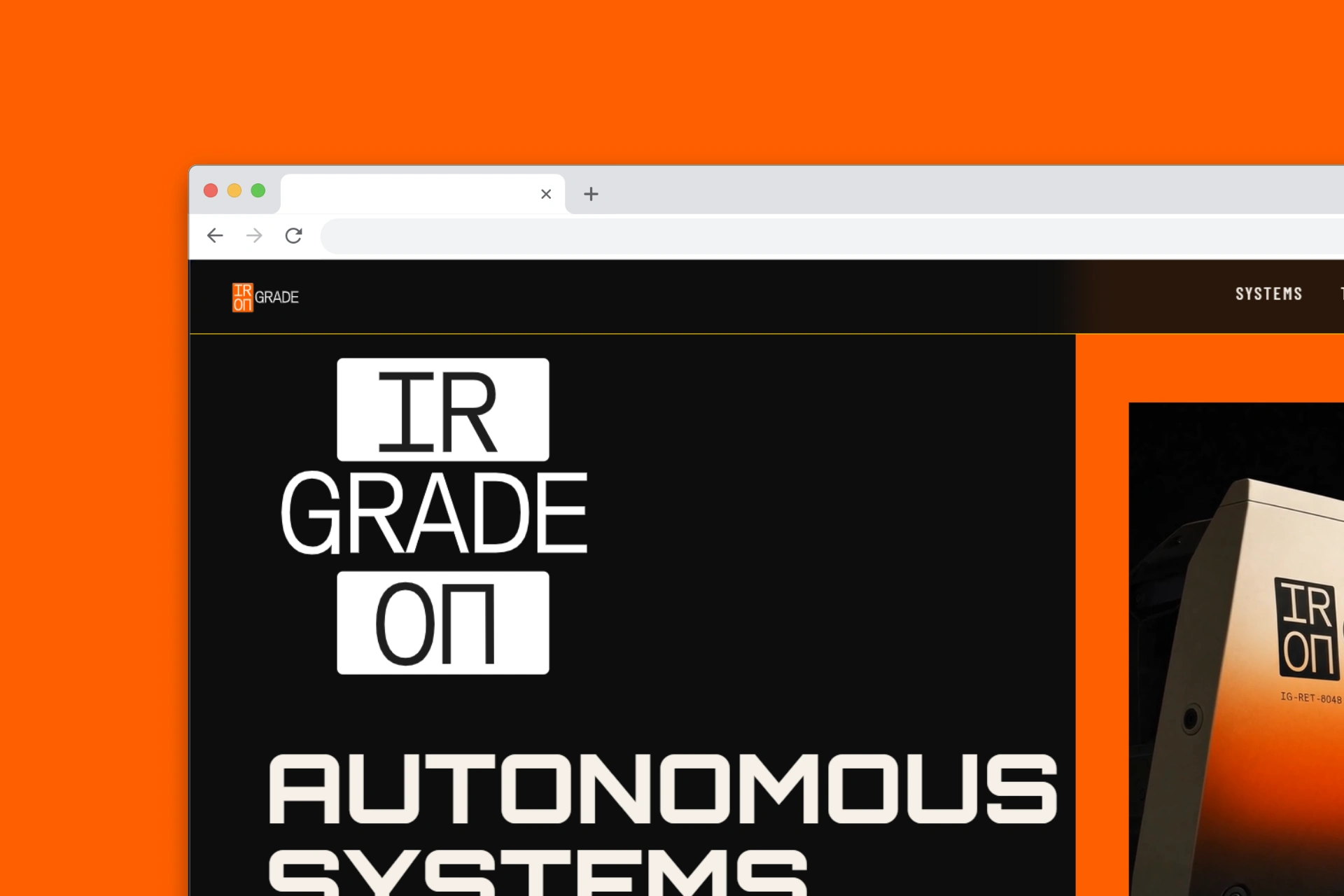
Full React + Vite build spec written with GSAP ScrollTrigger + SplitText for all scroll-triggered reveals, Lenis smooth scroll synced to GSAP ticker, Framer Motion for navbar state and hover interactions. Loading screen: logo enters on scaleY from bottom, serial code fades in below, Grade Yellow rule draws left-to-right, Safety Orange progress bar fills, loader exits. Hero: full-viewport two-column split — Void Black left with stacked logo at 260px, Orbitron headline SplitText reveal, IBM Plex Mono serial annotation, Safety Orange CTA button. Right column: full-height Safety Orange to deep red gradient panel with robotic arm render, Framer Motion parallax on scroll. Zero border-radius across all UI elements. Zero CSS transition workarounds — all motion through GSAP or Framer Motion exclusively.
THE RESULT
IRONGRADE doesn't exist. No factory, no units shipped, no client to call. But the brand exists completely — system-tight, pressure-tested across twenty applications, with a landing page spec detailed enough to build from a single brief.
What I wanted to prove was that industrial hardware branding doesn't have to be an afterthought. The sector produces objects of genuine visual authority — machines that cost millions, perform with sub-millimetre precision, and operate continuously for years without intervention. They deserve identities built with the same logic.
The case study is ongoing. Next phases: motion graphics system, brand guidelines document, social asset system, and the full landing page build. The spec is written. The grade is set.
IRONGRADE. GRD-A1. Certified.
Révolté — revolte.design
Project: IRONGRADE
Year: 2026
Scope: Brand Identity, Logo Design, Typography System, Color System, Mockup Direction, Landing Page Specification
Industry: Robotics / Automation Hardware
See more at revolte.design
Like this project
Posted Jun 7, 2026
Beo-industrial robotics brand built as a specification system, every color is a functional marking and the logo reads like a part number stamped into a housing
Likes
2
Views
19
Timeline
May 26, 2026 - Jun 7, 2026

