AZURA Brand Identity Development & Website
Révolté
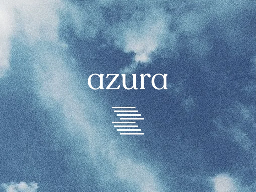
AZURA — The Network Was Always Yours
A web3 social brand built on the premise that every platform you've ever used profited from connections you built. AZURA makes those connections an asset — and the brand had to feel like something that had been inevitable all along.
THE BRIEF
The starting point was a web3 SocialFi concept — a decentralized social network where your identity is portable, your graph is tokenized, and your presence compounds over time rather than evaporating when a platform changes its terms. The brief was to build the brand from nothing: name direction confirmed, product concept locked, everything else open.
The real tension wasn't technical. It was credibility. Web3 branding has a visual language problem — neon gradients, cartoon avatars, frantic energy that performs urgency rather than earning trust. The ask was to build something that felt like it had existed for twenty years and would exist for twenty more. Something that didn't need to signal innovation because it was too busy being correct.
What made it interesting was the constraint I gave myself before touching anything: no web3 visual language at all. If this brand could be mistaken for a crypto project, I'd failed. The reference wasn't the blockchain. It was PanAm.
THE APPROACH
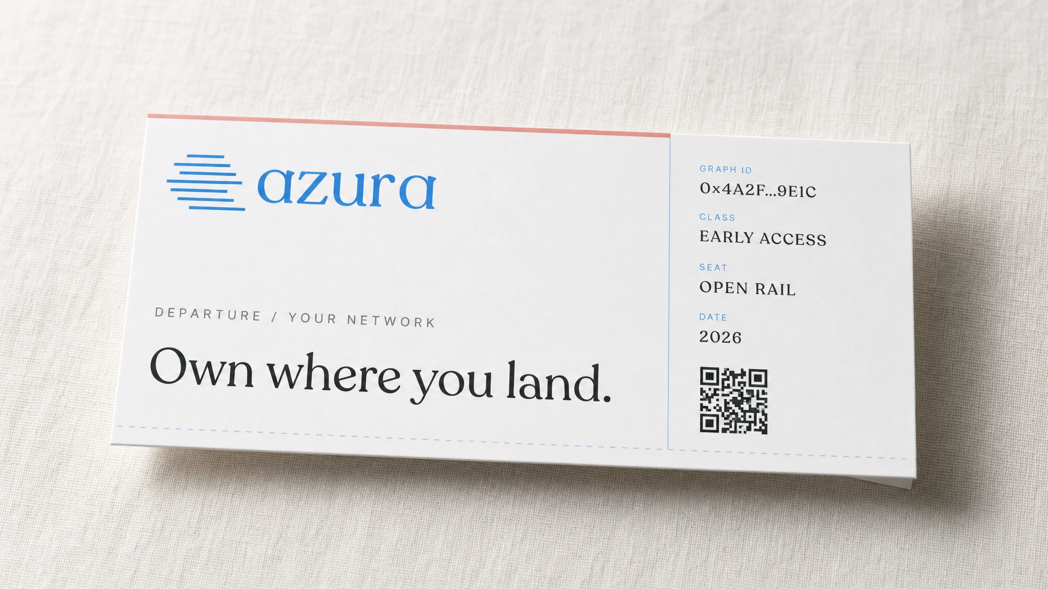
PanAm was the right reference because of what it represented structurally, not aesthetically. It wasn't about the globe or the ticket stubs or the stewardess uniform. It was about the belief that infrastructure could be premium — that the act of moving from one place to another deserved to be treated as something important. AZURA is infrastructure for social capital. Same logic, different rails.
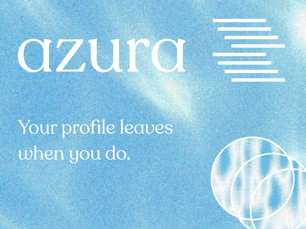
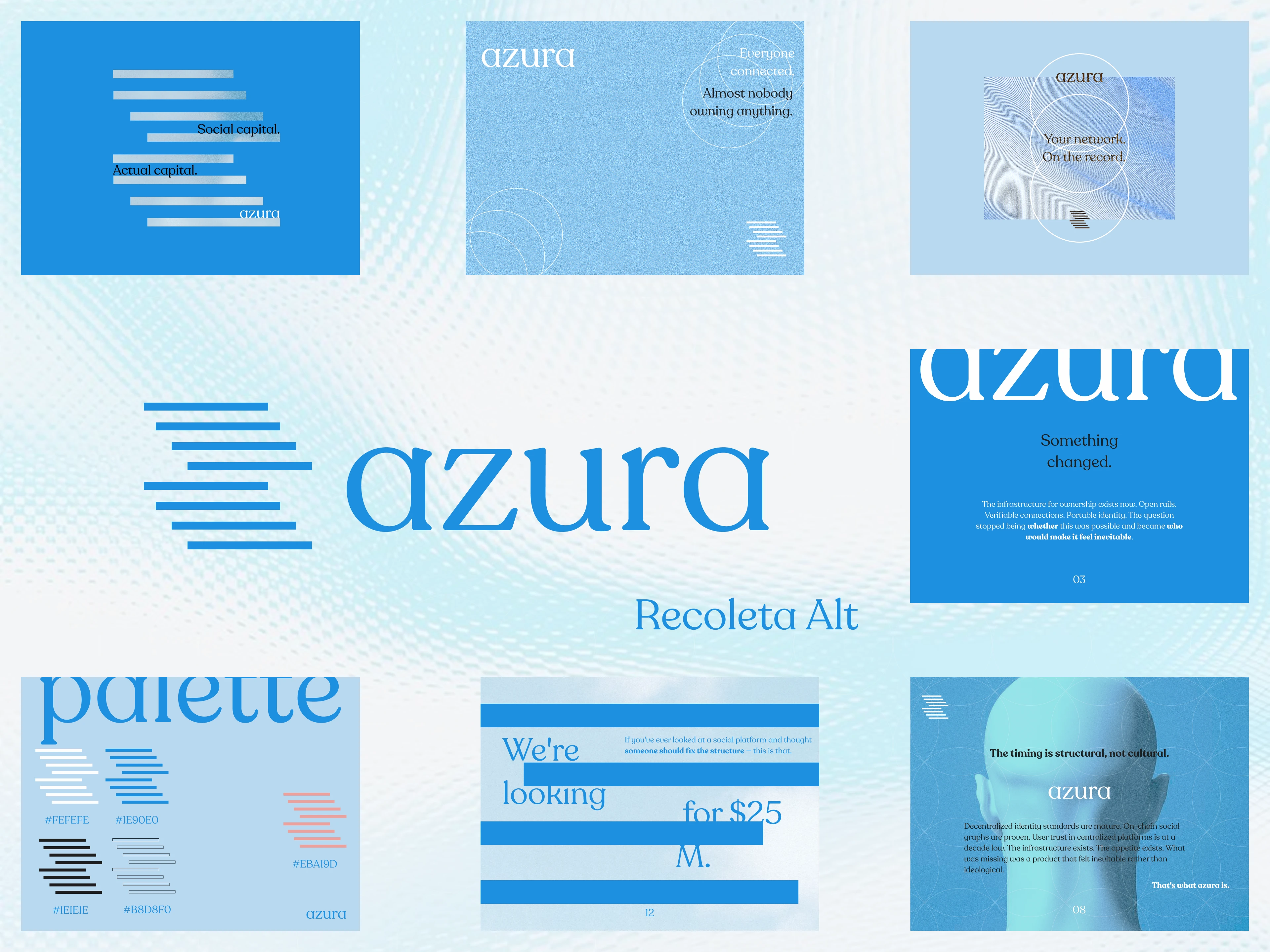
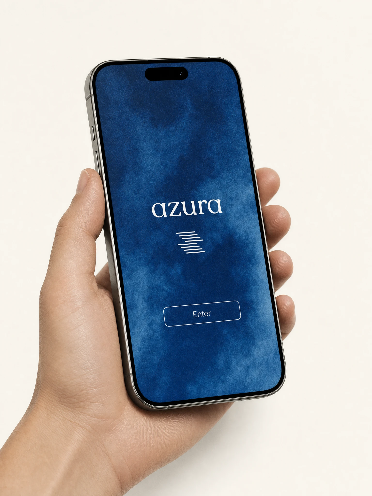
I started with the mark. The icon came before the wordmark, which is backwards from how I usually work, but it felt right here. I needed to know what the symbol was before I knew what the name looked like. The staggered horizontal bar mark — nine bars of varying lengths, offset progressively to the right — happened in one session. It reads three ways simultaneously: a signal stack acquiring lock, a social graph compressing into a single point, and an abstract Z for the brand name. I rejected it twice because it looked too simple, and then I accepted it because that was exactly the point. It didn't need to be complicated. It needed to be correct.
The wordmark followed. Recoleta Alt in lowercase — a serif with ink-trap details and enough warmth to keep the icon from reading as cold. The pairing works because of the tension: the mark is geometric, structural, horizontal; the wordmark is organic, ink-based, curved. Together they don't compete. They explain each other.
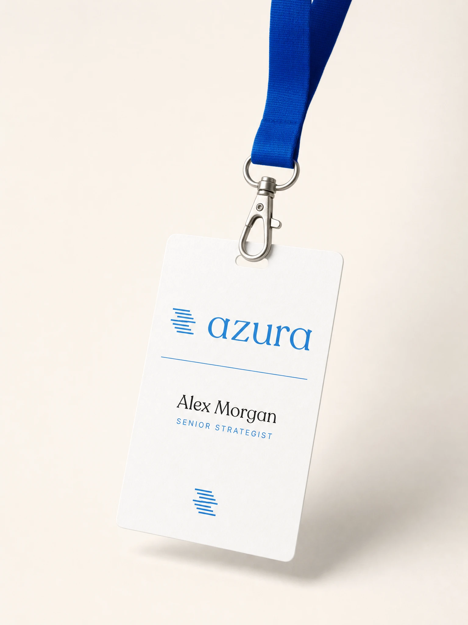
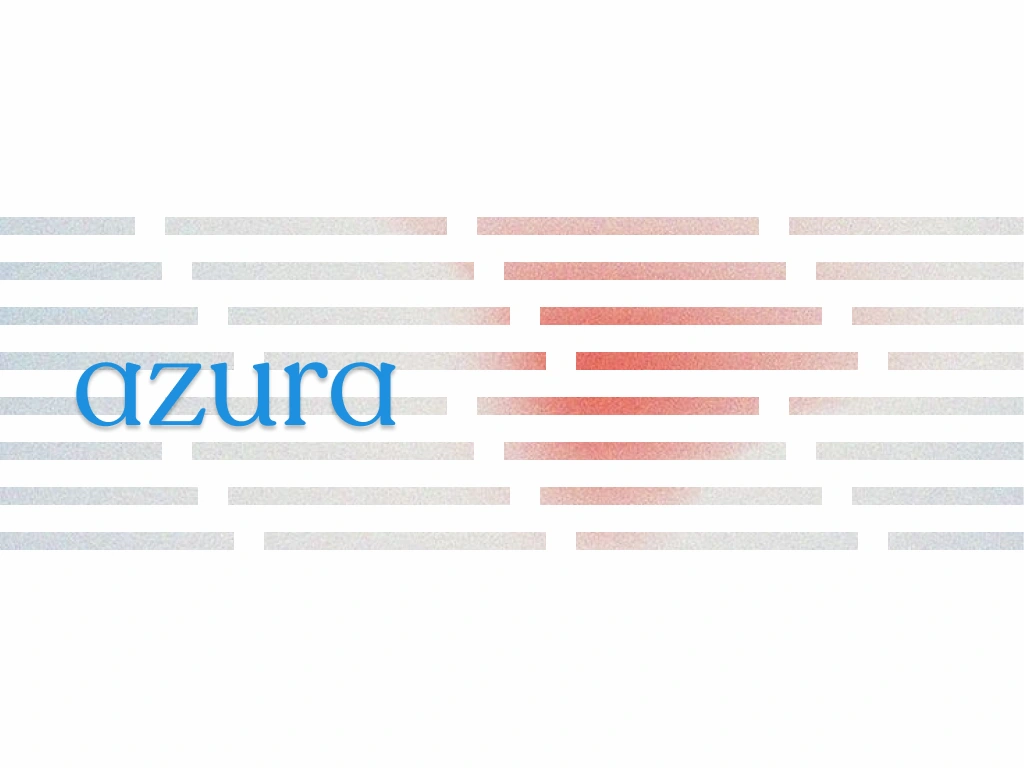
The color system locked early and didn't move. AZURA Blue
#1E90E0 as the sky at cruising altitude. Sky Mist #B8D8F0 as the mist — secondary surfaces, tints, hover states. Near-white #FEFEFE and near-black #1E1E1E as the structural poles. Coral #EBA19D as the only warm note in the system — used once in the pitch deck pull quote, once as a CTA hover state, nowhere else. The restraint is the point. When the coral appears, it means something.THE WORK
LOGO SYSTEM
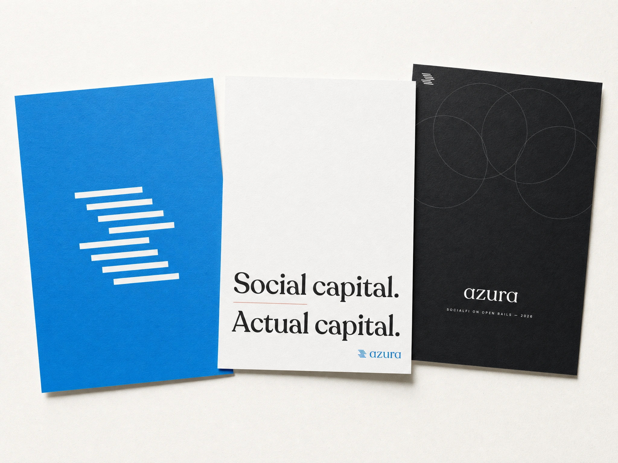
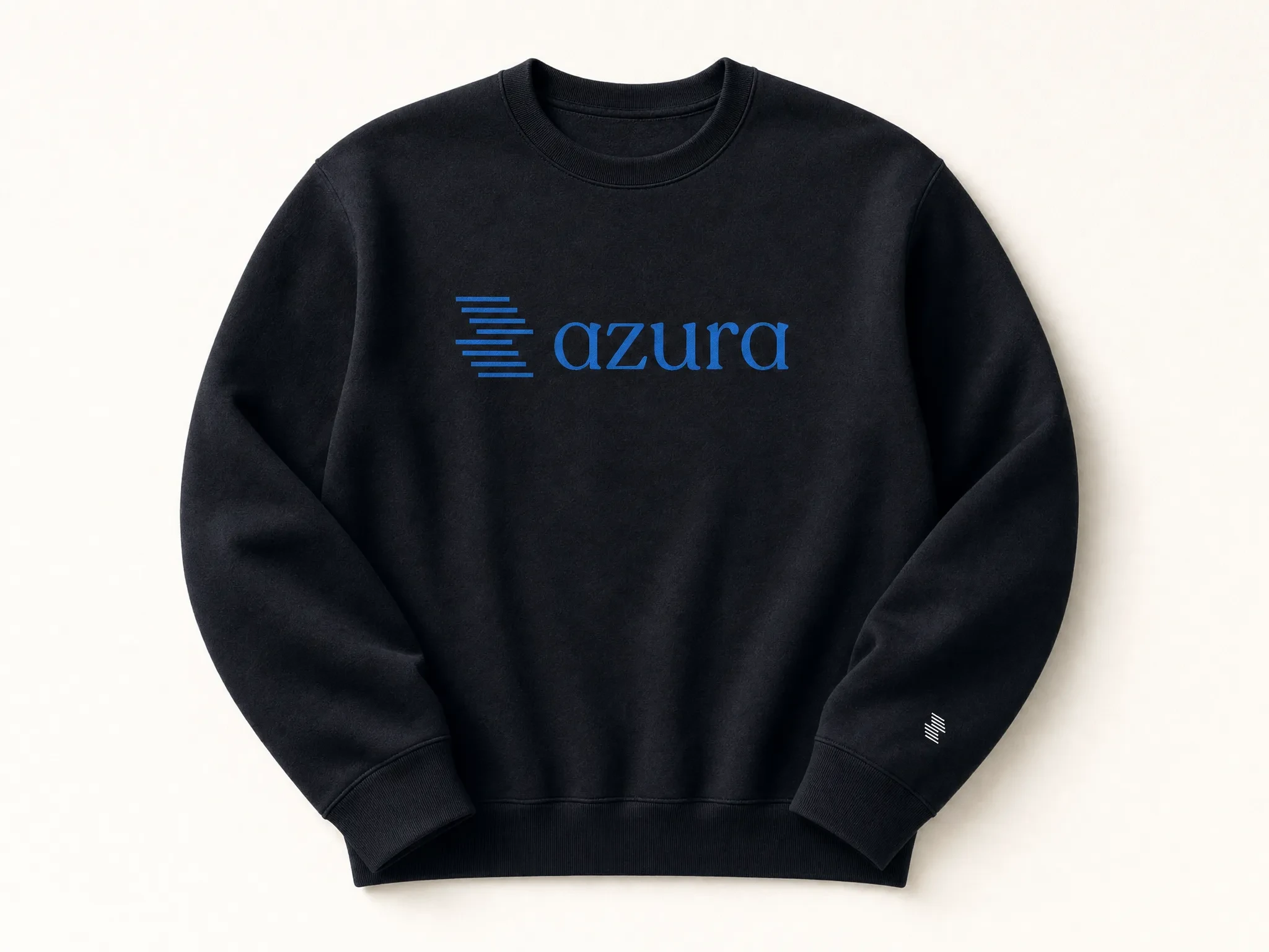
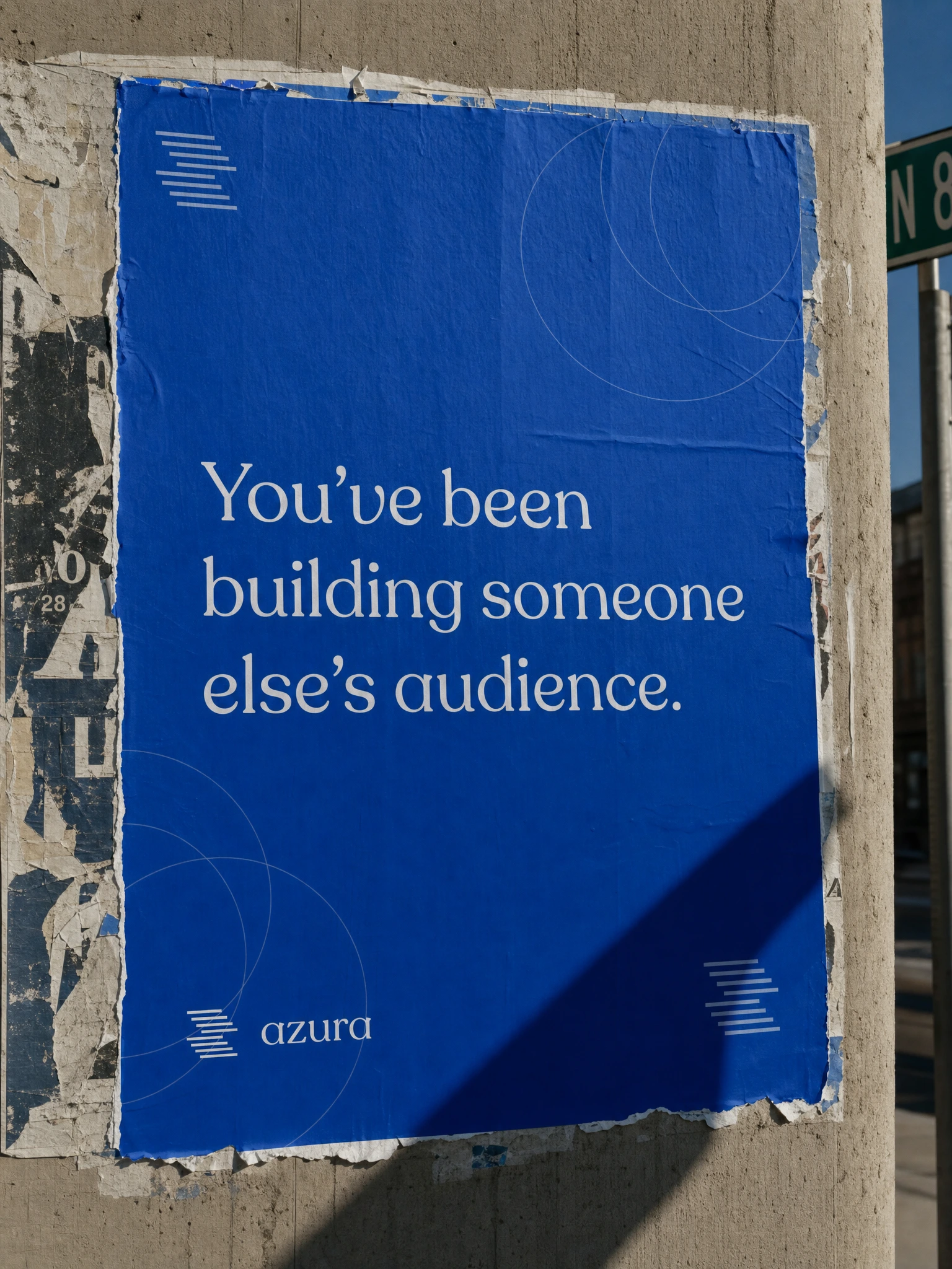
The icon is nine staggered bars, offset on a diagonal axis reading left to right and downward. The stagger is the brand — it communicates signal, movement, layering, and ownership simultaneously without explaining itself. The lockup is always horizontal: icon left, wordmark right. Baseline of the wordmark aligns to the lower third of the icon height. There is no stacked version. There is no wordmark-only primary application. They travel together. The icon alone is permitted only for the app icon, favicon, and embossed or blind-stamp applications where the lockup would be illegible.
COLOR SYSTEM
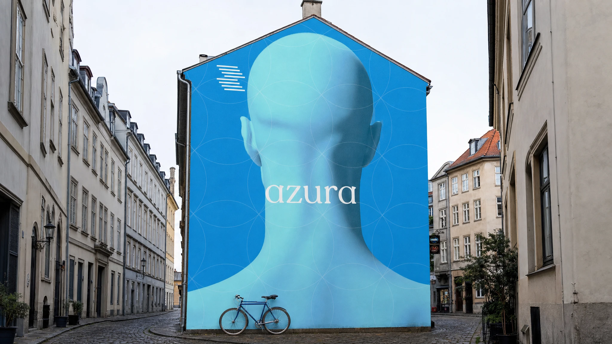
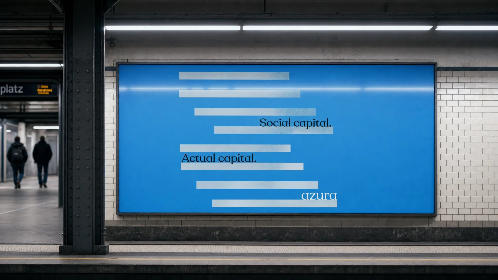
Five colors, strict hierarchy. AZURA Blue
#1E90E0 is the logo color, the CTA color, the primary surface on dark applications. Sky Mist #B8D8F0 is the secondary surface — the platform sky, the background tint, the card border. Near-white #FEFEFE and near-black #1E1E1E are the structural ground colors. Coral #EBA19D is earned, not assigned — it appears in two controlled moments in the entire system and nowhere else. Gold was considered and rejected: it read as legacy brand nostalgia, which was the wrong half of the PanAm reference.TYPOGRAPHY SYSTEM
Recoleta Alt handles all display and headline work — the wordmark, the hero copy, the poster statements, the pitch deck headlines, and all OOH. It was chosen because its ink traps and serif details read as considered at large sizes without becoming decorative. Inter handles all body copy and UI — it disappears correctly, which is what body copy should do. The two typefaces don't fight because they don't share a register. Recoleta Alt is the voice; Inter is the instrument.
COPYWRITING
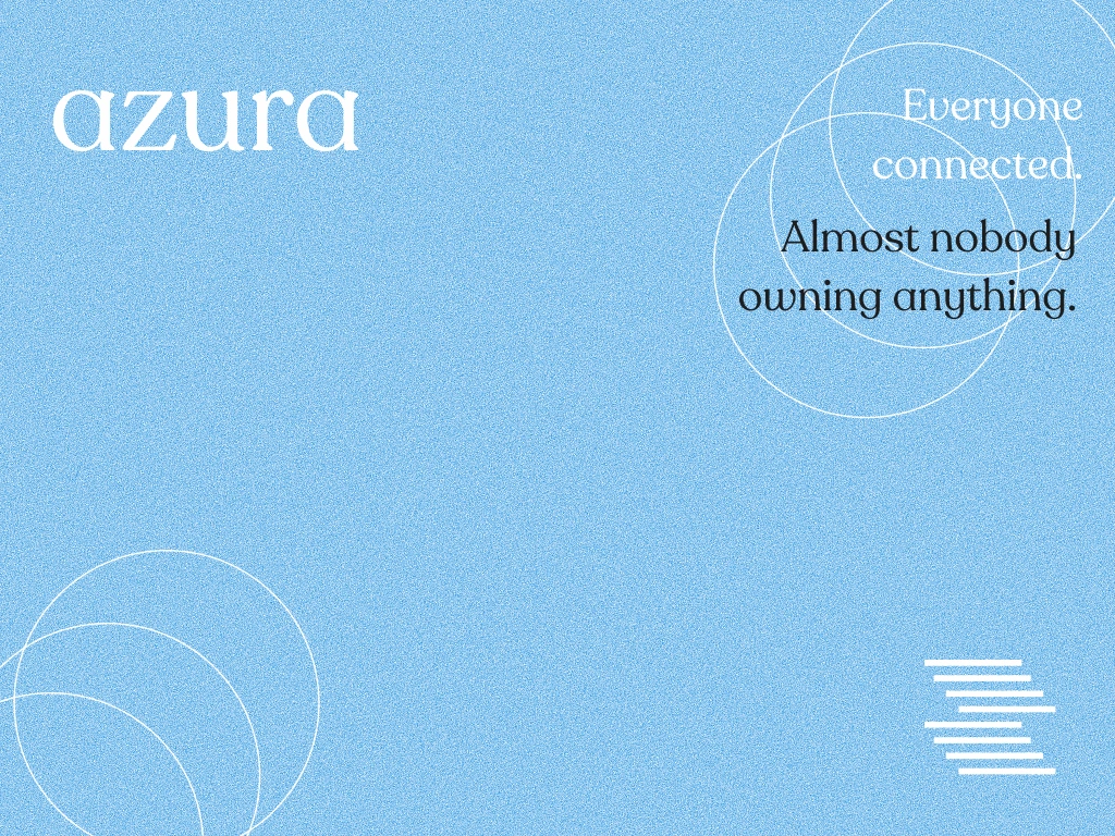
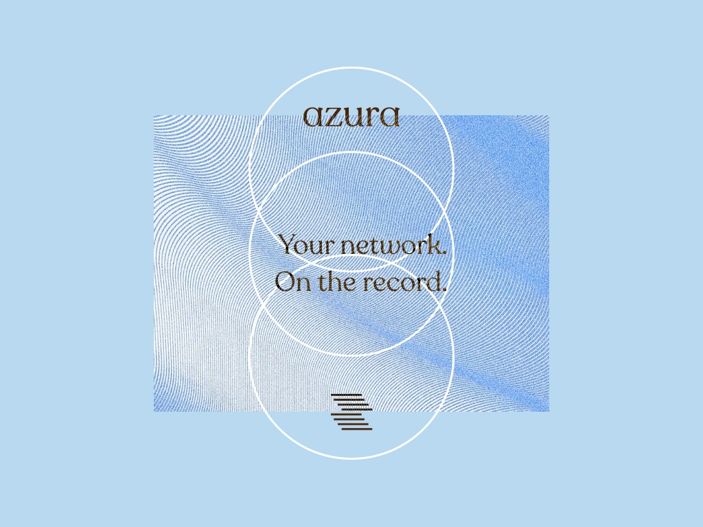
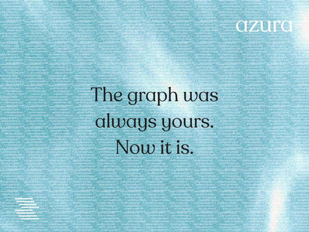
The copy suite was written before any visual execution, which I don't always do but should do more. Having the words locked — "The graph was always yours. Now it is." / "Social capital. Actual capital." / "Your profile leaves when you do." — gave the visual system a target to aim at rather than a surface to decorate. The poster that worked hardest was the "Social capital. Actual capital." execution: the copy woven directly between the staggered icon bars at large scale, the icon becoming the grid for the text. That integration was unplanned and ended up being the strongest single execution in the project.
PITCH DECK
Thirteen slides built directly on the brand system. The deck doesn't look like a pitch deck — it looks like a brand document that also happens to make an investment case. That was deliberate. The typography is display scale throughout. The copy is the brand copy, not softened for an investor audience. The visual assets from the identity appear as design elements, not as screenshots of work. The deck is the brand at work, not a presentation about the brand.
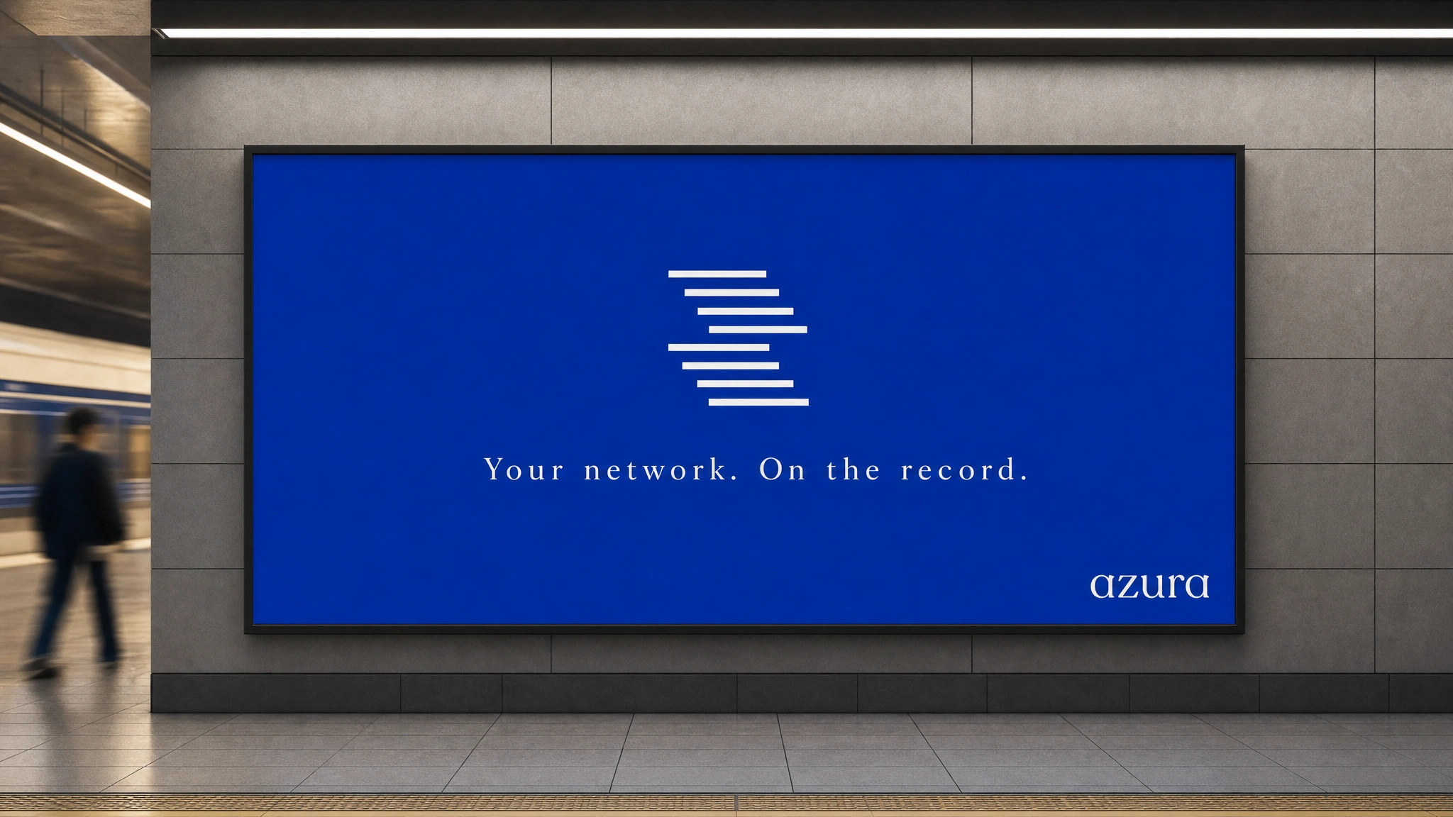
OOH CAMPAIGN
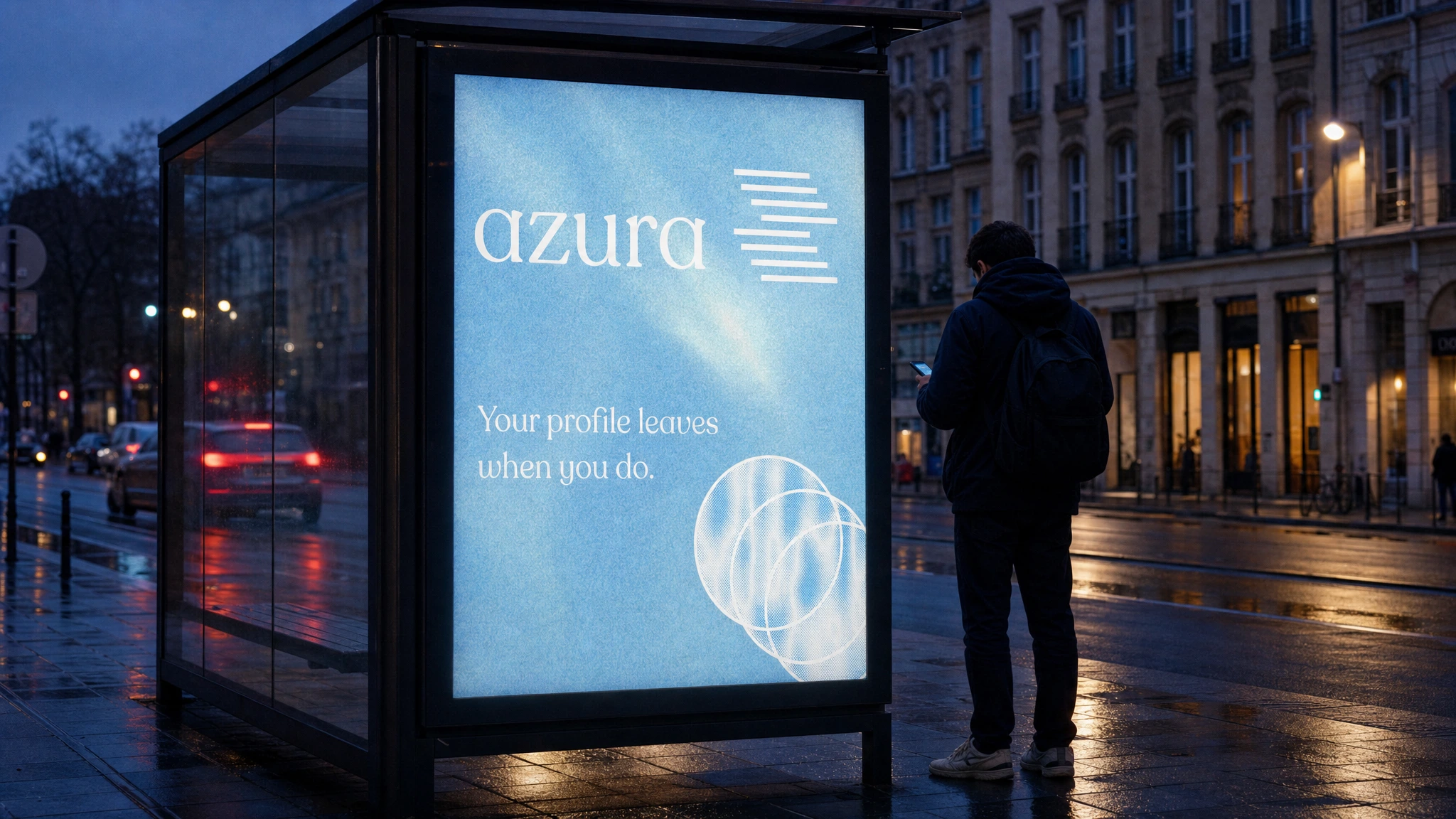
Twenty-five directed mockup briefs across metro billboard, bus stop, outdoor billboard, full bus side wrap, wall mural, stationery, apparel, branded artifacts, and product. The OOH campaign was the final proof of concept — if the brand held up at twelve metres on the side of a moving bus, it was resolved. The icon-only outdoor billboard was the most reductive execution: full-bleed AZURA blue, the white staggered mark centered, nothing else. The wall mural with the back-of-head 3D figure at four storeys was the most ambitious. Both worked because the system was strong enough to scale in either direction without assistance.
LANDING PAGE SYSTEM
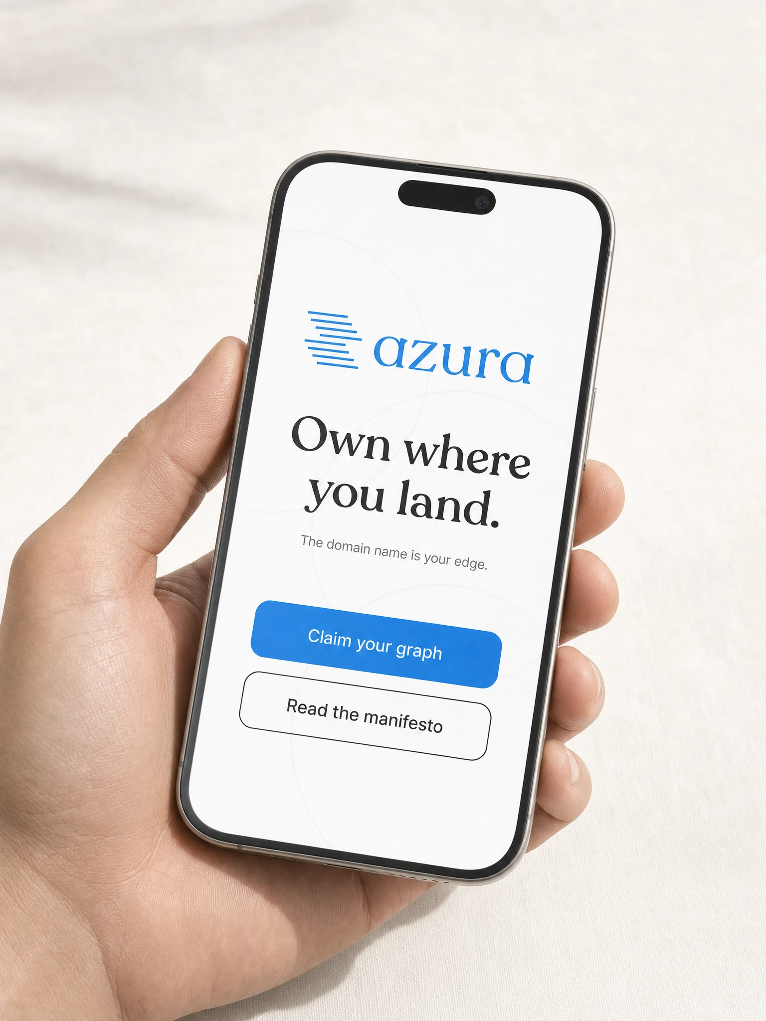
A full technical brief for a React/Next.js landing page with GSAP ScrollTrigger and Framer Motion — animated SVG logo (bars drawing in left to right, staggered 60ms each, signal acquiring lock), SplitText headline reveals, scrubbed statement section, horizontal scroll feature cards, CountTo traction stats, and a coral hover state on the waitlist CTA as the only warm moment in the entire digital experience. Motion rules: nothing rotates, nothing bounces, nothing repeats. Every animation plays once and resolves.
THE RESULT
AZURA is a speculative project built to demonstrate what a web3 brand looks like when it refuses to look like a web3 brand. The complete system — mark, color, type, copy, deck, OOH, and digital — is fully resolved and production-ready. The pitch deck is investor-grade. The OOH campaign is campaign-grade. The landing page brief is development-ready.
The work lands because it made one decision early and held it: premium infrastructure deserves a premium identity. Not borrowed heritage, not performed confidence — a visual language precise enough to be taken seriously and warm enough to be remembered.
Studio: Révolté — revolte.design
Project: AZURA
Year: 2026
Scope: Brand Identity, Logo Design, Visual System, Color System, Typography, Copywriting, Pitch Deck, OOH Campaign, Landing Page Direction
Industry: Web3 / SocialFi / Decentralized Social

See more at revolte.design
Like this project
Posted Jun 2, 2026
AZURA: a complete web3 social brand and website that looks nothing like a web3 brand — built on signal, ownership, and the precision of a 1960s airline
Likes
1
Views
10
Timeline
May 15, 2026 - Jun 2, 2026