Built with Lovart
SERAPH Brand Identity, Visual System & Website Development

Révolté


SERAPH — The Banknote Was Always a Design Object
A web3 brand built on the oldest form of anti-counterfeiting technology — the engraving — and the most disposable aesthetic of the digital era — Y2K translucent plastic. The collision between those two things is not a stylistic choice. It is the whole argument.
THE BRIEF
SERAPH came out of a simple frustration. The serious end of web3 collecting — the part that wants to be taken as seriously as art, as seriously as currency, as seriously as a numbered edition from a serious press — has almost no visual language that matches the ambition. Everything looks like a crypto project. Everything looks like it was designed to go viral, not to last.
The idea I kept coming back to was this: a banknote is a designed object. It is engraved, numbered, authenticated. It is trusted because it was made with precision and issued with intention. What would it look like to apply that logic to a phygital art label — something that issues physical artifacts and on-chain tokens simultaneously, treating both with equal seriousness?
The brief I set for SERAPH was to build that label from zero. Brand identity, visual system, product language, OOH campaign, website. Everything.
THE APPROACH
I started with the engraving. Not as decoration — as the core material logic of the brand. Currency engraving is one of the oldest anti-counterfeiting technologies in existence: intaglio lines pressed into paper with enough precision and density that forgery becomes mechanically impractical. That precision — the obsessive, nearly pathological density of the line — is what I wanted as the brand's underlying register. The SERAPH identity had to feel like it cost something to make.
The first direction I explored leaned too hard into that. It looked institutional. It looked like a mint, or a law firm that had read about web3 once. There was no irreverence in it, no indication that the people behind it had grown up on the internet, had used a transparent iMac, had held a Game Boy in a translucent yellow plastic shell. The engraving was necessary but not sufficient.
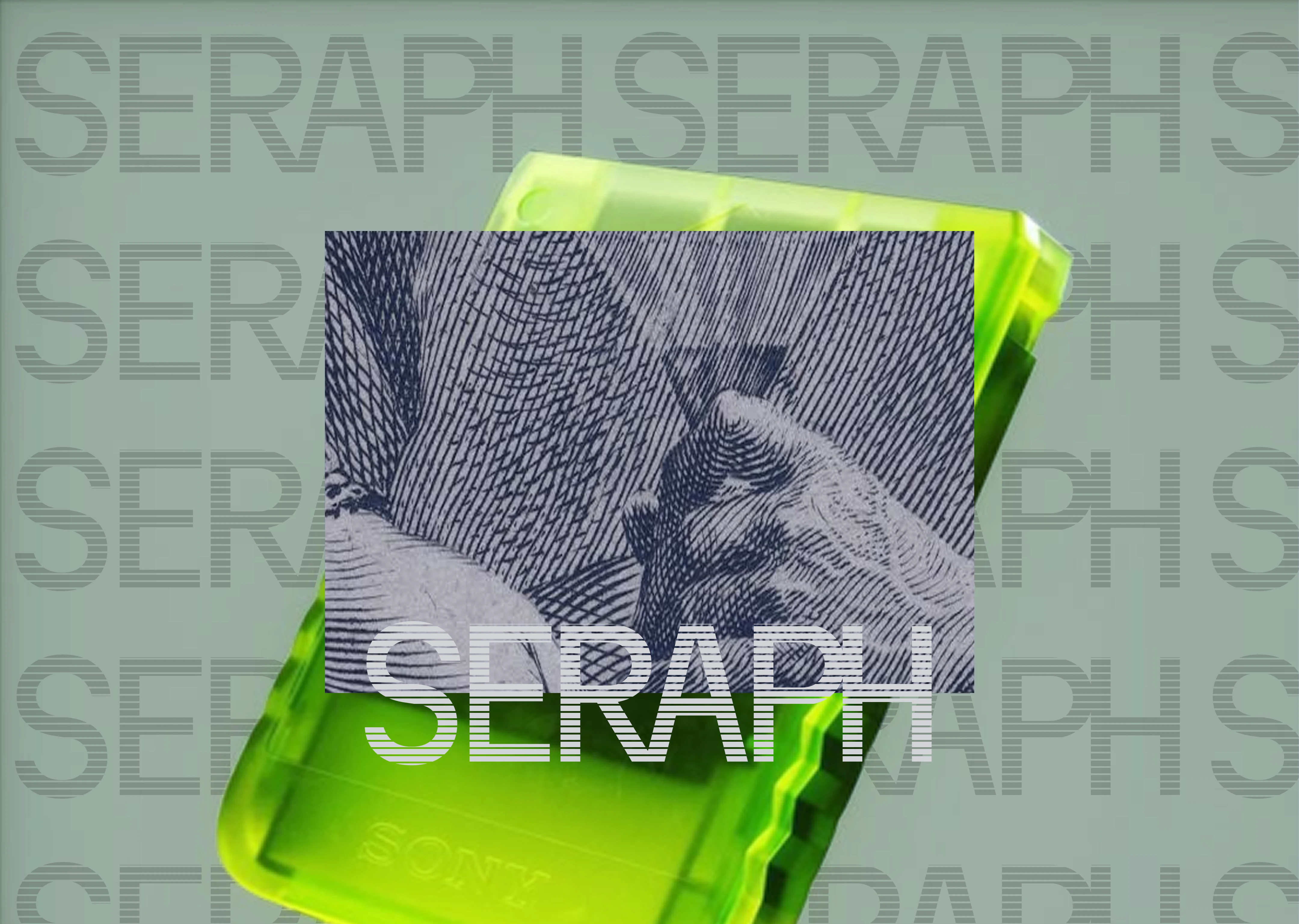
The unlock was the Y2K object. The translucent blue iMac. The stacked transparent dice. The polycarbonate headphones. Those objects carry a completely different kind of nostalgia to the engraving — not the nostalgia of permanence and authority, but the nostalgia of optimism. A moment when technology looked like it might be beautiful, when plastic was glamorous, when the future was see-through and electric blue.
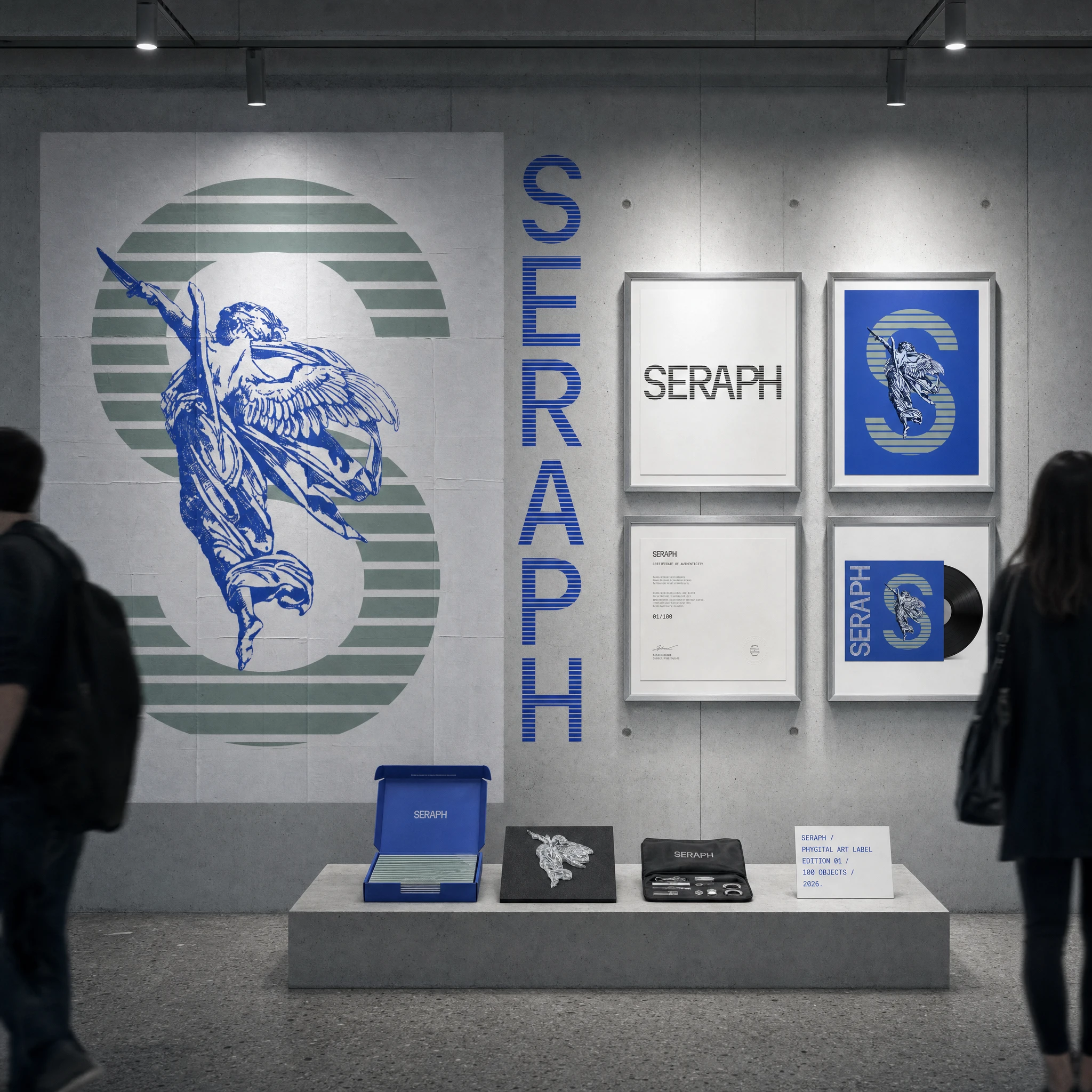
I named the three visual modes as I developed them: BLUE GREEN for the primary color system and sage texture layer, ENGRAVING 2KY for the intaglio imagery and currency reference layer, HALFTONE LETTERPRESS for the type treatment. The names mattered — they gave the system internal logic, made it teachable, made it possible to apply consistently across thirty-plus mockups.
The typographic decision locked everything into place. Martian Mono at minus fifteen percent tracking. Monospaced, all-caps, tight. It reads like a terminal readout, a classified document, a ledger entry. It does not read like a web3 project. That distinction is the whole point.
THE WORK
BRAND IDENTITY / VISUAL SYSTEM
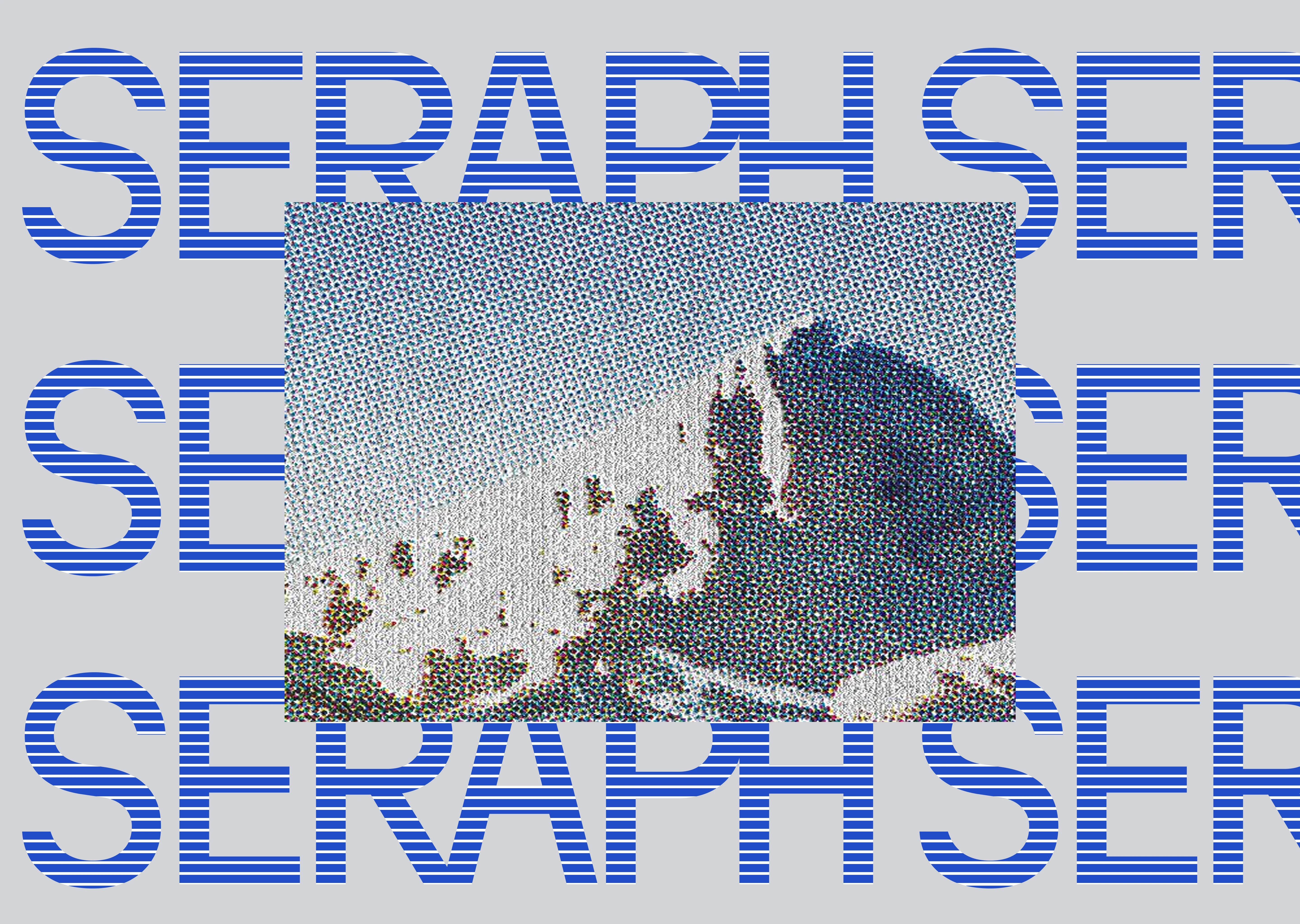
Three interlocking layers. First: the ground —
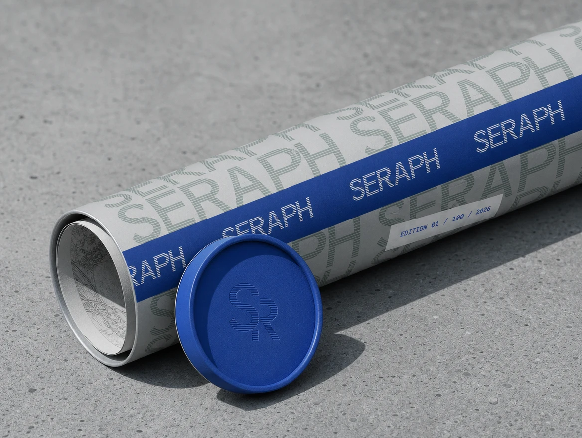
#D2D3D8 silver, flat, institutional, the color of uncoated card stock and brushed aluminum. Second: the ghost layer — the SERAPH wordmark tiled full-bleed in #99AFA3 sage at low opacity, functioning as wallpaper, watermark, and security pattern simultaneously. Third: the active layer — #214DC8 blue, the color of the line-fill wordmark, the engraving strokes, the Y2K plastic objects. The system works at any scale: a 48-sheet billboard or a business card.LOGO — WORDMARK
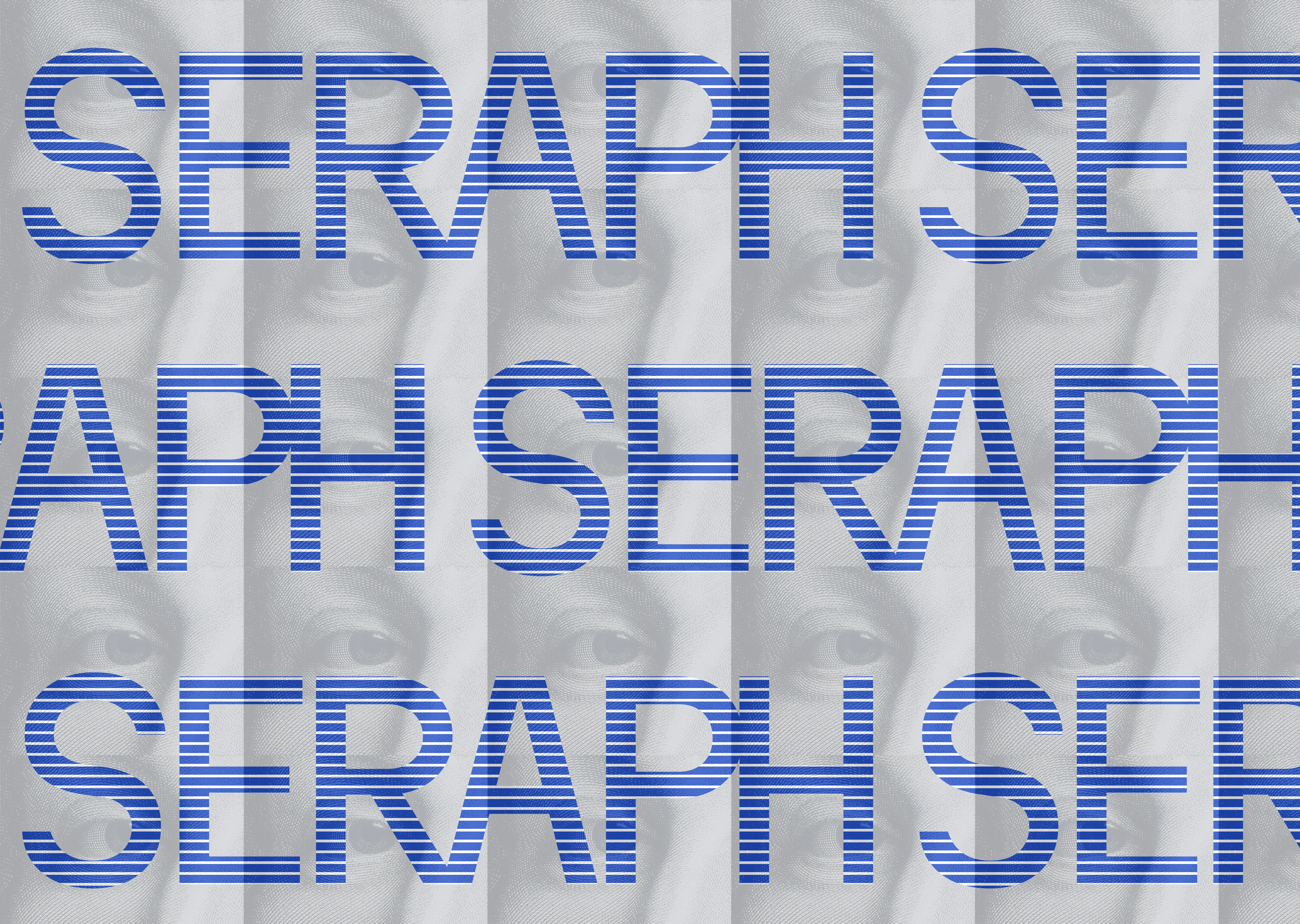
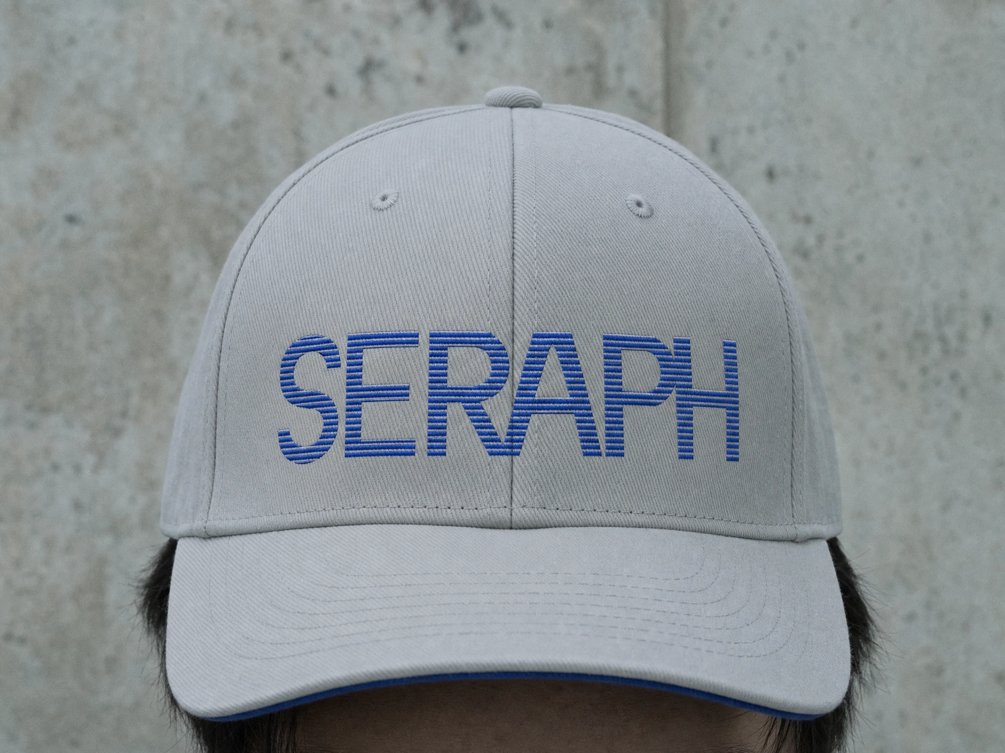
Martian Mono Bold, minus fifteen percent tracking, all-caps. The letterforms are filled not with solid color but with horizontal scan lines at four-pixel intervals — a letterpress / halftone treatment executed in SVG using clipPath and pattern elements. The result looks printed, looks pressed, looks physical. The H character has a vertical bar interrupting its crossbar — a signature deviation that is the only moment of overt construction in the mark.
LOGO — S-MARK ICON
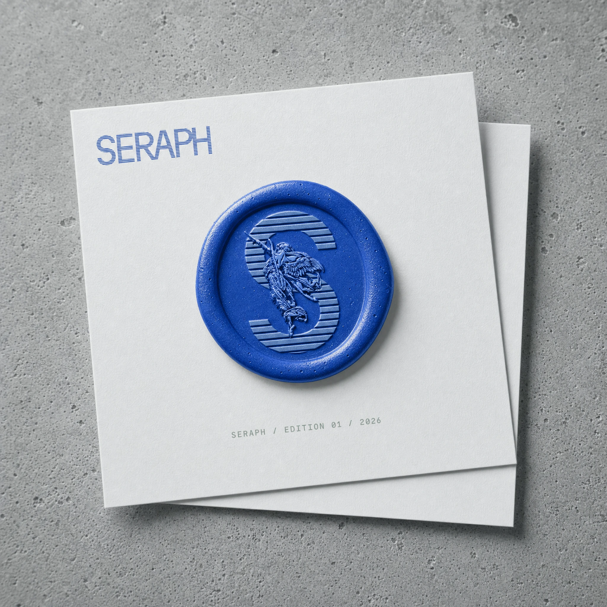
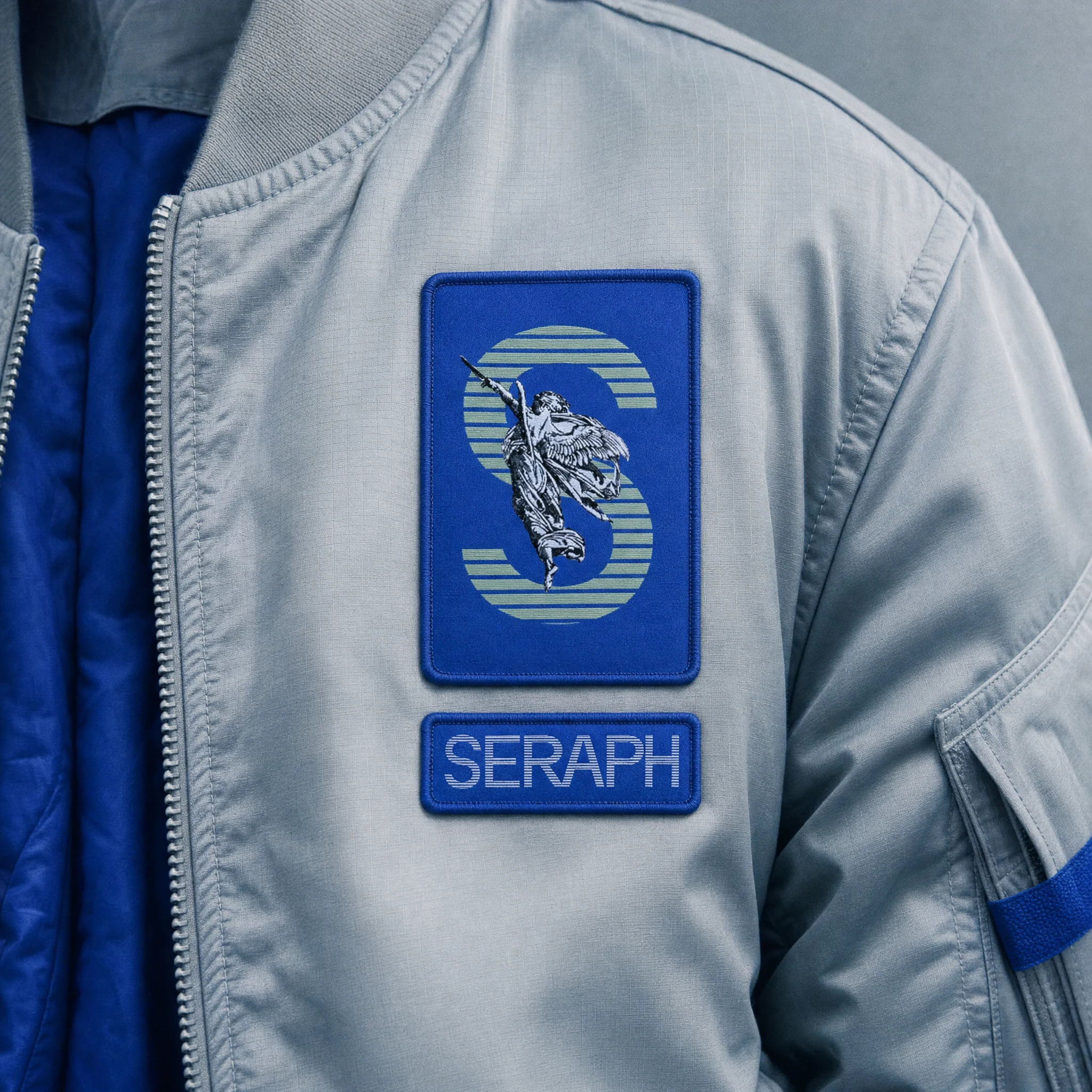
A monumental S in the same line-fill treatment,
#214DC8 lines on a solid #214DC8 ground with #99AFA3 horizontal stripe treatment. The classical angel figure — a winged figure from the engraving visual library — is overlaid and centered on the letterform, the figure's raised arm pointing skyward through the letterform. The icon works at favicon scale and at installation scale. The concept is direct: the seraph guarding the letter, the letter containing the figure, the mark holding both readings simultaneously.TYPOGRAPHY SYSTEM
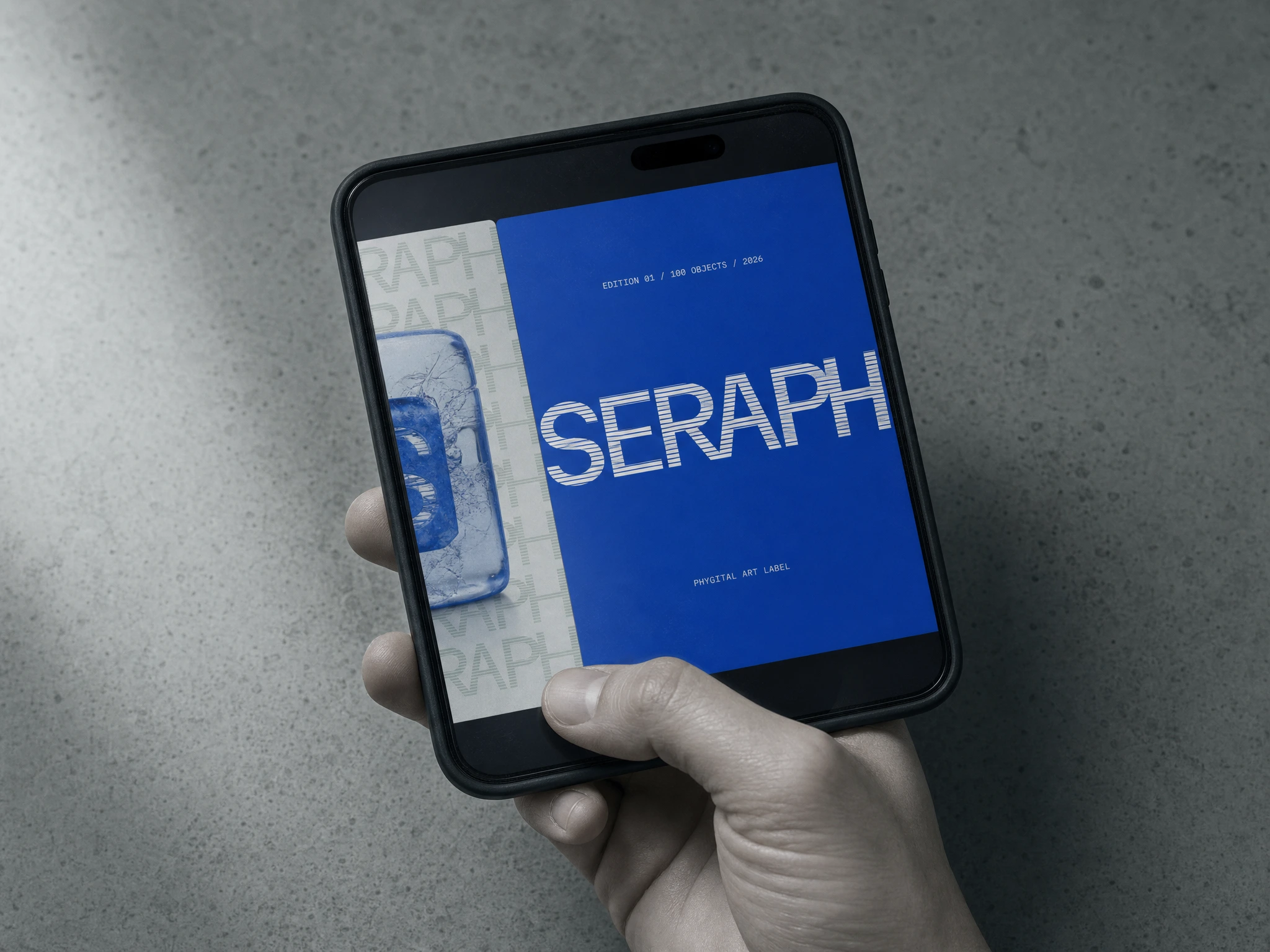
Martian Mono exclusively. Minus fifteen percent tracking applied globally. Two weights: 400 for body and secondary information, 700 for display and wordmark. Zero other typefaces. The monospaced grid of the typeface echoes the horizontal line-fill of the letterforms — the type and the logo are built from the same structural logic.
COLOR SYSTEM
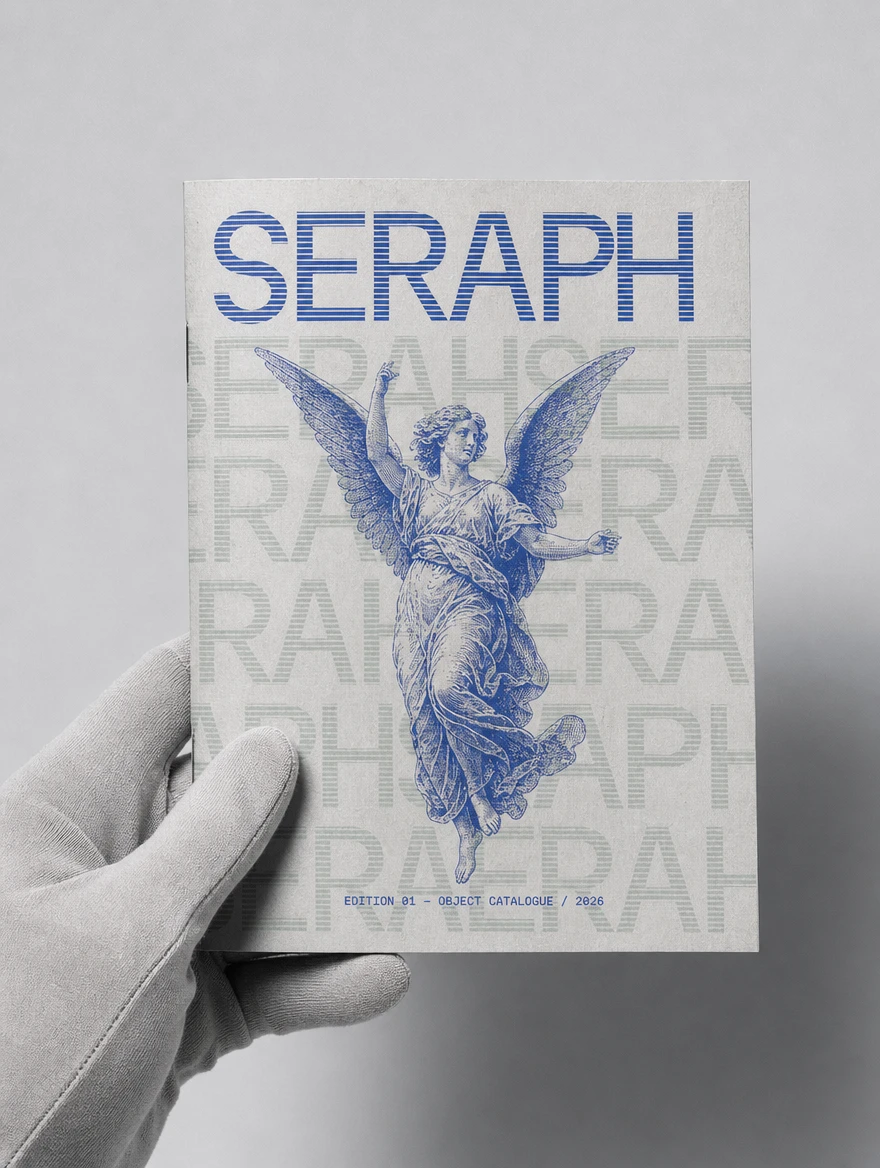
#214DC8 — primary. The engraving ink. The Y2K electric blue. The authority color and the nostalgia color at once.
#99AFA3 — sage. The ghost layer. The secondary register. The color that recedes.
#D2D3D8 — silver. The ground. The uncoated stock. The institutional surface.
#FFFFFF — white. Used sparingly, for maximum contrast moments only.
Zero warm tones anywhere in the system.OOH CAMPAIGN — 30 MOCKUP DIRECTIONS
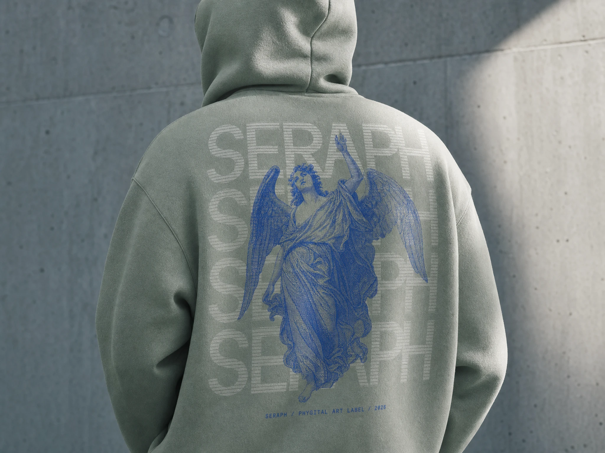
Thirty distinct mockup prompts developed across five categories: product packaging and physical drop objects, out-of-home (48-sheet billboard, metro tunnel panels, street paste-ups, bus shelter backlights, column wraps), editorial and print (letterpress editions, risograph posters, zines, certificates), apparel (embroidered cap, heavyweight hoodie, bomber jacket patch), and digital (Instagram carousel, screen installation, website UI). Each prompt written as a full art direction brief — surface, lighting, typography scale, color application, environmental context — to function as a production-ready image generation prompt.
WEBSITE — LANDING PAGE
Full specification written for a React single-page build: GSAP 3 plus ScrollTrigger for scroll-driven animation and the logo glitch reveal sequence, Framer Motion for component-level motion (nav entrance, section stagger, hover states, custom cursor with spring physics). A canvas-based film grain overlay at 3.5% opacity runs at 30fps. The SERAPH wordmark SVG executes a glitch reveal on load — staggered line-by-line with x-offset jitter and color flicker between
#214DC8 and #99AFA3. An idle micro-glitch fires every six to eight seconds on the wordmark and every ten seconds on the icon. No CSS animations anywhere — all motion through GSAP or Framer Motion exclusively.COPYWRITING
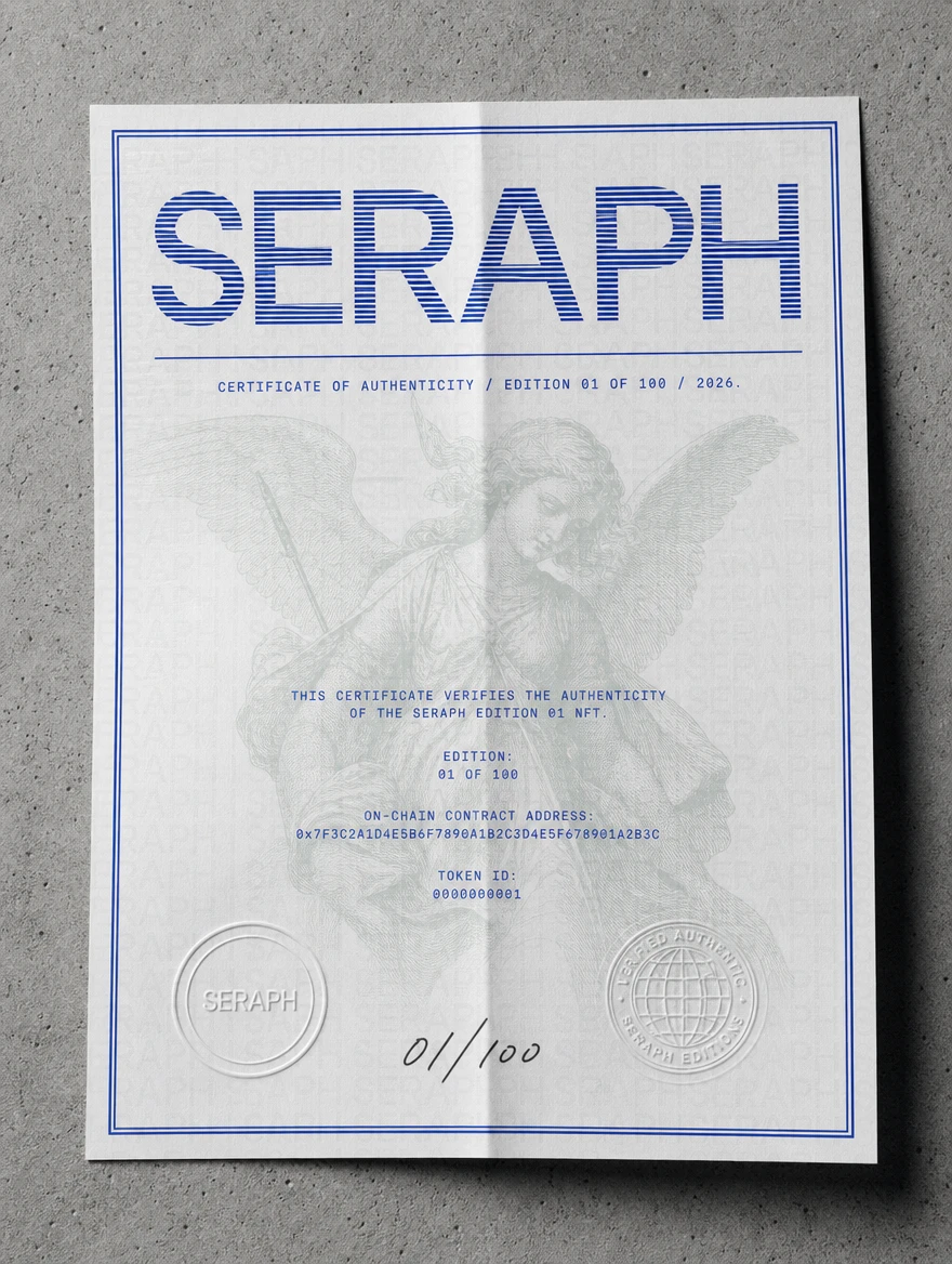
The brand voice: oblique, collector-grade, sacred-institutional. Never explains. Presupposes the reader already belongs. Hero headline: NOT A DROP. AN EDITION. Manifesto opening: SERAPH IS A PHYGITAL ART LABEL. EVERY EDITION IS A LIMITED RUN OF PHYSICAL OBJECTS PAIRED ONE-TO-ONE WITH ON-CHAIN TOKENS. YOU DON'T CHOOSE BETWEEN THE PHYSICAL AND THE DIGITAL. YOU HOLD BOTH OR YOU HOLD NEITHER. Footer line: HOLD THE OBJECT. THE CHAIN HOLDS THE REST.
THE RESULT
SERAPH is currently in development. What exists at this stage is a complete, deployment-ready brand system — identity, visual language, production mockup library, website specification, and copy architecture — built to hold up across every surface a phygital art label needs to occupy.
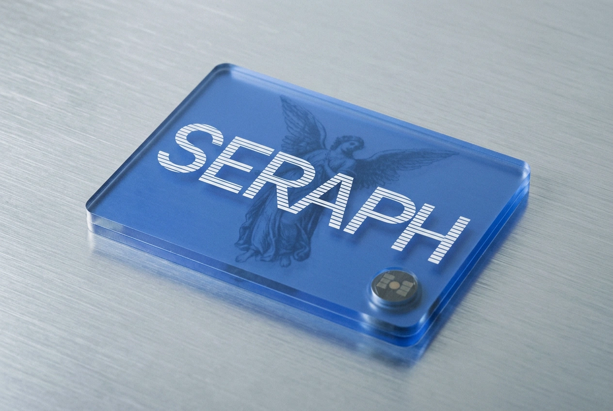
The brand does what I set out to make it do: it looks like it was made by people who understand both registers. The engraving says this is serious. The translucent blue dice say we grew up on the internet. The tension between them is not something to resolve. It is the product.
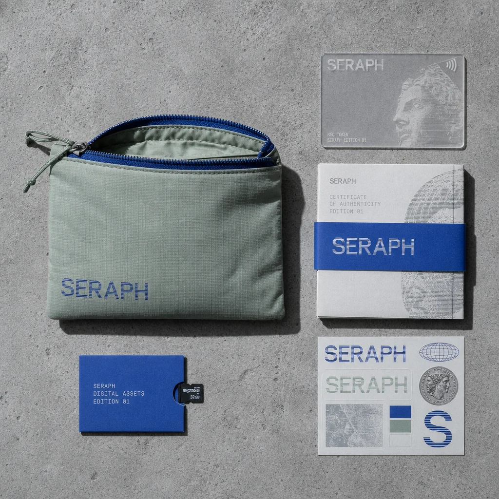
Révolté — revolte.design
Project: SERAPH
Year: 2026
Scope: Brand Identity, Visual System, Typography, OOH Campaign Direction, Packaging Direction, Web Design Specification, Copywriting
Industry: Web3 / Phygital Art / Digital Collectibles
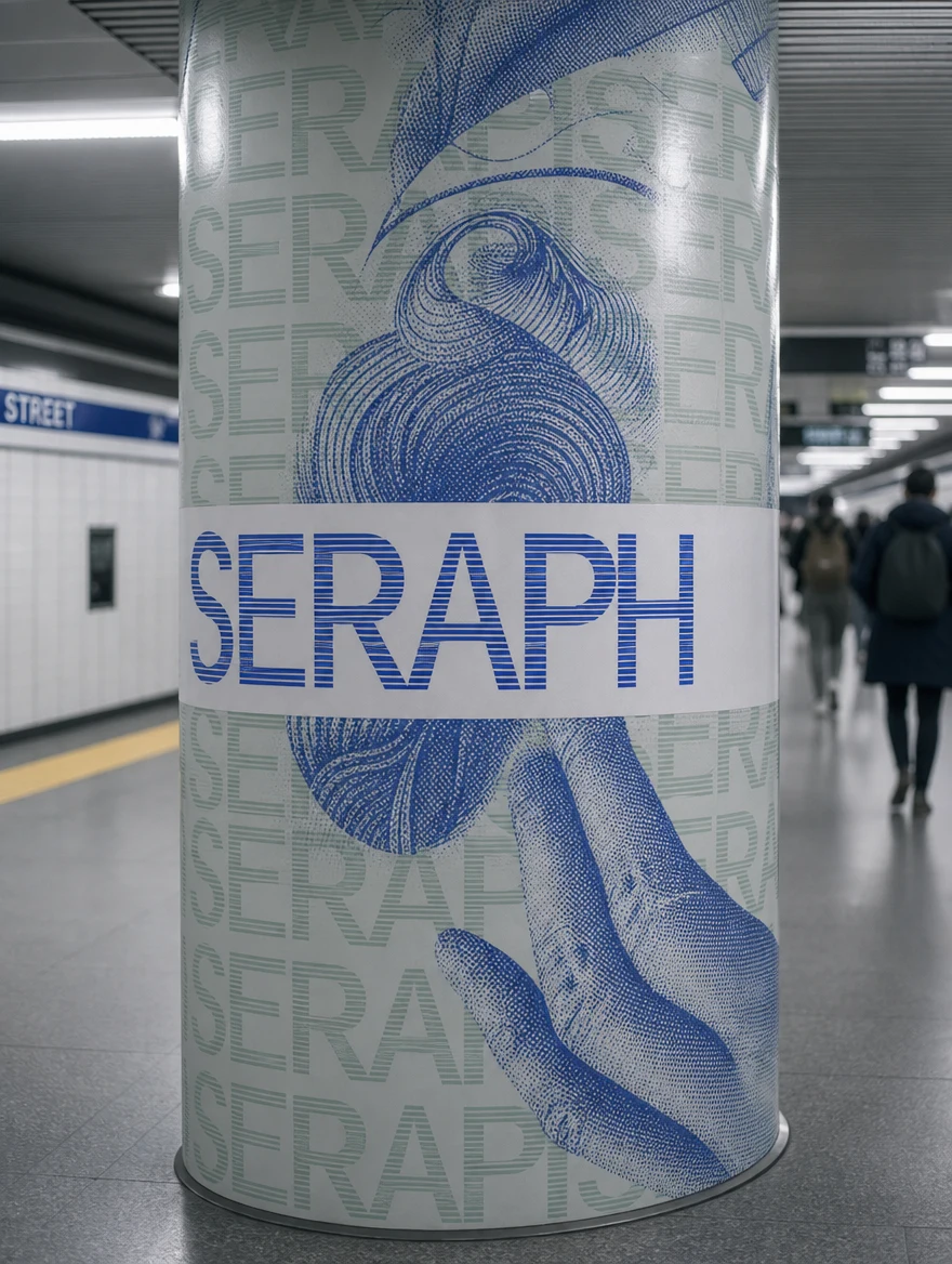
See more at revolte.design
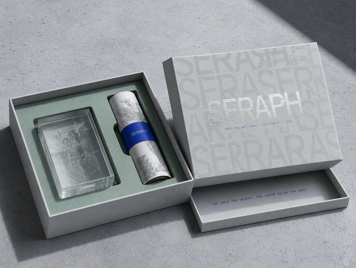
Like this project
Posted May 26, 2026
SERAPH: a phygital art label built on the tension between currency engraving and Y2K translucent plastic, where intaglio meets on-chain.
Likes
7
Views
74
Timeline
May 6, 2026 - May 26, 2026