Built with Lovart
LATRO°: The City, Annotated Brand System

Révolté


LATRO° — The City, Annotated
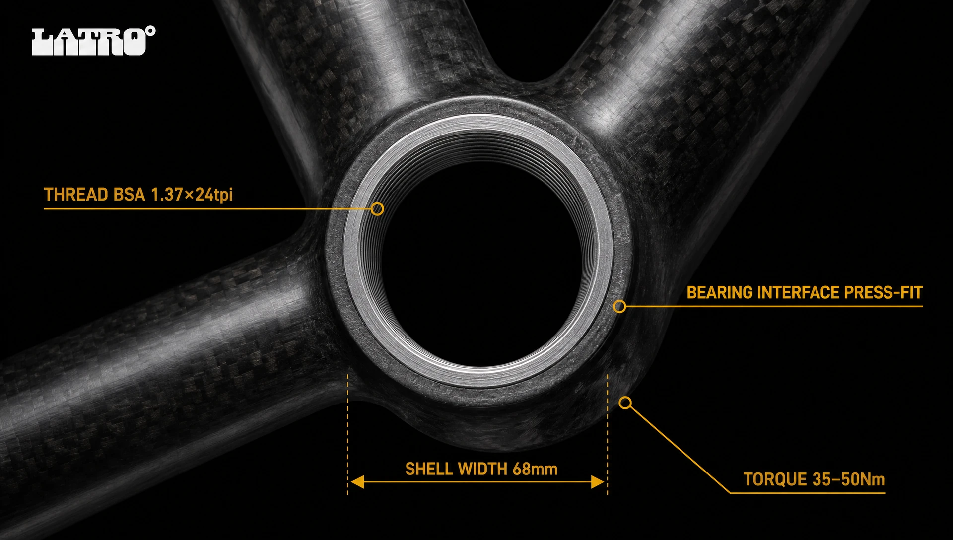
A brand for urban cyclists who treat their commute the way an engineer treats a load-bearing structure. No lifestyle. No athlete posing in golden hour. Just specs, tolerances, and a cityscape that doesn't care how you look moving through it.
THE BRIEF
The brief I set for myself was deceptively simple: build a brand for the urban cyclist who refuses to look athletic. The rider this brand is for commutes on a Colnago or a track build. They wear a field jacket, not a wind vest. They carry a backpack engineered to millimeter tolerances. They are, in their head and everyone else's, closer to architect than athlete — and they've spent years being underserved by brands that want them to look like they just finished a sportive.
The tension in the brief was immediate. Urban cycling gear has two dominant aesthetics: hardcore lycra-and-logo performance, or the sanitized lifestyle brand that puts a fixie in a coffee shop window. LATRO° needed to exist in neither category. It needed to feel like it came from the same world as surgical instruments and aerospace component catalogs — precise, annotated, cold, and quietly confident that the person reading it already knows what they're looking at.
The harder problem: how do you build a brand system around that idea without it becoming pastiche? Technical drawing as aesthetic has been done. The challenge was to make it feel like a system, not a reference.
THE APPROACH
I started with ten directions. Thermal Vision almost won — the idea of the city read as infrared, the body generating heat against cold urban mass, a palette built from deep violet through burn orange. It had tension. The LATRO° wordmark in that color field looked genuinely unsettling in the right way.
I rejected it because it was too atmospheric. Atmosphere was the enemy. The brand I was building needed to have no mood — only data. Thermal Vision was still a feeling. What I needed was a system.
Direction 2 — Instrument Grade — was the one that scared me slightly, which meant it was right. The concept: position every product as a precision instrument, not a consumer good. Photograph a rear cassette the way you'd photograph a watch movement. Annotate a field jacket the way you'd annotate a medical device. Apply OCR-B monospaced type with no hierarchy variation — same weight, differentiated only by scale, because in a technical document, everything is equally important or nothing is.
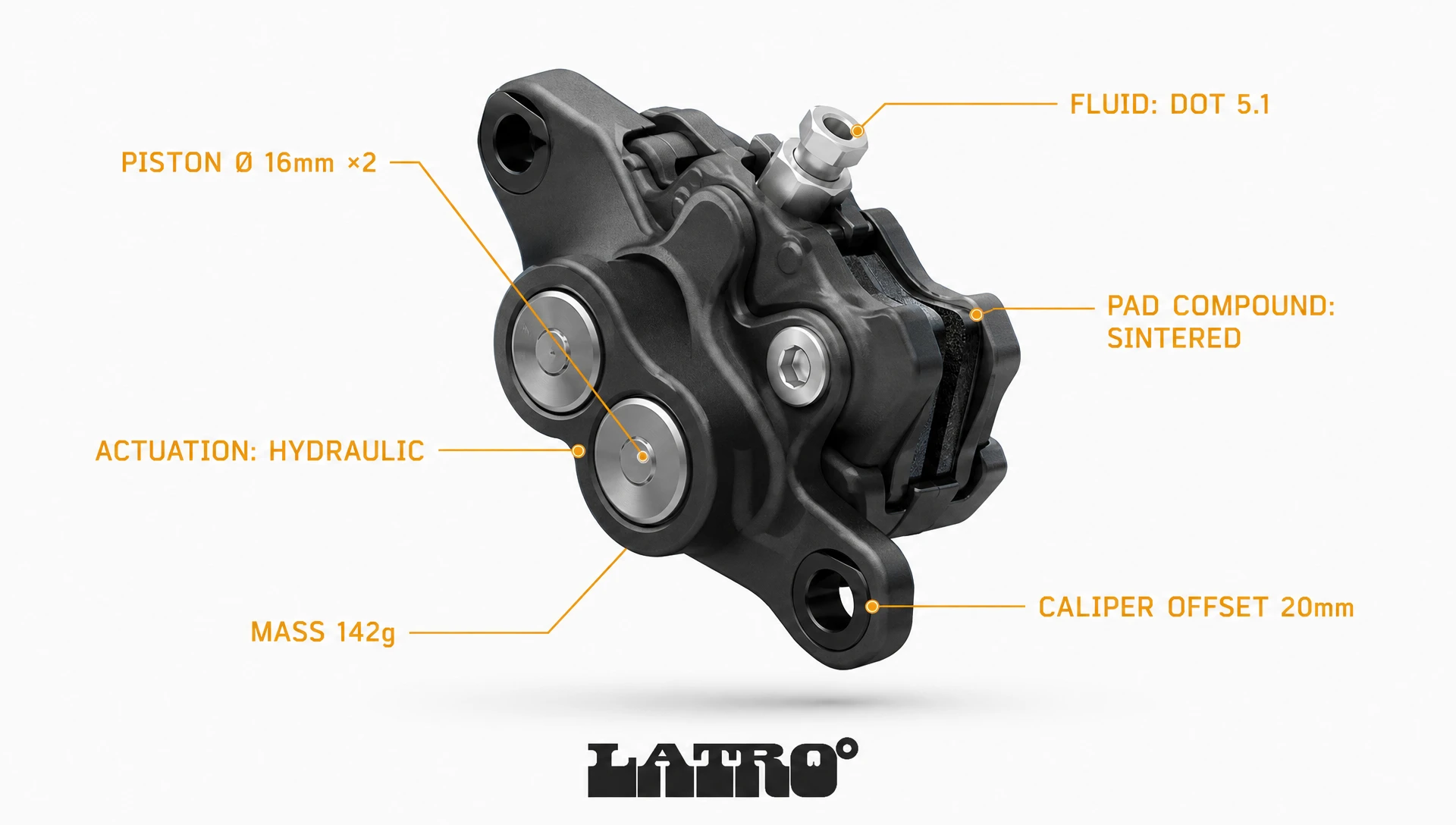
The insight that held the whole system together was this: the spec is the ad. Not a headline. Not a tagline. Not a brand promise. Just the specification — "TOOTH PITCH 3.175mm" — placed in Warning Amber (
#E8A020) on hairline rules radiating from the component, inside a metro billboard. The person who reads that and feels something is exactly who this brand is for. The person who doesn't is not the customer, and that's fine.The logo — lowercase italic "latro°" with the ° mark integrated structurally — reinforced this logic. Italic suggests velocity without performing it. The ° is simultaneously a brand mark, a temperature reference, and a geometric element. It does three things without trying, which is the right number of things for a mark to do.
The color decision was the easiest one I made. Technical Black (
#0D0D0D) and Arctic White (#FAFAFA) as the two grounds — nothing else. Warning Amber (#E8A020) for all annotation text and callout lines, because amber is the color of a warning label, and everything this brand says should feel slightly urgent. Anodized Silver (#9CA3AF) for dimension marks and secondary annotation. Matte Graphite (#3A3A3A) for all product surfaces. The palette has no warmth, no brand-book friendliness. It reads like a component datasheet. That was the goal.THE WORK
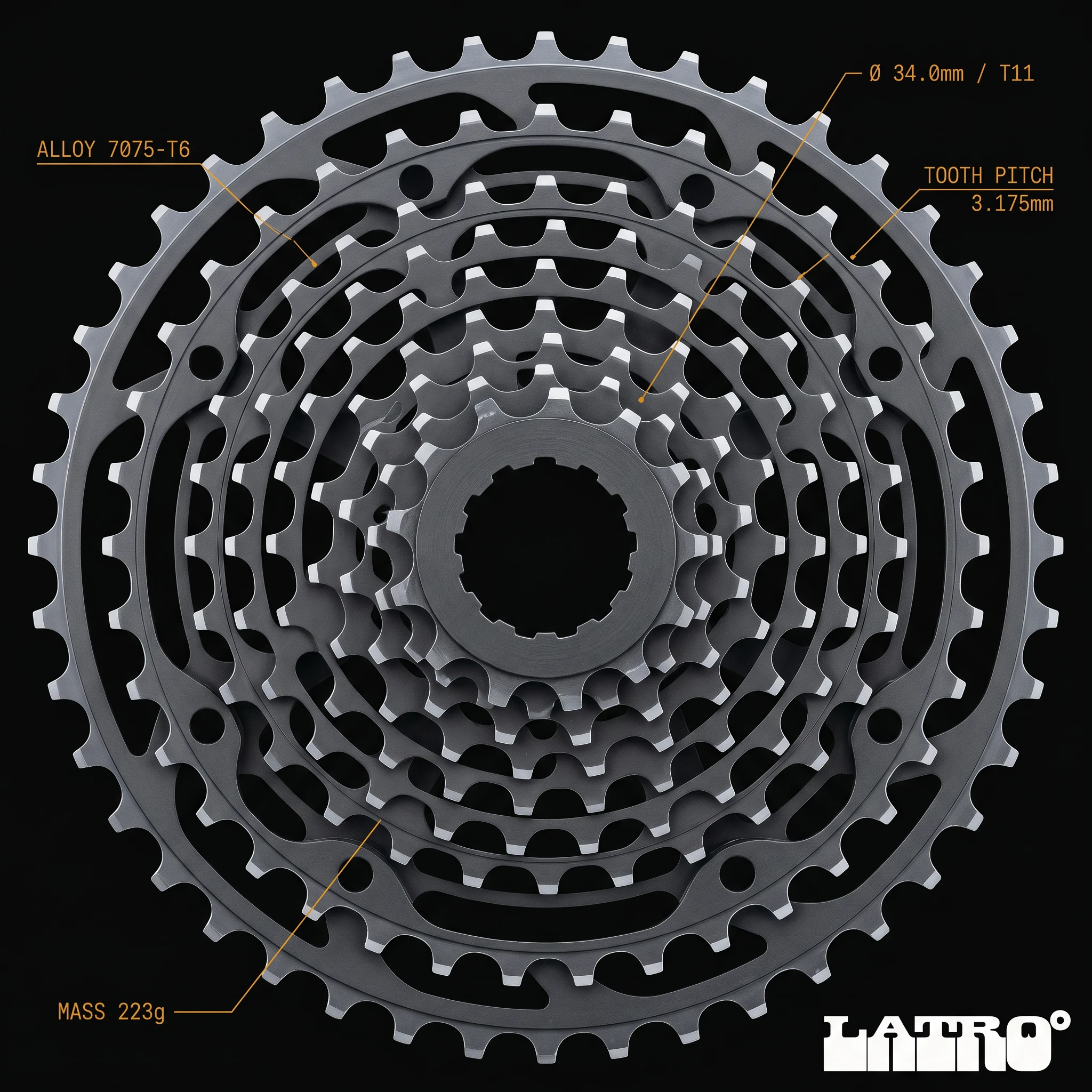
VISUAL SYSTEM
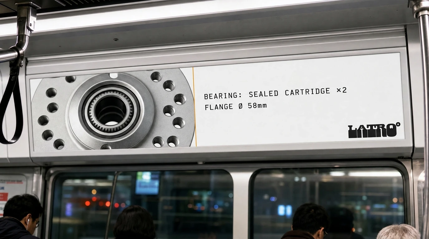
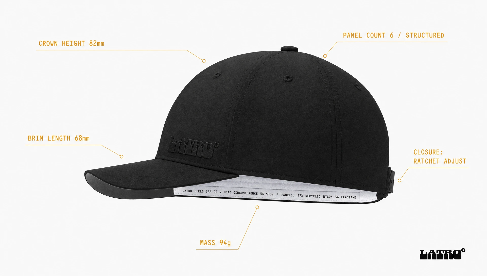
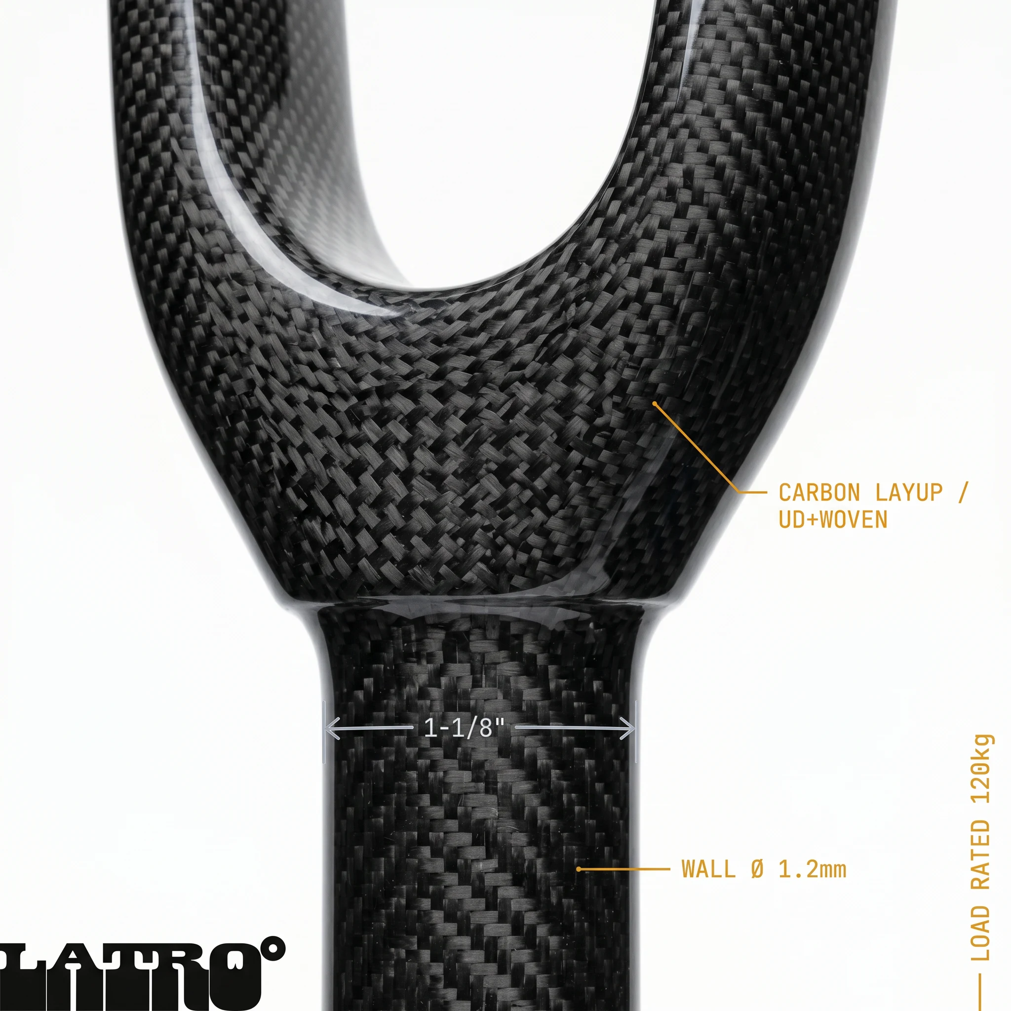
The entire system runs on one rule: no image without annotation. Every photograph becomes a technical document the moment the OCR-B callout lines appear. The annotation is not supporting copy — it is the headline. "CARBON LAYUP / UD+WOVEN" is more arresting than any campaign line I could have written, because it's true, it's specific, and it assumes the reader is intelligent enough to find it interesting.
BICYCLE PHOTOGRAPHY
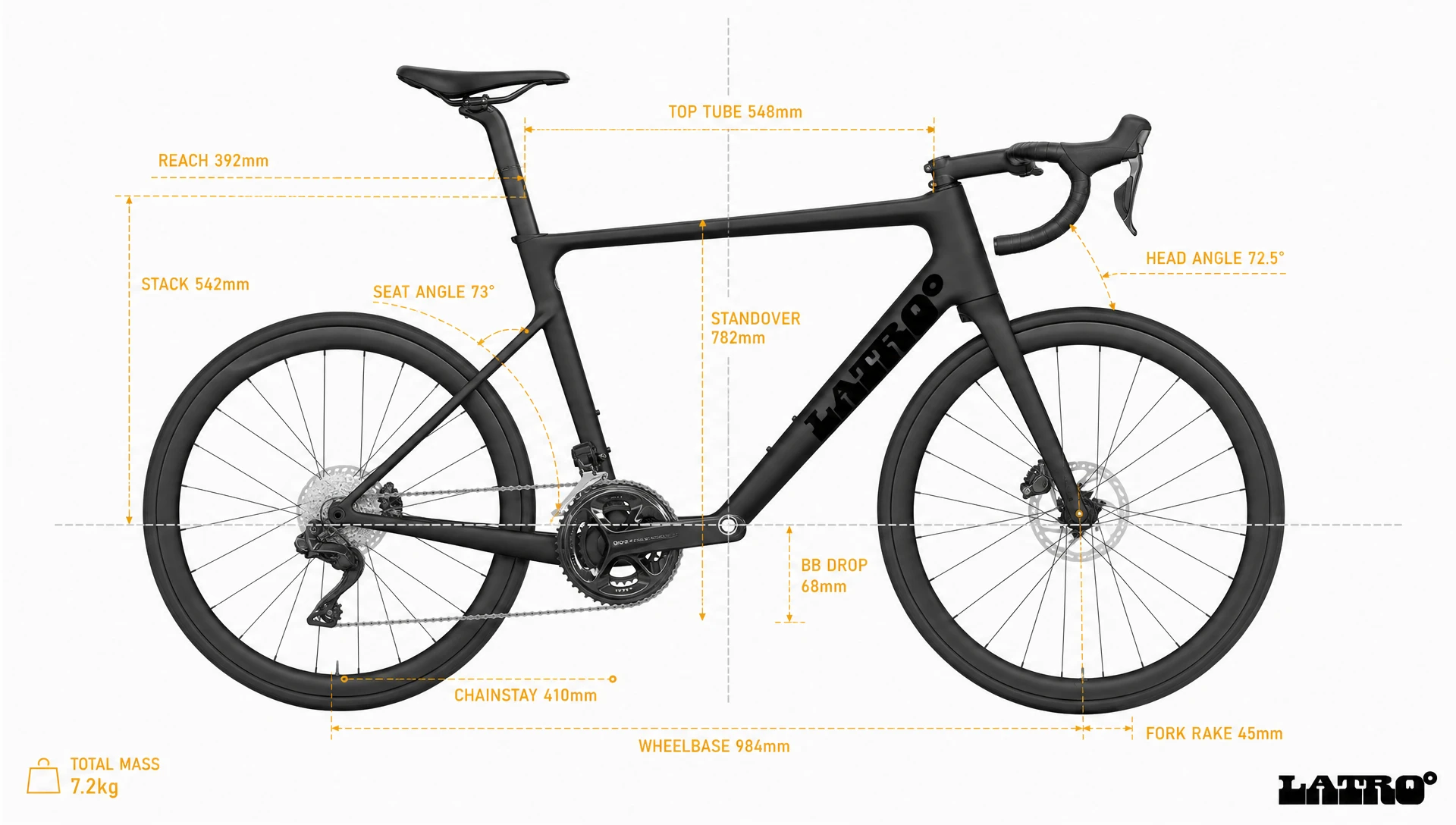
The full bike side elevation is shot as a patent drawing submission — zero perspective distortion, every geometry dimension annotated in Warning Amber, the BB as the coordinate origin. Eleven callouts, same weight, same scale. The frame is the document. The close-up component shots treat each part as a standalone instrument: the cassette dead-on at 90°, the hub flange as a geometric disc, the handlebar bar-end as a perfect circle with the carbon weave reading behind it. Nothing is styled. Everything is recorded.
APPAREL AND ACCESSORIES
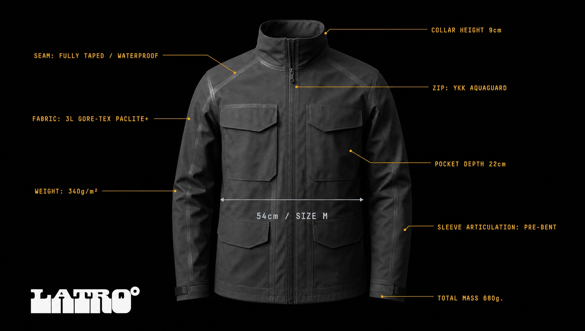
The field jacket on a ghost mannequin, fully zipped, lit by a single cold sidelight, eight annotation lines identifying seam tape, Gore-Tex specification, zip hardware, pocket depth, sleeve articulation, and total mass. The bib shorts in perfect orthographic overhead flat lay, chamois panel and compression grade annotated with the same clinical indifference. The baseball cap in true side elevation, every panel and closure identified. The backpack in 3/4 angle with dimensional arrows. The gloves paired and mirrored — 240 grip nodes per glove, documented.
OUT-OF-HOME ADVERTISING
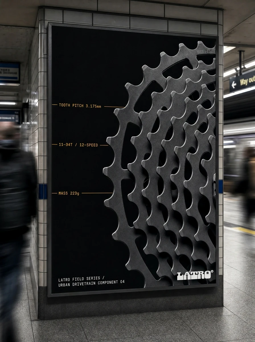
The outdoor work is where the system became a campaign. The metro platform billboard takes the cassette close-up and crops it to near-abstraction — only the upper-right quadrant visible, sprocket teeth reading as pure geometric pattern. Three amber annotation lines. Product code bottom left. Logo bottom right. No tagline. The metro car card runs the hub flange dead-on across the left 40% of a horizontal panel, the right 60% white space, one amber hairline rule dividing them. The tunnel banner is six meters of handlebar highlight line running edge to edge at eye level — almost invisible until you're close enough to read the callouts.
TYPOGRAPHY SYSTEM
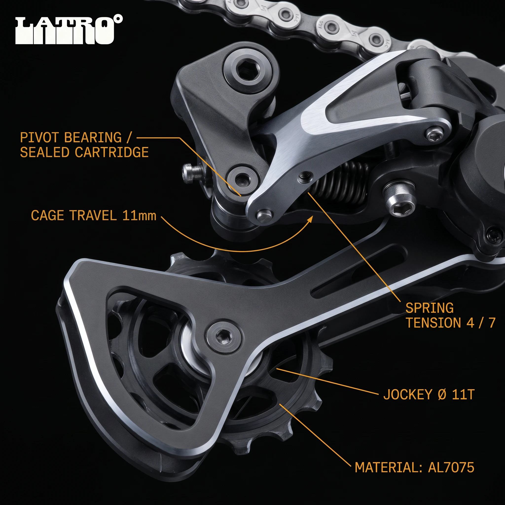
OCR-B throughout. No exceptions. No hierarchy variation by weight — size is the only differentiator. The monospaced grid created by OCR-B reads as data output, not design. That was the intention. Every annotation line terminates in a spec. Every spec is a complete sentence.
THE RESULT
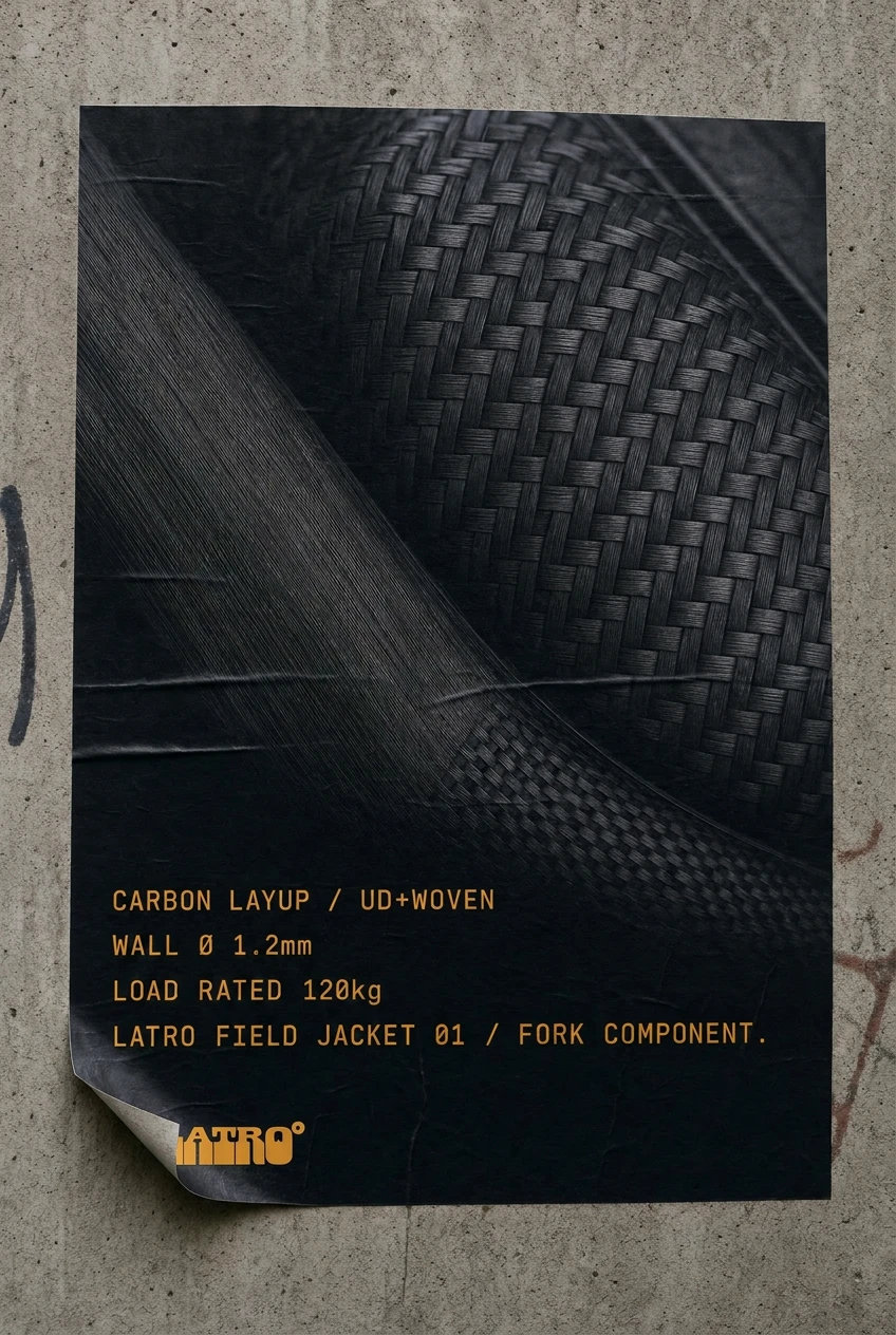
LATRO° is a self-initiated speculative brand, which means the client was the idea, and the idea had to be rigorous enough to justify the system. What I wanted to prove was that technical language could function as brand voice — that the annotation overlay format could carry a full campaign across product, apparel, and OOH formats without ever losing coherence.
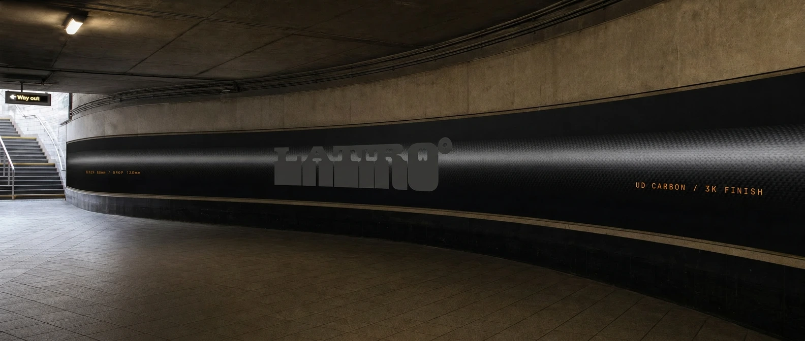
It held. The system scales from a 5×3cm woven garment label to a six-meter tunnel banner without changing a single rule. The spec is always the headline. The Warning Amber is always the carrier. The OCR-B never adjusts to be friendlier. The logo is always a stamp, never a statement.
The brand this became is for the commuter who reads "BEARING: SEALED CARTRIDGE ×2 / FLANGE Ø 58mm" on a metro car card and thinks: yes. That's the audience. That's the entire brief.
Révolté — revolte.design
Project: LATRO°
Year: 2026
Scope: Brand Identity, Visual System, OOH Advertising, Product Mockups, Apparel Design Direction, Accessory Design Direction
Industry: Urban Cycling / Performance Apparel
See more at revolte.design
Like this project
Posted May 24, 2026
LATRO° is an urban cycling brand built on one rule: the spec is the ad. No lifestyle photography, no athlete posing in golden hour, no brand promise.
Likes
2
Views
43
Timeline
May 15, 2026 - May 24, 2026