Built with Lovart
Ziru Identity System Development
Révolté
ZIRU — The Silence Between Values
A diagnostic platform that needed to look as certain as the data it returns. No reassurance. No wellness softness. Just measurement, rendered with the precision of the instruments that make it possible.
THE BRIEF
Ziru is a precision health platform — blood work, biomarkers, longitudinal tracking. The kind of product that sits at the intersection of medicine and data, where every design decision either builds trust or destroys it.
The brief was deceptively simple: make it feel calm and clinical without looking like a pharmacy. The real problem underneath that was harder — almost every health brand in this space has chosen one of two failure modes. Either it goes soft (gradients, affirmations, wellness-speak) or it goes cold (fluorescent, institutional, anxiety-inducing). Ziru needed a third path.
What I took on was the full identity system — logo, typography, color, physical packaging, digital UI, apparel, environmental signage. The scope was broad enough that every decision had to be a system decision. Nothing could be designed in isolation.
THE APPROACH
My first instinct was to look at the wrong references. I started where most people start with health brands — clean sans-serifs, white space, a restrained palette. It was technically correct and completely lifeless.
What unlocked it was a different archive entirely: Japanese pharmaceutical packaging from the 1970s and 80s. Meptin. Hi-z. Otsuka MV. These weren't designed to be beautiful — they were designed to be exact. Information was the visual. Typography was the structure. Color was functional, not decorative. The entire surface of the package was either data or void — nothing in between.
I added a second reference layer: the specimen label. Not the aesthetic of it, but the logic. A specimen label has a precise job — it identifies an object, encodes its origin, records its chain of custody. It doesn't try to be liked. It tries to be right. That became the organizing principle for the entire Ziru system: every touchpoint should read like a very well-designed specimen label.
The constraint that made everything click was deciding that the
#4A6FA5 instrument blue would be used for one thing only — live data signals. Not decoration, not brand color in the traditional sense. A calibration mark. The moment I set that rule, every other color decision became easy.THE WORK
LOGO
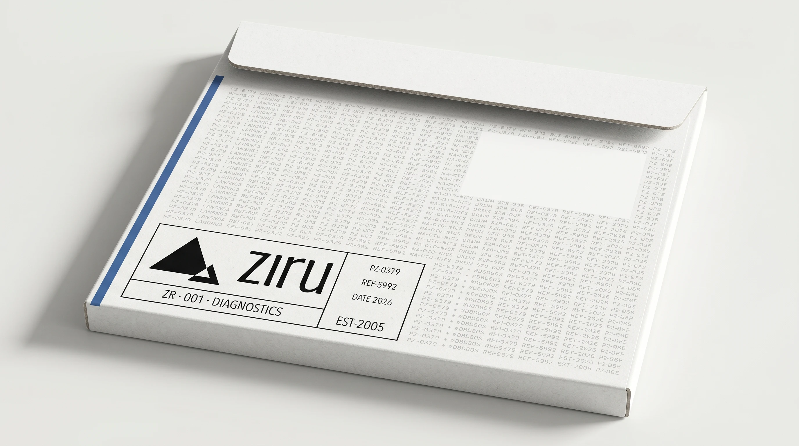
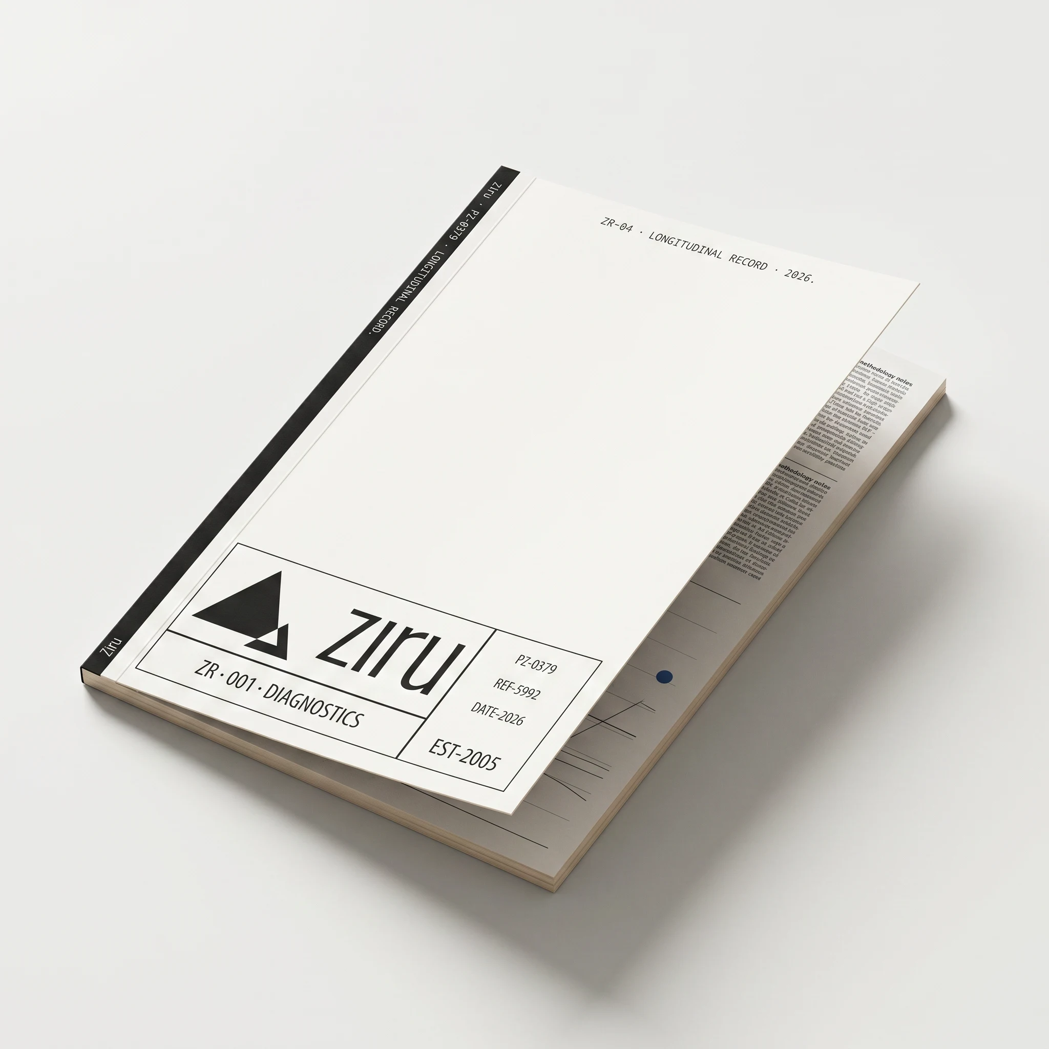
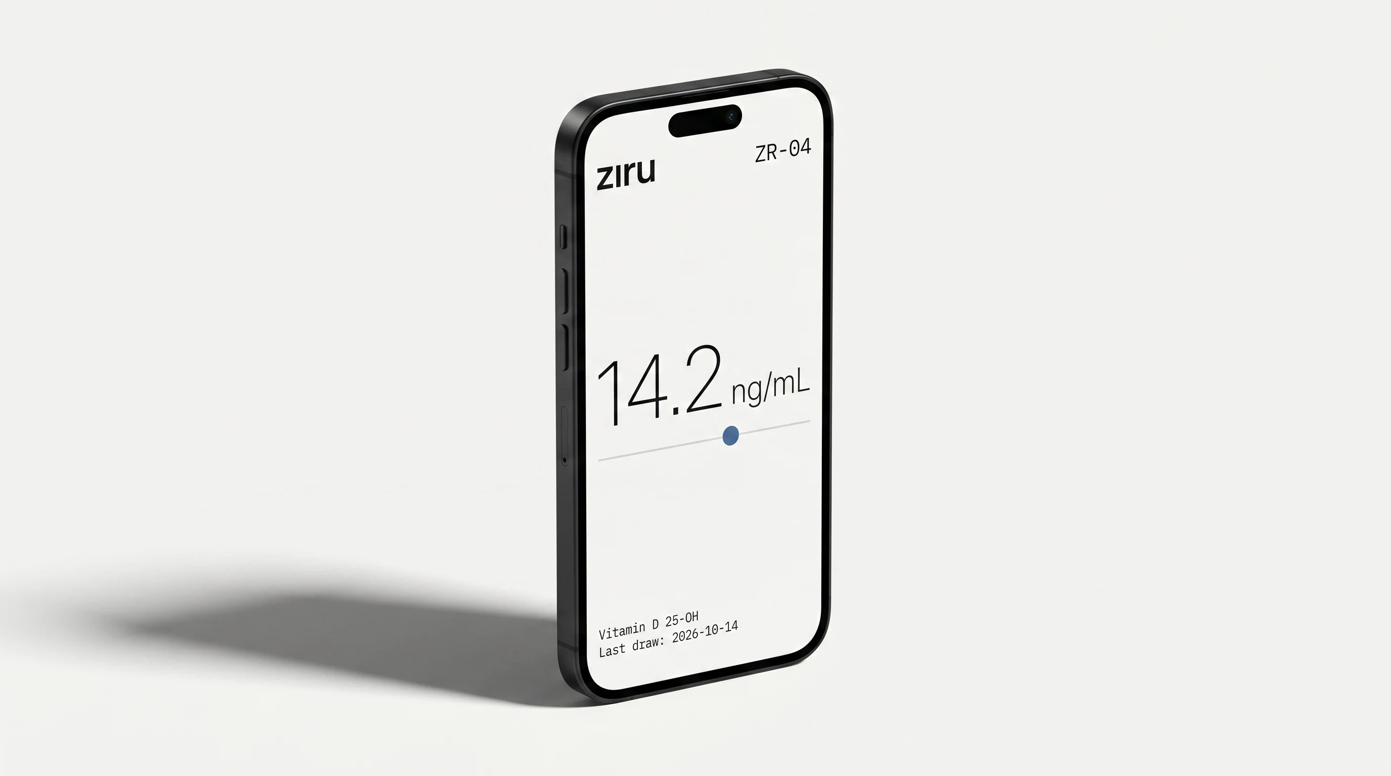
The mark is a monolinear mountain Z — two triangles, stacked, constructed on a strict grid. No optical corrections, no humanization. It reads like a topographic elevation marker or a data peak — intentionally ambiguous between the geometric and the scientific. The wordmark "ziru" sits in Suisse Int'l Thin at +120 tracking, all lowercase. The full lockup is a grid-divided classification block: logo and wordmark in the left field, micro-reference data (PZ-0379 / REF-5992 / DATE-2026) stacked in the right column, "ZR · 001 · DIAGNOSTICS" and "EST-2005" in the bottom row. The entire mark reads like a stamped specimen identifier.
TYPOGRAPHY SYSTEM
Two typefaces, two jobs. Suisse Int'l Thin handles everything human-facing — names, labels, navigation, body copy. IBM Plex Mono handles everything data-facing — values, ranges, codes, timestamps. The contrast between proportional and monospaced is the primary typographic signal in the system. Hierarchy is achieved through size and spacing alone — no bold, no italic, no color outside of the accent rule.
COLOR SYSTEM
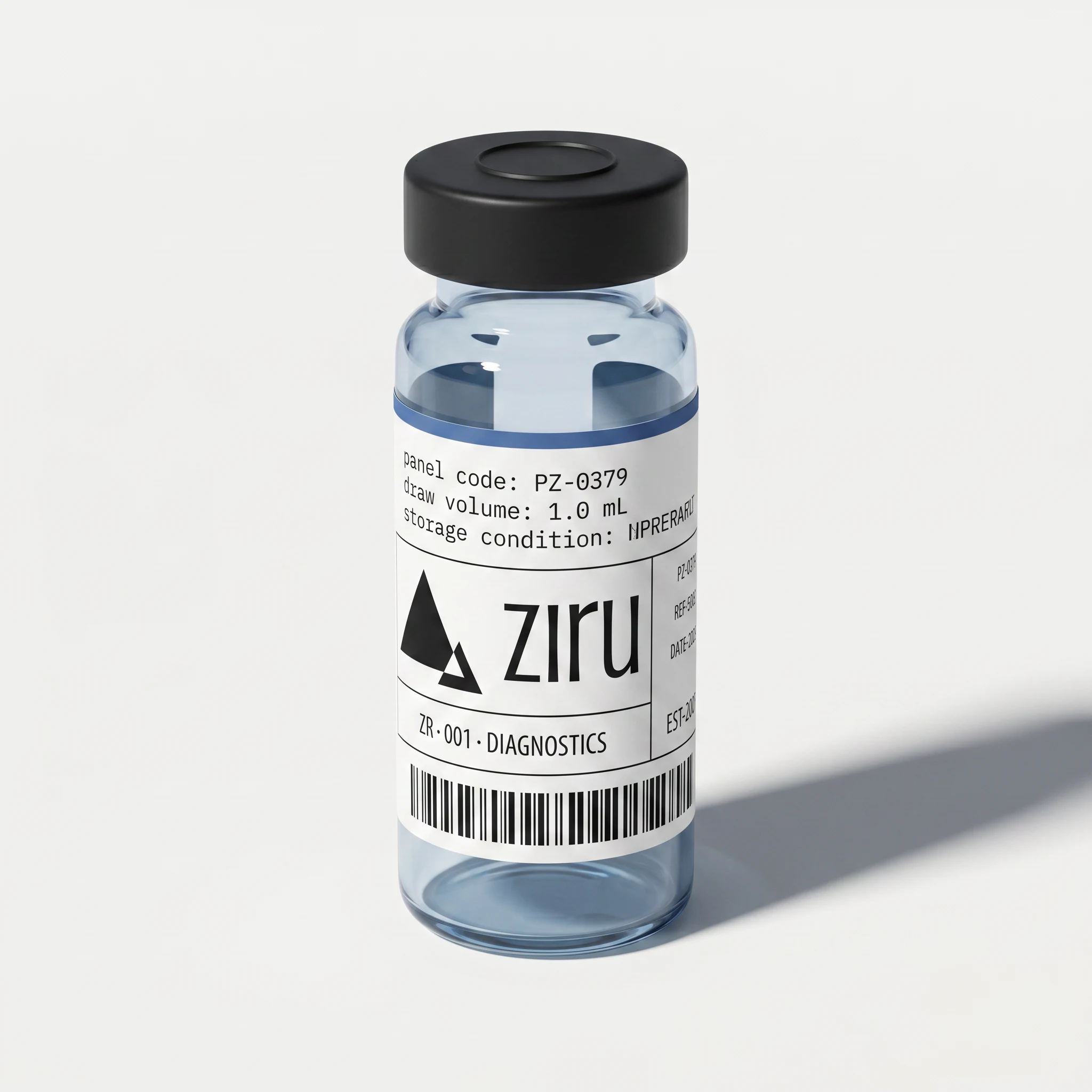
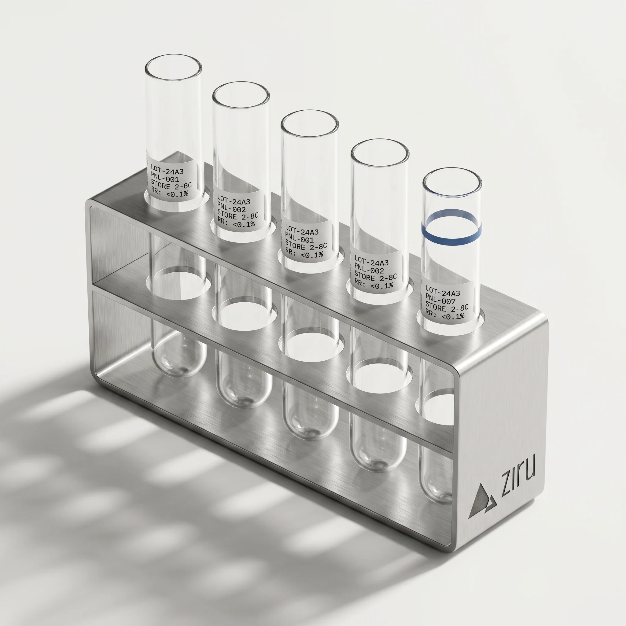
#F6F6F4 is the entire surface — slightly warm, so renders feel material rather than sterile. #111111 is primary text, slightly warm to match. #D8D8D6 handles structural elements: hairline rules, dividers, secondary information. #4A6FA5 appears only as a data signal — a single filled circle on a range bar, a 2mm edge band on a physical object, the date field in the logo cluster. Never decorative. Never large.PACKAGING — TEST KIT BOX
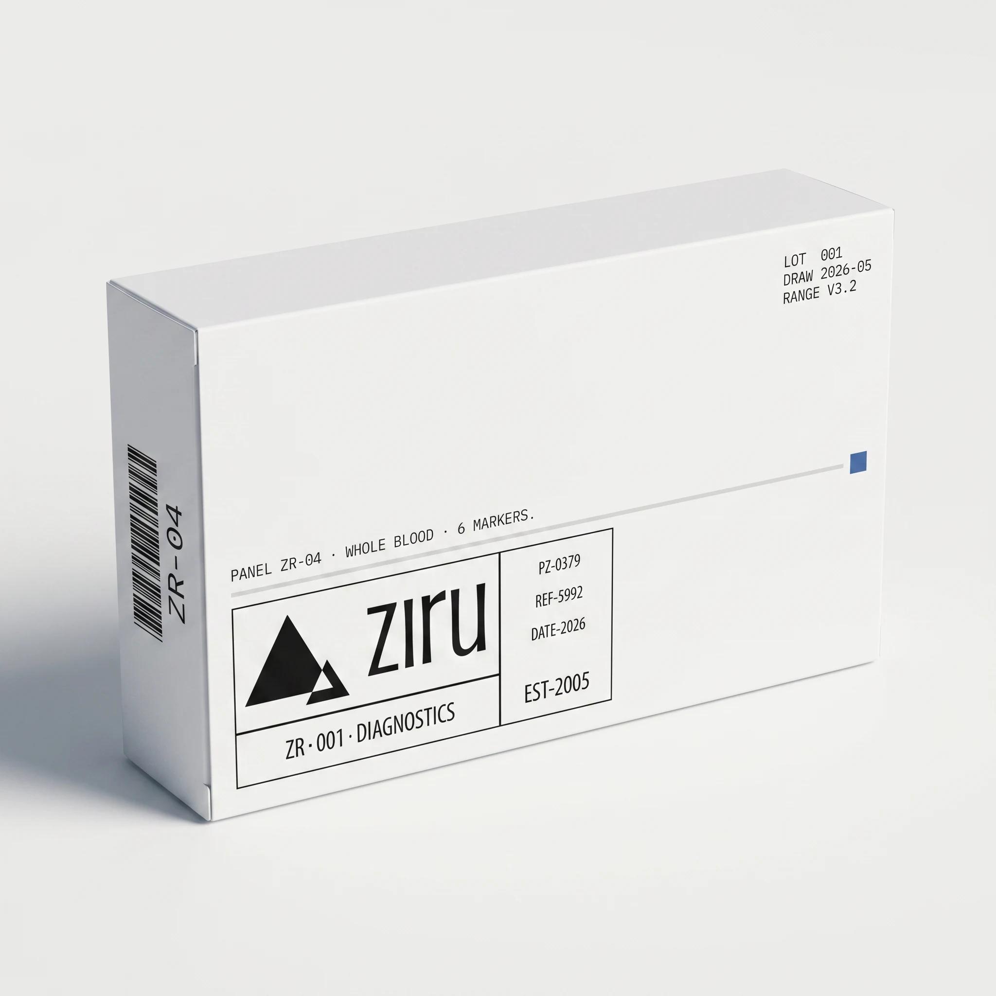
Matte white medical-grade cardboard. The primary face is almost entirely void — logo lockup bottom-left, a single micro-label line above it, a hairline rule across the full width with a 2mm blue calibration square at the right end. The side panel carries a vertical barcode and panel code. The information density is low and precise — nothing that doesn't need to be there is there.
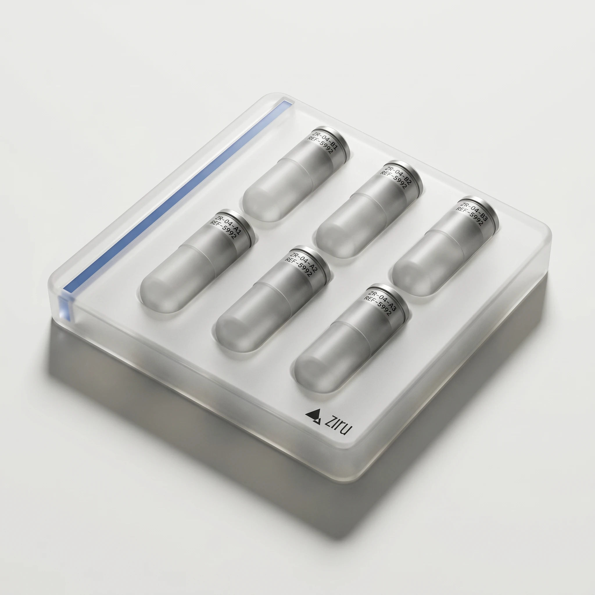
FROSTED POLYPROPYLENE COLLECTION KIT
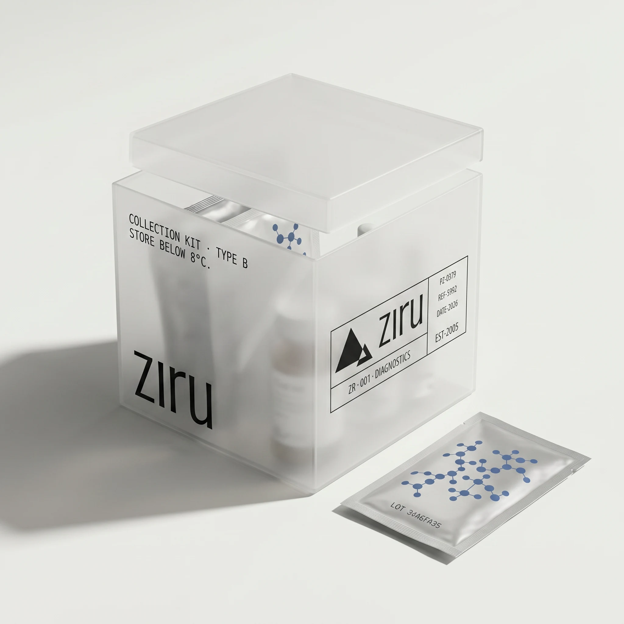
The material does most of the work — semi-opaque walls that blur the contents into soft shapes, typography that appears to live inside the plastic rather than on top of it. The molecular dot pattern on the foil sachet is the only graphic element in the entire system that isn't purely typographic.
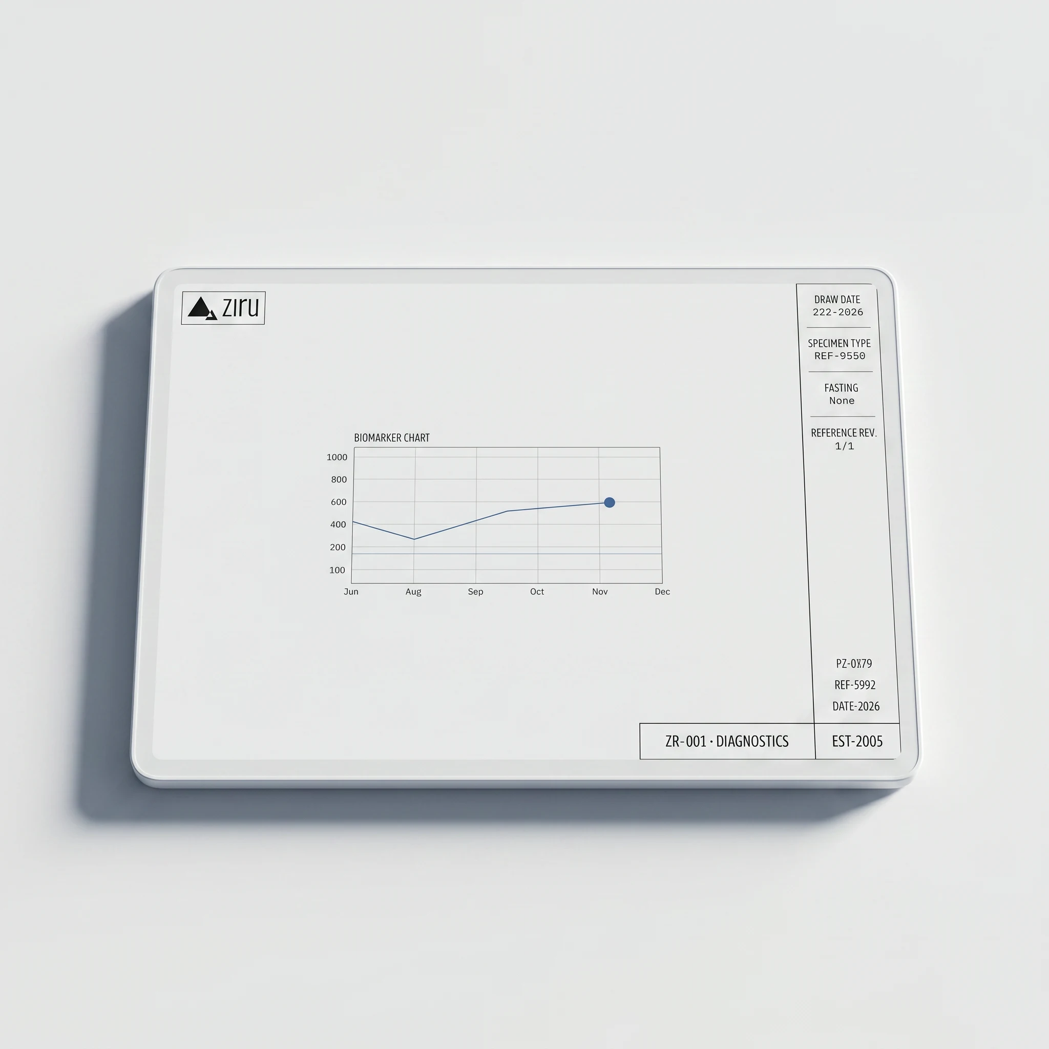
DIGITAL — DASHBOARD + MOBILE
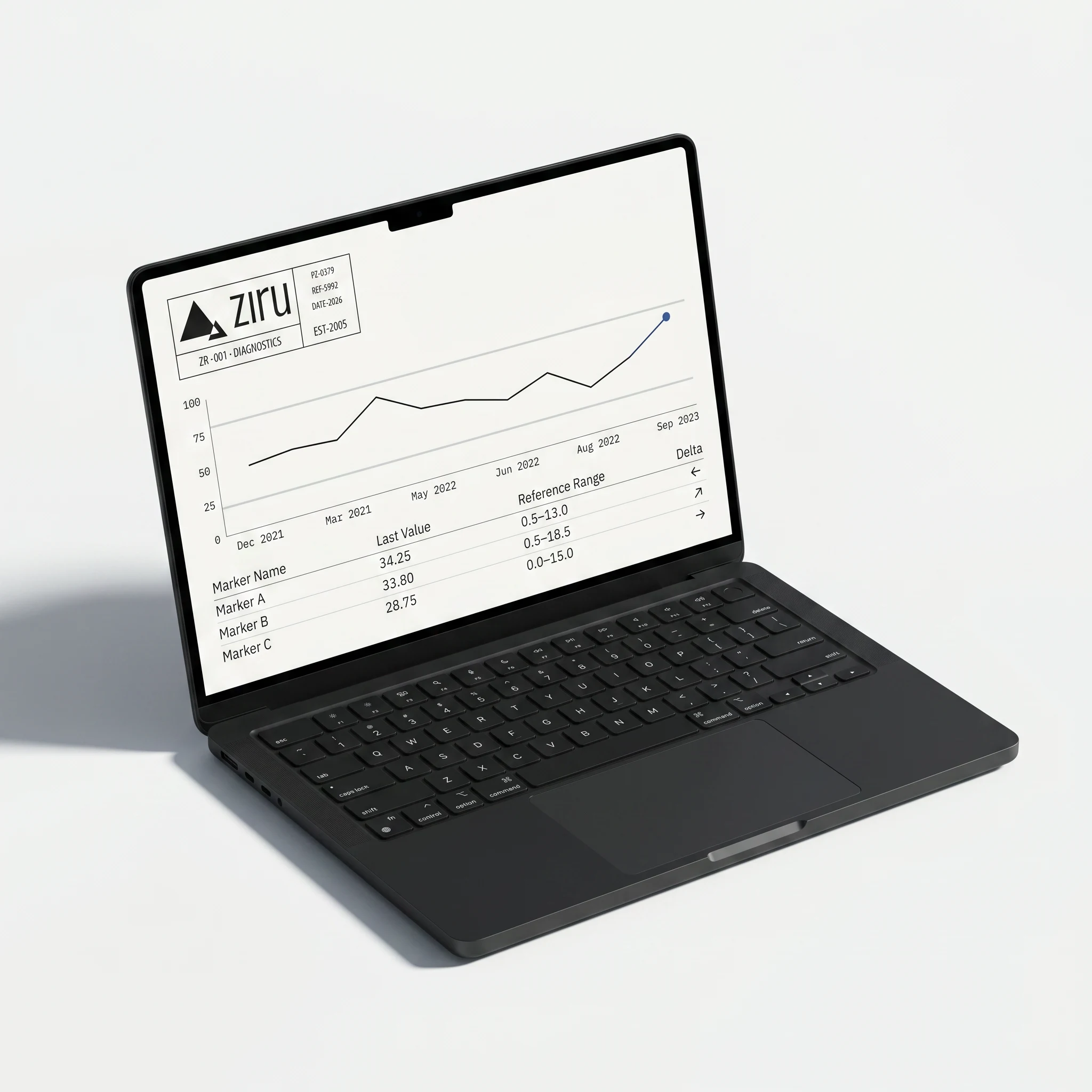
The desktop dashboard applies the specimen label logic to UI: information in defined zones, the rest is surface. The longitudinal chart uses a single hairline trace in
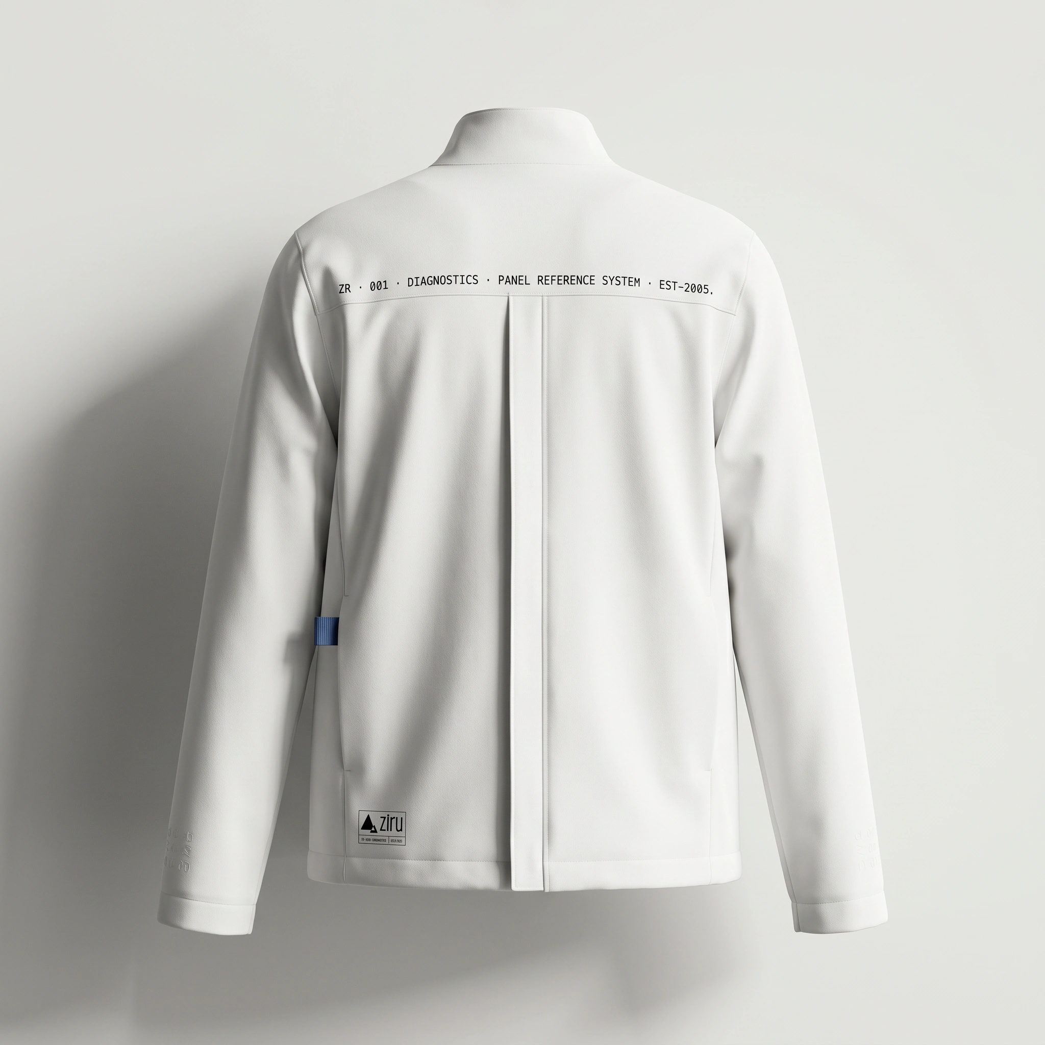
#111111, one #4A6FA5 data point marking the most recent draw. The reference range is shown as two #D8D8D6 horizontal rules — the healthy band. No alarm states, no traffic light logic. The mobile screen shows a single biomarker value at large scale, a range bar with one positioned dot. That's the entire UI.APPAREL
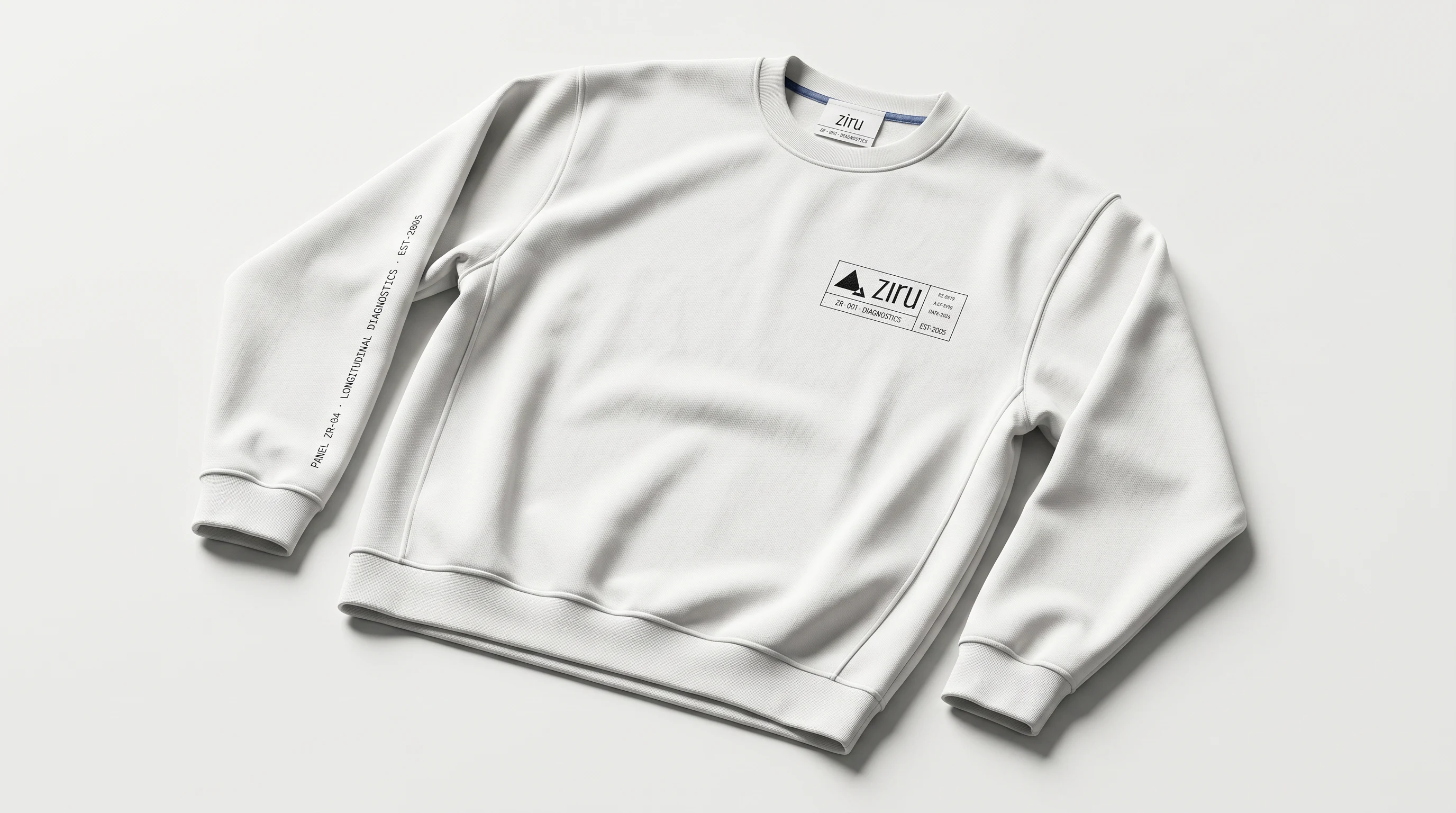
The crewneck and zip jacket apply the same logic to fabric. Logo lockup on the chest, sleeve text running vertically in monospace, interior woven label with the
#4A6FA5 accent as a single thread stripe. The garments are #F6F6F4 — identical to the surface they're rendered on, so they read through shadow and texture rather than contrast.THE RESULT
The system shipped across fifteen distinct touchpoints — physical, digital, environmental, apparel. What held it together wasn't a visual style but a behavioral rule: every surface is either information or intentional void. Nothing in between.
The work sits in Révolté's portfolio as a demonstration that health brands don't have to choose between clinical and human. Precision is its own form of care.
Studio: Révolté — revolte.design
Project: Ziru
Year: 2026
Scope: Brand Identity, Visual System, Packaging, Digital UI, Environmental Signage, Apparel
Industry: Health & Diagnostics
See more at revolte.design
Like this project
Posted May 15, 2026
Ziru, precision diagnostics identity. Specimen label logic, structured silence, data as the only decoration.
Likes
3
Views
17
Timeline
May 1, 2026 - May 15, 2026