Built with Lovart
SERO Brand Identity and Character System Development
Révolté
SERO — Calibrate, Don't Perform
A mental health brand built around emotional precision — not comfort, not positivity, not the usual visual language of wellness. The answer was a character that doesn't smile on command.
THE BRIEF
Mental health brands almost always make the same mistake: they try to make you feel better before they understand you. Soft gradients. Round type. Illustrations of people looking peacefully out of windows. I wanted to build something that operated in a different register entirely — closer to a tuning fork than a spa.
SERO started as a positioning exercise: emotional calibration. Not therapy. Not self-help. The idea that your inner life is a frequency you can learn to read, not a problem to be fixed. The tension in the brief was immediate — how do you make something feel precise and clinical without feeling cold? How do you make something warm without performing warmth?
What I didn't expect was how quickly the mascot became the answer to that question.
THE APPROACH
My first instinct was logomark-first — a clean abstract form, a continuous line, something referencing signal or breath or calibration. I wrote five directions. All of them were technically competent and completely forgettable. The problem was that emotional calibration is not an abstract concept — it's something that happens to a person, inside a body, with all the messiness that implies. A geometric mark wasn't going to carry that.
I went back to the reference images I'd been sitting with: a collage of a flower eye with riso typography layered over it, an abstract knotted organic form in deep green, and — most importantly — two illustration references where cartoon characters lived inside real-world environments. Thick outlines. Flat color. Weird anatomy. Characters that existed in the middle of something rather than posed for a portrait.
That's where SERO the character came from. Not designed as a logo — designed as an entity. Something that carries the brand's emotional logic in its body, not in an abstract shape.
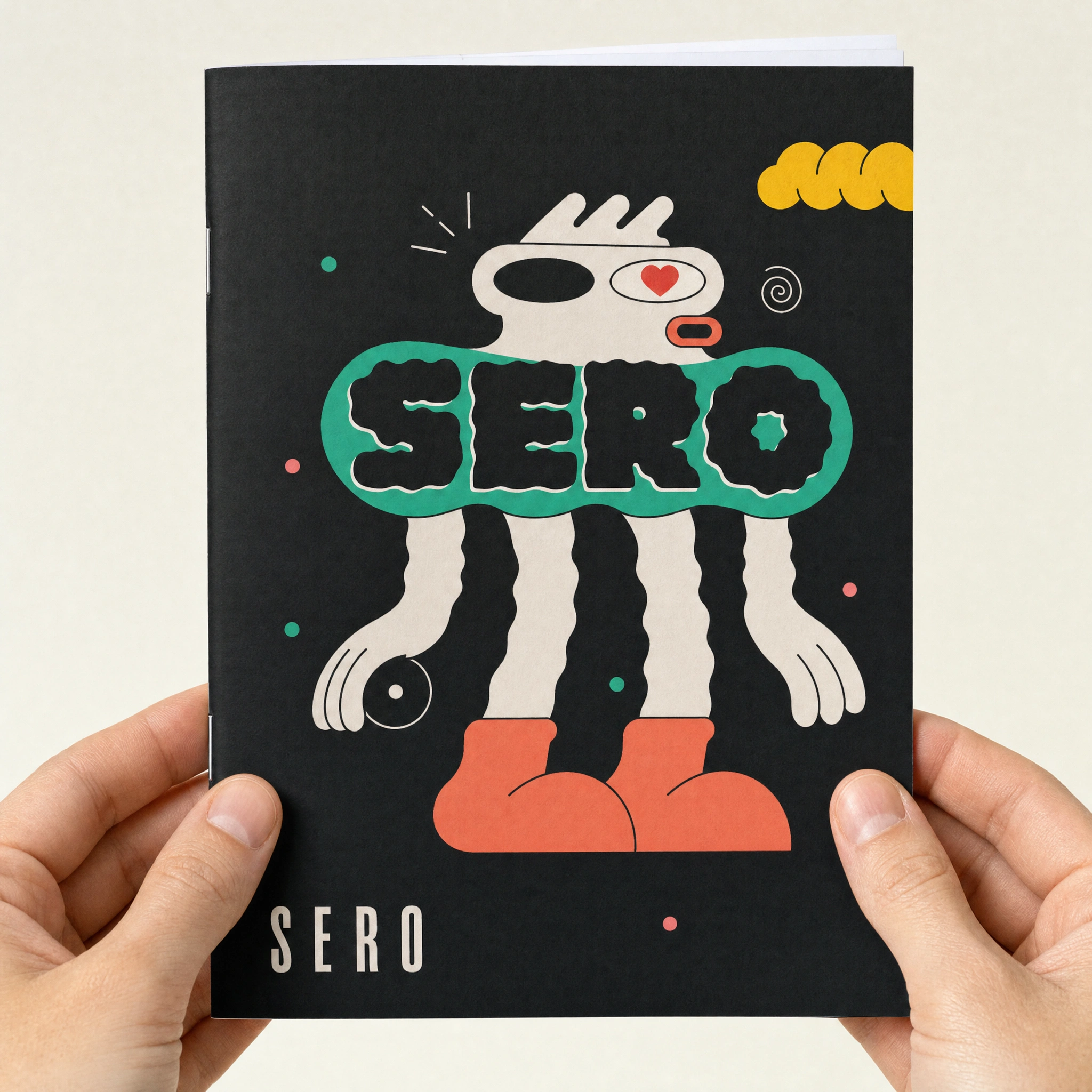
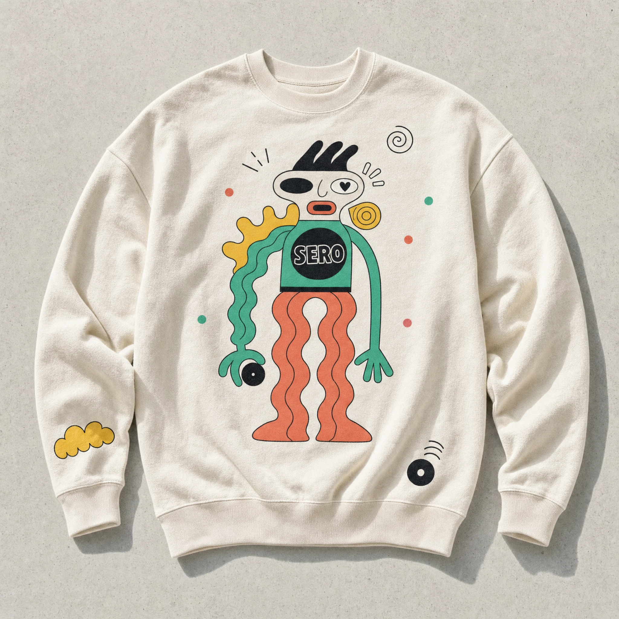
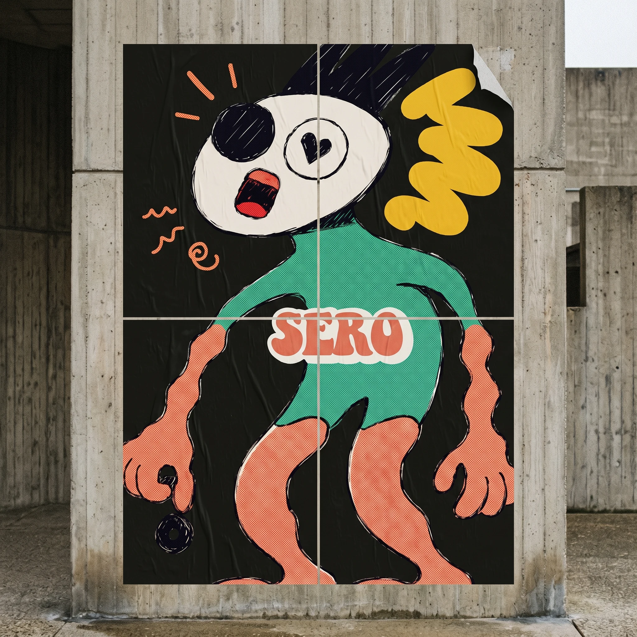
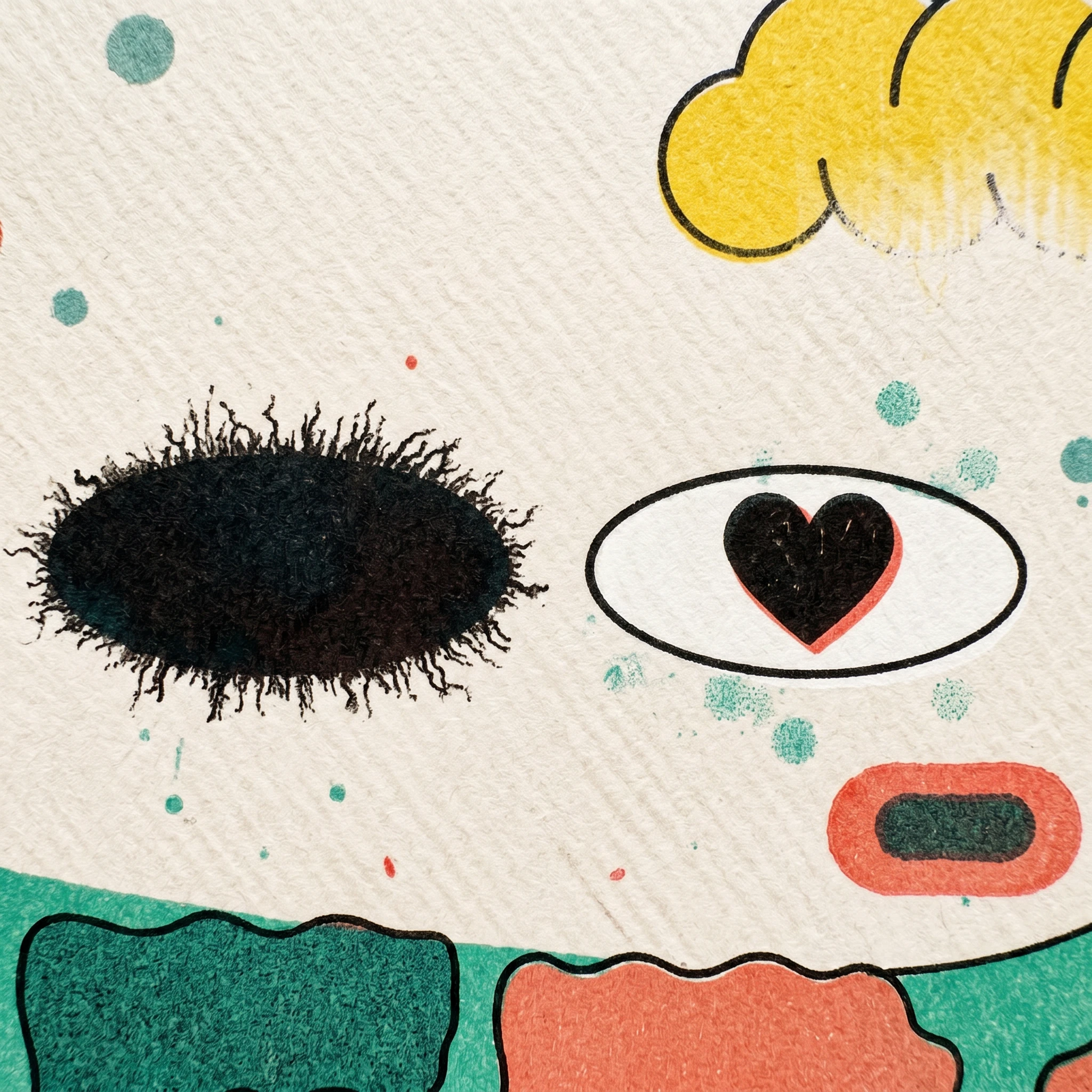
The mismatched eyes were the first locked decision. Left eye: a flat black oval void — closed, absent, or turned inward. Right eye: a white oval with a small hand-drawn heart as the pupil — present, soft, attentive. The two eyes together say everything the brand needed to say about the emotional interior: one part that shuts down, one part that stays open. No tagline required.
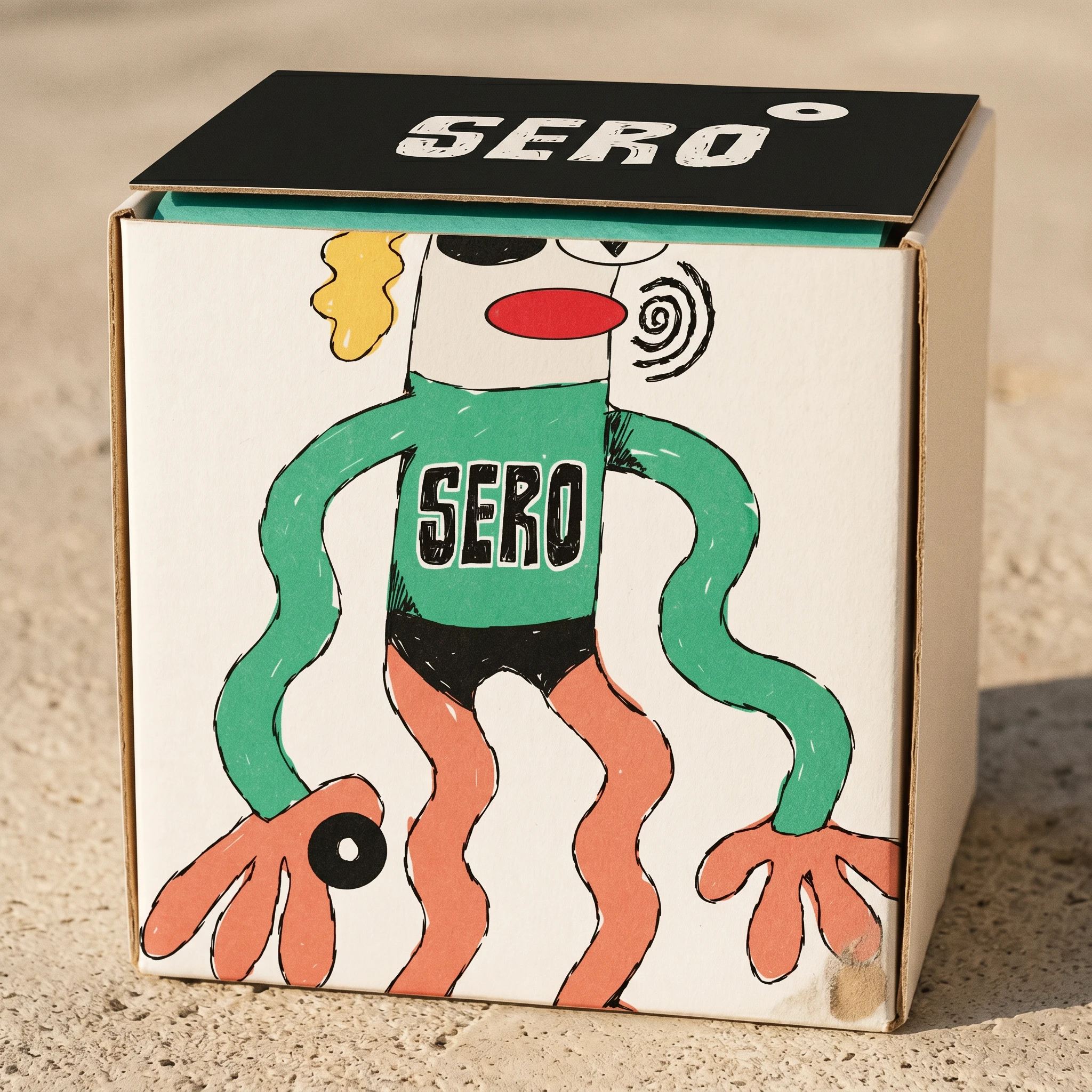
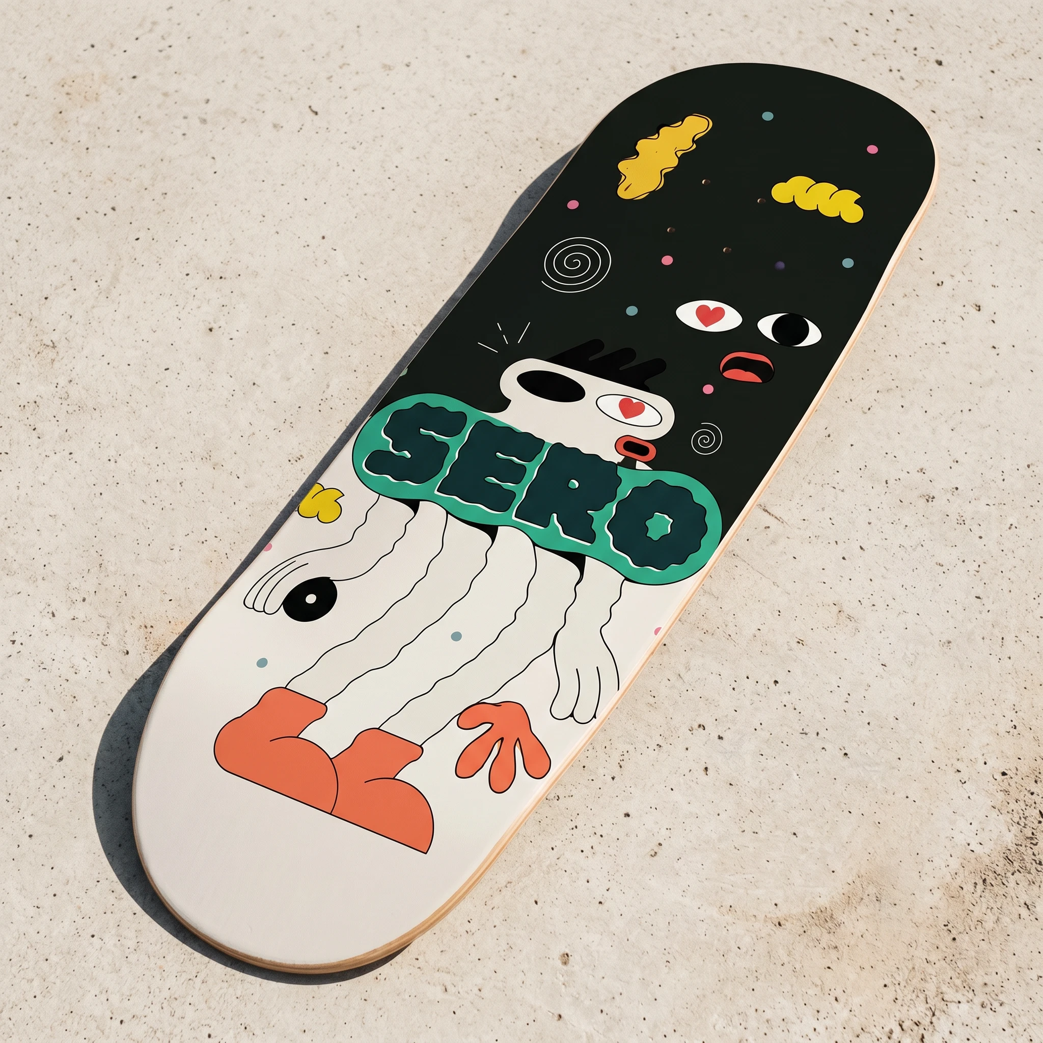
From there the character built itself: a teal torso with "SERO" hand-lettered directly onto the chest, coral noodle limbs with irregular wavy edges, black spiky hair always expressive, six different poses that each carry a different emotional register without ever being resolved or comfortable. I didn't lock one pose as the logo. All six are the logo. The character system is the brand system.
THE WORK
MASCOT / CHARACTER SYSTEM
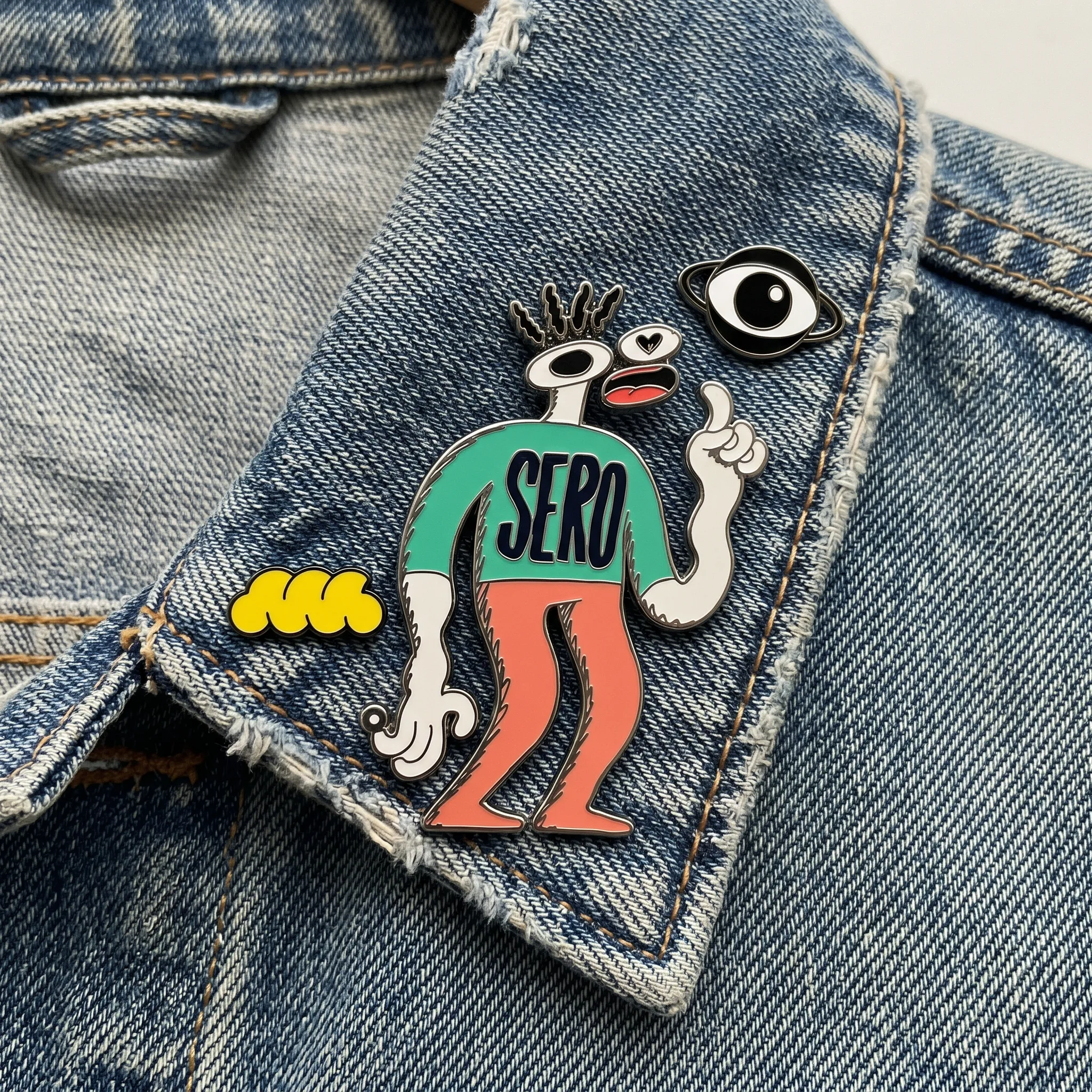
Six hand-drawn, digitized mascot poses — each a different expression of the same entity. Wide-leg wavy stance. Noodle-arm tall stretch. Spiky-hair mid-expression. Long-limb extension. Hunched forward tilt. Index-finger raised. All share the same construction rules: thick variable-weight outline (pen-brush origin, digitized with pressure variation intact), flat color fills with no gradients, mismatched eye signature, black spiky hair. Each pose is surrounded by a floating ecosystem of secondary elements — yellow cloud blob (
#f5c842), orbiting black eye, signal dashes, yellow spiral, teal arc (#3db88a) — that orbit the figure in editorial and environmental contexts. These ecosystem elements can operate independently as secondary marks but never replace the mascot in primary applications.COLOR SYSTEM
Five colors, each with a specific job. Near-black (
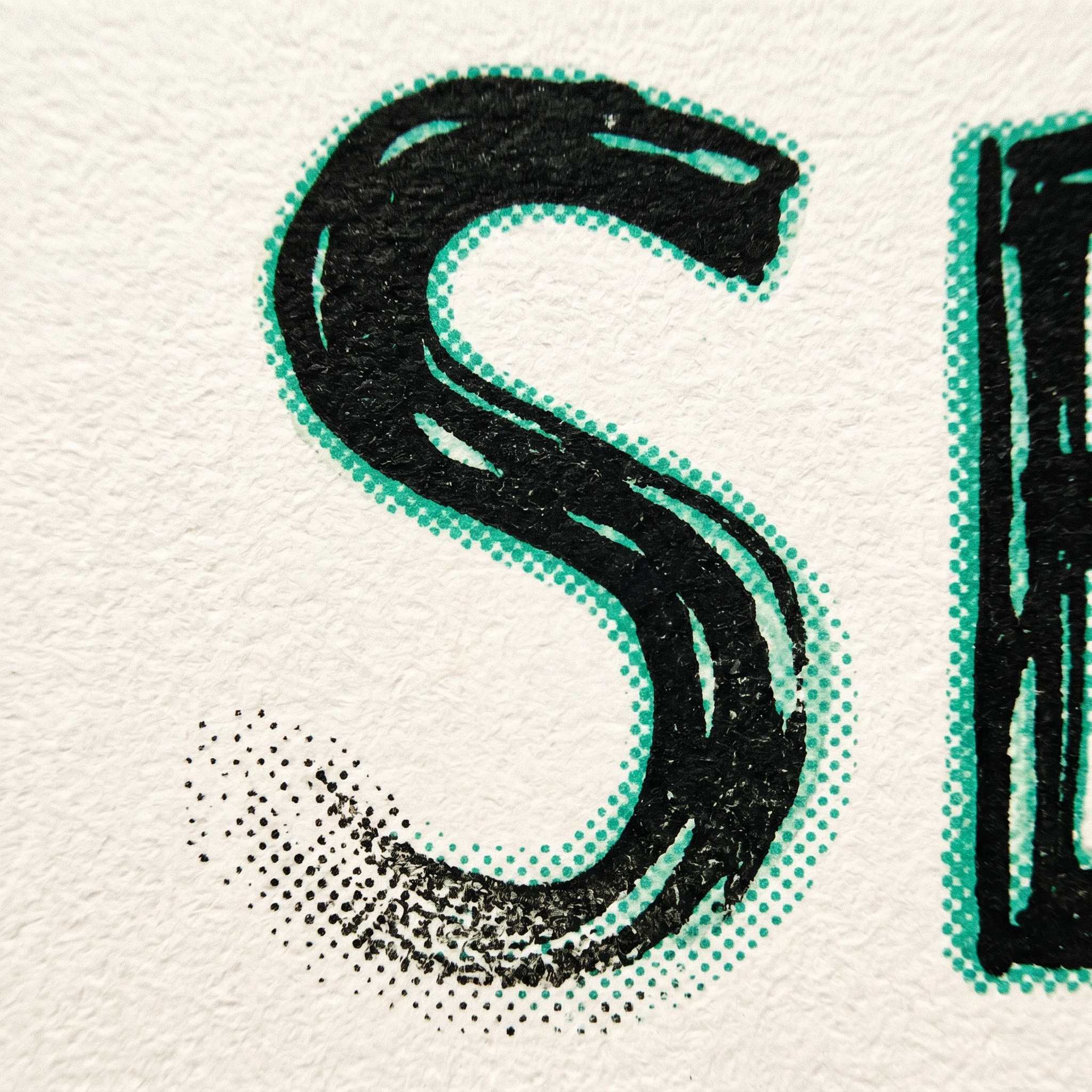
#1a1a18) — all outlines, wordmark, primary ground. Teal (#3db88a) — mascot torso, primary accent, the brand's most active color. Coral (#e8876a) — limbs, warmth, the human body. Warm yellow (#f5c842) — all floating ecosystem elements, the only truly "bright" color in the system. Off-white (#f5f0e8) — paper, base, ground. The palette was calibrated to work specifically in risograph printing — each color is a single ink layer, and the visual system was designed with riso misregistration as an intentional texture, not a production error.TYPOGRAPHY SYSTEM
Two typefaces, no overlap in function. Space Mono Bold — all headlines, the wordmark, all labels, all caps treatments, tracked wide at 0.15–0.2em. The letterforms carry the same hand-built tension as the mascot — mechanical but imperfect. DM Sans Light — all body copy, captions, descriptors, set at 300 weight with 1.6–1.7 line-height. The contrast between the two is the voice: Space Mono is the instrument, DM Sans is the person using it.
PRINT / RISO DIRECTION
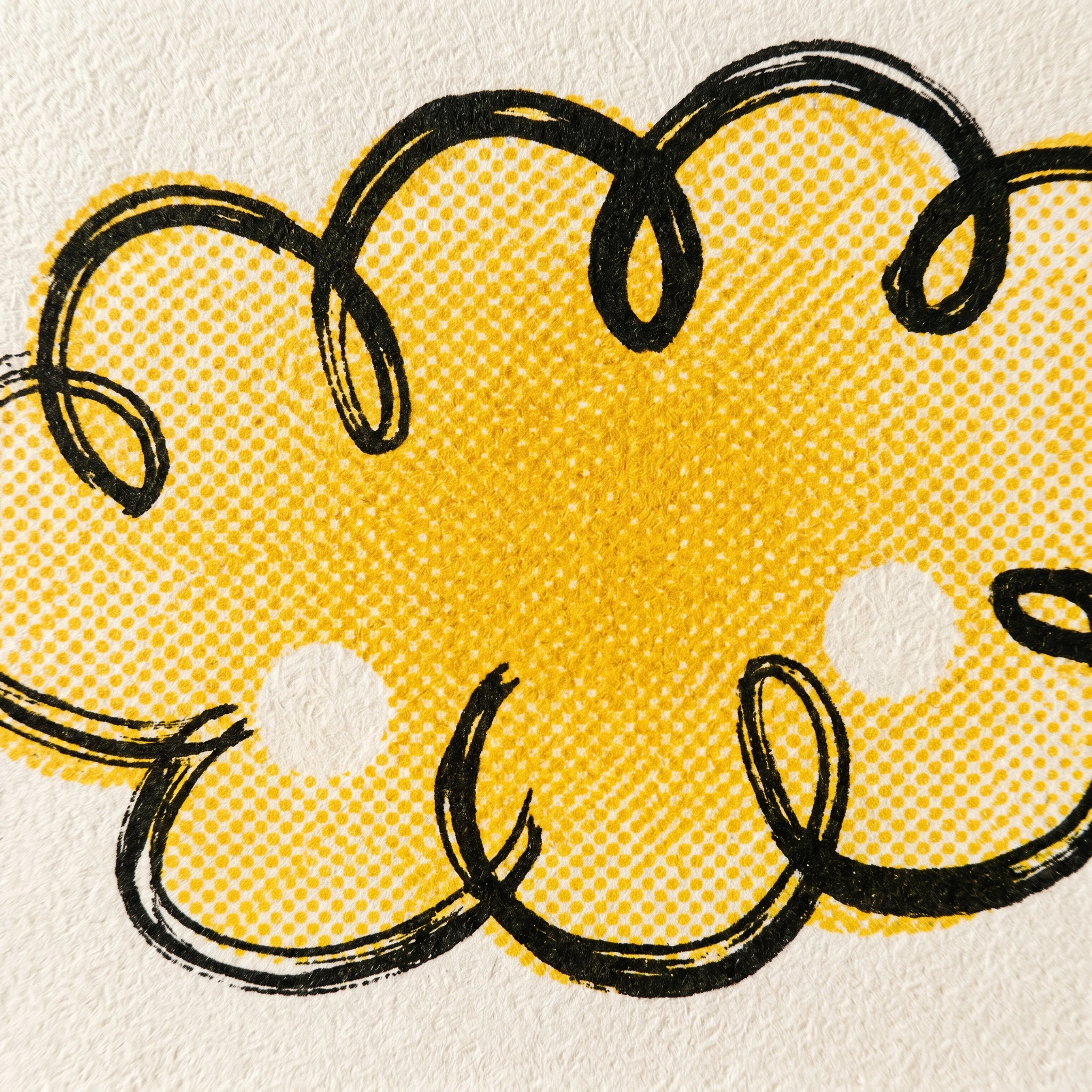
The brand's primary print language is risograph — not as a trend, as a deliberate alignment between the mascot's hand-drawn character and a printing process that refuses perfection. Every mockup was designed with riso-specific constraints: ink bleeding at fill edges, screen dot patterns visible at print boundaries, ink starvation in large fill areas, misregistration between color layers. The imperfections are documented as brand texture, not production failure. Mockups developed across 20 applications — risograph posters, sweatshirts, sticker sheets, tote bags, zines, enamel pins, vinyl records, skate decks, packaging boxes, wheat-paste murals, floor vinyls, painted exterior walls, and extreme macro close-ups of riso ink on cold-press paper.
BRAND GUIDELINES SHEET
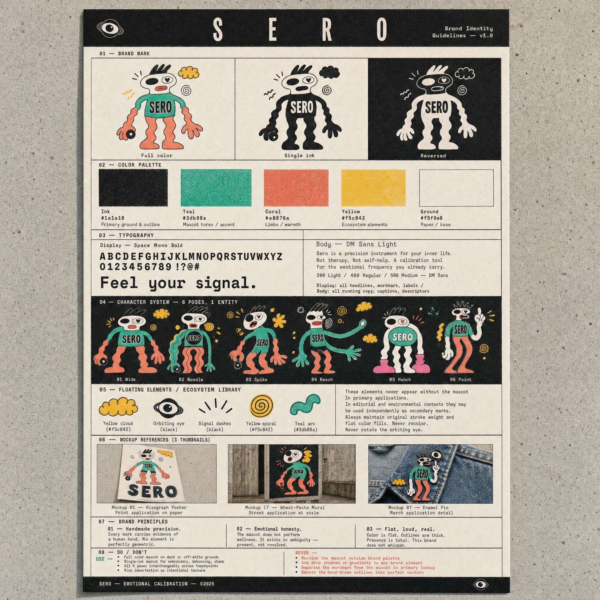
A single A4 poster documenting the full system — mascot variants, color palette, typography specimen, ecosystem element library, mockup references, do/don't rules — designed to print on uncoated off-white cold-press stock in risograph. The guidelines document is itself a riso print artifact, not a PDF.
THE RESULT
SERO shipped as a complete, self-contained brand world — character system, color system, typography, print direction, 20 documented mockup applications, and a single-sheet guidelines poster. It exists as a speculative portfolio project, which meant the only constraint was whether the system held up under pressure. It does.
The most interesting outcome was the mascot decision. By refusing to lock a single pose as the canonical logo, the brand has a flexibility most identity systems have to engineer through secondary elements. SERO's character simply shows up differently depending on context — hunched on a sticker, reaching on a wall, wide-legged on a sweatshirt — and it reads as the same entity every time because the construction rules are tight enough to hold it together. That's what a character system buys you that a geometric logomark never can.
Studio: Revolte — revolte.design
Project: SERO
Year: 2026
Scope: Brand Identity, Character System, Typography, Color, Print Direction, Brand Guidelines
Industry: Mental Health / Emotional Wellness
See more at revolte.design
Like this project
Posted May 10, 2026
SERO, a mental health brand that refuses to smile. Hand-drawn mascot, riso ink, 6 poses, one character that holds the whole system.
Likes
5
Views
15
Timeline
Apr 28, 2026 - May 10, 2026