Built with Lovart
Onbrd Brand Identity & Brand Guidelines
Révolté
ONBRD — The First Day Has a System
Remote onboarding was being treated like a checklist problem. The real problem was that new hires had no sense of arrival — no moment where the company said: you're here, and here's what that means. Onbrd needed to be the brand that changed that.
THE BRIEF
Onbrd automates the onboarding experience for remote-first companies — tool provisioning, buddy matching, culture content, structured checklists. The product is genuinely useful. The problem was that nothing about the brand communicated that. It existed in the same visual category as every other HR SaaS: blues, rounded fonts, stock photography of smiling people in open offices. Forgettable by design.
What they needed wasn't a refresh. They needed a brand that understood the emotional weight of a first day at work — the anticipation, the disorientation, the moment when something clicks and you realize you're actually in. That's a harder brief than it sounds. Most brand systems in this space flatten that feeling. They optimize for trust signals and ignore the human stakes entirely.
I took on the full identity: logo, color system, typography, brand personality, imagery direction, motion principles, and a complete guidelines document. The constraint that made it interesting was the name itself — Onbrd. Truncated, purposeful, a word that implies motion and direction. The brand had to earn that name.
THE APPROACH
My first instinct was to work with arrival as a spatial concept. The idea of coming on board — physically, psychologically — suggested thresholds, transitions, moments of crossing from outside to inside. I explored type-led directions first, but nothing was landing. The name was doing all the work and the visual system had nothing to say back.
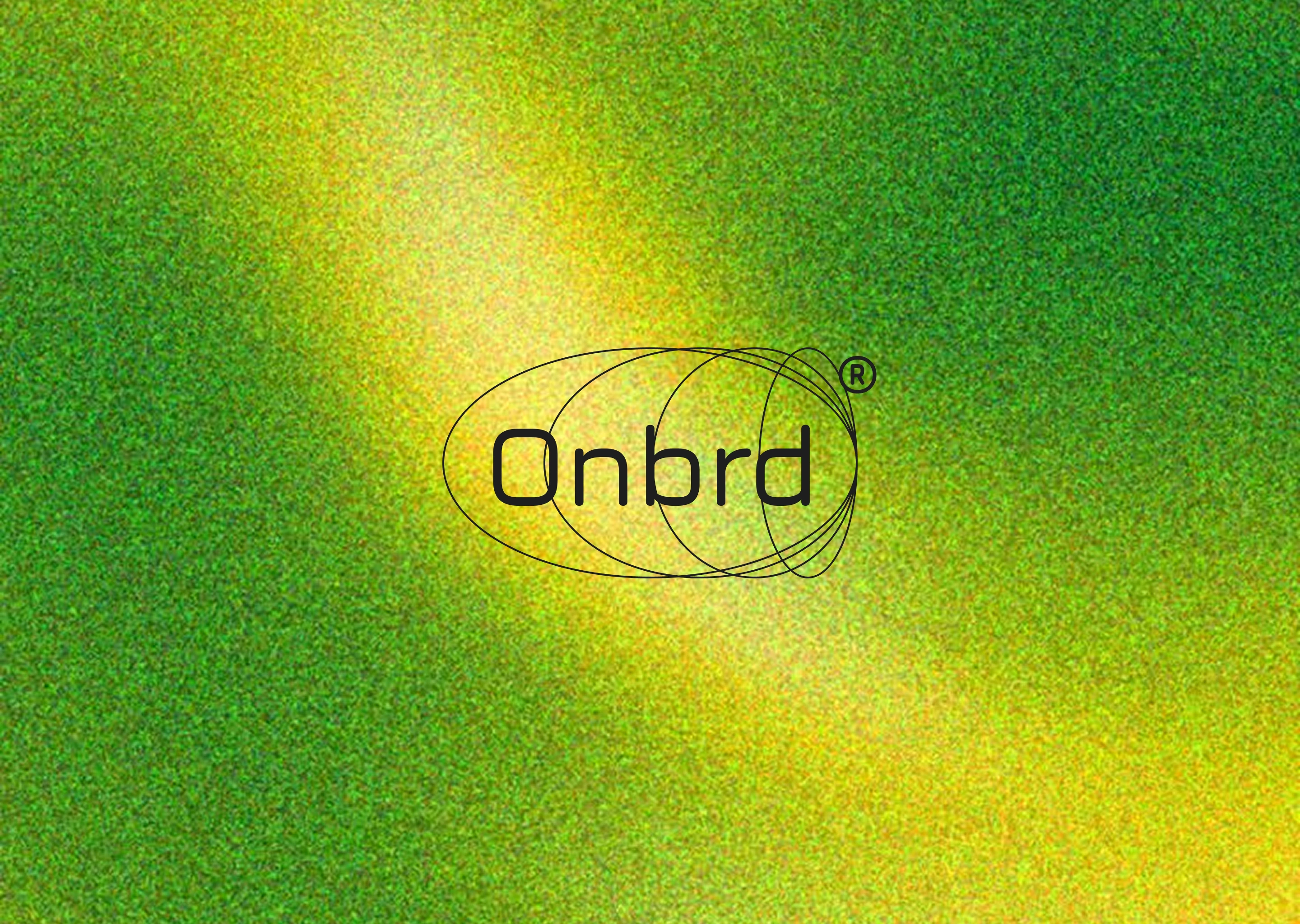
What unlocked it was thinking about orbits. Not planets — the physics of objects that have entered a system and are now in stable motion around a center. An orbit isn't arrival exactly. It's the state after arrival. It's what happens when something belongs. That became the logic for the logo: a set of stacked, offset ellipses — each one slightly rotated, slightly smaller — enclosing the wordmark inside the outermost curve. The ellipses don't frame the name so much as pull it in. There's gravity in the mark.
I rejected the idea of making the green earthy or natural early on. The product is a technology platform. Its users are remote workers, distributed teams, people who live inside software. The green needed to belong to that world — not a forest, not a wellness brand. Electric. Precise. The kind of green that reads on a dark interface at 2am as clearly as it reads on a business card under gallery lighting.
The typography decision followed directly from the orbital logic. Jura's letterforms have the same quality as the ellipses — smooth, slightly geometric, with just enough warmth to avoid clinical coldness. Geist Mono for secondary text brought the system language in: data labels, captions, the parts of the brand that are doing work rather than making statements.
THE WORK
Logo System
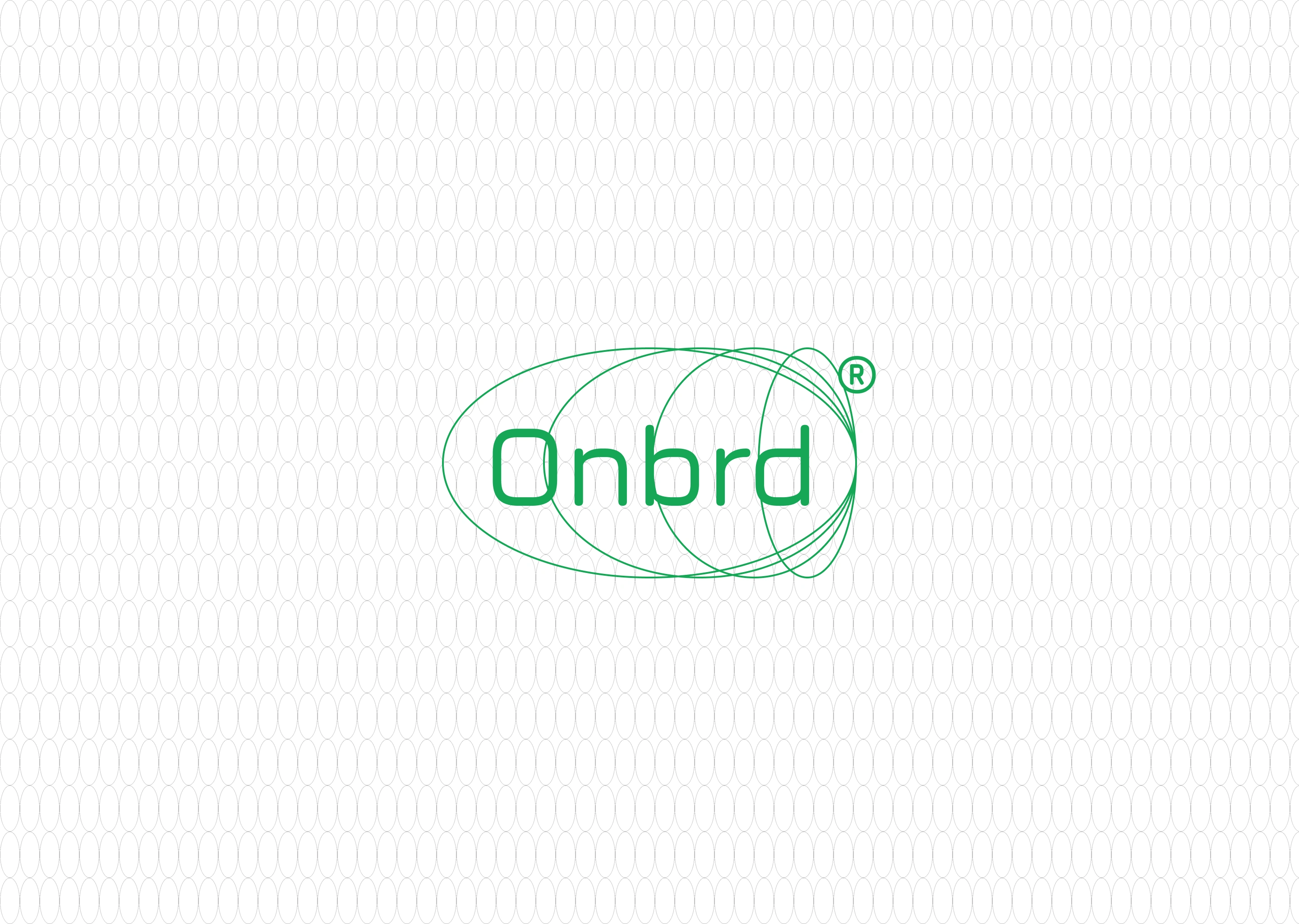
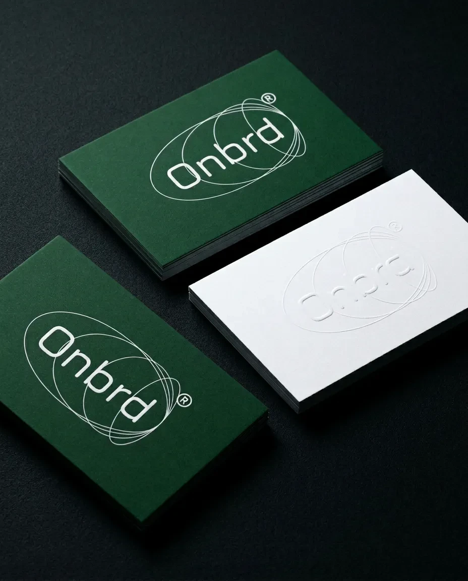
The mark is a wordmark-inside-symbol hybrid. Four ellipses — each offset both horizontally and rotationally — collapse around the Jura-set "Onbrd" wordmark. The outermost ellipse is the container; the inner curves are traces of motion, suggesting the system in transit rather than at rest. The ® sits at the top-right exit point of the orbital stack, which is also where the curves fan out most dramatically — making it feel designed rather than appended. Three official lockups: white on
#1E1E1E, #16A756 on white, white on #0E723A. No other color combinations are permitted.Color System
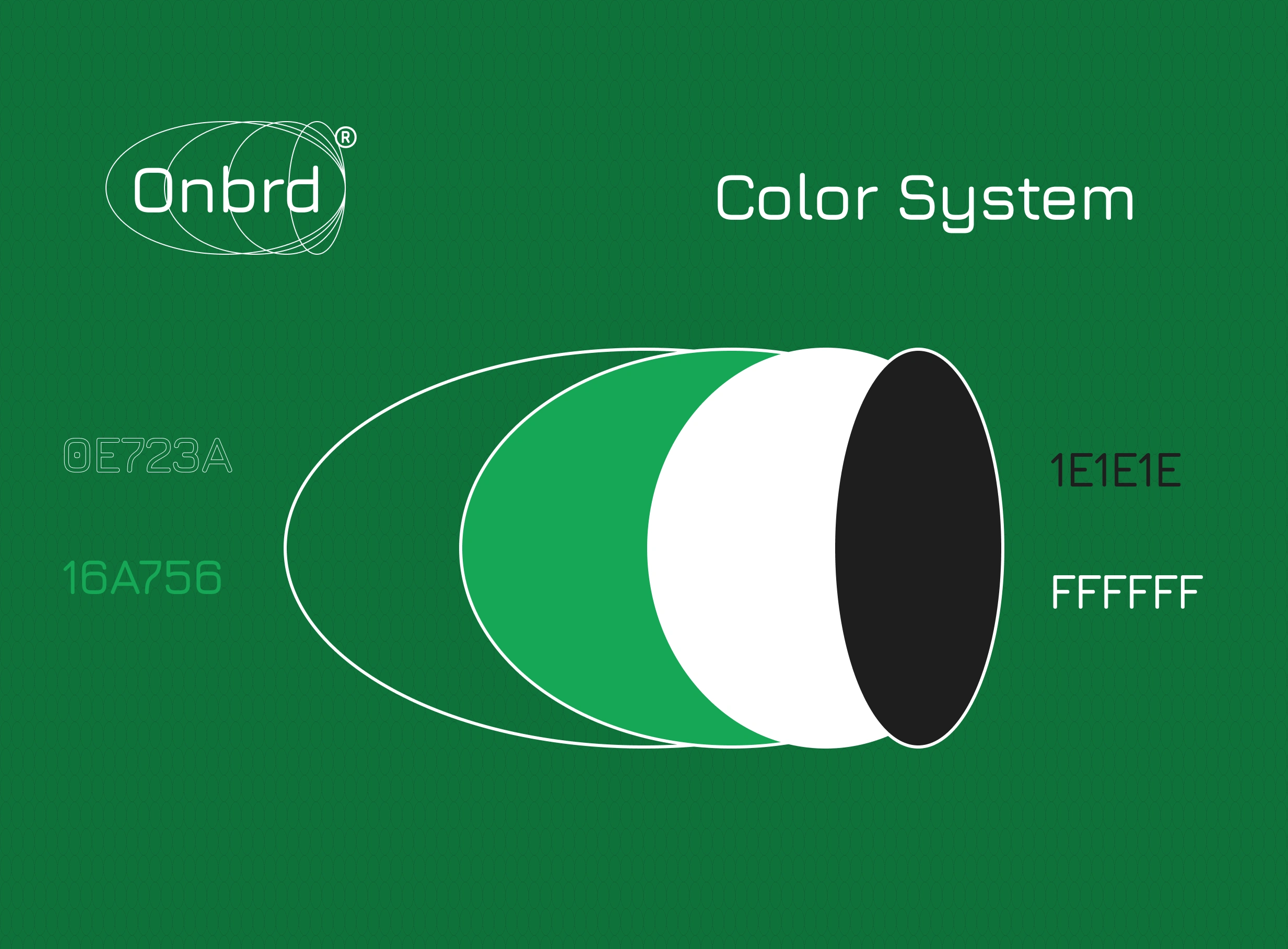
Four colors, two functions. The greens (
#0E723A and #16A756) are the dominant brand surfaces — used at a 60% ratio across all materials. White (#FFFFFF) is reserved for typography and logo on dark. Near-black (#1E1E1E) is the precision surface — interfaces, dark-mode components, the spaces where information lives. The palette has no neutral gray. Every color is either active or structural.Typography System
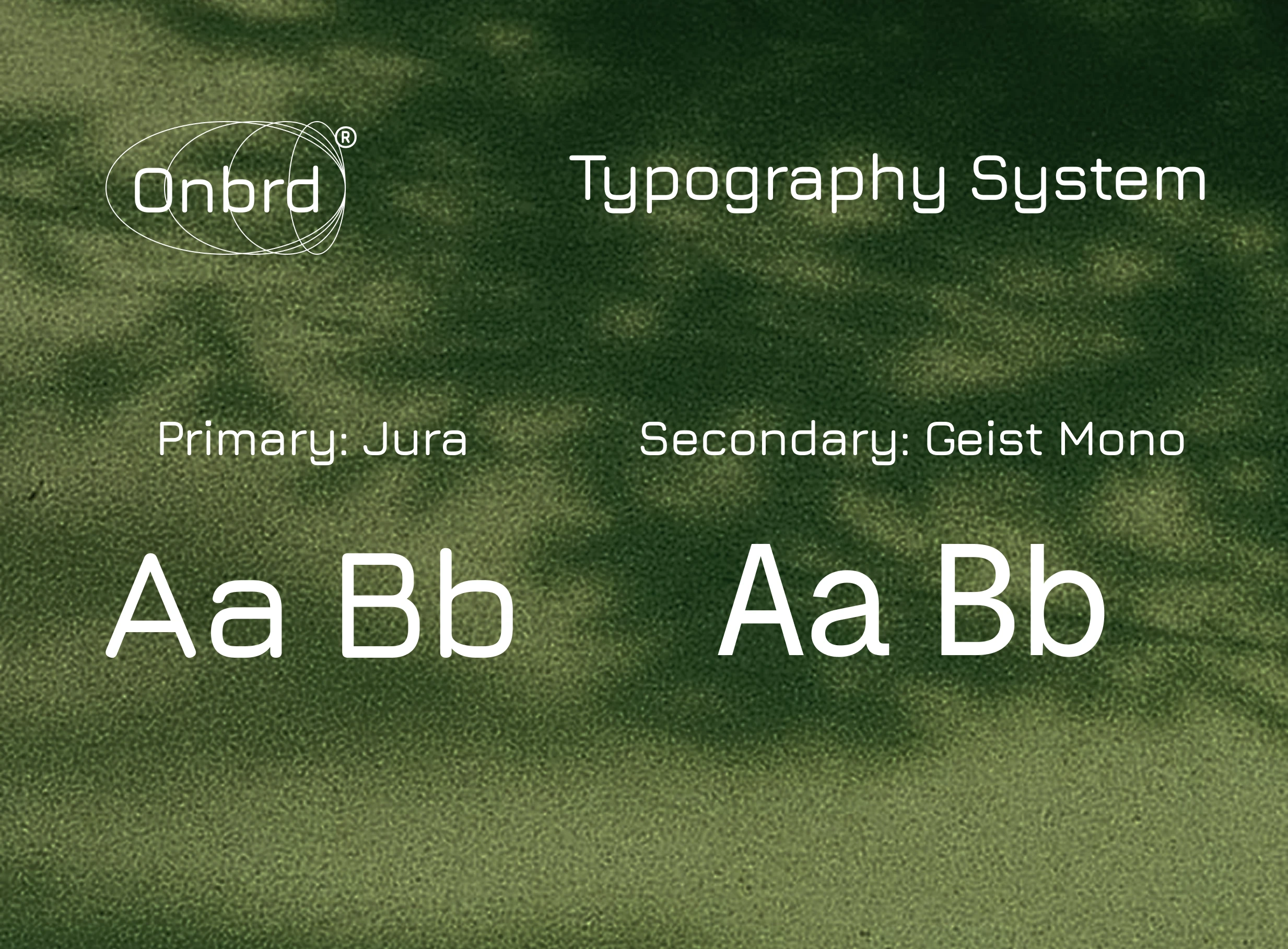
Jura Medium carries everything editorial: headlines, navigation, the wordmark itself. Jura Light handles body copy and secondary display. Geist Mono Regular handles all data-adjacent text — labels, URLs, specs, metadata. The pairing works because both fonts operate on similar geometric principles without feeling matched. One is fluid, one is rigid. That tension is the brand's personality in typographic form.
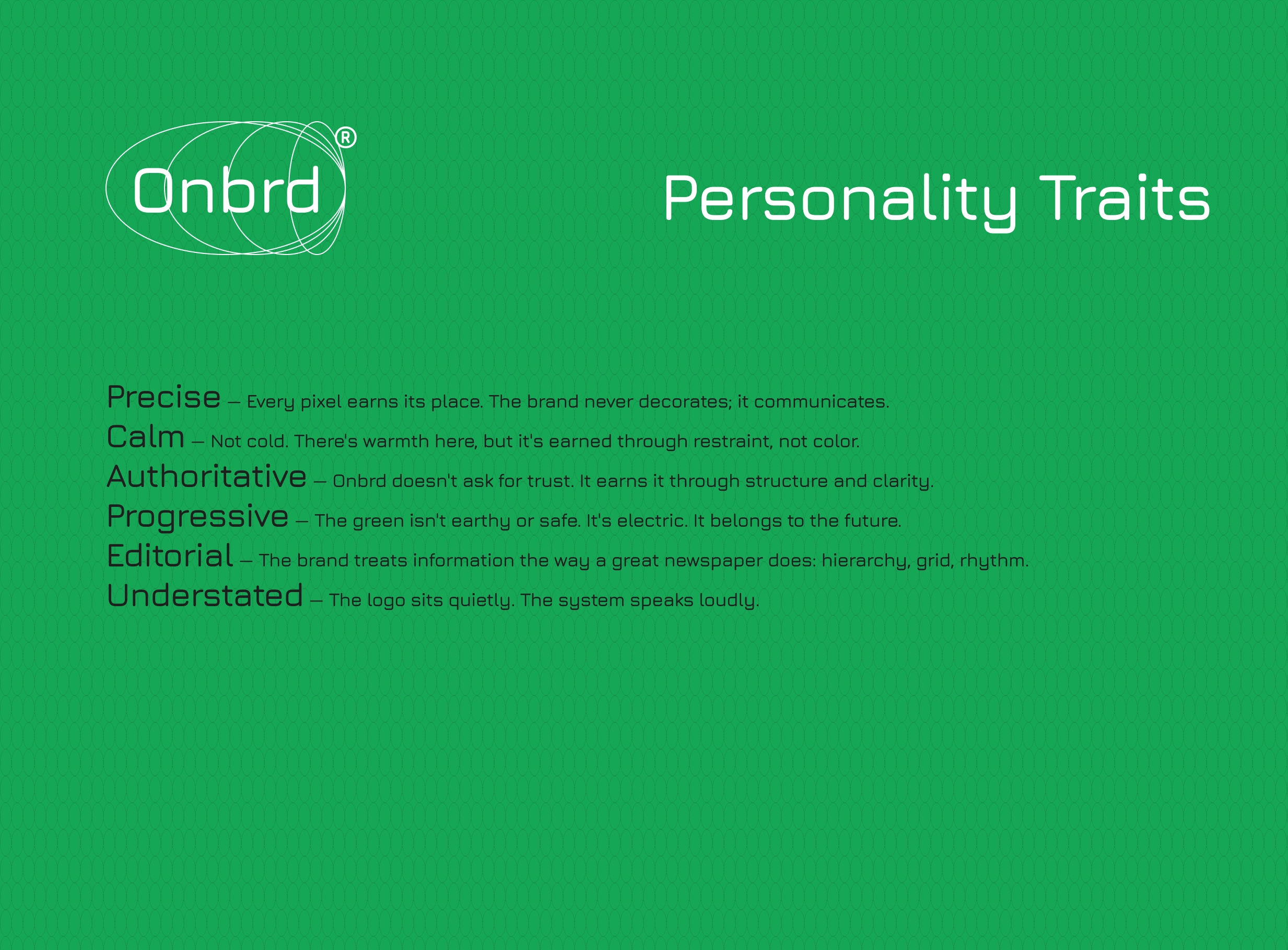
Brand Personality
Six traits: Precise, Calm, Authoritative, Progressive, Editorial, Understated. Each one was written with an anti-definition — what the trait is not — because in branding, the negatives are more useful than the positives. "The logo sits quietly. The system speaks loudly." That line became the operating principle for every application decision.
Imagery & Motion
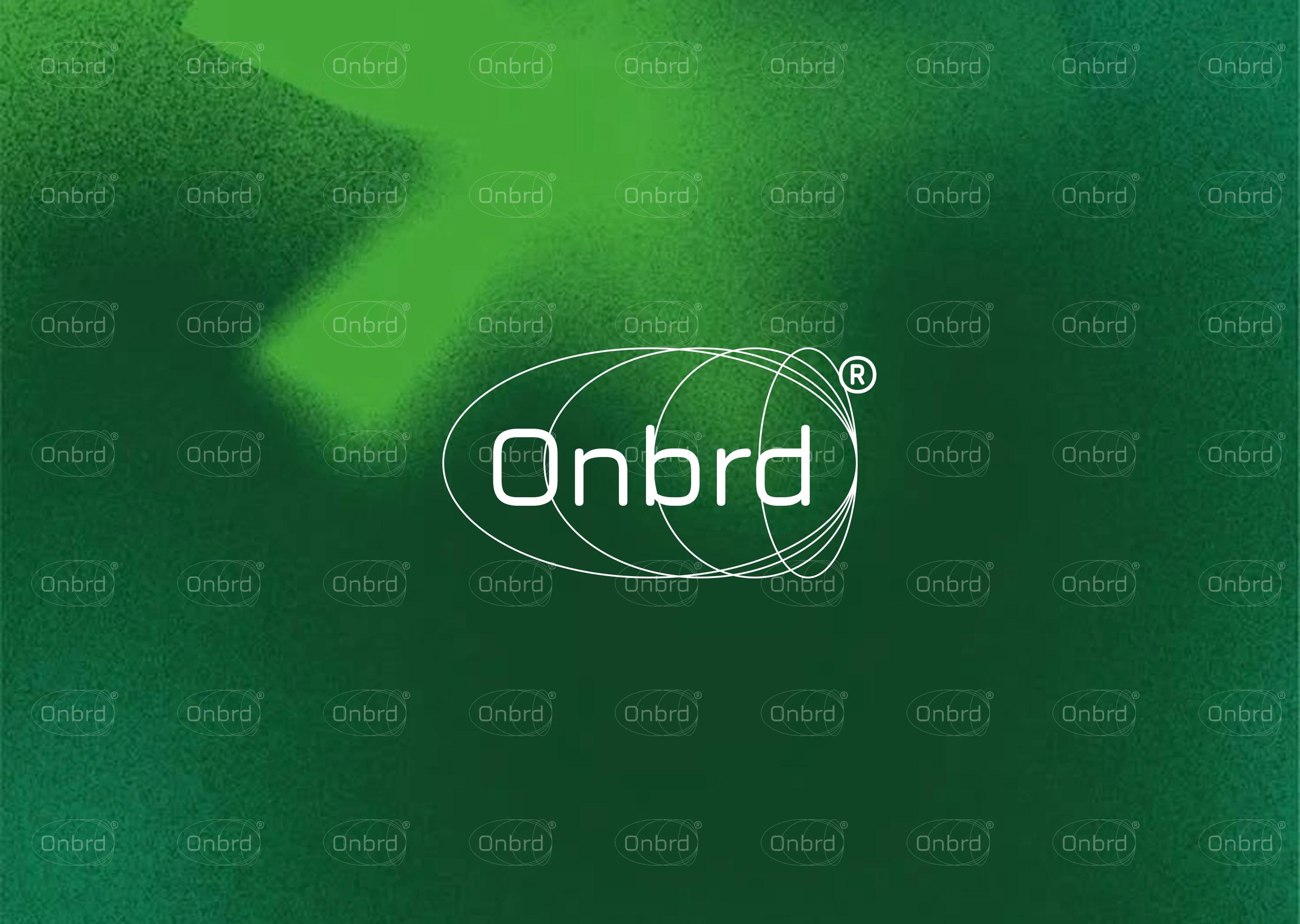
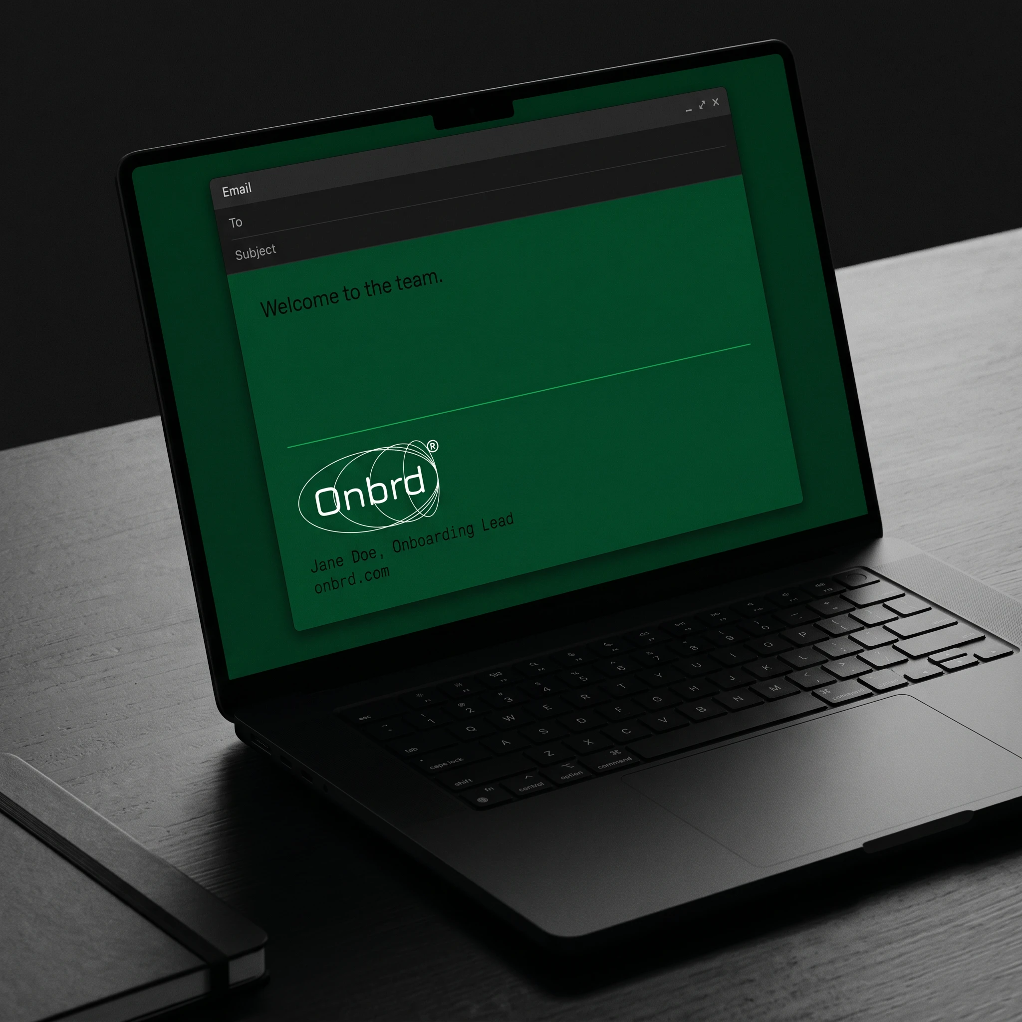
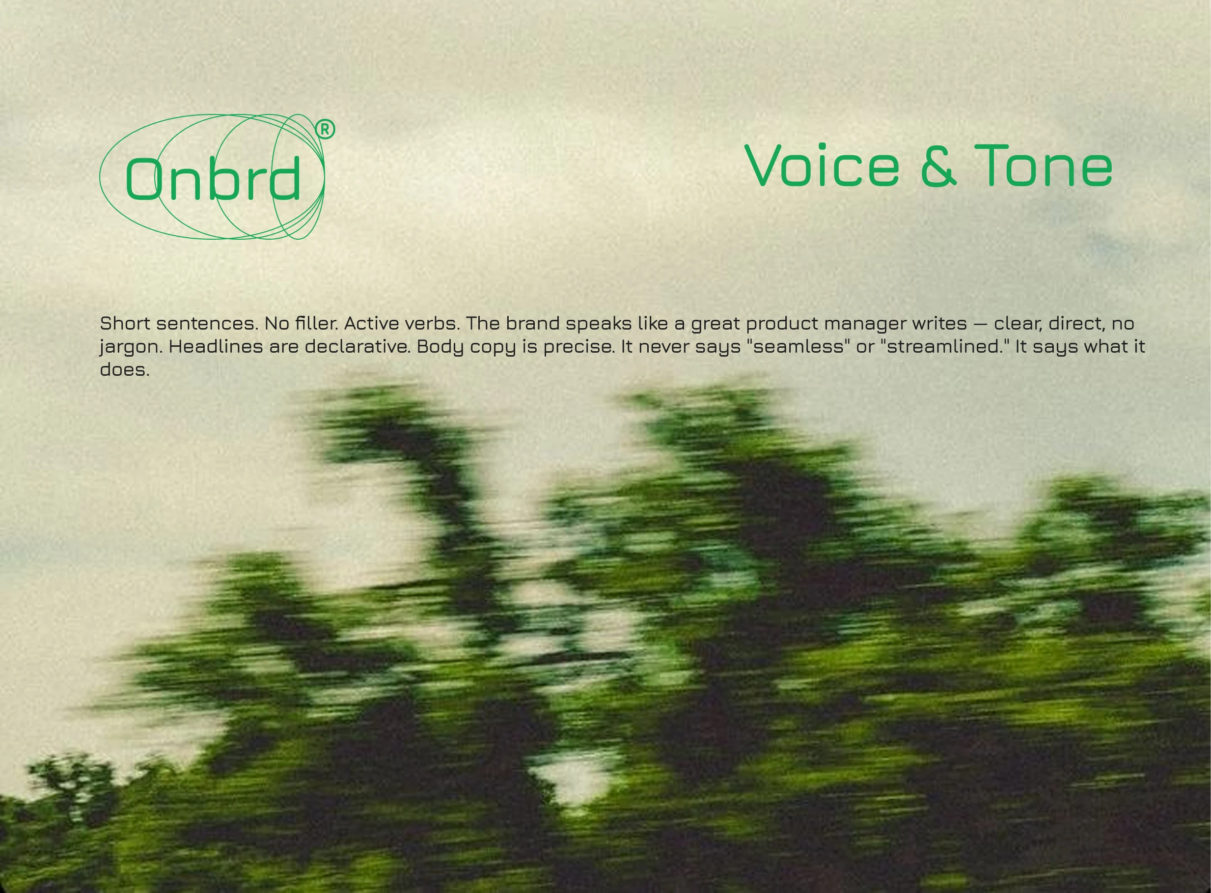
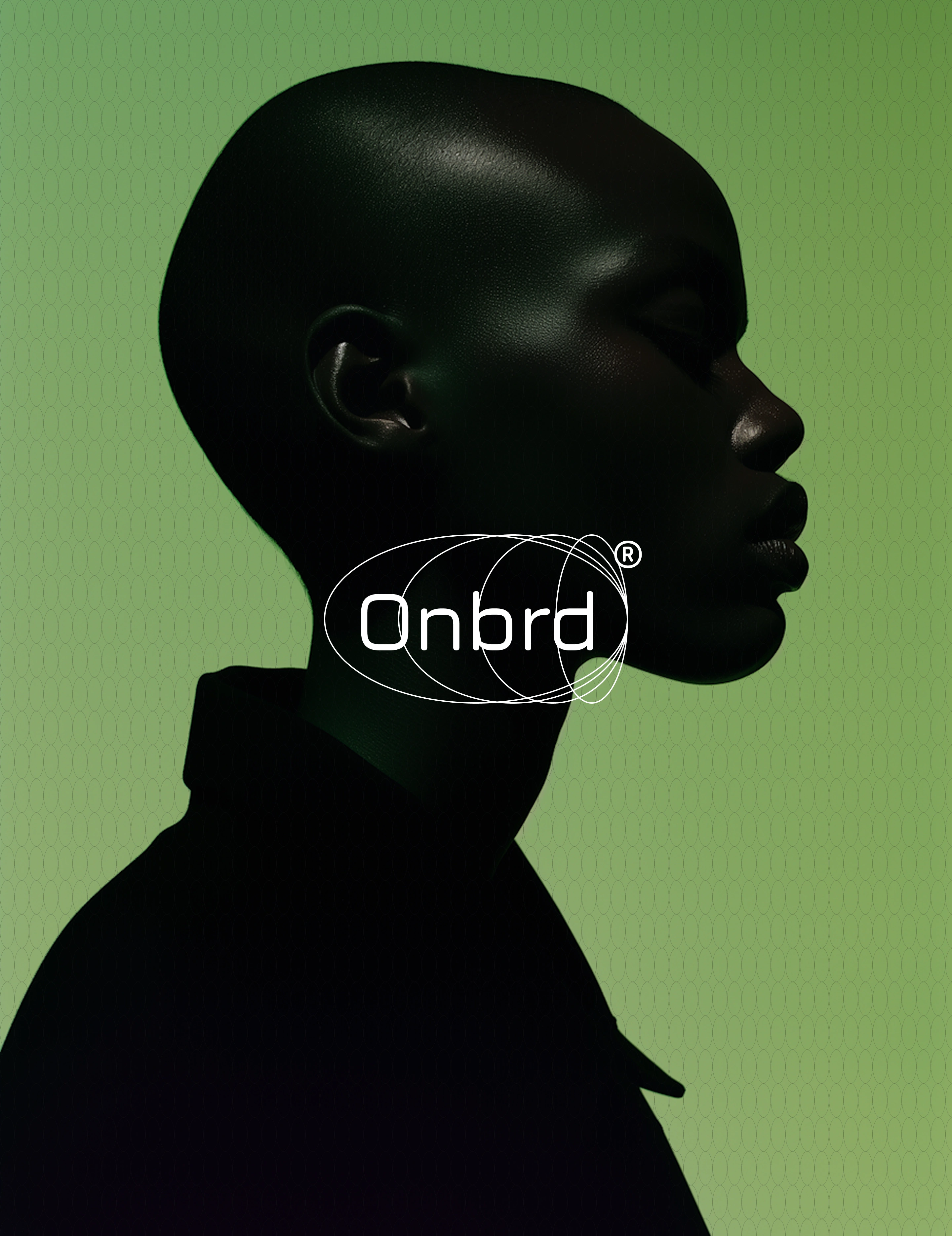
Photography direction centers on motion blur — landscapes and environments shot through moving vehicles, aerial greens, human silhouettes against the brand palette. Film grain at 10–15% over every image. The orbital motif tiled as a semi-transparent watermark. The effect is a brand that feels like it's already in motion before you interact with it.
Motion spec: the ellipses animate in sequentially — outermost first, innermost last — over 600ms on a cubic-bezier(0.4, 0, 0.2, 1) ease-out. The wordmark fades in last. The sequence mimics an orbit forming around a center. Nothing moves simultaneously.
Mockup Suite
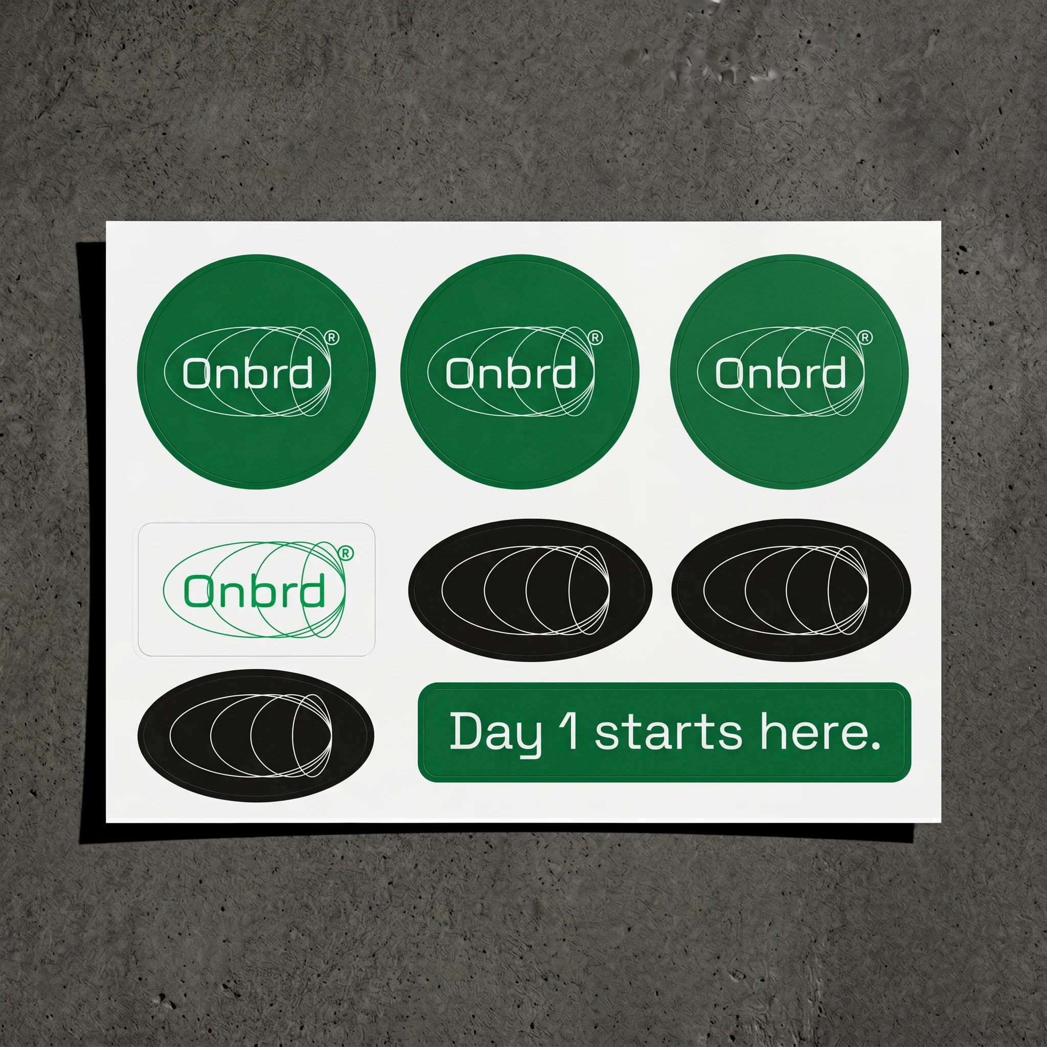
Eleven environments: welcome kit box (green linen, debossed lid, "You're in." welcome card), business cards (deep green matte with white logo, white back with blind emboss), notebook with foil logo on forest green cloth cover, tote bag in raw canvas with forest green screen print, email signature in dark-mode email client, sticker sheet on concrete, frosted glass office door with "People Operations." sub-label, dimensional reception wall logo in brushed aluminum, desk campaign still, and a phone screen social post with the orbital tile pattern.
THE RESULT
The brand delivered a system that doesn't look like HR software. It looks like something a remote-first company would actually be proud to put on a box, a door, a screen. The welcome kit mockup in particular landed the brief: a new hire opens a green linen box, sees a white card that says "You're in." — and for the first time, the product's name makes physical sense.
The guidelines document runs six pages and covers every system in full. It's designed to be handed to a developer, a content team, or a future designer with zero verbal explanation required. That was the goal from the start: a brand so internally consistent that it explains itself.
Révolté — revolte.design
Project: Onbrd Brand Identity
Year: 2026
Scope: Brand Identity, Logo Design, Typography System, Color System, Motion Principles, Brand Guidelines, Mockup Direction
Industry: HR Technology / SaaS / Remote Work
See more at revolte.design
Like this project
Posted May 6, 2026
Developed a new brand identity for Onbrd, a brand that understood the emotional weight of a first day
Likes
4
Views
32
Timeline
Apr 27, 2026 - May 6, 2026