Built with Lovart
SOLEN Studio Visual Identity
Révolté
SOLEN Studio — The Line That Holds Everything
A Milano-rooted interior objects brand that needed to feel permanent before it had a history. The answer was one mark, one rule, and the discipline to use nothing else.
THE BRIEF
SOLEN came to me as a concept — an interior objects studio positioned somewhere between furniture design and editorial lifestyle, with ambitions that stretched London, Paris, and Milan. The premise was tight: objects made with intention, spaces that don't perform. What they didn't have was a visual language that matched that restraint.
The tension was real. "Considered" is easy to say and hard to design for. Every reference they pointed to was either too cold — the kind of Swiss minimalism that mistakes emptiness for intelligence — or too warm, drifting into that Kinfolk-adjacent softness where everything looks like an aspirational apartment you'd never actually live in. Neither was right.
What I took on was the full identity: wordmark, typographic system, color logic, and the complete collateral suite — stationery, packaging, print, and the visual framework for product photography. The challenge wasn't building something beautiful. It was building something that could hold its own against objects that were already doing most of the work.
THE APPROACH
My first instinct was to let the typography carry everything. One typeface, one weight, maximum tracking — the kind of wordmark that reads as institutional by force of confidence alone. That direction held up. What didn't hold up was what came around it: early explorations kept trying to add a second visual idea. A symbol. A geometric mark. Something that could stand alone. I rejected all of it. SOLEN didn't need a logo that explained itself — it needed a wordmark that assumed you already understood.
What unlocked the system was reducing the brand device to a single horizontal line in warm gold. Not a decorative element — a structural one. A divider that appears on every piece of print collateral at the same weight, the same color, the same position relative to the wordmark. It sounds minimal to the point of nothing, and that's exactly why it works. The line creates hierarchy without introducing a second idea. It's the only thing separating the name from everything below it, and that economy of means is the brand logic made visible.
The color decision followed the same rule. Ivory parchment as the ground — not white, not grey, something that reads warm without reading soft. Near-black charcoal for all type, so the wordmark sits with authority. The gold line, one accent, used nowhere else in the identity system. Teal, sage, and burgundy appear only as glaze colors, upholstery finishes, and material choices in the objects themselves — never as brand colors. The brand doesn't compete with the product. It frames it.
THE WORK
WORDMARK + TYPOGRAPHY SYSTEM
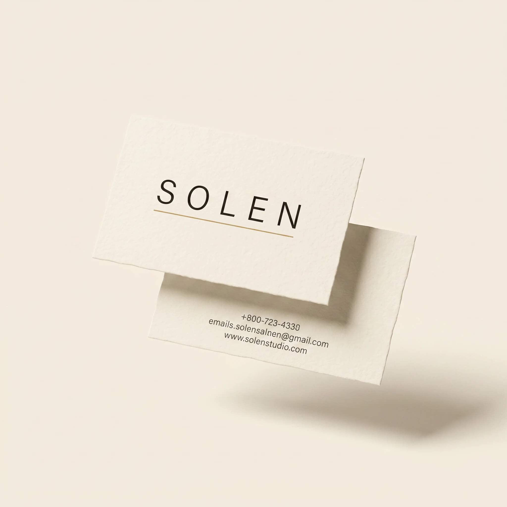
The wordmark is set in a geometric sans at approximately 400 weight, fully tracked at around 200 units, all-caps. No symbol, no mark — the word alone carries the identity. Below the wordmark, a single 1pt gold rule at
#B8962E runs the full width of the text block. For supporting typography, the system splits between the same grotesque for UI and structural labels, and a transitional serif used exclusively for editorial contexts — visible in the brochure tagline "Interior Objects. Considered Spaces." set in italic, and in collection labels like "The Object Collection — Spring 2025." The two typefaces never share the same line. They occupy different hierarchical registers and stay in their lanes.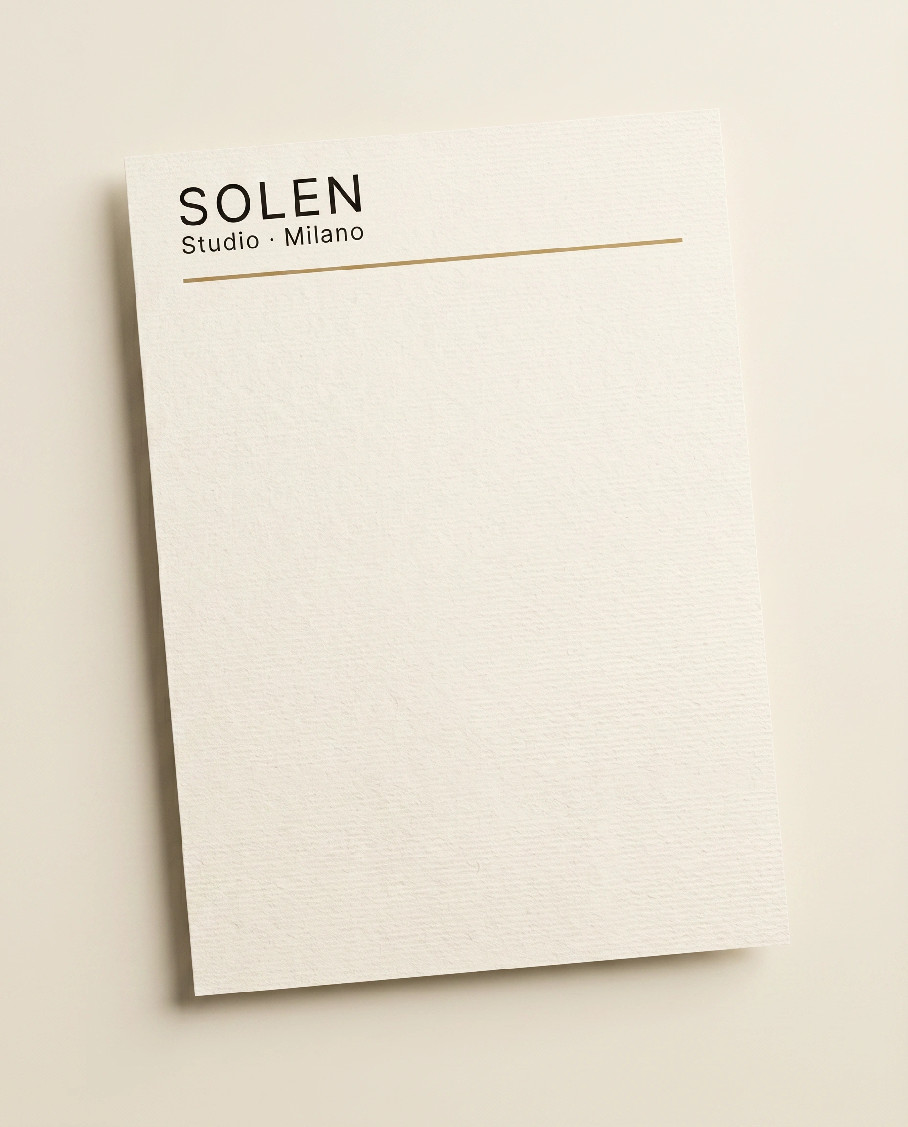
COLOR SYSTEM
Four values, three roles. Parchment (
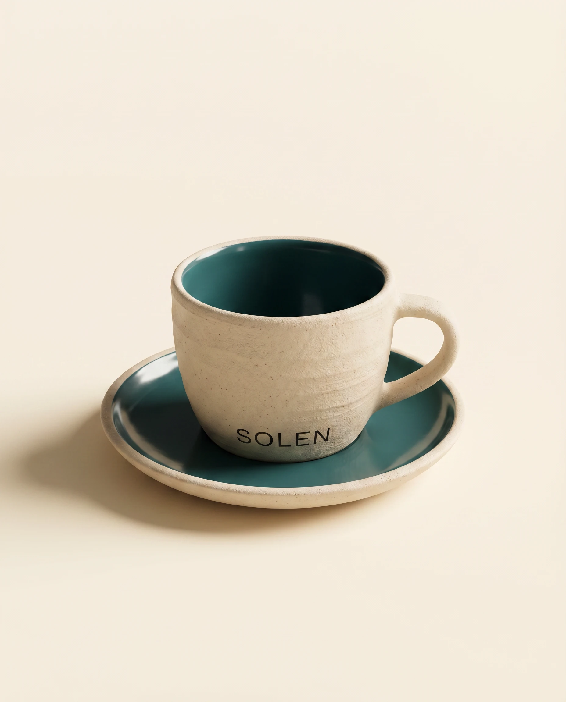
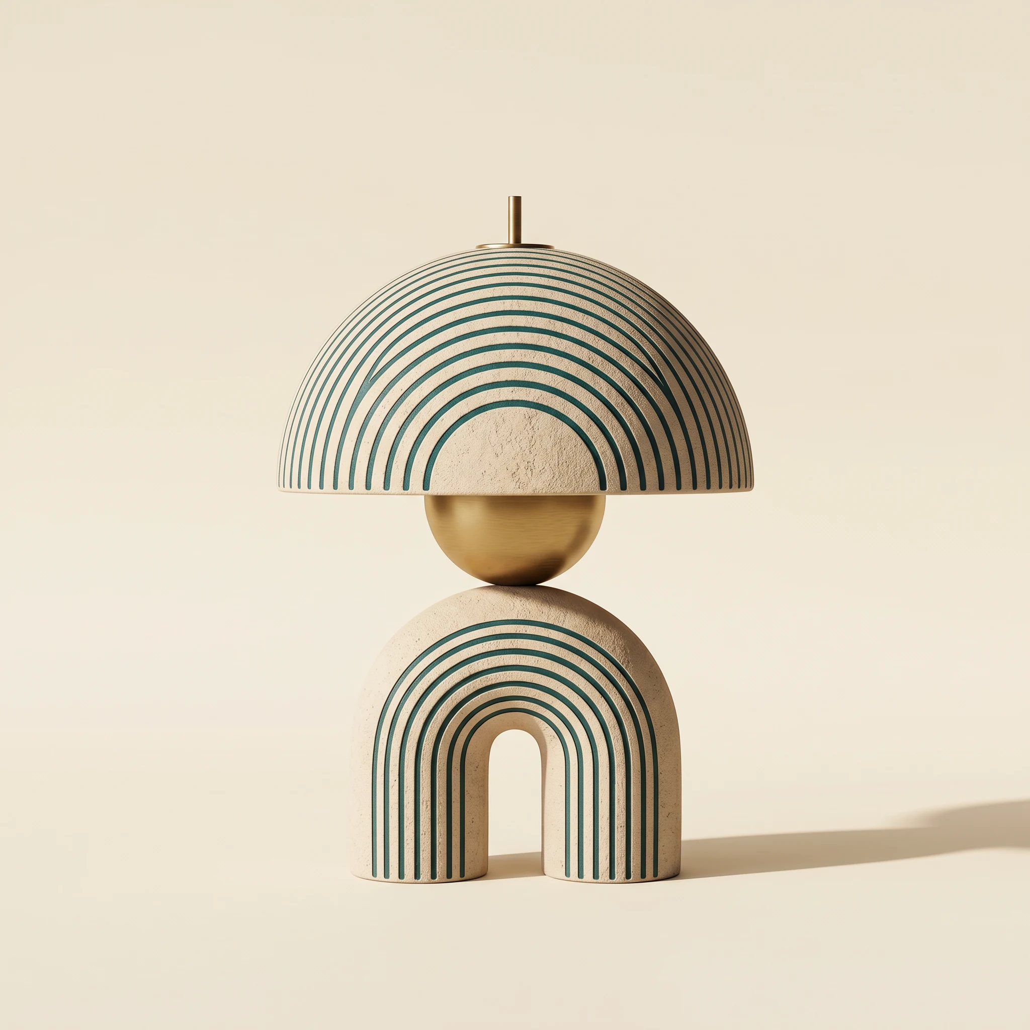
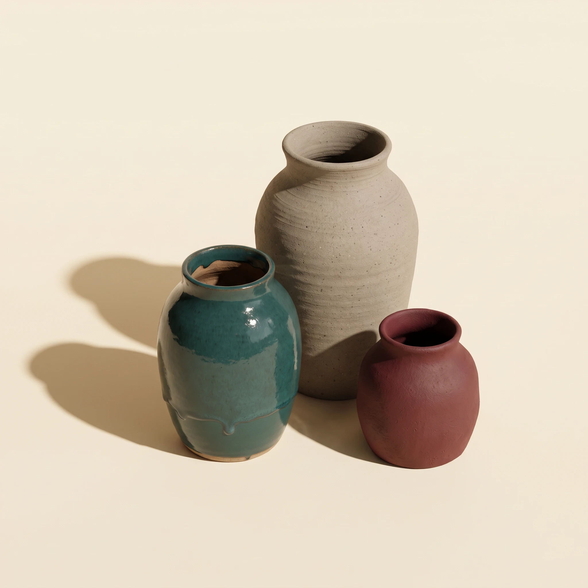
#F5F0E8 range) as the universal ground — every surface, every background, every photograph. Near-black (#1A1A18 range) for all typographic elements. Warm gold (#B8962E) for the structural rule and foil applications only — embossed on the shipping box lid, foil-stamped on the studio notebook spine and cover, woven into the grosgrain ribbon on packaging. The teal, dusty green, and burgundy that appear across the object photography are material references — ceramic glazes, upholstery fabrics, powder-coated lamp finishes. They are not in the brand palette. This distinction matters: it keeps the identity quiet enough to let individually colored objects read as a coherent collection rather than a mood board.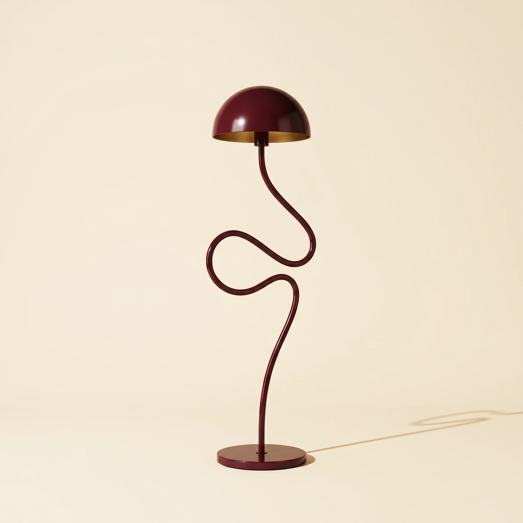
PRINT COLLATERAL
The stationery system applies the gold rule device consistently: business card, A4 letterhead, invoice sheet. Every piece uses the same spatial logic — wordmark and location set flush left in the upper quadrant, gold rule running across the full text column width immediately below. The system is modular: any new document format can be templated in under ten minutes. The A2 editorial poster for Spring 2025 pushes the typographic scale — "01" fills the lower two-thirds of the sheet at display size, with "The Object Collection — Spring 2025" set in tracked caps at 8pt below a full-bleed gold rule. The scale contrast does all the visual work.
PACKAGING
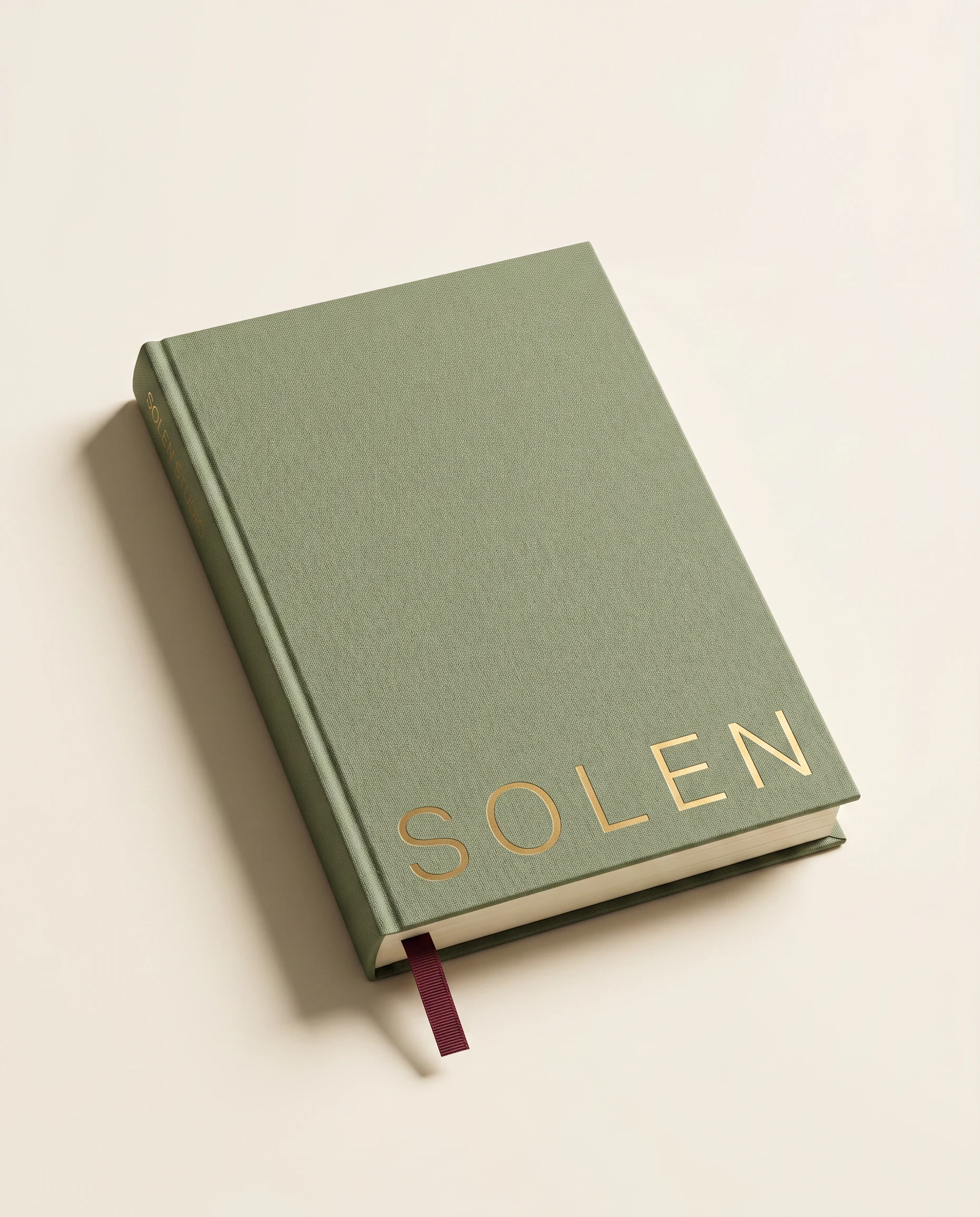
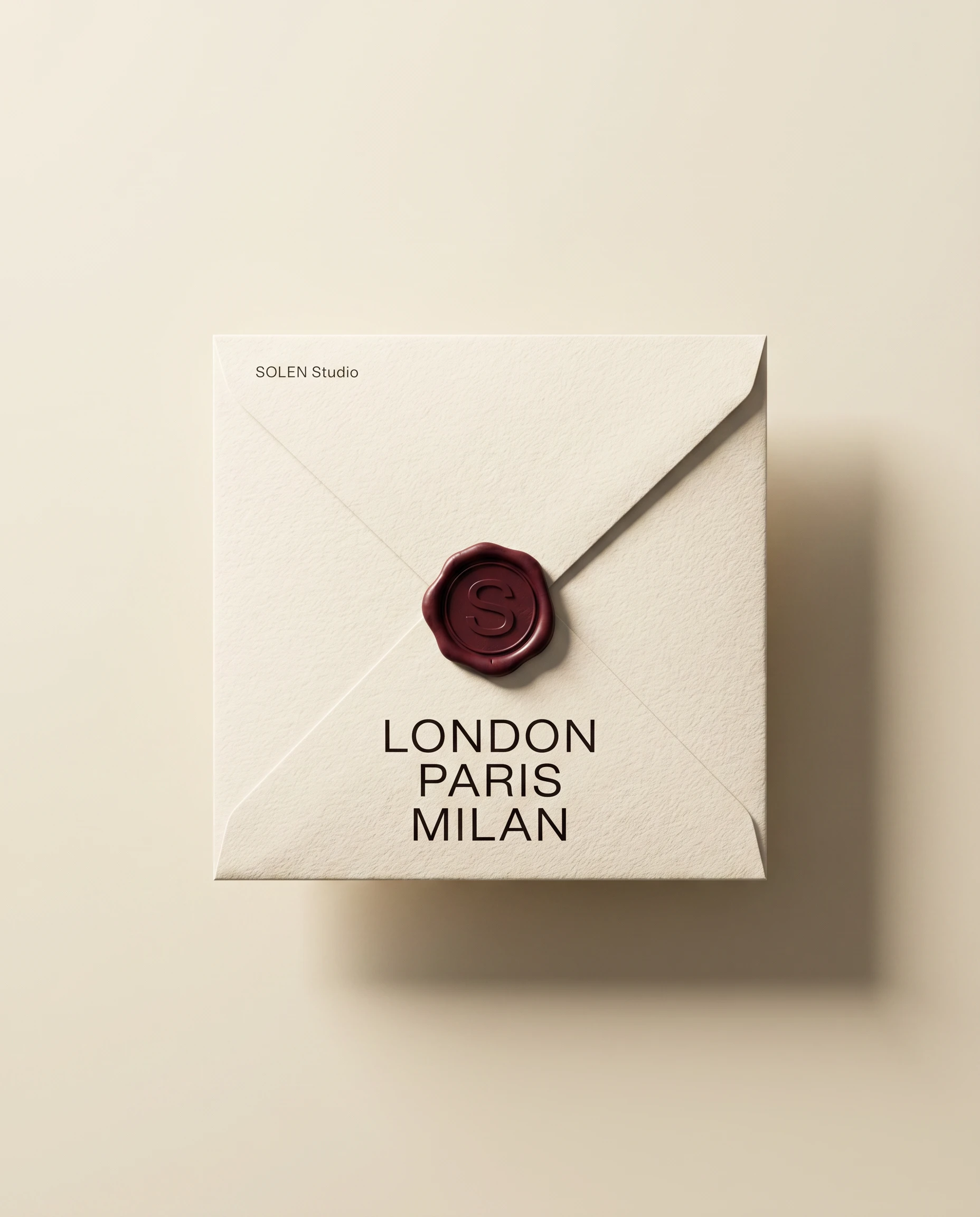
Three formats: a rigid gift box with embossed wordmark and gold grosgrain bow, a wax seal envelope with "LONDON / PARIS / MILAN" in large tracked sans on the face, and a linen tote with a frayed-edge sewn label. The packaging logic mirrors the brand logic — one material, one mark, one accent. The wax seal is stamped with the S monogram in burgundy, the only place the monogram appears in the system. I chose burgundy for the wax deliberately: it's pulled from the object palette, so it reads as a material choice rather than a brand color.
PRODUCT PHOTOGRAPHY DIRECTION
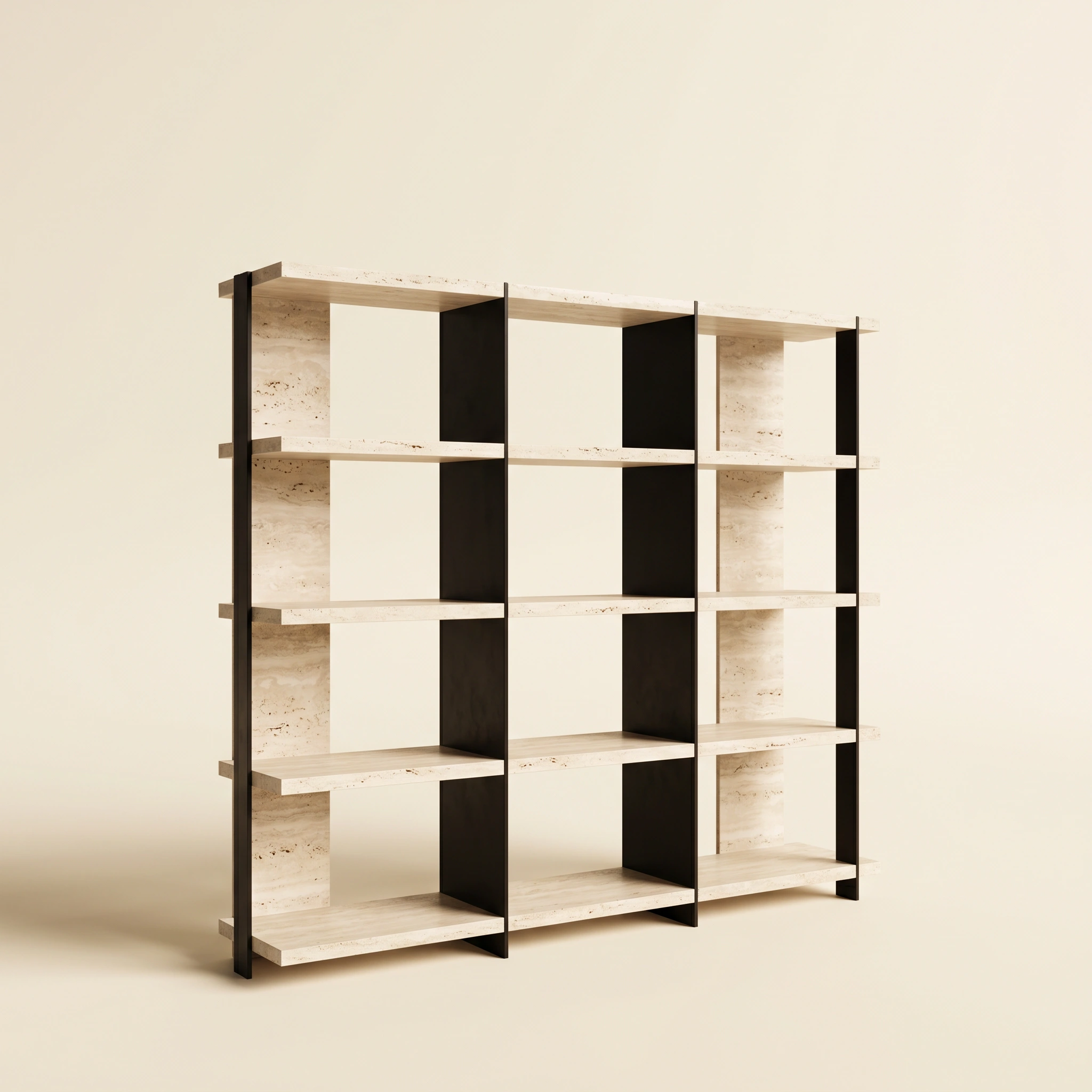
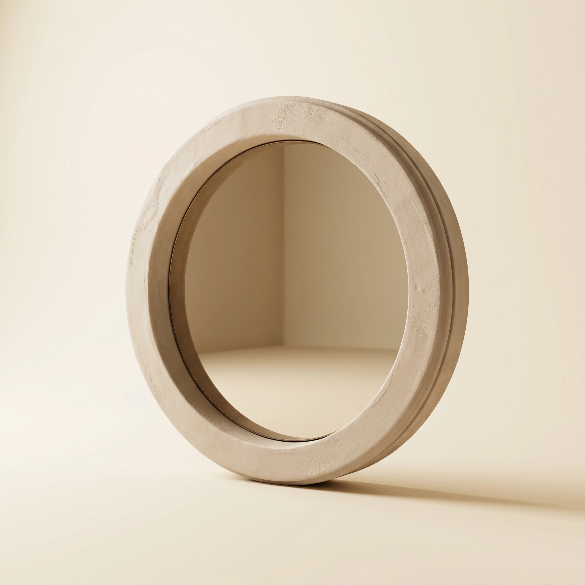
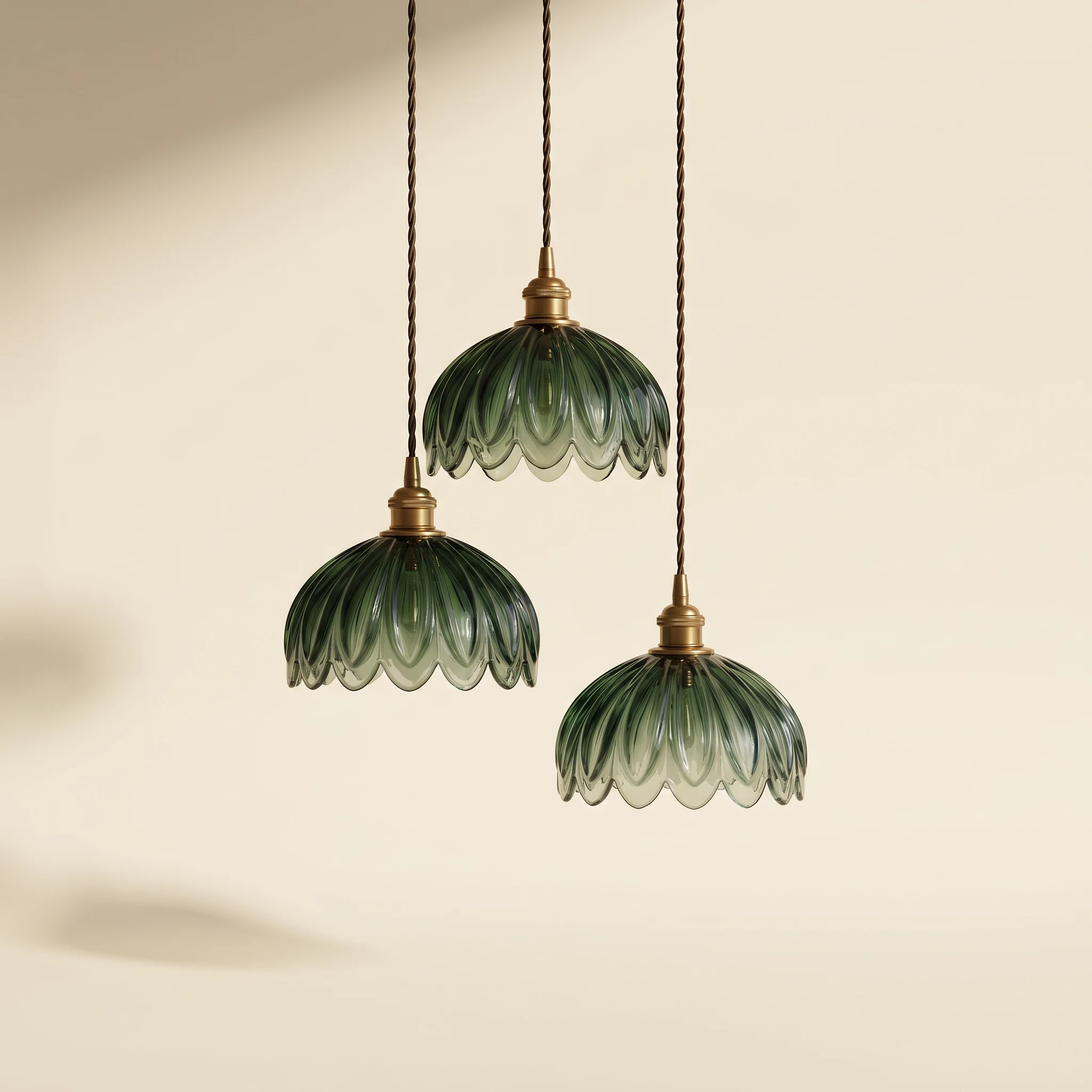
The photography system is built on one consistent setup: warm cream void, diffused directional light from upper left, shadows landing long at roughly 45 degrees. No props, no context, no lifestyle staging. Every object sits alone in the same space — the lounge chair, the sculptural sofa, the travertine side table, the pendant cluster, the ceramic vase trio. The consistency makes the collection read as a world rather than a catalog. The objects do enough on their own.
THE RESULT
SOLEN shipped as a complete identity system with full collateral suite and photography direction. The wax seal envelope — "LONDON / PARIS / MILAN" in tracked sans over a parchment face, sealed in burgundy — became the strongest single piece: it tells the brand's geographic ambition in three words and a mark, with no explanation needed. The studio notebook in sage linen with gold foil spine and cover lettering is the object the identity most closely resembles in feel — cloth-bound, unhurried, made to be kept.
The system holds because it refuses to do more than necessary. One line. One accent. One typographic rule. Everything else is the product.
Révolté — revolte.design
Project: SOLEN Studio
Year: 2026
Scope: Brand Identity, Typography System, Print Collateral, Packaging, Photography Direction
Industry: Interior Objects / Home Design
See more at revolte.design
Like this project
Posted May 19, 2026
An interior design studio where the only ornament is a horizon line. One stroke holds the logo, the grid, the business card, the signage.
Likes
1
Views
19
Timeline
May 10, 2026 - May 19, 2026

