Built with Lovart
Orion Brand Identity Project
Révolté
ORION PROJECT
Brand Identity — Case Study
Archive Edition 01
ORION-REF-001/A.01
PREMISE
Most design brands announce themselves. Orion Project observes.
The brief was to build a portfolio identity for a designer named Orion — one that felt as considered as the work inside it. The solution emerged not from branding conventions but from a simpler question: what is design, really? Not as a service. As a practice. The answer: a sustained act of observation, structured by geometry, informed by living systems.
The name already contained the direction. Orion — the hunter, the navigator, the constellation used for millennia as an instrument of orientation. A figure defined not by what he carries but by where he looks.
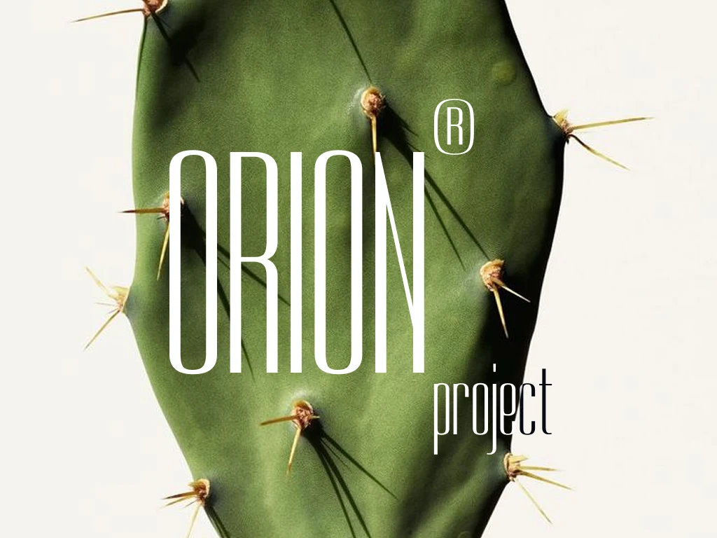
01 — THE MARK
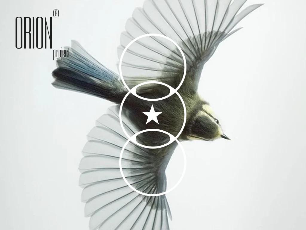
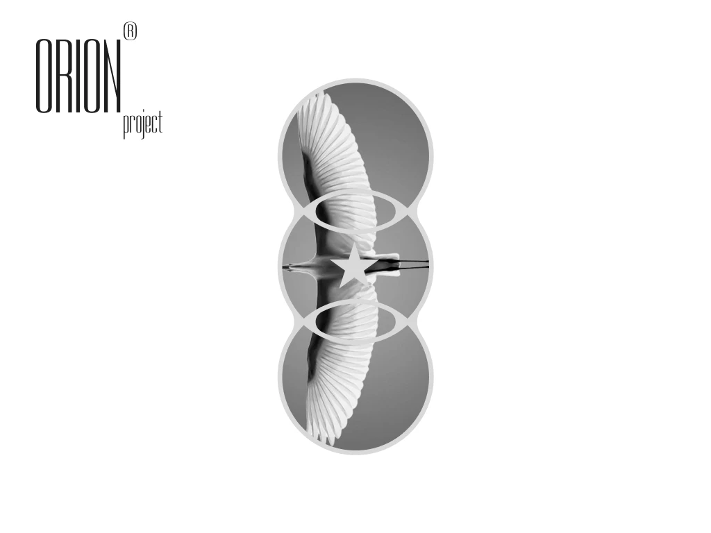
Three circles. Two intersections. One star.
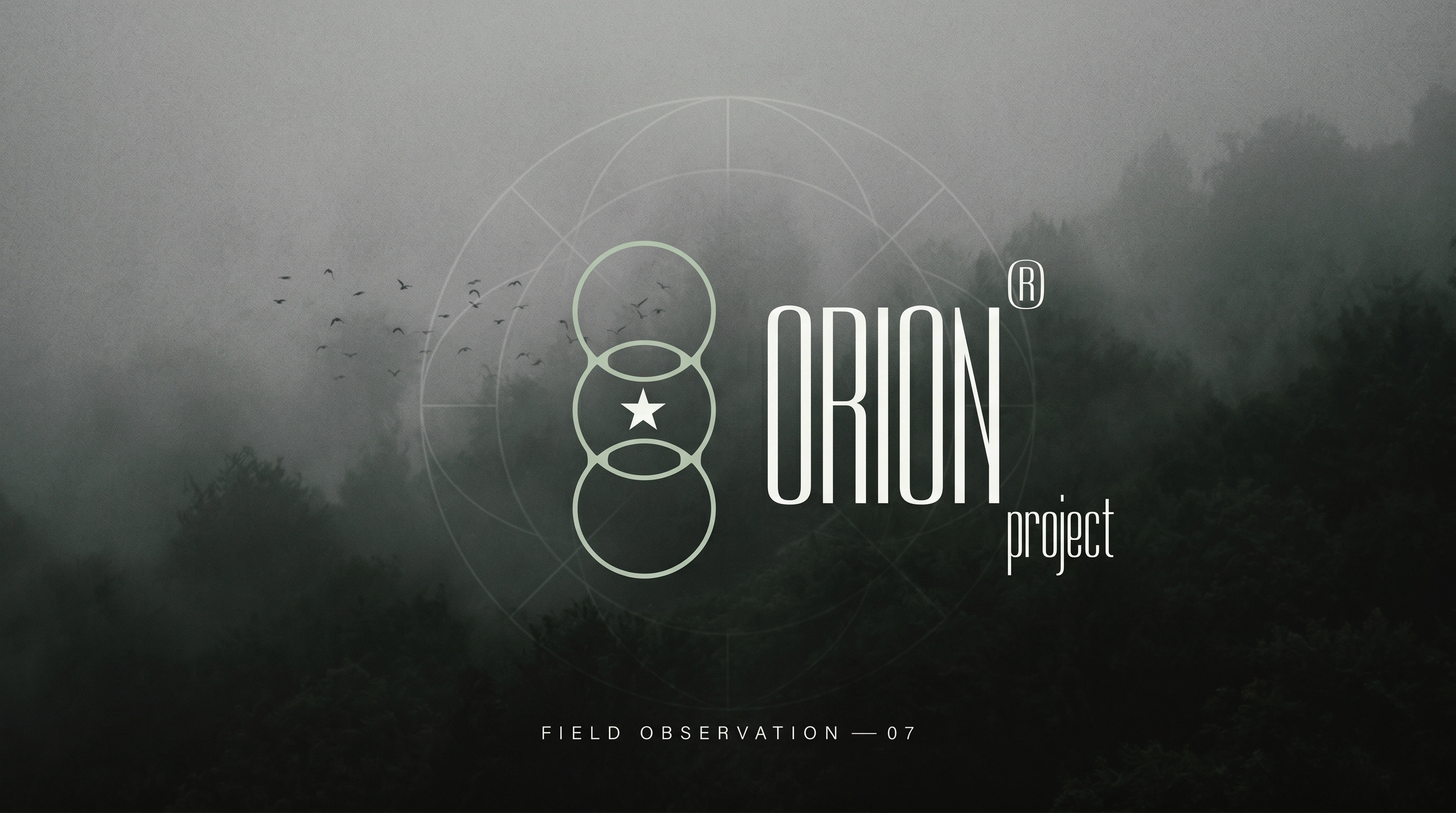
The mark is not decorative — it is structural. The upper circle is the lens: observation, the act of sustained looking. The central vesica is the threshold: where two fields overlap and something new becomes visible. The lower circle is the archive: what is collected, studied, kept. The star marks the centre of attention. The point of focus.
The mark holds across contexts. From a dark field panel with light-bleeding edges to a flat canvas tote rendered in raw line weight. From an embossed cover on sage linen cloth to a reversed-out overlay on a misty forest photograph. It does not need colour to survive. It does not need explanation to communicate.
The registered trademark symbol — set as a superscript — is a deliberate choice. It adds institutional weight without corporate affect. It says: this is a practice, not a project.
Mark anatomy:
The Lens — Observation. The act of sustained looking. The eye placed over the world.
The Node — The intersection. Where two fields converge and something that did not exist in either becomes possible.
The Archive — Collected structure. What endures observation. What is worth keeping.
02 — PALETTE
The palette was not specified. It was extracted.
Field White — #F5F5F3
The surface. Paper. The ground that everything else is observed against. Slightly warm — never clinical.
Ink Black — #1A1A1A
Type, mark, structure. Not pure black. Retains warmth at close range.
Canopy — #2E3D2A
Deep botanical green. The colour of a forest interior at overcast noon. Used for dark-mode applications, accent backgrounds, and the field cap.
Leaf Light — #B8C9B0
The colour of light transmitted through a lotus leaf. Sage. The living colour of the system — used for hover states, dividers, logo on dark grounds, glove detail, notebook cover.
Usage rule: Field White and Ink Black do 80% of the work. The greens appear like natural light through leaves — present but not announcing themselves.
03 — TYPE SYSTEM
Display / Headline: Cormorant Garamond, Light and Light Italic
The serif for all emotive and editorial moments. High contrast, refined, with the kind of character that reads differently at display scale than at text scale. Set in Light — never heavier. Italics used for emphasis, never for decoration.
UI / Body: Josefin Sans, 200–400
The workhorse. Geometric grotesque with a humanist undertone. Set in uppercase for all labels, metadata, and navigation. Set in sentence case for body copy. Letter-spacing generous throughout — minimum 0.08em.
Archive / Metadata: DM Mono, Light
For reference codes, coordinates, specimen classifications, and any data that should read as a record rather than a sentence. The monospaced weight enforces the field-note register.
Type hierarchy:
Titles — Cormorant Garamond Light, 3–5rem, letter-spacing −0.01em
Subheadings — Cormorant Garamond Light Italic, 1.4–2rem
Labels — Josefin Sans 300, 0.55–0.65rem, letter-spacing 0.2–0.28em, uppercase
Body — Josefin Sans 300, 0.7–0.75rem, letter-spacing 0.07em, uppercase, line-height 2.1
Codes — DM Mono Light, 0.52–0.6rem, letter-spacing 0.1em
04 — FIELD STUDIES
The portfolio is not a gallery. It is a research archive. Each project is a field study — numbered, dated, catalogued.
Field Study 001 — Morphologies of Flight
The first archive edition. Flight as the primary subject — not as metaphor, but as observable phenomenon. Wing displacement phases. Air current response patterns. Kinetic abstraction as design. Each specimen catalogued: Latin binomial, location coordinates, motion classification. The mark is placed over the subject as a viewfinder, not as a watermark.
Tags: Motion / Pattern / Structure / Kinetic Archive
Field Study 002 — Organic Geometry
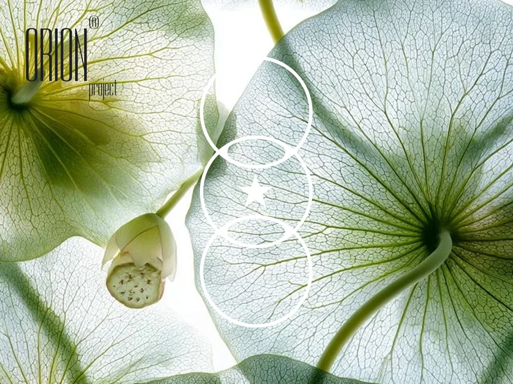
Sacred geometry as natural fact. The Flower of Life found in lotus venation. The golden section in feather vane spacing. Circles are overlaid on specimens as measurement instruments — not as design elements. The poster reads: "Observing Natural Structure / Field Study 002 / Organic Geometry Archive."
Tags: Botanical / Structure / Geometric Analysis
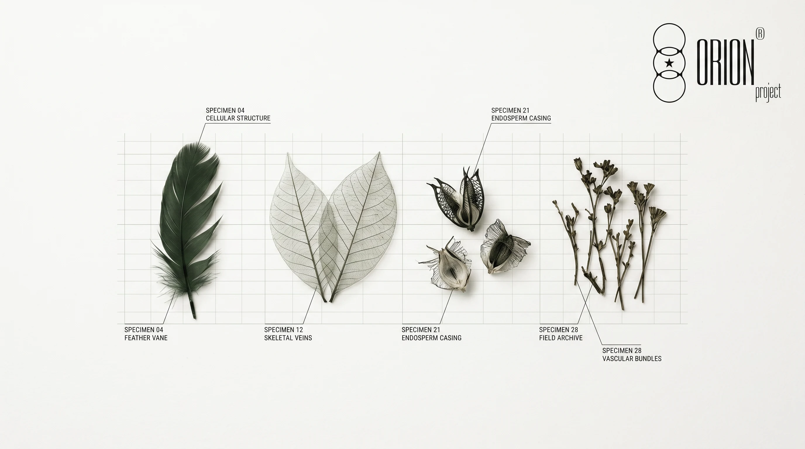
Field Study 003 — Cellular Systems
Skeletal leaf venation. Endosperm casing. Vascular bundles. Feather vane. Natural information design, more efficient than anything human-made. Specimens are labelled in the field-note register: "SPECIMEN 04 — FEATHER VANE / SPECIMEN 12 — SKELETAL VEINS / SPECIMEN 21 — ENDOSPERM CASING."
Tags: Micro / Specimen / Archive
05 — BRAND PRINCIPLES
01 — Observe first
Every design decision begins with looking. Not assuming. The mark is a lens placed over the world — geometry as a tool of perception, not decoration. The portfolio begins with the question: what did you actually see?
02 — Structure is found
Pattern is not invented. It is discovered in feather vane spacing, leaf venation, the spiral of a fern. The designer's role is observation and extraction. The work shows what was found, not what was made up.
03 — Restraint is active
Refinement is not silence. It is the confident removal of everything unnecessary until only the essential remains — and the essential is always interesting. White space is not emptiness. It is pressure.
04 — The archive grows
Each project is a field study. Numbered, dated, catalogued. The portfolio accumulates like a research dossier. Nothing is presented as finished. Everything is evidence of an ongoing investigation.
06 — APPLICATIONS
Print & Publication
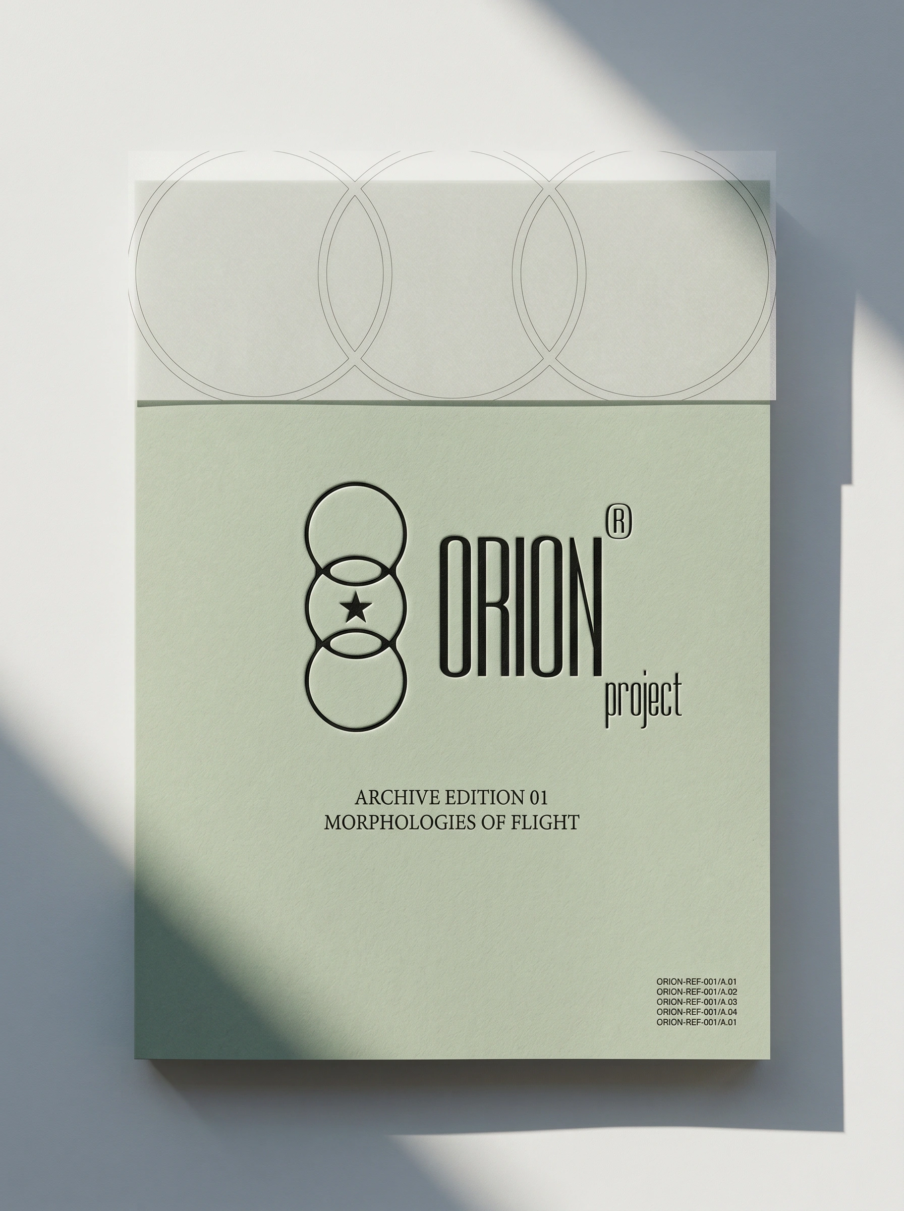
The Research Dossier: Case studies formatted as field reports. The Archive Edition cover — sage linen cloth, embossed mark, reference codes in monospace — signals the brand's commitment to physical form. Interior left page: blank, with the Orion mark set at one-third size, bottom right. Interior right page: full-bleed feather macro, captioned in white type: "Patterns emerge when observation becomes discipline." The deliberate asymmetry is structural — the empty page is not a mistake.
The Botanical Observatory Poster: Scientific illustration overlaid with intersecting circles. The mark as compositional element. Labelled: "Observing Natural Structure / Field Study 002 / Organic Geometry Archive."
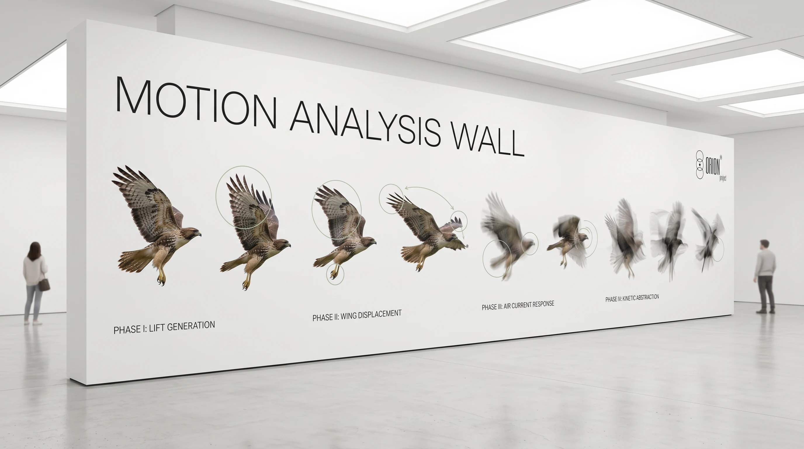
The Motion Analysis Wall: An 8-metre installation. A hawk in seven phases of flight — from lift generation through kinetic abstraction. The images move from photographic to blurred to near-abstract. The Orion mark sits small, top right. Nothing else. The work does not need explaining.
Environment
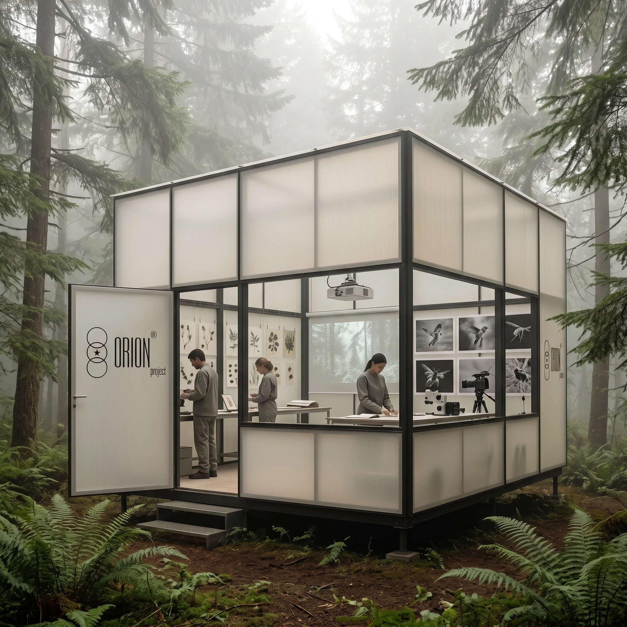
The Field Station: A translucent polycarbonate structure in a forest clearing. Black steel frame. Botanical specimens pinned to interior walls. Projected bird motion studies on the rear panel. The Orion mark on the door — the only exterior branding. Inside: a light table, a microscope, printed field notes. The brand exists in the world as a research practice, not a design agency.
Objects & Apparel
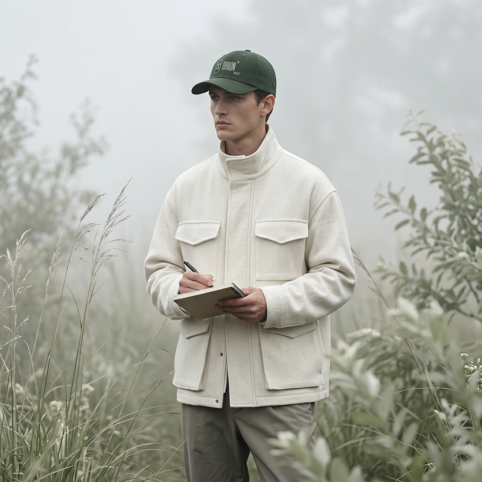
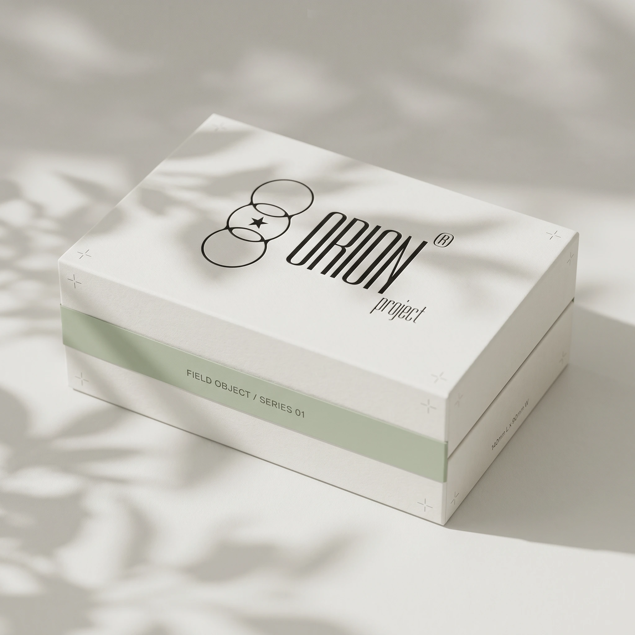
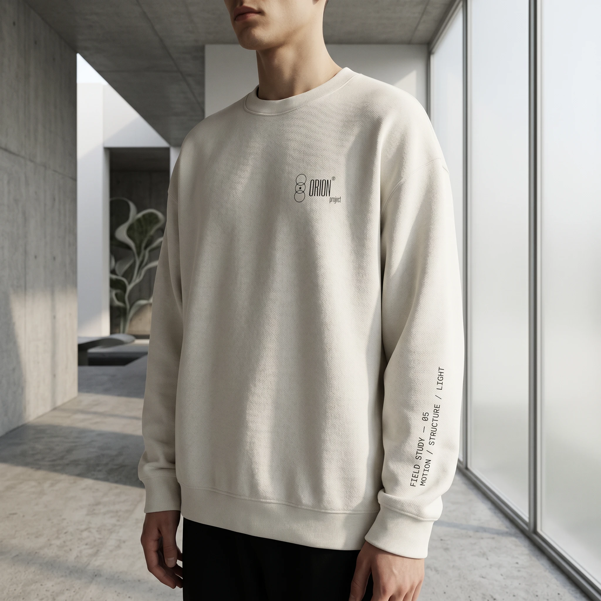
The Utility Object Series: Not merchandise — field equipment. A sage-covered hardbound notebook marked "ORION PROJECT / ARCHIVE / DATE___". A matte black flask. Sage gloves with a star detail at the wrist. Labelled specimen envelopes containing a dried leaf, a fragment of mineral. An archive tote: "ARCHIVE CARRIER / SERIES 01." A cream observation jumper with "FIELD STUDY — 05 / MOTION / STRUCTURE / LIGHT" running along the sleeve in tracking-heavy monospace. A dark green field cap with the mark and wordmark in tonal embroidery.
Digital Interface
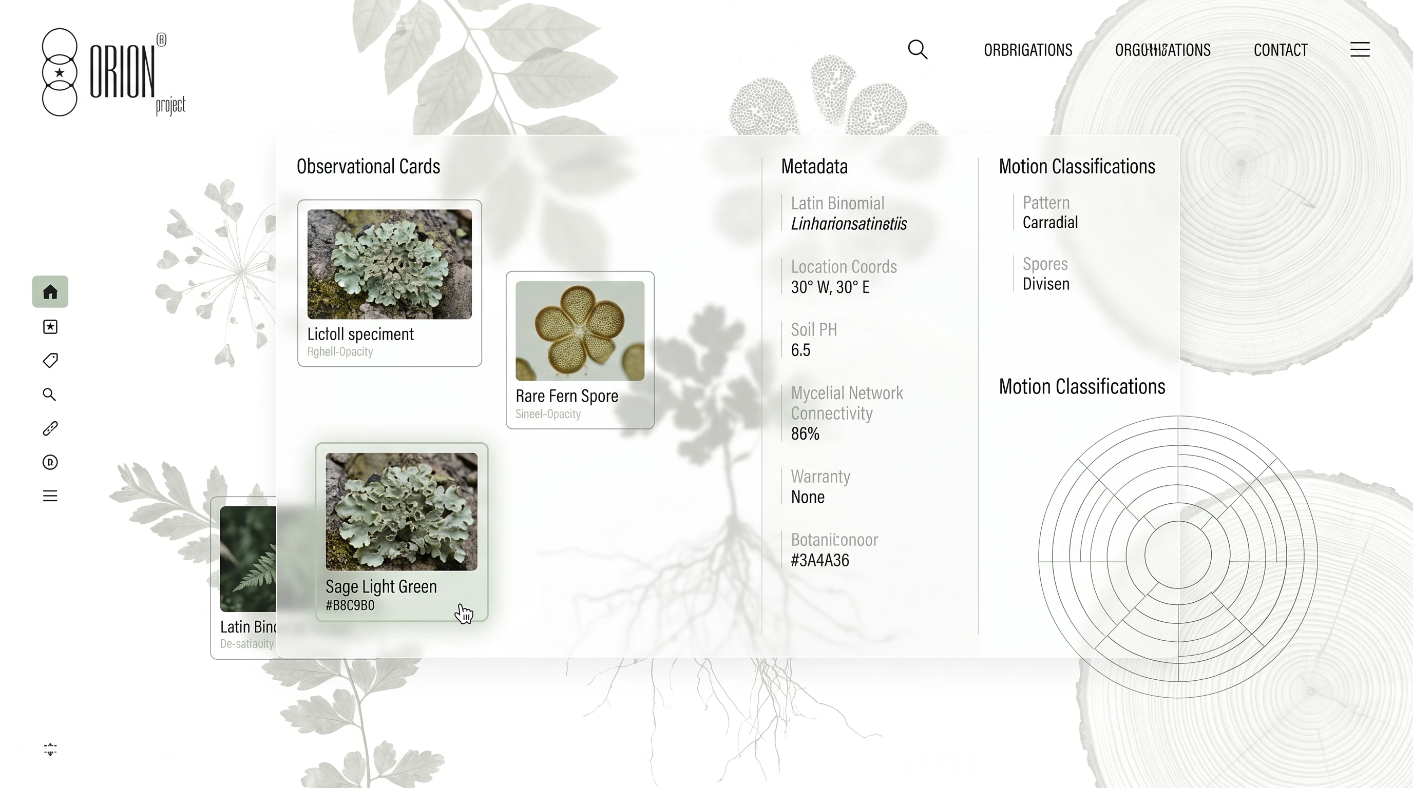
The Translucent Interface System: The portfolio site functions as an observational database. Observational Cards display specimens with full metadata: Latin binomial, location coordinates, soil pH, mycelial network connectivity, botanical colour reference (hex code). Motion classifications shown as radar diagrams. Botanical illustration ghosted as background texture. The UI is clinical — data-forward, not decorative. Navigation reads: "Orbrigations / Organisations / Contact." The language of a research institution.
The Dark Field Identity Panel: Deep canopy green. The mark and wordmark reversed to Leaf Light. Astronomical coordinates flanking the composition. Sub-label: "Motion / Pattern / Structure / Specimen Classification." The dark version is used for social headers, film title frames, and any context where the brand needs presence without brightness.
07 — VOICE
Orion Project speaks like a researcher who has done the fieldwork and doesn't need to explain it. Short sentences. No hedging. No "passionate about creating impactful experiences." The confidence comes from the observation, not the announcement.
Project introduction register:
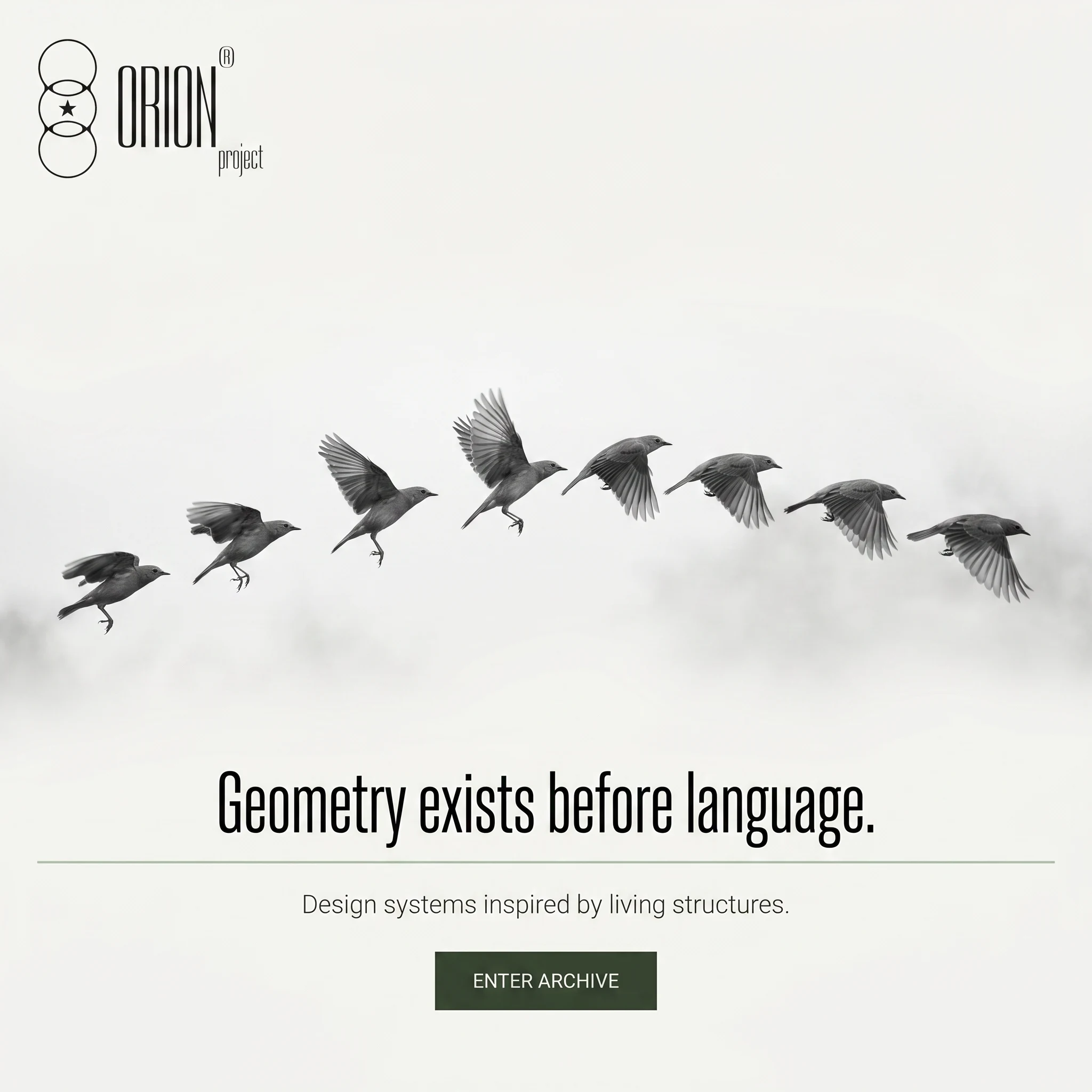
"Geometry exists before language. This is not a metaphor."
Case study body register:
"Patterns emerge when observation becomes discipline."
Object labelling register:
"Archive Carrier / Series 01 · Field Study — 05 · Motion / Structure / Light"
Navigation and UI register:
"Enter Archive. Orbrigations. Specimen Classification. Field Observation — 07."
What the brand never says:
— Creative solutions for forward-thinking clients
— Passionate about design
— Let's collaborate
— Turning ideas into reality
— Where creativity meets strategy
CLOSING
Orion Project is not a rebrand. It is a first brand — built from first principles. The identity system is complete: mark, palette, type, voice, physical language, digital language. It has the consistency of something that grew from a single observed truth rather than a brief.
The truth was this: geometry exists before language. The designer's job is to see it.
ORION PROJECT / ARCHIVE EDITION 01 / MORPHOLOGIES OF FLIGHT
α 05h 35m, δ −05° 23′
ORION-REF-001/A.01 — ORION-REF-001/A.02 — ORION-REF-001/A.03
Like this project
Posted May 18, 2026
A portfolio identity built like a field archive. Geometry, flight, botanical systems — design as sustained observation.
Likes
6
Views
47
Timeline
May 5, 2026 - May 18, 2026

