Built with Lovart
POLVERE Brand Identity Design & Website
Révolté
POLVERE — Postcards From Where The Air Runs Out
A specialty coffee brand built on one obsession: knowing exactly where your coffee comes from, down to the altitude, the farm, and the harvest date. The identity had to make that traceability feel like an adventure, not a data sheet.

The Brief
POLVERE came to me as a concept — a micro-roastery whose entire reason for existing was radical transparency. Every bag would carry the farm name, GPS coordinates, altitude, and harvest date. The product was exceptional. The problem was making all that precision feel warm, personal, and alive instead of clinical and cold.
The tension was real: specialty coffee had already been colonized by two aesthetics — the brutalist minimalism of third-wave roasters, or the precious craft-goods warmth of artisan markets. Neither fit. POLVERE wasn't trying to be cool or cozy. It was trying to be specific. Obsessively, joyfully, geographically specific. It was a brand that knew what farm its coffee came from, and it wanted you to know too — not as a credential, but as a story.
What I took on was the full brand system — identity, packaging, apparel, environmental, campaign, and web — built around a single conceptual framework strong enough to hold all of it without fracturing.
The Approach
The first instinct was to lean into scientific precision — monospaced type everywhere, data as hero, coordinates as decoration. I explored that direction for several rounds. Every version kept landing cold and unapproachable. The data was interesting, but the brand wasn't saying anything about why that data mattered. There was no emotional reason to care about a farm at 2,100 meters if the packaging felt like a nutritional label.
What cracked it was reframing entirely. Not data — correspondence. Not a report — a letter. The shift from "we know where this coffee comes from" to "we're writing to you from where this coffee comes from" changed everything. Every origin became a destination. Every bag became a postcard sent from altitude. Once that frame was clear, the visual system followed immediately and completely: vintage airmail borders, topographic maps as illustration and texture, rubber stamps for batch numbers and altitude markers, collector's stamp sheets, a field journal, a wax seal on the envelope.
The hardest restraint was the color palette. I wanted to give each origin its own color — it would have been the obvious move, collectible and differentiated. I rejected it because it would have broken the system logic. The palette had to function as a set of tools that the illustrations and data could work within, not a series of individual expressions. Five colors: Airmail Blue (
#4A7FB5), Stamp Red (#D94F3D), Aged Paper (#EDE0C8), Forest Green (#3A5C3B), Ink Black (#1C1C1C). Fixed across every touchpoint.The logo came from the stamp logic. I wanted something that read as a mark of authentication — heavy, geometric, unmistakable. The chunky all-caps slab wordmark in Airmail Blue sits like it was always there. It doesn't flex or adapt. It arrives on every surface and makes its claim.
The Work
Logo System
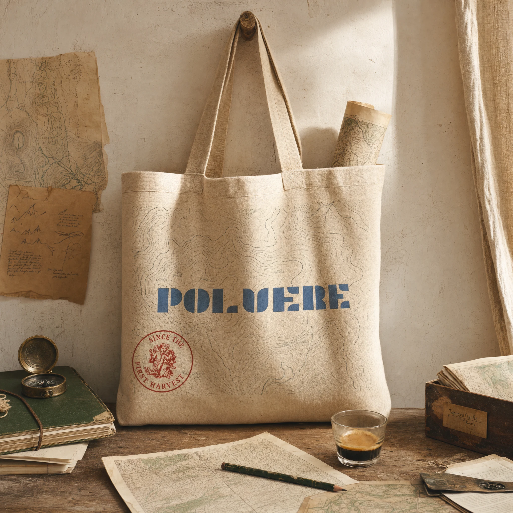
The wordmark is a custom geometric slab, all-caps, with counters that feel architectural — the weight of a rubber stamp, the precision of a surveyor's mark. It works debossed in foil on a field journal, screen-printed large on a waxed canvas apron, vinyl-cut on a plate glass shopfront, or reduced to a wax seal emboss. No secondary lockup was built — the name carries the brand alone, at any scale.
Packaging — Kraft Coffee Bag (250g)
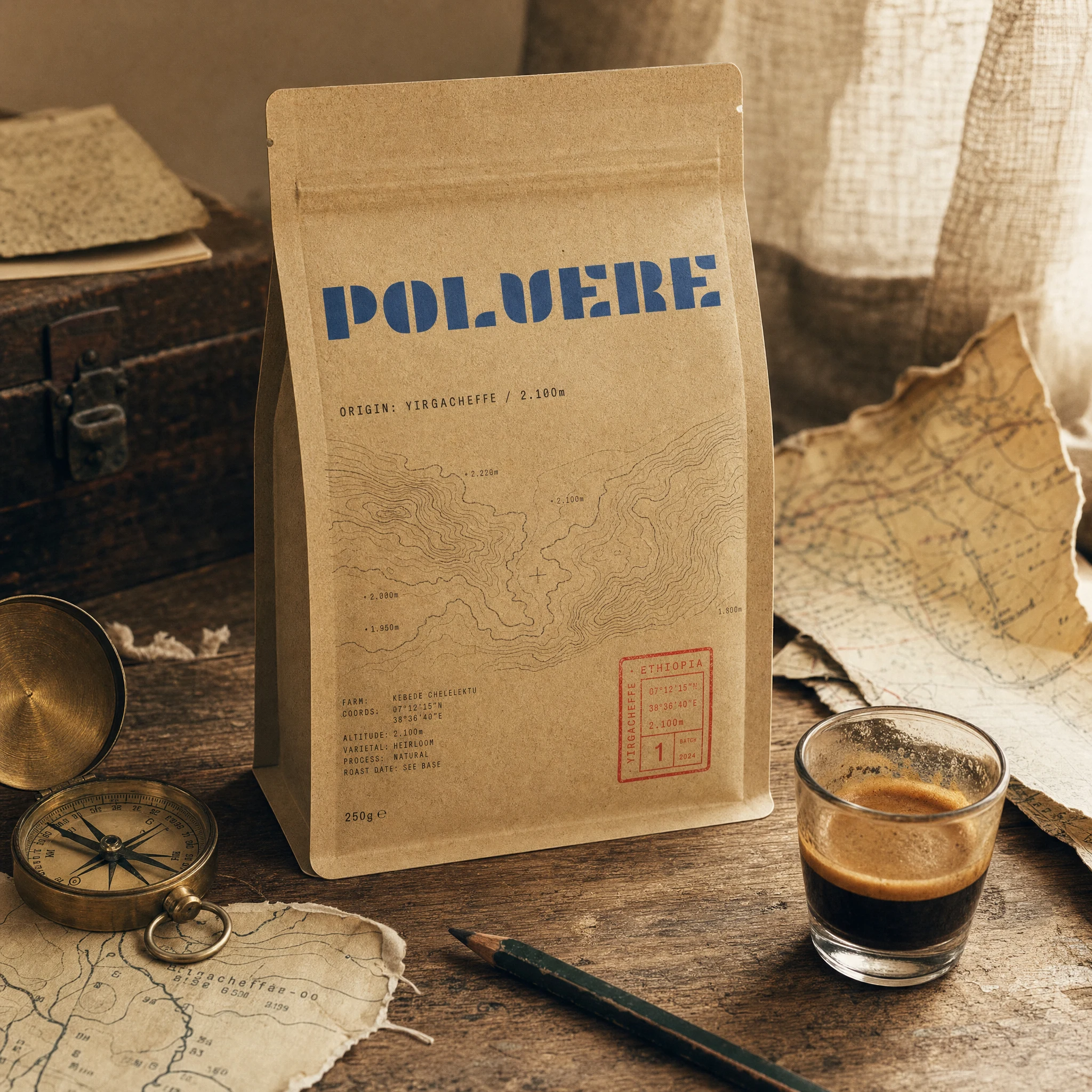
The primary bag is uncoated kraft with a full-face topographic map illustration of the origin region printed in Ink Black (
#1C1C1C) line work. All data — farm name, GPS coordinates, altitude, harvest date, varietal, process — is typeset in tight monospaced type that reads like field notes, not marketing copy. A Stamp Red (#D94F3D) rectangular stamp in the lower corner carries the batch number and origin name. The bag tells the whole story without a single claim.Packaging — Drip Sachet Pack
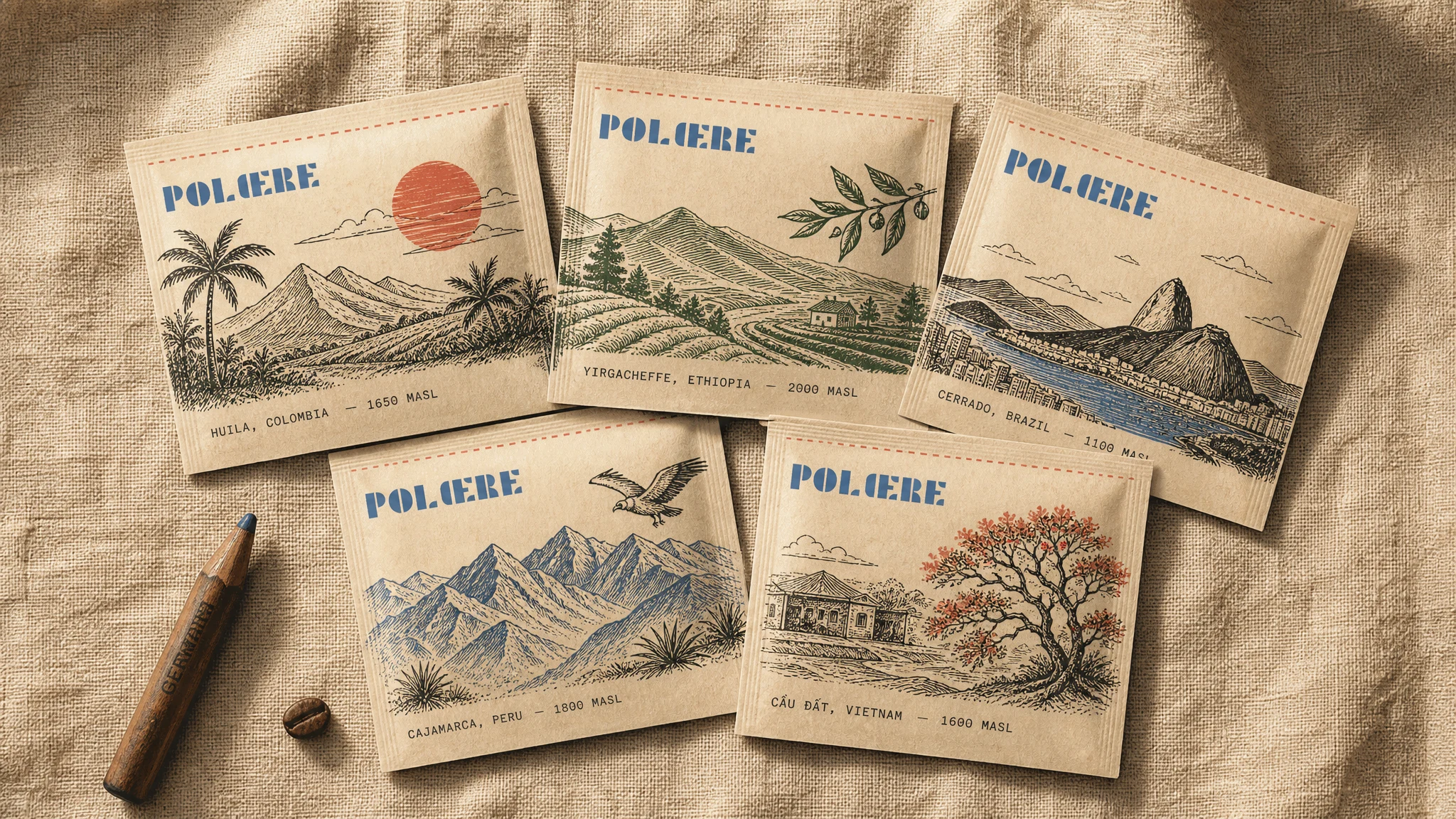
Five sachets, five origins, five postcards. Each carries a hand-drawn landscape illustration specific to its farm — Ethiopian highlands, Colombian palms, a Guatemalan volcano. The POLVERE logo sits top-left in Airmail Blue, origin name and MASL figure run along the bottom in monospaced type, and the Stamp Red tear strip runs across the top. Laid out together they function as a collection — the format rewards the repeat buyer.
Packaging — Collector's Stamp Sheet
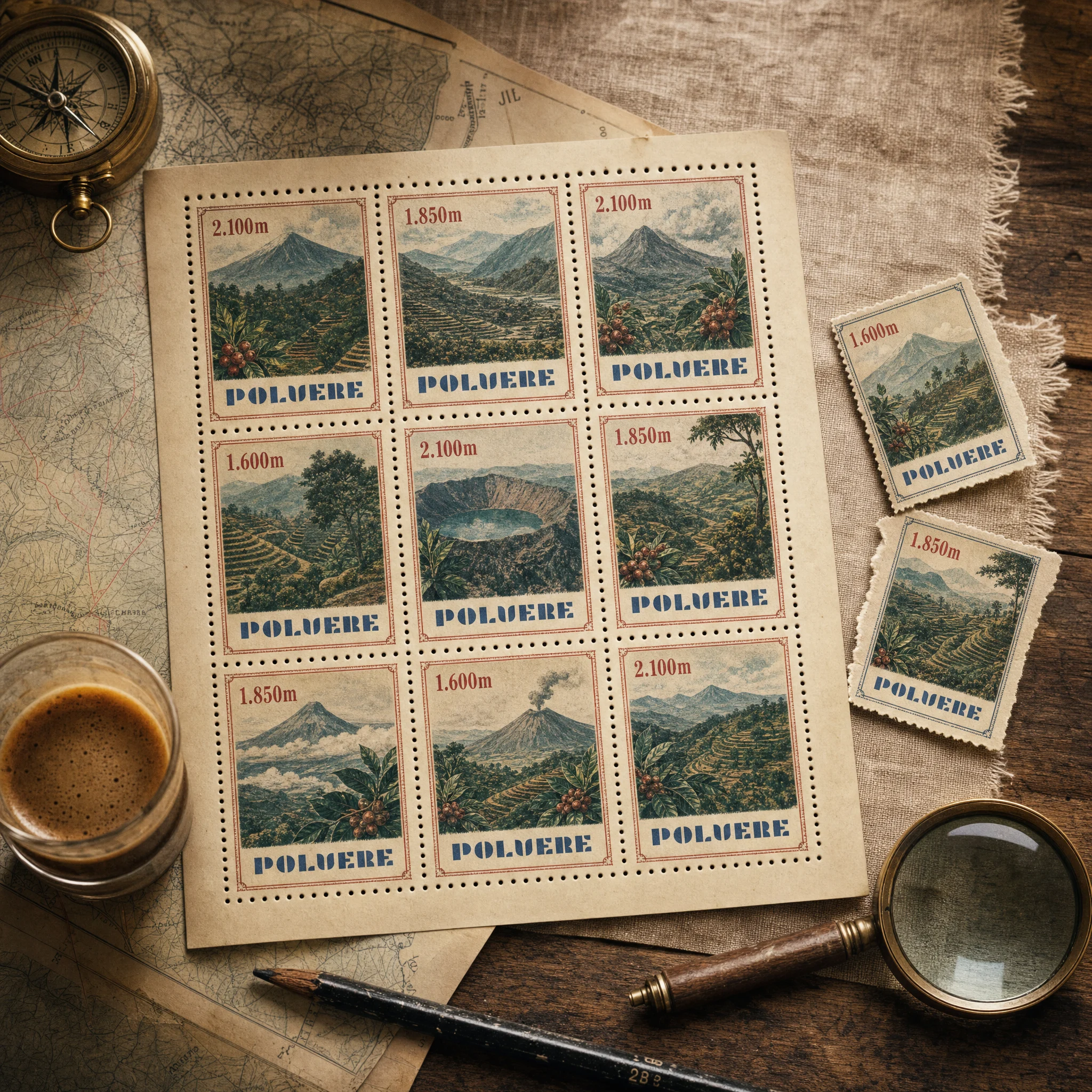
Nine perforated stamps, each a different illustrated landscape in a two-color palette drawn from the brand system. The altitude replaces the denomination. The POLVERE logo appears as the issuing authority at the base of each stamp. Two stamps torn loose and placed beside the sheet — the invitation to collect is built directly into the format, no explanation needed.
Packaging — Coffee Tin
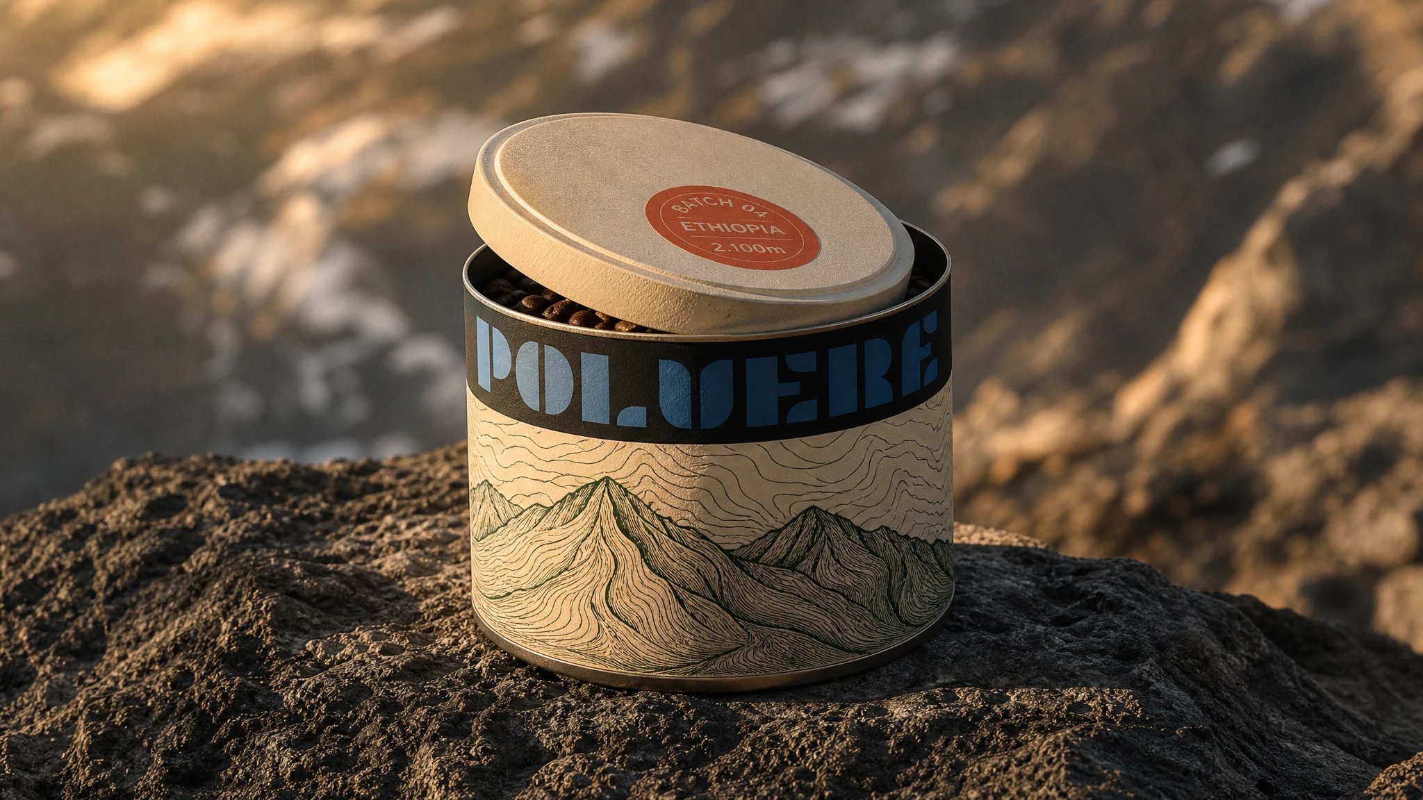
A cylindrical tin set on volcanic rock at golden hour. The Aged Paper (
#EDE0C8) label wraps the body with a topographic mountain illustration in Forest Green (#3A5C3B). The logo band runs across the top in Airmail Blue on Ink Black. The lid carries a Stamp Red (#D94F3D) circle badge: batch, origin, altitude. The background terrain places the product at altitude without a single word of copy. This is the hero product — the one that earns the shelf and the Instagram.Print Collateral — Postcard Set
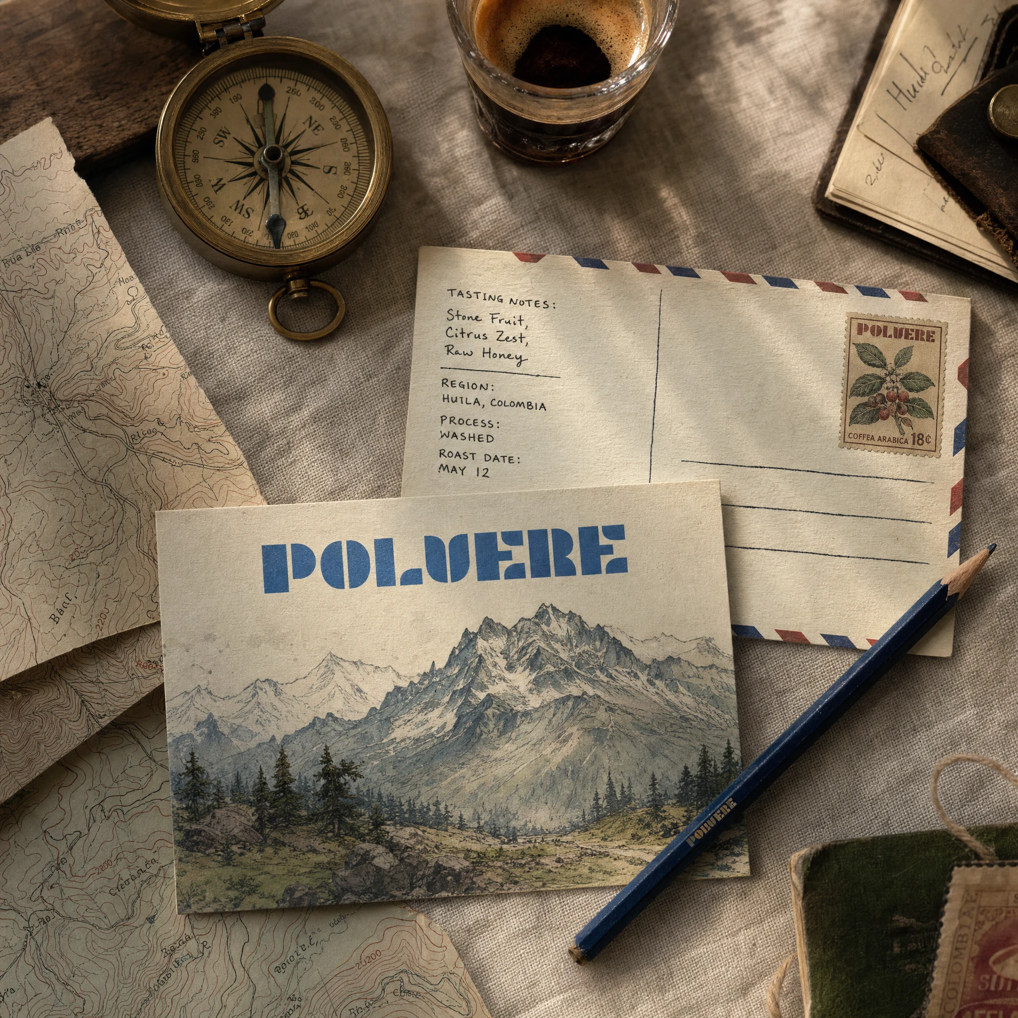
Front: hand-drawn mountain landscape in palette colors, POLVERE logo in the sky. Back: the classic postcard grid — tasting notes as handwritten message, airmail stripe border in Airmail Blue and Stamp Red, a custom POLVERE postage stamp top-right featuring a coffee plant illustration. These function as product inserts, mailers, subscription drops, and standalone collectibles. The format does three jobs at once.
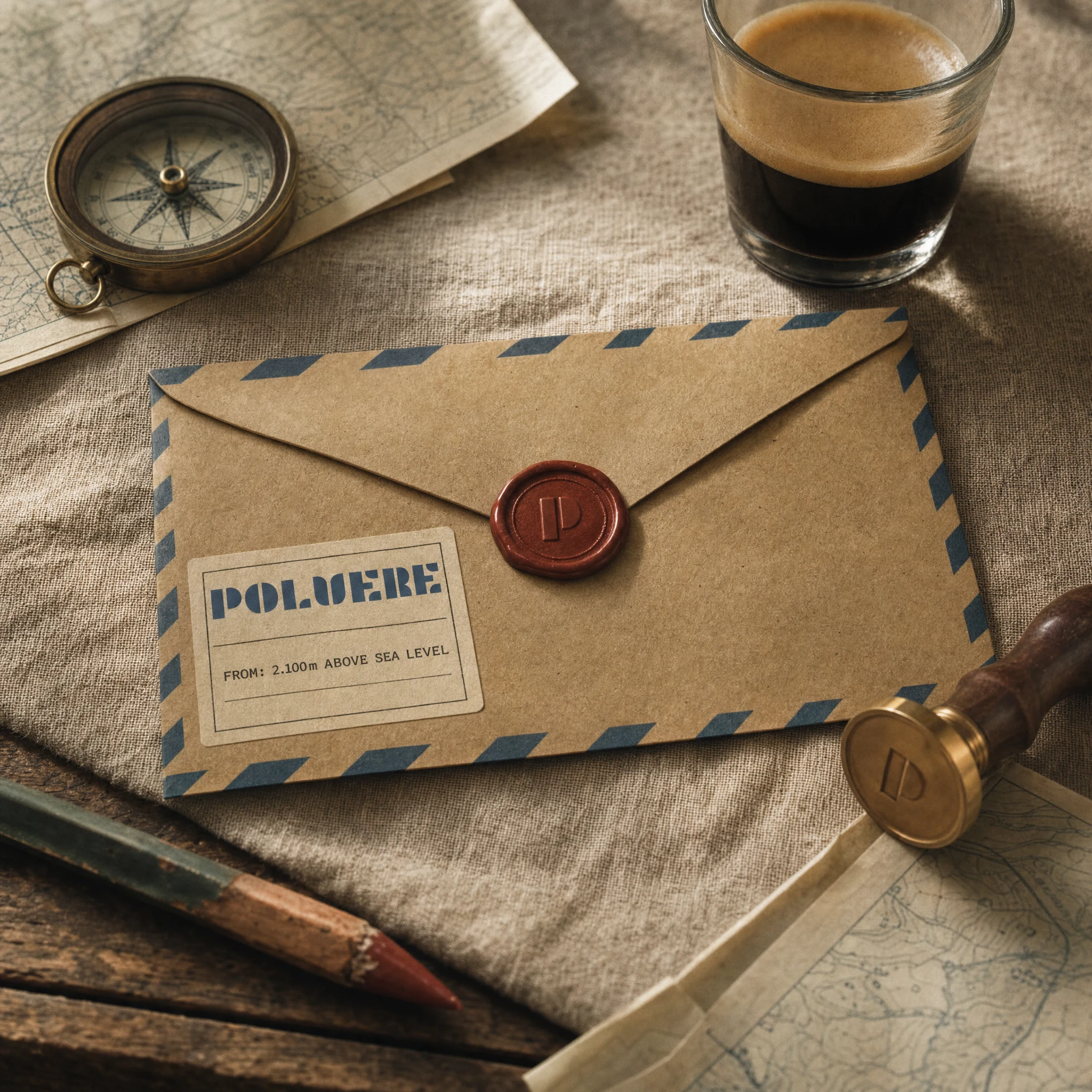
Print Collateral — Wax Seal Envelope

Kraft airmail envelope with the logo address label on the front, deep red wax seal embossed with the P letterform closing the flap, sender address reading FROM: 2.100m ABOVE SEA LEVEL. The brass stamp tool sits beside it, still warm. This is the gift packaging and subscription mailer — every unboxing is an arrival from altitude.
Print Collateral — Field Journal
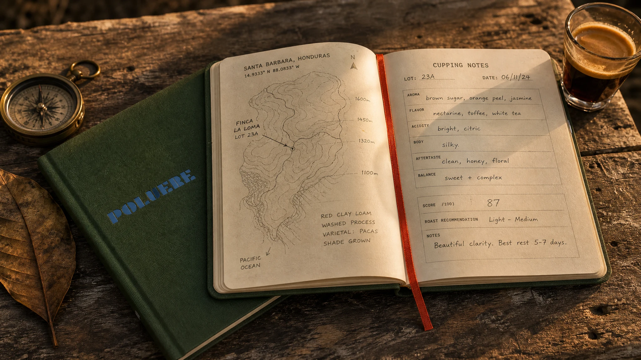
Forest Green (
#3A5C3B) hardcover cloth, POLVERE logo foiled in Airmail Blue, Stamp Red ribbon bookmark. Inside: a topographic map of the origin region with pencil annotations on the left page, a structured cupping notes template — lot, date, aroma, flavor, acidity, body, score, roast recommendation — on the right. The journal is both a product and a proof of method. This is how POLVERE thinks about coffee, made physical.Apparel — Staff Apron
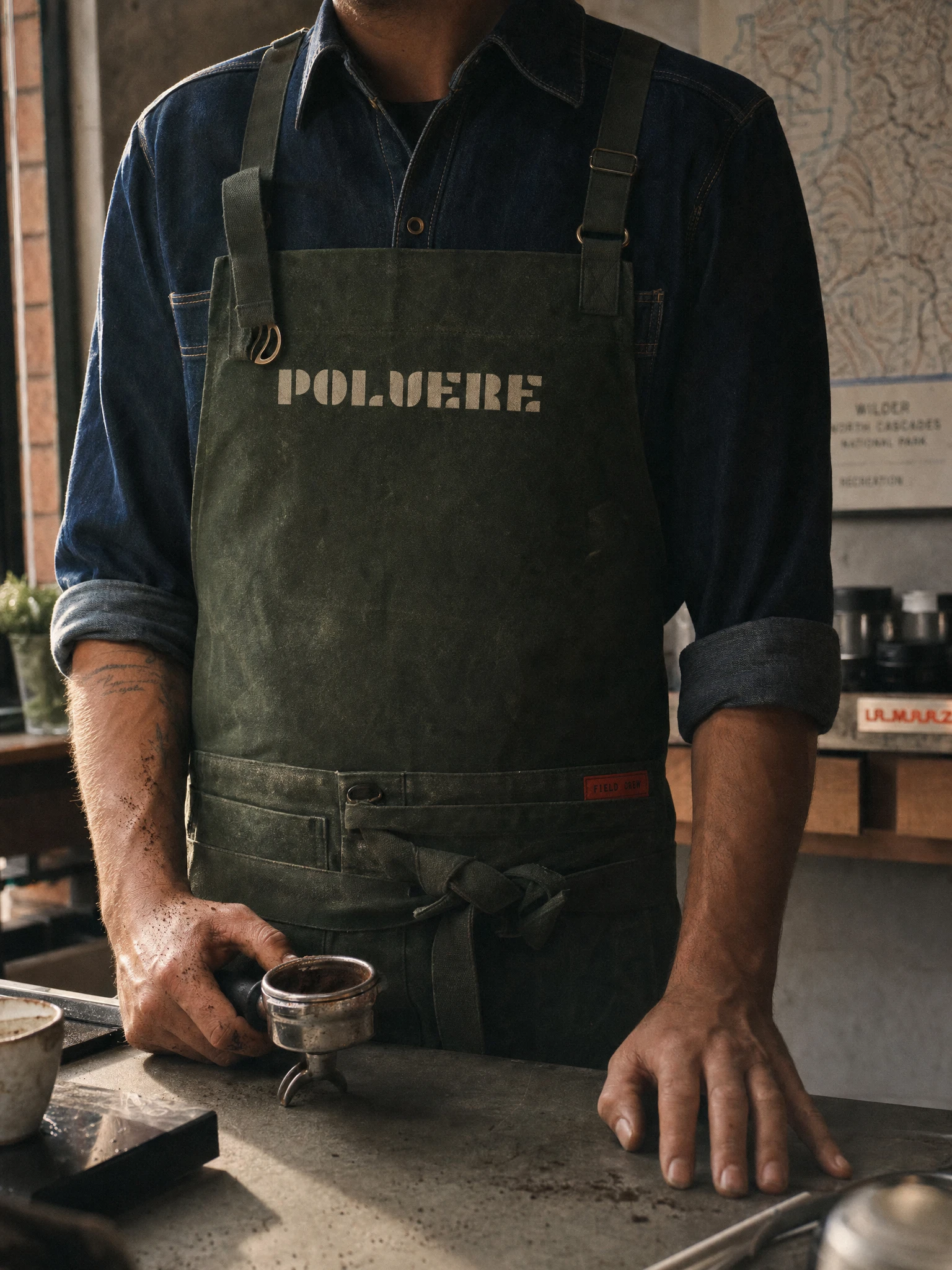
Heavy waxed canvas in Forest Green (
#3A5C3B), POLVERE logo stencil-printed large across the chest in Aged Paper (#EDE0C8) — worn and slightly faded, lived-in rather than precious. A Stamp Red woven label on the pocket strap reads FIELD CREW in monospaced type. Behind the barista, just in frame: a topographic map pinned to the wall. The apron is a uniform and a campaign image simultaneously — it was shot that way on purpose.Apparel — Bomber Jacket
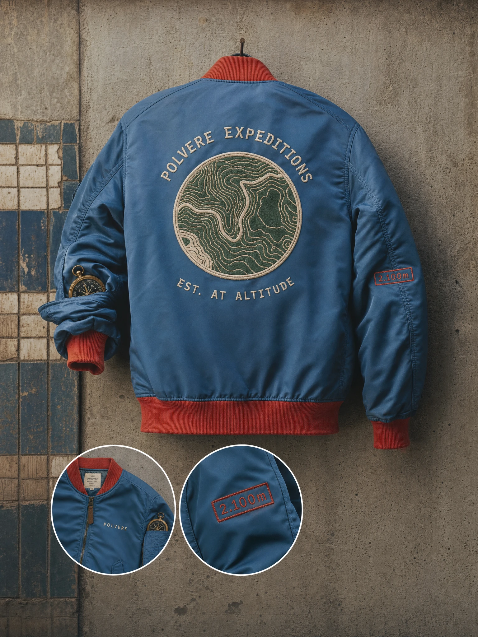
Airmail Blue (
#4A7FB5) nylon body with Stamp Red (#D94F3D) ribbed collar, cuffs, and hem — classic MA-1 blocking repainted in the brand palette. The back: a large circular embroidered patch with a topographic contour map in Aged Paper and Forest Green thread, POLVERE EXPEDITIONS arched above, EST. AT ALTITUDE below. A 2.100m woven badge on the right sleeve. A brass compass tucked in the chest pocket. This is the piece that makes someone stop on the street and ask what the brand is.Environmental — Journey Wall Mural
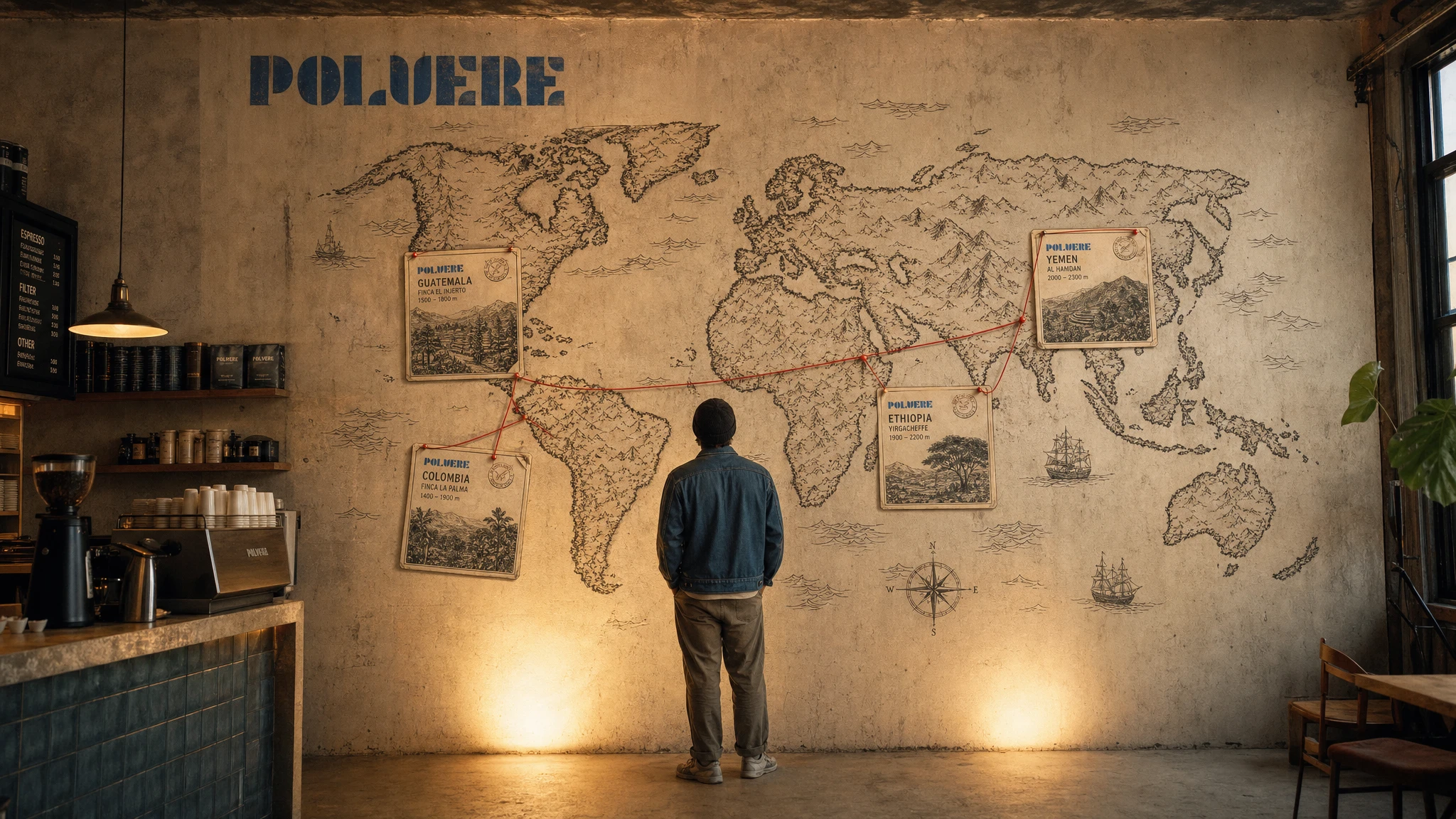
Full-height hand-illustrated world map on raw plaster. Four POLVERE origin cards pinned to their coordinates — Guatemala, Colombia, Ethiopia, Yemen — connected with red string. The logo painted large in Airmail Blue in the upper left as the cartographer's title block. One figure stands facing the wall, back to camera, small against the scale of it. The mural makes the brand's premise physical: every cup has traveled further than you have.
Environmental — Roastery Shopfront
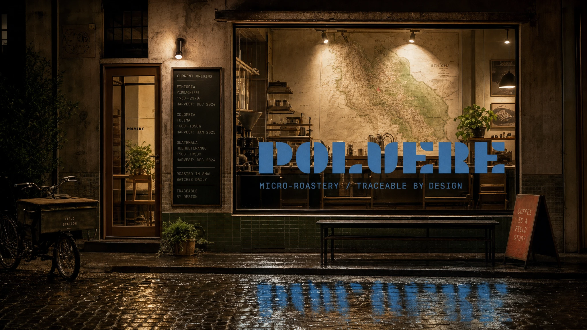
Plate glass window, large-format Airmail Blue vinyl logo centered, monospaced tagline below: MICRO-ROASTERY / TRACEABLE BY DESIGN. A chalk board beside the door lists current origins with altitudes and harvest dates — updated daily, never printed. The logo reflects in the wet cobblestones. A sandwich board in Stamp Red reads COFFEE IS A FIELD STUDY. The shop reads as a field station that became a destination.
Web — Hero Screen
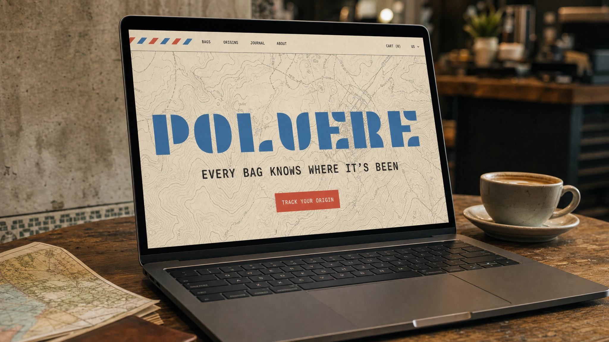
Aged Paper (
#EDE0C8) base, full-bleed topographic map at low opacity as background texture. POLVERE logo large and centered in Airmail Blue. Headline below in monospaced tracking: EVERY BAG KNOWS WHERE IT'S BEEN. A Stamp Red (#D94F3D) CTA button: TRACK YOUR ORIGIN. Airmail stripe detail runs along the top navigation edge. The website opens like a letter — the metaphor holds to the first pixel.Campaign — The Farmer's Hands

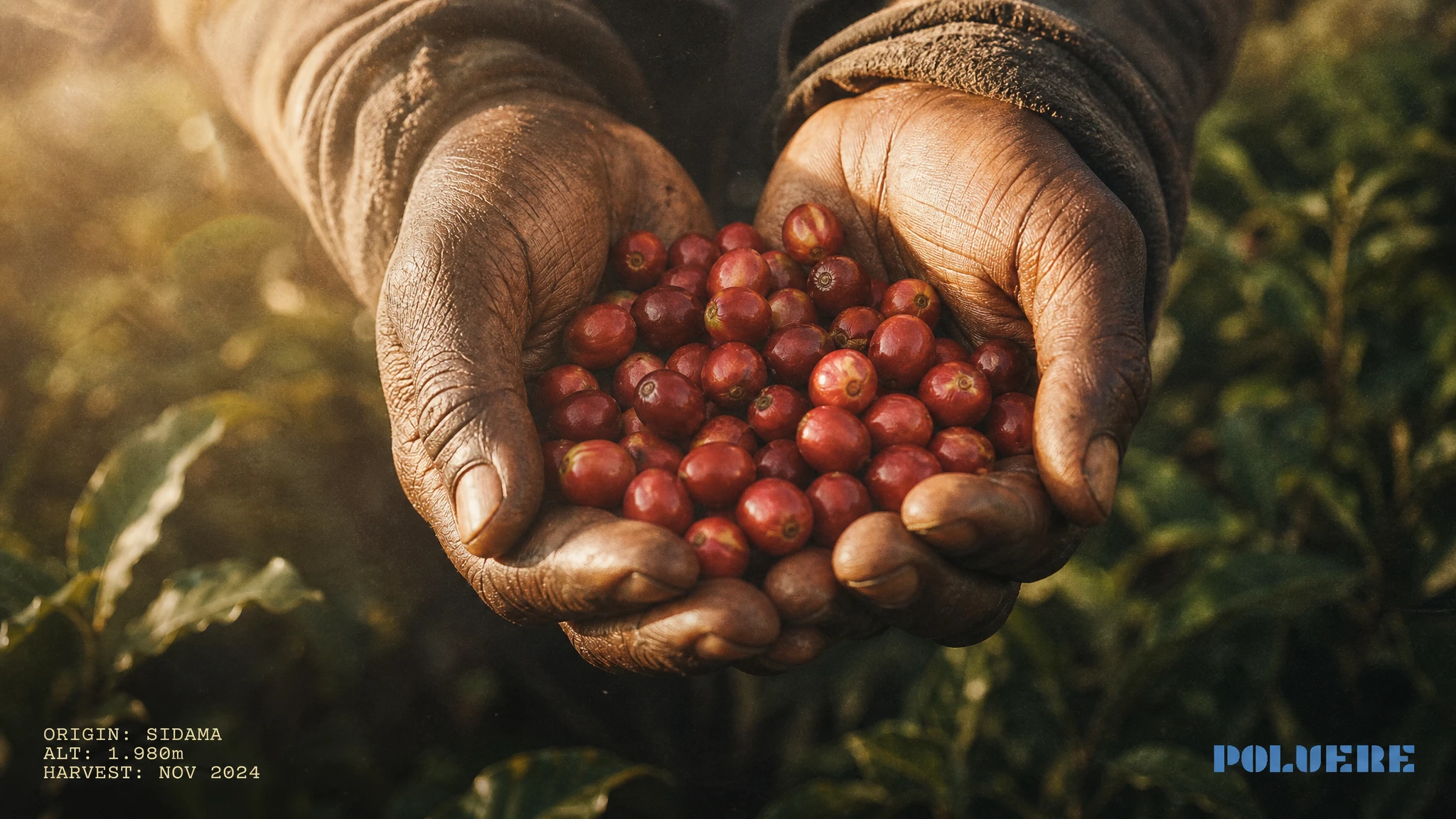
Close-up of weathered hands holding ripe red coffee cherries, backlit at golden hour, foliage soft behind. Origin data in the lower left in monospaced type: ORIGIN: SIDAMA / ALT: 1.980m / HARVEST: NOV 2024. POLVERE logo small and still in the lower right. The image earns the brand. The logo doesn't compete — it just confirms where the image came from.
Campaign — Altitude Poster
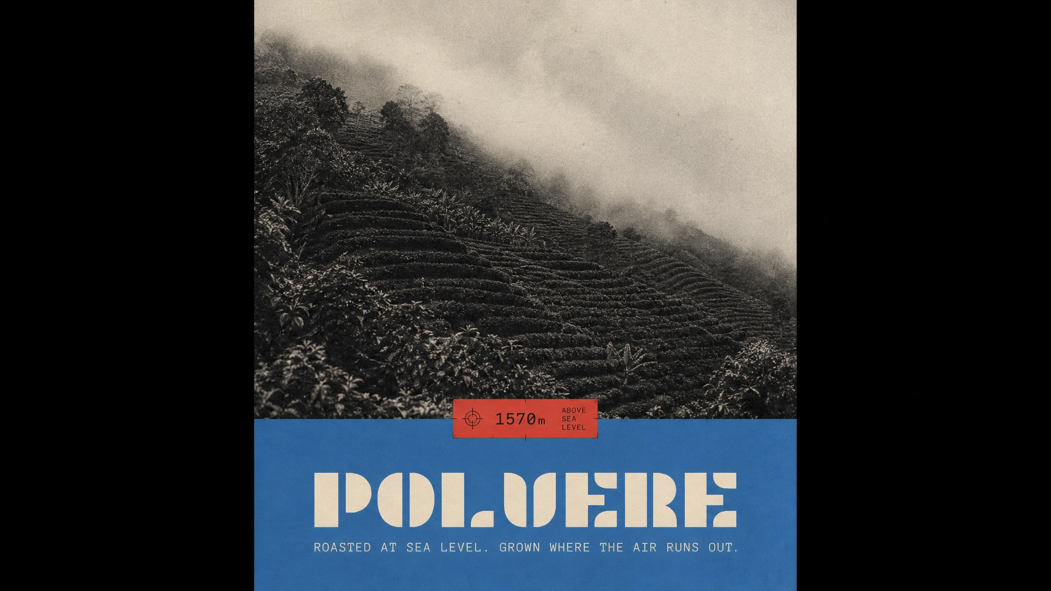
Split composition: top two-thirds is a full-bleed black and white photograph of terraced coffee farms disappearing into cloud, heavy film grain. Bottom third: solid Airmail Blue (
#4A7FB5), POLVERE logo centered in Aged Paper, one line of monospaced type below: ROASTED AT SEA LEVEL. GROWN WHERE THE AIR RUNS OUT. A Stamp Red altitude marker in a surveyor's tag format pins the horizon line where photograph meets color. Printed on uncoated stock, the grain and the matte surface do the rest.The Result
POLVERE launched as a complete brand world. Every touchpoint — from the wax seal on the subscription envelope to the vinyl on the shopfront window to the embroidered patch on the bomber jacket — operates inside the same system without strain. The altitude postcard framework proved strong enough to hold a fifteen-piece rollout across packaging, apparel, print, environmental, campaign, and web without a single element feeling forced or grafted on.
The work demonstrates that data-forward brands don't have to choose between precision and warmth. The trap is presenting the data as the product. The answer is building a world where the data becomes the story — where coordinates are coordinates, but they're also a return address, and every bag is a letter from somewhere real.
POLVERE found its world in the explorer's desk. Everything else followed.
Studio: Revolte — revolte.design
Project: POLVERE
Year: 2026
Scope: Brand Identity, Packaging, Apparel, Print Collateral, Environmental Design, Campaign, Web Design
Industry: Specialty Coffee / Food & Beverage
See more at revolte.design
Like this project
Posted May 16, 2026
POLVERE. A micro-roastery obsessed with traceability. Every bag is a postcard from altitude — farm, coordinates, harvest date, 2,100m above sea level.
Likes
3
Views
21
Timeline
May 7, 2026 - May 16, 2026