Built with Lovart
PLNE Brand Identity, Mobile & Website Project
Révolté
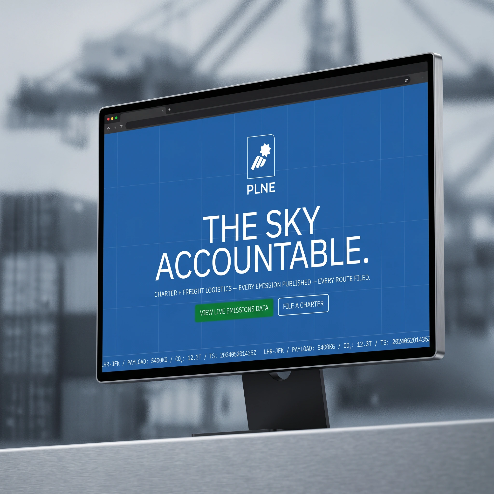
PLNE — Accountability at Altitude
An aviation logistics brand that refuses to hide its emissions. The brief was radical transparency. The answer was a visual system that looks exactly like what the company does: files, manifests, data — made public.
THE BRIEF
PLNE is a freight and charter operator built on one premise: publish everything. Every route, every tonne, every CO₂ figure — filed publicly, no exceptions. In an industry that runs on opacity, that's not a positioning statement. It's a structural decision that changes how the whole company operates.
The name says it all. No vowels. No filler. PLNE is what's left when you strip aviation down to function. My job was to build an identity system that matched that logic — one that felt less like branding and more like infrastructure. The kind of thing you'd find stencilled on a cargo door, not printed on a pitch deck.
The tension in the brief was real: how do you make radical transparency feel designed without it tipping into performance? The moment it looks like you're trying to appear honest, you've already failed. Everything in this system had to earn its place or get cut.
THE APPROACH
My first instinct was to go full industrial — raw stencil typography, uncoated surfaces, no color beyond near-black and white. It was honest but it was also dead. It read like a logistics company that had given up on communication entirely. That wasn't PLNE. PLNE has a position, a voice, a reason to exist beyond just being grim about carbon.
What unlocked it was the moodboard. Specifically the combination of two references that shouldn't have worked together: the corrugated steel of real shipping containers — serial numbers stencilled in white, worn paint, functional typography — and the editorial grammar of brands like Escaped and Shelter, where a logo floats clean over a full-bleed environment with utility words anchoring the corners. One is pure infrastructure. The other is pure communication. PLNE needed both.
The second unlock was the glass distortion principle. Every background in this system is frosted, refractive, slightly liquid — as if seen through an aircraft window or a tempered panel. But the foreground is always razor sharp. Type, data, mark. This became the governing rule of the whole visual system: the world is complicated and blurred, PLNE's data is always exact. You always know where you stand.
The color decision was the last thing to settle. I rejected botanical green immediately — Carbon Signal territory, too safe, too expected. The palette I landed on treats color as function: Aviation Blue (
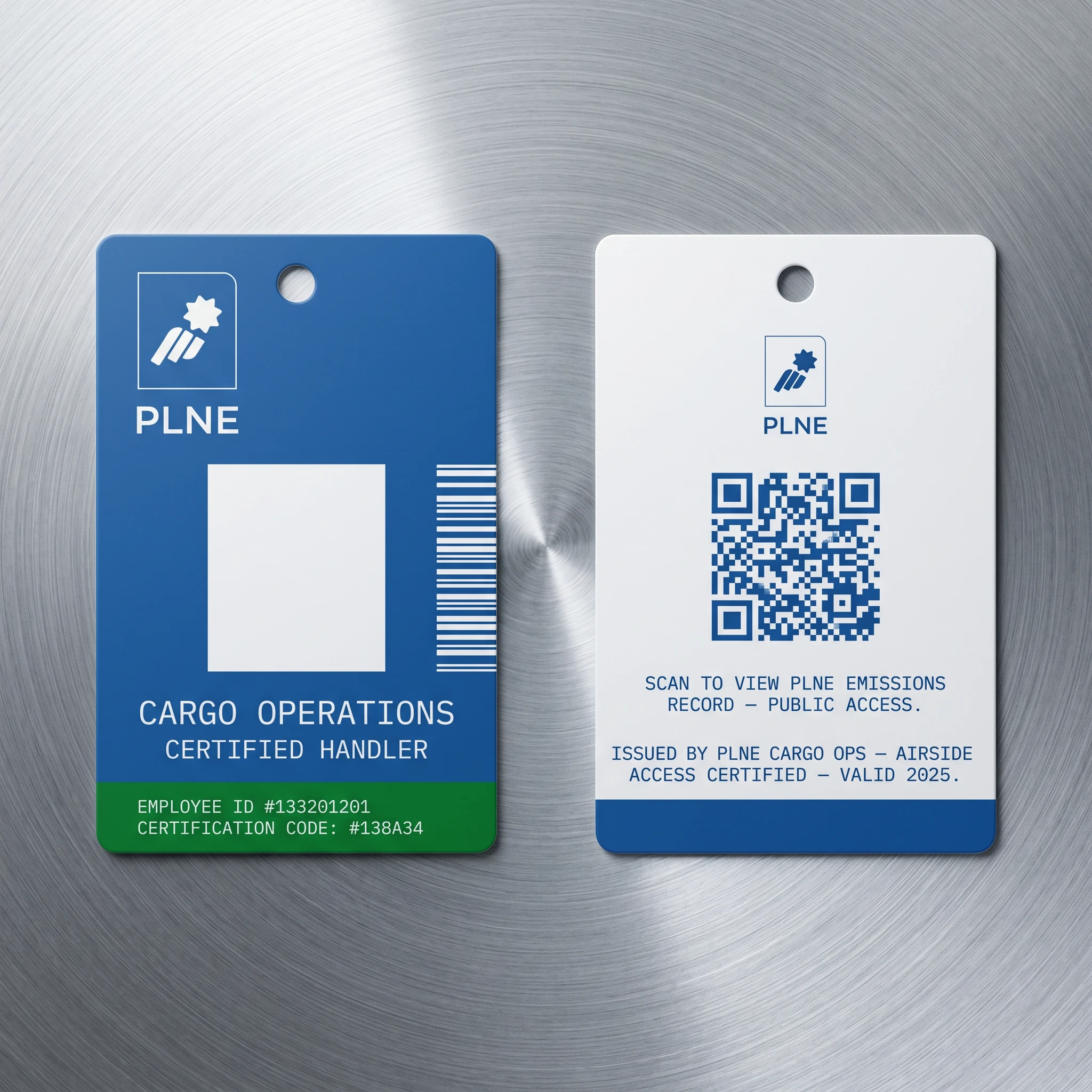
#2564AD) is the industry we're operating inside. Cloud White (#FFFFFF) is the blank document, the filed record, the clean slate. Deep Signal Green (#138A34) is earned, not decorative — it appears only on verified, certified, confirmed elements. It's the color of accountability, not aspiration.THE WORK
VISUAL SYSTEM
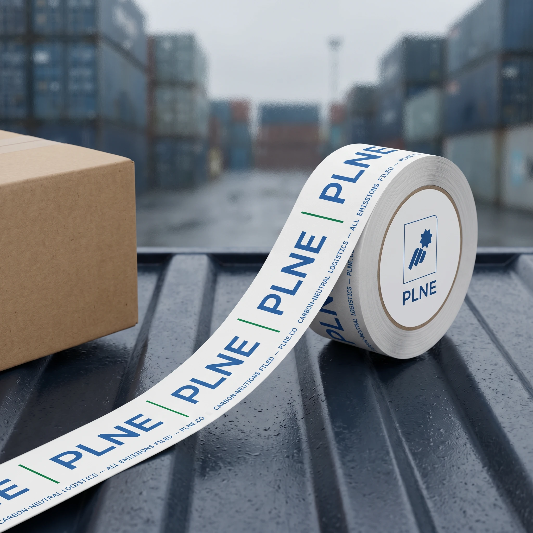
The system is built around one governing tension: industrial infrastructure meets editorial precision. The corrugated steel surface of a shipping container is not decoration here — it's the primary texture of the brand world, appearing as background pattern, as real-world application surface, as photographic subject. Against it, type is always sharp, always white, always positioned like data on an instrument panel. The grid is strict. The flow lines — atmospheric, data-contour, barely visible at low opacity — appear as background texture only. They never compete with the foreground.
TYPOGRAPHY
NATS handles everything that needs to be seen first: headlines, data callouts, wordmarks, environmental type at scale. It's condensed, geometric, all-caps, tracked tight. IBM Plex Mono handles all operational content — route codes, emissions figures, timestamps, manifest data. The pairing reads as cockpit display meets public filing. Inter Light handles body copy wherever running text is needed, but the system actively discourages running text. PLNE doesn't explain. It states.
COLOR SYSTEM
Five colors, strict hierarchy. Cloud White dominates — it's the document ground, the verified field, the blank record. Aviation Blue (
#2564AD) is structural — used for large fields, container surfaces, any zone that references the industry itself. Deep Signal Green (#138A34) is certification — it appears on offset-confirmed elements, verified badges, the bottom band of the container. It's the only color in the system that means something specific. Atmosphere Cyan (#70B9D0) handles atmospheric overlays and data visualization. Forest Deep Green (#005310) grounds the palette when a dark field is needed without going neutral grey.CAMPAIGN
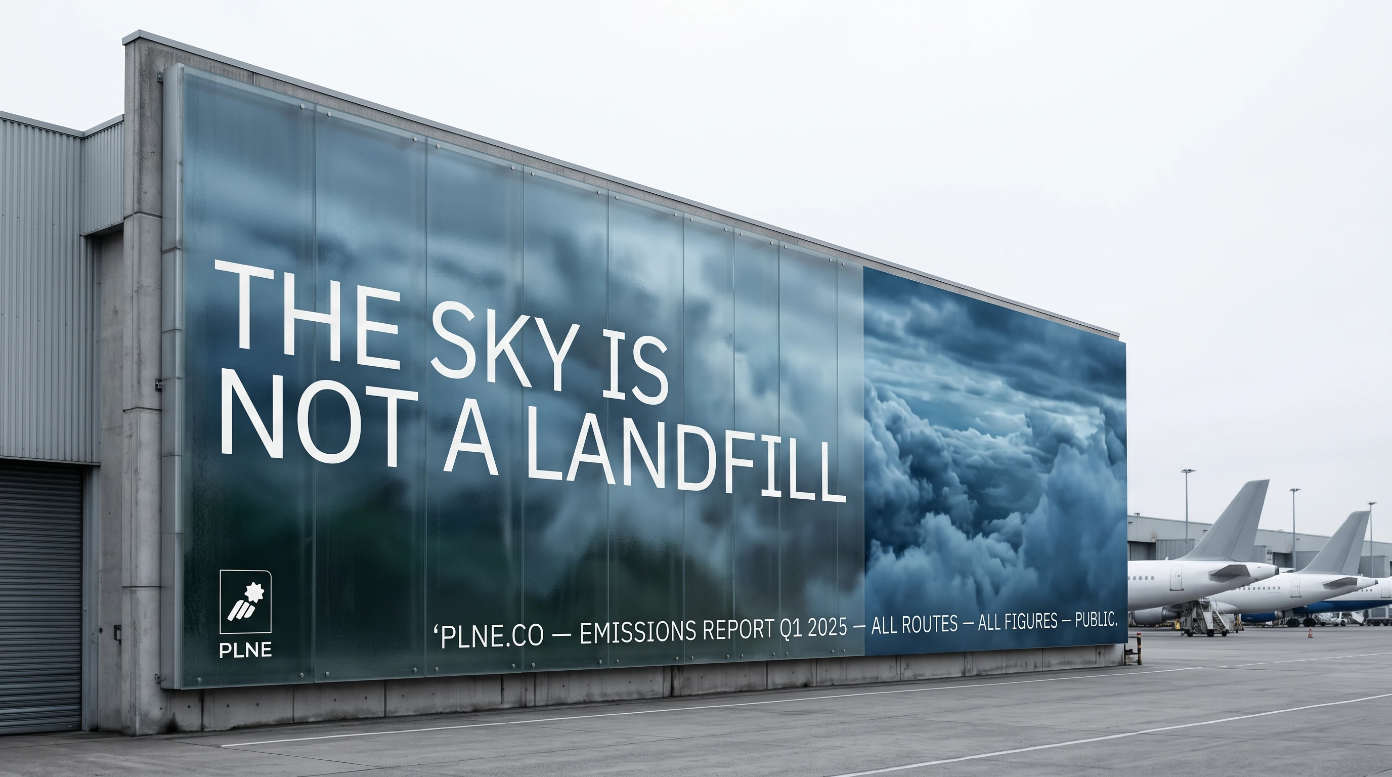
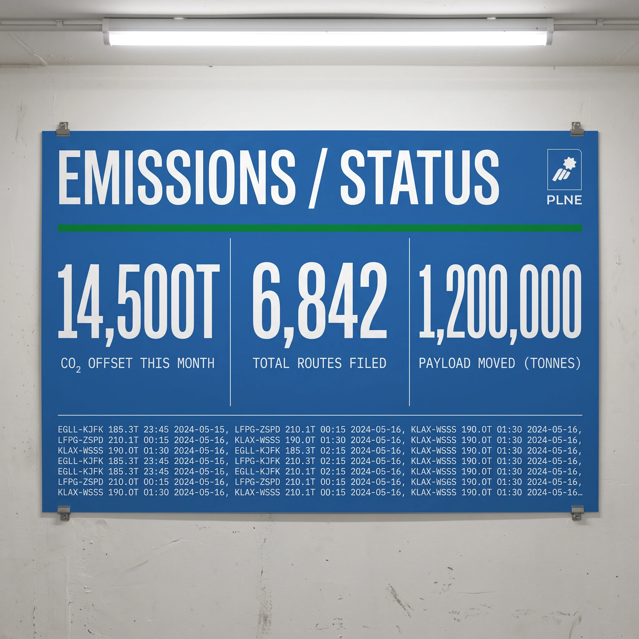
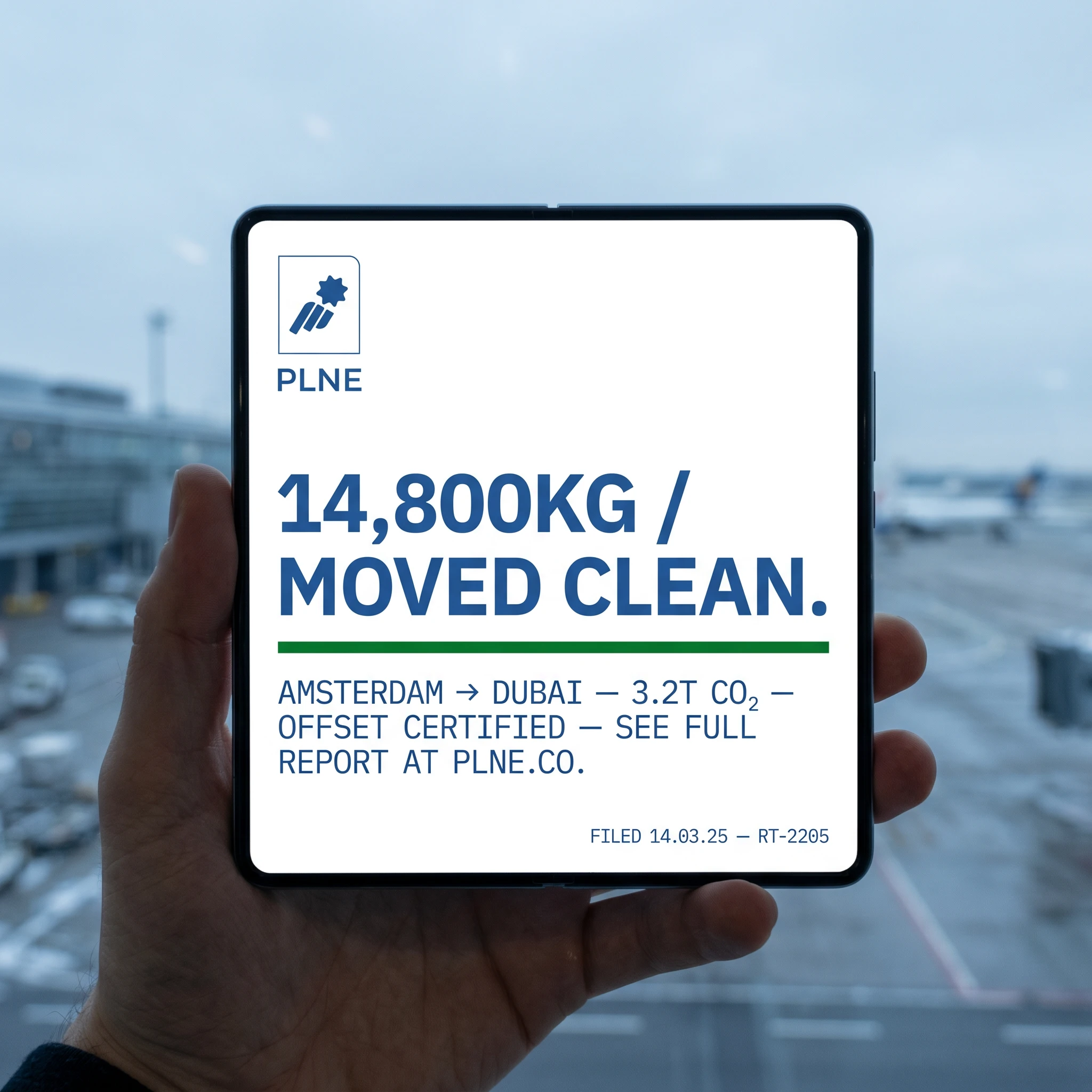
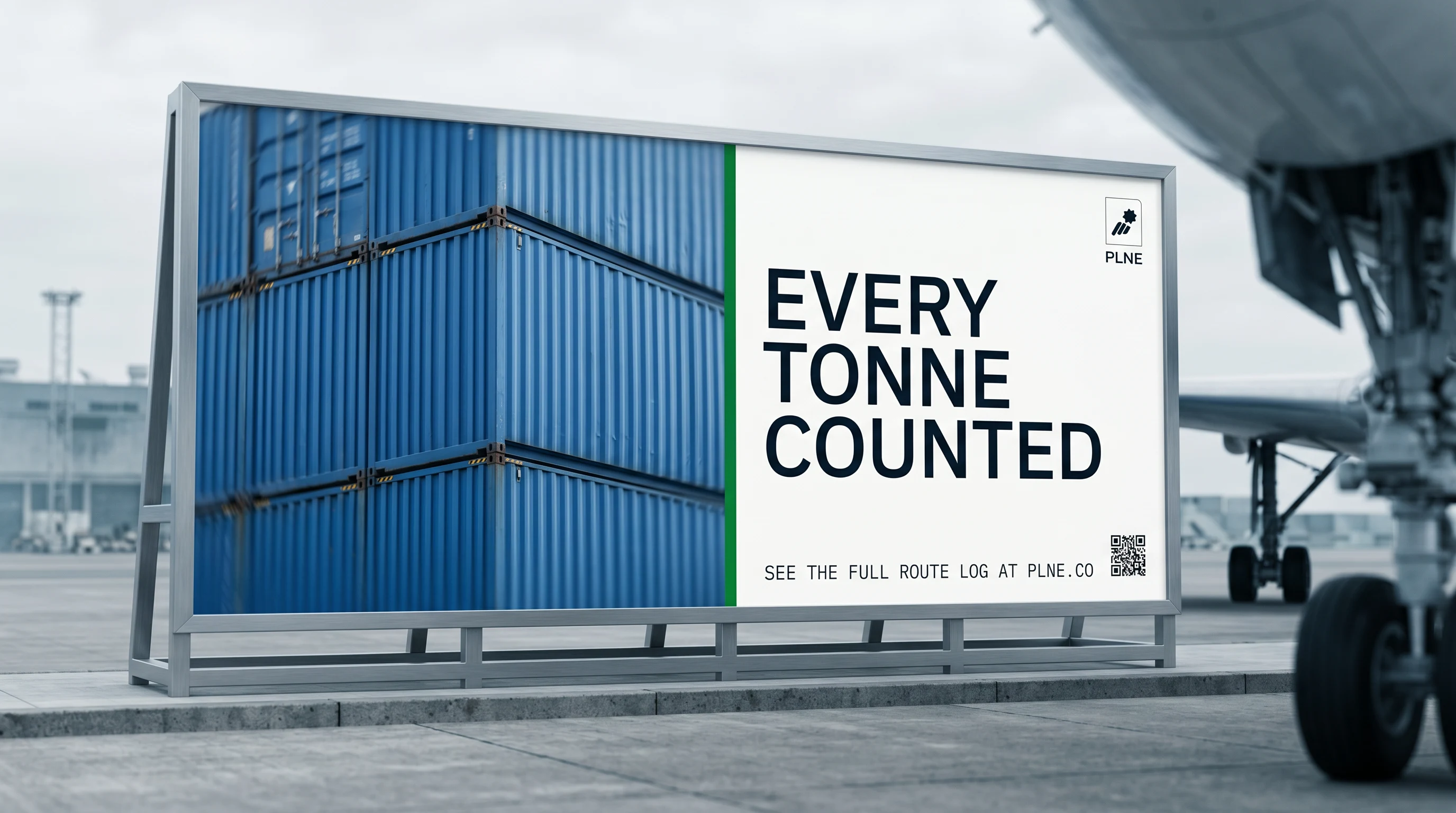
Five lines carry the whole campaign. "WE PUBLISH WHAT OTHERS BURY." "3.2T. FILED. OFFSET. CONFIRMED." "THE SKY IS NOT A LANDFILL." "EVERY TONNE COUNTED." "14,800KG / MOVED CLEAN." None of these are slogans. They're declarations formatted as data. The campaign poster series treats each line as an operational statement — set in NATS at maximum scale, anchored by a dense IBM Plex Mono data block at the bottom, the kind of information you'd find in an actual emissions filing. The posters look like they belong on the wall of a freight terminal, not in an agency presentation.
TOUCHPOINTS
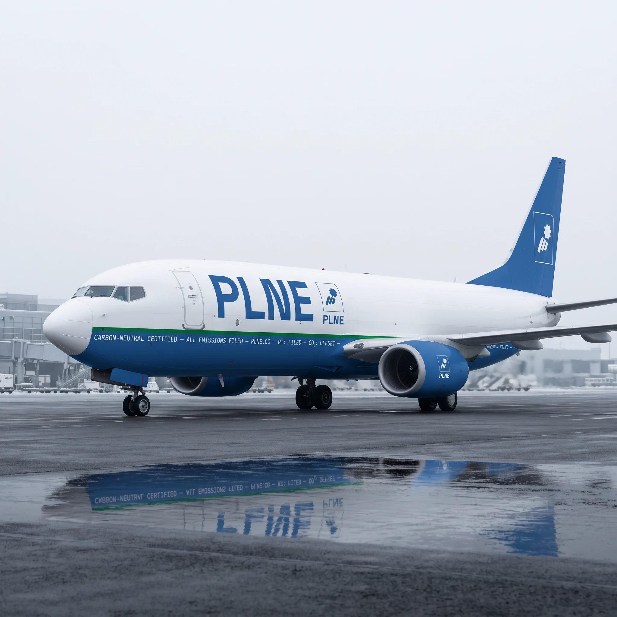
The system scales from macro to micro without losing its logic. The aircraft livery runs the full emissions data ticker along the Aviation Blue fuselage band — accountability moving at 500 knots, its own reflection distorted in the wet tarmac below. The cargo container carries "FILED" across the door panels in NATS at human scale. The ground crew vest uses Signal Green as the hi-vis panel color — the certification color made functional. The emissions dashboard wall panel turns operational data into a room-filling graphic: three figures at display scale, the full route log in 6pt IBM Plex Mono running beneath like ticker tape. Every touchpoint asks the same question: if you had to show the data, what would the design look like?
THE RESULT
What shipped was a brand identity that functions as a proof of concept for the company's entire thesis. When you see the container with its green certification band and its manifest data stencilled in white, you understand what PLNE is before you've read a word of copy. When you see the aircraft livery — white fuselage, blue band, data running the full length of the plane — it reads not as branding but as evidence. The wet tarmac reflection of the data ticker in the livery shot was unplanned. It looked intentional. That's the test.
PLNE is a speculative project — number four in an ongoing series of self-initiated brand identities built around companies that should exist. The brief was written to be unanswerable by most of the aviation industry's incumbent designers. I wanted to see what happened when you designed accountability instead of promising it.
Studio: Révolté — revolte.design
Project: PLNE
Year: 2026
Scope: Brand Identity, Visual System, Campaign, Environmental Design, Digital Touchpoints
Industry: Aviation Logistics / Carbon-Neutral Freight
See more at revolte.design
Like this project
Posted May 11, 2026
PLNE, an aviation logistics brand that refuses to hide its emissions. The brief was radical transparency.
Likes
1
Views
9
Timeline
Apr 22, 2026 - May 11, 2026

