Built with Lovart
Brand Identity for Still Here
Révolté
STILL HERE — Case Study
Overview
Still Here is a mental health and self-help brand for adults built on a deliberately disarming premise: that the most honest emotional language is the one we learned before we learned to hide. The brand uses the visual vocabulary of childhood — illustrated characters, storybook palettes, handmade imperfection — not as nostalgia, but as a strategic act of openness. When something looks like a picture book, your defenses lower. That's the point.
The creative challenge was building a brand that operates simultaneously in two registers: tender enough for a child, honest enough for an adult who has had a hard year. Every decision — typographic, chromatic, illustrative, photographic — had to hold both truths at once without winking at either.
Naming
"Still Here" works as a children's phrase and an adult survival statement at the same time. No irony. No explanation needed. It's the kind of sentence you might write at the front of a journal you didn't know you needed. The period, when used, carries weight: still here. Not a celebration. A fact. A small, significant one.
Logo
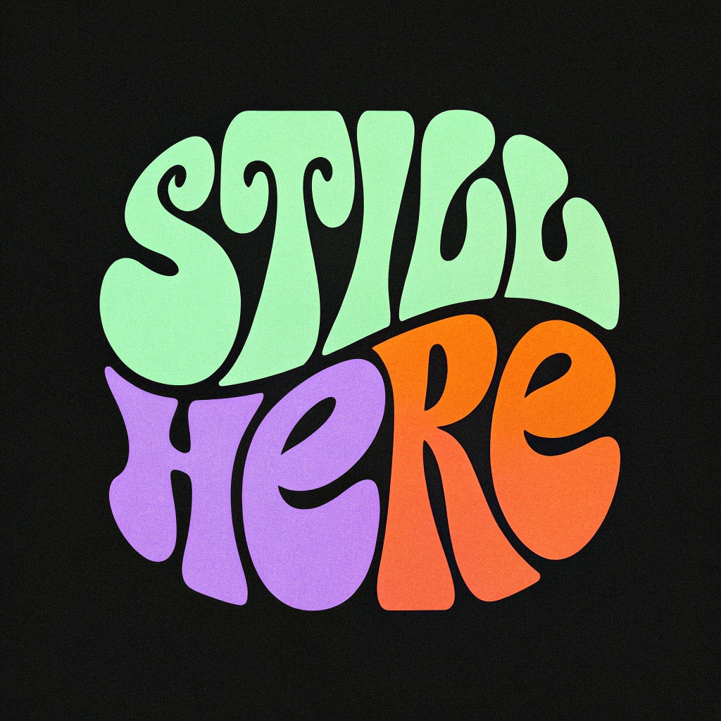
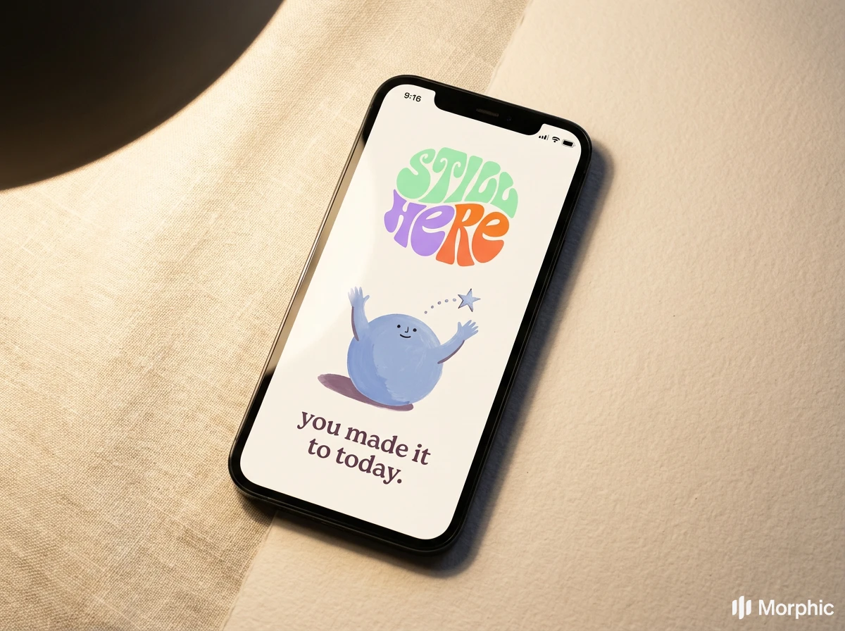
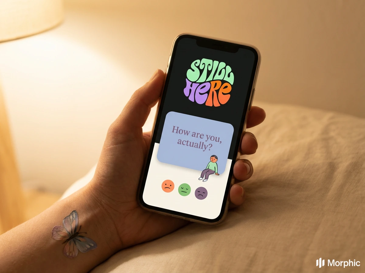
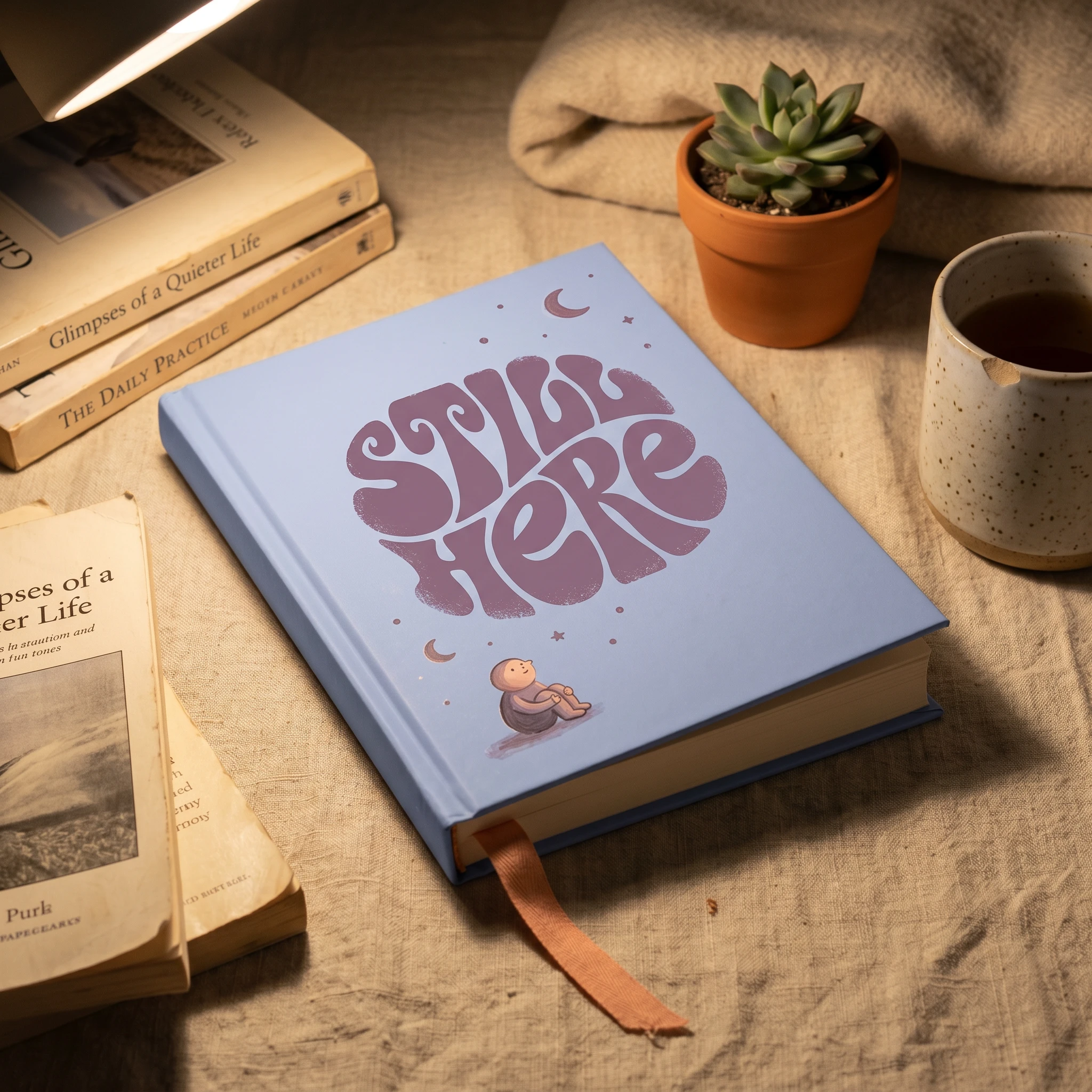
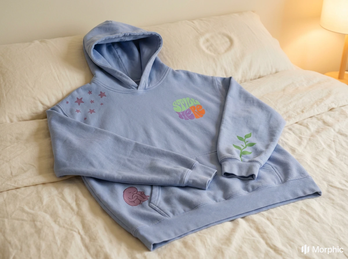
The logo is a custom bubble wordmark — "STILL HERE" set across two stacked lines in inflated, rounded lettering built from oval forms with the structural bones of a serif. Each letter is blown up from the inside, as if made of something soft. The letterforms interlock and compress into a roughly circular overall silhouette, creating a mark that reads as a shape before it reads as words — which means it works at small sizes, on embroidered patches, debossed into matte card, and printed on a tote bag equally well. Multi-color versions use the full brand palette across the two lines; single-color applications in Soft Plum
#8B6B8B are equally strong. The mark is high-energy and deeply legible — it holds the brand's whole tension in one shape: bubbly and serious, playful and grounded.Color
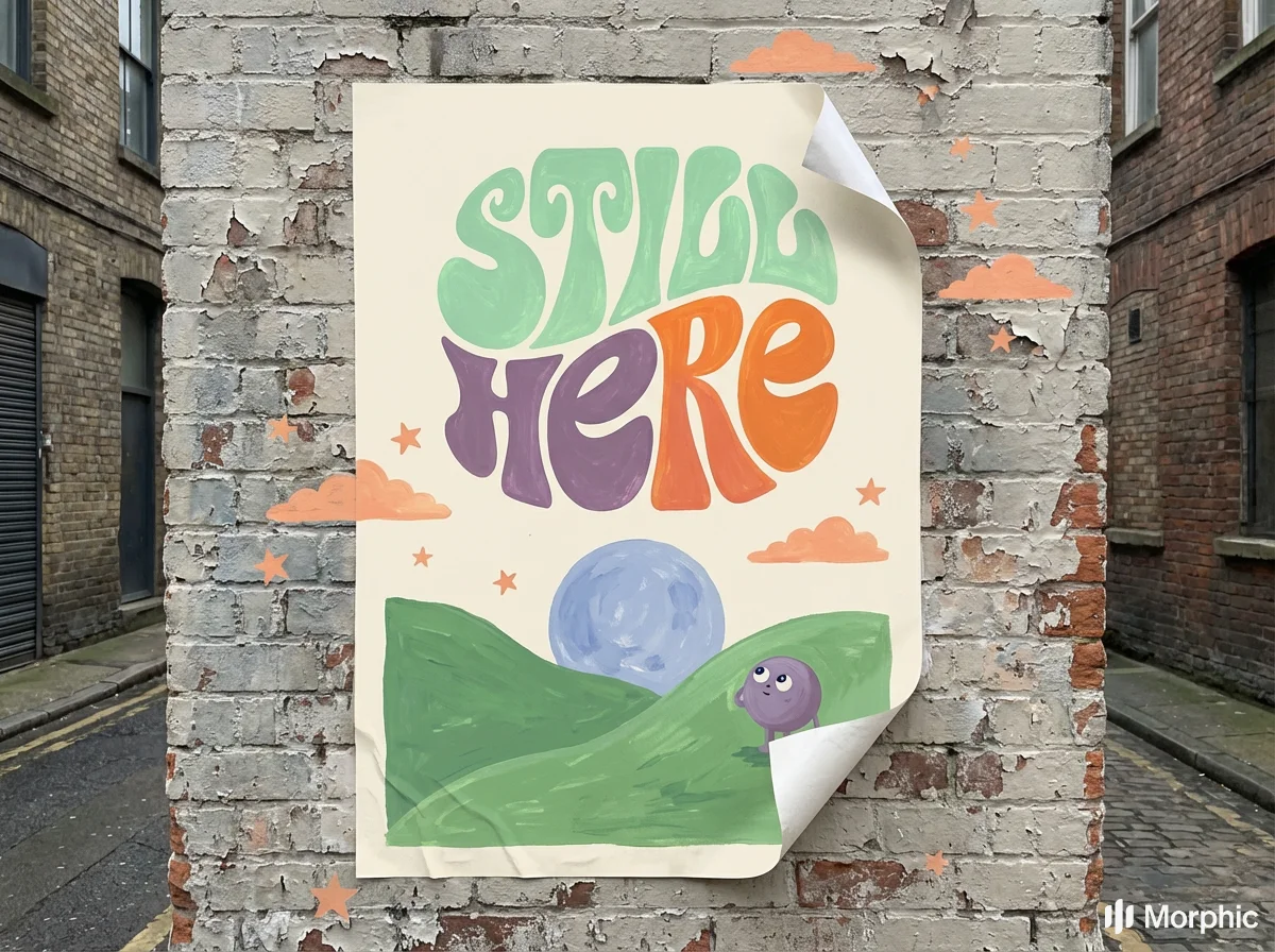
The palette walks the edge between tender and childish without crossing it. Sky Periwinkle
#A8B8D8 is the primary — calm, slightly melancholy, the color of a good memory. Sunset Peach #F4A47C provides warmth and is used for anything that says you are welcome here. Leaf Green #7DB87D marks growth and is used sparingly so it means something when it appears. Cream Page #FAF4E8 is the base — all text lives here, the color of a page that has been read many times. Soft Plum #8B6B8B does the emotional heavy lifting: shadows, typographic emphasis, the parts of the brand that acknowledge difficulty without dramatizing it.Illustration System
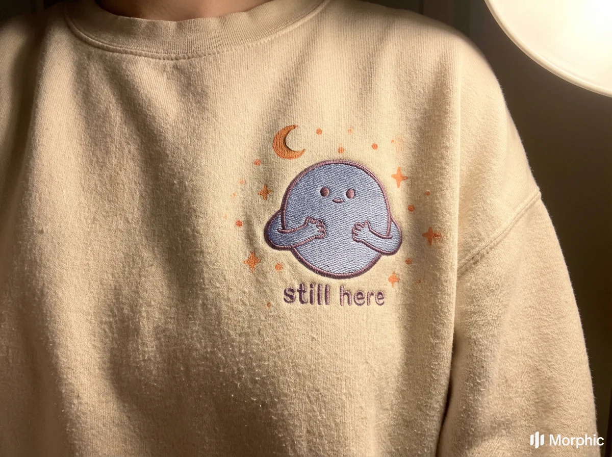
The illustrated character — a round, blobby, soft-limbed figure with two dot eyes — is the brand's emotional center. It exists in multiple states across the system: arms open, curled up, sitting cross-legged, holding a tiny lantern, walking away into a landscape. It never has a mouth. Expression comes entirely from posture and context. The character is always painted in gouache — visible bristle texture, slightly imprecise edges, color that bleeds gently at the boundary. It is never flat, never vector-smooth. The imperfection is the point.
Photography + Illustration Collision
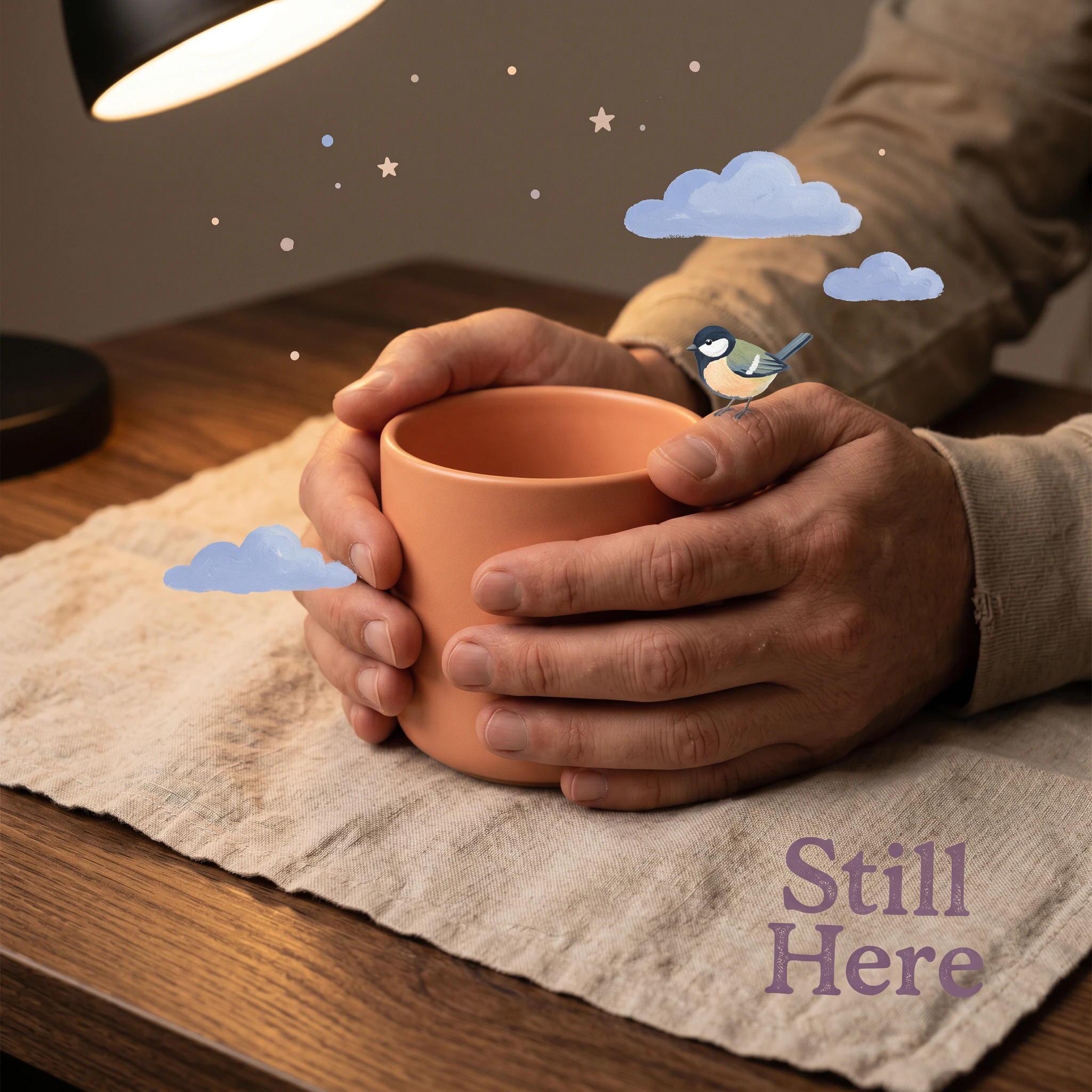
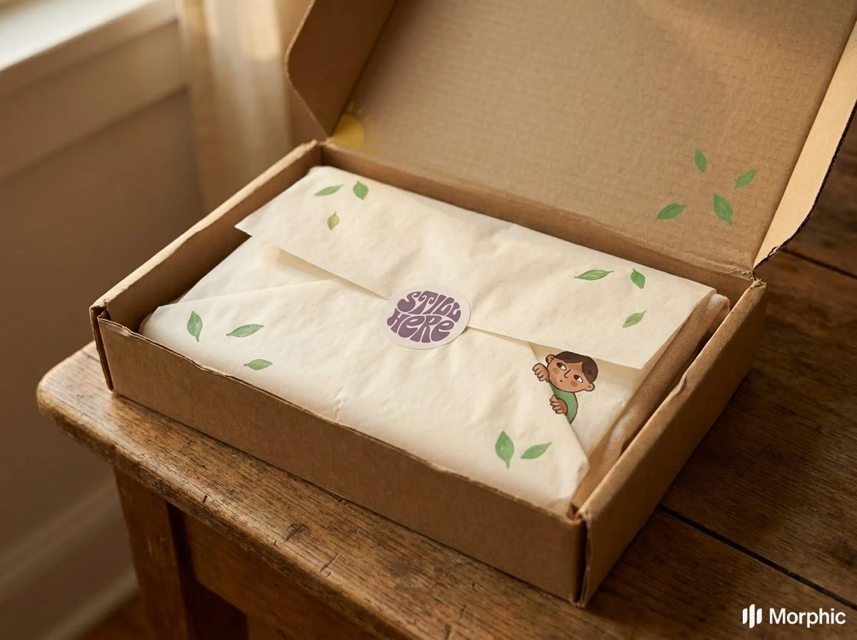
The brand's most distinctive visual move is the treatment of photography and illustration as a single unified surface rather than two separate layers. Real photographs — warm, low-contrast, intimate — show adult lived experience: hands around a ceramic mug, a phone held in bed, an open gift box on linen. Illustration invades these scenes physically: a small bird perched on a real thumb, illustrated clouds floating above a real wooden table, gouache stars scattered across an embroidered sweatshirt. The result is a world where the interior emotional life is visible in the physical world — which is precisely what the brand is trying to do for the people who use it.
Touchpoints
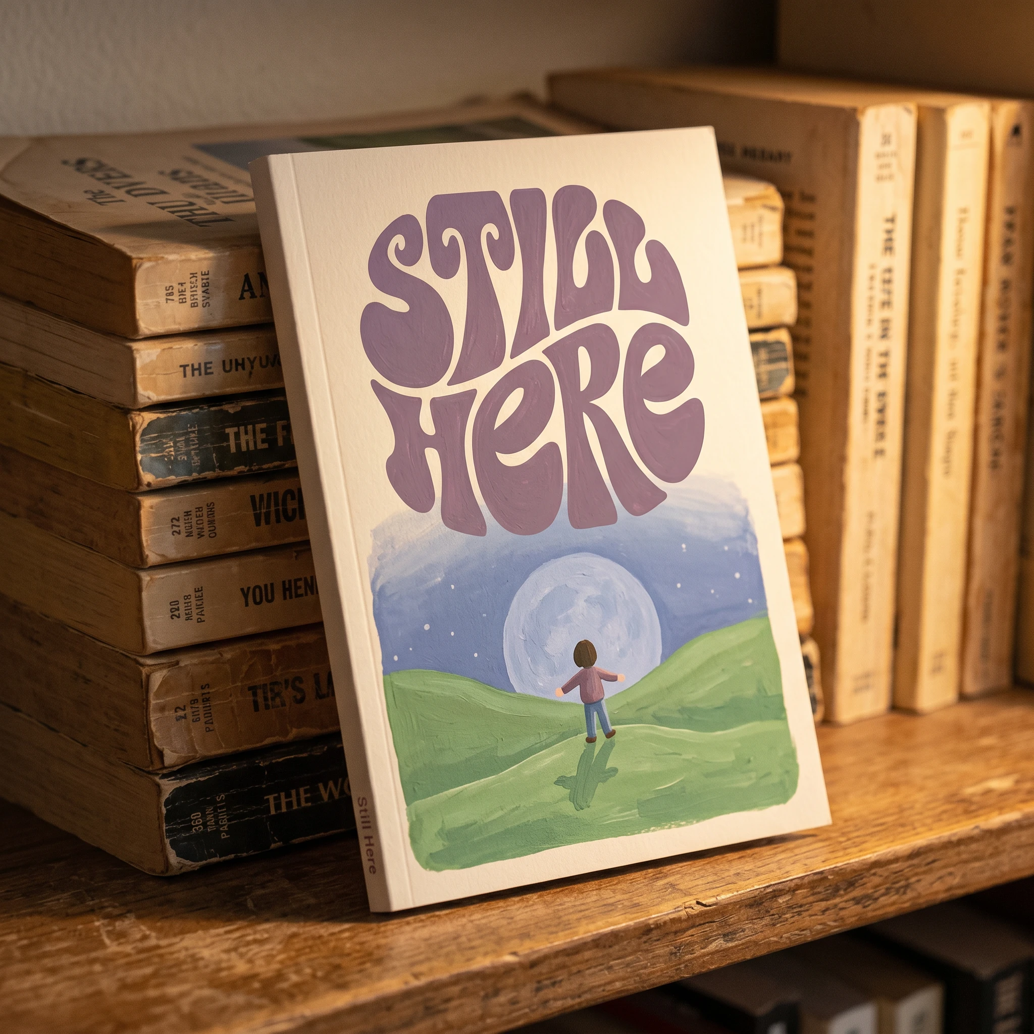
The system was validated across ten mockups spanning apparel (embroidered sweatshirt, hoodie laid on a bed), packaging (matte Soft Plum gift box with debossed logo, kraft shipping box with illustrated tissue paper), print (sticker sheet, illustrated book cover leaning against worn paperbacks), digital (app home screen in hand, social card on phone on linen), campaign photography (hands and mug with illustration overlay), and outdoor (wheat-pasted A1 poster on brick, corner lifting). Across all of them, the brand held. The bubble wordmark scaled from embroidery to wheat paste without losing its character. The illustrated figure appeared at every size without losing its warmth. The photography never looked like stock. The illustration never looked like clipart.
What It Is
A brand that meets you where softness lives. That looks like a bedtime story because it knows that's the register in which you'll actually listen. That says still here without explaining what that means, because you already know.
Révolté — revolte.design
Project: Still here
Year: 2026
Scope: Brand Identity, App Interfaces, Logo Design, Typography System, Color System, Brand Pattern, Environmental Design, Print, Apparel, Packaging
Industry: Mental health, Self-help
See more at revolte.design
Like this project
Posted Apr 28, 2026
Still Here, mental health brand using children's book illustration, the most honest emotional language is the one we learned before we learned to hide.
Likes
3
Views
17
Timeline
Apr 22, 2026 - Apr 28, 2026