Built with Lovart
Phlox Brand Identity Development
Révolté
PHLOX — Between States
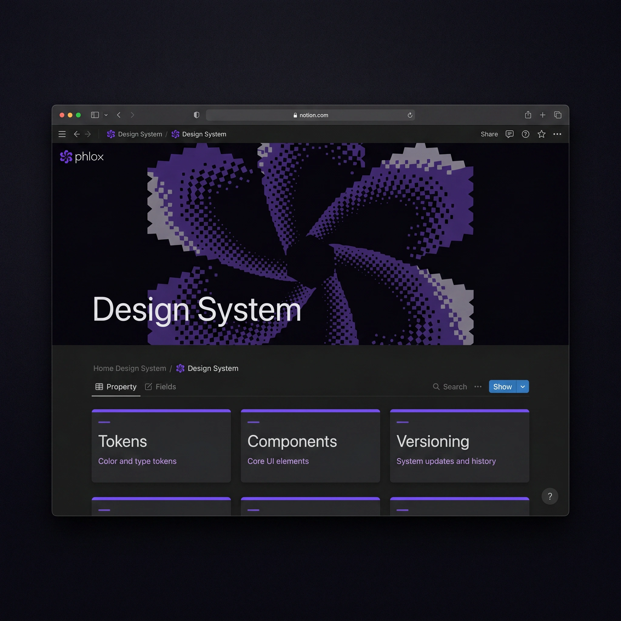
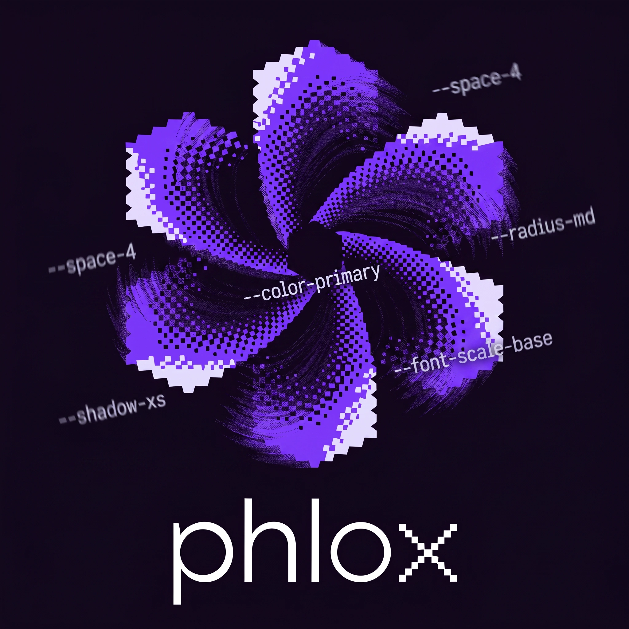
A design system tool that needed to feel like what it does: something precise and alive at the same time. The answer was a flower built from pixels and halftone dots — something that resolves into beauty from a distance and into data up close.
THE BRIEF
The premise was simple and uncomfortable in equal measure: build a brand identity for a modular design system management platform from scratch, with no client, no brief, no safety net. Just a name — Phlox — and a field: the exact intersection of design and engineering where tokens, components, and versioning live.
The tension was immediately obvious. Design system tools are almost universally cold — dark UIs, monospaced fonts, the aesthetic of infrastructure. They communicate precision but not personality. They look like they were built by engineers for engineers, and designers tolerate them. The opportunity was to build something that spoke to both sides of the handoff without patronizing either.
What made it interesting and hard was the name itself. Phlox is a wildflower. That's not accidental — but it could easily become a liability. A botanical logo for a SaaS tool risks reading as decorative, soft, disconnected from the technical seriousness of the product. The question from day one was: how do you honor the name without surrendering to it?
THE APPROACH
I explored ten creative directions before landing. Most of them were wrong in instructive ways. The grid-based directions were too cold. The craft-forward directions were too warm. The brutalist editorial direction was interesting but it ignored the name entirely — it could have been called anything. The name Phlox is the brand's entire personality. I couldn't design around it.
The unlock came from thinking about what a design token actually is. A token is not one thing — it's a set of possible values depending on context. Light mode, dark mode, mobile, desktop, draft, published. A token exists in superposition until it resolves. That's the exact physics of quantum state — something that is simultaneously multiple things until observed. And a phlox flower, at the right scale, is a radial form that reads differently at every zoom level. Those two ideas were the same idea.
I rejected a literal botanical illustration immediately. Instead I built the mark from a Bayer-matrix halftone dither — a pixel-level technique where density encodes value. Solid at the outer edge, dissolving inward toward a void center. The petal silhouettes are constructed on a strict pixel grid with staircase edges, deliberately digital. The petals rotate in a pinwheel arrangement — kinetic, not static. From across a room it reads as a flower. Up close it reads as a data field. The tension between those two readings is the entire brand concept.
The 'x' in the wordmark was the last piece. Lowercase "phlox" in Satoshi — clean, geometric, modern. But the 'x' is rendered in the same bitmap pixel-grid logic as the icon. It's a tiny moment that rewards attention: a letter built from the same system as the mark. Not decoration. A signature.
THE WORK
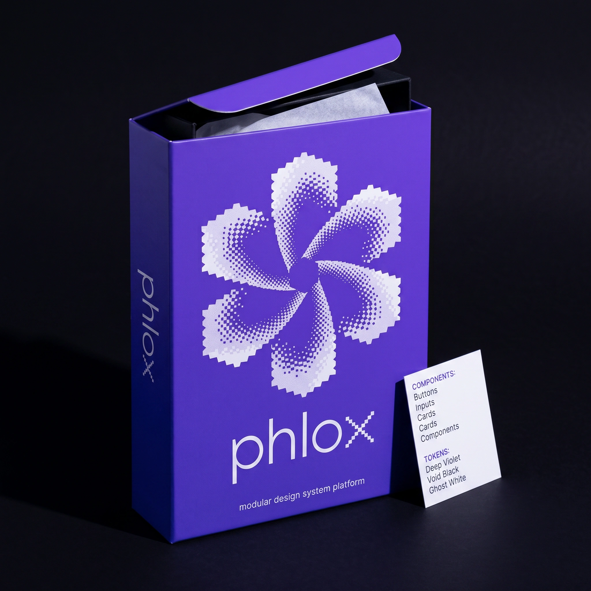
LOGO
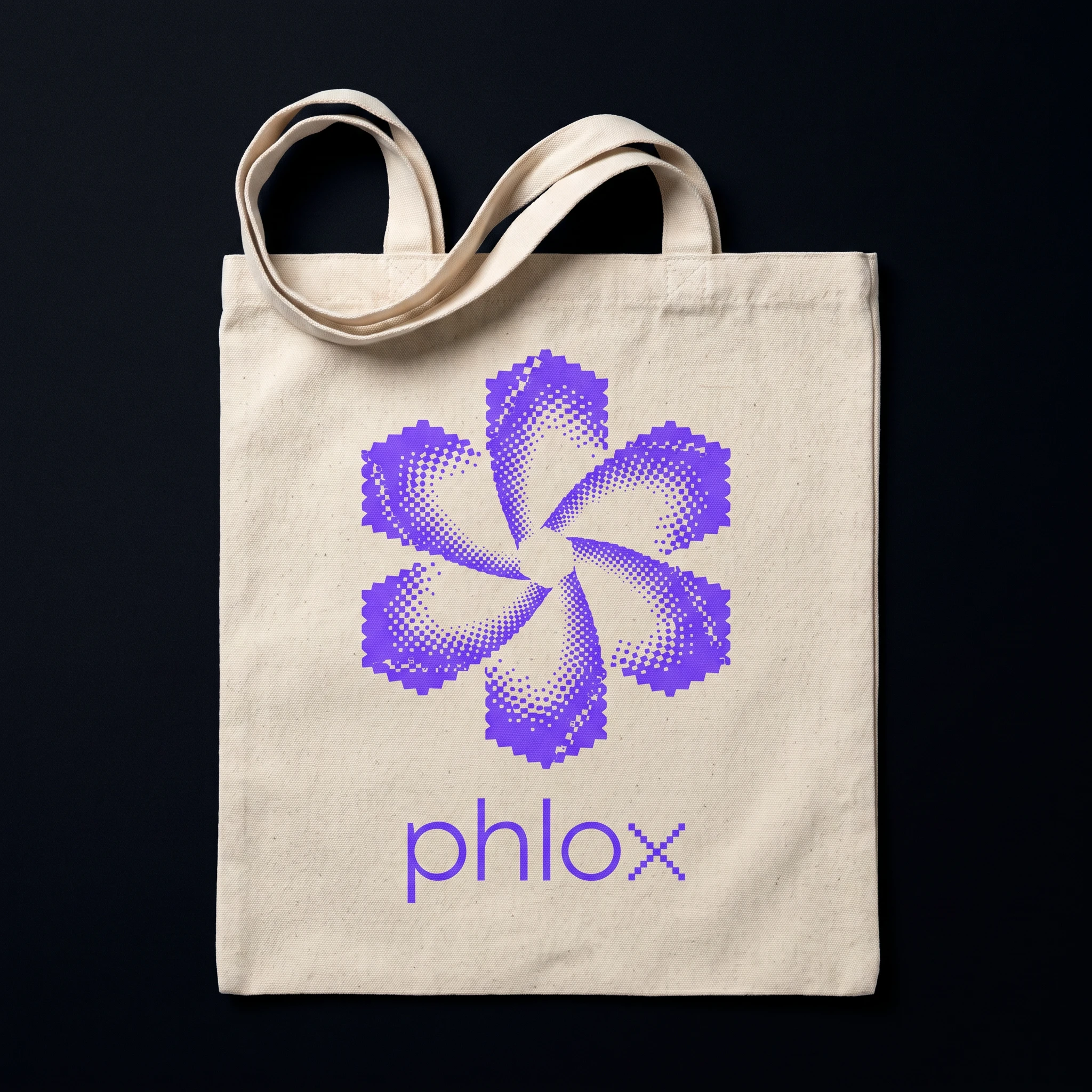
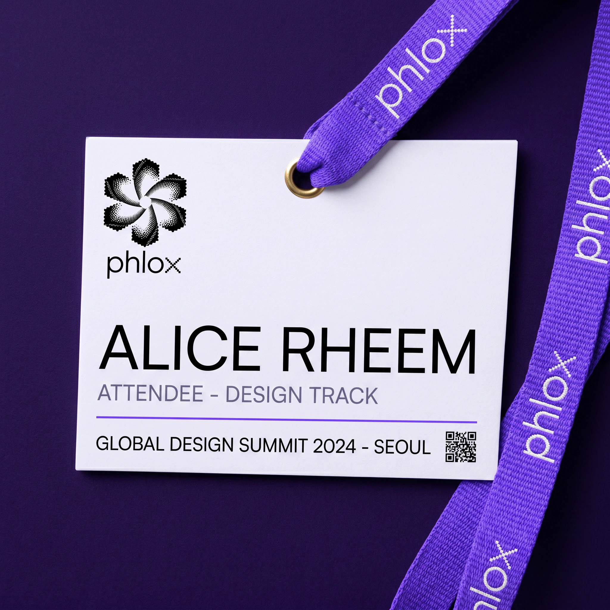
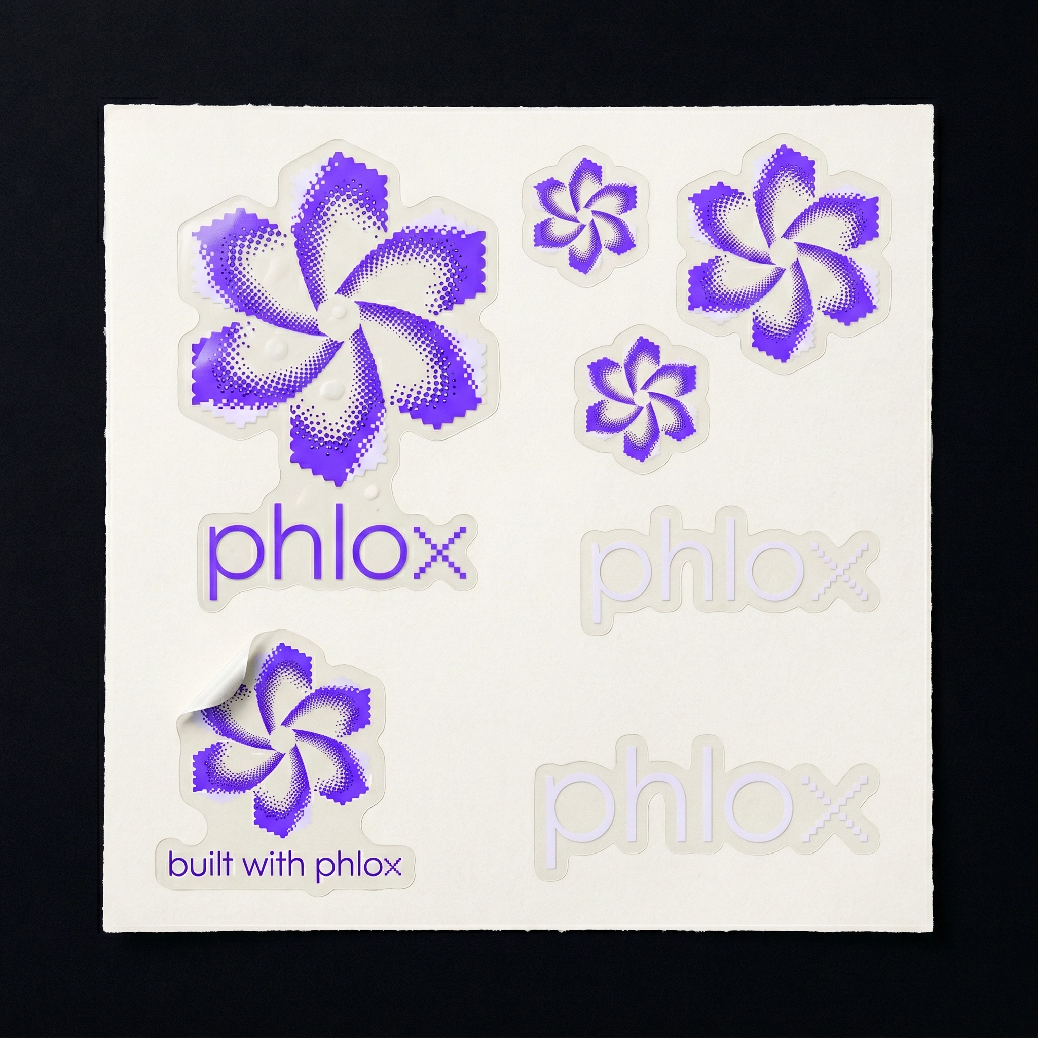
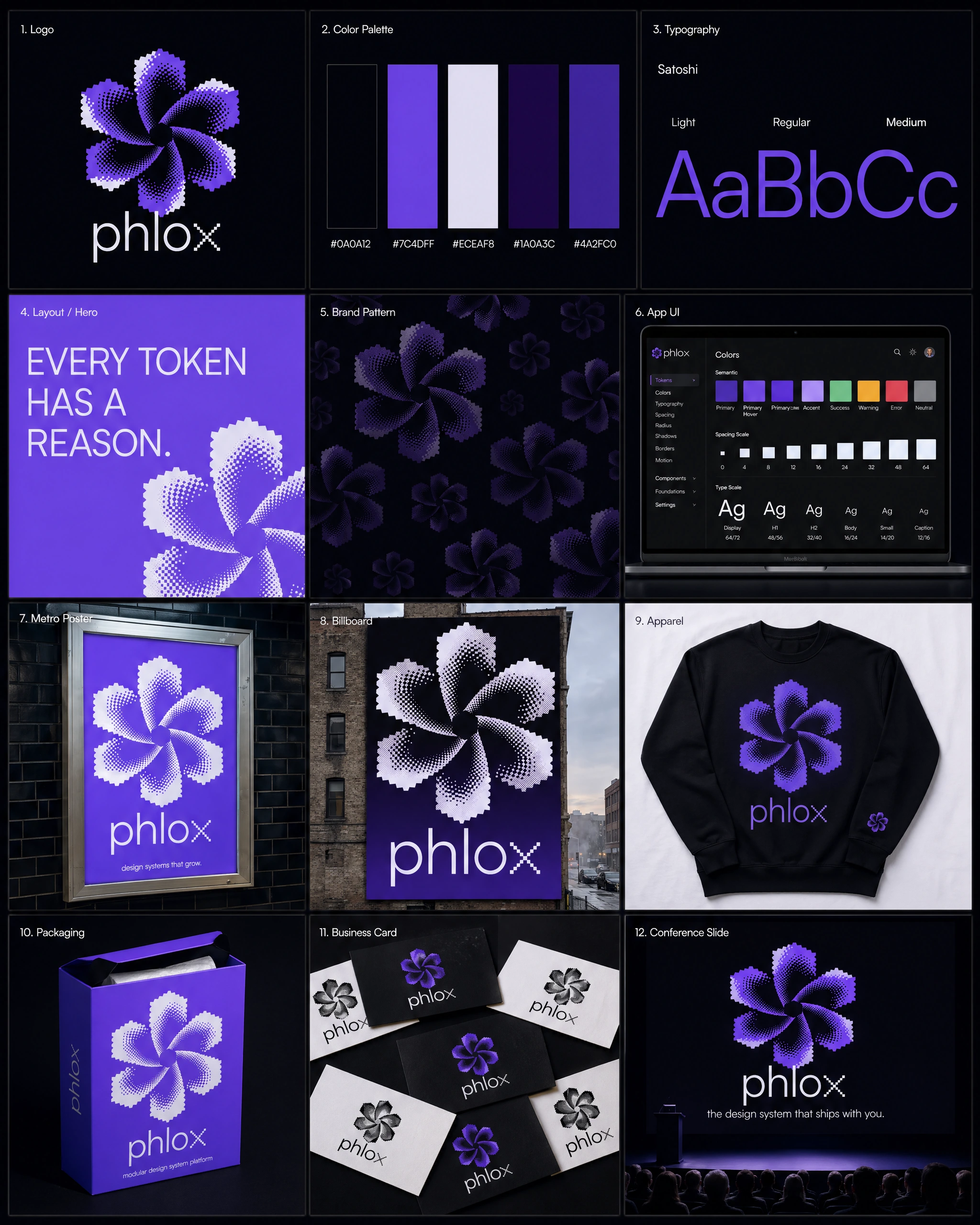
A 5-petal dithered bloom in a clockwise pinwheel rotation, constructed entirely from Bayer-matrix halftone dithering on a pixel grid. Each petal transitions from dense solid fill at its outer edge to isolated scattered pixels toward the center, creating a gradient dissolve without gradients. The staircase pixel edges are hard and deliberate — not a limitation but the point. Ghost white highlight passes on the leading petal edges create depth without shadow. The central negative space is an irregular void formed by the rotation. The wordmark pairs the bloom above "phlox" in Satoshi Regular, all lowercase, with the 'x' rebuilt in the same 4×4 pixel-block logic as the icon. The mark reads at 16px favicon scale and at 6-meter billboard scale without simplification.
TYPOGRAPHY SYSTEM
Satoshi in three weights: Light, Regular, Medium. No bold — the palette does the work that weight would otherwise do. The geometric neutrality of Satoshi prevents the typography from competing with the mark. Token names and code contexts use a matching mono stack. Leading set at 140% throughout. Tracking neutral on body, -1% on display sizes.
COLOR SYSTEM
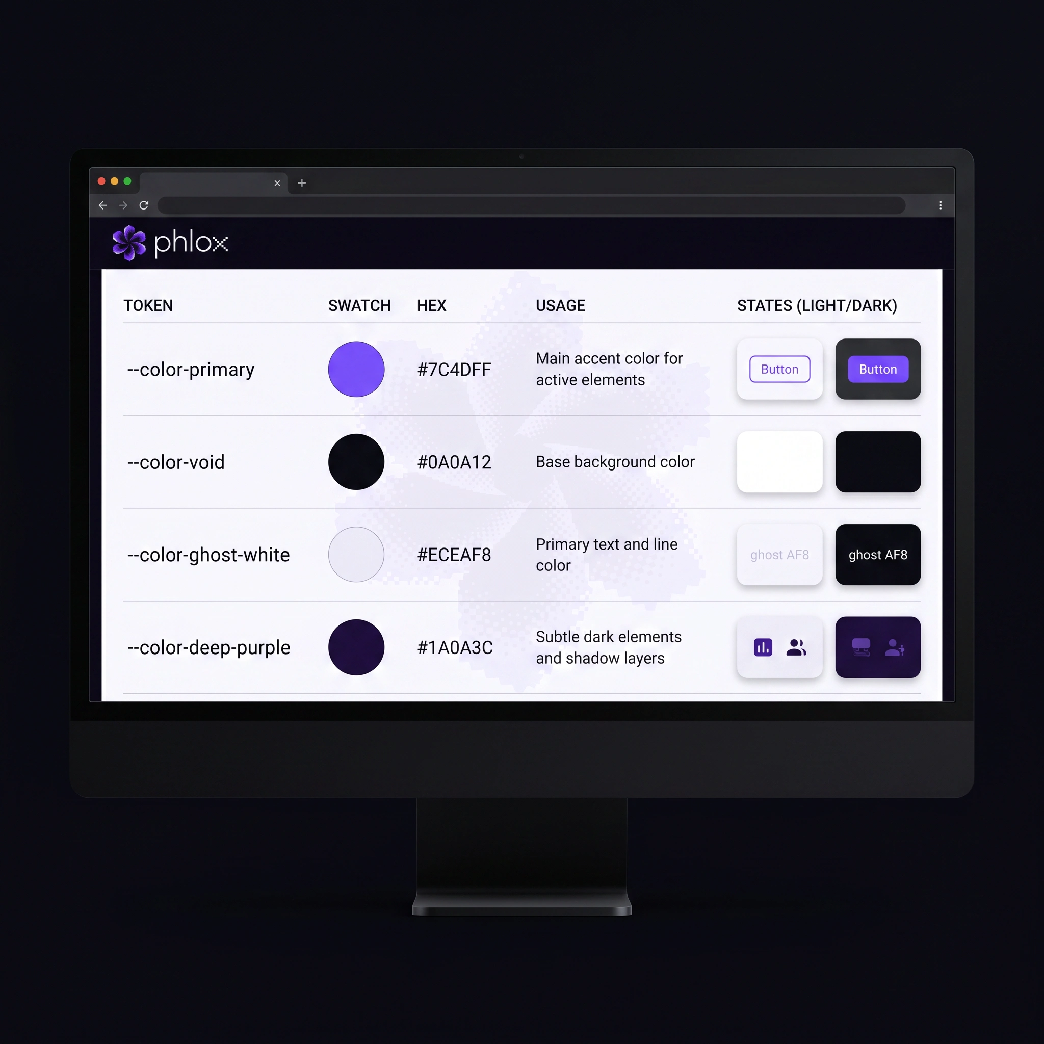
Five tokens. Void black
#0A0A12 — the dominant surface, not quite black, carrying a faint violet undertone that rewards calibrated monitors. Electric violet #7C4DFF — the signal color, used sparingly and with intent. Ghost white #ECEAF8 — warm enough to avoid clinical flatness. Deep purple #1A0A3C — shadow and depth, the space between surfaces. Mid violet #4A2FC0 — structural accents, borders, the system's connective tissue. The palette is deliberately narrow. Five tokens. That's it. The mark does the rest.BRAND PATTERN
The bloom tiled at three scales across void black, each layer in electric violet at 100%, 40%, and 15% opacity. The overlapping dither fields from adjacent blooms create interference patterns — an emergent moiré that wasn't designed, only enabled. A system producing something its components didn't intend. That felt right.
ENVIRONMENTAL & PRINT
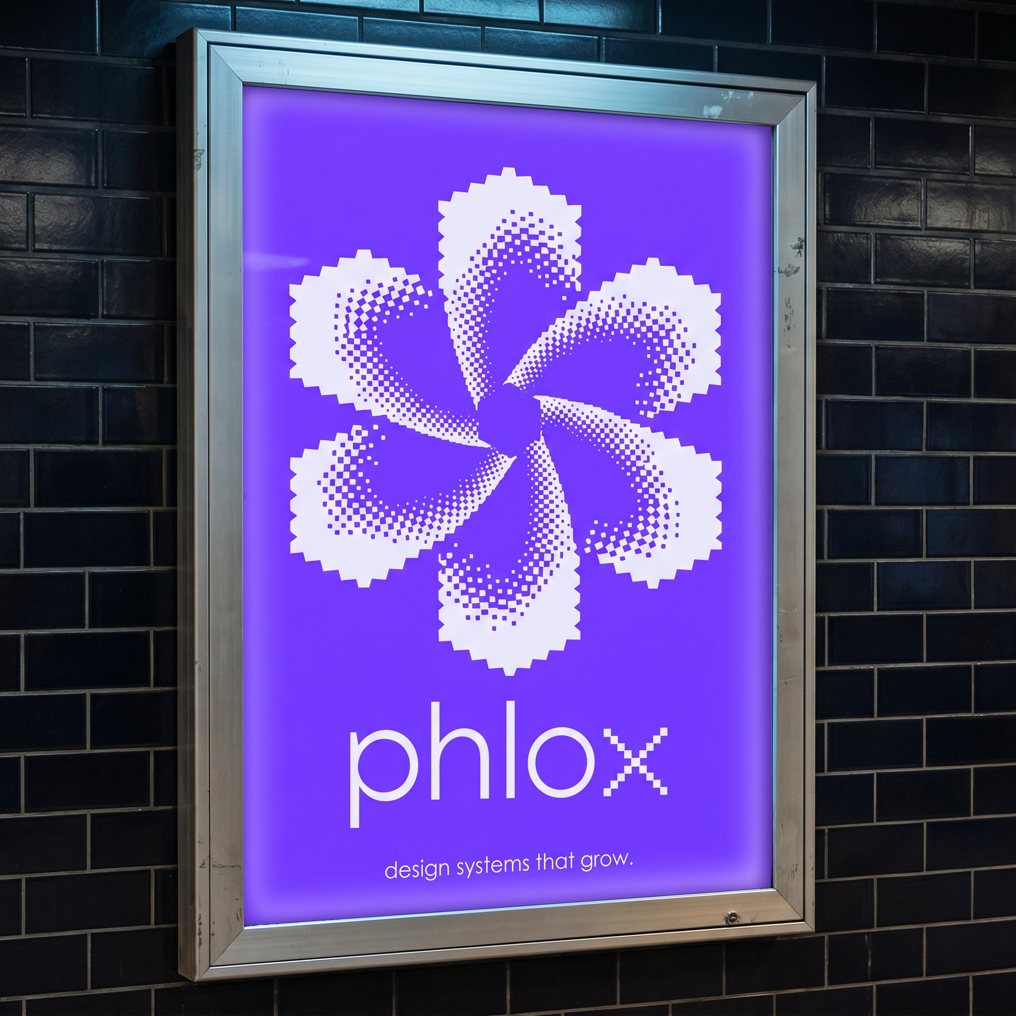
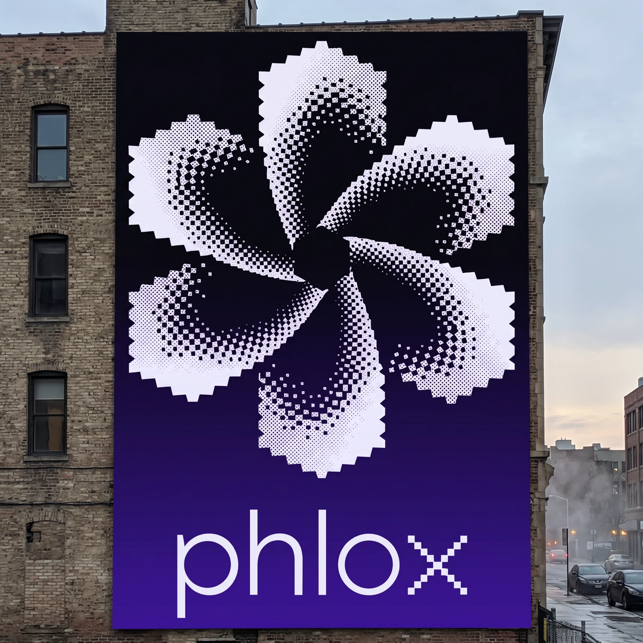
The metro poster runs the bloom at full bleed on solid electric violet — the dither inverted to ghost white, each pixel dot catching the backlit glow of the lightbox frame differently. At billboard scale on a void-to-violet gradient, the dither pixels read as a coarse newsprint halftone, giving the mark a cathedral-scale presence it doesn't have at smaller sizes. The Risograph poster uses violet ink on uncoated cream stock — the natural dropout and misregistration of the printing process doubles the dither texture, layering digital and analogue grain into something that feels both printed and transmitted.
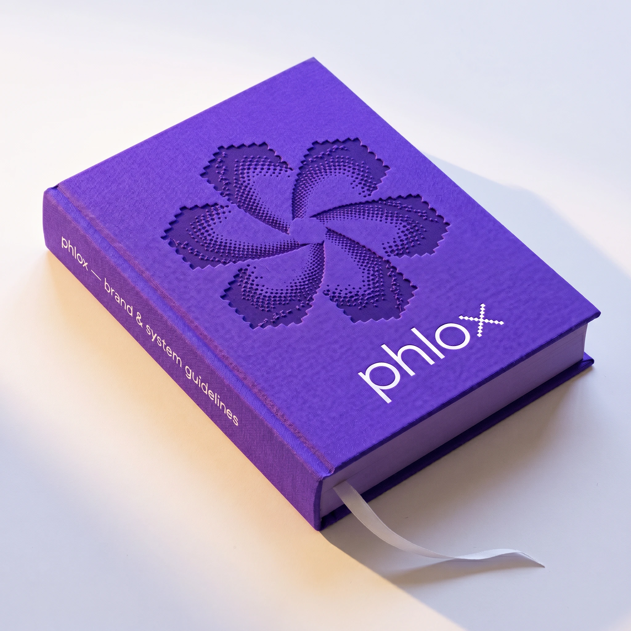
The hardcover brand guidelines emboss the bloom blind into electric violet cloth — no ink, only shadow and relief — with the wordmark foil-stamped below in ghost white. The combination of processes makes the cover feel both precious and structural.
APPAREL
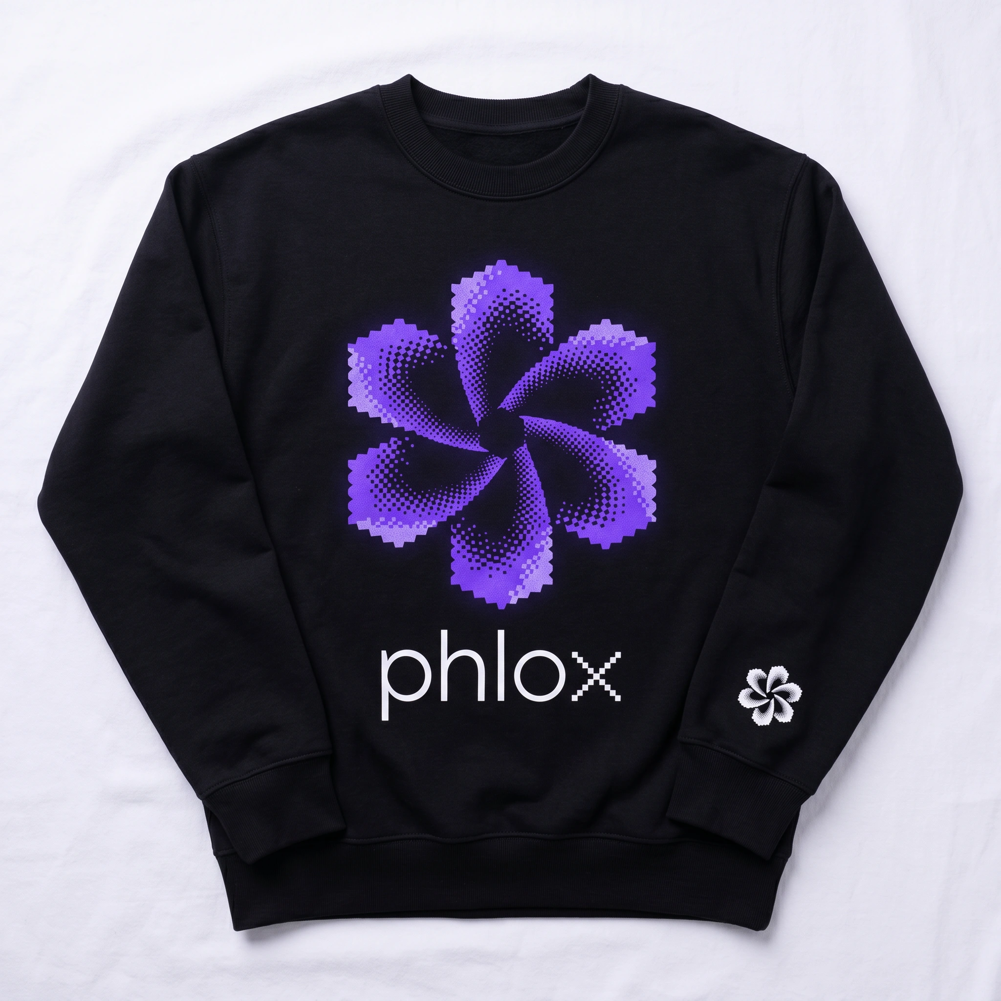
A heavyweight crewneck in void black with the bloom screenprinted in electric violet, chest-centered at a scale where individual dither dots are visible against the cotton weave. A secondary hit on the left sleeve cuff: the bloom icon alone in ghost white at 20mm, a maker's mark. The two textures — cotton weave and halftone grid — compete and complement in a way that doesn't happen at any other scale.
MOTION
Two motion stills documented the system in movement. The first: the bloom mid-rotation at 40°, leading edges sharp, trailing edges dissolved into velocity smear, token names floating outward at different blur intensities. The second: a UI state transition frozen at the moment of morph — two component states bleeding into each other at a vertical transition zone, the bloom the only fully-resolved element in the frame.
THE RESULT
Phlox shipped as a complete brand system: logo, typography, color tokens, brand pattern, motion language, and 15 touchpoints across digital, print, environmental, and physical formats. The brand deck documented all 12 canonical applications in a single presentation sheet built to the same visual standards as the work itself.
The system holds at every scale — from a 16px favicon to a 6-meter building face. The dither bloom reads as a flower to someone who doesn't know the product and as a data structure to someone who does. That duality was always the goal. It turned out the best way to represent something that lives between states was to build a mark that does the same.
Révolté — revolte.design
Project: Phlox
Year: 2026
Scope: Brand Identity, Logo Design, Typography System, Color System, Brand Pattern, Environmental Design, Print, Apparel, Packaging, Motion Direction, Brand Deck
Industry: SaaS / Design Tooling
See more at revolte.design
Like this project
Posted Apr 27, 2026
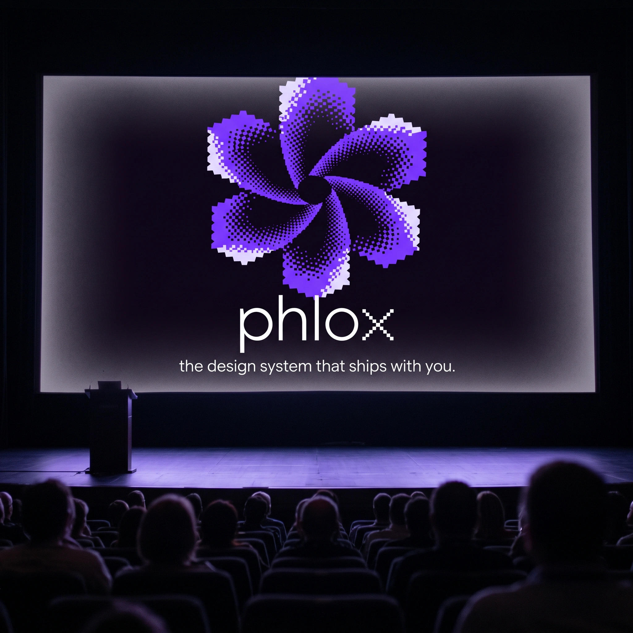
A SaaS brand built on one idea: a token exists in superposition. Dithered bloom, pixel wordmark, 15 touchpoints. Every token has a reason.
Likes
4
Views
32
Timeline
Apr 16, 2026 - Apr 27, 2026