Built with Lovart
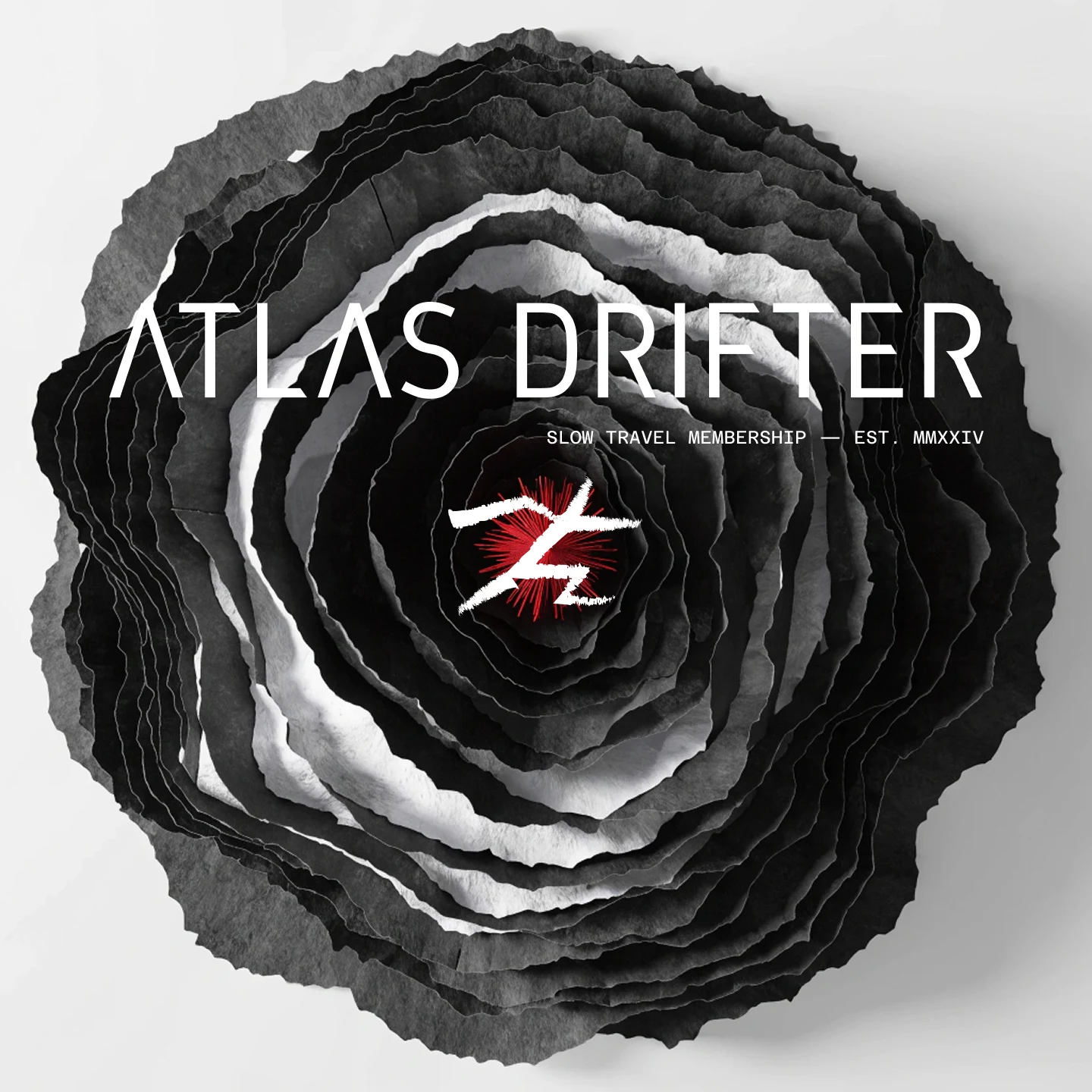
Atlas Drifter: Slow Travel Brand Identity
Révolté
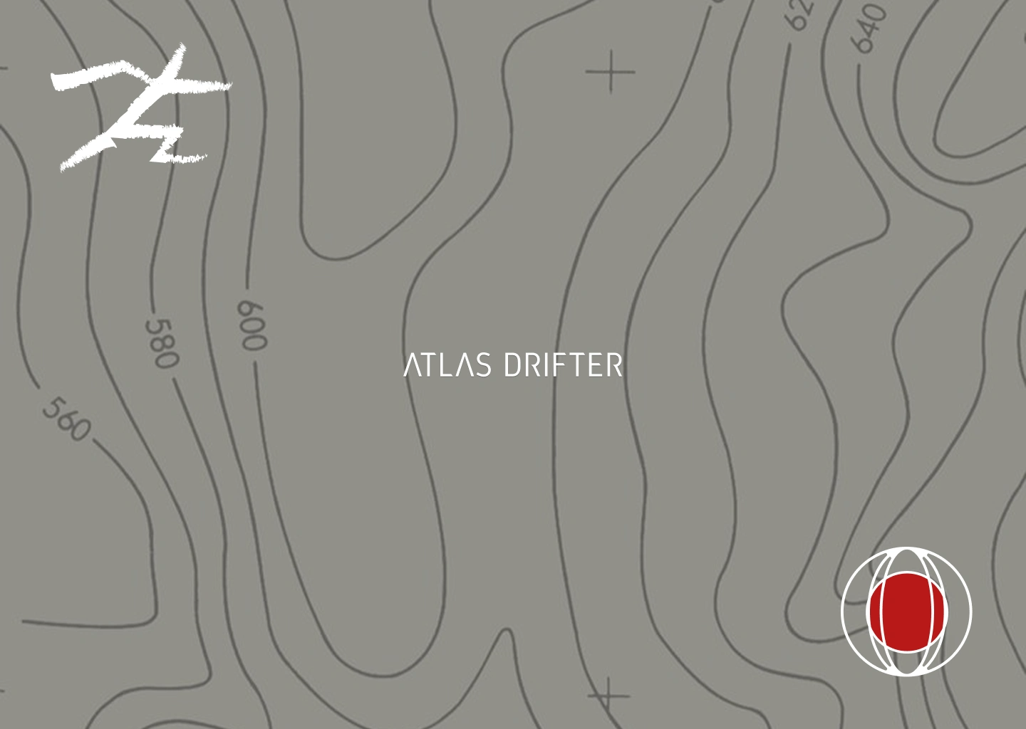
ATLAS DRIFTER — The Route Is the Product
A brand for people who travel the way most people read — obsessively, slowly, over years. The whole system built from one mark that doesn't ask for permission.
THE BRIEF
Atlas Drifter is a speculative brand I built for my portfolio — a slow travel membership and route planning platform. The concept: part editorial magazine, part logistical intelligence system, for travelers who measure trips in years and carry worn notebooks through every time zone. Not an app. Not a booking tool. Something closer to a cartography archive with a membership structure.
The challenge I set myself was a particular kind of hard — no client constraints, which sounds like freedom but isn't. Without external pressure, every decision had to be earned through the work itself. I wanted to build something that felt genuinely original in the travel space, which meant identifying exactly what I was refusing to make: no adventure tourism energy, no Airbnb cheerfulness, no rounded corners, no bucket list anything.
The tension I kept returning to was the gap between the precision of cartography and the fundamental unpredictability of long travel. Maps tell you what's there. They don't tell you whether to go. That gap — between surveyed terrain and the decision to cross it — became the brand's whole logic.
THE APPROACH
I started with the color system because I needed to anchor the world before building anything else. Aged Paper (
#E8DFC8) as the dominant warm ground for print surfaces. Midnight (#1C2230) as the primary dark — denser and more directional than pure black. Expedition Red (#B83232) as the single active color, deployed sparingly: one mark, one route line, one center. Khaki (#8C7A5E) as the tonal bridge. Four colors, strict hierarchy. The restriction forced every composition to earn its contrast.The first logo direction I explored was a clean contour-ring mark — concentric circles converging on a red dot. It was legible, geometric, and immediately recognizable. It was also too resolved. It looked like it belonged to a wellness brand or a target. I rejected it because it had no tension — it was a solved object. The brand needed something rawer.
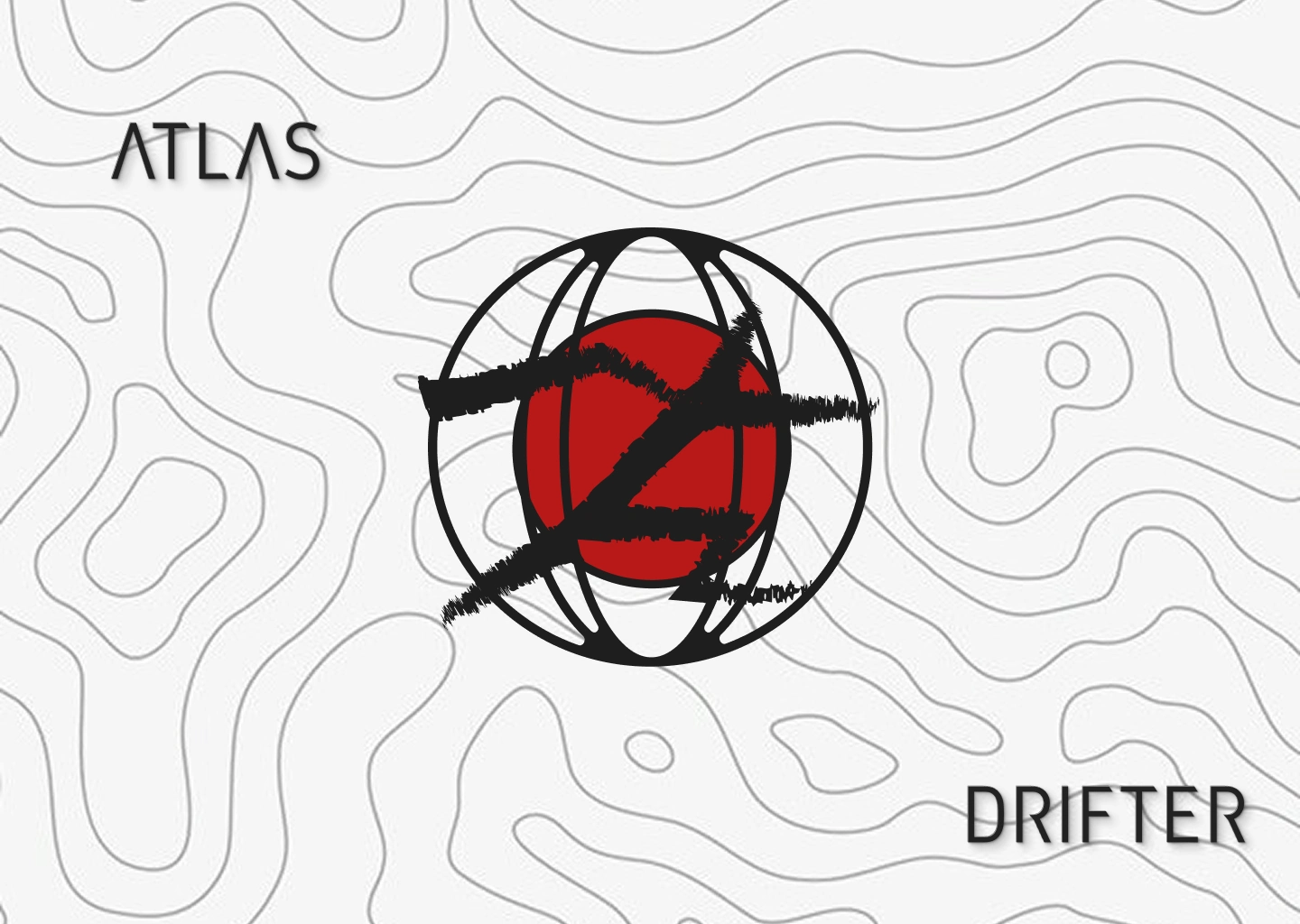
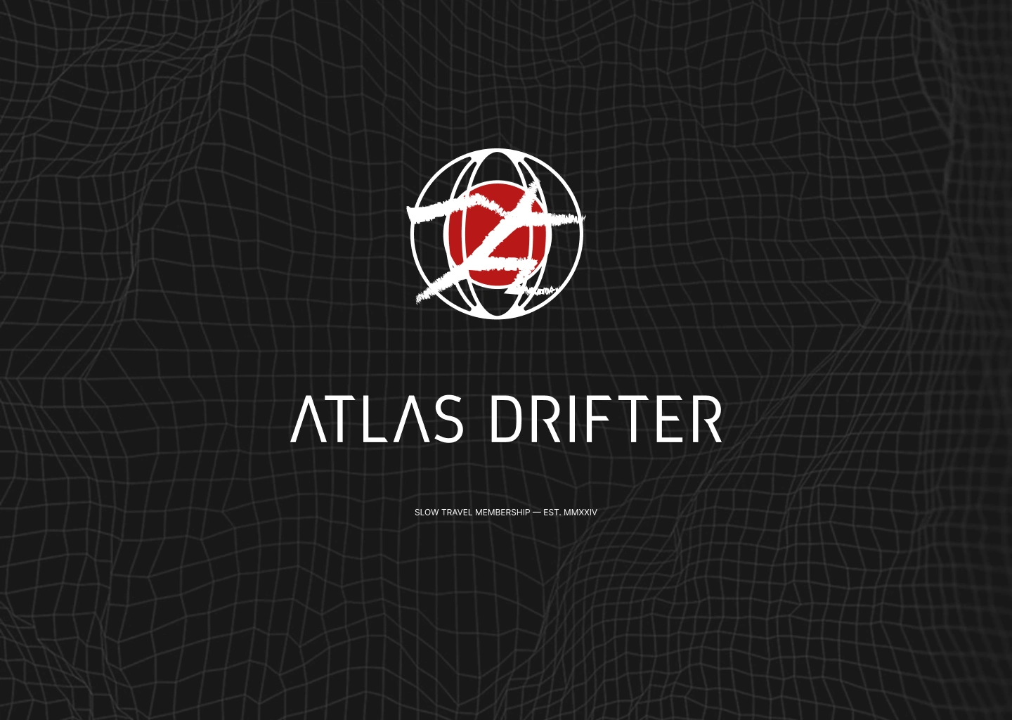
What I landed on was the globe mark: a wireframe sphere with sparse latitude and longitude lines, a solid red circle filling the center mass, and a diagonal slash — rough, hand-drawn, frayed at the edges — cutting across the entire mark from upper-left to lower-right. The slash is the instinct I kept coming back to. It reads as defacement but also as a route — the act of drawing a line across the world and deciding to follow it. The globe says "the whole world." The slash says "this way." Together they're a navigational statement that has no politeness in it.
The slash mark then became autonomous. I separated it from the globe entirely and let it operate as a standalone secondary mark — at monumental scale, filled with clipped topographic map texture, layered beneath the wordmark, or used in Expedition Red alone on dark ground. A system with two marks that each hold their own.
THE WORK
Logo System
The primary mark is the globe with slash: wireframe sphere in white, solid red center circle (
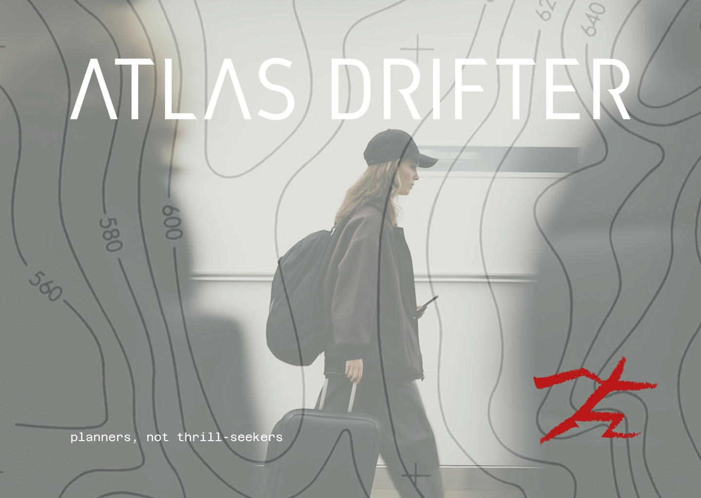
#B83232), diagonal frayed brushstroke slash. The slash extends beyond the globe's outer edge, breaking the containment — it doesn't stay inside the mark, it escapes it. The secondary mark is the standalone slash only, no globe: used at display scale, as a clipping mask container for landscape photography, or as a pure graphic gesture. The wordmark is "ATLAS DRIFTER" in a wide-tracked geometric sans, all caps, in two weights depending on context — lighter for lockups with the globe mark, heavier for standalone display. Secondary typographic register is narrow monospaced for data, coordinates, and callout lines: "NMB — 00412", "LEG 07 — KARAKORAM HIGHWAY", "planners, not thrill-seekers."Color System
Four colors. Strict hierarchy. Aged Paper (
#E8DFC8) on uncoated print surfaces only — never as a digital background. Midnight (#1C2230) as the primary dark ground and text color throughout. Khaki/Olive (#8C7A5E) as a mid-tone ground in the light-field variant — the topographic poster and map documents. Expedition Red (#B83232) appears in one place per composition: the globe center. When the slash mark is used in red, it replaces the globe entirely.Topographic Language
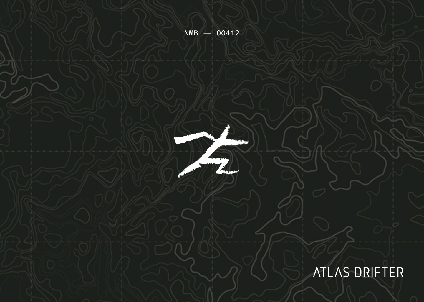
The brand runs on two surface modes. Dark-field: Midnight ground, white and light-grey organic contour lines at varying weights (heavier index lines, thinner interval lines) filling the entire surface — dense, survey-grade, never decorative. Light-field: Khaki/Olive ground, dark charcoal contour lines with elevation labels at intervals, referencing actual survey map aesthetics. Both modes use the slash mark and globe mark identically — only the ground inverts.
Print Collateral
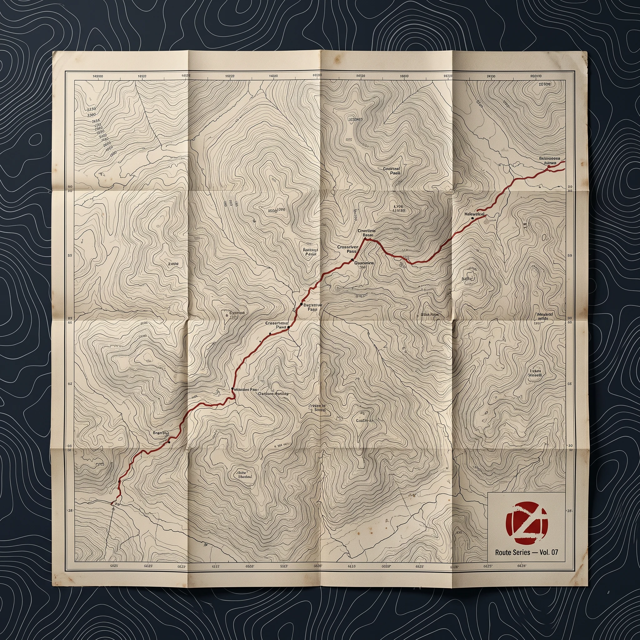
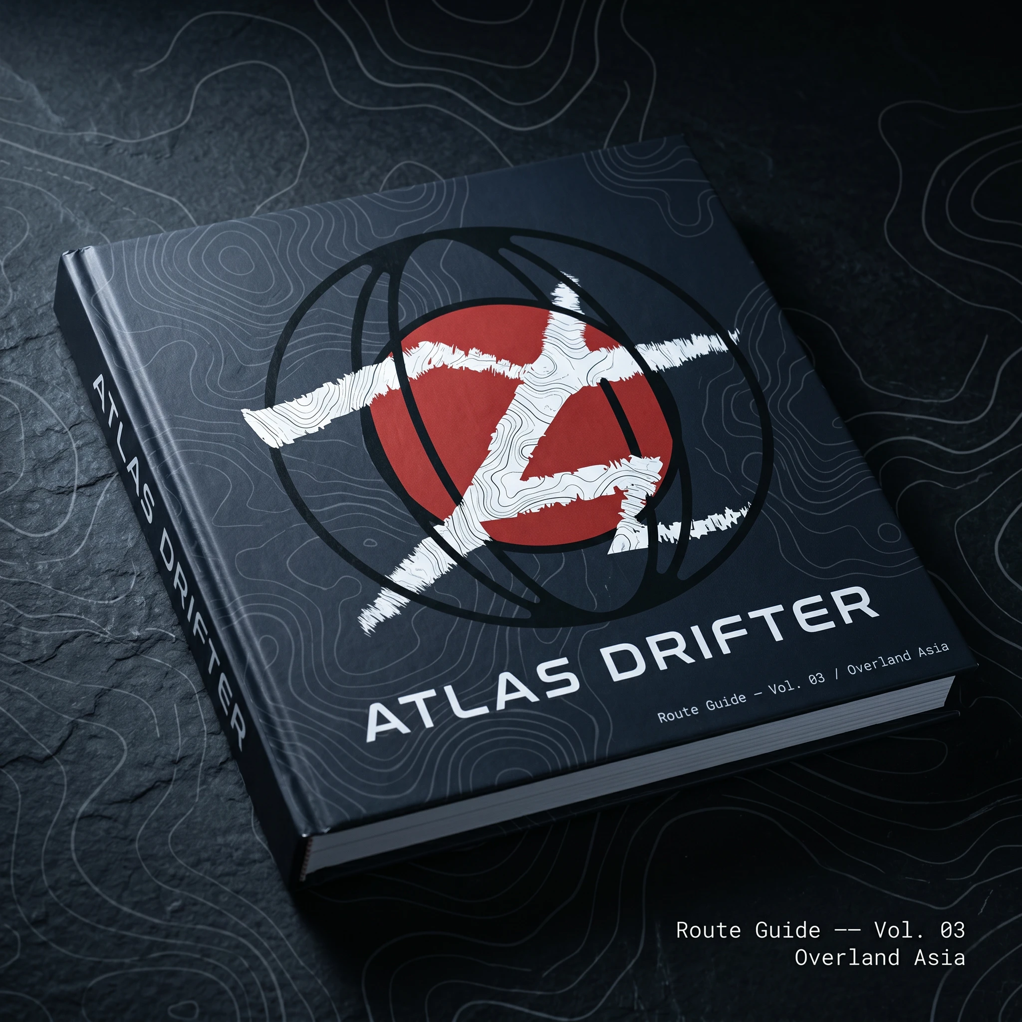
The route guide book (Route Guide — Vol. 03 / Overland Asia) uses the full globe mark centered on a dark-field cover, with ghost topographic lines at reduced opacity across the entire surface. The white slash inside the mark is filled with white contour texture, creating a second layer of cartographic information inside the logo itself. The folded survey map — uncoated aged paper stock, dark contour lines, red route line tracing a multi-week overland crossing — carries the globe mark as a small bottom-right colophon alongside "Route Series — Vol. 07."
Apparel
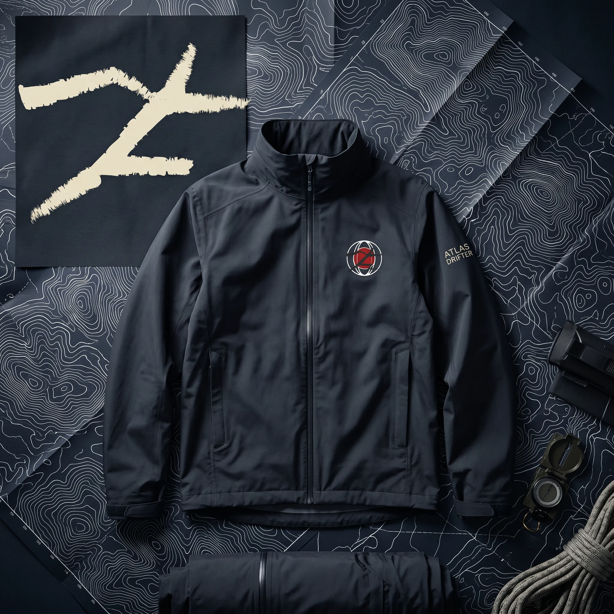
The technical jacket carries the globe mark embroidered on the left chest at 5cm diameter, with "ATLAS DRIFTER" in narrow spaced caps on the right sleeve. The canvas tote uses the standalone slash mark at display scale in Midnight ink on raw natural canvas — no topographic fill in this application, pure flat brushstroke. The contrast between the precise geometric wordmark below and the rough frayed slash above is the whole tension of the brand compressed into one object.
Digital
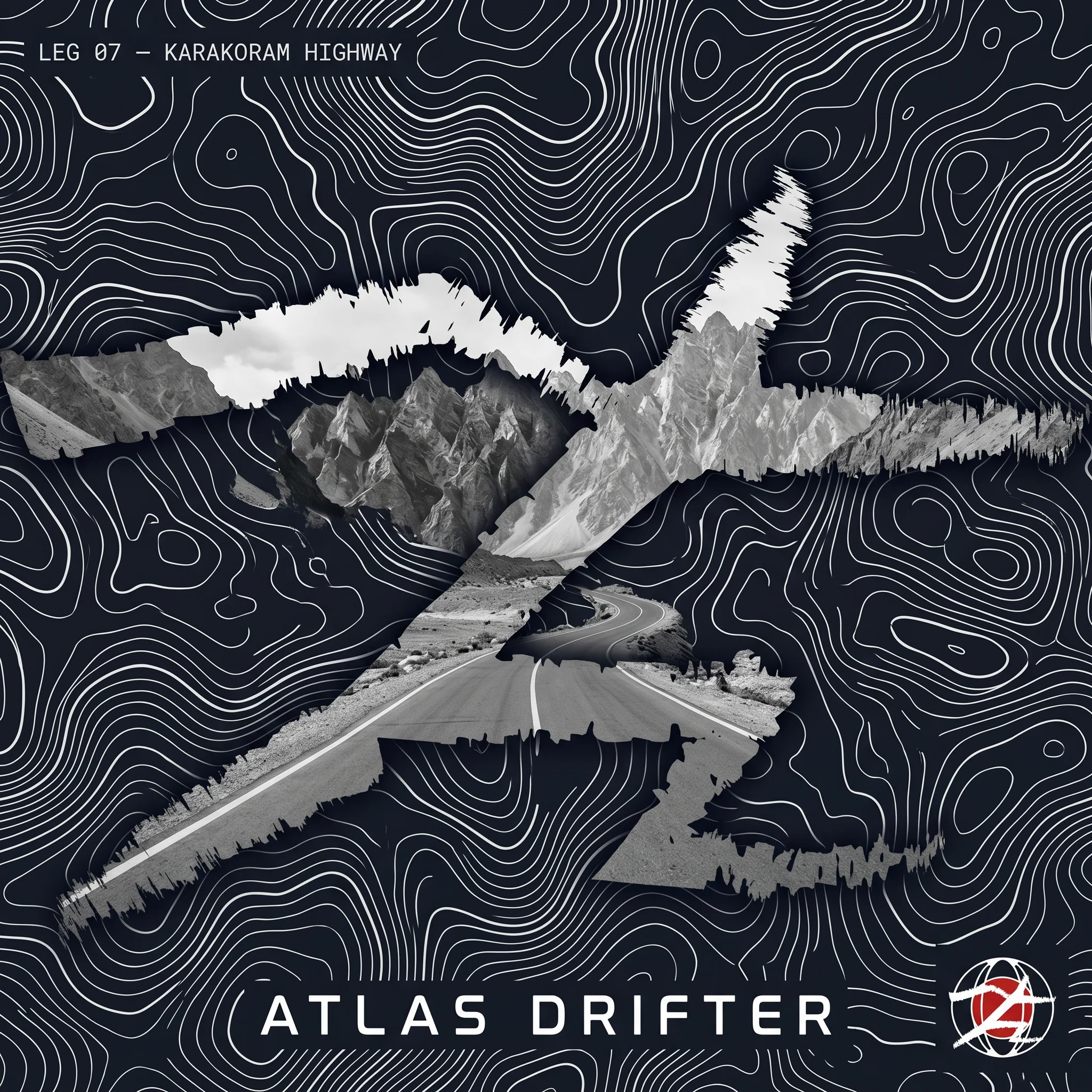
The app screen mockup uses the globe mark as a live waypoint icon embedded in a full-bleed topographic route map — the mark at miniature scale, red center still visible, functioning as "you are here." The social card (Karakoram Highway, Leg 07) uses the slash mark as a clipping mask filled with a desaturated mountain landscape photograph — the frayed brushstroke edges become terrain edges, the image appears to tear through the topographic background.
Field Notebook
The field notebook uses a die-cut or laser-cut cover treatment: the globe mark shape is cut entirely through the aged paper cover, revealing the dark interior material below. The globe wireframe and slash read as negative space — the mark is defined by absence. The open interior page shows a hand-annotated route sketch in pencil with red ink waypoints and elevation notes in narrow caps. It's the strongest single object in the system because it makes the logo physical without printing it.
THE RESULT
Atlas Drifter is a speculative project — there's no client, no launch, no revenue metric to report. What I can say is that the system is consistent enough to deploy at any scale from a 3cm enamel pin to a full-building environmental installation, and distinctive enough that you wouldn't mistake it for any other brand in its category. The cartographic references are handled with enough precision that people who know maps recognize them immediately. The slash mark is raw enough that people who don't still feel its directional force.
The brief I gave myself was to build something that felt genuinely original in the travel space. I think it does. More importantly, it feels like a system — a set of rules and marks that can generate new applications consistently, not a collection of well-crafted individual pieces. That's what I was after.
Révolté — revolte.design
Project: Atlas Drifter
Year: 2026
Scope: Brand Identity, Logo System, Color System, Typography, Print Collateral, Apparel, Digital Assets
Industry: Slow Travel / Membership Platform (Speculative)
See more at revolte.design
Like this project
Posted Apr 25, 2026
Developed a slow travel brand for people who travel the way most people read, obsessively, slowly, over years.
Likes
0
Views
12
Timeline
Mar 20, 2026 - Apr 25, 2026