Built with Lovart
COSTA Visual interface & Brand Identity Creation
Révolté
COSTA — Ancient Obsession, Machine Precision
An AI research platform that needed to feel like it had always existed. Not a tech product. Something older. Something that knew things before you asked.
THE BRIEF
COSTA is an AI-powered deep research tool. The problem wasn't functional — the product worked. The problem was identity. Every AI product on the market looks the same: gradients, geometric sans-serifs, glowing orbs on dark backgrounds. Clean. Frictionless. Forgettable.
What I wanted to build was the opposite. A brand that felt like it came from somewhere — like it had been researching longer than computers have existed. The tension was real: how do you make a machine feel ancient without making it feel slow?
The scope covered everything: wordmark, visual system, interface design, and a full suite of brand touchpoints. No single deliverable could carry it alone. It had to be a world.
THE APPROACH
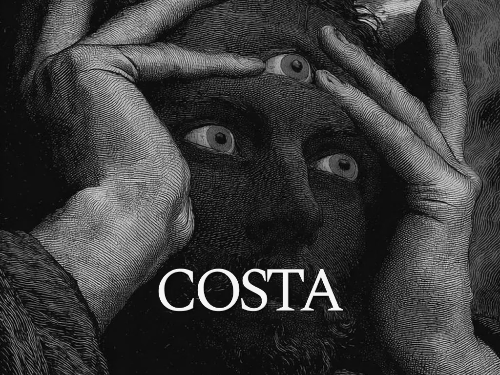
I started with the engraving. Not as a decoration, not as a retro nod — as the structural logic of the whole system. 19th-century cross-hatching has a quality that nothing digital can replicate: density, obsession, the feeling that every line was placed with intention. It maps perfectly to what deep research actually is. Thousands of micro-decisions, layered until something becomes true.
The first direction I rejected was the obvious one — taking a classical figure and simply placing it behind a modern UI. It looked like a mood board. The engraving and the interface were two separate things sitting in the same frame, not one coherent object. That didn't work.
What unlocked it was treating the engraving as atmosphere, not illustration. The figure doesn't explain COSTA. It haunts it. The UI floats in front of it — clean, precise, functional — while the engraving operates as the emotional subtext. Ancient knowledge. The feeling that something vast is behind this.
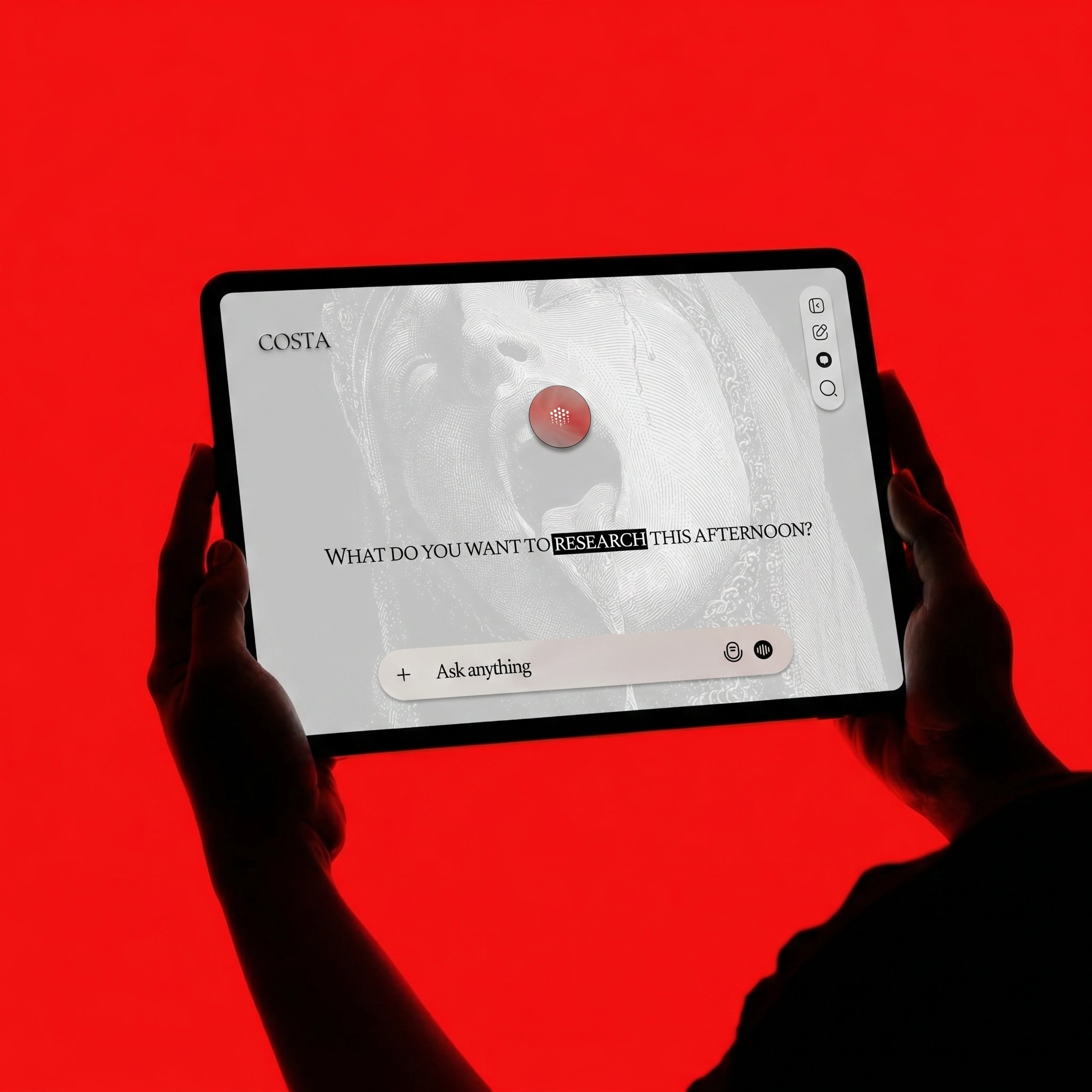
The red followed from that logic. One color. One element per composition. Never decorative — always load-bearing. A red iris. A crimson wax seal. The floating orb at the center of the interface, glowing faintly, like a signal from somewhere deeper than the screen.
THE WORK
WORDMARK
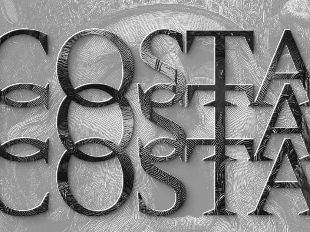
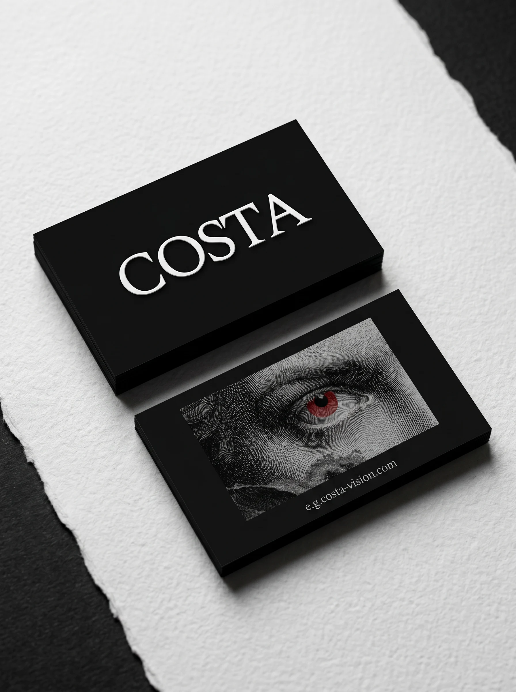
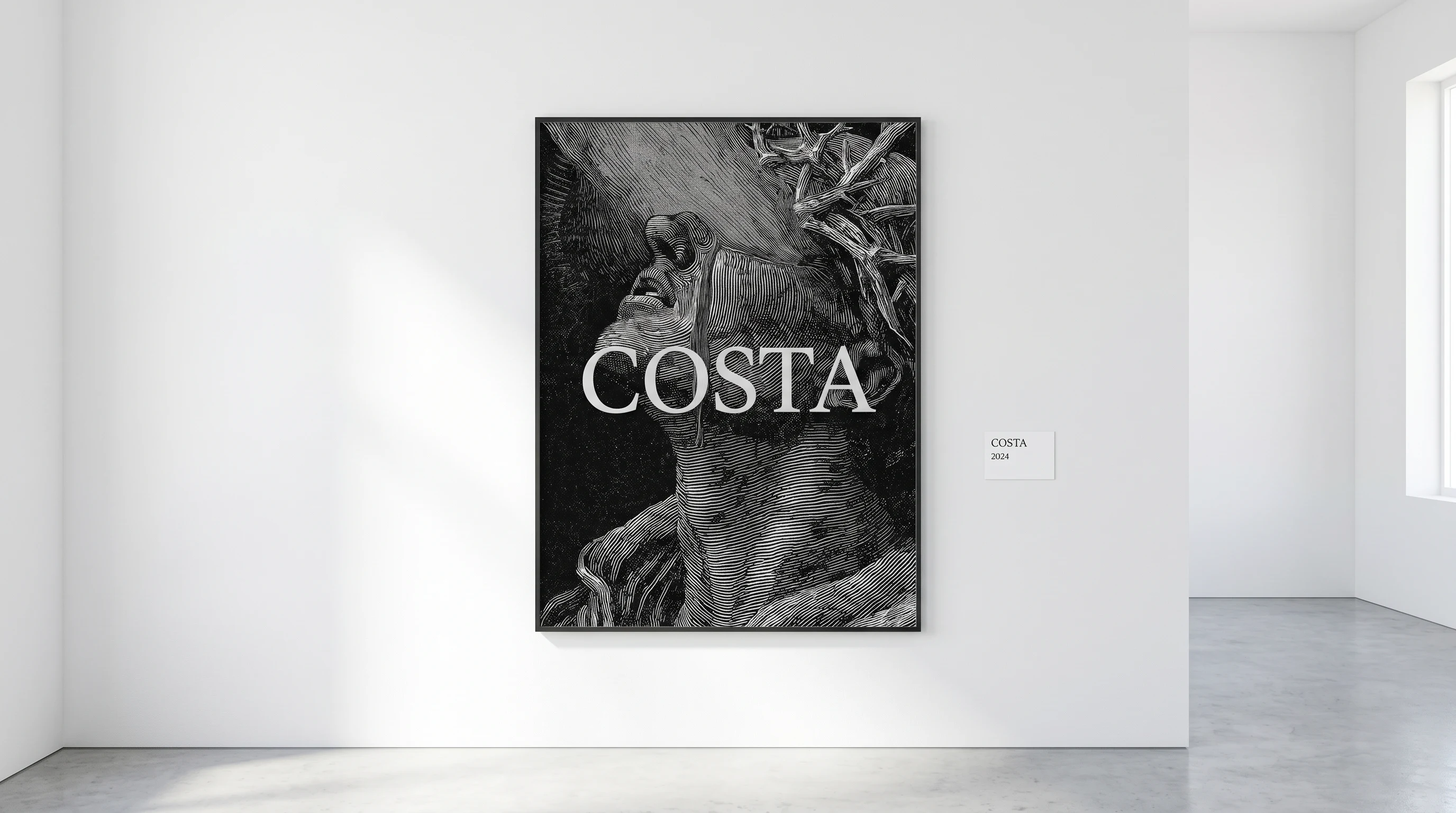
The wordmark is COSTA in a high-contrast Didot-weight serif, uppercase, with tight tracking and no modifications. No icon, no container, no tagline attached. The letters are permanent — they read like they belong on a printing plate from 1870 and on a screen in 2025 at the same time. It is rendered in pure white on black or pure black on white. No other configurations exist.
VISUAL SYSTEM
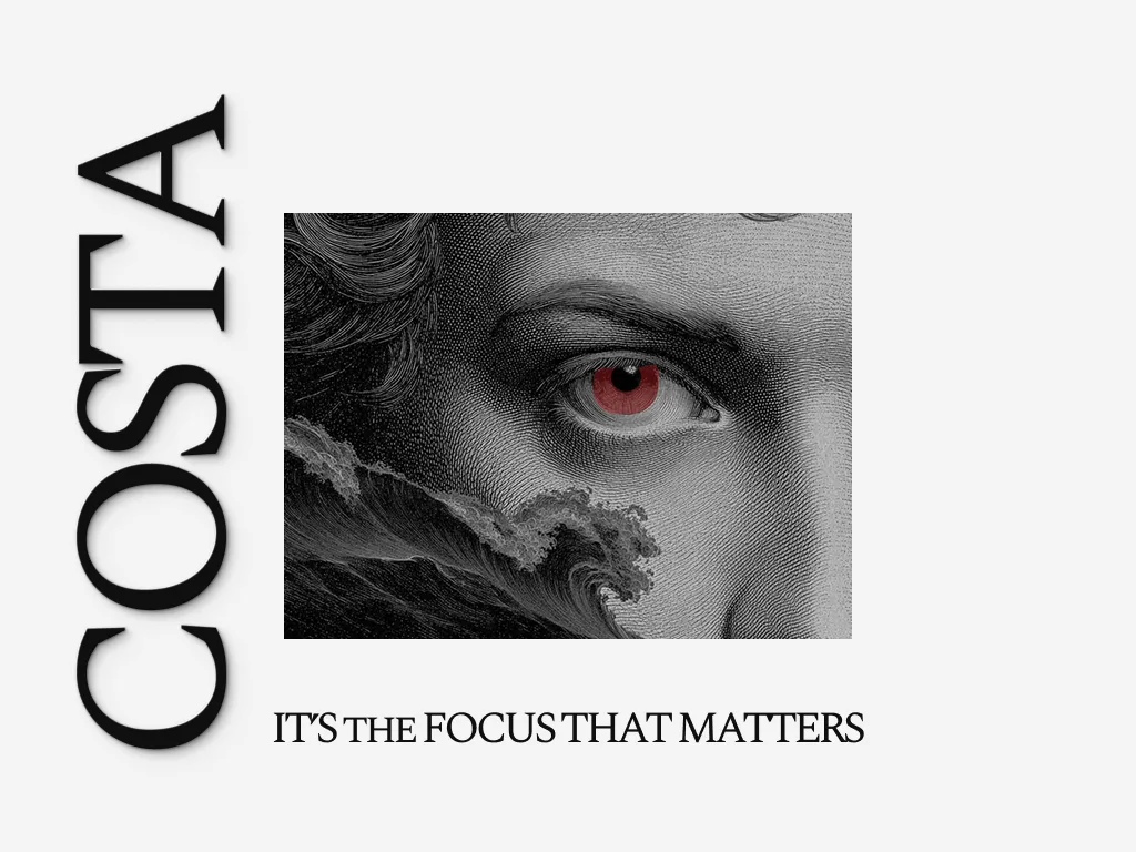
Three elements form the entire system: the engraving corpus (classical and biblical figures — weeping, reaching, obsessing), the wordmark, and the red accent. Every composition is built from these three things only. The red appears once per frame — never twice. This constraint is non-negotiable and is what gives the brand its precision. When everything is black and white and then there is one red element, that element becomes the only thing in the room.
INTERFACE DESIGN
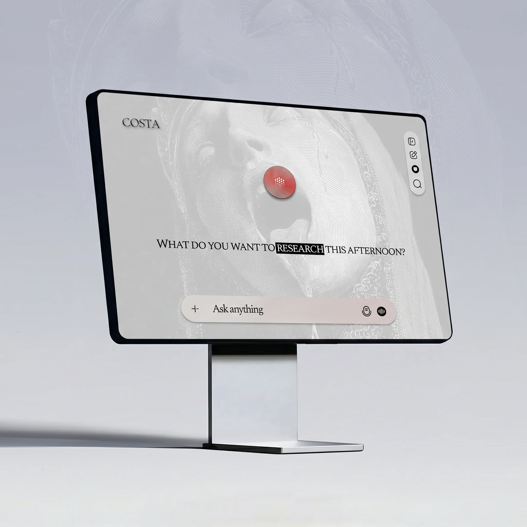
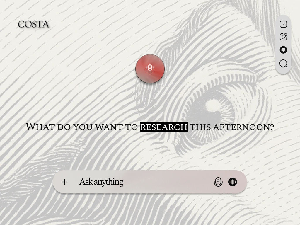
The home screen asks one question — "What do you want to research this afternoon?" — with "RESEARCH" highlighted in a black rectangle, functioning as a pulse. The floating red orb sits above it: the AI, rendered as a physical object, something you could hold. The sidebar carries four minimal icons. Two interface versions were developed — one with the engraving figure bleeding through the background, one on a flat F4F4F4 surface. The engraving version is the definitive one. The clean version exists for contexts where the texture would compete with content.
BRAND TOUCHPOINTS
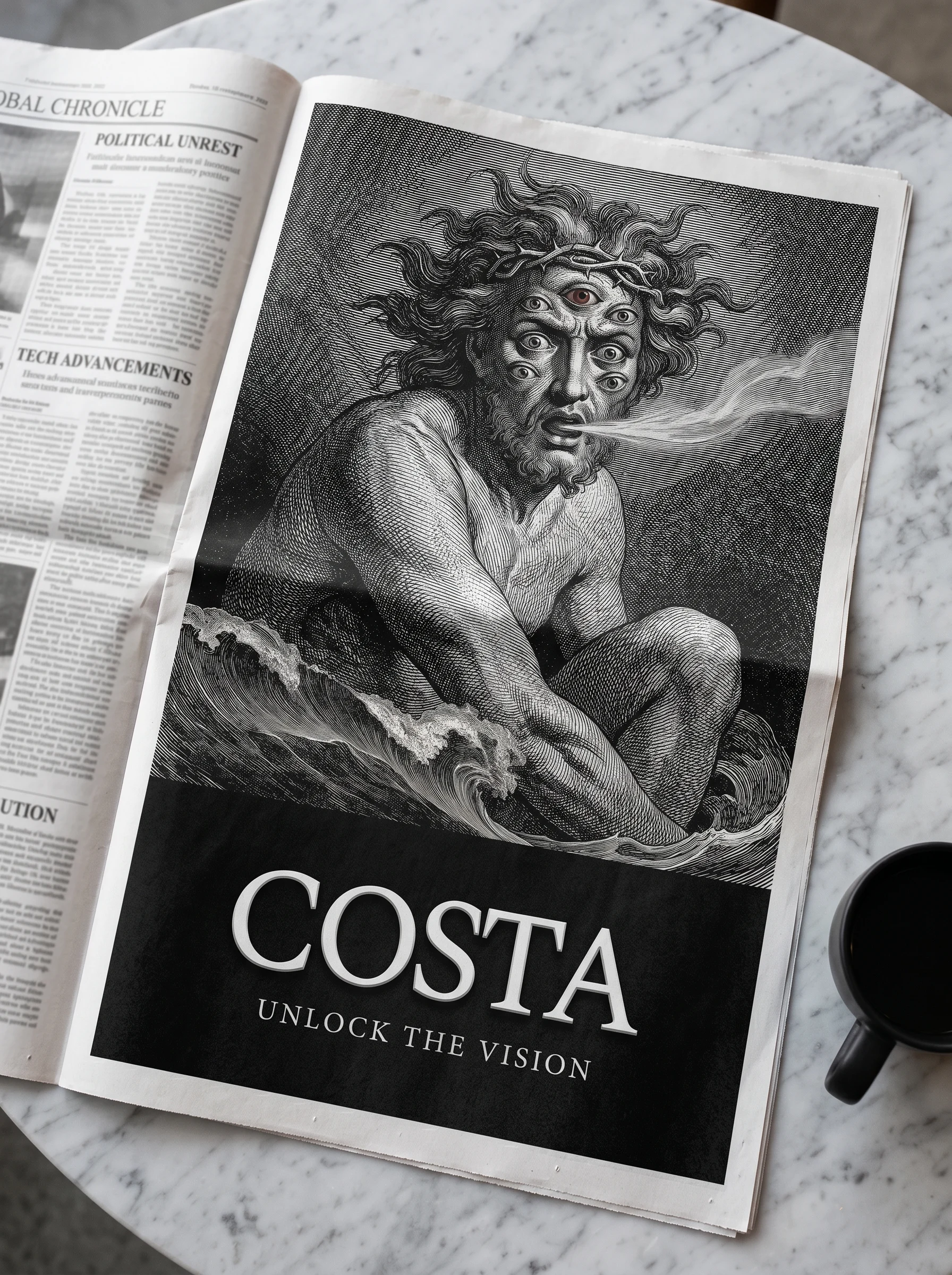
The newspaper full-page ad is the strongest single execution in the system. A Doré-style figure — multi-eyed, mythological, sitting in waves — fills the top two-thirds. "COSTA / UNLOCK THE VISION" anchors the bottom in pure black. It ran as a broadsheet page and looked like it had always been there.
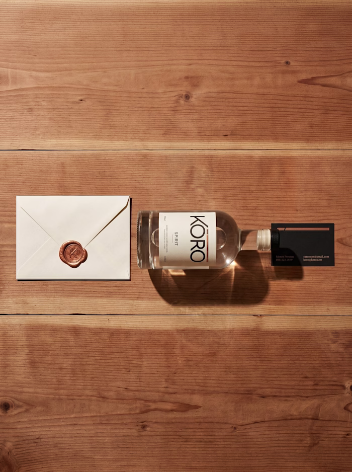
The wax seal envelope is the other one I keep returning to. Black envelope, crimson wax seal with the wordmark pressed in, a white card with engraving fragment slipping out. The red of the seal is the only color in the frame. It looks like correspondence from an institution that has been operating for centuries. That's exactly right.
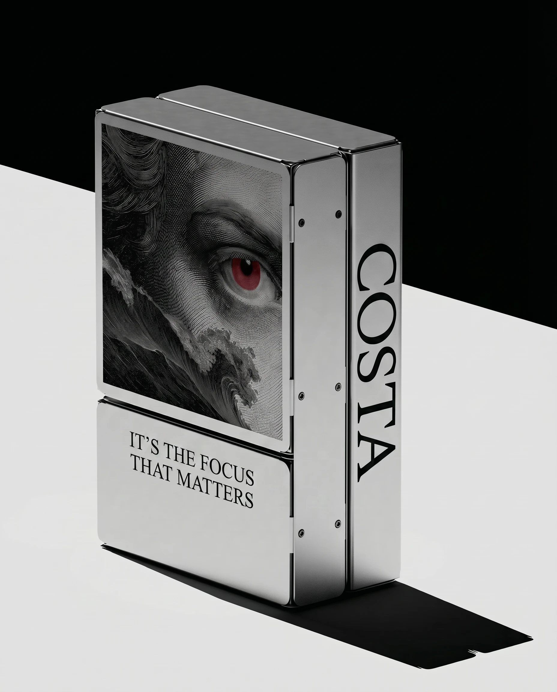
The business cards, research journal, product box, tote, sticker sheet, billboard, and gallery print all extend the same logic without diluting it. Each one uses the system's three elements. None of them overcrowd.
THE RESULT
What shipped is a complete brand world — identity, interface, and a full touchpoint system — that positions COSTA as something outside the current AI product landscape. It doesn't look like Perplexity. It doesn't look like Notion. It looks like something you'd find referenced in a paper about the history of knowledge.
The work is speculative, but it's fully resolved. Every mockup was built to production standard. The system holds at every scale, from a wax seal at 40mm to a billboard at 14 meters. That's the only test that matters.
Révolté — revolte.design
Project: COSTA
Year: 2026
Scope: Brand Identity, Visual System, Interface Design, Brand Collateral
Industry: AI / Deep Research
See more at revolte.design
Like this project
Posted Apr 24, 2026
Developed a distinctive visual interface and brand identity for COSTA, blending ancient aesthetics with modern UI.
Likes
2
Views
15
Timeline
Apr 6, 2026 - Apr 24, 2026