Built with Lovart
Grub Club Brand Identity, Website and System Design
Révolté
GRUB CLUB — Two Figures, One Snack
A brand for chaotic eaters built around a single confrontational image: two ink figures fighting over the thing between them. Not a food brand that celebrates nourishment. One that celebrates the fight.
THE BRIEF
Grub Club is a fictional DTC snack subscription I built as a self-initiated project. The premise: a monthly box of weird, global, unapologetic snacks for people who eat with their whole personality. Not a wellness product. Not a gift for someone's aunt. Something you tear open standing over a kitchen sink at midnight.
The tension in the brief was a familiar one — food brands almost always land in one of two failure modes. Either they go premium and clean (sage green, linen texture, the word "nourish"), or they go ironic-millennial startup (pastel, Recoleta, a winking tone that apologizes for itself). I rejected both on day one. What I wanted was a brand that felt genuinely feral. Warm but not soft. Funny but not performative. The kind of thing that looks like it was made by someone who cared way too much about a bag of chips.
The scope was full-system: identity, packaging, apparel, digital, campaign, and motion. The real constraint was maintaining visual coherence across registers that had no business being in the same room — raw gestural illustration and oversaturated food photography.
THE APPROACH
I started with the logo and worked outward from there, which is backwards for how I usually operate. But the visual references I was working with — Antithrust's gestural ink runner, Daniel Zendor's filled black characters, the double-silhouette primitive forms from folk illustration — pointed so clearly toward a single mark that I followed it.
The first instinct was one figure. A runner, a stamp, something in motion. It worked but it didn't have the brand's specific energy. Grub Club isn't about movement — it's about the exchange. The obsessive negotiation between someone who has a snack and someone who wants it. Two figures made the logo into a scene, not just a symbol.
What I rejected was everything that smoothed the figures out. Early directions went too clean, too vector-finished. The mark needed to feel like it was stamped, not designed. The slight imperfection in the silhouettes, the distressed texture in the wordmark — those aren't stylistic choices, they're the brand's claim that it doesn't take itself too seriously even when it does.
The harder problem was the visual system. I wanted real food photography — saturated, pushed, almost wrong in how intense the color gets — but I also wanted the ink illustration world intact. The solution was to treat them as two distinct layers that never blend. The figures always sit on top of photography, never inside it. They exist in their own register. You see a photograph of a chaotic food table and then you notice two ink creatures standing on it, at massive scale, fighting over something. The two-layer rule kept the system coherent across 20+ deliverables without ever feeling like the same trick twice.
THE WORK
LOGO
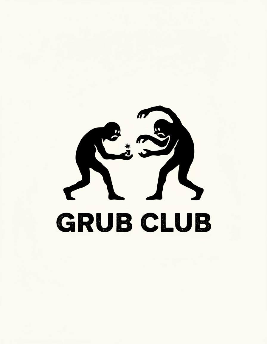
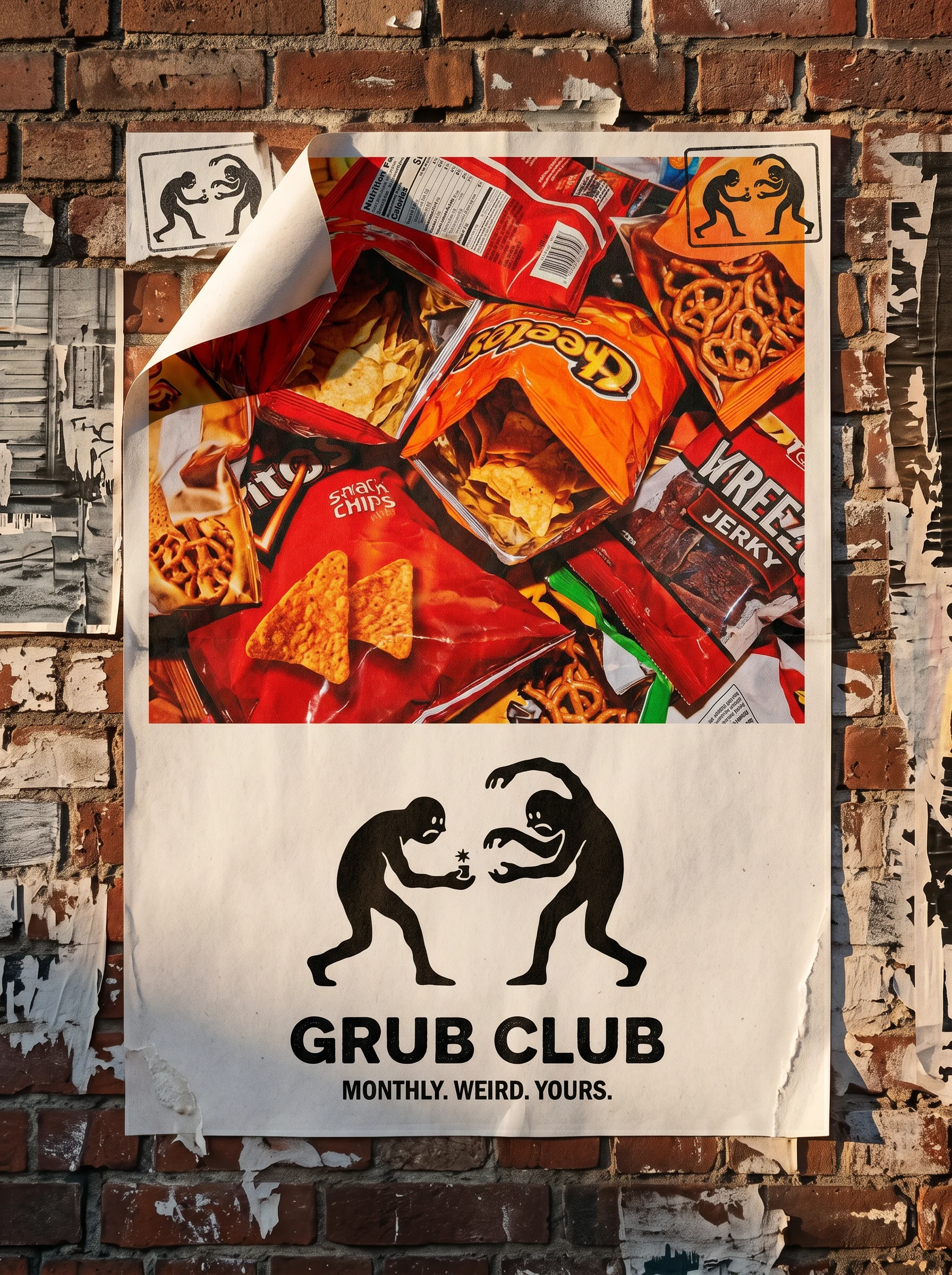
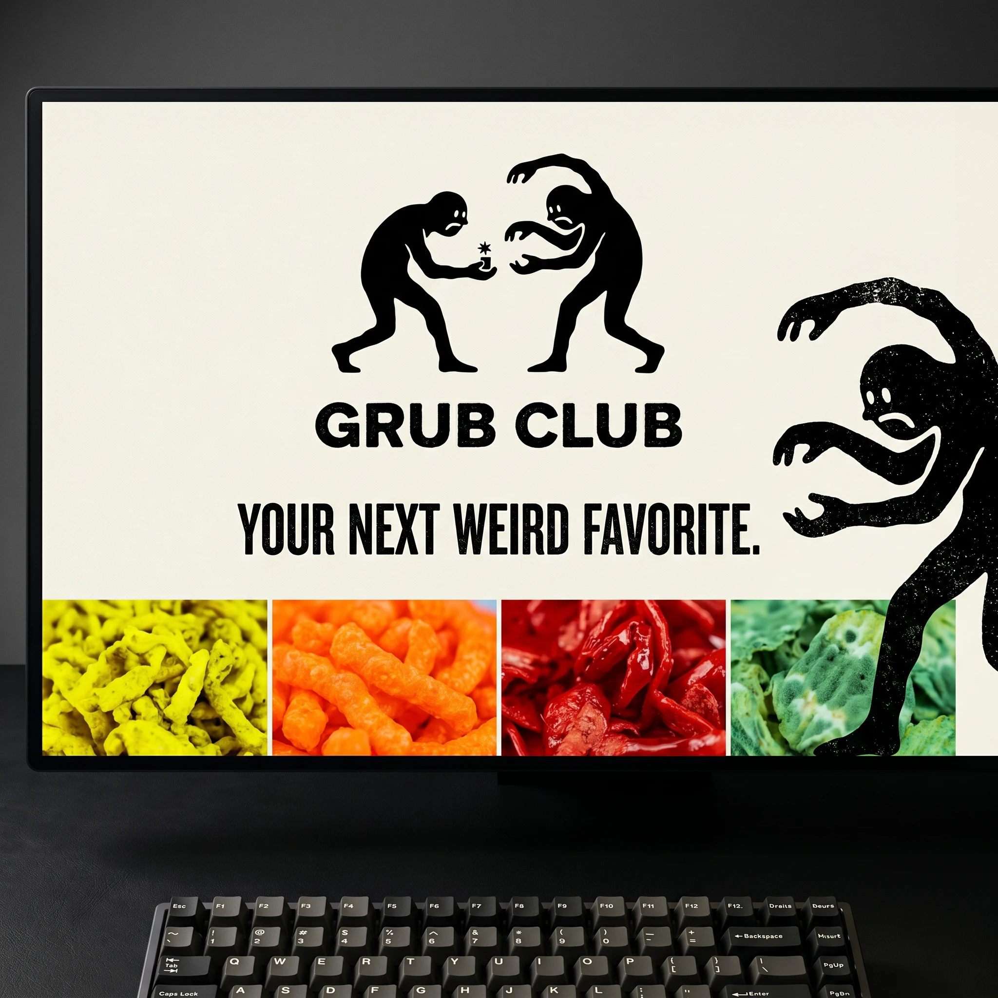
Two filled black silhouettes mid-confrontation, facing each other over a small star-burst element between them — the snack, always ambiguous, always worth fighting over. Both figures carry white knockout faces: minimal dot eyes, simple mouths. The construction is gestural, not geometric — built from filled shapes, no strokes, no clean edges. The wordmark "GRUB CLUB" sits below in a heavy condensed grotesque, all-caps, slightly distressed, tight tracking. The lockup reads at billboard scale and holds at 20px. The distress in the letterforms matches the ink imperfection of the figures — every element is telling the same story.
COLOR SYSTEM
Six colors, three modes. Ink Black
#0D0D0D and Bone #F2EDE4 anchor everything — they're the illustration world, the base layer, the default. Acid Yellow #E8F400 is the interrupt color: it appears when the brand needs to shout. Lacquer Red #D42B2B lives in the photography register — heat, appetite, the color of things that will absolutely hurt you. Mold Green #4DBD74 is the weird one, the fermented-alive color that signals something is happening beneath the surface. Neon Tangerine #FF6B2B fills the warmth gap. The palette is never used all at once — it's deployed by register, by surface, by intent.TYPOGRAPHY
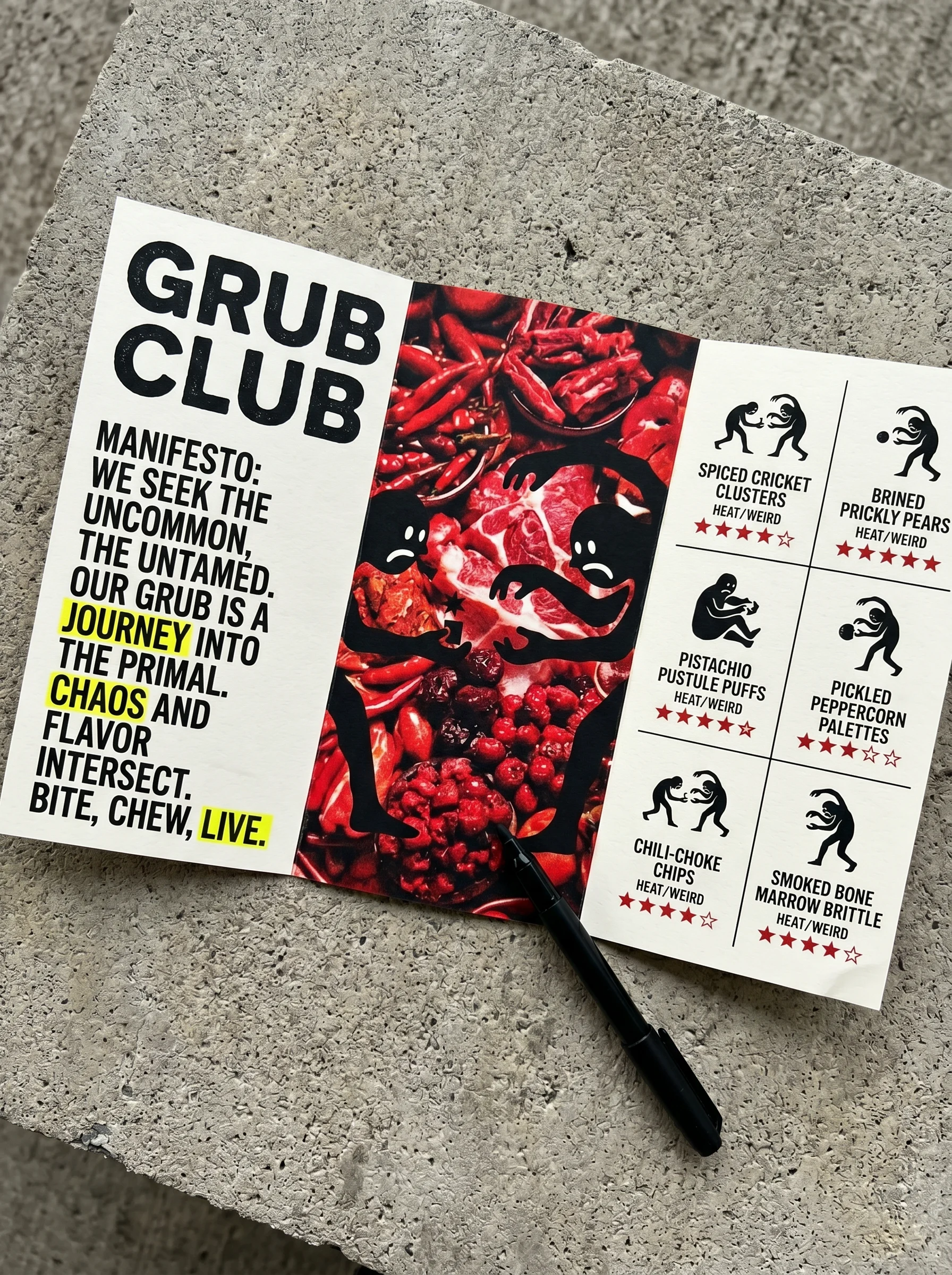
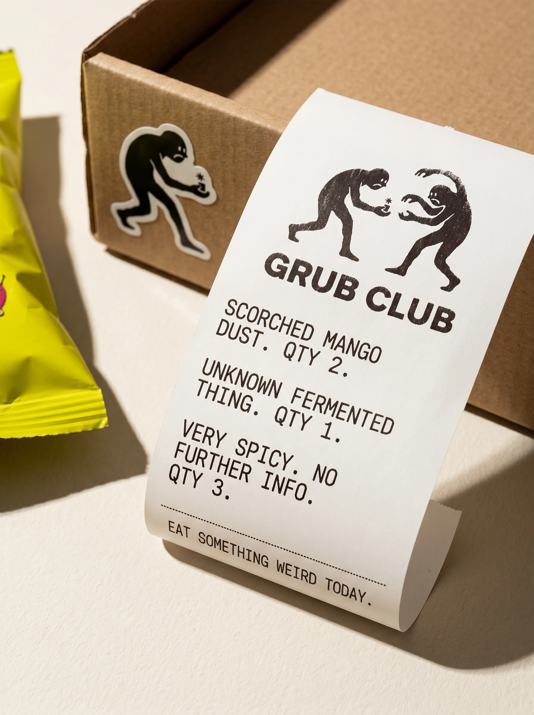
Primary: heavy condensed grotesque, all-caps, tight tracking — the wordmark energy extended into every headline. Secondary: monospaced thermal-style type for body copy, labels, and receipts. The combination gives everything a "printed fast and meant it" quality. No scripts, no rounded sans, nothing that could be described as friendly.
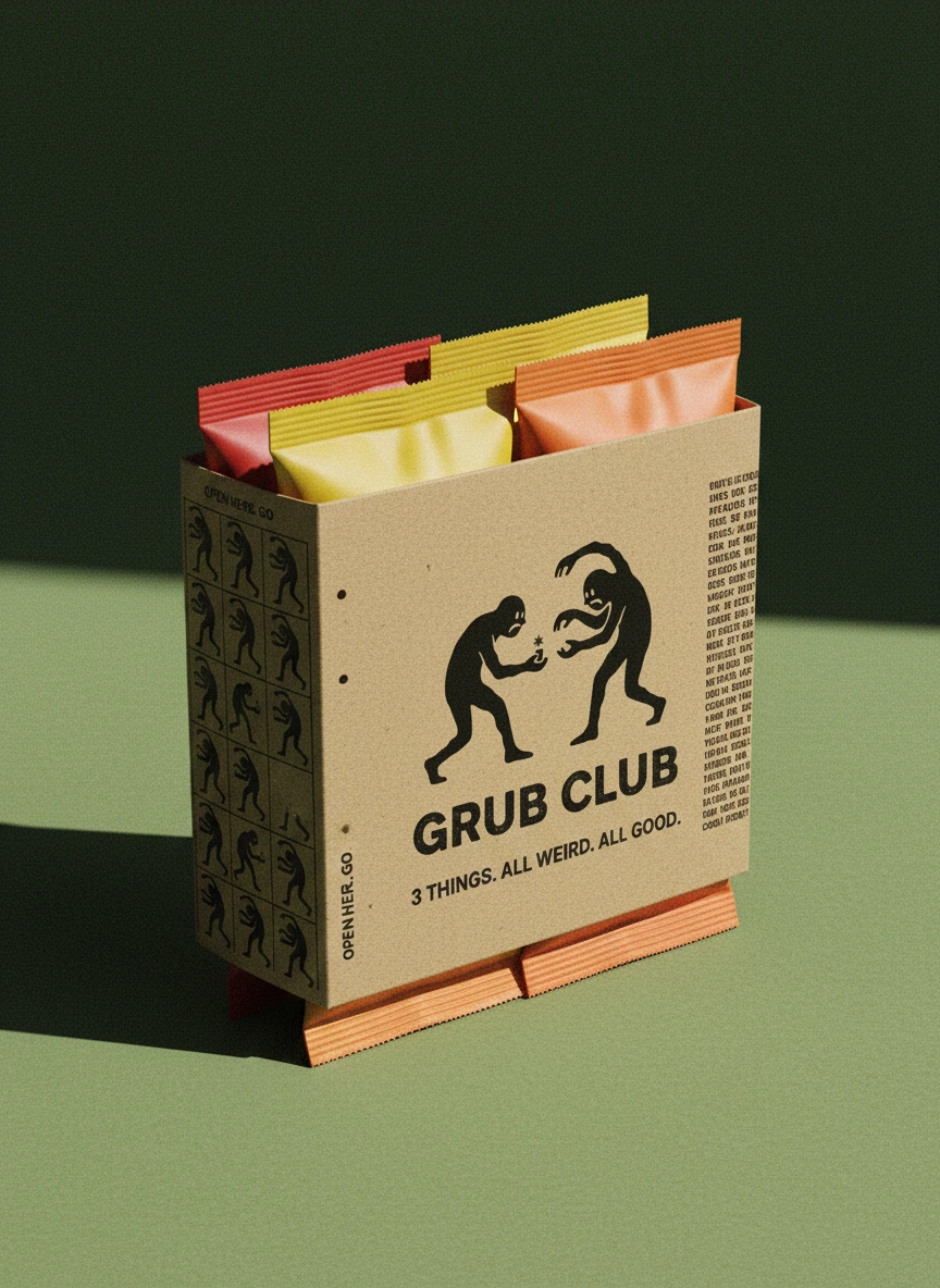
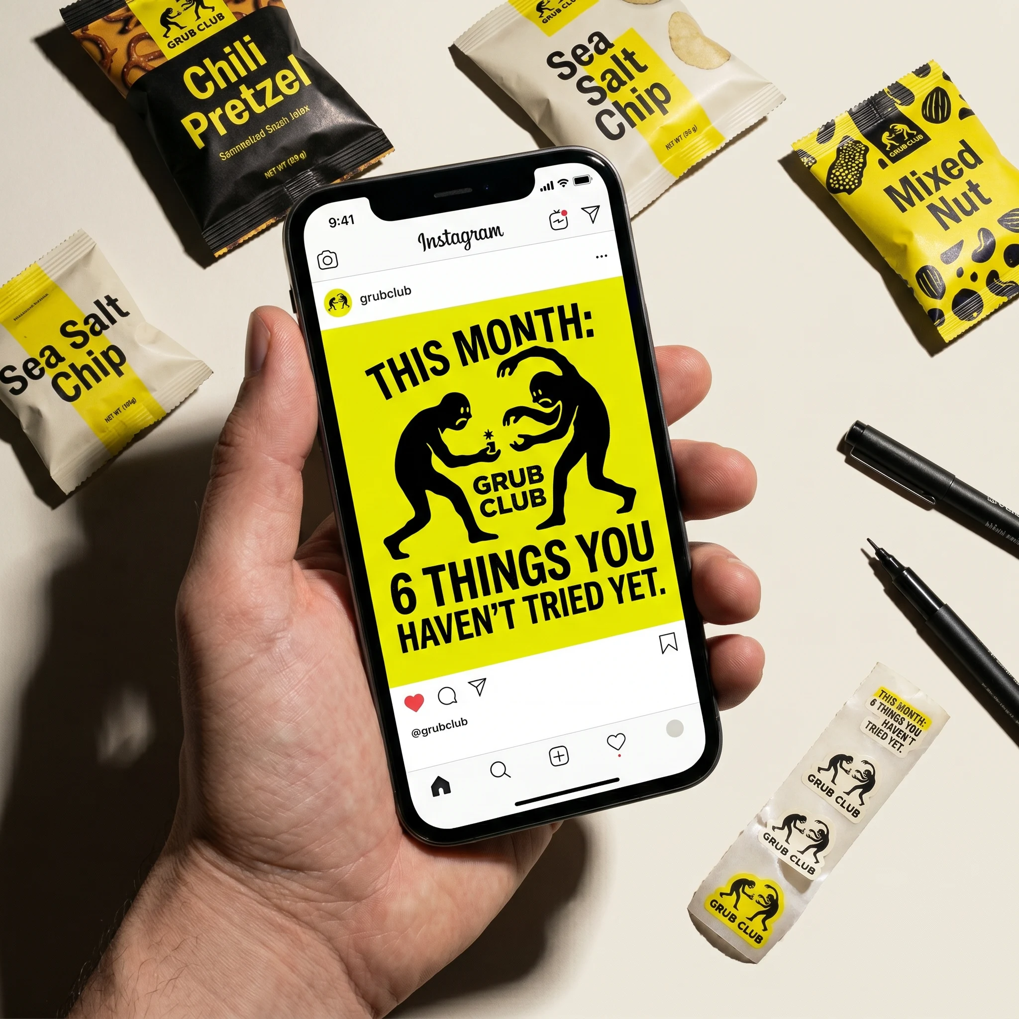
PACKAGING
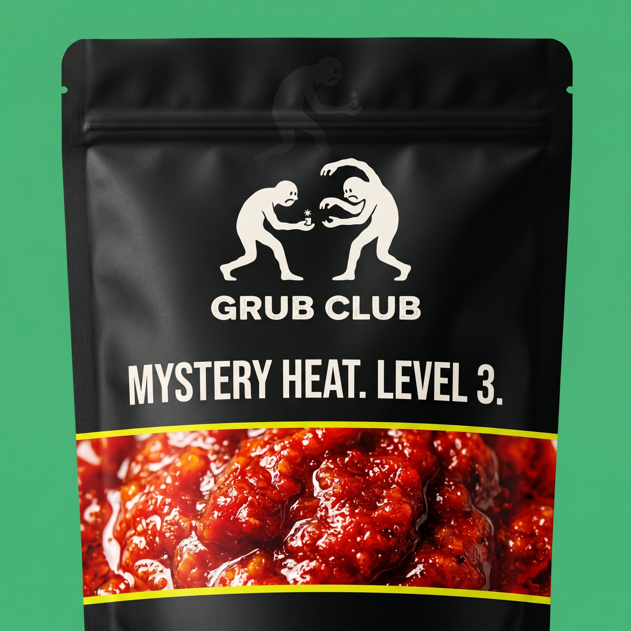
Two formats in the final cut. The snack bag: matte black stand-up pouch, bone logo centered upper third, a photographic band of oversaturated food wrapping the lower half, separated by a single acid yellow rule. The subscription box: kraft, logo stamped slightly off-center and rotated 2 degrees — the off-axis placement was deliberate, makes it feel hand-applied rather than produced. Interior panels carry secondary figures. The packaging tape runs the full system in a single line: wordmark, figure mark, star, repeat.
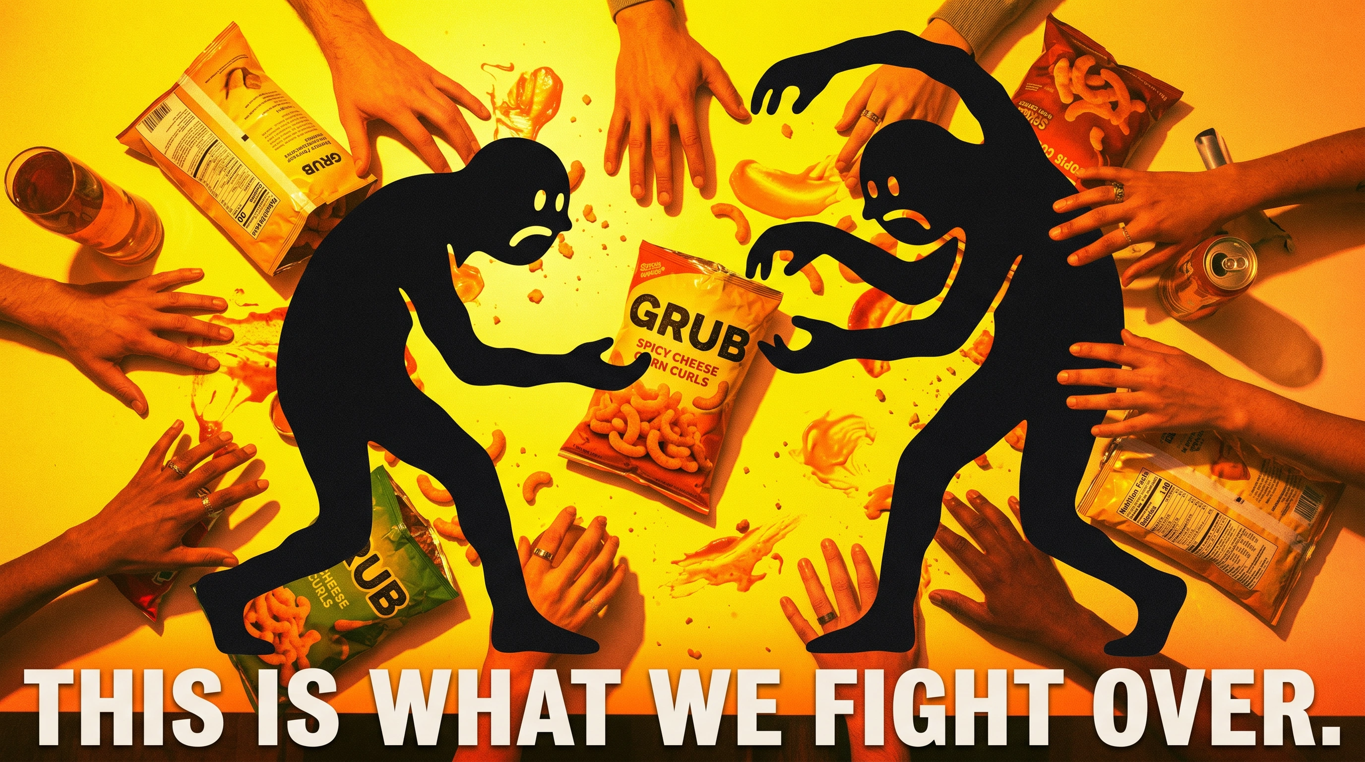
CAMPAIGN
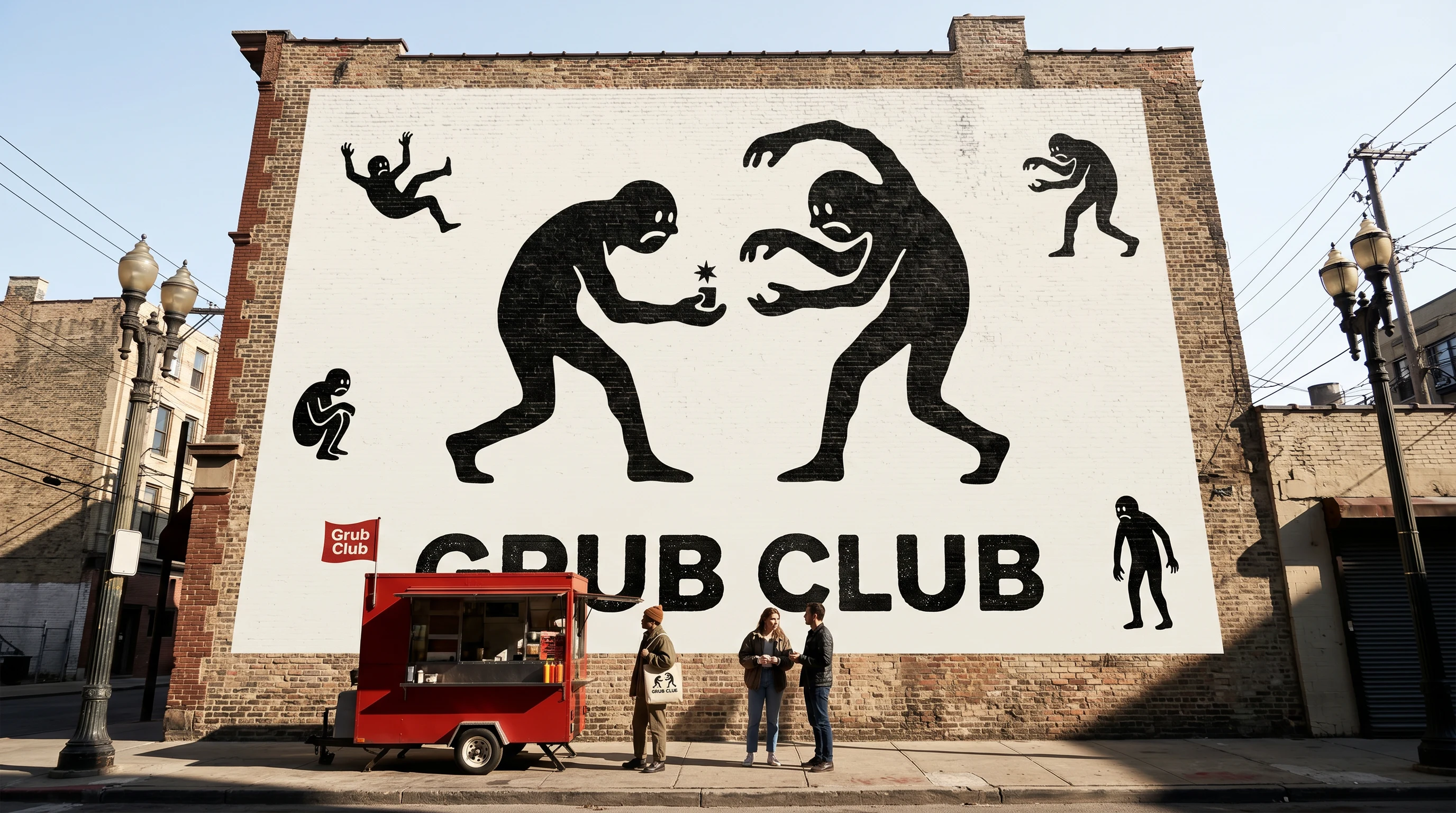
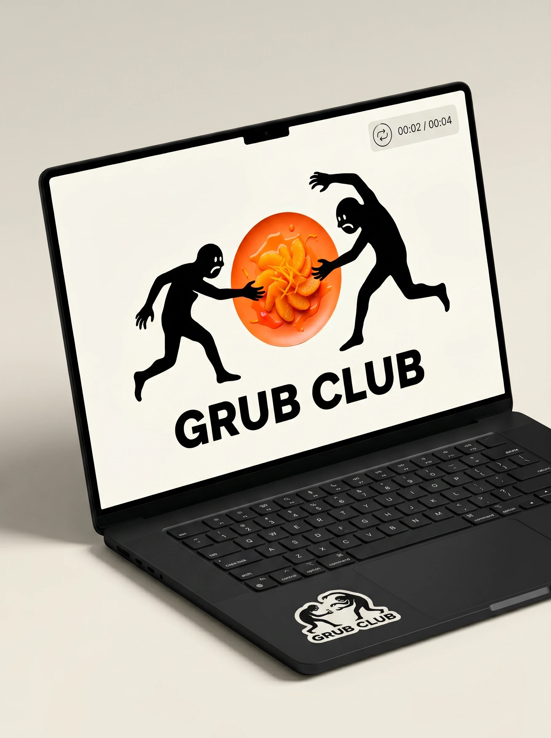
Five frames, one logic. The ink figures escape the logo and enter the photographic world at a scale that makes them impossible to ignore. In The Argument, both figures span the full width of a chaotic overhead food table — the logo rendered environmental. In The Stranger, one figure walks down a real street beside a real person, taller than the buildings, casting no shadow because ink figures don't answer to light. In The Wall, the whole logo becomes a four-story mural and the brand becomes infrastructure. The campaign never explains the figures. They're just there.
DIGITAL AND MOTION
The website hero uses the logo as its primary visual anchor and lets secondary figures bleed off the edges of the frame — the system escaping its container. The 5-second product video uses 3 hard cuts, staccato stamp animation for the logo's entrance, and a single percussive sound per cut. No ease, no bounce, no cinematic breath. The brand in motion looks like the brand in print: abrupt and intentional.
THE RESULT
What shipped was a complete brand system across 20+ touchpoints — identity, packaging, apparel, print, digital, campaign, and motion. The visual language held across every surface without feeling templated, which is the only thing that matters in a project like this. The two-register system — ink world and photo world — gave every application a decision framework: which layer is dominant here, and how do they meet at the edge?
The work does what the brand brief demanded. It doesn't look like a subscription box company. It doesn't look like it was made by committee. It looks like someone had a strong opinion about snacks and followed it all the way to a four-story mural.
Révolté — revolte.design
Project: Grub Club
Year: 2026
Scope: Brand Identity, Logo, Visual System, Packaging, Apparel, Digital, Campaign, Motion
Industry: Food & Beverage / DTC Subscription
See more at revolte.design
Like this project
Posted Apr 20, 2026
GRUB CLUB, A snack brand built on one image: two ink figures fighting over something worth fighting over.
Likes
2
Views
18
Timeline
Apr 6, 2026 - Apr 20, 2026