Built with Lovart
Avant People OS Branding Project
Révolté
AVANT PEOPLE OS - Authoritarian Aesthetics for the Age of Work
An HR software brand built on the visual logic of Soviet constructivism. The brief was simple and impossible: make people operations feel like a movement, not a module.
THE BRIEF
HR SaaS is one of the most visually cowardly categories in software. Pastel gradients. Rounded everything. Illustrations of diverse stick figures holding hands. The implicit message in all of it: we are safe, we are harmless, please don't be afraid of us. The problem is that nobody identifies with harmless.
The opportunity I saw was in the inverse. HR teams - the good ones, the ones with actual ambition - don't see themselves as administrators. They see themselves as the people who build the organization that everything else depends on. They are making consequential decisions about who gets in, who advances, who leaves, and what kind of company gets built in the process. That is not a pastel job. That deserved a different visual register entirely.
The scope was the full brand system: identity, visual language, typography, color, and a website. I also wanted a set of applications that would stress-test whether this direction could hold at every scale - from a favicon to a billboard.
THE APPROACH
I started with a positioning question rather than a visual one: what would this brand believe? The answer came quickly. The category talks about people as resources - assets to be managed, costs to be optimized. Avant's counter-position was structural: people are not a resource, they are the force. That single sentence determined everything downstream.
From there, the visual reference was obvious: Soviet constructivism. Not as costume, not as nostalgia, but as formal language. Rodchenko, Lissitzky, the agitprop poster tradition - these were systems built to mobilize people toward a collective purpose. The geometry was never decorative. It was ideological. That tension - authoritarian visual power deployed for something contemporary and deliberately ironic - was exactly right for a brand that wanted HR teams to feel like a vanguard rather than a support function.
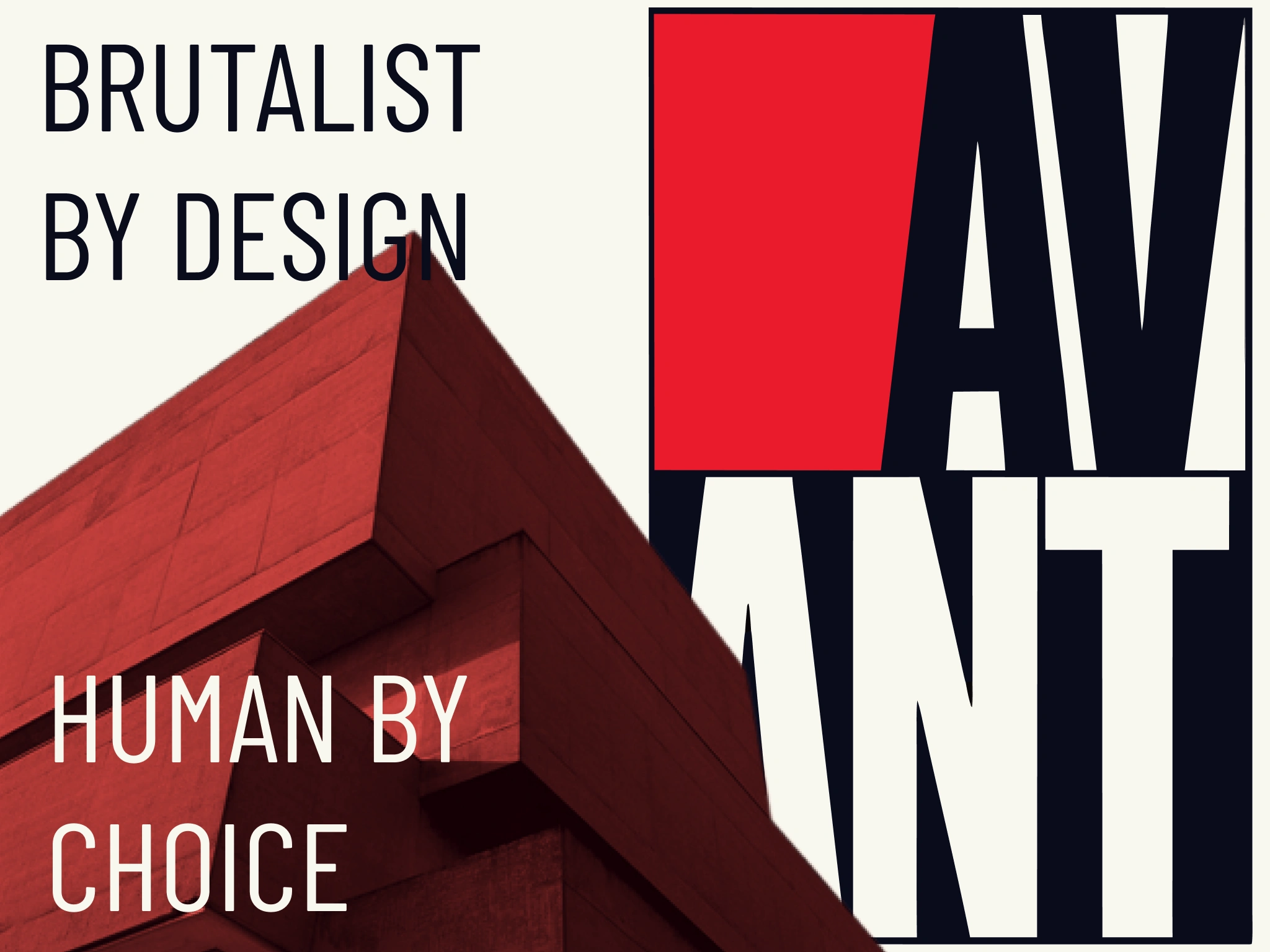
The first direction I tested was too literal. Pure recreation: red diagonals, photomontage, heroic figures. It read as a history lesson. The pivot was subtraction - strip out the illustration and the explicit historical reference, keep only the formal properties. The geometry. The compressed condensed type as architecture. The diagonal as implied energy rather than explicit motif. What remained was a visual system that felt like it had historical weight without being a costume.
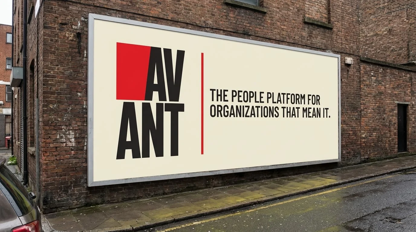
The logo locked the whole thing. Two rows - AV over ANT - inside a thin rectangular frame, with a flat red block occupying the top-left quadrant. The critical detail was the shear: the edge between the red block and the letterforms is not a clean vertical. It cuts at a slight diagonal, as if the block was forced into place. That single detail carries the entire constructivist DNA without a single explicit historical reference. It looks like something was assembled under pressure.
THE WORK
LOGO SYSTEM
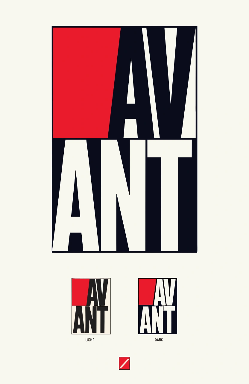
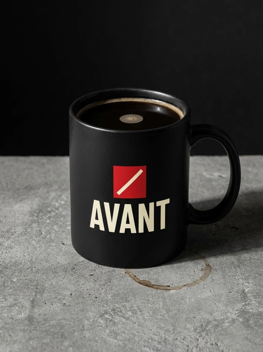
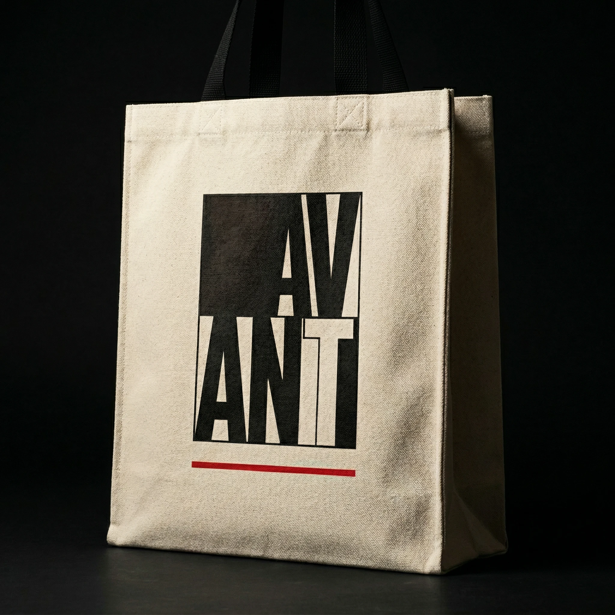
Three versions built from one form. The hero is the full two-row stacked block at display scale - AV in the upper half against the dark field and red block, ANT reversed to cream in the lower half against full black. The compact is the same construction at application scale, used for business cards, email signatures, apparel. The micro is the red block alone with a white diagonal slash - the favicon, the app icon, the mug. The system works because each version is a direct reduction of the same geometry, not a redesign.
The color split between the two rows is the most important structural decision in the logo. Upper half: dark letterforms on a light field, red block competing with the type for dominance. Lower half: cream letterforms reversed out of full black. The horizontal midline is a hard edge - no gradient, no transition. It references the constructivist tradition of dividing a composition into flat color fields with a single decisive line.
TYPOGRAPHY SYSTEM
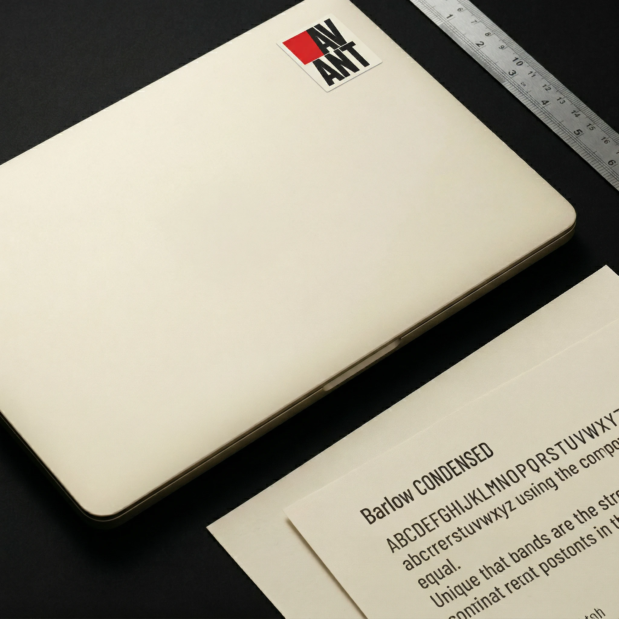
Barlow Condensed at 900 weight for everything that matters. The condensed proportion does the work that a different typeface would need decoration to achieve - it reads as compressed, forceful, deliberately architectural. Headline tracking at -10 to -20 units so the letters mass together into blocks. Eyebrow and label tracking at +40 to +120 units so the small type spreads to match the width of the headline above it - a technique borrowed directly from constructivist poster layout. Body copy in Barlow 400, the only place lowercase is permitted.
COLOR SYSTEM
Revolutionary Red #CC1010 used surgically - only on the logo block, rule lines, and critical UI alerts. Black #1A1A1A dominates all surfaces. Industrial Cream #F0E8D0 replaces white - it carries warmth and material reference (uncoated paper, raw canvas) that flat white cannot. Steel Grey #6A7580 handles all secondary type and non-critical UI elements. The rule is simple: if something uses red, it is saying something urgent.
WEBSITE
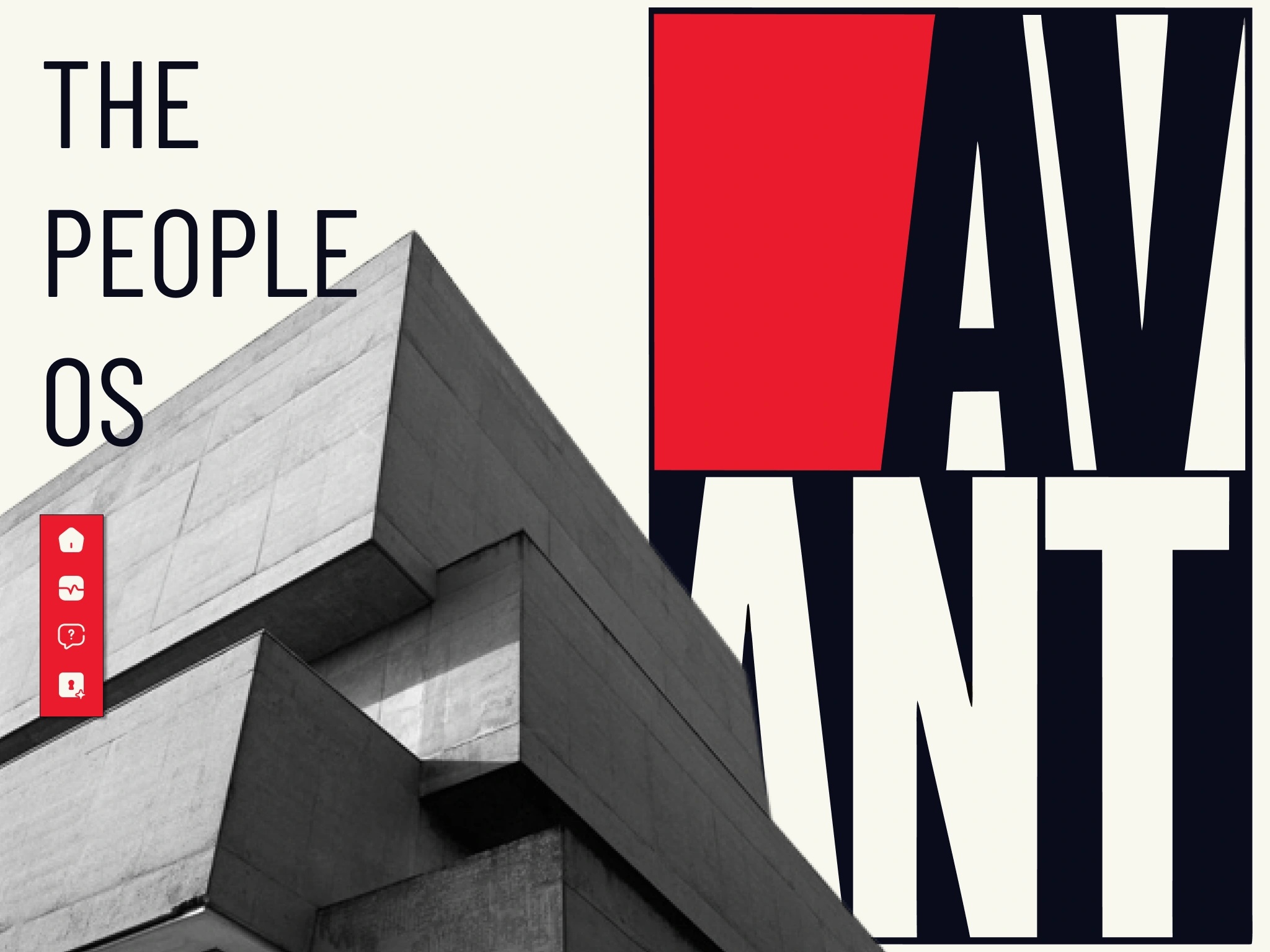
The site opens with a split composition: large-format Barlow Condensed display type on the left against the cream field, a duotone architectural photograph on the right - brutalist concrete geometry color-graded to deep charcoal and red. The hero copy reads "THE PEOPLE OS" at maximum scale, three lines, tracked tight. The product UI section below uses the same black/cream/red palette in the interface itself - the sidebar navigation in full black with condensed all-caps labels, the data panels in cream stock, the alert states in red only. The UI does not switch aesthetic registers from the brand. It is the same system at a different scale.
PRINT AND COLLATERAL
The A3 poster is the clearest expression of the brand's movement ambition - the hero logo at maximum scale, a #CC1010 rule line beneath it, and three lines of text reading "PEOPLE ARE NOT A RESOURCE / THEY ARE THE FORCE / AVANT PEOPLE OS." It is designed to be pinned to a wall, not framed. The newsprint insert pushed the editorial angle: tabloid format, the headline "THE ORGANIZATION IS THE PRODUCT." set at 42pt across four columns of condensed body copy. It reads like a manifesto, which is the point.
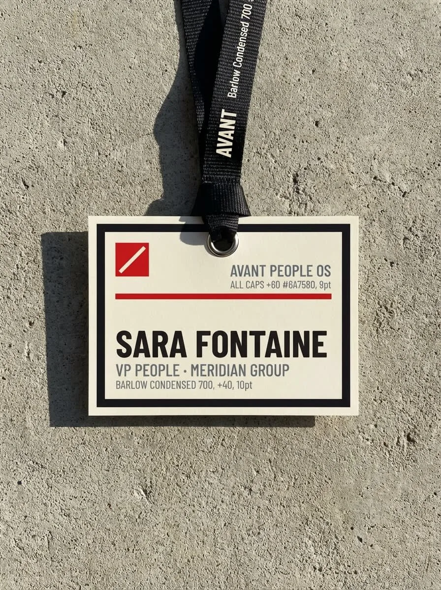
The business card runs the system at its smallest scale - compact logo top-left on cream stock, a single #CC1010 rule at the bottom edge, nothing else. The back is full matte black with the micro logo centered. The conference badge uses the micro mark at 18mm, the name at 28pt Barlow Condensed 900 - it reads from across a room. The hoodie carries the compact logo on the left chest at 65mm, matte screen-print on dark charcoal. The ceramic mug is the micro mark stacked over the AVANT wordmark in cream against matte black. Every object is the same system. None of them needed a new design decision.
THE RESULT
What shipped was a complete brand system that holds at every scale from a 6-metre billboard to a 28×28px favicon - and stays in the same aesthetic register at every one. The most important test was the website: if the product UI had defaulted to generic SaaS conventions, the brand would have broken. It didn't. The interface uses the same typography, the same color logic, the same hard edges as the identity. The product looks like it was built by the same mind that built the brand.
The category response was exactly the signal I was looking for - this does not look like HR software. It looks like something that has a position. For a movement brand, that is the only outcome that matters.
Révolté - revolte.design
Project: Avant People OS
Year: 2026
Scope: Brand Identity, Logo System, Typography System, Color System, Web Design, Print Collateral, Merch & Apparel
Industry: HR SaaS / People Operations
See more at revolte.design
Like this project
Posted Apr 16, 2026
An HR software brand built on the visual logic of Soviet constructivism. The brief was simple and impossible: make people operations feel like a movement.
Likes
0
Views
14
Timeline
Apr 6, 2026 - Apr 16, 2026