Built with Lovart
GRAZIA: A Byzantine-inspired Brand System
Révolté
GRAZIA — The Empire Never Fell
A self-initiated brand identity built on a single premise: what if the Byzantine Empire never collapsed, and simply pivoted to artisan soap?
The Brief
I gave myself one constraint going in: no references that exist in contemporary beauty. The brief was self-imposed and deliberately uncomfortable — a fictional artisan soap brand, built entirely from scratch, with no client, no safety net, and no excuse to be safe. The only requirement was that it couldn't be mistaken for anything else.
The tension I was chasing was specific. What happens when you take the full visual theology of Byzantine imperialism — the gold grounds, the sacred figures, the hieratic stillness, the total conviction that beauty is doctrine — and apply it to a bar of soap? The absurdity is structural. And the only way it works is if the brand never acknowledges it. If it behaves as if the question was never absurd at all.
The scope was deliberately total: name, positioning, visual identity, logo, typography, color system, packaging, environmental applications, branded objects, and a campaign series. I wanted a portfolio piece that functions as a complete world — not a logo with three supporting mockups, but a system that proves itself across fifteen different surfaces.
The Approach
My first instinct was to stay in wabi-sabi territory — decay, imperfection, the beauty of things falling apart. That direction had something, but it was quiet. And I kept circling back to the opposite: total excess. Maximum conviction. A brand that doesn't crumble but insists, after everything, on still standing.
Byzantium locked in not as an aesthetic reference but as a behavioral framework. This was a civilization that believed gold was the color of divine light made visible — not decoration but theology. That every surface was an opportunity for meaning. That beauty was not tasteful but total. I wanted a brand that operated from those premises fully, without irony and without apology.
The first logo direction I tried was a wordmark-only system. It was too restrained. Byzantine identity is built around the sacred figure — the frontal face, the absolute stillness of something that has been venerated for centuries. So the mark became a face: reductive, hieratic, enclosed within a spiked imperial halo. Eyes that look at you the way a Byzantine saint looks at you in an icon — present, unpsychological, performing nothing.
I rejected the idea of softening the concept for accessibility at any point. If the brand needed to explain itself, it had failed. GRAZIA presents. It does not invite.
The Work
Brand Identity / Visual System
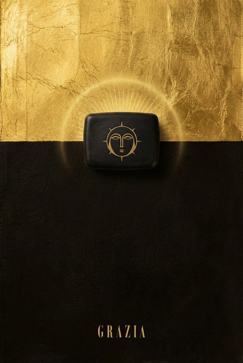
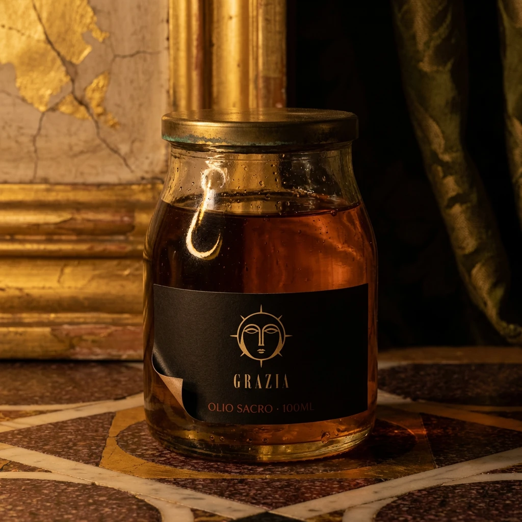
The core rule of the visual system: gold is not an accent, it is the environment. Where other brands use white space, GRAZIA uses gold (
#C9A84C). The icon black (#1A1410) — a warm near-black with the suggestion of aged lacquer — is the surface everything emerges from or rests against. The result is a system with almost no neutrals. You are inside the palette at all times.Imperial porphyry (
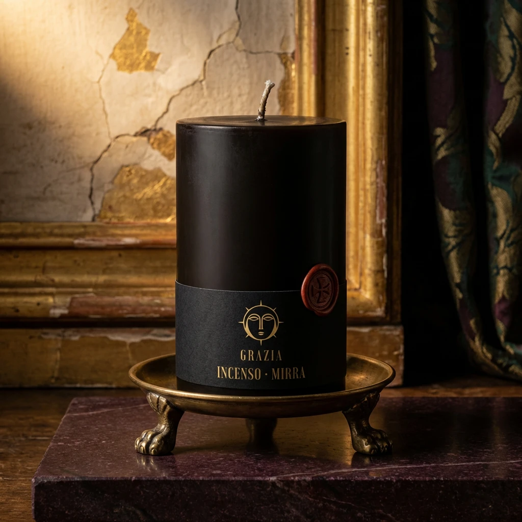
#4A1942) enters as a premium secondary — the purple-red marble that Byzantine law reserved exclusively for the imperial family. Lapis (#1B3A6B) appears only as an interior lining or ribbon accent, signaling that something inside is especially significant. Faded cinnabar (#A63D2F) functions as the rubric color — the red used in Byzantine manuscripts to mark sacred names. It never appears decoratively. Every application is intentional.Logo
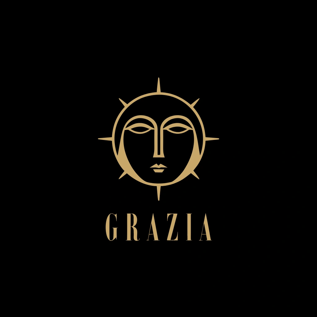
The mark is a frontal face within a spiked imperial halo: eight spikes at equal intervals, facial marks reduced to the minimum required to read as human — two almond eyes with heavy upper lids, a long straight nose, a closed mouth. No expression. No angle other than frontal. The face looks directly at the viewer with the flat, unpsychological gaze of a Byzantine icon figure — present but not performing presence.
Below the mark: GRAZIA in a high-contrast uncial-influenced serif, small caps, tracked at 250 units, always centered. The wordmark width equals the halo diameter exactly — a proportional lock that makes the full composition feel inevitable. The logo scales from embossed soap bar to mosaic floor medallion without losing its logic.
Typography System
The primary display serif draws from uncial and half-uncial manuscript traditions — high stroke contrast, serifs that widen dramatically at their terminals as if cut in stone. Always centered. Always small caps. Generous tracking — text treated as inscription, not communication. A supporting roman handles product names and secondary hierarchy. A compressed upright italic functions as texture at very small sizes — ingredient listings formatted like the names of saints in a martyrology.
System rule: nothing sans-serif. Nothing that was conceptually designed after the printing press. Every typographic decision refers back to stone-cut inscription or manuscript hand.
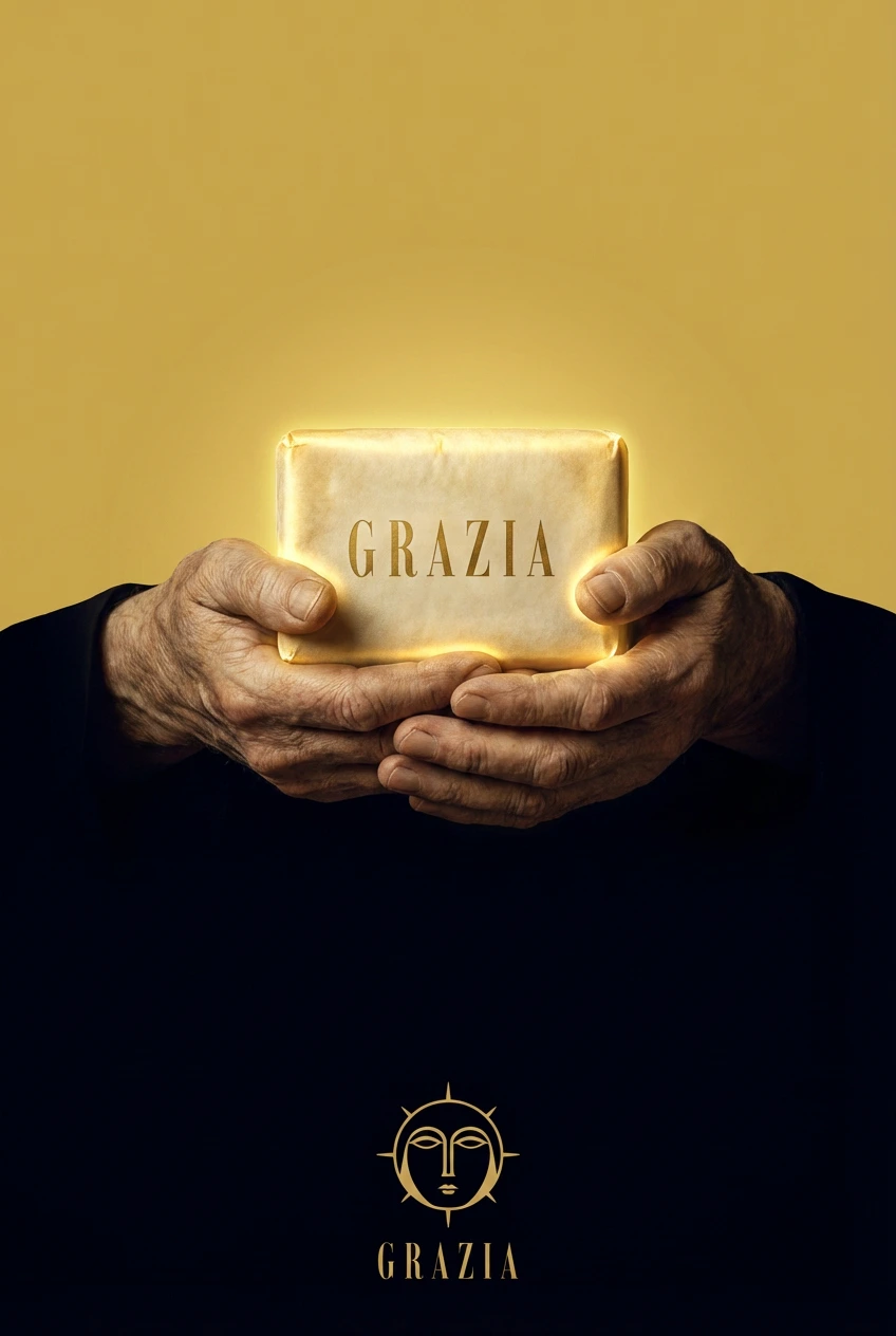
Packaging
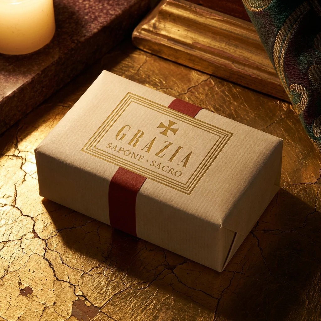
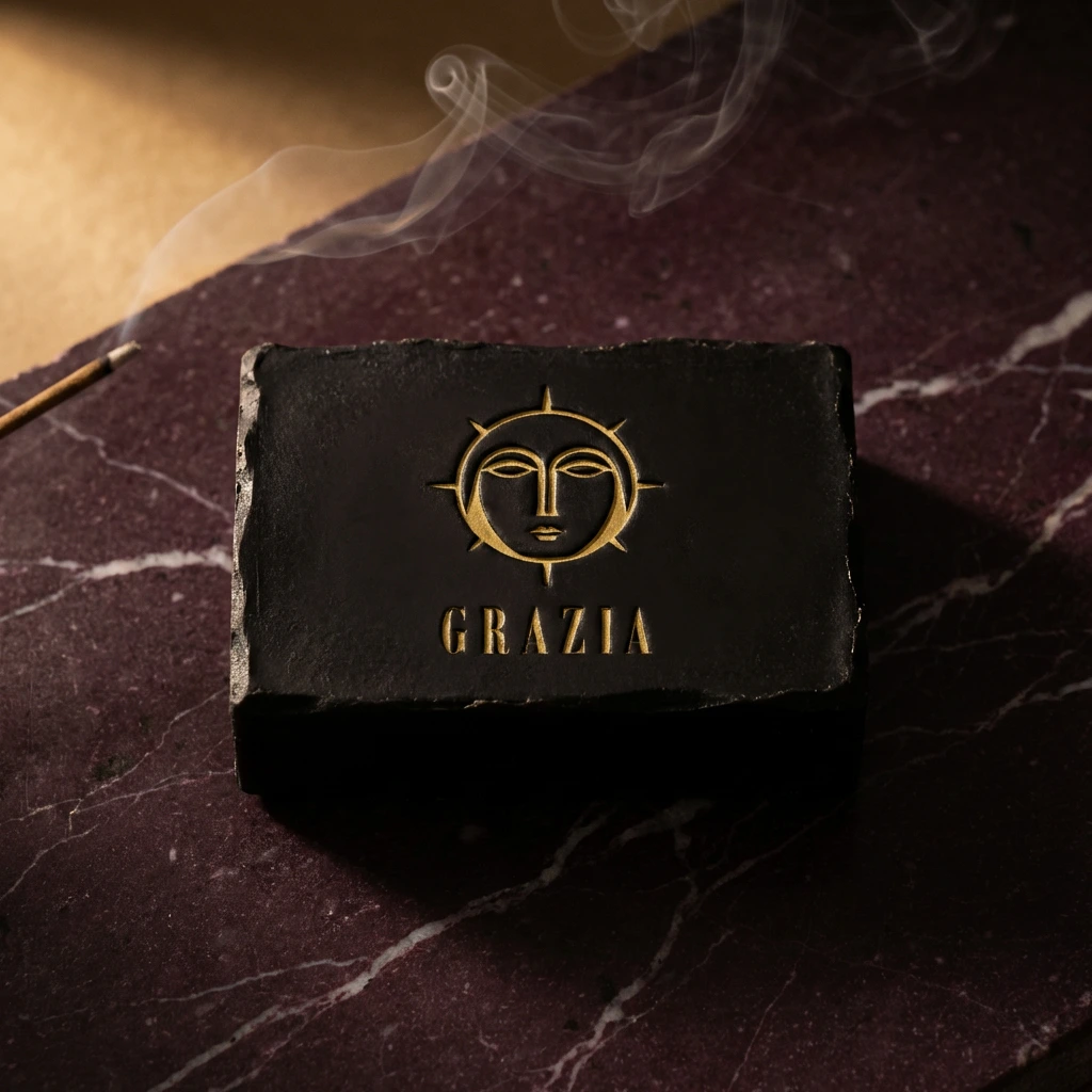
The soap bar: icon black, hand-cast with visible mold irregularity, logo debossed and gold-pigment filled — a pressed seal directly on the product surface. The outer wrap: heavyweight aged parchment, the votive stamp cartouche in Byzantine gold, sealed with a cinnabar washi band. The reliquary box: exterior in black lacquered board with gold foil cartouche; interior lined in lapis paper with a faint gold guilloche printed at low opacity, visible only on close inspection. Two parchment-wrapped bars nested inside, separated by a fold of lapis paper. A card resting on top reads only: GRAZIA. Nothing else.
Environmental Applications
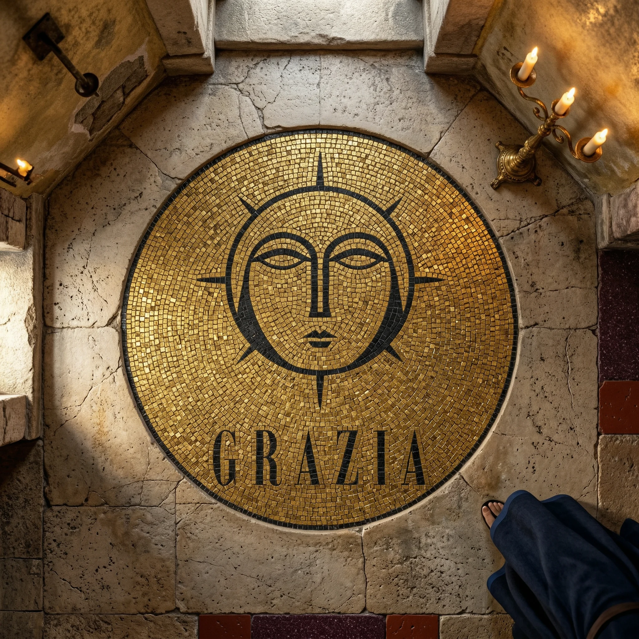
The stone threshold sign: porphyry slab, logo sandblasted and gold-leaf filled, mounted on cracked plaster with ghost fresco color bleeding through beneath. The ritual tray: oxidized bronze with Byzantine interlace band cast in relief, lapis-lined interior, the halo face mark centered in the border at higher relief than the surrounding ornament. The mosaic floor medallion: the full mark in gold smalti — glass mosaic tile with leaf sandwiched inside, the actual material of Byzantine church apses — each tesserae catching light independently so the gold ground is never flat. The brass door plate: three-tier vertical composition — halo mark, GRAZIA, SAPONE · SACRO · CONSTANTINOPOLI. A place of origin that cannot be verified and does not need to be.
Campaign Series
The campaign operates as devotional images, not advertisements. No product in use. No models smiling. No call to action.
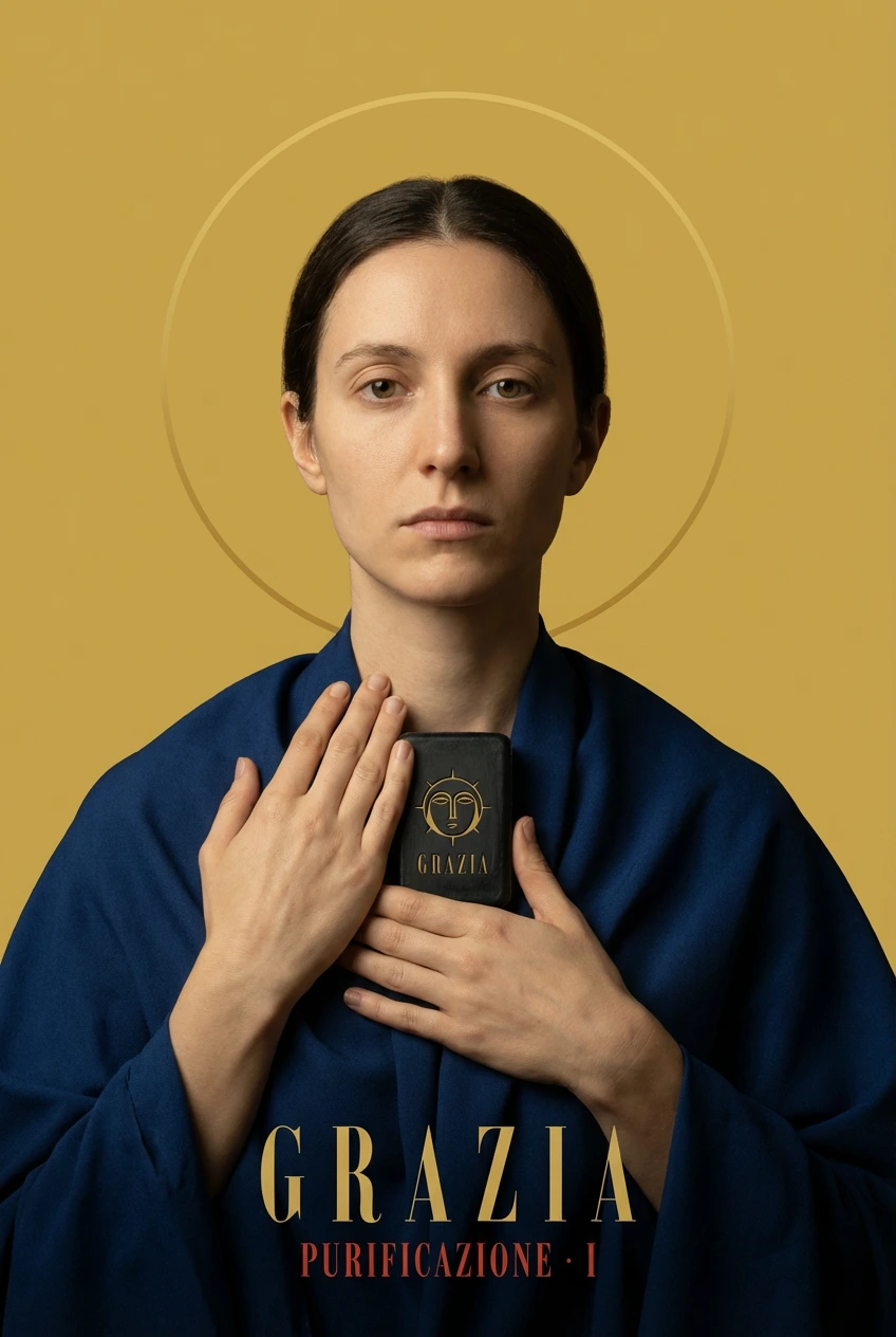
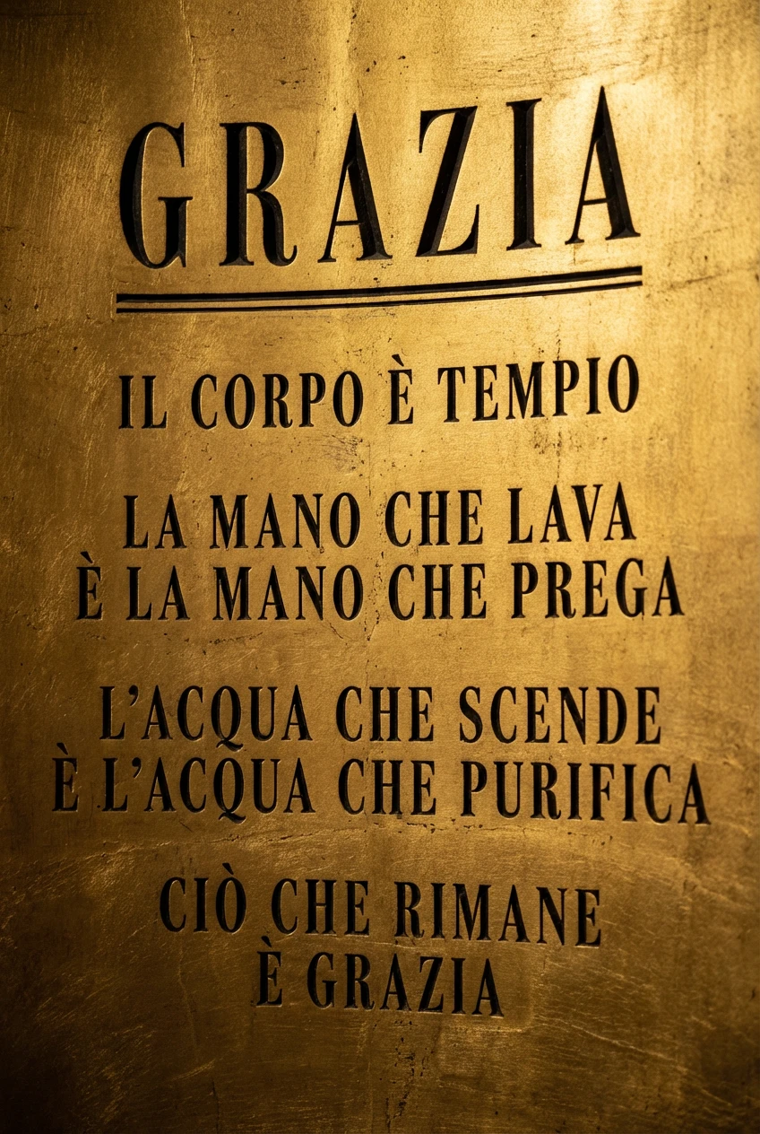
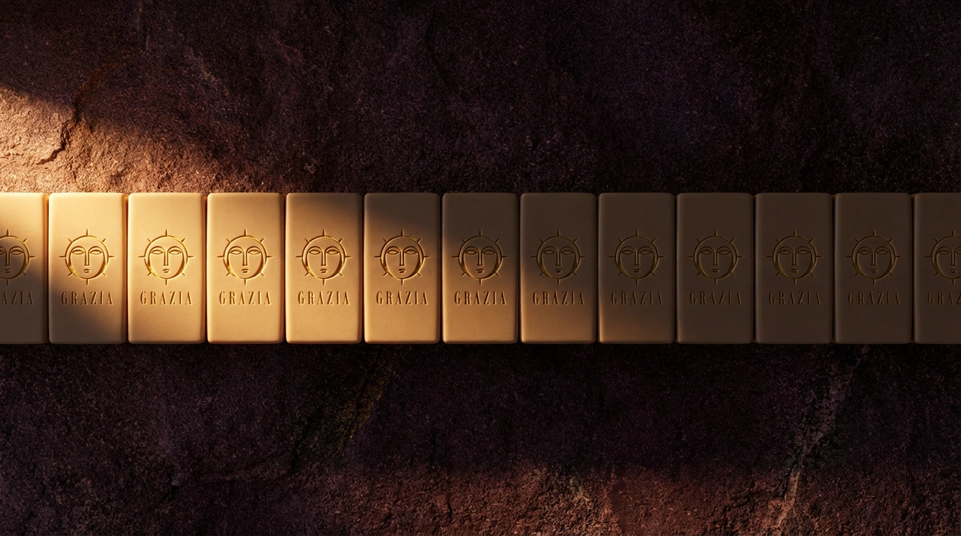
The Annunciation: a single soap bar at the hard horizon between gold ground above and icon black below, emitting a halo of reflected light upward. The Offering: disembodied hands in the gesture of presenting something to a sovereign, holding a wrapped bar against pure gold ground. The Forty Days: forty soap bars in a horizontal row on porphyry, lit from the far left, logos modulating from fully legible gold to near-invisible impression as they recede into shadow — an image about repetition, ritual, the accumulation of identical sacred acts. PURIFICAZIONE · I: a frontal figure in lapis against gold ground, thin halo ring, holding the soap bar at the chest — the first in a series that will never be completed, because this is a fictional brand and that is exactly correct. The Creed: pure typography on gold ground, formatted as a Byzantine apse inscription:
IL CORPO E TEMPIO
LA MANO CHE LAVA E LA MANO CHE PREGA
L'ACQUA CHE SCENDE E L'ACQUA CHE PURIFICA
CIO CHE RIMANE E GRAZIA
The Result
GRAZIA is speculative work — no client, no launch. What it demonstrates is the ability to sustain a single conceptual framework across an entire brand system without flinching. Every decision — color, type, material, campaign logic — traces back to the same premise: a civilization that treated beauty as doctrine, applied to a bar of soap.
The system held across fifteen applications because the idea was specific enough. Vague concepts make for inconsistent systems. Byzantine imperial theology is not vague. It has rules. It has hierarchy. It has a visual grammar developed over a thousand years. I borrowed all of it and pointed it at something mundane, and the result is a brand that looks like it has always existed and knows it.
Révolté — revolte.design
Project: GRAZIA
Year: 2026
Scope: Brand Identity, Logo Design, Typography System, Packaging Design, Environmental Design, Campaign Art Direction
Industry: Personal Care / Artisan Goods (Speculative / Self-Initiated)
Like this project
Posted Apr 12, 2026
What happens when you take the full visual theology of Byzantine imperialism and apply it to a bar of soap?
Likes
2
Views
14
Timeline
Mar 9, 2026 - Apr 12, 2026