Built with Lovart
Bluppa Brand Identity & Website Design
Révolté
BLUPPA
Events & Entertainment
Brand Identity & Website Design Case Study
OVERVIEW
Bluppa is a fictional events and entertainment brand developed as a speculative identity and web design case study. The brief called for a maximalist, design-savvy brand targeting creative professionals — one that treats event infrastructure with the seriousness of urban planning and the visual logic of a children's toy that somehow runs a city. The project covers the full brand system from logo to physical applications, and extends into a complete Y2K-influenced web presence where the digital experience is as tactile and systematic as the printed objects it mirrors.
The creative direction: Candy Infrastructure. Corporate signage and brutalist architecture redrawn in bubblegum colors and inflatable 3D shapes. Every system — maps, wayfinding, ticketing, digital interfaces — feels like it was made of plastic and sugar.
BRAND STRATEGY
Positioning Statement
Bluppa is the event brand that treats every gathering like a built environment — designed, structured, and slightly too colorful to be real. For creatives who are tired of black-and-white minimalist event branding, Bluppa is the alternative: maximalist, tactile, absurdly well-organized chaos.
Personality Traits
Inflated — Everything Bluppa does feels one size bigger than necessary. Not loud for loudness's sake, but genuinely oversized with intention, like a wayfinding sign you could bounce on.
Systematic — Under the bubblegum exterior is a rigorous grid. Bluppa events run on time. The maps are accurate. The chaos is controlled.
Synthetic-Warm — Plastic doesn't have to feel cold. Bluppa's palette reads clearly artificial but radiates warmth — like a toy you loved so much it became real.
Absurdist-Serious — The brand says ridiculous things with complete deadpan conviction. A flowchart for where to find the bar. An isometric map of a 200-person venue.
Collectible — Everything Bluppa produces feels like it should be kept. Tickets, lanyards, maps — they're objects first, communication second.
Loudly Legible — No mystery, no exclusivity signaling. If you can't read it instantly, it doesn't ship.
Voice and Tone
Direct, slightly bureaucratic, secretly funny. Bluppa writes like a very enthusiastic city planner who just discovered rave culture. Sentences are short. Labels are literal. The humor comes from treating absurd things with total seriousness — "ZONE C: MILD CHAOS" on a laminated map is peak Bluppa. No slang, no try-hard cool. Just confident, inflated, weirdly precise language.
What Bluppa Is Not
— Not dark or moody event branding
— Not ironic or detached
— Not chaotic for chaos's sake
— Not minimalist
VISUAL IDENTITY
Logo
The primary mark is a chunky badge — a heavily rounded rectangle with a lanyard hole at the top center, referencing event access passes and acrylic keychains. Inside the badge: the BLUPPA wordmark set in an ultra-wide, organically inflated display typeface — letterforms that bulge and breathe, closer to inflatable objects than traditional type. The badge border is Sky Plastic #A3D4F7. The inner field is near-black #0D0D12. The wordmark is Matte White #F7F5F0. Below the wordmark, in a clean monospaced typeface: "EVENTS & ENTERTAINMENT" in Concrete Lilac #C5B8E8.
The logo functions as both a standalone icon and a system anchor. At small sizes it reads as a badge or keychain. At large sizes every curve of the letterforms becomes architectural. The lanyard hole is not decorative — it is a functional detail that makes the logo a physical object in every application.
Color Palette
Bubblegum Blush #F4A6C0 — Primary. Surfaces, backgrounds, packaging base. The brand color. Warm, synthetic, immediately Bluppa.
Sky Plastic #A3D4F7 — Secondary. Signage, zone color, digital UI panels. Clear and artificial, like a cloudless sky made of acrylic.
Lemon System #F2E14B — Accent and Alert. CTAs, highlights, ticket borders, stripe details. The color of something important.
Concrete Lilac #C5B8E8 — Support. Diagrams, maps, secondary zones. Softens the palette without losing the synthetic edge.
Matte White #F7F5F0 — Base. Never pure white — always slightly warm, like uncoated stock fresh from the printer.
Near-Black #0D0D12 — Ground. Backgrounds, badge interior, type on light surfaces. Deep without being cold.
Typography System
Display: Ultra-wide rounded grotesque, all-caps, maximum weight. Used for event names, zone labels, wayfinding headers and web hero sections. The letterforms are pushed to the edge of legibility — so wide and round they feel pressurized.
Data / Secondary: Clean monospaced sans — IBM Plex Mono or equivalent. Used for times, ticket numbers, zone codes, system information, small print, and all web UI body text and interface labels.
Rule: Never more than two weights. The contrast between bloated display and precise mono is the typographic identity — on screen as much as in print.
Visual World
Materials: inflatable vinyl, laminated card stock, colored acrylic, candy-chrome foil stickers, printed wristbands, uncoated print stock, heavyweight cotton fleece, ribbed knit.
Digital surfaces: Y2K window chrome, chunky border UI, isometric canvas elements, progress bars, zone panels, system status strips.
Photography: bright, flat, slightly overexposed — product photography shot in a white vinyl studio. No lifestyle. No hands. No golden hour.
Layout: dense but gridded. Isometric diagrams everywhere. Bold rules and zones. Labeled arrows. Every layout — physical or digital — feels like a map of somewhere real but impossible.
WEBSITE DESIGN
Design Philosophy
The Bluppa website is not a brochure. It is a system interface — the digital equivalent of the wayfinding totems and laminated venue maps that define the physical brand. Every screen is a zone. Every interaction is a check-in. The Y2K GUI aesthetic is not ironic nostalgia — it is the honest visual language of a brand that takes infrastructure seriously and color seriously at the same time.
The site runs on the same rules as the print system: bold grid, isometric illustrations, mono type for all data, display type for all declarations. The browser window is just another badge to fill.
Site Structure
— Home / Hero: full-bleed near-black #0D0D12 background, large isometric city illustration, logo centered, next event CTA in Lemon System #F2E14B, "GET YOUR BADGE" pill button in Bubblegum Blush #F4A6C0.
— Events / Zone Map: interactive isometric venue map, color-coded zones, clickable buildings that expand into event detail panels. Zone labels in all-caps mono type. Current zone highlighted in Lemon System #F2E14B.
— Tickets / Access: Y2K-style ticket booking interface. Progress bar UI showing steps ("ZONE SELECTION → SEAT TYPE → BADGE DETAILS → CONFIRM"). Chunky form fields with Sky Plastic #A3D4F7 focus states. Ticket preview generates in real time as the user fills in details — a live thermal-print simulation on screen.
— Archive / Past Events: grid of past Bluppa events displayed as laminated map thumbnails. Hover state reveals isometric city illustration of that event's venue. Filter system styled as a zone selector panel — chunky rounded toggle buttons in each palette color.
— About / System Info: the brand manifesto rendered as a Y2K desktop application window — scrollable text in mono type, window chrome in Sky Plastic #A3D4F7, status bar at bottom reading "BLUPPA SYSTEM · ALL ZONES OPERATIONAL."
Key Web Interactions
— Navigation: a persistent top bar styled as a system status strip — near-black #0D0D12 background, mono type links in Matte White #F7F5F0, active page shown as a Lemon System #F2E14B filled zone tag. The logo badge sits left, always linking home.
— Hover states: all interactive elements respond with a 2px Sky Plastic #A3D4F7 border appearing — like a zone boundary activating.
— Loading states: every page transition shows a mini loading bar in Bubblegum Blush #F4A6C0 filling across the top of the screen, with a small mono-type status message: "LOADING ZONE DATA..." or "INITIALIZING ARCHIVE..."
— Ticket purchase confirmation: full-screen splash in near-black with the logo badge pulsing outward in three concentric rings — a radar ping. Below: "BADGE CONFIRMED · ZONE A · BLP–0142" in Lemon System #F2E14B mono type.
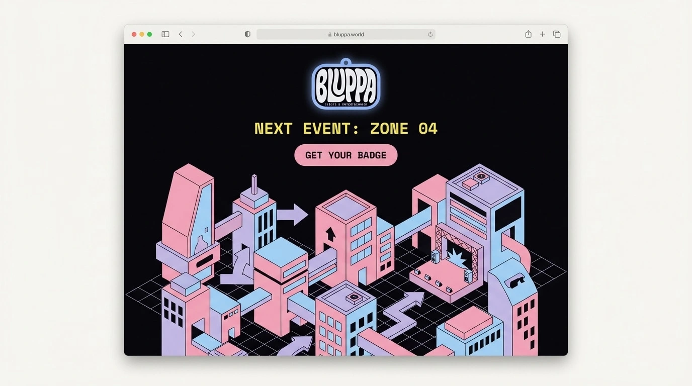
Web Mockup — Hero Screen
Desktop browser at 1440px, slight 3/4 perspective angle. Near-black #0D0D12 hero. Large isometric city in lower two-thirds in Bubblegum Blush #F4A6C0, Sky Plastic #A3D4F7, Concrete Lilac #C5B8E8 flat shapes. Logo centered at top at 280px. "NEXT EVENT: ZONE 04" in Lemon System #F2E14B mono type. Chunky Bubblegum Blush #F4A6C0 pill CTA: "GET YOUR BADGE." Full Y2K GUI energy — bold, gridded, plastic.
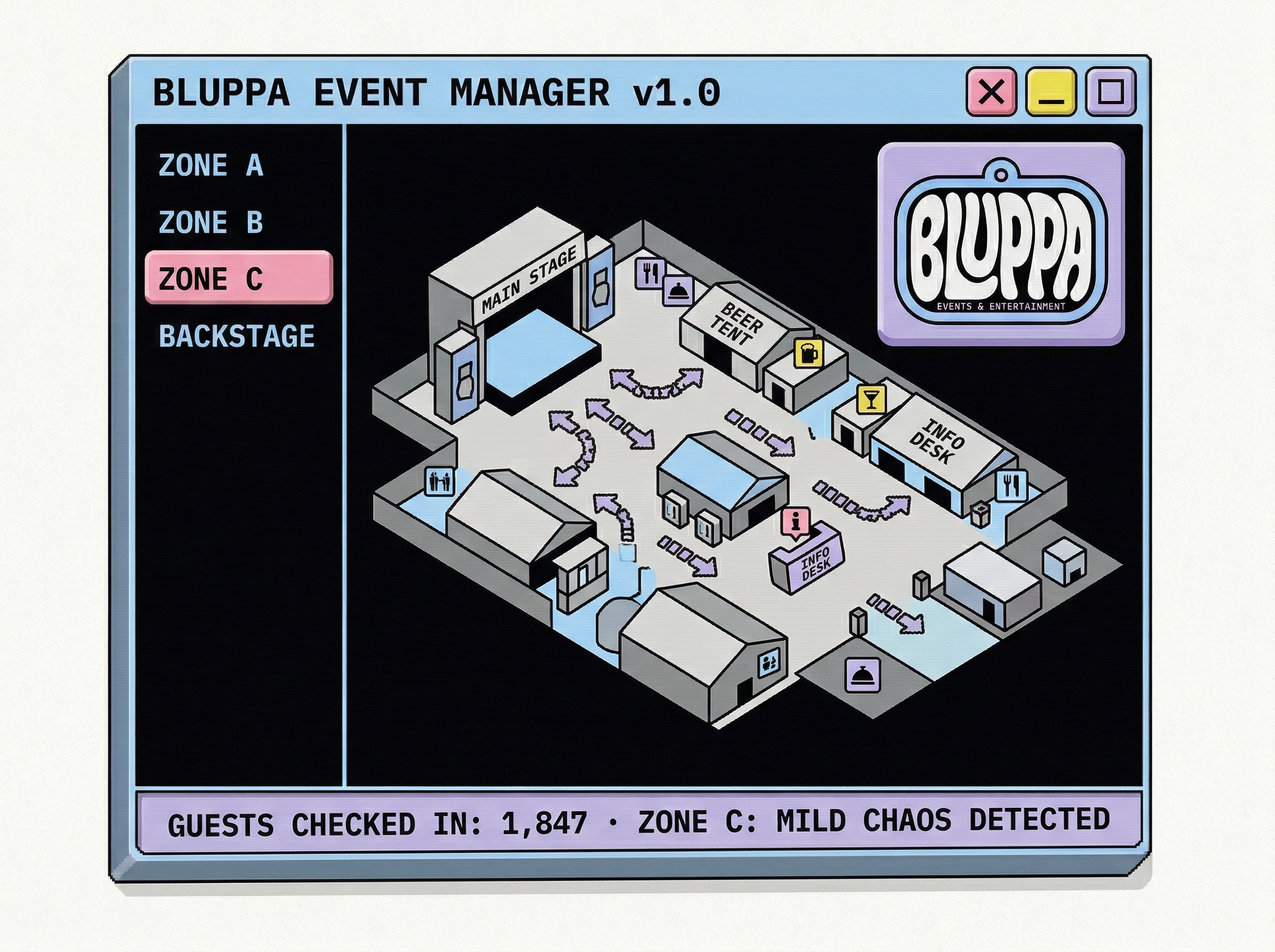
Web Mockup — Y2K Desktop Application / Event Manager
Desktop application window at 1280×960px, 3/4 perspective. Title bar in Sky Plastic #A3D4F7: "BLUPPA EVENT MANAGER v1.0" in near-black mono type. Control buttons: Bubblegum Blush #F4A6C0 close, Lemon System #F2E14B minimize, Concrete Lilac #C5B8E8 maximize. Interior: near-black #0D0D12 background. Left sidebar zone navigation in Sky Plastic #A3D4F7 mono type, active state in Bubblegum Blush #F4A6C0. Main panel: isometric venue map. Logo badge top-right at 80px, in a chunky rounded rect panel. Status bar in Concrete Lilac #C5B8E8: "GUESTS CHECKED IN: 1,847 · ZONE C: MILD CHAOS DETECTED."
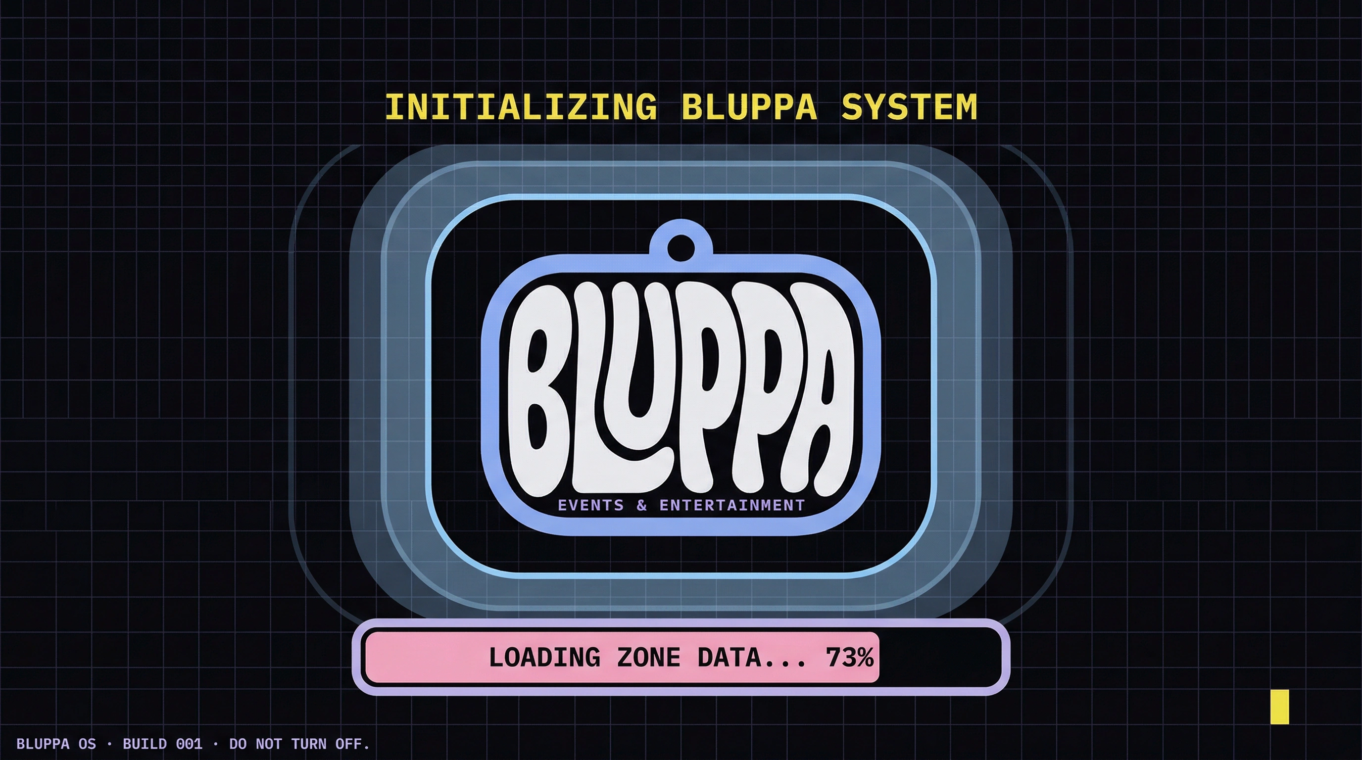
Web Mockup — Y2K Loading / Splash Screen
Full-screen 1440×900px. Near-black #0D0D12 background with 1px grid texture. Logo badge centered at 320px, surrounded by three concentric rounded rectangles in Sky Plastic #A3D4F7 at 100%, 50%, 20% opacity — radar ping frozen mid-pulse. Above: "INITIALIZING BLUPPA SYSTEM" in Lemon System #F2E14B mono type. Below: progress bar 73% filled in Bubblegum Blush #F4A6C0, "LOADING ZONE DATA... 73%" centered in mono type. Bottom-left: "BLUPPA OS · BUILD 001 · DO NOT TURN OFF." Bottom-right: blinking Lemon System #F2E14B cursor block.
IDENTITY APPLICATIONS
01 — Event Lanyard & Badge
The logo reproduced as a hard acrylic badge, approximately 9×7cm, hanging from a woven Bubblegum Blush #F4A6C0 lanyard with a repeating Lemon System #F2E14B dot pattern. The badge is the logo made literal — a physical object that was always implied by the mark's keychain silhouette.
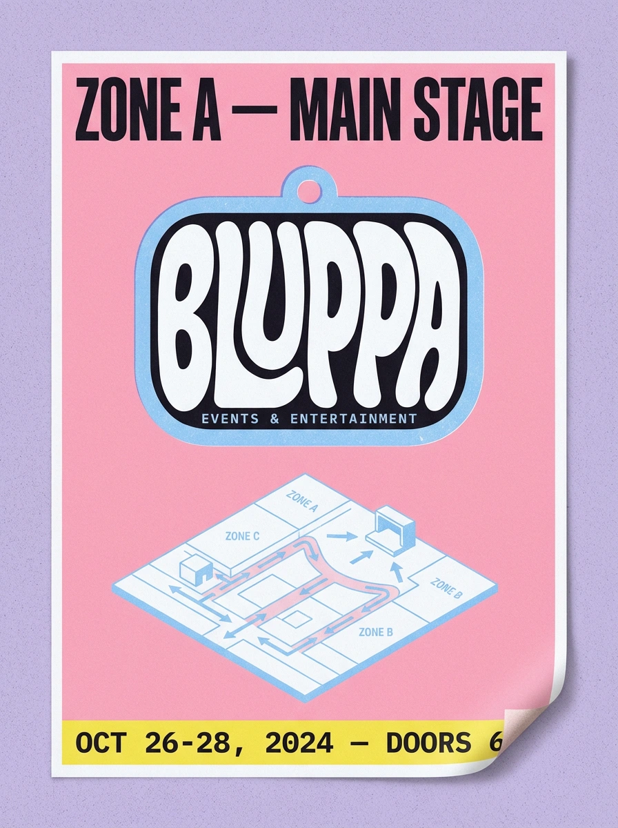
02 — Risograph Event Poster
A2 portrait poster, two-color Risograph print. Bubblegum Blush #F4A6C0 background. Large zone label in near-black mono type at the top. Logo centered in the middle third. Isometric venue map in Sky Plastic #A3D4F7 ink below. Lemon System #F2E14B bottom strip with event data. Slight misregistration gives it handmade warmth.
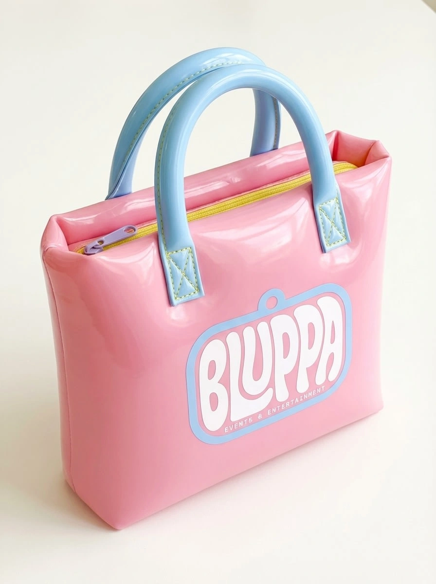
03 — Inflatable Vinyl Tote Bag
Structured tote in Bubblegum Blush #F4A6C0 glossy PVC vinyl — the material of pool toys. Logo heat-transferred to the front face. Sky Plastic #A3D4F7 tubular handles with Lemon System #F2E14B stitching. Slightly overfilled, giving it a satisfying inflated silhouette.
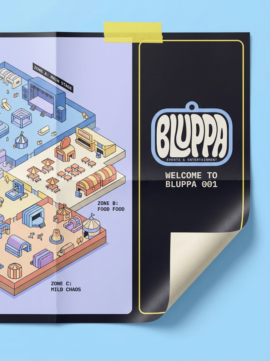
04 — Laminated Venue Map / Zine
A3 folded map on thick uncoated stock, soft matte laminate. Left panel: full isometric venue map, color-coded zones, mono type labels ("ZONE C: MILD CHAOS"). Right panel: logo large and centered, event welcome copy below. Lemon System #F2E14B washi tape strip along the top edge.
05 — Website Hero Screen
Desktop browser mockup at 1440px. Near-black #0D0D12 hero background. Large isometric city illustration in the lower two-thirds. Logo centered top. "NEXT EVENT: ZONE 04" in Lemon System #F2E14B mono type. Chunky Bubblegum Blush #F4A6C0 pill button: "GET YOUR BADGE." Full Y2K GUI energy — bold, gridded, plastic.
06 — Chunky Double-Sided Acrylic Keychain
8cm wide, 8mm thick, die-cut in the exact badge silhouette. Front: logo UV-printed pixel-perfect on Sky Plastic #A3D4F7 satin acrylic. Back: Bubblegum Blush #F4A6C0 acrylic with isometric building illustration and "BLUPPA · ZONE 01" in mono type. Heavy brass carabiner. Bubblegum Blush #F4A6C0 woven cord loop. Shot overhead on near-black showing both faces and the Lemon System #F2E14B acrylic edge stripe.
07 — Inflatable Event Floor Cushion
40×40cm inflatable seat cushion in Bubblegum Blush #F4A6C0 glossy PVC. Logo centered on top face at 22cm wide, heat-transfer printed. Tonal isometric city wallpaper pattern in Concrete Lilac #C5B8E8 at 15% opacity across the entire top surface. Sky Plastic #A3D4F7 side gusset with "BLUPPA · SIT HERE · ZONE B" in near-black mono type. Lemon System #F2E14B inflation valve.
08 — Enamel Pin Set on Backing Card
Three hard enamel pins on an A6 Matte White #F7F5F0 backing card with Lemon System #F2E14B border rule. Pin 01: logo badge in hard enamel, 4cm wide, pixel-perfect. Pin 02: chunky isometric building in Sky Plastic #A3D4F7 with Bubblegum Blush #F4A6C0 windows. Pin 03: rounded rectangle zone label in Lemon System #F2E14B enamel reading "ZONE C." Bubblegum Blush #F4A6C0 ribbon through hole-punch at card top.
09 — Thermal-Printed Event Ticket Roll
Roll of thermal event tickets partially unrolled to show five consecutive tickets, 20×7cm each. Lemon System #F2E14B left accent strip. Logo adapted to monochrome thermal print — all curves and letterforms preserved. Dashed perforation line. Stub section: "ADMIT ONE · ZONE A · BLP–0047" in bold mono type. Small Bubblegum Blush #F4A6C0 ticket printer partially cropped in corner.
10 — Folded Zine / Event Programme
A5 saddle-stitched zine, 16 pages, 120gsm uncoated stock. Cover: near-black #0D0D12 background, logo centered, "BLUPPA 001 · EVENT PROGRAMME" in Lemon System #F2E14B mono type. Center spread: isometric venue map left, event schedule data table right with Bubblegum Blush #F4A6C0 alternating rows and Lemon System #F2E14B current-slot highlight. Lemon System #F2E14B washi tape diagonal strip on bottom corner: "KEEP THIS."
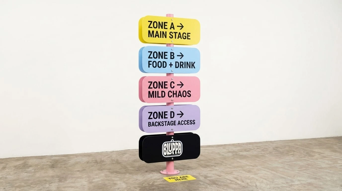
11 — Venue Wayfinding Totem
180cm freestanding acrylic totem on Bubblegum Blush #F4A6C0 powder-coated aluminum pole. Five stacked directional panels in each palette color: Lemon System #F2E14B, Sky Plastic #A3D4F7, Bubblegum Blush #F4A6C0, Concrete Lilac #C5B8E8, near-black #0D0D12. Each panel with zone label and directional arrow in all-caps mono type. Bottom panel: logo pixel-perfect on near-black ground. "YOU ARE HERE" sticker on floor at base, slightly crooked.
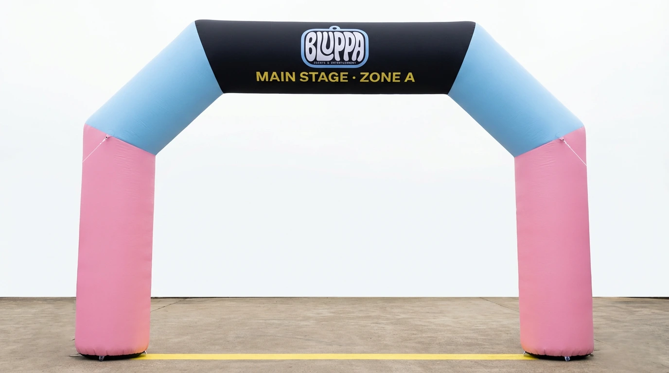
12 — Inflatable Stage Entrance Arch
5 meters wide, 4 meters tall. Four fat inflatable tubes: Bubblegum Blush #F4A6C0 vertical columns, Sky Plastic #A3D4F7 diagonal shoulders. Near-black #0D0D12 horizontal banner tube across top with logo centered at 120cm wide, dye-sublimation printed. "MAIN STAGE · ZONE A" in Lemon System #F2E14B mono type below the logo. Lemon System #F2E14B threshold line painted on ground. Slightly asymmetric inflation — one column fractionally more inflated than the other.
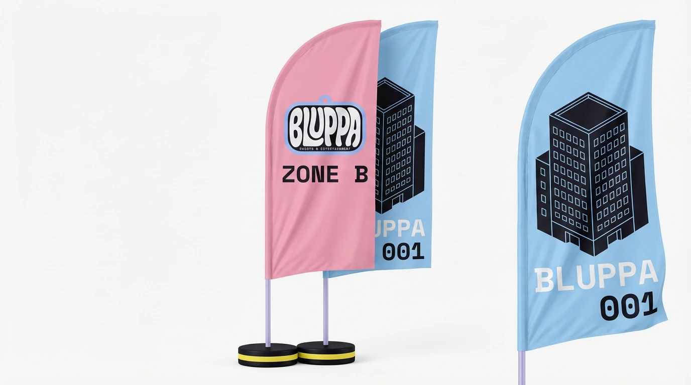
13 — Double-Sided Venue Flag
250cm teardrop flag, matte dye-sublimation polyester. Front: Bubblegum Blush #F4A6C0 background, logo centered at 40cm wide, "ZONE B" in large near-black mono type below. Back: Sky Plastic #A3D4F7 background with isometric building illustration and "BLUPPA 001" in Matte White #F7F5F0 mono type. Concrete Lilac #C5B8E8 powder-coated pole. Near-black #0D0D12 disc base with Lemon System #F2E14B circumference ring.
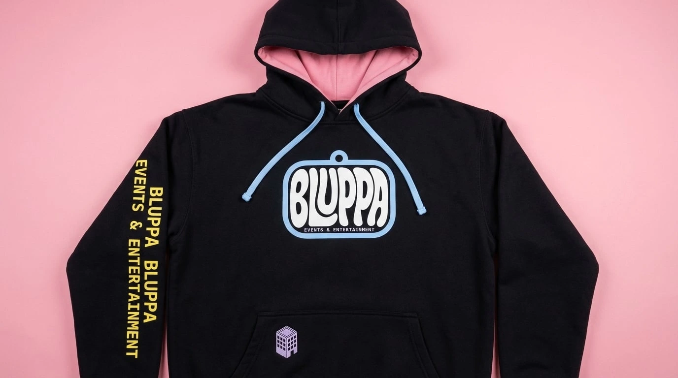
14 — Heavyweight Hoodie
400gsm pullover in near-black #0D0D12. Logo screen-printed on chest at 20cm wide, pixel-perfect. Left sleeve: "BLUPPA EVENTS & ENTERTAINMENT" in Lemon System #F2E14B mono type running shoulder to cuff. Hood interior: Bubblegum Blush #F4A6C0 lining. Kangaroo pocket: Concrete Lilac #C5B8E8 embroidered isometric building icon. Sky Plastic #A3D4F7 flat braid drawstrings.
15 — Knitted Sock Pair
Mid-calf crew socks, 80% combed cotton, Matte White #F7F5F0 base. Tonal isometric building jacquard across foot body in Concrete Lilac #C5B8E8 at 8% contrast. Ankle stripe block: Bubblegum Blush #F4A6C0, Sky Plastic #A3D4F7, Lemon System #F2E14B, Concrete Lilac #C5B8E8. "BLUPPA" intarsia knit in Sky Plastic #A3D4F7 on calf. Near-black #0D0D12 ribbed cuff with single Lemon System #F2E14B stripe at top edge.
16 — Y2K Desktop Application / Event Manager Screen
Desktop application window at 1280×960px, 3/4 perspective. Title bar in Sky Plastic #A3D4F7. Zone navigation sidebar in near-black with Sky Plastic #A3D4F7 mono type labels. Isometric venue map as main panel content. Logo badge top-right at 80px. Status bar in Concrete Lilac #C5B8E8: "GUESTS CHECKED IN: 1,847 · ZONE C: MILD CHAOS DETECTED."
17 — Y2K Loading / Splash Screen
Full-screen 1440×900px. Near-black #0D0D12 with 1px grid texture. Logo badge at 320px centered, three concentric rounded rectangle rings in Sky Plastic #A3D4F7 at decreasing opacity — radar ping. Progress bar 73% filled in Bubblegum Blush #F4A6C0. Status messages in Lemon System #F2E14B mono type. Blinking cursor block bottom-right.
DESIGN PRINCIPLES
Infrastructure first. Every Bluppa touchpoint — physical or digital — is a system element. A sign, a map, a ticket, a zone marker, a web page. The brand never makes something that doesn't serve a function, even if that function is absurd.
The object is the communication. Bluppa doesn't decorate objects with brand. The object itself is the brand statement — a cushion you sit on at an event, a keychain you keep for years, a map you fold into your pocket and take home, a website that feels like a piece of software worth installing.
Controlled maximalism. There is always a grid underneath. The chaos is cartographic. Every color has a zone. Every label has a purpose. The more elements on the page or screen, the more rigorous the system holding them together.
Synthetic warmth. The palette is clearly artificial — no organic, earthy, natural references. But artificial doesn't mean cold. Bubblegum Blush is warm. Lemon System is alive. The materials are plastic and vinyl and acrylic and browser chrome, and they feel good to hold and to look at.
Collectible by design. Everything is made to be kept. Tickets are objects. Maps are posters. Badges are keychains. Web screens are screenshots worth saving. If an attendee — or a visitor — doesn't want to take it home, Bluppa has failed.
Screen and print are the same system. The website is not a translation of the brand — it is the same brand, running on different hardware. A zone panel on screen and a zone panel on a wayfinding totem follow identical logic: same type rules, same color assignments, same grid discipline. Bluppa does not have a digital identity and a physical identity. It has one identity that works everywhere.
BLUPPA · EVENTS & ENTERTAINMENT
Brand Identity & Website Design — Speculative Case Study
Direction: Candy Infrastructure
Audience: Design-savvy creatives
Like this project
Posted Apr 11, 2026
Designed a maximalist brand identity and Y2K-influenced website for the fictional Bluppa events brand.
Likes
0
Views
29
Timeline
Feb 23, 2026 - Apr 11, 2026

