Built with Lovart
Abyssal Tide Brand Identity Creation
Révolté
ABYSSAL TIDE
Brand Identity Case Study
OVERVIEW
ABYSSAL TIDE is a precision aquaculture and sea farming brand built around a single conceptual tension: the ocean is calm on the surface and operating under forces so immense at depth that they are almost impossible to perceive until they are irreversible. The brand lives in that space — between the measurable rhythm of the tide and the absolute pressure of the abyss. Ancient knowledge and precise data. Cycles older than agriculture and monitoring systems running in real time.
The creative challenge was building a brand that could hold both registers simultaneously — poetic and scientific, warm and cold, surface and depth — without resolving the tension between them. The tension is the brand. The moment it resolves, it becomes something lesser.
THE CENTRAL METAPHOR
The halocline. The invisible boundary layer in the ocean where fresh water meets salt water — where two systems occupy the same space without fully mixing, where visibility distorts and the boundary shimmers but never resolves. Every major design decision in this project — the split retail environment, the two-register layout system, the compression of the mark, the seasonal color contained within Ink rings — is a restatement of the halocline. Surface above. Depth below. The meeting point is where ABYSSAL TIDE operates.
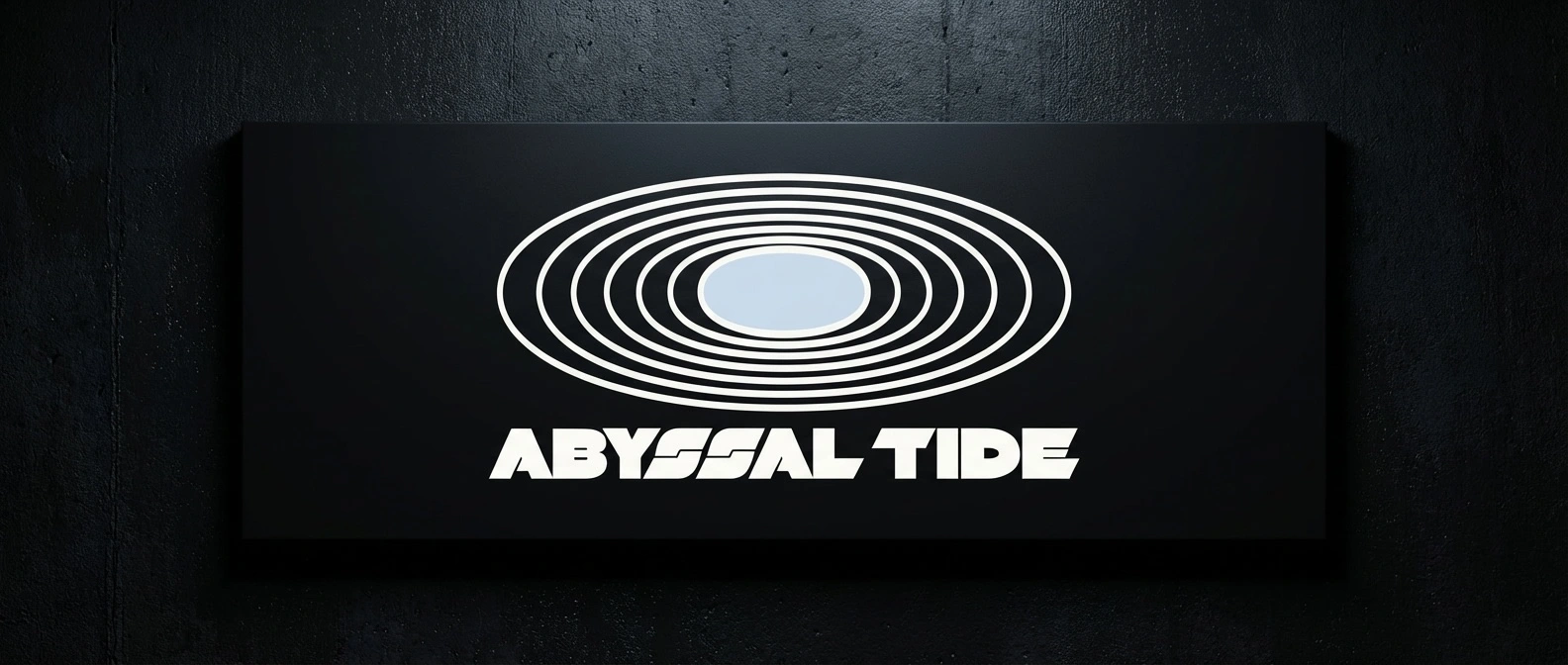
THE LOGO
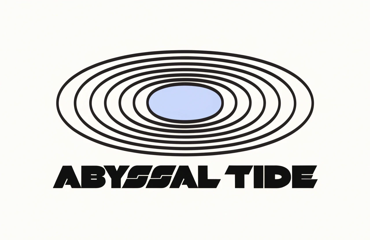
A wide, flat ellipse — aspect ratio 3:1, compressed beyond what a circle should be — containing seven concentric rings of decreasing stroke weight, from outermost to innermost, centered on a filled ellipse at the core. The form reads simultaneously as a tidal ring system viewed from above, a bathymetric pressure contour map viewed from the side, a sonar return, and a tree ring cross-section. It does four things at once and announces none of them.
The compression is the concept made physical. At extreme depth, pressure acts equally from all directions but the visual sensation is always vertical force pushing down, flattening, reducing height, expanding width. The mark has been flattened by what it represents. The outermost ring's stroke weight matches the wordmark's stroke weight exactly — the mark and the type are made of the same material, the same system, the same force.
ABYSSAL TIDE set in a heavy mono grotesque beneath — wide, low, pressured. All caps. The wordmark is as horizontal as the mark. Everything in this logo has been pushed as wide as it can go and as short as it can be without losing legibility.
The center ellipse is the variable. Everything else holds.
THE SEASONAL COLOR SYSTEM
The center of the mark shifts four times per year. The concentric rings never change — always Ink, always the same weight, always the same structure. Only the center moves. This means the seasonal color is always contained, always surrounded by pressure, always observed through layers of weight. It reads as something alive at depth, visible through the system but not free from it.
Spring — Sea Glass #8BBCB0: A tidal pool at low water. Cool, clear, slightly mineral.
Summer — Solar #D4A853: A brass navigational instrument in direct light. Warm, ancient.
Autumn — Kelp #5C6B3A: Biological matter under compression. Muted, dense, grounded.
Winter — Ice #C8D8E4: Frozen surface, low-contrast light, the season of dormancy and depth.
THE DEPARTMENT COLOR SYSTEM
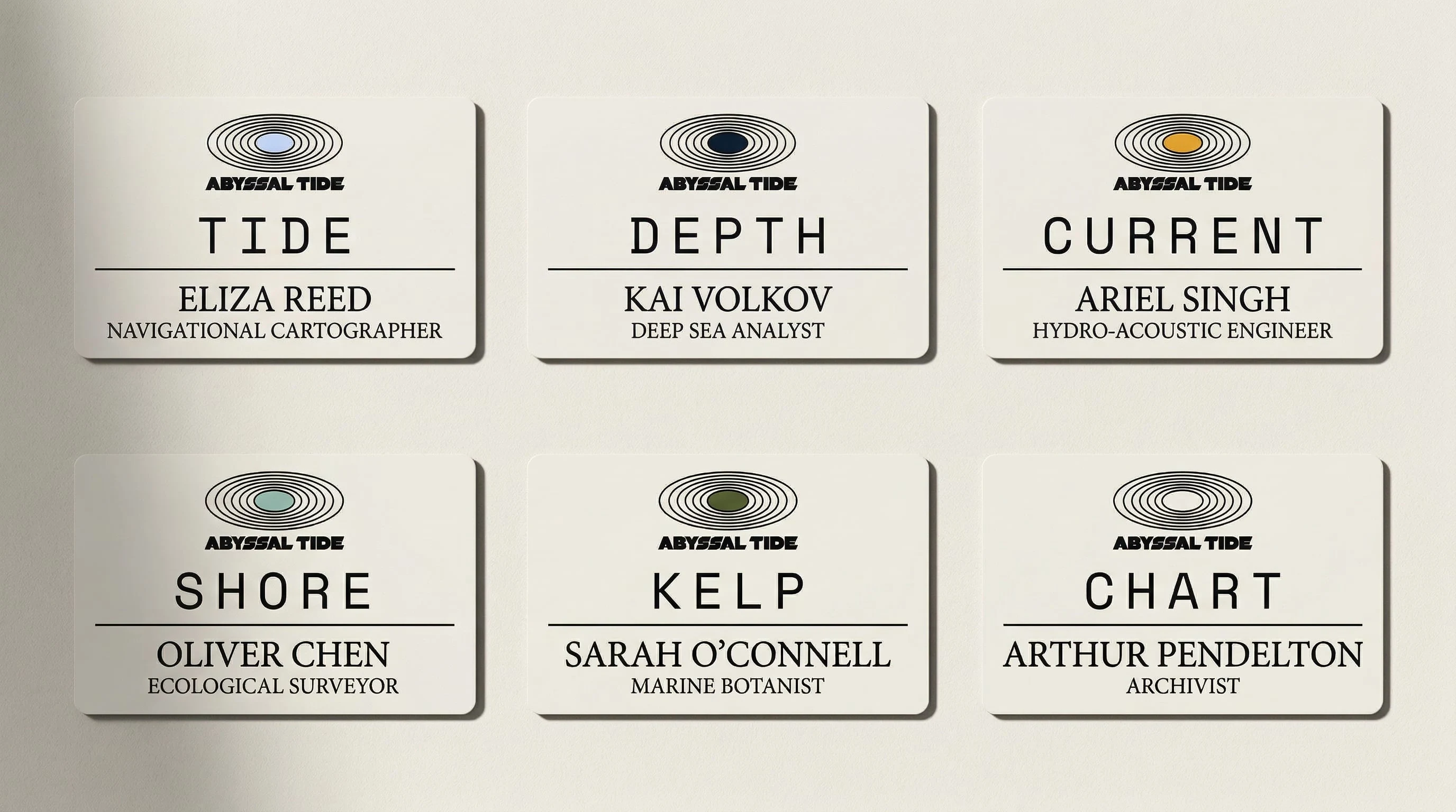
Six departments. One mark. The center ellipse is the only variable between them. The rings never change. This means every worker, every crate, every badge, every document carries the same structural identity — what differs is only what's at the center. The system rewards close reading. At distance, everything is Abyssal Tide. Up close, the department is legible immediately.
TIDE — Ice #C8D8E4 — Operations & Harvest. The people closest to the water.
DEPTH — Void #1A3A4A — Research & Science. Nearly Ink, perceptible only at close range.
CURRENT — Solar #D4A853 — Logistics & Supply Chain. Warm and directional.
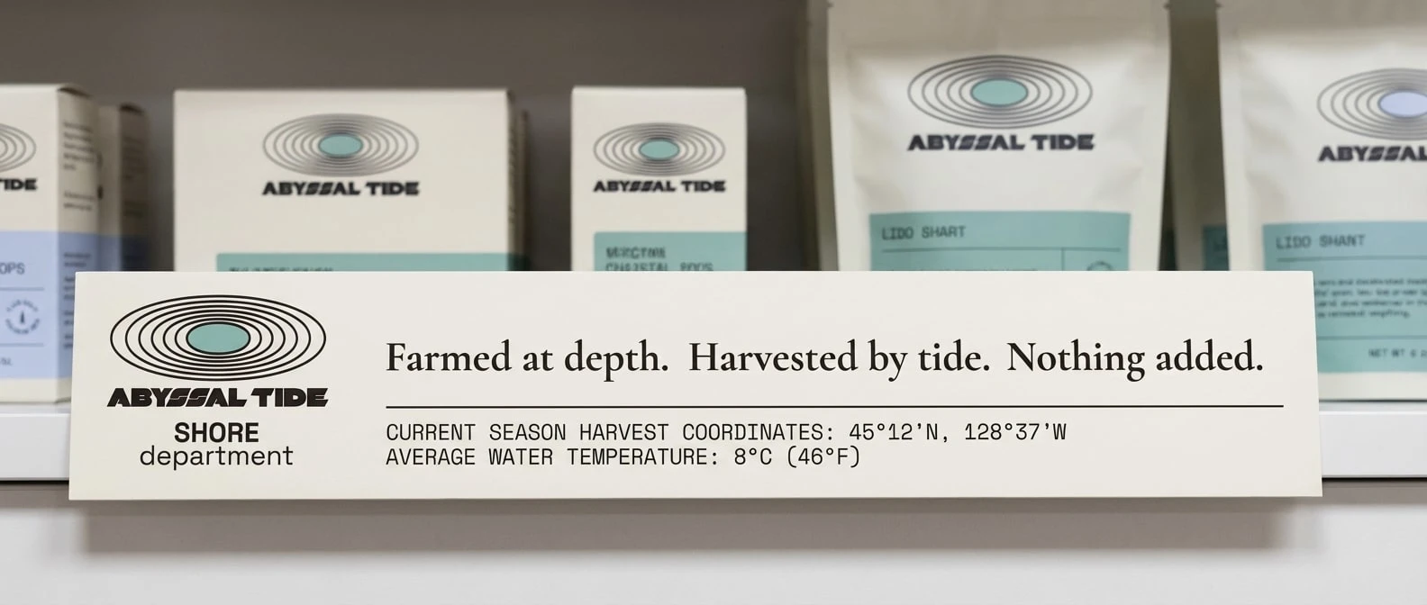
SHORE — Sea Glass #8BBCB0 — Sales & Client Relations. The interface between ocean and land.
KELP — Kelp #5C6B3A — Sustainability & Environment. Dense, slow-growing, foundational.
CHART — Bone center, Ink rings — Brand & Communications. The frame, not the content.
THE TWO-REGISTER SYSTEM
Every touchpoint in this brand belongs to one of two visual registers and never mixes them within a single frame.
The surface register is warm, legible, human-scaled: Bone backgrounds, directional light from upper left, aged paper textures, almanac typography, the quality of light in a tidal pool at low water. It carries the seasonal color, the Cormorant Garamond headlines, the provenance data in mono type.
The depth register is cold, inhuman-scaled, operating without acknowledgment of human presence: near-total darkness, a single overhead light source, Pressure White as the only illumination point, coordinates as the only context. No warmth. No seasonal color. Only Ink, Bone, and the one light at depth.
The retail environment is the only touchpoint where both registers appear simultaneously — Bone walls on the left half, Ink walls on the right, a single hairline rule running the full length of both walls at mid-height, transitioning from Ink on Bone to Pressure White on Ink without interruption. The horizon line. The tide mark. The halocline made architectural.
APPLICATIONS
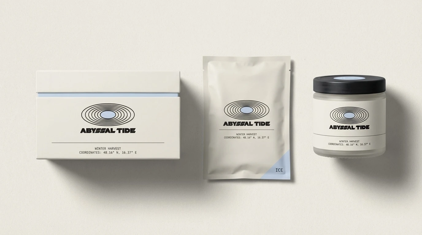
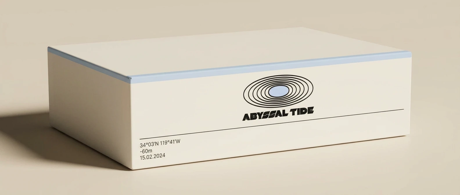
Packaging — Three formats: a wide low rigid box with Ice lid stripe, a matte vacuum pouch with Ice corner accent, a frosted glass jar with Ink pressed lid. Every surface carries the mark and a provenance data block: coordinates, depth, temperature, harvest date. The product is a document. The box proves the system works.
Harvest Tag — Kraft paper, wider than tall, the proportions of the mark itself. The Ice hole-punch is the seasonal color in miniature — a circle instead of an ellipse, but the same temperature, the same containment logic.
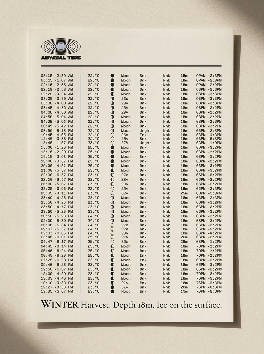
Almanac Page — A seasonal harvest document formatted as a cross between a tide table and a laboratory report. Dense mono data filling the lower half. A single Cormorant Garamond headline at the bottom: "WINTER Harvest. Depth 18m. Ice on the surface." The data tells you what happened. The headline tells you what it meant.
Environmental Signage — Powder-coated black steel, extremely horizontal, Pressure White logo on Ink surface. The Ice center at this scale reads as the only light source in the room. Which is exactly what it is.
Harvest Vessel — The mark applied at 60cm to the stern hull in Pressure White on black paint. The water reflection below the waterline distorts the concentric rings — the pressure that shaped the mark becomes visible in the water that generated the brand. The best unplanned detail in the entire project.
Equipment Crate — CURRENT department, Solar center, Solar horizontal stripe on the side face. In a dark warehouse surrounded by Ink-toned surfaces, the Solar yellow is the warmest point in the room. It reads as a beacon. It reads as something moving.
Department Badges — Six cards, identical layout, one variable. The center ellipse on each badge is the entire department identity. At small scale the rings read as fine detail. At badge scale they read as a system. Six people wearing the same badge with six different answers at the center.
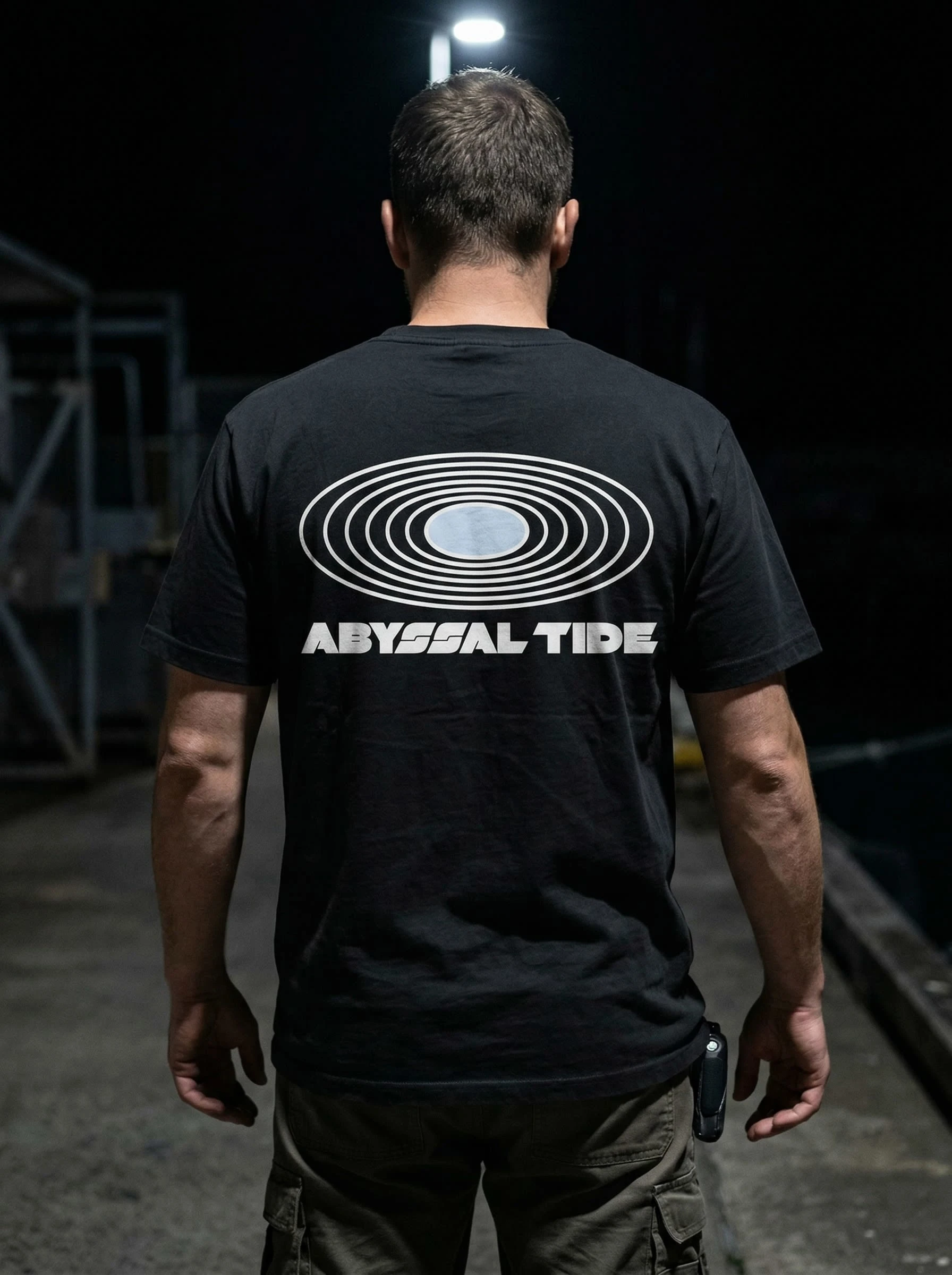
Worker T-Shirt — Ink tee, Pressure White mark and wordmark on the back, Ice center. Photographed from behind at harbor in near-total darkness, single overhead light. The Ice center is the warmest element in the entire frame. The worker doesn't turn around. The brand doesn't need a face.
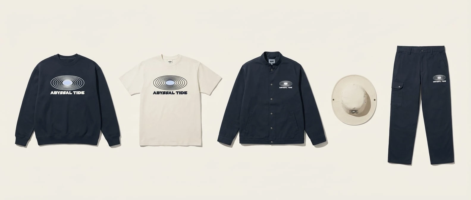
Apparel Range — Five pieces across two colorways: Ink and Bone. The mark scales from chest-span on the crewneck to left-chest on the work jacket to thigh on the cargo trousers. It holds at every scale because the concentric ring system was designed to reduce gracefully — rings drop as size decreases, the center always remains.
Retail Environment — The halocline built at architectural scale. Bone half and Ink half divided at mid-height by a single continuous hairline rule. The product lives in the warm half. The brand lives in the dark half. The rule between them is the only place both are true simultaneously.
Seasonal Campaign Poster — 3:1 horizontal. The mark top left, small, with Ice center. The data band below the horizon rule fills the lower register completely — forty lines of tide tables, coordinates, salinity readings, moon phases — dense enough that the individual numbers stop mattering and the density itself becomes the message. The ocean does not simplify for legibility.
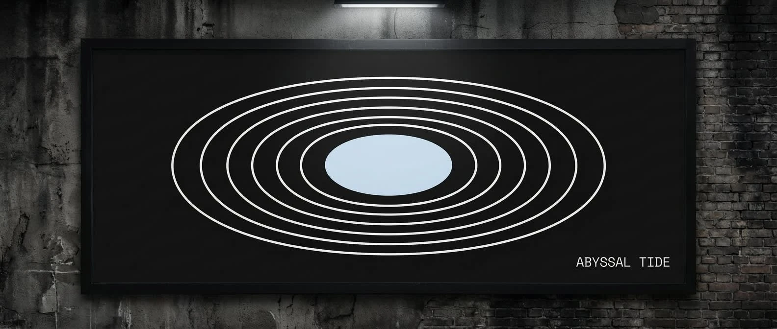
Billboard — Mark only. No wordmark at this scale. The concentric rings span 70% of the billboard face in Pressure White on Ink. The Ice center is the only color in a dark urban frame. ABYSSAL TIDE appears as a footnote in the bottom right, Pressure White, minimum legible size. The mark does not need the name. The name is there for those who look closely enough.
WHAT WORKED
The mark is the project's single best decision. It reads as a tide ring from above, a pressure diagram from the side, a sonar return from any angle, and a depth contour from every distance. One form, four readings, zero explanation required. It scales from billboard to badge without losing structural logic. At micro scale the center ellipse alone — the compressed dot — carries the entire brand identity in three square millimeters.
The vessel reflection was unplanned and is the strongest single image in the project. The water distorts the concentric rings below the waterline — the same form that was designed to represent pressure under compression becomes, in the water's surface, literally pressured and distorted. The ocean did the final refinement.
The department badge system is architecturally elegant. The center shifts. Everything else holds. Six departments, one mark, infinite scale. It functions as a wayfinding system, an identity system, and a hierarchy system simultaneously, with no additional elements required beyond the one color change at the center.
WHAT THIS BRAND IS NOT
Not a wellness ocean brand — no turquoise gradients, no sunrise photography, no "reconnect with nature."
Not a sustainability brand — it does not lead with environmental credentials. The ocean is not a cause here. It is an operating environment.
Not nostalgic about fishing — no weathered wood, no heritage trawler aesthetic, no fisherman's hands.
Not a tech startup — no sans-serif system, no flat icon set, no SaaS product aesthetic.
Not soft — the calm is real but it is not reassuring.
THE BRAND IN ONE SENTENCE
ABYSSAL TIDE is what the ocean actually is — cyclical, measurable, ancient, and operating under forces that don't care whether you're paying attention.
Designed by Révolté.
Like this project
Posted Apr 9, 2026
ABYSSAL TIDE is a precision aquaculture and sea farming brand built around a tension: the ocean is calm on the surface and under forces so immense at depth
Likes
1
Views
23
Timeline
Feb 23, 2026 - Apr 9, 2026