Built with Lovart
Caravan Brand Identity and Campaign Design
Révolté
CARAVAN
A healthy juice brand for people who are always on their way somewhere.
The Brief
Design a brand identity and campaign visual system for a healthy canned juice brand rooted in the spirit of the hippie trail — the overland route that ran from Istanbul to Kathmandu through the 1960s and 70s. The brand needed to feel genuinely alive: not nostalgic pastiche, not wellness-aisle safe. Something you'd actually want to carry in your bag, pull out of your back pocket, crack open at the side of a road you've never been on before.
The name came early: Caravan. One word. A moving feast. A community in motion.
The Positioning
Caravan is not a health brand that happens to come in a can. It's a travel brand that happens to be a drink. Every can is a stop on a route — a flavor tied to a place, a color tied to a feeling, a moment of cold refreshment earned after a long stretch of road. The brand speaks to people who move through the world with curiosity, who collect experiences instead of things, who find beauty in cracked earth and roadside wildflowers.
The core tension that drives everything: dust and bloom. Harsh conditions and unexpected beauty. The road is rough. The drink is good. That contrast is the whole brand.
The Logo
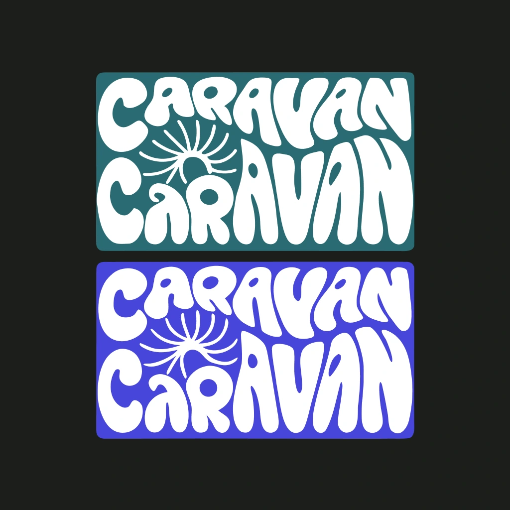
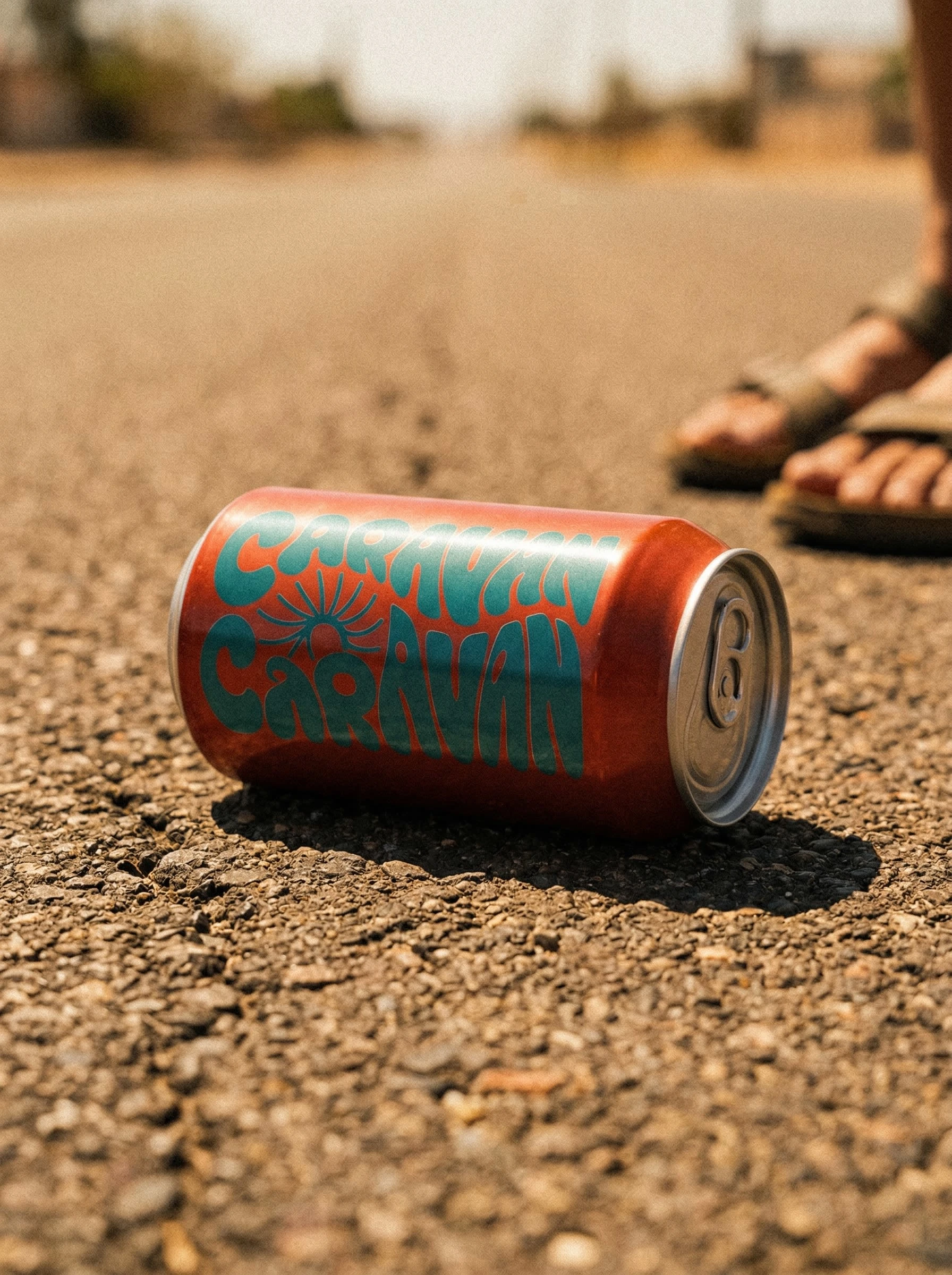
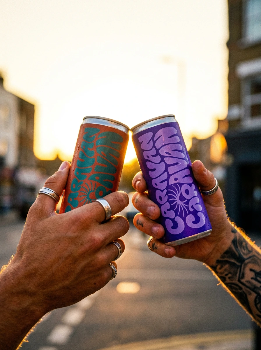
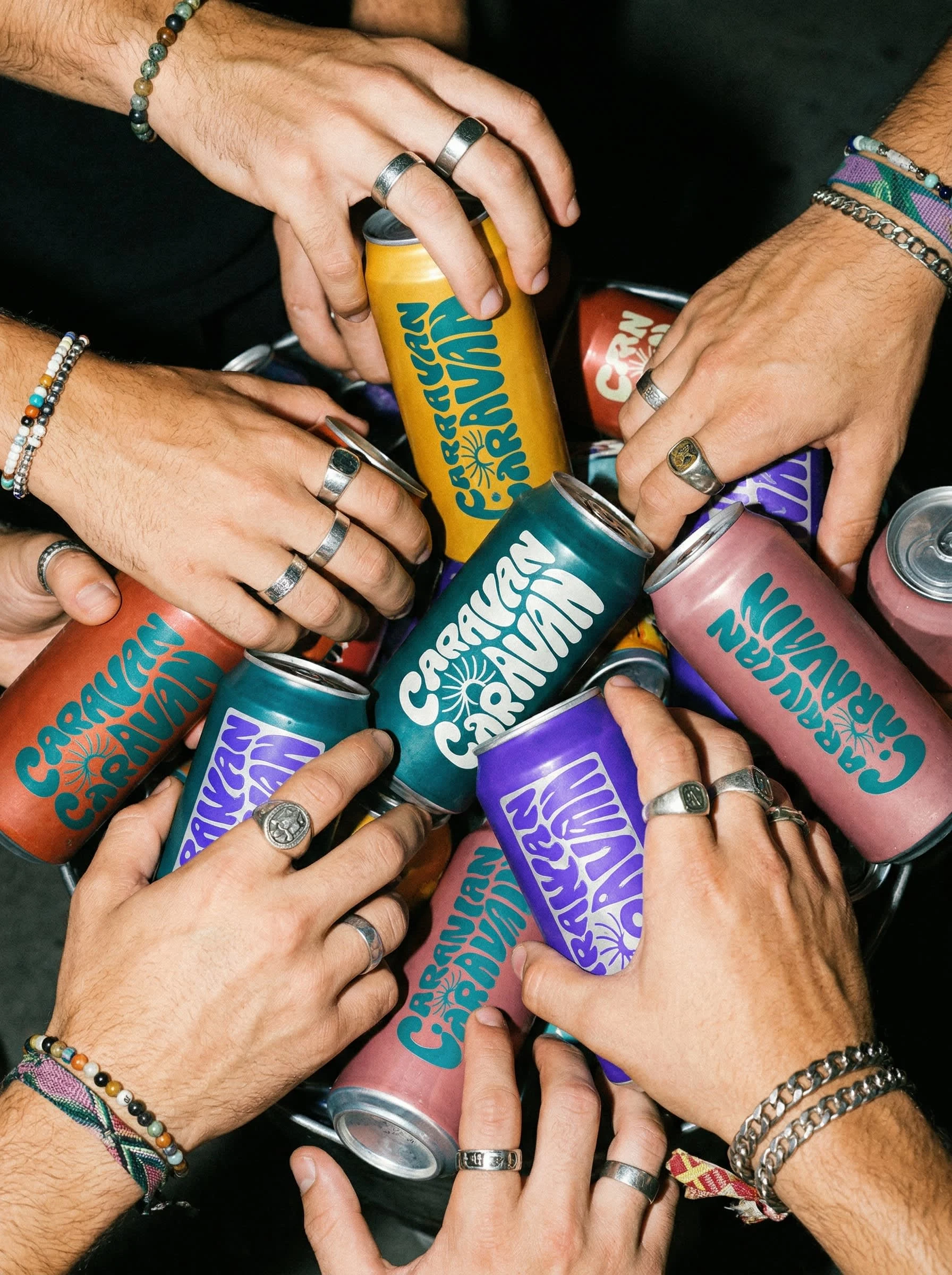
The wordmark is a single mark in two colorway versions — teal and purple — both equally primary, used interchangeably across the range. The lettering is wavy, bubbly, stacked double: CARAVAN over CARAVAN, with a sunburst flower sitting in the negative space between the two words. It is unambiguously 1970s in spirit — bold, warm, slightly psychedelic — but executed with enough confidence and simplicity to feel completely contemporary. The rounded rectangle lock-up gives it a stamp quality: something you'd find on a market stall, a festival wristband, a label on a bottle someone made themselves.
The logo wraps the full can body, large and ownable. At distance it reads as pure color and form. Up close the letterforms reward attention.
The Color System
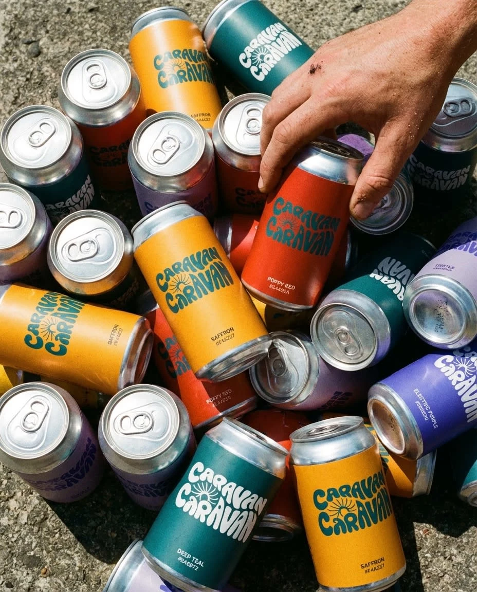
Five can colorways, each a stop on the trail:
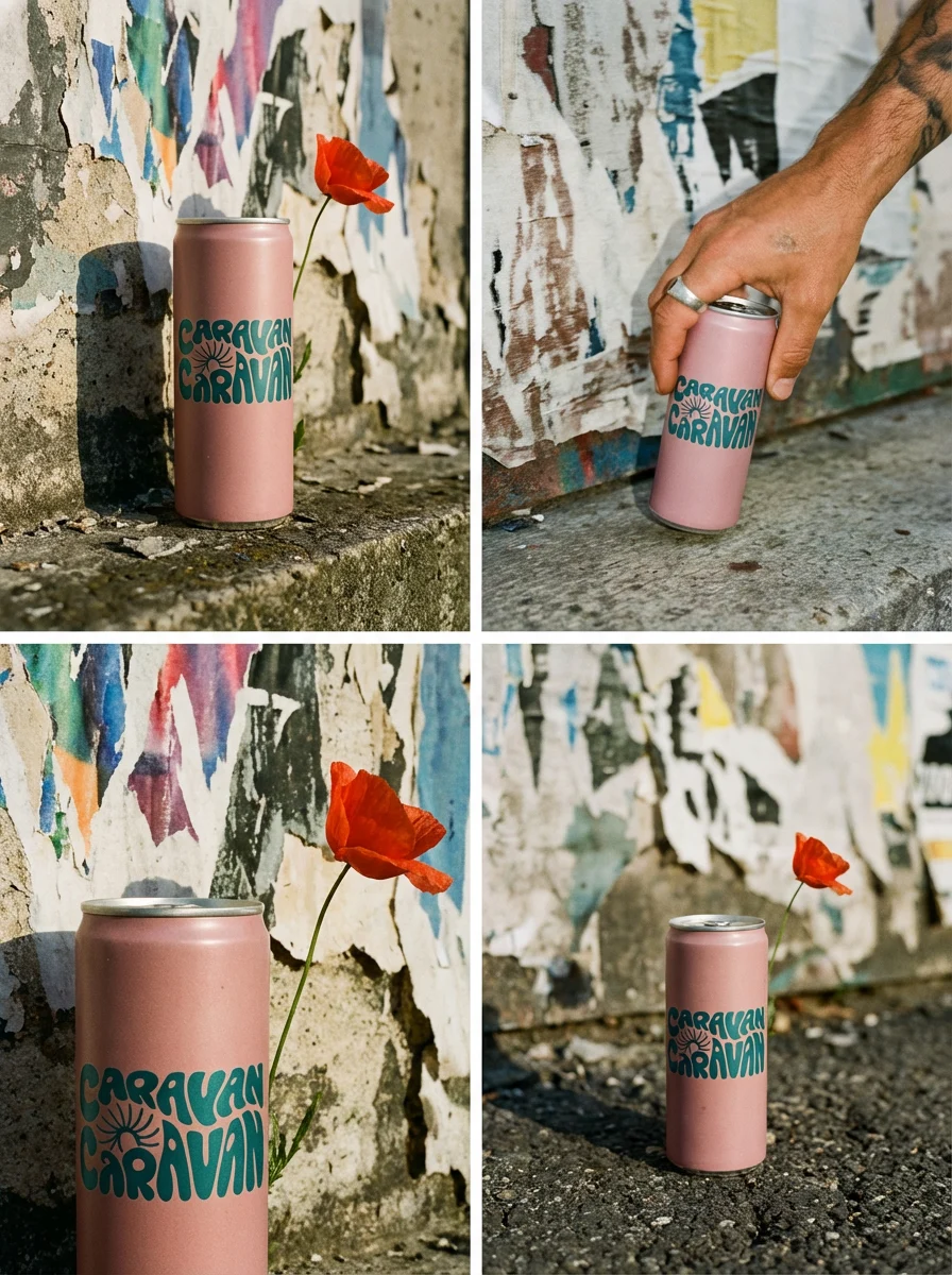
Warm golden yellow — Saffron, Isfahan
Brick red — Poppy, Kandahar
Deep teal — Bazaar, Istanbul
Dusty pink — Thistle, the mountain passes
Electric purple — Dusk, Kathmandu
The teal logo version lives on warm-colored cans. The purple logo version lives on cool-colored cans. Together on shelf or in a crate they vibrate with collective energy — the whole range more alive than any single can.
The Photography Direction
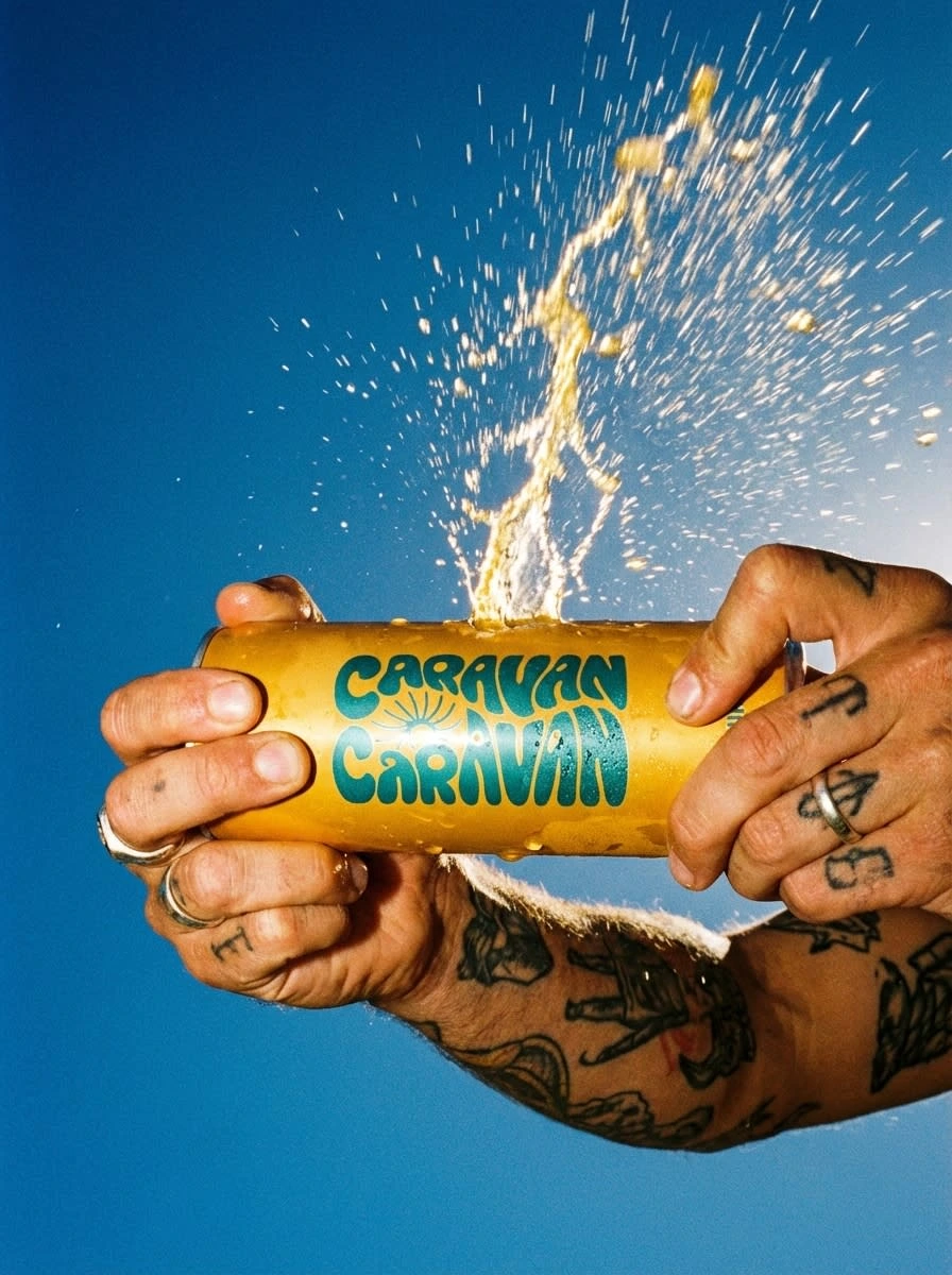
The campaign was shot entirely in a handheld, street-level, 35mm film aesthetic. No studio. No softboxes. No clean surfaces. Every image feels grabbed rather than planned — the kind of photograph taken by someone who was also drinking one.
The visual references were drawn from street documentary photography, overland travel imagery, and the raw energy of independent drink brands that live in the real world rather than in a mood board. Grain, available light, motion blur, hard shadows, blown highlights — all treated not as flaws but as the point.
The color palette of the cans does the graphic work. The photography does the emotional work. The two systems never compete.
The Mockups
Fourteen images were developed across the campaign, covering:
Product in environment: cracked earth, rooftop city ledge, urban torn-poster wall, dusty road ground level, market stall crate
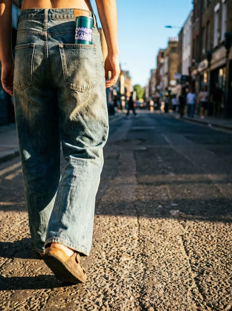
Product in motion: car window held out over a desert road, can rolling on asphalt, back pocket walking shot
Product in hands: group grab with rings and bracelets, backlit street clink, tattooed hands exploding open, single person offering to camera, held to open sky with rainbow
Multi-format: four-panel wall sequence, market stall full range display
Each image was built from a single master prompt — consistent grain, consistent light logic, consistent world — with individual scene direction layered on top. The supplied logo was placed as a fixed asset in every generation, never redrawn or reinterpreted.
What the Brand Is
A drink for people in motion. A color for every stop on the road. A logo that looks like it belongs on a wall in every city from Istanbul to Kathmandu. A can you hold out of a car window going too fast down a road you don't know yet.
Caravan. Keep moving.
Like this project
Posted Apr 6, 2026
From Istanbul to Kathmandu in a can. Caravan is a healthy juice brand designed for people who are always on their way somewhere.
Likes
1
Views
12
Timeline
Mar 30, 2026 - Apr 6, 2026