Built with Lovart
VELA Brand Identity and Website Design
Révolté
VELA — Brand Identity and Website Case Study
Overview
VELA is a celestial fine jewelry brand rooted in astronomy, ancient navigation, and the poetic relationship between light and darkness. The brand was built from a single idea: jewelry as personal cosmology — not ornament, but meaning. Each piece is a fixed point in the wearer's universe.
The identity was developed from scratch: name, creative direction, logotype, icon, and a complete brand world across fifteen touchpoints. Every decision was made in service of one feeling — the silence and precision of standing inside an observatory at 2am.
01 — Creative Direction
The brief asked for cold, luminous, and vast. The brand needed to feel like it belonged to a different century of making — when maps were drawn by hand and sailors navigated by the fixed stars above them. Not nostalgic, but referential. Not heritage, but depth.
The color palette was locked early: deep navy (#0D1B2A), pale gold (#C9A96E), ivory (#F5F0E8), and soft silver (#B8C4CC). No warm ambers, no pure whites, no digital brightness. Every surface in the world of VELA is matte, reflective only when the light earns it.
Typography follows the same logic. A tall, high-contrast Didot-adjacent serif for the wordmark — letters tracked generously, almost architectural in their stillness — paired with a fine-weight geometric sans for all secondary text. The hierarchy is extreme. Either you are the star, or you are the silence around it.
Moodboard direction: obsidian, 17th-century star charts, gold leaf, observatory silence, ancient cartography, deep navy sky, the moment just before dawn.
02 — Identity System
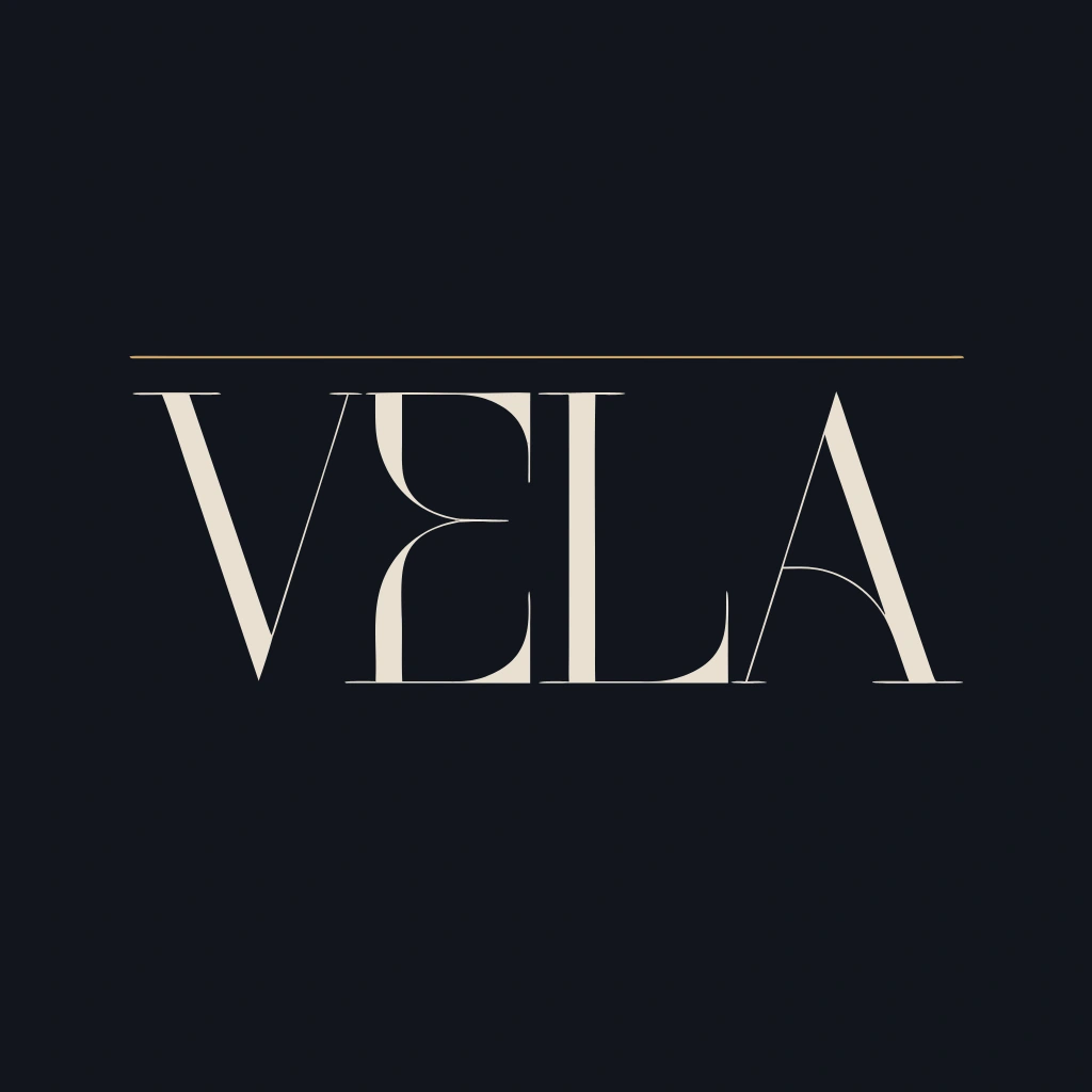
The logotype
The VELA wordmark is set in an extreme high-contrast serif with generous tracking. The V and A mirror each other diagonally, creating a quiet bilateral symmetry that rewards a second look. The hairline horizontals of the E and L are razor-thin, emphasizing the vertical stress of the typeface. Every letterform feels tall and narrow — elongated, almost architectural.
A single pale gold rule — 0.5pt — runs the full width of the wordmark above the letters. It is the smallest decision in the system and one of the most important: it is the horizon line. It recurs throughout the brand world — in the store window, the lookbook, the website — just enough to become a signature without becoming decoration.
The logotype sits in ivory (#F5F0E8) on deep navy (#0D1B2A), or reversed. No shadow, no outline. Just the letterform in pure contrast.
The Meridian Star icon
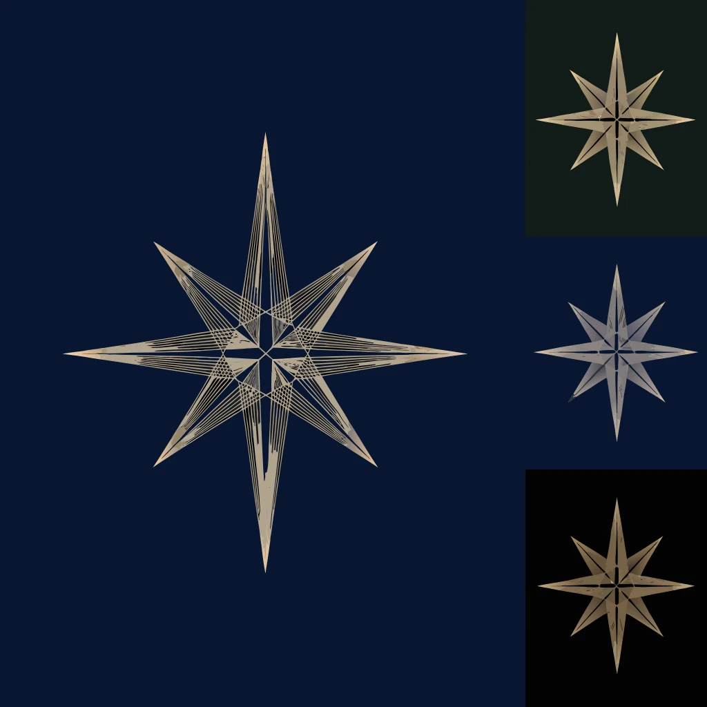
The icon is an eight-pointed star built on the logic of a navigator's compass rose: four long cardinal points and four shorter diagonal bearings. Constructed entirely from straight lines — no curves, no softness. It reads simultaneously as a star, a crosshair, and a celestial instrument.
The fine internal engraving lines running between each arm give it depth and material weight: it looks like something etched into brass by hand, not generated on a screen. At large scale, the engraving becomes the story — cartographic, precise, obsessive. At small scale, the lines fall away and you are left with a clean geometric star that works at 12px as a favicon or at 3 meters on a billboard.
It is rendered in pale gold (#C9A96E) on deep navy as the primary mark, and as a single-color ivory or gold stamp for embossing, embroidery, and wax seals.
03 — Color System
Deep Navy · #0D1B2A — The ground. Every surface starts here. Used as the primary background across packaging, stationery, and campaign photography. Cold and absolute.
Pale Gold · #C9A96E — The light. Applied to the Meridian Star icon, the rule above the wordmark, foil stamping, wax seals, and embroidery. Never used as a fill — always as an accent that catches the light.
Ivory · #F5F0E8 — The paper. Used for interior packaging linings, shopping bag stock, correspondence cards, body copy, and the logotype in its reversed application. Warm enough to not read as white, cool enough to not read as cream.
Soft Silver · #B8C4CC — The metal. Used for secondary hardware elements: cord handles, drawstring ties, secondary typographic applications. It reads as unpolished platinum rather than chrome.
04 — Brand in the World
The identity was applied across fifteen touchpoints. Every surface was treated as an opportunity to deepen the world of VELA rather than simply repeat the logo.
Packaging
The rigid jewelry box is deep navy cloth with an ivory silk interior. The logotype is blind-debossed in pale gold on the lid's face. The Meridian Star is foil-stamped on the interior ceiling — only visible when the box is opened, a private moment of discovery.
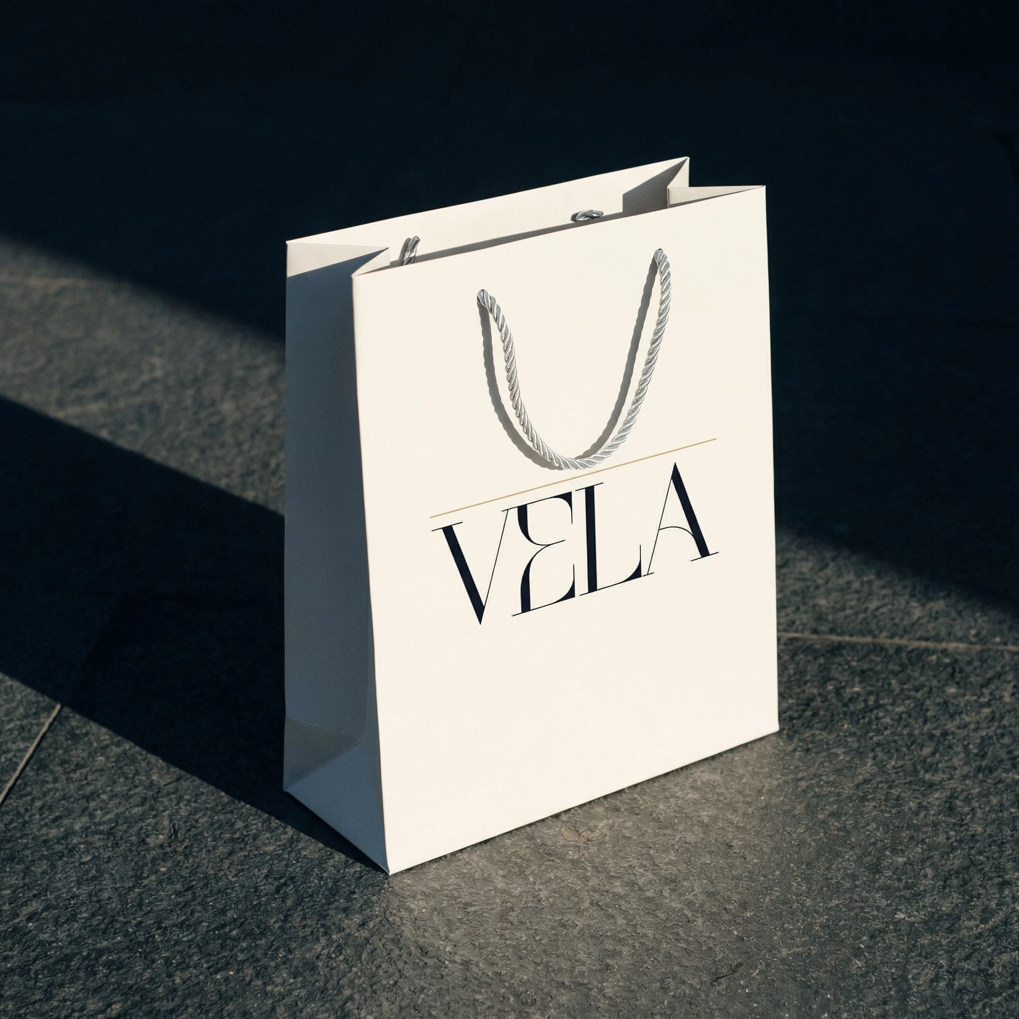
The shopping bag is ivory heavyweight matte paper, the logotype in deep navy with the gold rule above it, twisted soft silver cord handles. It photographs as well on a stone pavement as it does in a hand.
The ring pouch is deep navy suede with the Meridian Star embroidered in pale gold thread — individual stitches visible in raking light, giving the mark a craft quality that foil cannot achieve.
The gift wrap carries an allover constellation field of the Meridian Star at 15% opacity in pale gold on deep navy — so dense the stars read as a map rather than a pattern. Sealed with an ivory grosgrain ribbon and a pale gold foil sticker bearing the star.
The tissue paper inside the box is ivory, printed with the same constellation repeat at 30% opacity. A brass wax stamp sits beside it.
Stationery and correspondence
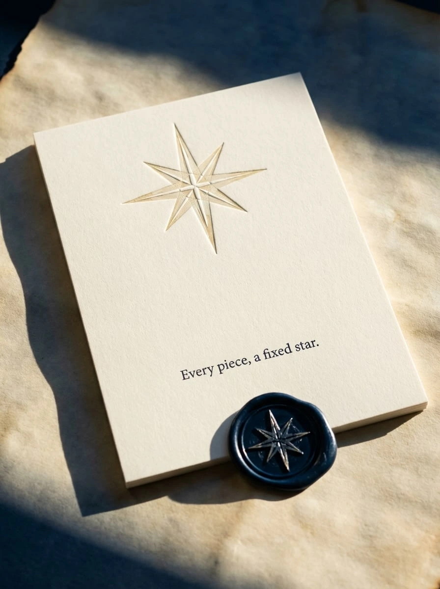
The stationery set is dark — deep navy cards and envelopes, the logotype in ivory, the Meridian Star wax seal in navy. The letter opener is ivory. The total effect is that of a private correspondence system, not a retail brand.
The correspondence card carries a single line of fine-weight serif text centered in the lower third: "Every piece, a fixed star." The Meridian Star is blind-debossed at the top of the card, catching raking light so the impression glows without ink. A deep navy wax seal completes the bottom edge.
Campaign and editorial
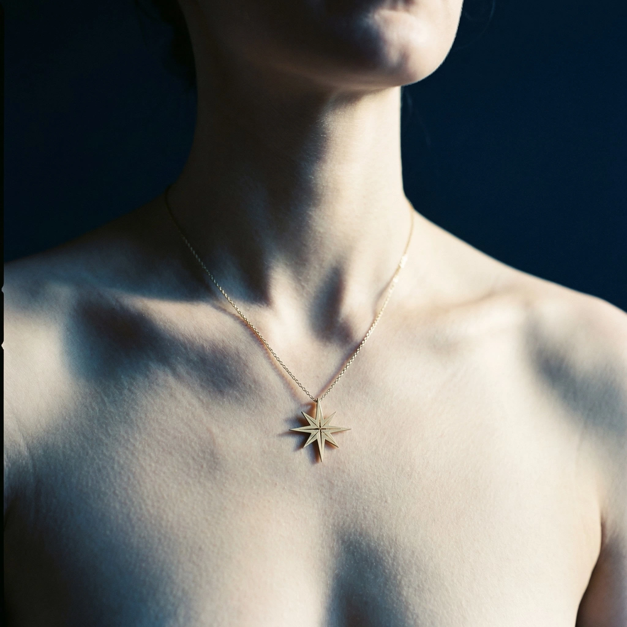
The pendant shot places the Meridian Star on the collarbone against a pure deep navy ground. The skin is cool-toned, lit from the upper left. The chain catches the raking light as a single bright thread. No branding in frame — just the piece.
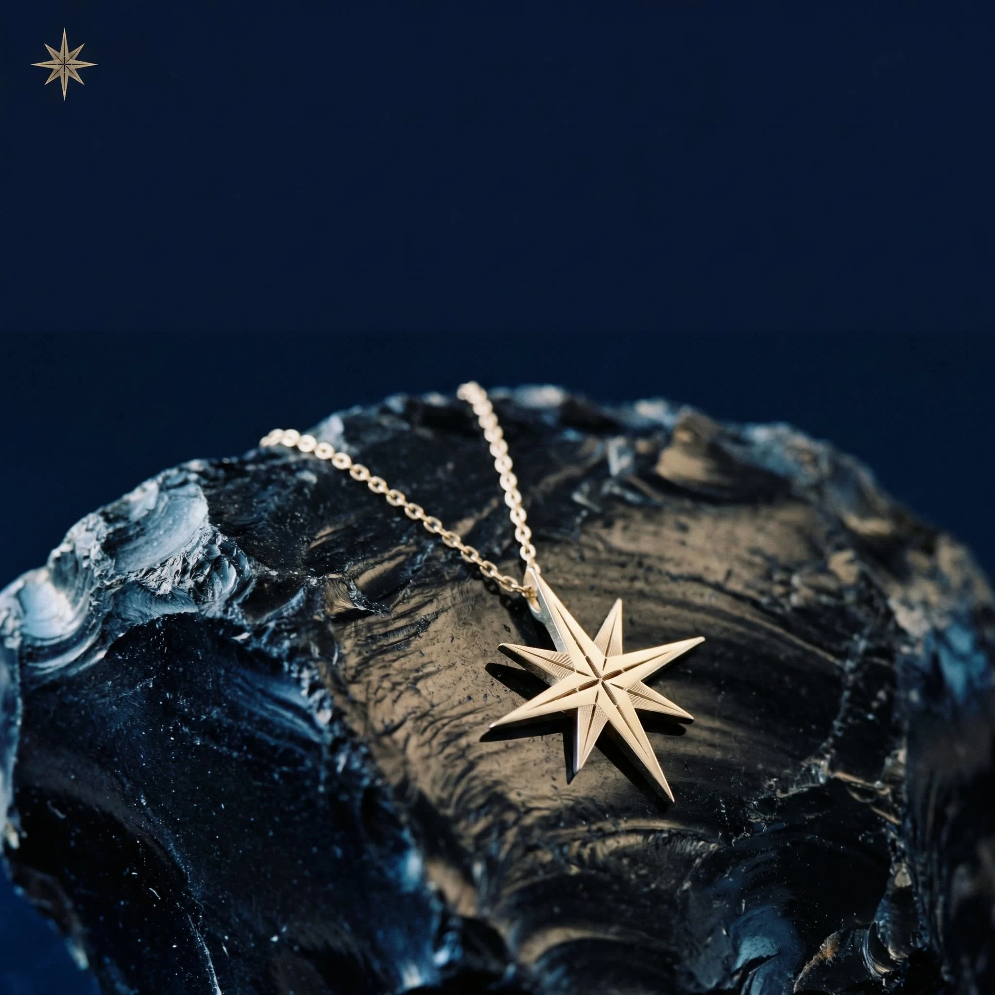
The Instagram square is a macro of the chain and pendant draped over raw obsidian. The stone fills the lower two-thirds; the upper third is deep navy negative space. The Meridian Star appears in pale gold at 18px scale in the upper left corner — not a caption, not a credit, just a mark.
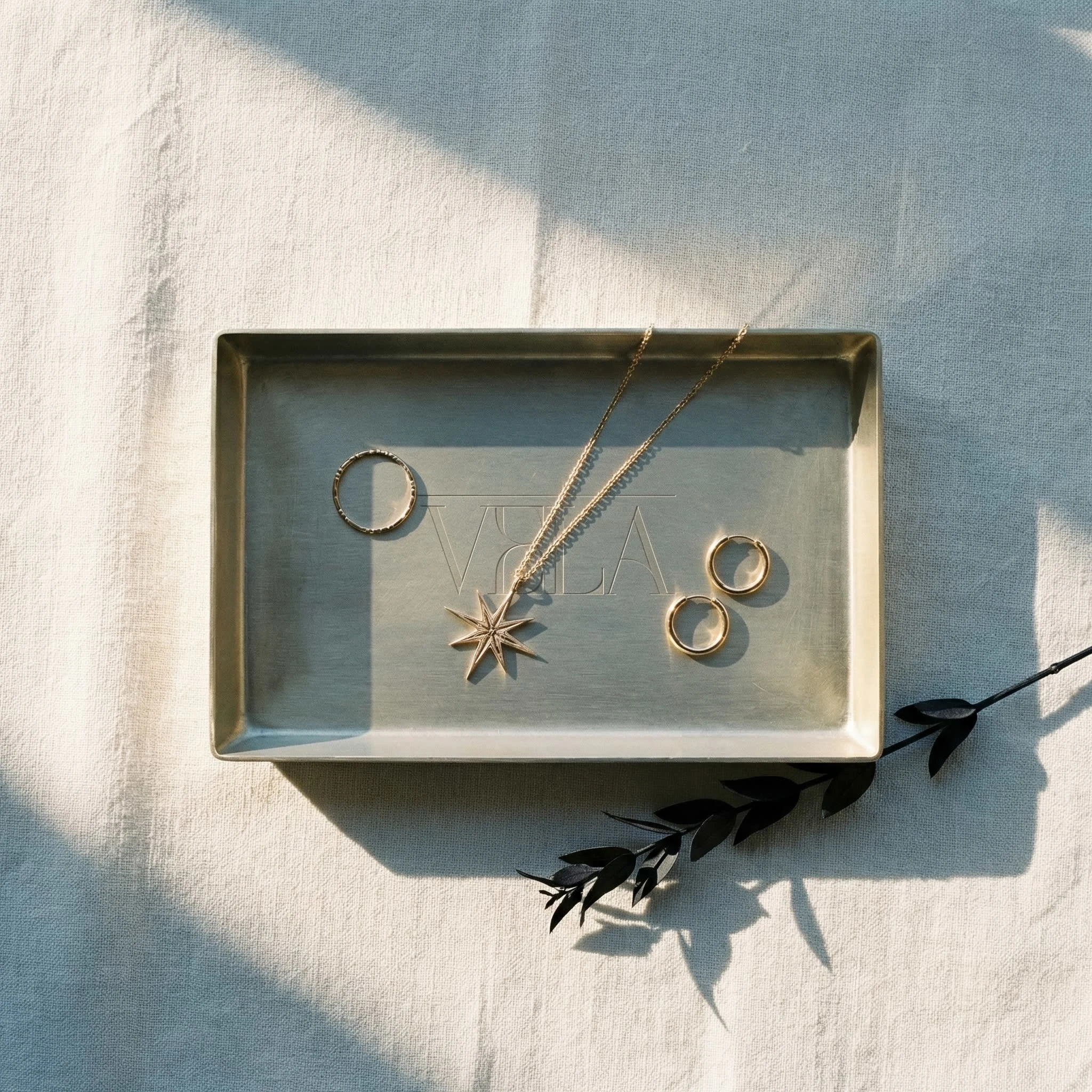
The jewelry tray flat lay is shot overhead: a brushed brass tray on ivory linen, three pieces inside, the VELA logotype debossed into the tray base. A single dark dried sprig at the edge. Nothing else.
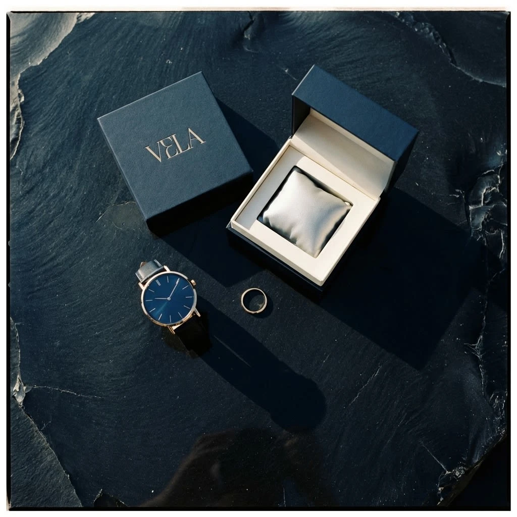
The watch collaboration flat lay is overhead on raw obsidian: the VELA box open and empty beside a slim dress watch with a deep navy dial, a single gold ring between them. The obsidian reflects both objects as dark ghosts.
Environmental and digital
The billboard is the icon at maximum scale on deep navy. No wordmark on the face — only the Meridian Star, large and centered in pale gold, with VELA in small ivory in the lower right corner. Shot at night on a wet urban street, the billboard surface catching rain reflections. The decision is confident to the point of silence: the brand shows its symbol and trusts it to be enough.
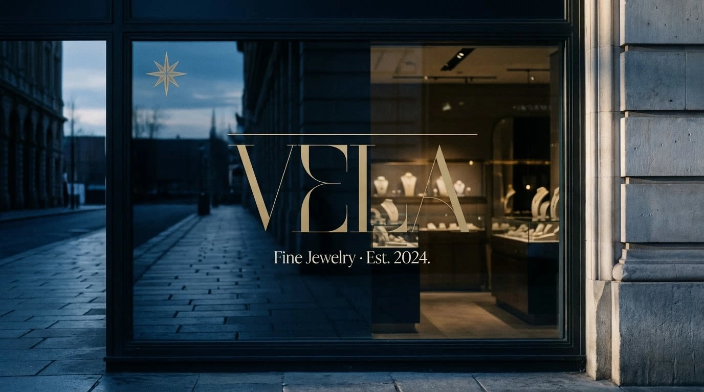
The store window is shot at dusk. The logotype in pale gold frosted vinyl, centered at eye level, the gold rule running above it. The Meridian Star appears separately in the upper left pane at small scale, like a cartouche. The interior of the boutique glows dimly behind the glass.
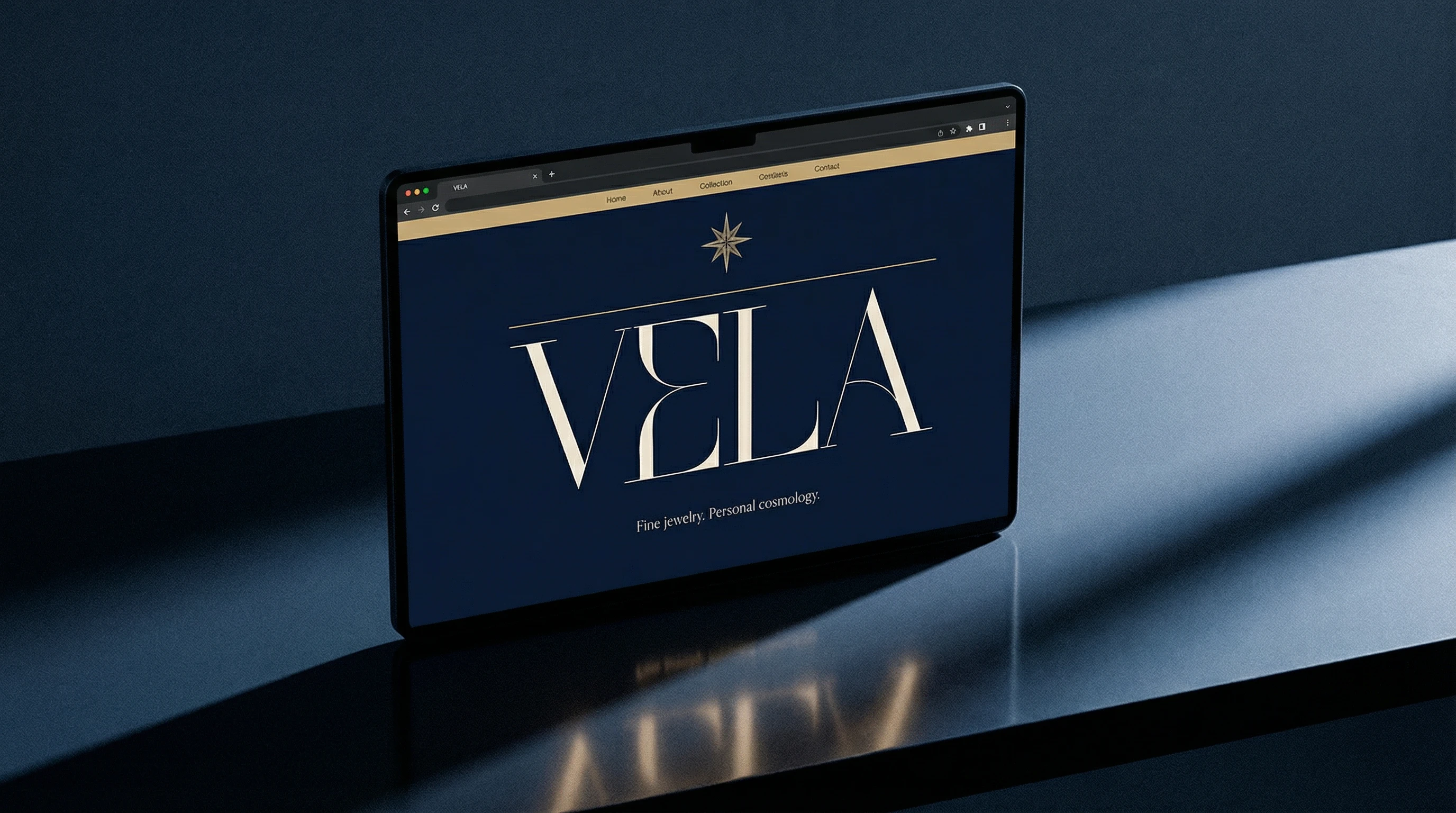
The website hero is full-bleed deep navy. The Meridian Star sits alone above the logotype, small and precise. Below: "Fine jewelry. Personal cosmology." — a single line in fine-weight ivory. The navigation is a pale gold bar at the very top. Nothing else.
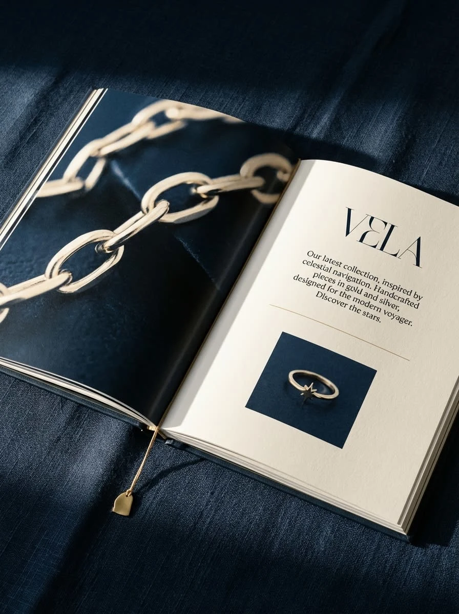
The lookbook spread pairs a full-bleed macro campaign image on the left page — chain links close, near-abstract — with an ivory editorial page on the right: the VELA logotype, a short block of body copy, a pale gold rule, and a single product shot at the base.
05 — What Makes It Work
Restraint as identity. Every element of VELA earns its place or it is not there. The logotype uses no ornament beyond the gold rule. The icon uses no curves. The palette uses no more than four colors. Restraint is not minimalism for its own sake — it is the visual equivalent of silence, which is the brand's core feeling.
The rule is doing a lot. The thin pale gold rule running above the wordmark is the smallest decision in the system and one of the most load-bearing. It is the horizon line. It separates sky from earth. It recurs just enough to become a signature.
The icon scales perfectly because it contains no fills. Only lines and negative space. At small sizes the engraving drops away and you have a clean star. At large sizes the engraving becomes the detail. The same mark works on a 3-metre billboard and a wax seal stamp.
Photography discipline holds everything together. All fifteen mockups were generated with the same master visual direction: medium-format film quality, cold blue bias in shadows, single raking light source, matte or gently reflective surfaces. The result is a body of images that feels like it came from one shoot. Coherence is a form of confidence.
The brand never explains itself. No tagline on the billboard. No name on the pendant shot. No caption on the Instagram watermark. VELA operates as if it expects to be recognized — which is exactly how luxury brands should behave.
VELA — Fine jewelry. Personal cosmology.
Brand identity · 2026
Like this project
Posted Apr 2, 2026
VELA, celestial fine jewelry. One icon. One rule. Four colors. The brief: silence, precision, depth. Like standing inside an observatory at 2am.
Likes
2
Views
18
Timeline
Mar 16, 2026 - Apr 2, 2026