Built with Lovart
MARE Brand Identity System Development
Révolté
MARE — Brand Identity
Discipline: Brand Identity, Identity System, Art Direction
Deliverables: Mark System, Color System, Type System, Physical & Digital Applications, Photography Direction, Environmental Signage
The Brief
Open-water swimming is one of the oldest human acts. You find a body of water. You enter it. You leave. There is no infrastructure, no scoreboard, no audience. Most brands in the space treat this as a sport to be optimized — gear brands, performance metrics, hydration systems. MARE started from a different question: what if the brand treated open-water swimming the way it actually feels to the people who do it every morning before work, in cold water, alone or in quiet company?
The brief was precise and uncompromising. No action photography. No performance language. No generic blue. The audience already knows why they swim — the brand doesn't need to explain it to them. What it needed to do was recognize them.
The Logo
The decision that shaped everything: MARE has no fixed logo. It has a system.
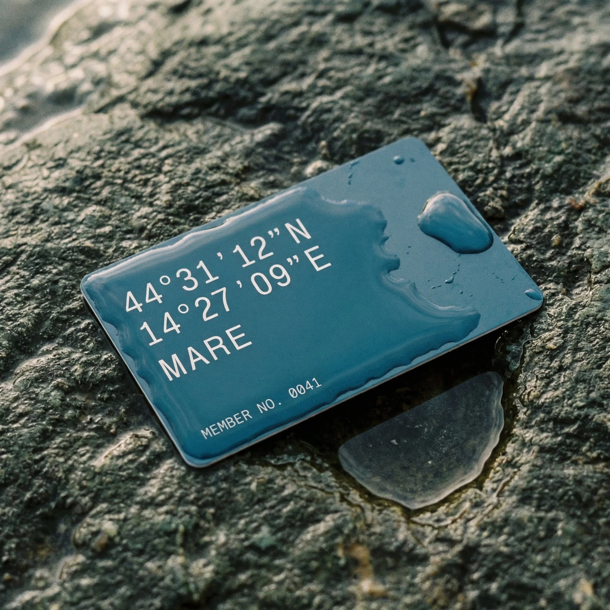
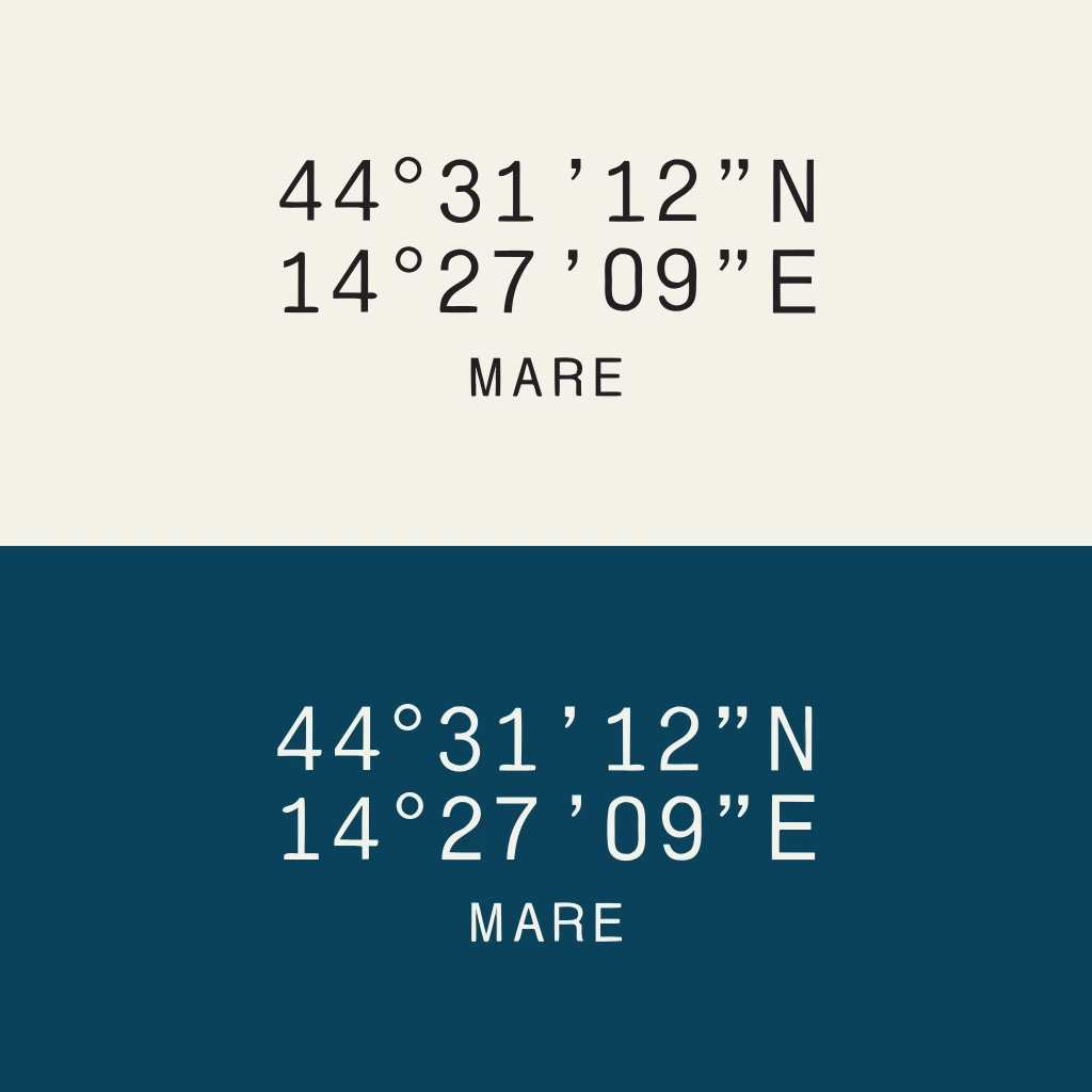
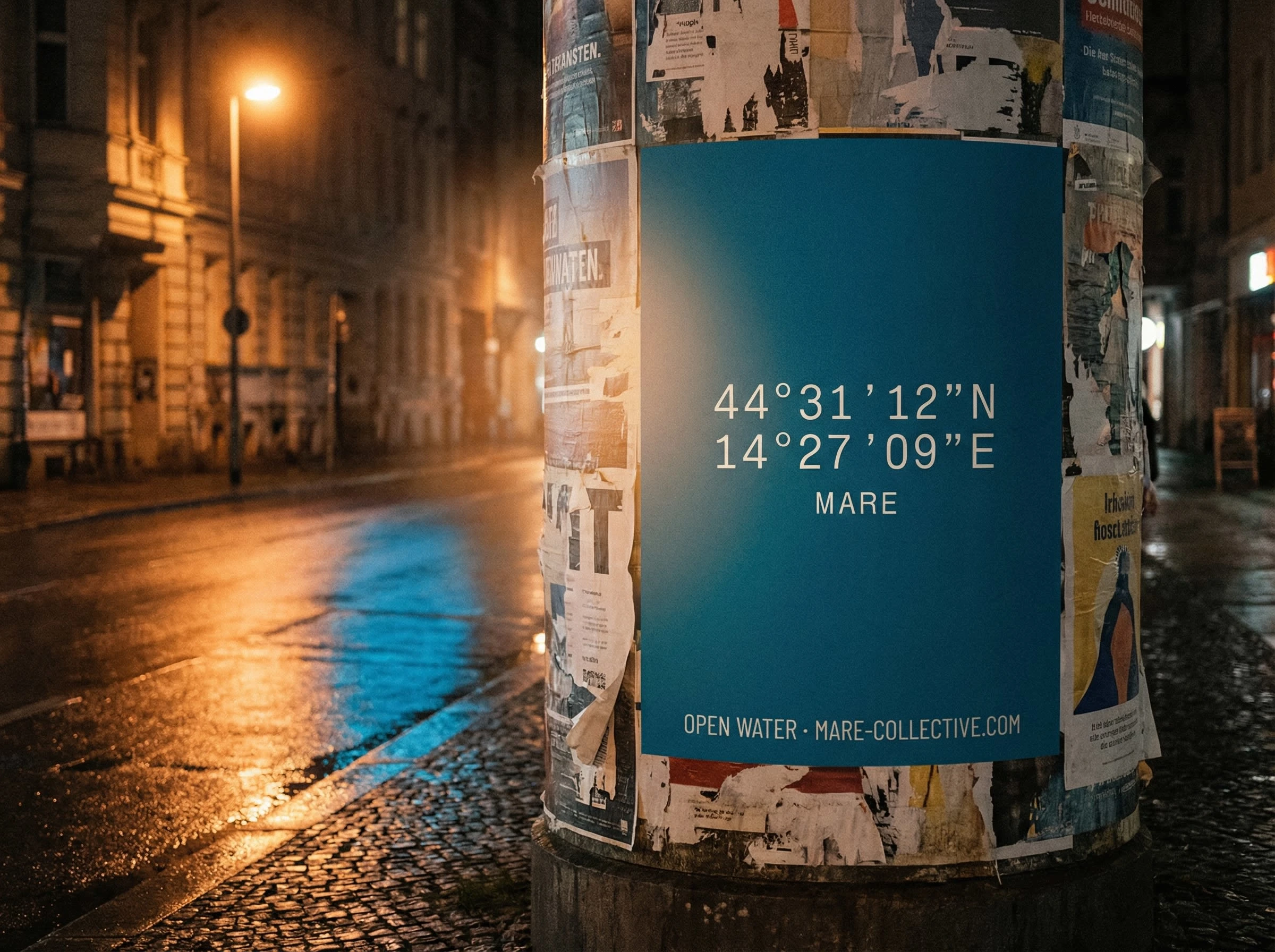
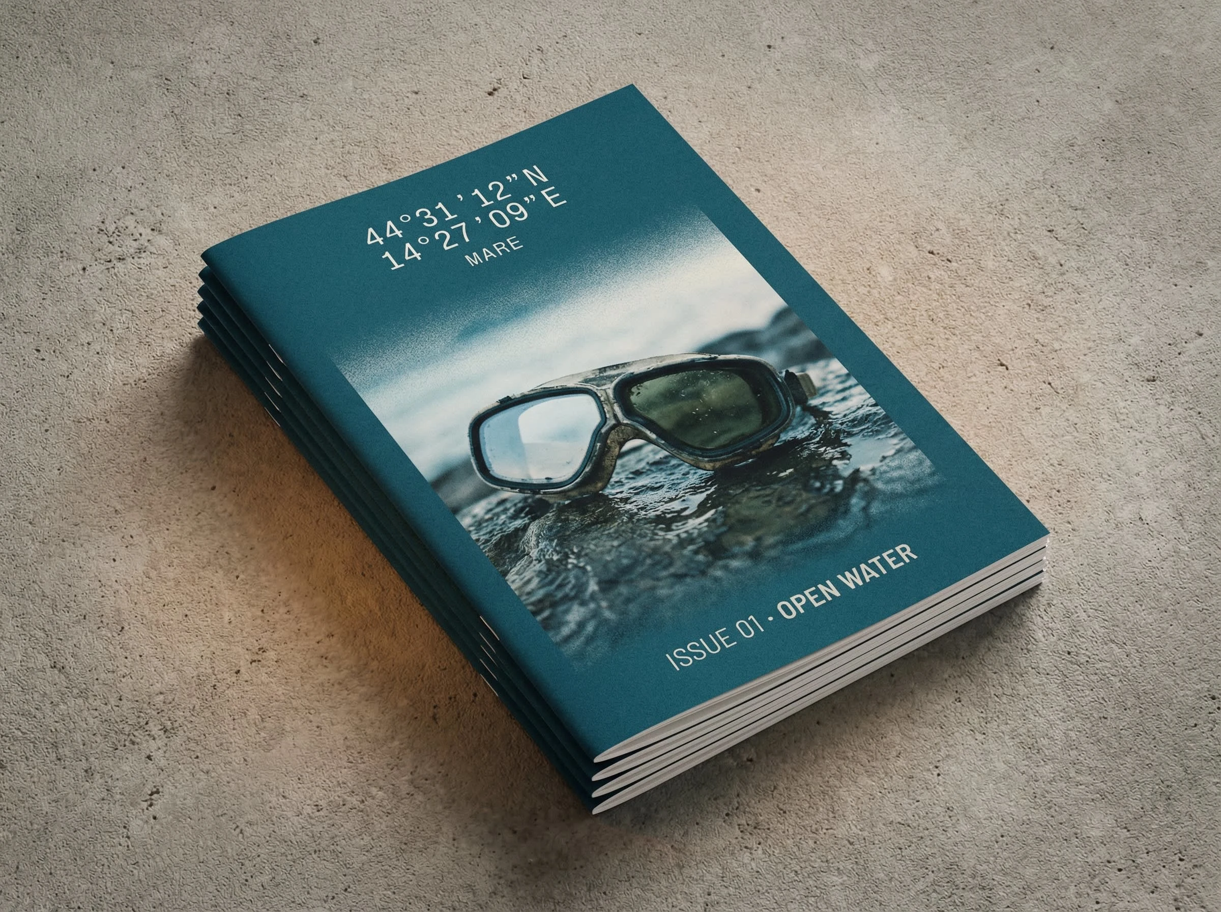
The identity is built around a GPS coordinate pair — the exact location of the founding swim spot, Sveti Nikola island off Poreč, Croatia. Two lines of monospaced text, left-aligned, regular weight, no modification:
44°31'12"N
14°27'09"E
Below them, after one line-height gap, the word
MARE in a condensed grotesque at 55% of the coordinate size. The coordinate is the name. MARE is the footnote.This is not a gimmick. Open-water swimmers are GPS-literate by habit — they log every swim, they know their entry points by feel and by number. The coordinate speaks their language before any copy does. More importantly, it makes every brand touchpoint specific to a place. A tote bag from MARE VENEZIA carries different coordinates than one from MARE NAPOLI. Same system, different objects. The identity is the methodology, not the mark.
Typography & Color
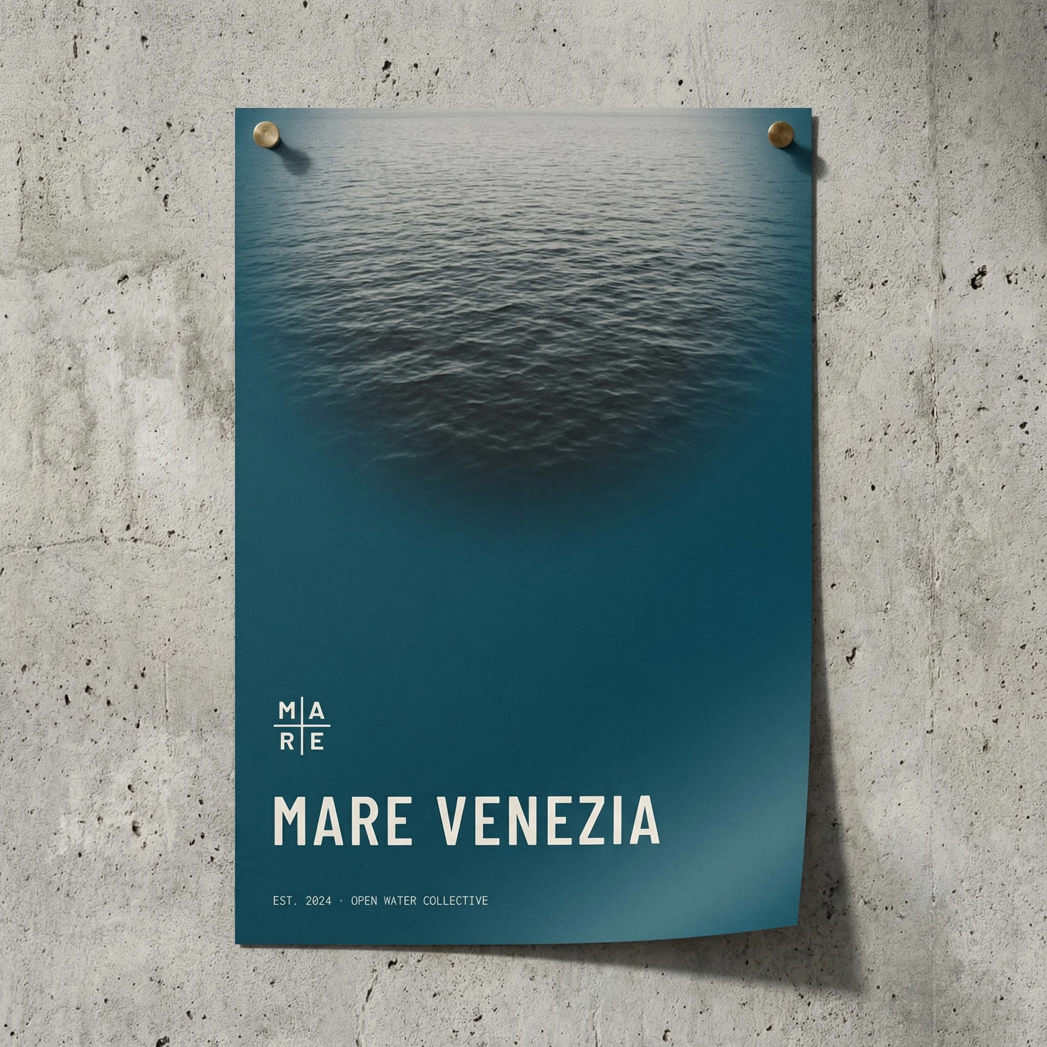
Two typefaces, no exceptions. A monospaced face carries all coordinate data, member numbers, technical information — the system voice, neutral and precise. Barlow Condensed in Regular and Medium carries the MARE wordmark, chapter names, event titles — tracked loose at every size, creating a vertical standing quality that reads like figures in water.
Three color values, governed by context rather than hierarchy.
#F2EDE4 — Linen. Not white. The color of uncoated paper, of a towel dried in coastal wind. The dry world.#1C5C6B — Adriatic. The color of the sea at depth, mid-morning, clear day. Not the Mediterranean in general — this specific body of water.#C8C0B4 — Salt. What linen becomes after repeated exposure. Used for secondary text, dividing rules, the transitions between the other two.No color grading. No fourth value at launch. The restriction is the identity.
Photography Direction
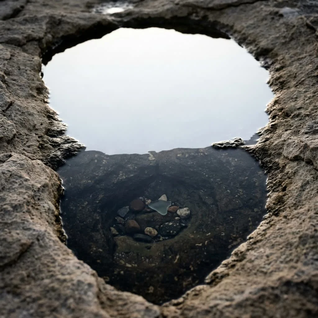
The single most consequential creative decision in the system. No swimming photography. No action, no splash, no athleticism performed for a camera. MARE members don't perform their swimming — they do it.
Everything is before or after. A folded towel on a wet rock. A member card in an open dry bag. Goggles beside a swim cap on linen. A closed swim log on coastal limestone. The coordinate written in pencil in the top field of a log page, slightly smudged. Clothes left at the entry point. The water line on a stone pier.
The photographs are evidence of swimming, not documentation of it. The subject has always just left frame. Grain on every image — the sea doesn't do clean.
Applications
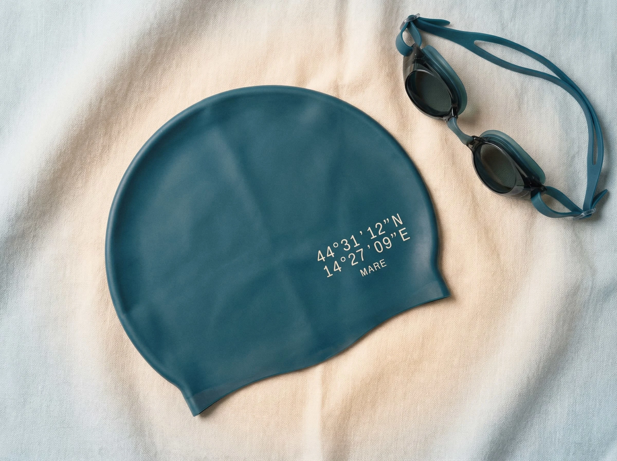
The system was built to survive the actual conditions of its use. The member card is 0.8mm waterproof PVC — it goes in a wetsuit pocket, a dry bag, a jacket lining. It gets wet. It survives. The towel carries the coordinate as a woven jacquard border on the hem, in salt thread on linen ground — visible only when the towel is unfolded at the entry point. The swim cap is silicone Adriatic, the coordinate heat-transferred in linen, designed to be the last thing a member sees before their face enters the water.
In physical retail contexts the coordinate mark is applied as frosted vinyl to window glass — reversed, readable from the street, the interior dissolving behind it. The window frame is painted Adriatic. The mark is the only sign. There is no other signage because none is needed.
In print, the newspaper ad reduces everything to a photograph of the wet swim log on rocks, the coordinate mark on the cover the only brand element, a 1cm Adriatic square the only color in the spread. In urban advertising, the poster column at night in wet cobblestone streets places the founding coordinate in full-bleed Adriatic — the only current poster on a column of torn, weathered, irrelevant campaigns.
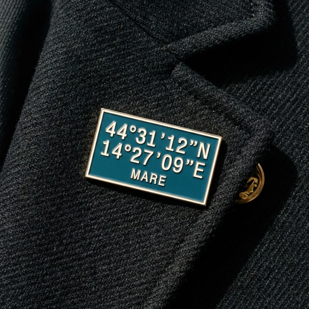
The zine, the enamel pin on a wool overcoat lapel, the billboard on a coastal road, the tube station poster underground — each touchpoint uses the same three values, the same two typefaces, the same photography logic. The system doesn't require a fixed mark because every execution is unmistakably the same brand.
Outcome
MARE is an identity that trusts its audience completely. The coordinate assumes you already know what it means. The photography assumes you already know what it feels like. The restraint — three colors, two typefaces, no action photography, no fixed logo — is not minimalism as aesthetic choice. It's honesty about what this thing actually is.
The brand stays on the rocks while the member enters the water. Everything is designed to survive that moment, and to be worth returning to afterward.
Like this project
Posted Mar 27, 2026
A membership brand built on GPS coordinates. No fixed logo, just the exact location of the first swim. Identity that trusts its audience completely.
Likes
1
Views
52
Timeline
Mar 9, 2026 - Mar 27, 2026