Built with Lovart
Velvyne Brand Identity & Website Development
Révolté
VELVYNE
Case Study · Brand Identity & Website
Dark Romanticism meets 19th-century Apothecary
The Brief I Set Myself
This is a self-initiated case study. A deliberate step outside my usual territory — brutalism, hypernoise, aggressive digital aesthetics — into something that required the opposite discipline: restraint, warmth, historical reference handled without pastiche.
The question I asked myself: can I build a feminine cosmetic brand that earns its darkness? That feels genuinely literary and sensory rather than aesthetically borrowed?
Velvyne is the answer I built.
The Concept
The brand lives at the intersection of a Victorian botanist's greenhouse and a medieval alchemist's study. Not gothic as costume — gothic as atmosphere. The emotional territory is private, literary, ritualistic. The woman this brand belongs to treats her vanity table as an altar and her skincare as a practice, not a routine.
The name itself — Velvyne — is invented but feels inherited. It carries the weight of velvet and the sharpness of something botanical. It has no meaning you can look up, which means it accumulates the meaning the brand gives it.
Typography
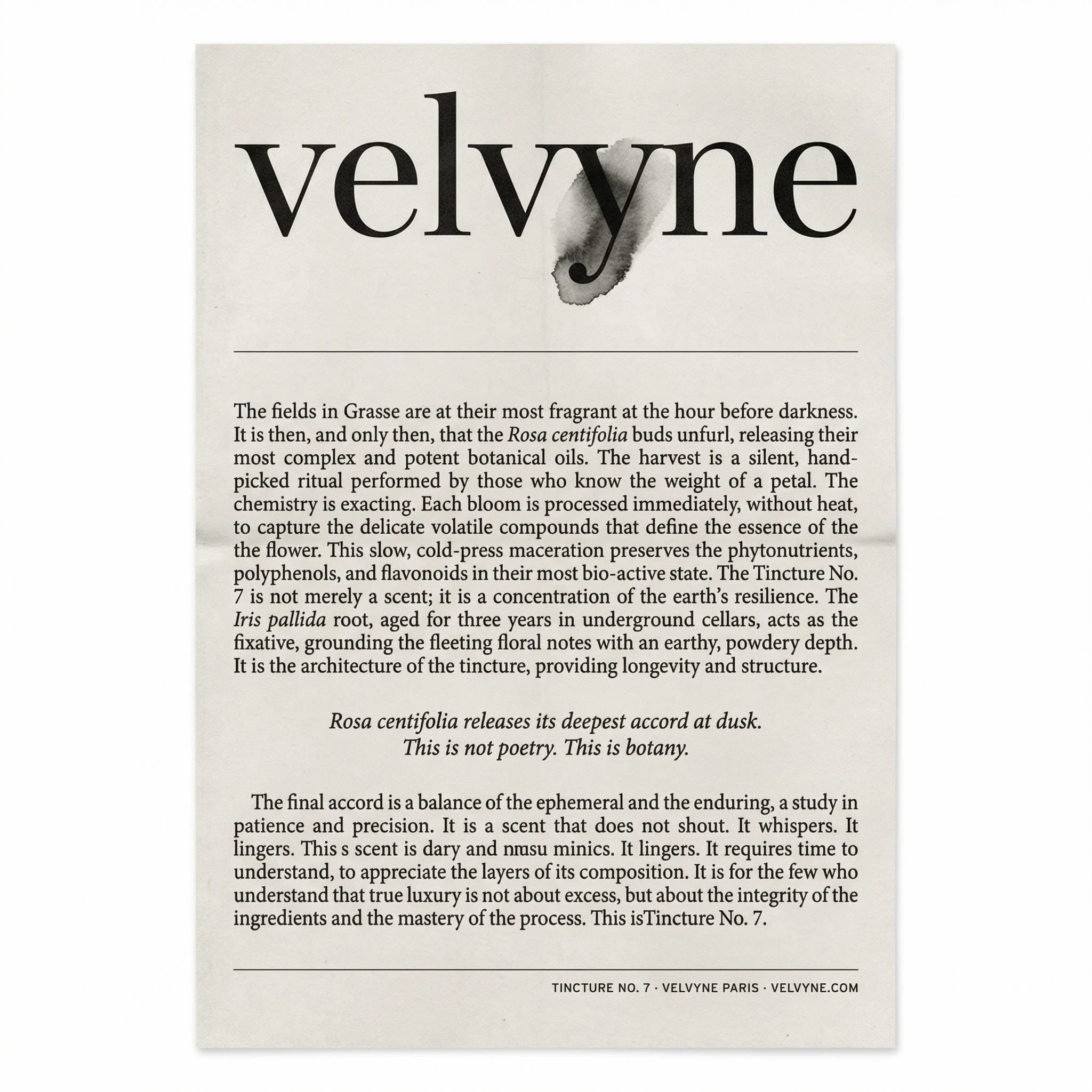
The entire visual system pivots on a single typographic decision: GFS Didot as the exclusive display face.
I chose GFS Didot over commercial Didot variants deliberately. It comes from the Greek Font Society — a classical revival rather than a commercial one — and carries a severity that French Didot variants smooth away. The thin strokes are sharper. The contrast between thick and thin is more extreme. At large sizes it reads like a carved inscription rather than a typeset headline. That distinction — carved versus printed — was exactly the quality Velvyne needed.
It is also open source. For a case study built by one person without a type licensing budget, that matters practically. But the choice was aesthetic first.
The wordmark is set in GFS Didot lowercase — a deliberate decision. Lowercase signals intimacy, not weakness. It is the typographic equivalent of speaking quietly in a room where speaking quietly is the most powerful thing you can do.
Body copy pairs with a humanist old-style serif — warm, slightly irregular, suggestive of apothecary labels and typeset books. The italic variant of the same family handles all botanical Latin names and pull quotes. Three typefaces total in the system. In practice, two on any given surface.
The Logo
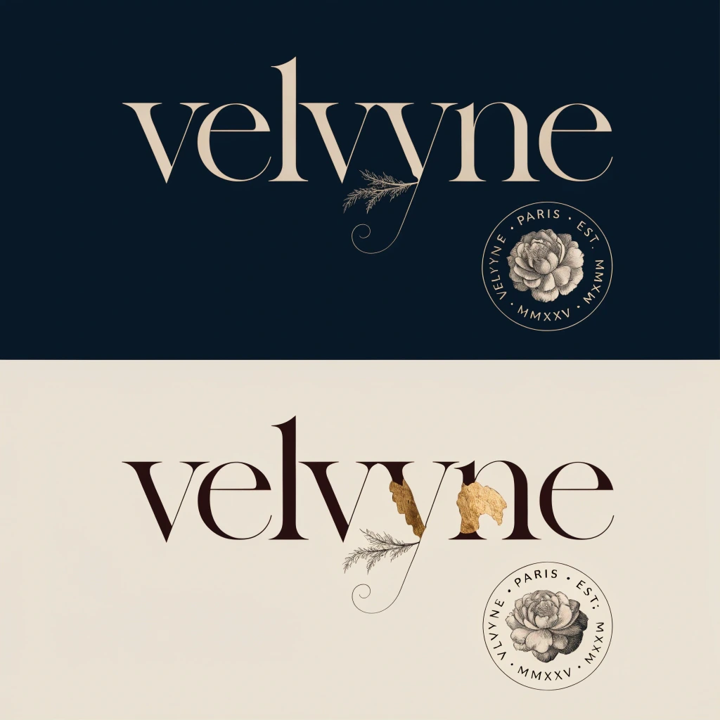
The wordmark carries one piece of illustration: the "y" descender extends into a fine botanical tendril — a sprig, a curl at its terminus — and behind the descender, partially obscuring it, sits a torn fragment of gold leaf. Irregular, organic, unrepeatable in feel.
This detail is the brand's fingerprint. At small sizes it reads as a refined descender. At display size the intention becomes clear. In the primary light version, the gold leaf fragment is warm against parchment. In the inverted dark version, it burns slightly brighter against the Plum Black ground — the only warm tone in the composition, and the last thing the eye finds.
The secondary mark is a circular seal — VELVYNE · PARIS · EST. MMXXV — with a copperplate-engraved Rosa centifolia at its center. It exists for physical applications: wax seals, embossed box lids, correspondence. It never appears at small digital sizes. It is a tactile mark, not a screen mark.
Color
Five colors. Used with discipline.
Parchment #E8DDD0 — the ground. Every light surface. Never pure white.
Plum Black #1A0A1E — the anchor. Near-black with violet warmth. Never cold.
Dried Rose #C49A8A — the warmth. Accents, photography grading, never type.
Dusty Mauve #9B6E8A — the bridge. Secondary labels, fine rules, UI hints.
Tarnished Gold #B8952A — the earned one. Logo detail, foil, fine rules only. Never a fill.
The rule I set myself: maximum three palette colors in any single composition. Parchment and Plum Black are the default pair. A third color enters only when a specific emotional note requires it. Gold and Sage — a sixth tone used in botanical contexts — never share a composition.
The Mockups
Ten physical-world pieces across two series. No screens. No UI. The brand exists in the world you can touch.
01 · The Primary Product Suite
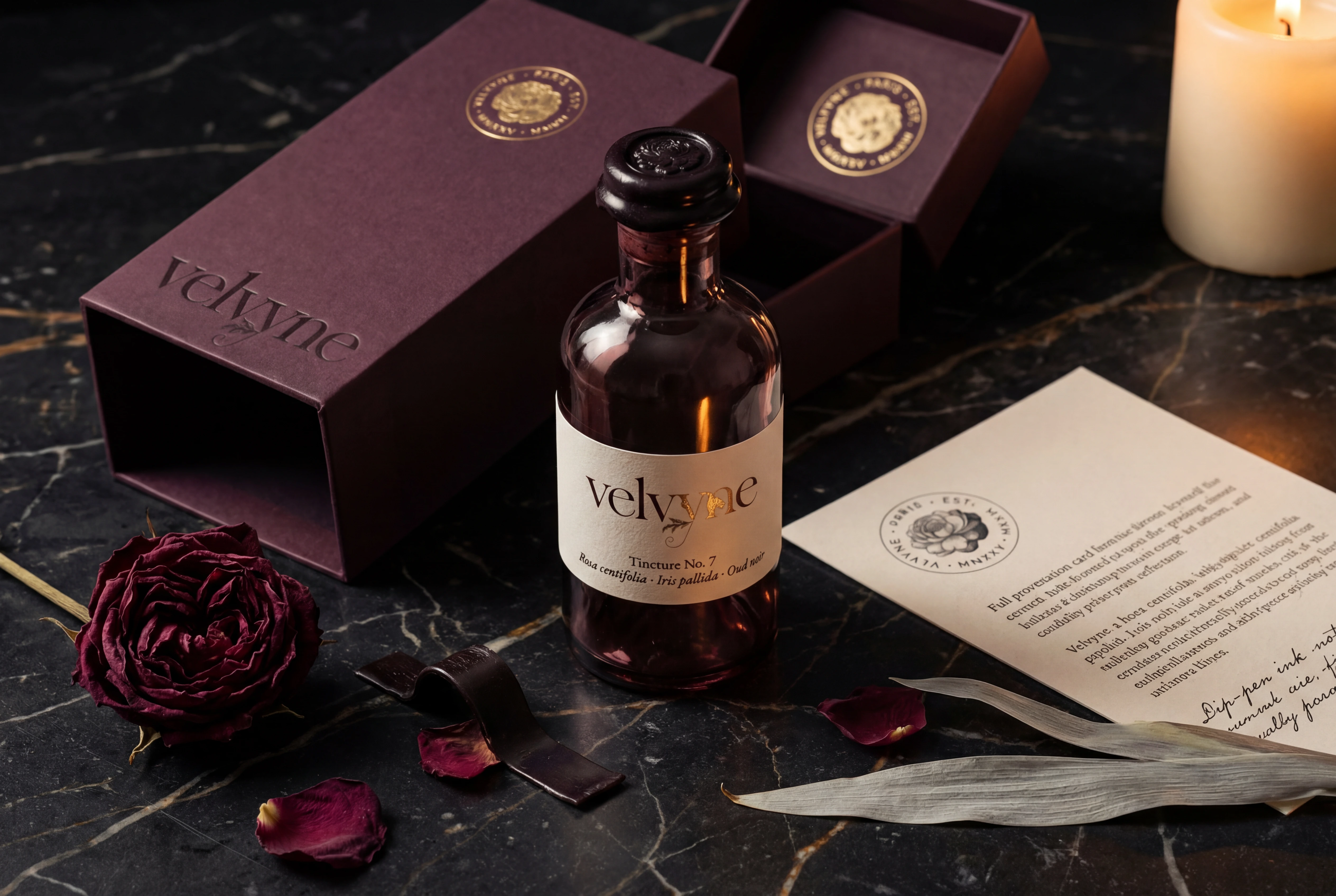
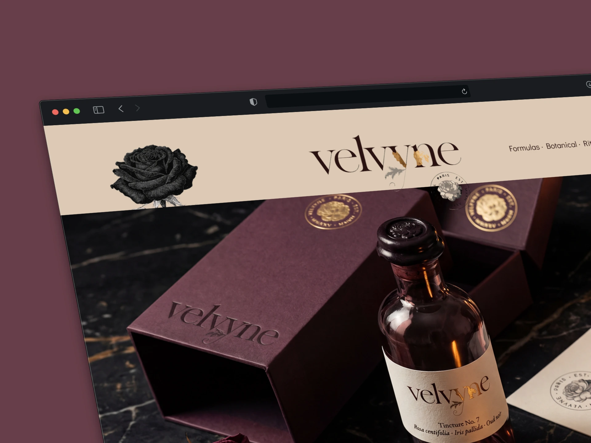
The hero product — Tincture No. 7 — photographed as a still life on aged black marble. A hand-blown plum-tinted glass bottle, dark wax seal, cotton label letterpress-printed. The outer box open behind it, its debossed wordmark catching the candle as a line of shadow inside each letterform.
The decision I want to highlight here is the formulation card — uncoated cotton stock, letterpress-printed, with a handwritten margin note in dip-pen ink. That note is illegible in the photograph. I put it there anyway. It changes how the object feels to look at, even without being read. Some details are not for the camera.
The light is a single candle, off-frame right, low. Every material in the frame — glass, paper, wax, dried rose — responds to that light differently, and those differences are the photograph.
02 · The Campaign Poster
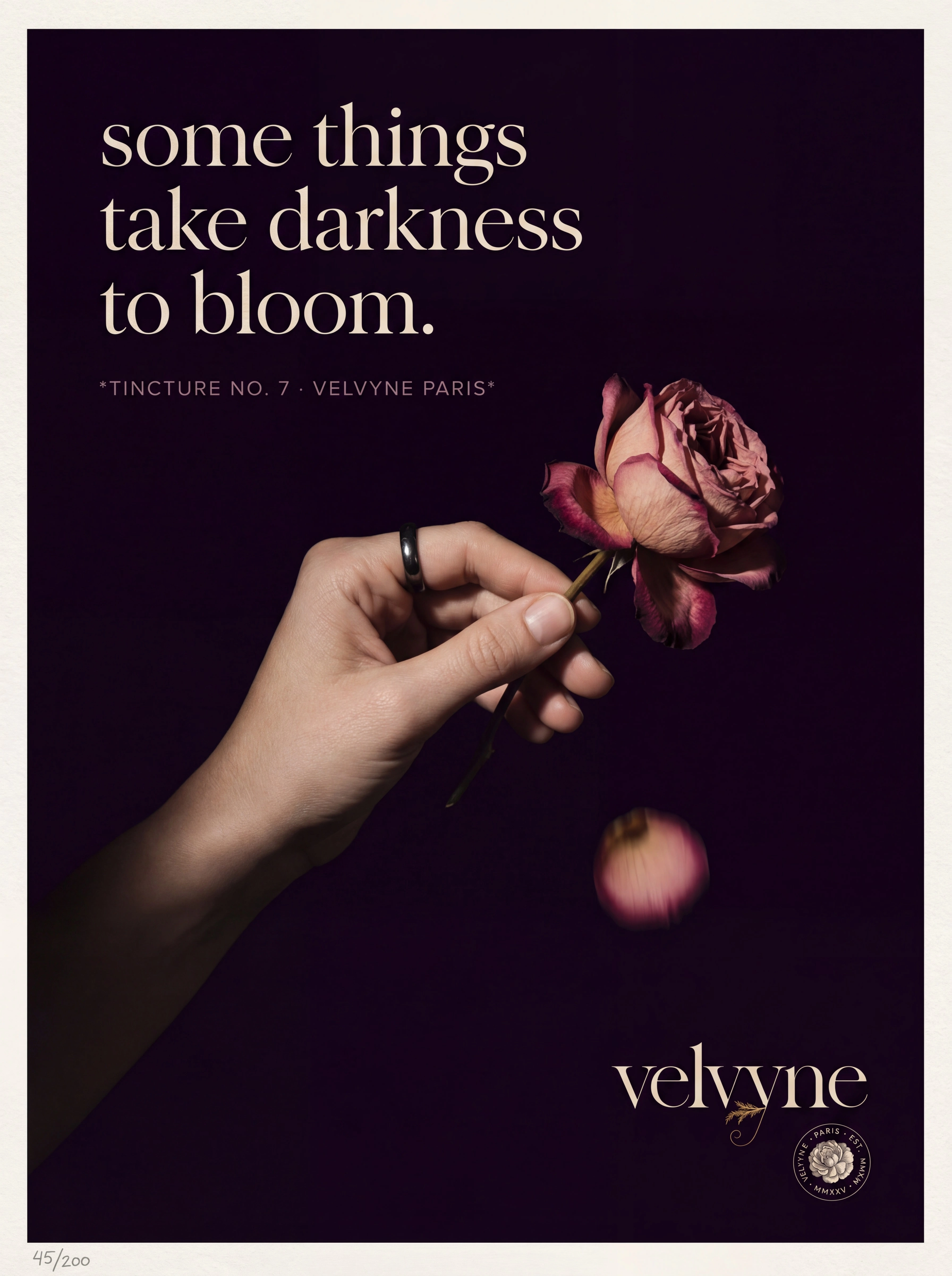
A woman's hand holds a Rosa centifolia bloom. One petal is mid-fall — the only motion in an otherwise still image. The background is absolute Plum Black. The hand emerges from darkness with no visible wrist.
The headline sits in the upper left quadrant in GFS Didot at 68pt, parchment on black:
"some things
take darkness
to bloom."
Three lines, left-aligned, no attempt at symmetry. The weight of GFS Didot's thick strokes against that darkness is the entire graphic event — no supporting cast needed.
The eye moves: headline → falling petal → the gold "y" in the wordmark at the bottom right. That sequence was engineered. The petal is the bridge between the language and the brand mark. Without it, the eye jumps. With it, the journey takes about three seconds and feels inevitable.
The atelier edition prints on 300gsm uncoated cotton, letterpress in two passes. The registration offset between passes is permitted. Preferred.
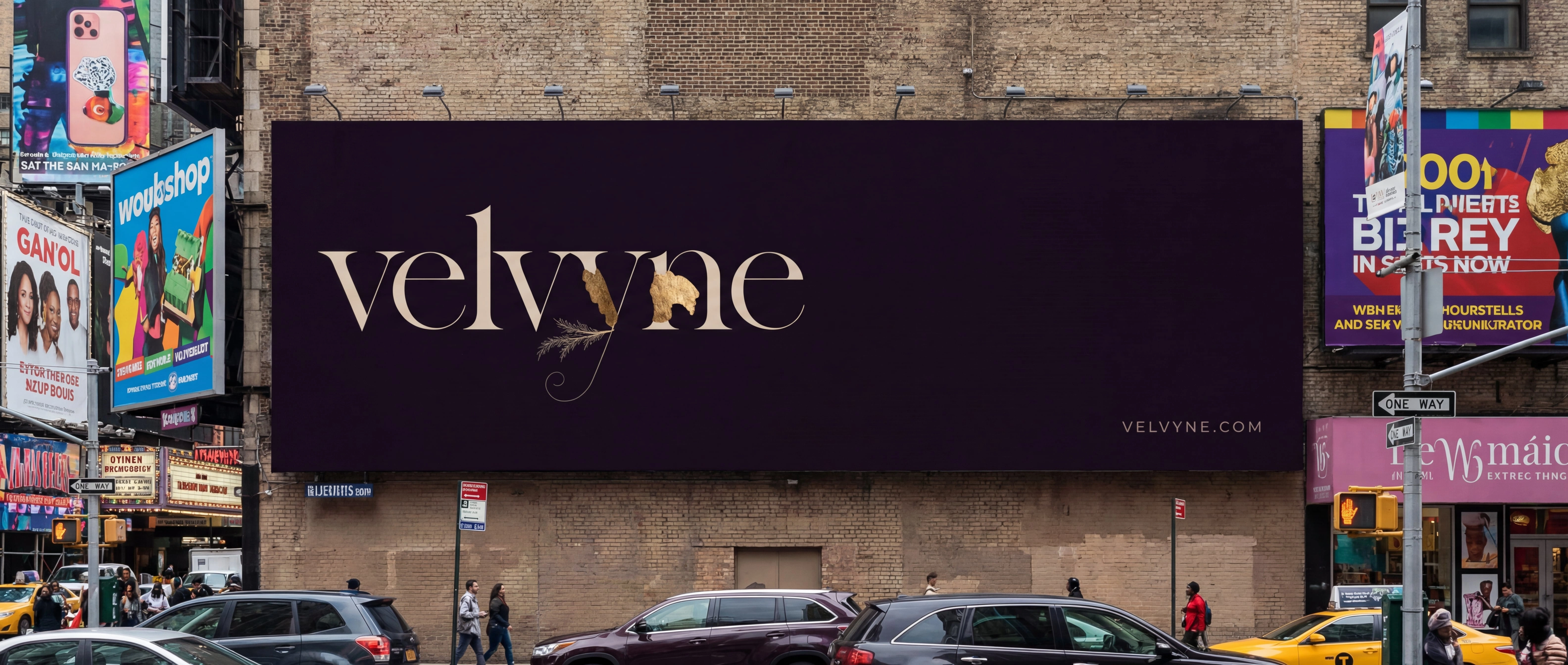
03 · The Billboard
Twelve meters of Plum Black matte vinyl on a wall in the Marais.
The wordmark in parchment, left third only. The right two-thirds: nothing. Entirely empty.
VELVYNE.COM in the smallest legible size, bottom right corner.
That is the whole billboard.
I made this decision because every billboard around it will be trying to fill every centimeter. Velvyne buys twelve meters and uses four. The empty space is not wasted — it is the most expensive part of the composition. It says, without saying: we do not need the room.
There is no backlit version. No digital version. The brand does not glow.
04 · The Unboxing Triptych
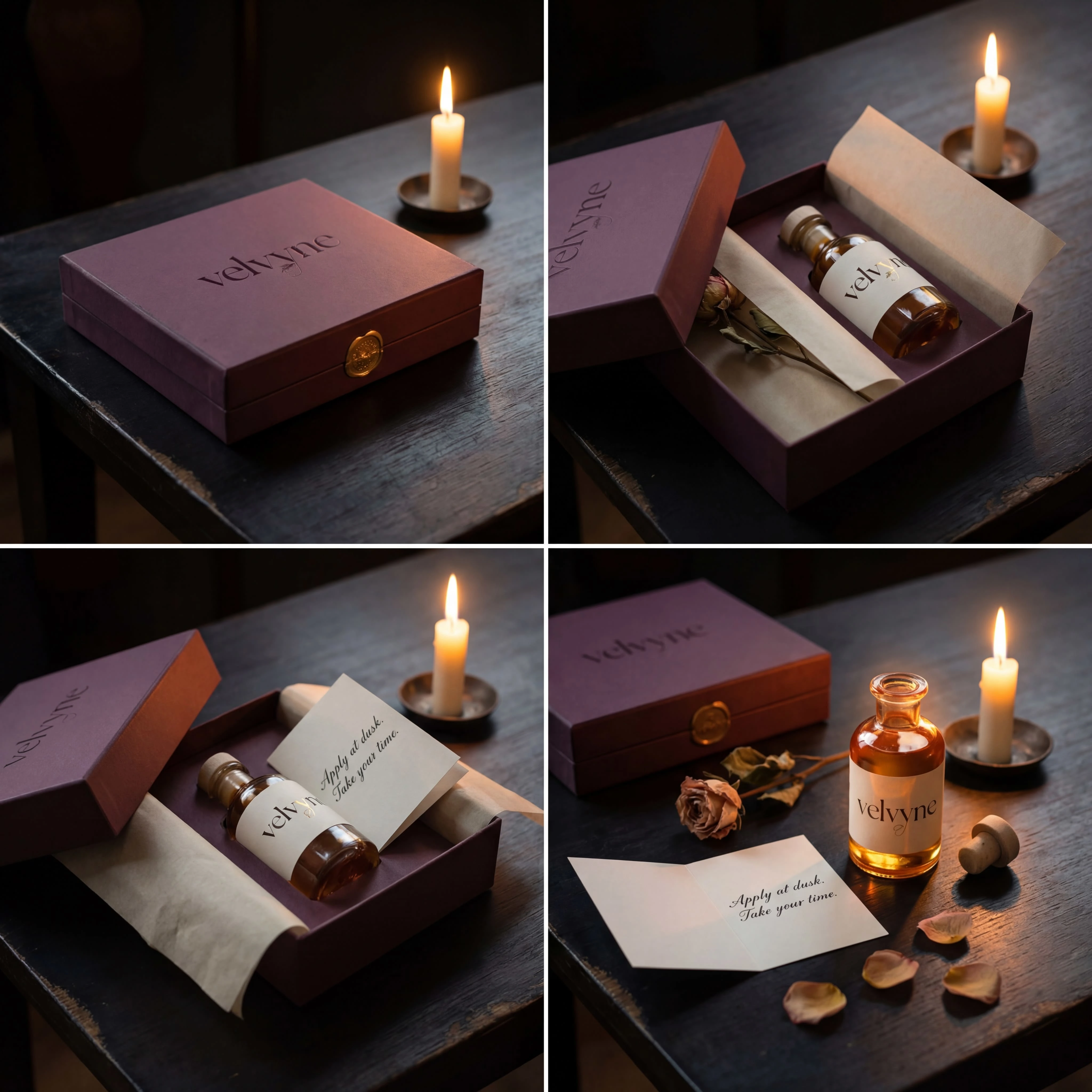
Three photographs. Same table, same candle, time passing.
Sealed. The box exists and is enough.
Opened. The bottle visible but not yet removed. The handwritten card still folded.
After. The bottle uncapped, oil glowing amber from within. The dried rose fully revealed — it was buried at the bottom, the last thing found.
The color grade shifts fractionally across the three images: sealed is coolest, after is warmest. The shift is felt, not noticed. I wanted the act of opening to generate warmth — literally, in the grade, not just emotionally in the content.
The detail I am most satisfied with: the dried rose appears in all three images but is completely concealed in the first, partially visible in the second, and scattered in the third. It has a complete narrative arc across three photographs. No caption explains this. It simply happens.
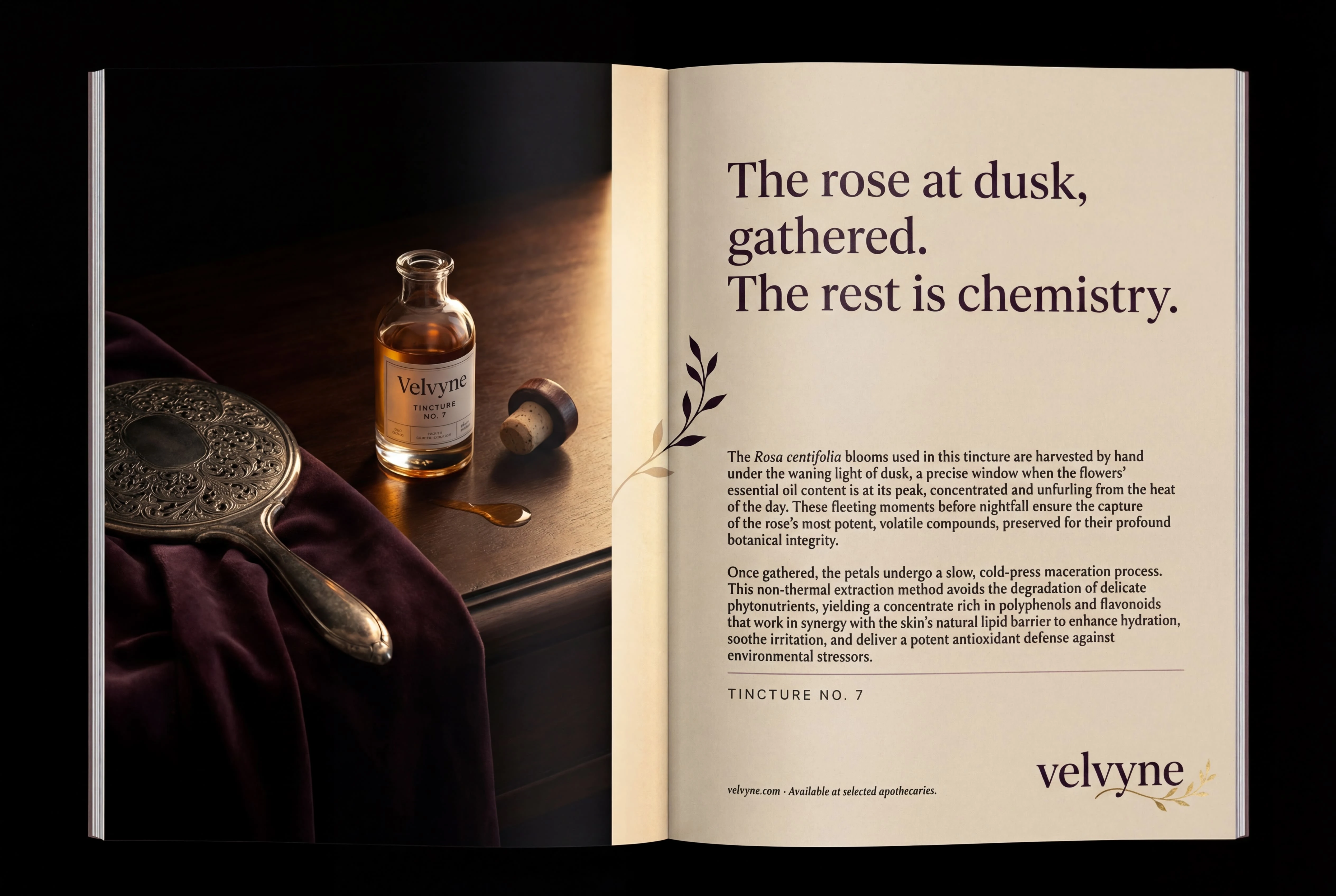
05 · The Press Ad — Double Page Spread
Designed for AnOther, 032c, System Magazine. The French edition of Vogue if necessary. Nowhere else.
The left page is photography: the product, a dressing table, candlelight, an amber trace of oil on dark wood. The right page is parchment ground and typography — the full ingredient provenance of Tincture No. 7 in body copy, GFS Didot headline above it.
The detail that only exists in print: a single botanical tendril — the same tendril from the wordmark's "y" — bleeds across the gutter, half on each page. On the left it prints in parchment, barely visible against the dark photography. On the right it prints in Plum Black against the parchment ground. It reads as one continuous line only when the spread is fully open and flat. It cannot be seen in digital reproduction of the ad. It is not mentioned anywhere in the copy.
It is for the person who looks closely. Every brand should have at least one thing like this.
06 · The Ampoule Collection
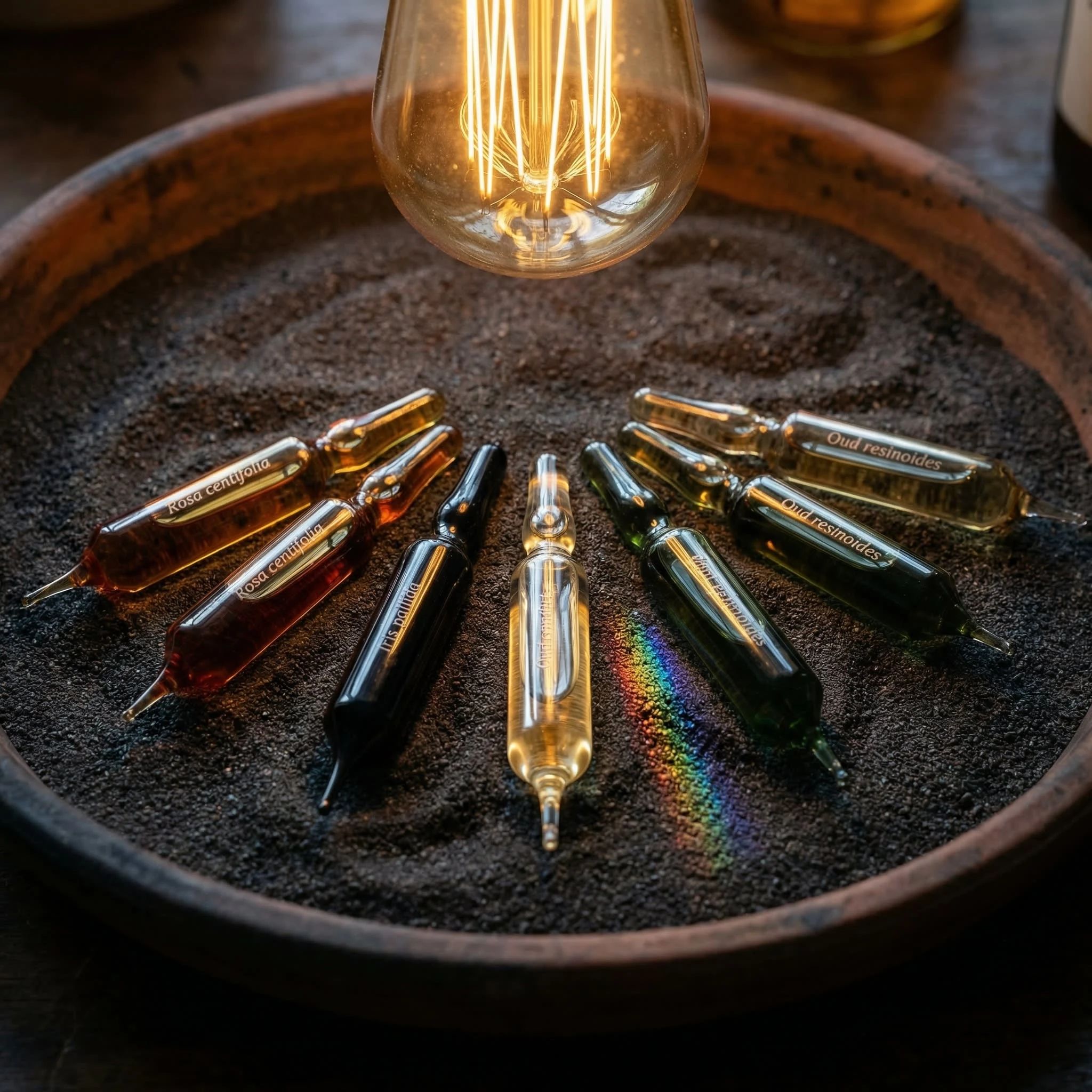
Seven 2ml hand-blown ampoules in a shallow tray of dark iron sand. Each contains a different botanical extract — amber, near-black, pale gold, ink-dark green. No labels on the bodies. Only the botanical name etched directly into the glass near the sealed tip, in type so small it requires leaning in to read.
A single overhead filament bulb — the one moment in the case study where the light source is not a candle. The amber ampoule glows from within. The pale gold one refracts into a small spectrum on the sand beside it — the only rainbow Velvyne will ever produce, and it is an accident of physics, not a design decision.
I included it because accidents that are beautiful are more convincing than intentions that are beautiful. The photography captures it rather than corrects it.
07 · The Correspondence Suite
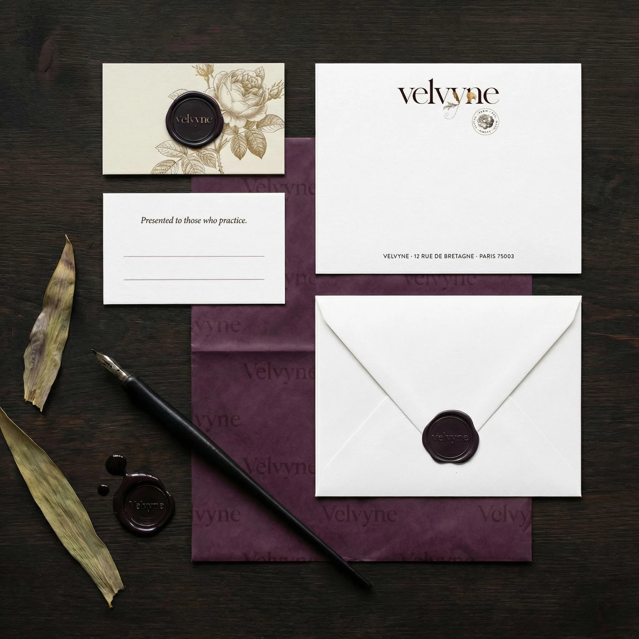
The loyalty card, the correspondence card, the envelope, the tissue sheet — all shot from directly above, perfectly perpendicular. The one mockup in the entire case study where the camera is completely level.
Every other piece in this project is slightly angled, slightly found. This one is formal. These are documents. Documents deserve to be read straight.
The loyalty card is 600gsm cotton board — so thick it has a visible edge in the photograph. The name space is two fine rules 6mm apart, nothing else. The name will be written by a person with a pen. This is the only element in the entire brand system that is completed by the customer rather than the brand. I find that detail worth noting.
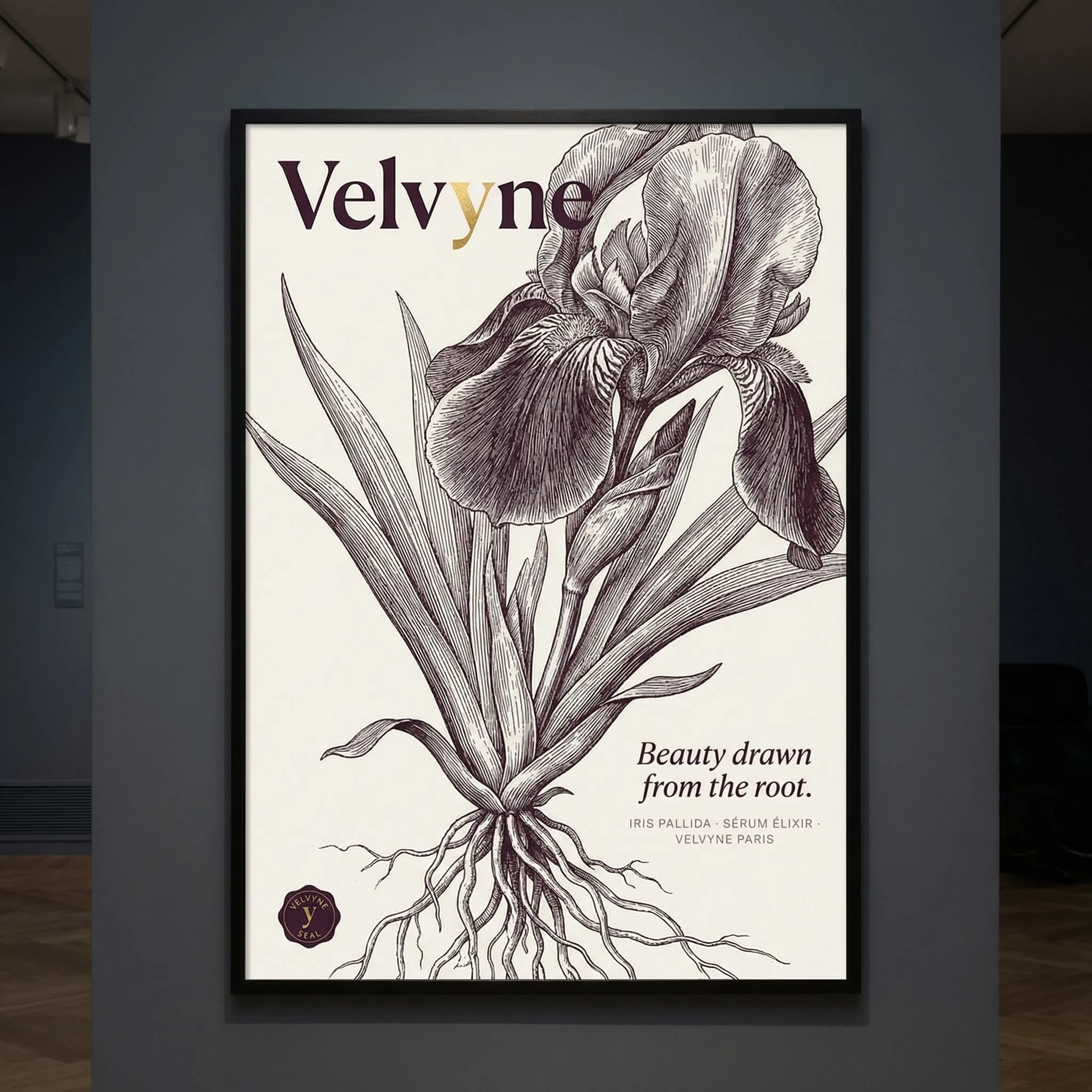
08 · The Botanical Poster
A full-bleed copperplate illustration of Iris pallida — bloom, stem, and roots — printed in warm black ink on parchment stock. The roots are shown. Velvyne is the only cosmetic brand in this imagined world that shows the roots.
The wordmark sits in the open sky area above the bloom, as if it was always part of the print. The campaign line sits in the root area, at 70% opacity, transparent enough to layer over the illustration without competing:
"Beauty drawn from the root."
A signed artist's proof edition of 50 exists on 300gsm cotton. It is sold through the atelier, never advertised. I invented this detail because it is exactly the kind of thing a brand like Velvyne would do — the thing that is not a marketing activity but becomes the most discussed marketing activity.
09 · The Ritual Calendar
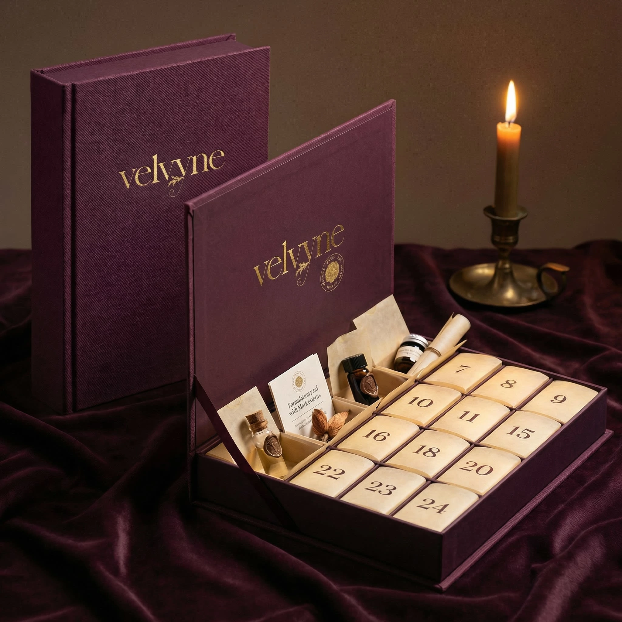
A book-binding cloth case, 280×200×60mm, deep plum, with the wordmark debossed into the cloth. No foil on the exterior. The cloth is the texture. The deboss is the mark.
Inside: twenty-four compartments, each holding one item from the Sérum Noir ritual calendar. The compartments are numbered in GFS Didot — the only place in the system where a numeral is large, centered, and singular. Every other typographic rule in the brand is suspended for this one context, because the ritual of advent requires it. A rule broken once, deliberately, for a specific reason, reinforces every other rule in the system.
10 · The Newspaper Ad
Black and white. Le Monde Saturday magazine, The Guardian Weekend.
The entire page is typographic. No photography, no illustration. GFS Didot at 96pt for the wordmark — the largest it appears anywhere in the case study. The gold leaf "y" detail becomes an ink wash: a loose, slightly uneven patch of 40% black behind the descender. It loses its gold. It gains mystery.
Below a single fine rule: 600 words of body copy. The full provenance of Tincture No. 7 — the field, the harvest hour, the chemistry, the fixative. Most readers will not finish it. The ones who do are Velvyne's customers, and they have just identified themselves.
I designed this ad knowing the medium: ink bleeding slightly into newsprint, the rule printing fractionally uneven, the thin strokes of GFS Didot at the edge of their reproduction tolerance. These are features. An ad designed for newsprint and printed on newsprint looks different from an ad designed for a screen and adapted. The difference is felt immediately, even by people who cannot name it.
This is strong. The hero is doing most things right — the product photography is convincing, the candlelight reads, the marble surface works, the tagline at the bottom has the right weight in GFS Didot. A few things to refine before this goes into the case study: the parchment header bar feels slightly disconnected from the dark photography — the transition is abrupt where it could be dissolved. The rose upper left is slightly decorative in a way the rest of the image isn't — it floats rather than belongs. But the bottle, the box, the formulation card, the wax ribbon — all exactly right.
Now, on the website absence from the case study copy —
You're right. I cut it deliberately when you said no screens, but that was a misread. You meant no screen-based mockups as the primary product deliverables. The website still exists as part of the brand world — it just isn't a UI mockup exercise. It belongs in the case study as creative direction and design decisions, not as a screen mockup.
Here is the website section, written in the same case study voice:
The Website
Digital Presence as Brand Extension
The website is not where Velvyne lives. It is where Velvyne is found.
That distinction shaped every decision. The site is not a shop with editorial decoration — it is an editorial experience that happens to contain a shop, somewhere, eventually, for the person patient enough to arrive there.
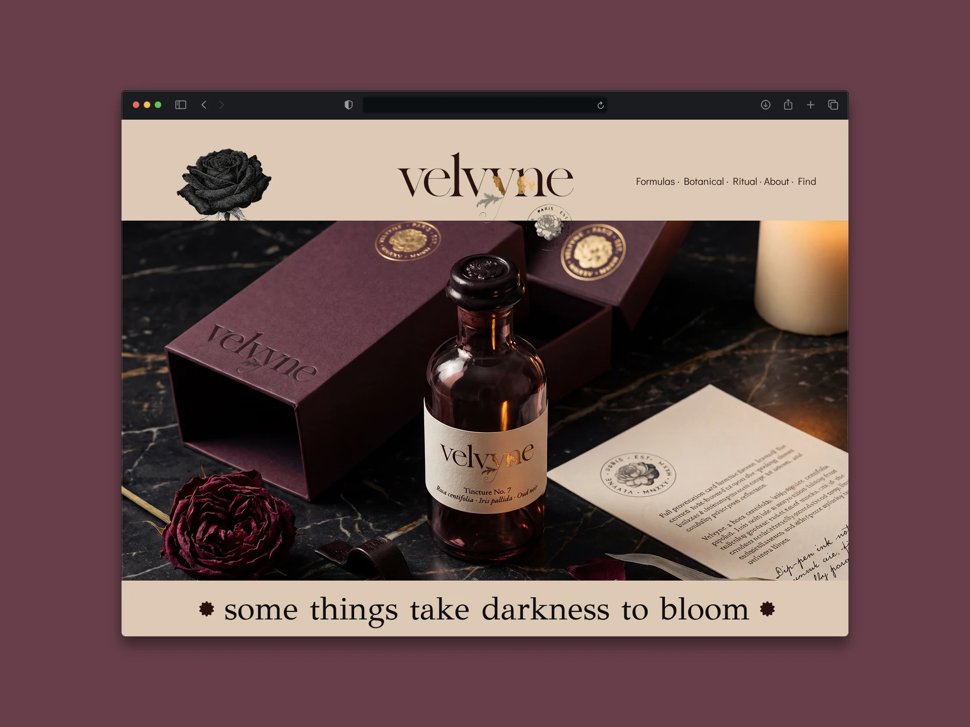
The Entry
No loading screen. No pop-up. No cookie banner on first sight — handled in the footer, legally, invisibly. The page simply opens.
What is there: the full-bleed hero. The product on dark marble, candlelit, exactly as the photography direction specifies. The wordmark in parchment, upper left. Navigation in tracked small-caps across the top right: Formulas · Botanical · Ritual · About · Find. Five words. No icons, no hamburger, no search bar visible. The navigation is a sentence, not a menu.
The hero scrolls at a fractionally slower parallax than the page — the bottle appears to be sinking slightly as you move downward, disappearing into the darkness below. It takes approximately four seconds before any other content enters the viewport. Those four seconds are intentional. The site asks for your attention before it gives you anything.
The Navigation Philosophy
Formulas — the products, reached through ingredient stories, not category grids. You do not browse by product type. You read about Rosa centifolia and arrive at Tincture No. 7 as a conclusion, not a thumbnail.
Botanical — the ingredient glossary. Each entry is a full text: origin, harvest, chemistry, the reason it is in the formula. Written in the brand voice. Illustrated with copperplate botanical drawings. This section has no commercial function. It exists because the brand believes the person who understands the ingredient understands the product.
Ritual — editorial content. Not a blog. Not "tips." Texts on the history of fragrance, the chemistry of dusk-harvesting, the apothecary tradition in 19th-century Paris. Long-form. No comments. No share buttons. The content is not optimized for traffic — it is written for the person already there.
About — one page. The founding text, set in the humanist serif at reading size with generous leading, no subheadings, no bullet points. A single image: not a founder portrait, not a team photo — the atelier address on a piece of cotton paper, handwritten.
Find — stockists only. A short list of selected apothecaries by city. No map widget, no filter, no geolocation request. A list, set in the humanist serif, with city names in tracked small-caps and stockist names in italic below each. The list is intentionally short. Scarcity is part of the proposition.
The Product Page
The product page does not begin with the product.
It begins with the headline — the campaign line for that formula, in GFS Didot at display size, full width, on parchment ground. Then the botanical illustration, full bleed, the same copperplate engraving from the packaging. Then, after scrolling past both of those: the product photography. Then the ingredient provenance text — two to three paragraphs, body copy, humanist serif. Then, and only then: the bottle. Photographed. A price. A quiet text link — Add to ritual — in tracked small-caps, Dusty Mauve, 13px. No button. No quantity selector visible until clicked. No related products. No reviews.
The page ends with a single italic line: "Formulated in small batches. Availability is limited by design." Below it, the Velvyne seal at 48px, centered — the only centered element on the entire site.
Typography on Screen
GFS Didot loads via Google Fonts. Display sizes only — 48px minimum. Below that the font renders poorly on screen at certain weights and the thin strokes suffer. This is a known limitation of extreme Didone serifs in digital environments and I designed around it rather than ignoring it.
Body copy switches to EB Garamond at 17px, line-height 1.75. This is generous — more generous than most cosmetic brand sites, which tend toward tight editorial density. Velvyne's pages breathe. White space — parchment space — is not empty. It is the dominant texture of every page.
All body copy is left-aligned. The one exception: the closing seal on the product page, centered. That exception is visible because every other element on every other page is left-aligned. The eye notices. The centering of the seal feels like a formal conclusion, a full stop, because nothing else on the site behaves that way.
Color on Screen
Parchment (#E8DDD0) as the page background throughout — never white. On screens this reads as slightly warm, slightly aged. On some monitors it will look almost white. On others, distinctly cream. This variance is acceptable. The brand does not require color precision from the viewer's hardware.
Plum Black (#1A0A1E) for all type. At small sizes on parchment ground this reads as very dark warm grey — never harsh, never pure black. The combination has the quality of ink on aged paper, which is exactly the quality it should have.
The only moment of darkness on the site is the hero — full-bleed photography on Plum Black. Every other page is parchment. The darkness is the entrance. You pass through it and arrive somewhere warm.
Motion
One principle: everything moves slower than expected.
The hero parallax. The page transitions — cross-dissolve, 400ms, no slide. Hover states on navigation links: the text fades to Dusty Mauve over 300ms, not instantly. The product photography on hover: a fractional zoom inward, 600ms ease, as if leaning closer. No bounce, no spring physics, no elastic easing. Everything decelerates into its resting state.
The one exception: the botanical illustrations on the Botanical section scroll at their own pace — slightly faster than the page content, as if they are rising toward the reader rather than moving with them. This is the only place motion calls attention to itself. It is a single gesture, used once, and it works because it is the only one.
What the site is not
Not a Shopify theme. Not a template with brand colors applied. Not optimized for conversion rate in the conventional sense — no urgency messaging, no countdown timers, no "only 3 left" notifications, no exit-intent pop-ups. Not designed for the person who arrived by accident and needs to be convinced. Designed for the person who arrived on purpose and needs to be respected.
The site assumes the visitor already suspects they want this. Its job is to confirm that suspicion slowly, with quality, and then step aside.
What This Project Taught Me
Working against my instincts was the point. My usual vocabulary — tension, friction, visual aggression — had no place here. Velvyne required me to find power in the opposite direction: in restraint, in warmth, in the calculated use of empty space, in details placed for the one person who looks closely rather than the many who glance.
The discipline that brutalism and hypernoise demand is actually the same discipline, expressed differently. Both require complete commitment to a system. Both punish decoration that isn't load-bearing. Both reward the viewer who pays attention.
The difference is that Velvyne whispers, and I had to learn to trust that a whisper, in the right room, carries further than a shout.
Self-initiated case study · 2026
Brand identity, art direction & creative strategy, website
Like this project
Posted Mar 25, 2026
Created Velvyne's brand identity and website, focusing on dark romanticism and historical aesthetics.
Likes
0
Views
36
Timeline
Mar 2, 2026 - Mar 25, 2026