Built with Lovart
STROKE Brand Identity and Website Development
Révolté
STROKE — Brand Identity and website Case Study
Révolté
Year: 2026
Scope: Naming, Identity, Typography, Copywriting, Digital, Apparel, Collateral
The Brief
A fictional contraculture fashion brand. No heritage to borrow, no archive to reference, no mood board of existing brands to triangulate between. The brief was a single constraint and a single question.
The constraint: the logo must be drawn in one continuous line, never lifted, every angle exactly 90 degrees.
The question: what does a brand look like when it refuses every convention of how brands are supposed to look?
The Insight
Every fashion brand builds mythology around its origins. The founder's vision. The atelier. The archive. The craft lineage.
STROKE has none of that. STROKE has a wall.
The brand is built on a single truth: the act of marking a surface is itself a statement of ownership. You don't ask permission to tag a wall. You don't explain yourself afterward. You make the mark and you walk away.
The logo is the brand philosophy made visible. One gesture. No revision. No going back.
The Logo
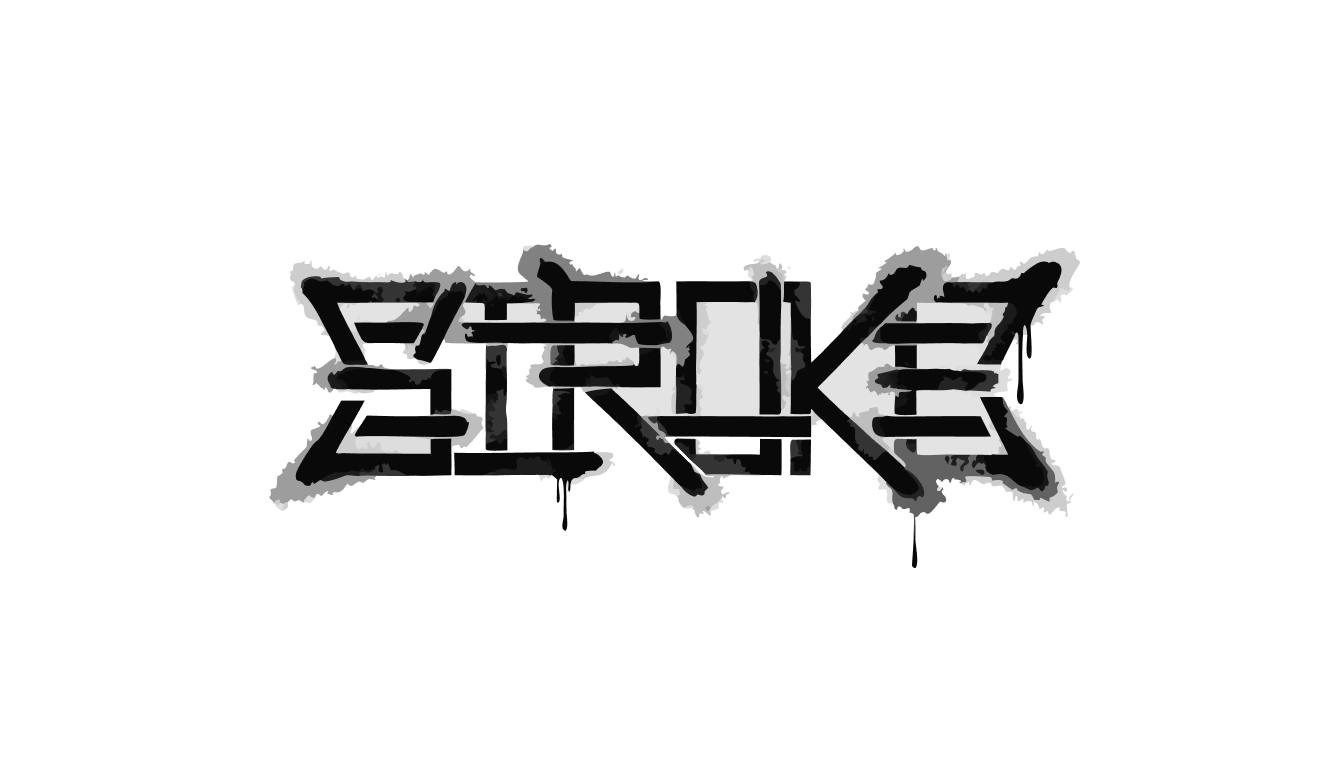
The entire wordmark is constructed as a single orthogonal system — one continuous line traveling through all six letters without ever lifting, without ever curving, with every directional change at exactly 90 degrees.
The alphabet was rebuilt from scratch. Each letter is a pure geometric construction: the S becomes three horizontal bars connected by vertical jumps, the O a hollow square, the K two right-angle arms off a vertical stem. No diagonal. No curve. No concession to legibility over logic.
The stroke itself is pressure-variant — thick where the hand holds, thin where it accelerates. Overspray bleeds at every corner. The fill is not solid but a dense aerosol texture, darker at center, fading at edges. A ghost pass offset by two pixels suggests a second coat started before the first dried.
The result is a mark that looks like it was drawn by someone who knew exactly what they were doing and did it fast and walked away without looking back.
Palette
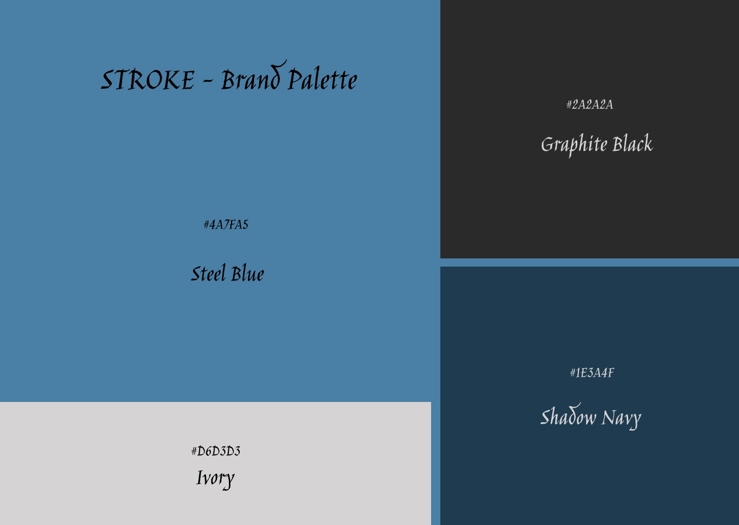
Four colors. Each one earned, not chosen.
Steel Blue — #4A7FA5 — the dominant color. The exact tone of concrete under a sodium streetlamp at 2am. Cold without being corporate. Present without being loud. It is the color the brand lives in.
Graphite Black — #2A2A2A — not pure black. Slightly warm, slightly dusty, like a wall that has been tagged and painted over and tagged again. The color of surfaces that have a history.
Shadow Navy — #1E3A4F — the darkest register. Used where black would be too aggressive and blue too bright. The color of the space between the two — depth without drama.
Ivory — #D6D3D3 — not white. Off, slightly grey, slightly cold. Used for text on dark grounds and for the sticker sheet stock. The only light value in the system and the most restrained.
No warm tones. No amber. No red. The entire palette exists in a cold register that refuses comfort without demanding attention. Every color was found in the same place the brand lives: outside, at night, in weather.
Typography
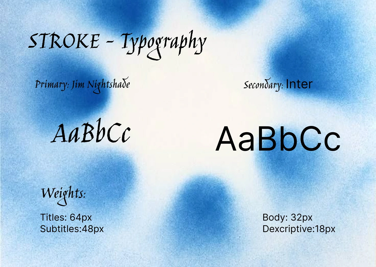
Two typefaces. One tension.
Jim Nightshade is the primary voice — an italic blackletter with genuine irregularity, almost calligraphic, historically rooted but not decorative. It carries the brand's headings, titles, and all display-scale text at 64px for titles, 48px for subtitles. The choice is deliberate and unexpected: a gothic script in a contraculture streetwear context reads as anachronistic aggression. It looks like it was pulled from a medieval manuscript and stenciled onto a loading bay door. That contradiction is the point.
Inter is the secondary voice — geometric, neutral, invisible when working correctly. Used for body copy at 32px and all descriptive text at 18px. It provides no personality of its own. That is its job.
The pairing works because they share nothing. Jim Nightshade is historical, expressive, almost violent in its calligraphic weight. Inter is contemporary, rational, frictionless. Together they describe the same brand from two completely opposite directions — the mythological and the operational. The brand title arrives as a threat. The product information arrives as a fact. Neither register softens for the other.
Copywriting
The brand speaks in five words or fewer. Never explains. Never justifies.
Every clean surface is an invitation.
This is the only line the brand ever needs. It is a philosophy, a threat, a business model, and a product promise simultaneously. It appears on the website hero beneath the logo and nowhere else. It does not need to appear anywhere else.
Supporting lines follow the same logic:
Clothes for people who don't need a slogan.
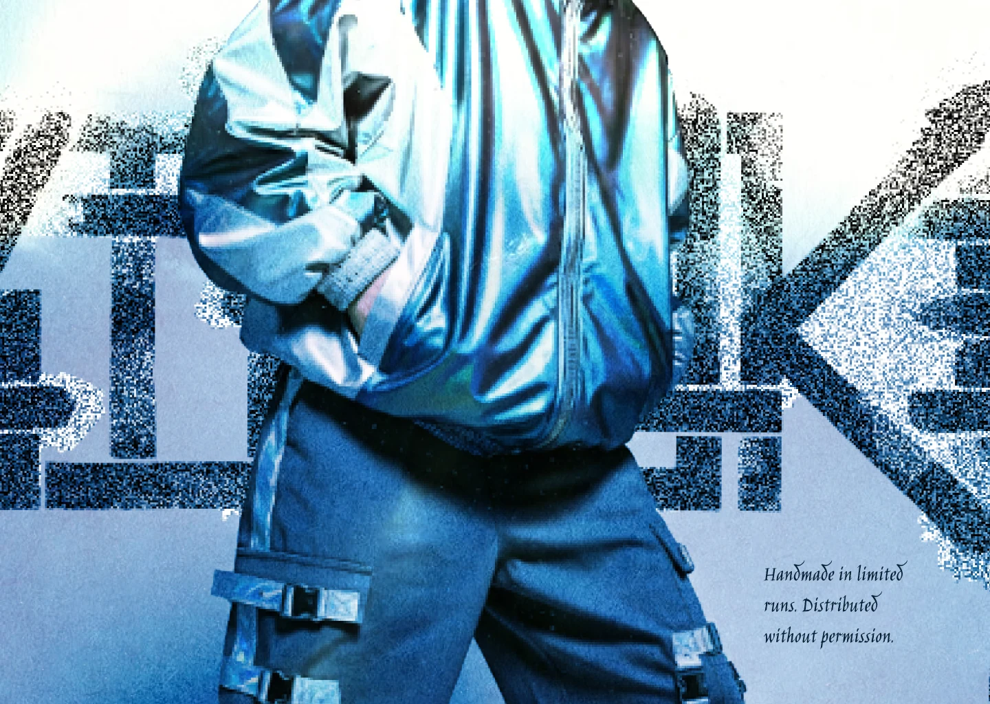
Handmade in limited runs. Distributed without permission.
We don't have a story. We have a wall.
Each line is set in Inter at descriptive scale, same size, no hierarchy between them. They are not a campaign. They are a posture.
Website
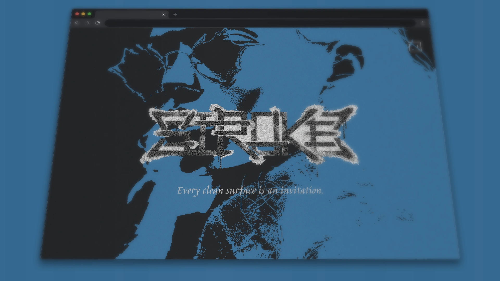
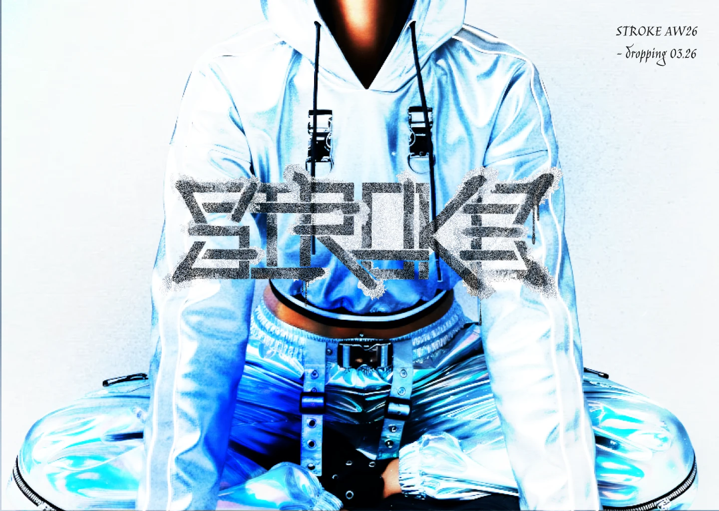
The hero is full-bleed: a high-contrast duotone figure rendered in Steel Blue on Graphite Black, with the STROKE wordmark centered at eye level, spray texture visible at full resolution, overspray halos bleeding into the background image. The subline sits below in Inter at minimum size, left-aligned, understated against the scale of everything above it.
There is no navigation bar. There is no hamburger menu. There is a single muted icon in the top right corner — a sound toggle. The site plays ambient sound by default: the hiss of a spray can, distant, looped.
The only interactive element above the fold is a single arrow pointing down. It does not say scroll. It does not say explore. It points.
Apparel
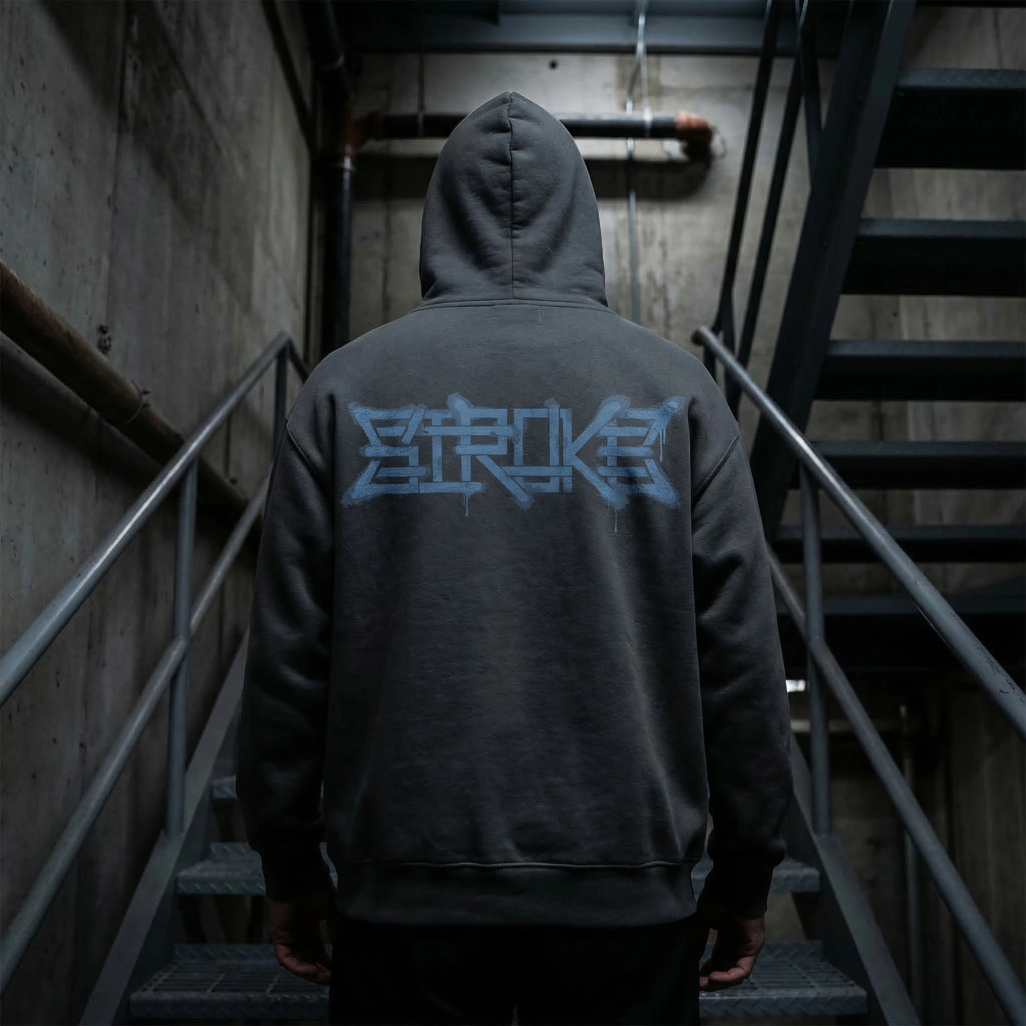
The hoodie is the primary object. 500gsm stonewashed cotton, charcoal, the STROKE wordmark sprayed across the full back panel in Steel Blue — not printed, stenciled. The spray bleeds into the fabric weave at the letter edges. No two are identical. Shot from behind in a raw concrete stairwell, single overhead source, the figure walking away. The brand never shows a face.
The cap is matte black with a rectangular patch on the front panel: the STROKE wordmark on a Steel Blue ground, stitched border, tone-on-tone logo pressed into the leather-look patch. Shot under a single overhead beam in pure black — the only light source in the frame. The product floats. The darkness is the background.
Collateral
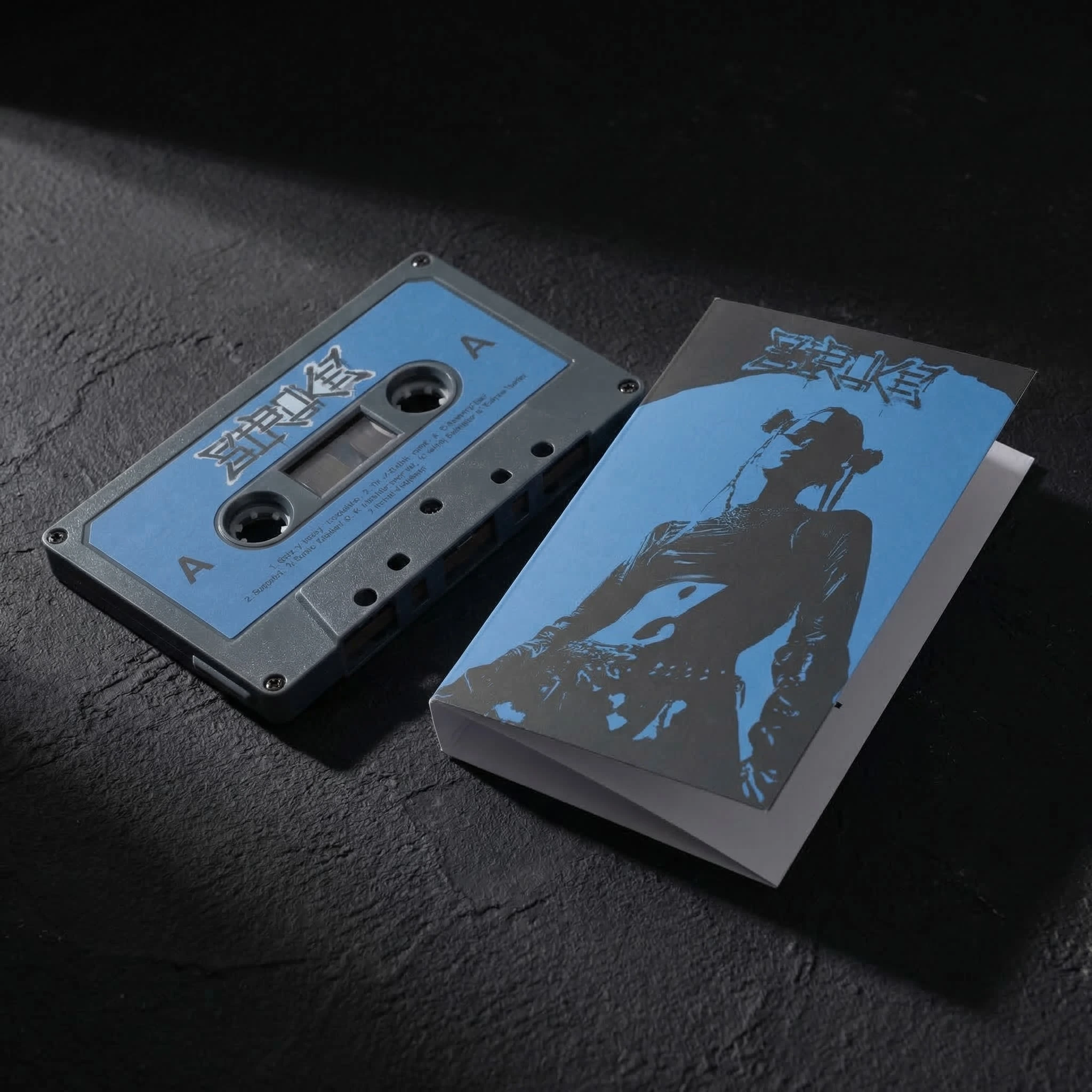
The cassette tape is the artifact that makes no functional sense and therefore makes complete sense for this brand. Steel Blue shell, the wordmark on the A-side label, a duotone figure on the inlay card. It is not a music release. It is a collectible object that communicates the brand's relationship with obsolete formats — things that were declared dead and kept being used anyway by the people who understood them.
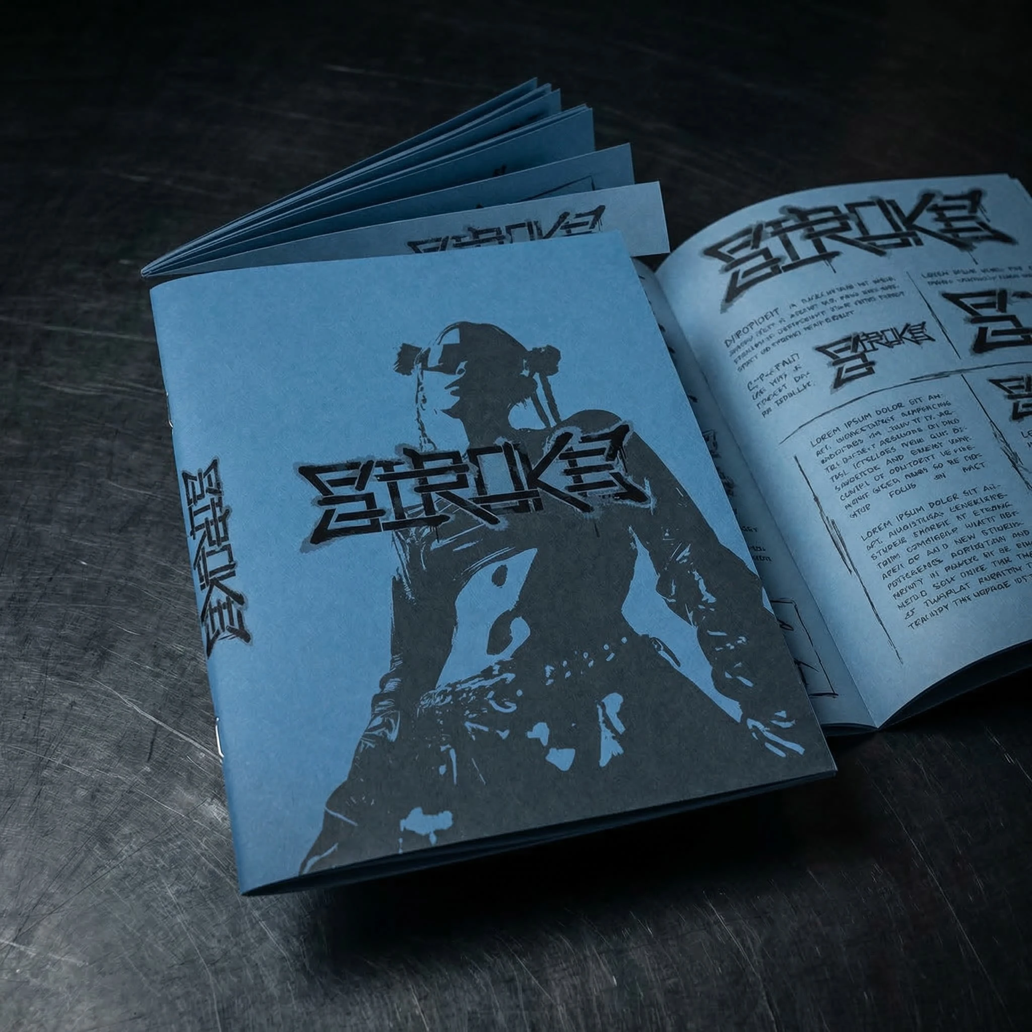
The zine is A5, saddle-stitched, Steel Blue cover stock, the logo screenprinted in Graphite Black. Inside: brand imagery, the logo system at various scales, fragments of the copywriting set in different configurations across Jim Nightshade and Inter. It is distributed physically only, at specific locations, with no announcement of where or when.
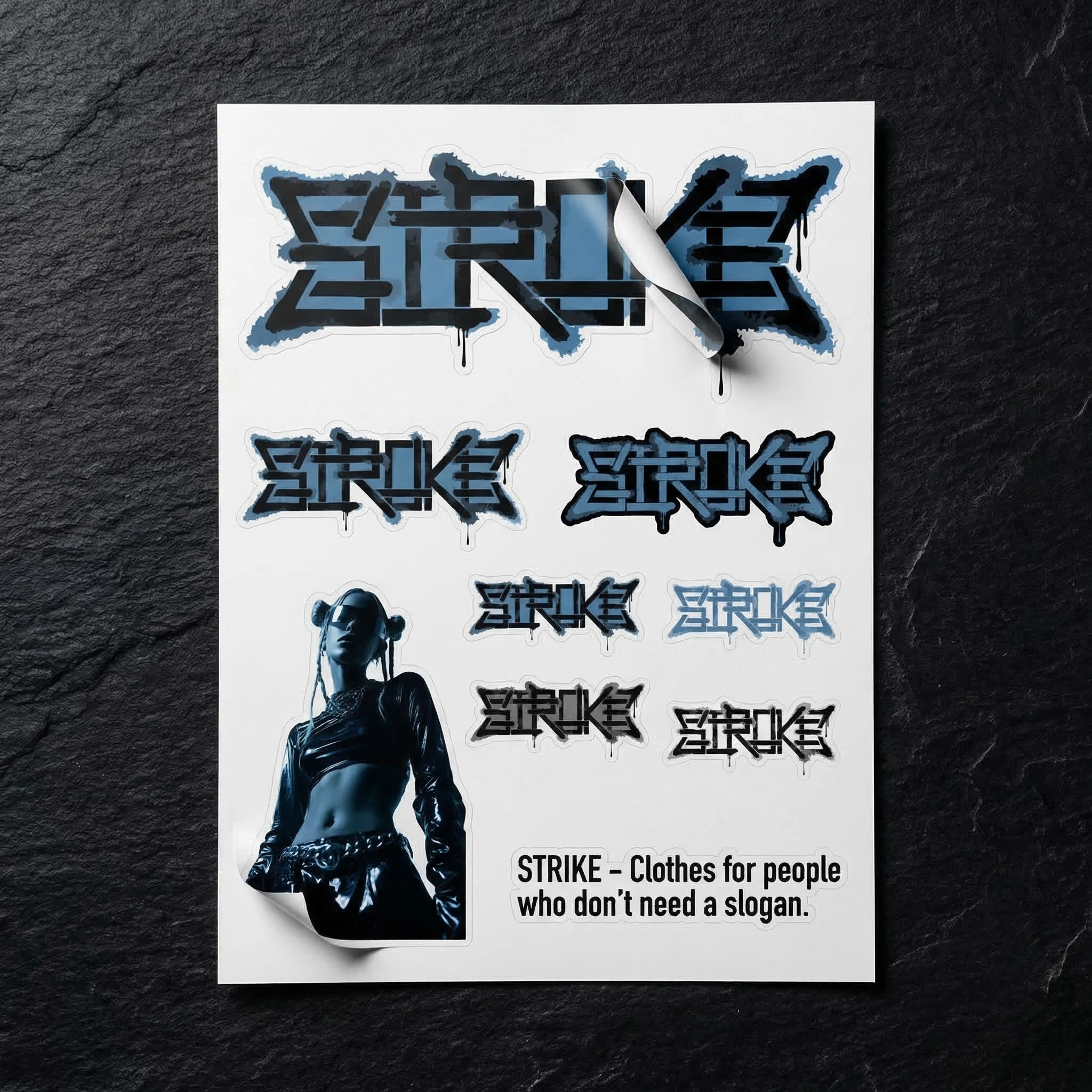
The sticker sheet is the most democratic object in the system — nine logo variations at different scales and colorways, die-cut, on Ivory stock. It is the brand's permission slip. Put it wherever you think it belongs.
The wheat-paste poster is A0 newsprint, two colors, the duotone figure and the wordmark. It exists in the street first, in the lookbook second. The photograph of it peeling off a crumbling wall in late afternoon light is the most honest image in the entire project.
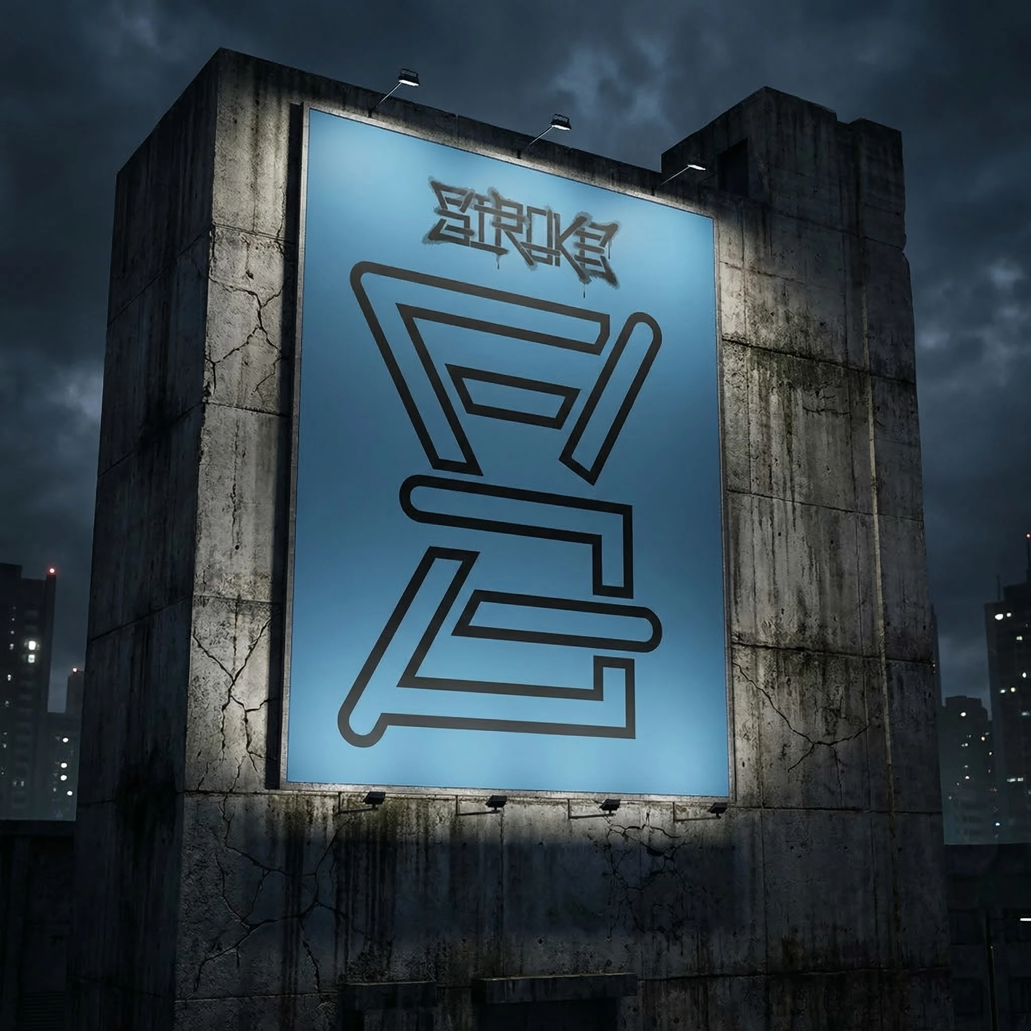
The billboard shows the S monogram enlarged to architectural scale on a backlit Steel Blue panel mounted on a brutalist concrete structure under storm clouds. The brand name sprayed above it in small scale in Jim Nightshade, as if someone tagged the billboard after it was installed. As if the brand arrived before the advertising did.
The lookbook cover is pure Graphite Black, the wordmark in white spray positioned in the lower third — deliberately low, refusing the center. Top left corner: AW26 in amber, 8pt, the only warm tone in the entire system, present for exactly one moment and never repeated. The spine is Steel Blue, STROKE running vertically in Jim Nightshade. Shot on concrete in direct sun, hard shadow cutting across the cover at 45 degrees.
The Thread
Everything in this system follows the same decision: the mark comes first, the explanation never arrives.
The logo doesn't tell you what the brand is. The cassette doesn't play music. The stickers don't come with instructions. The website doesn't have a nav. The poster doesn't have a date.
STROKE gives you the mark. What you do with it is your problem.
Every clean surface is an invitation.
Brand built by Révolté, independent brand/web designer.
→ www.revolte.design
Like this project
Posted Mar 19, 2026
A controculture fashion brand built on one rule: one line, no curves, 90° only. Logo drawn like a tag. Distributed without permission.
Likes
0
Views
19
Timeline
Mar 2, 2026 - Mar 19, 2026