Built with Lovart
REMNANT Website and Brand identity
Révolté
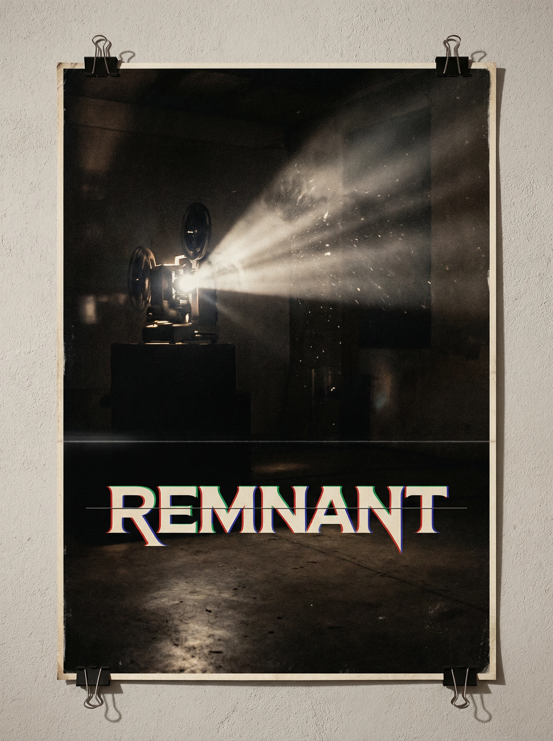
REMNANT
Brand Identity Case Study
Chromatic Decay — Naming, Logo System & Brand World
The Brief
A film restoration and post-production studio needed an identity capable of holding two contradictory truths simultaneously: that deterioration is beautiful, and that the act of preserving something against entropy is a form of obsession. The studio works on material other people have abandoned — damaged negatives, corrupted transfers, orphaned footage. The brand needed to feel like it understood what it was saving, and why it was worth saving.
The result is REMNANT.
Naming
Ten names were developed across the full semantic range of the brief — chemical, temporal, technical, poetic. The shortlist spanned single-syllable precision (GRAIN, ETCH) through to charged atmospheric words (AFTERBURN, DISSOLVE). The final selection, REMNANT, was chosen for its irreducibility: one word, seven letters, no disambiguation required. It names the thing the studio works with — what survives after everything else is gone — and positions the studio as both archaeologist and guardian. It sounds like a studio that handles things other people have given up on. It sounds, in the best possible way, like a film title.
Logo System
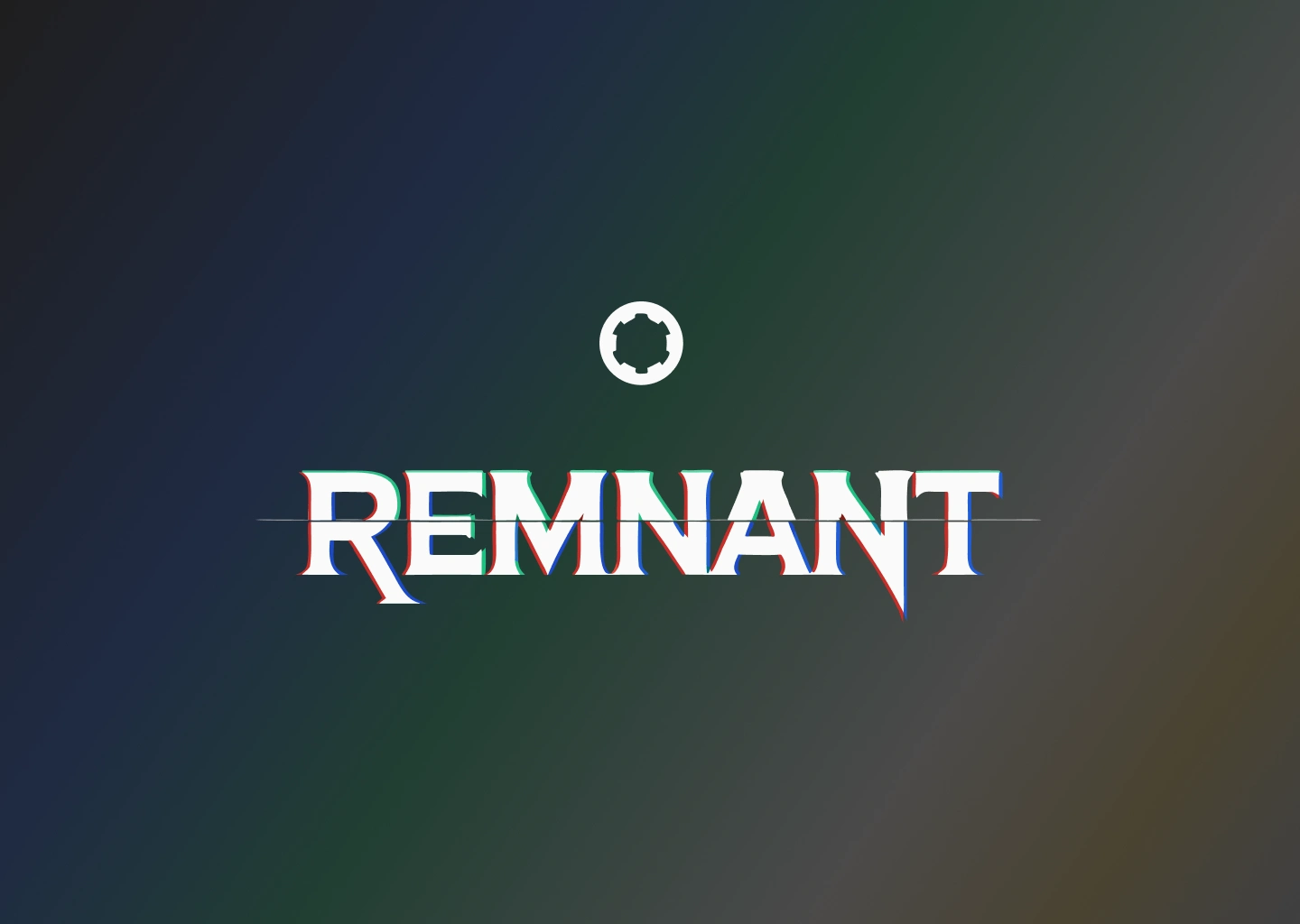
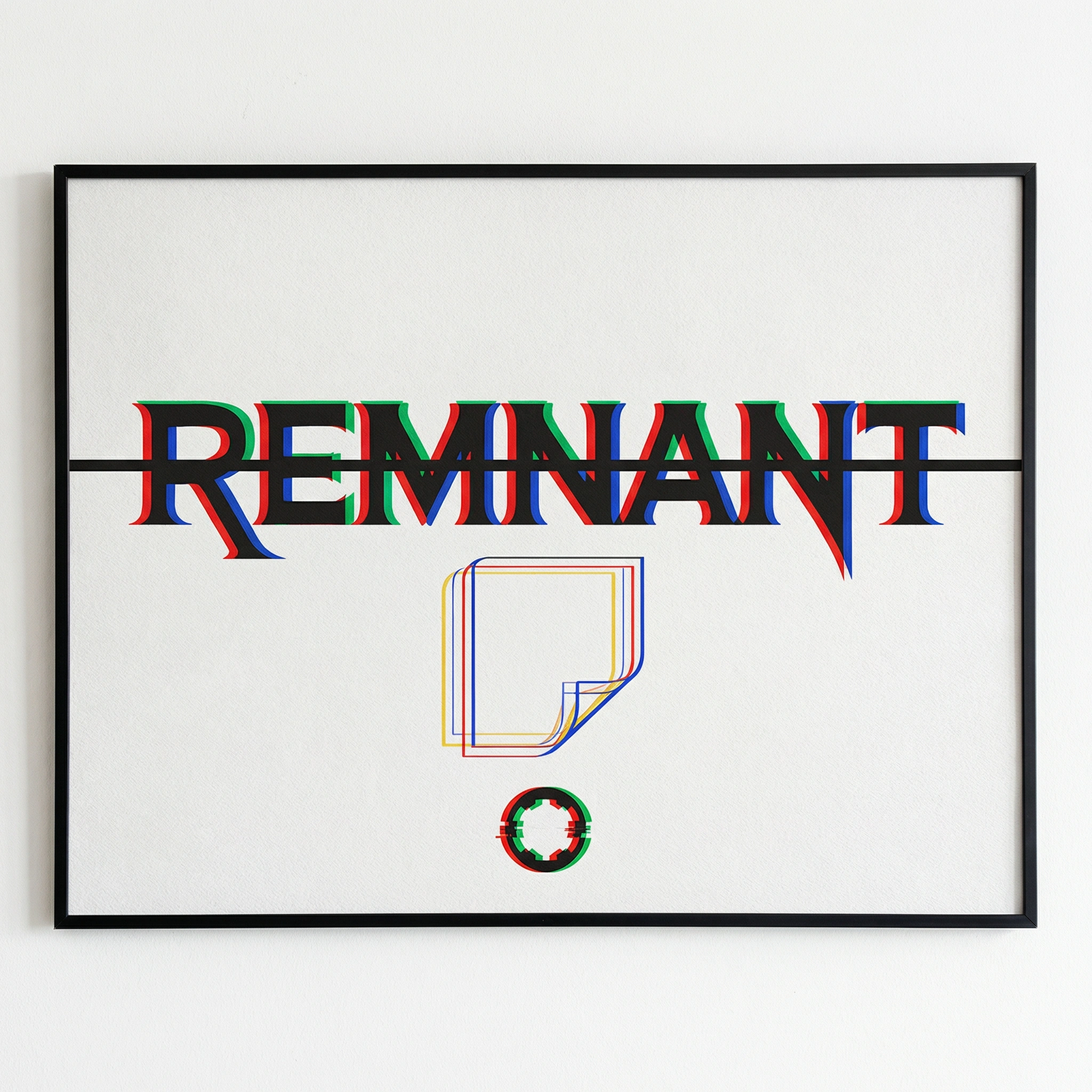
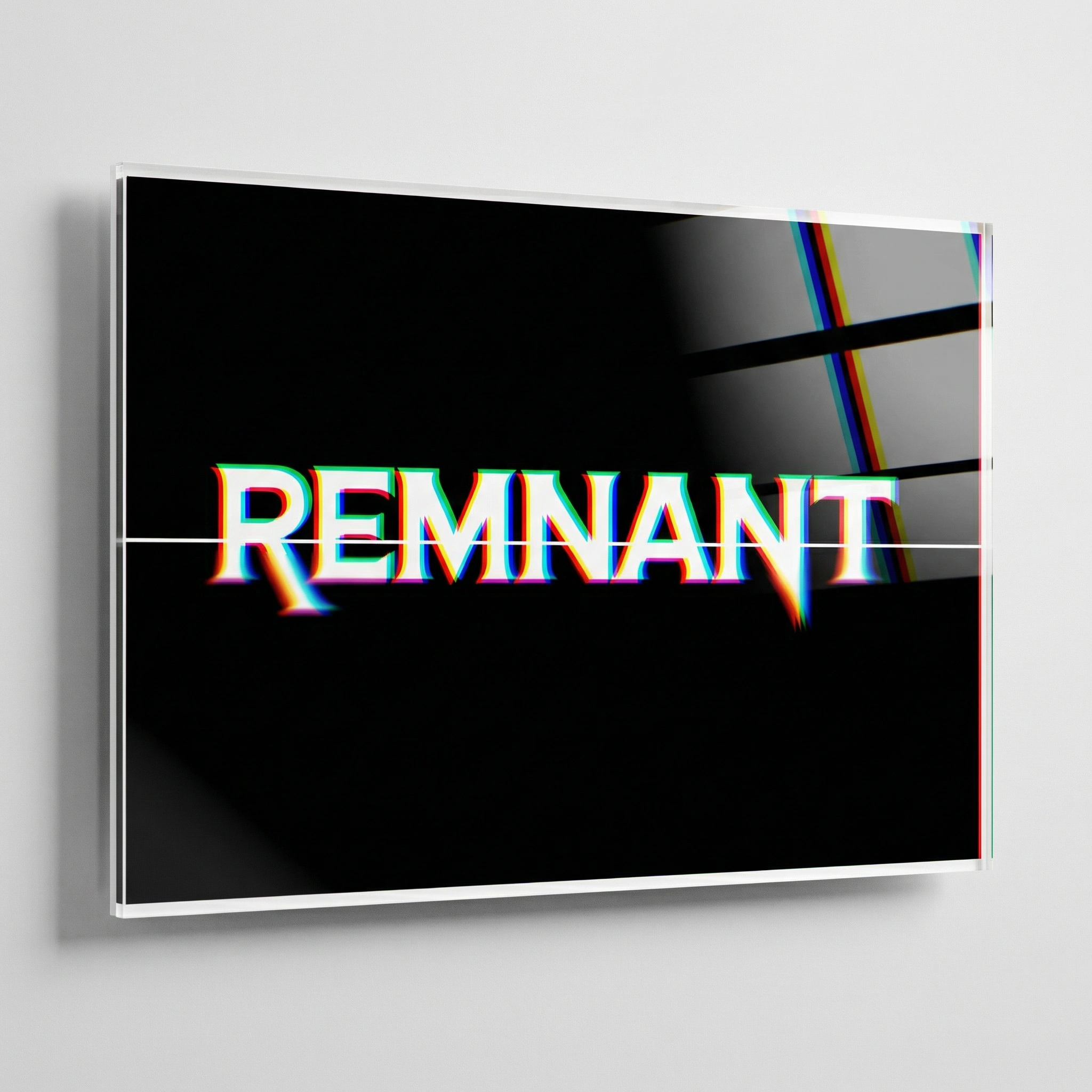
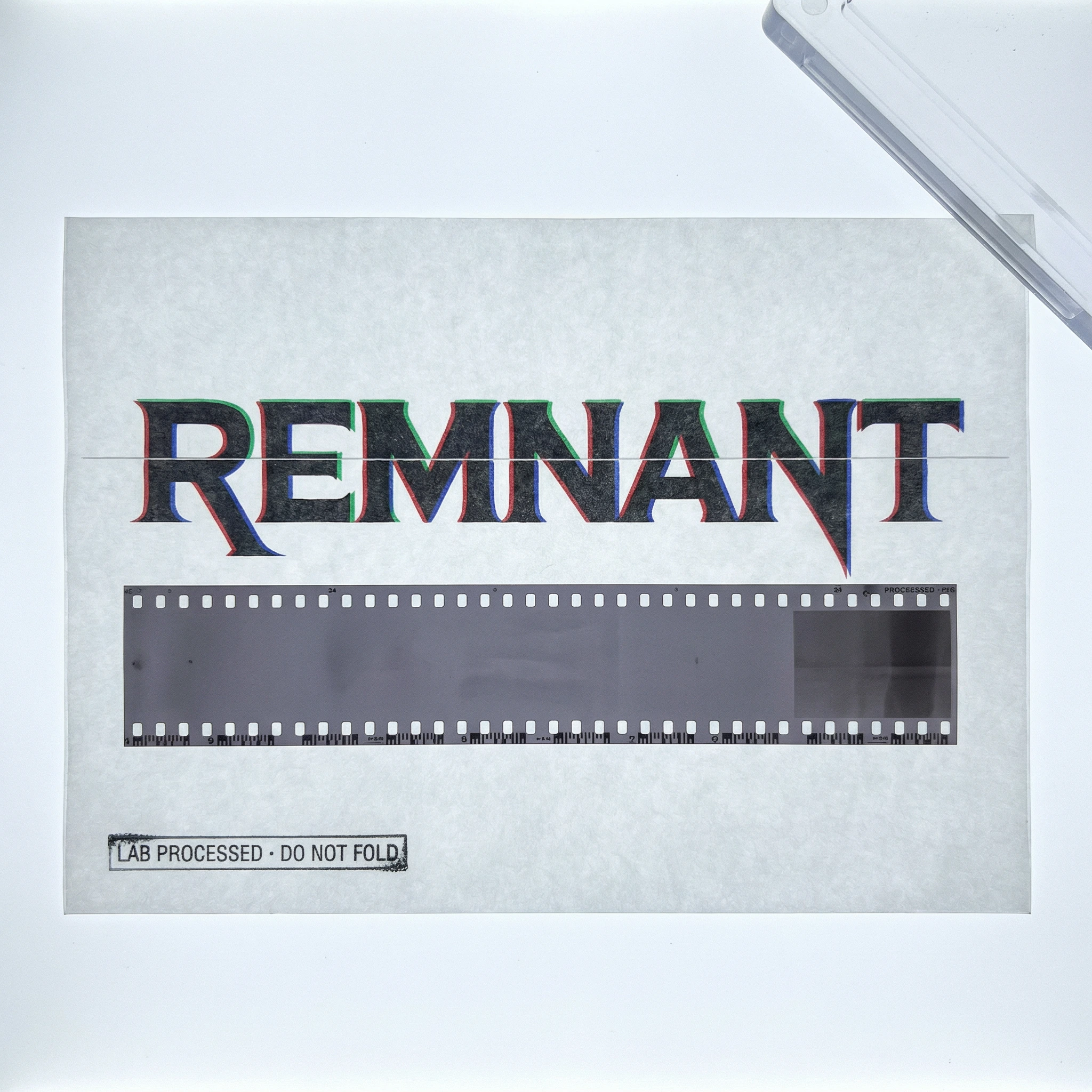
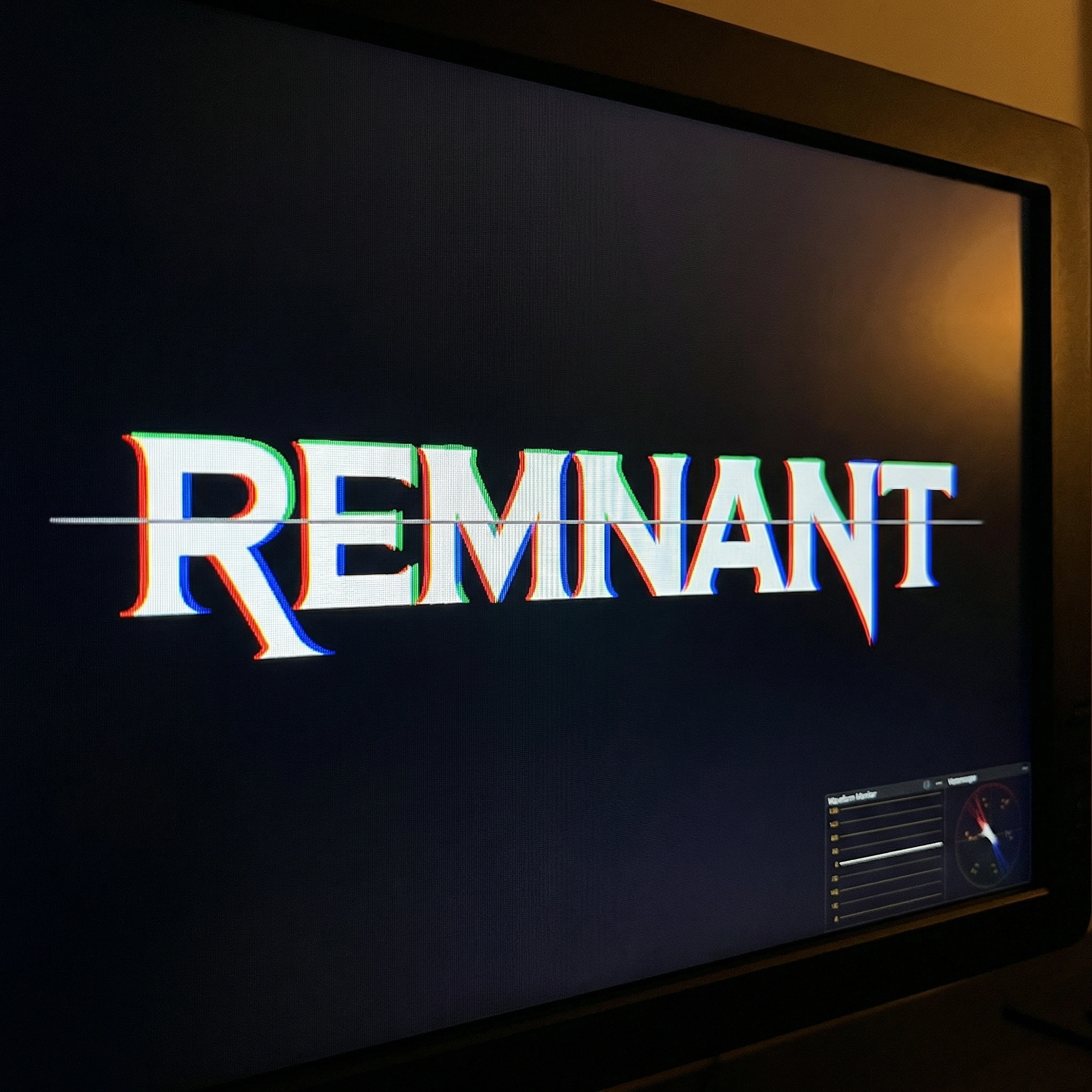
The wordmark is set in a modified condensed grotesque with deliberate micro-imperfections — optical corrections reversed, tracking tighter than comfortable, the kind of rigour that only becomes visible when you know where to look. The primary treatment applies a controlled chromatic aberration directly to the letterforms: three colour channels split and offset, red left, blue right, green holding centre. The aberration is not a filter. It is baked into the artwork.
A 0.5px scan line bisects the wordmark at cap-height midpoint — present in every static application, drifting in motion. It does not call attention to itself. It is just wrong enough to be noticed.
The secondary mark abstracts a single 35mm frame to pure geometry: an outlined rectangle in Academy proportions, one corner curling, the interior deliberately empty. The frame holds no image because every image it has ever held is already gone. The tertiary mark — a film reel hub reduced to a circle with four equidistant notches — functions at 16px as cleanly as it does at two metres tall.
The colour system is built from materials, not conventions. Near-black with a warm brown undertone. Aged white at the colour of old paper stock. Film-red, cold blue, and the amber of celluloid held up to transmitted light.
Mockups
Fifteen mockup directions were developed to establish the brand's physical presence across the full range of contexts in which a studio of this kind operates — archival, industrial, institutional, wearable, environmental.
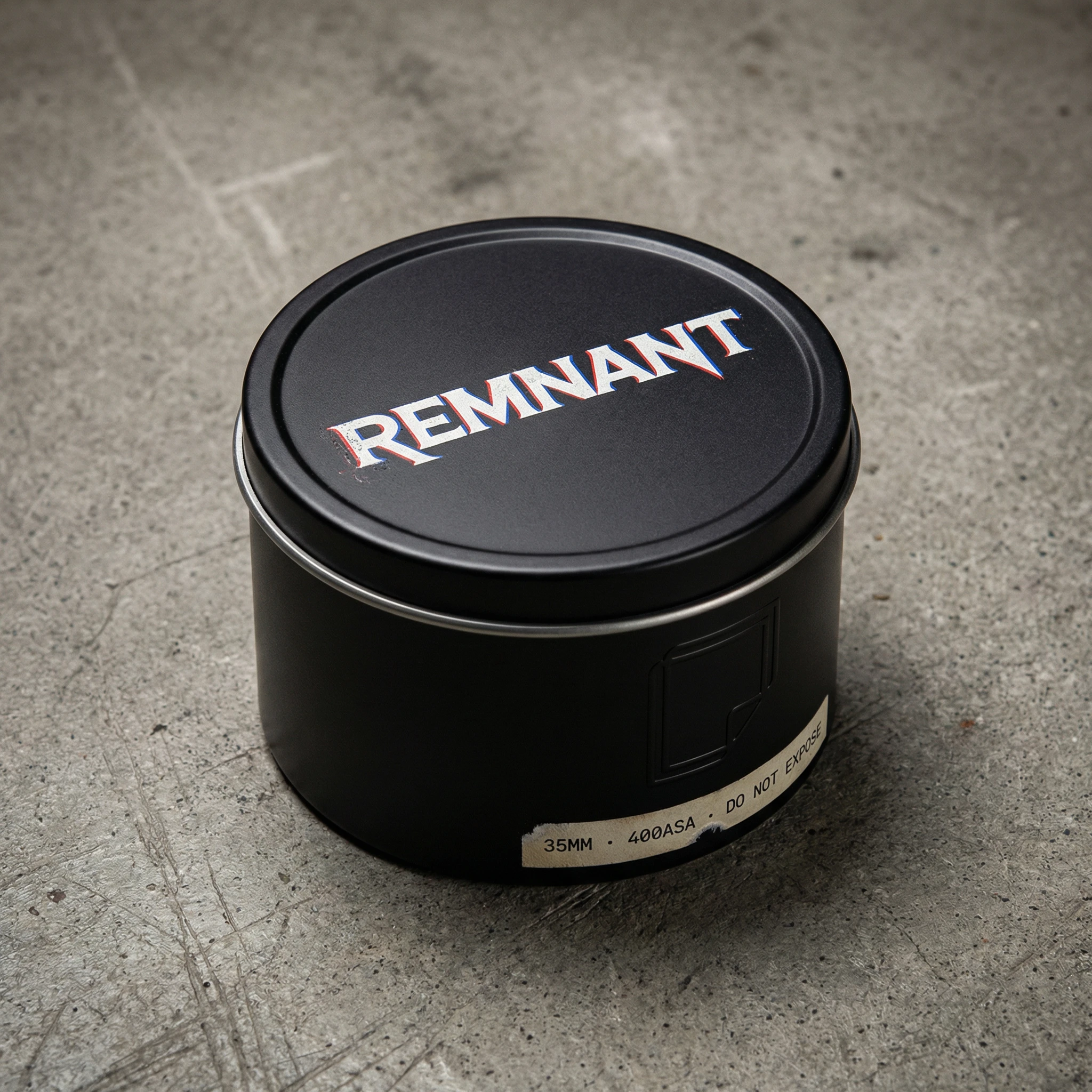
The Reel Can established the brand's relationship to its primary artefact: a matte black 35mm canister on concrete, the wordmark letterpress-pressed into the lid, the secondary frame mark embossed without ink on the side, a specification strip reading 35MM · 400ASA · DO NOT EXPOSE. The brand name sits on the object it exists to protect.
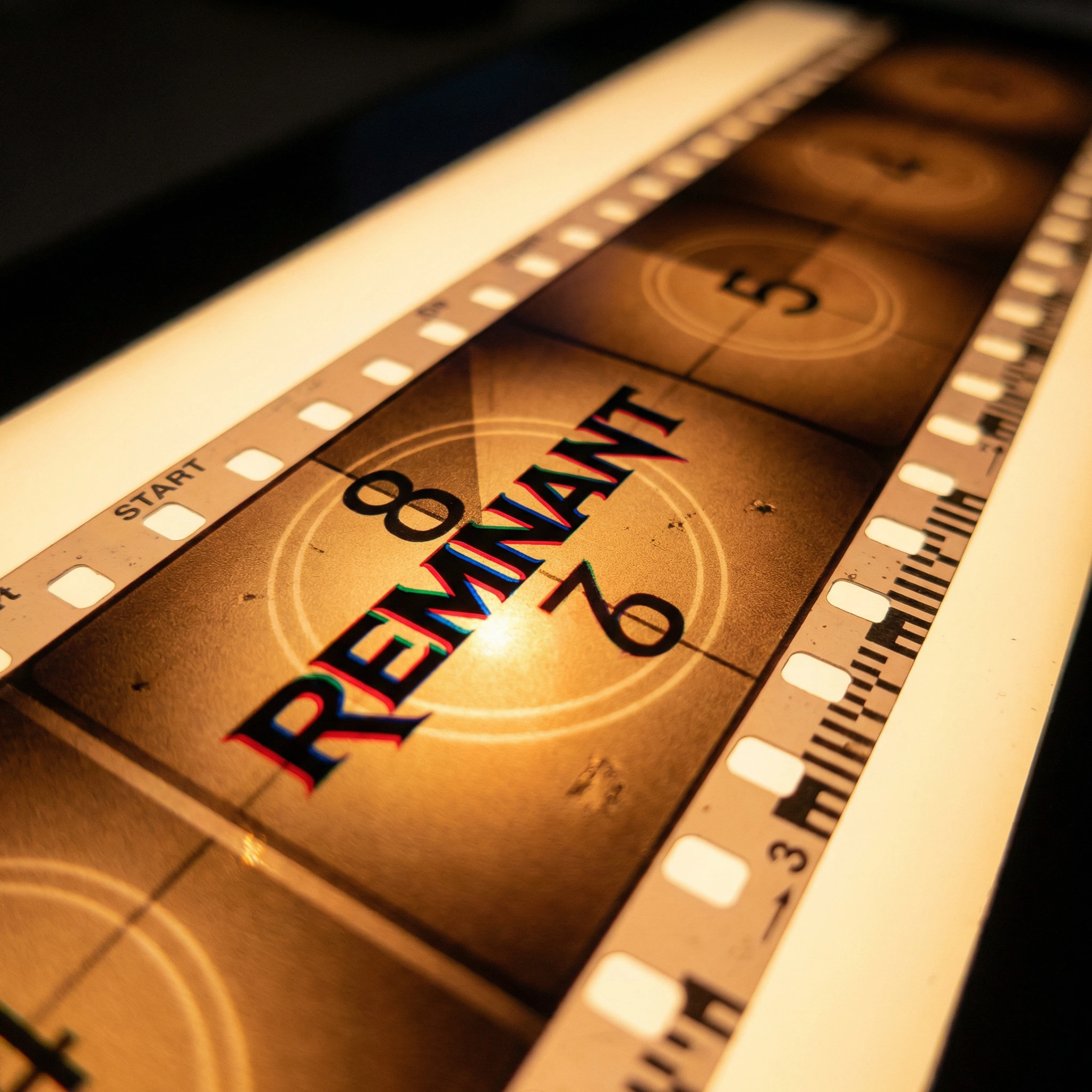
The Leader Tape placed the wordmark directly into the Academy countdown position on a 35mm leader strip, illuminated from below on a light table. The transmitted amber amplified the chromatic split, making the red and blue channels glow independently. This is the brand appearing exactly where a brand like this should appear — at the head of a reel, before anything else has a chance to begin.
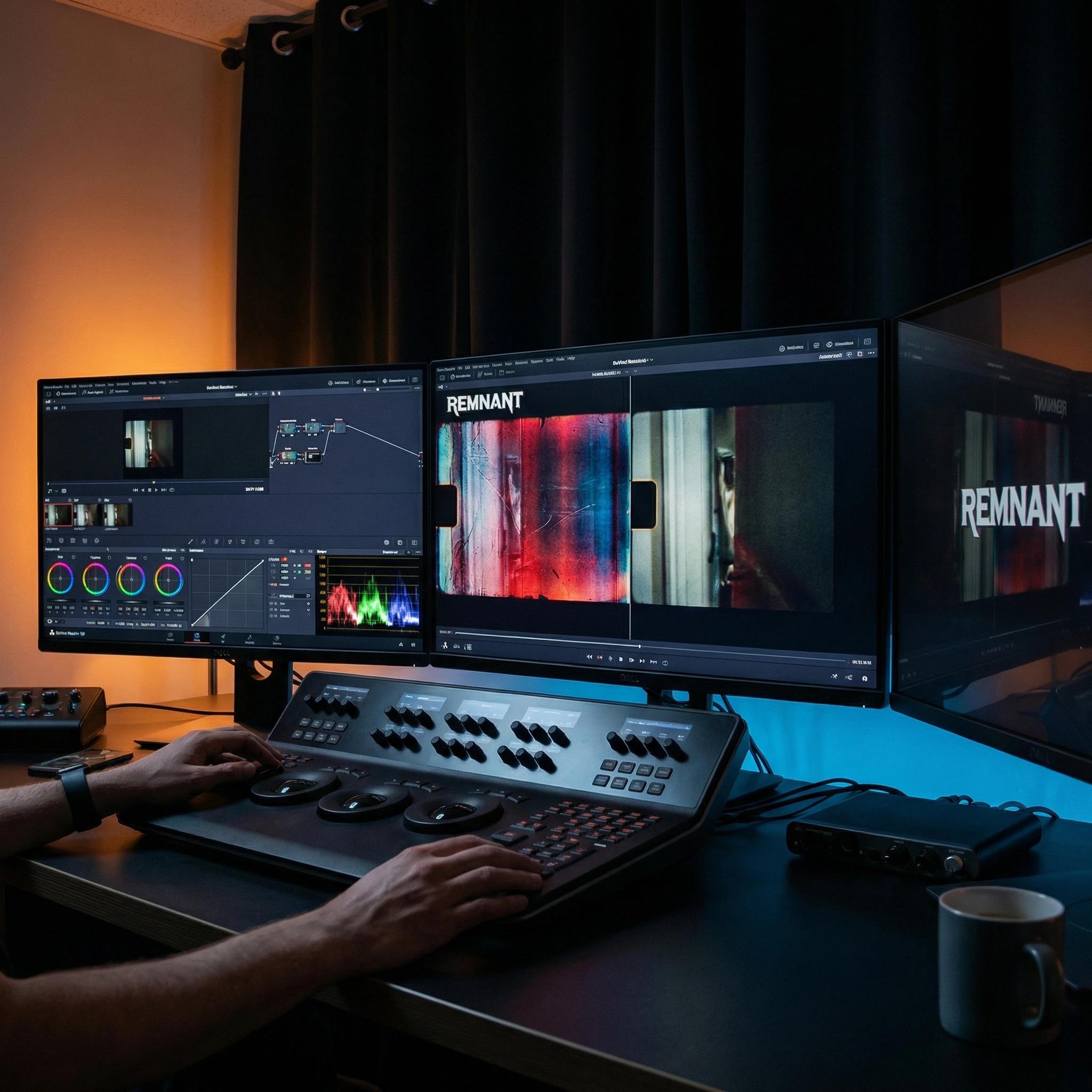
The Grading Suite put the brand to work. Dual reference monitors, a DaVinci control surface, the REMNANT wordmark as a persistent UI element in the upper left while a film frame split-screens between deterioration and restoration. The brand name appears twice — once in the interface, once reflected in the monitor bezel. The ambient light is entirely from the screens: warm on one side, cold on the other.
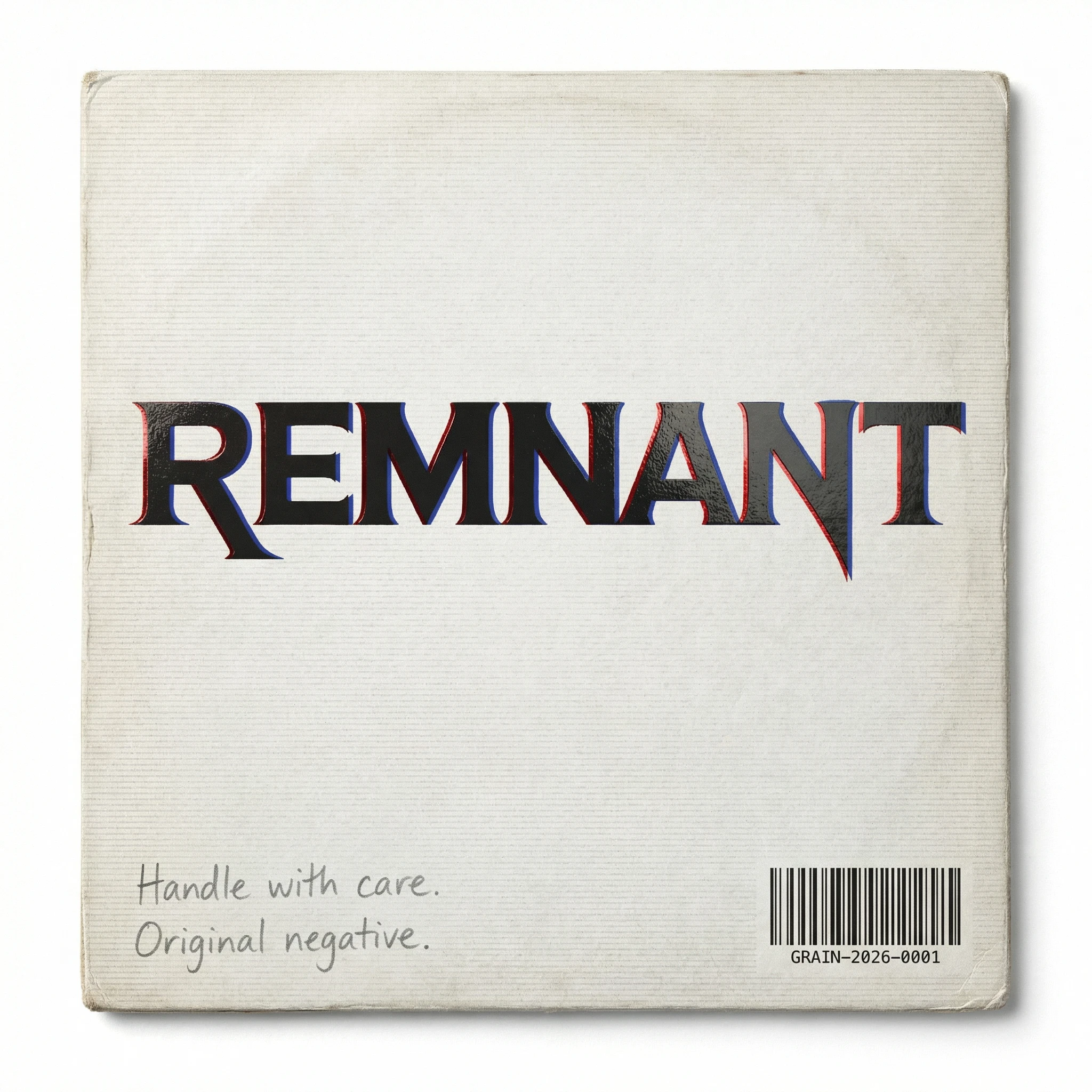
The Shipping Sleeve demonstrated how the chromatic aberration survives material translation. The red channel rendered in spot UV varnish — visible at certain angles, invisible at others — while the blue channel disappears entirely. The barcode reads GRAIN-2026-0001. A pencil note on the reverse: Handle with care. Original negative. The object feels like it was already old before it was made.
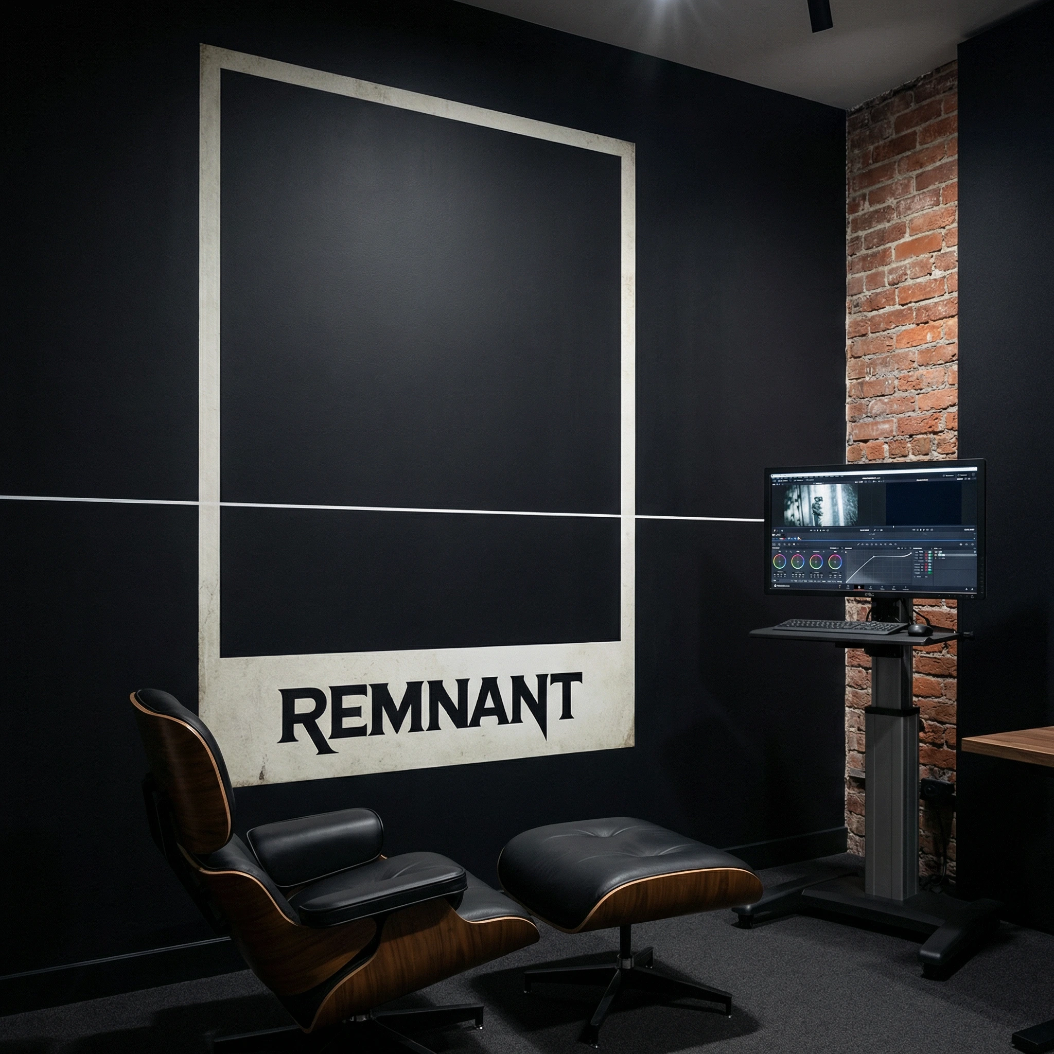
The Edit Suite Wall scaled the secondary frame mark to floor-to-ceiling — two metres of empty rectangle on a near-black wall, the wordmark sitting inside it at the bottom third as a title card, the scan line running at exactly 1500mm from the floor. An Eames chair. A monitor on a stand. Exposed brick on one wall. The room looks like it was designed around the print.
The Motion Freeze is the brand at maximum stress. The wordmark fully split into its three colour channels at the exact moment of greatest separation, a tracking error distorting the centre third, a scan line fully opaque. Printed large on uncoated stock, face-mounted to 5mm acrylic, hung without a frame. The image looks like a mistake. It is the most considered thing in the room.
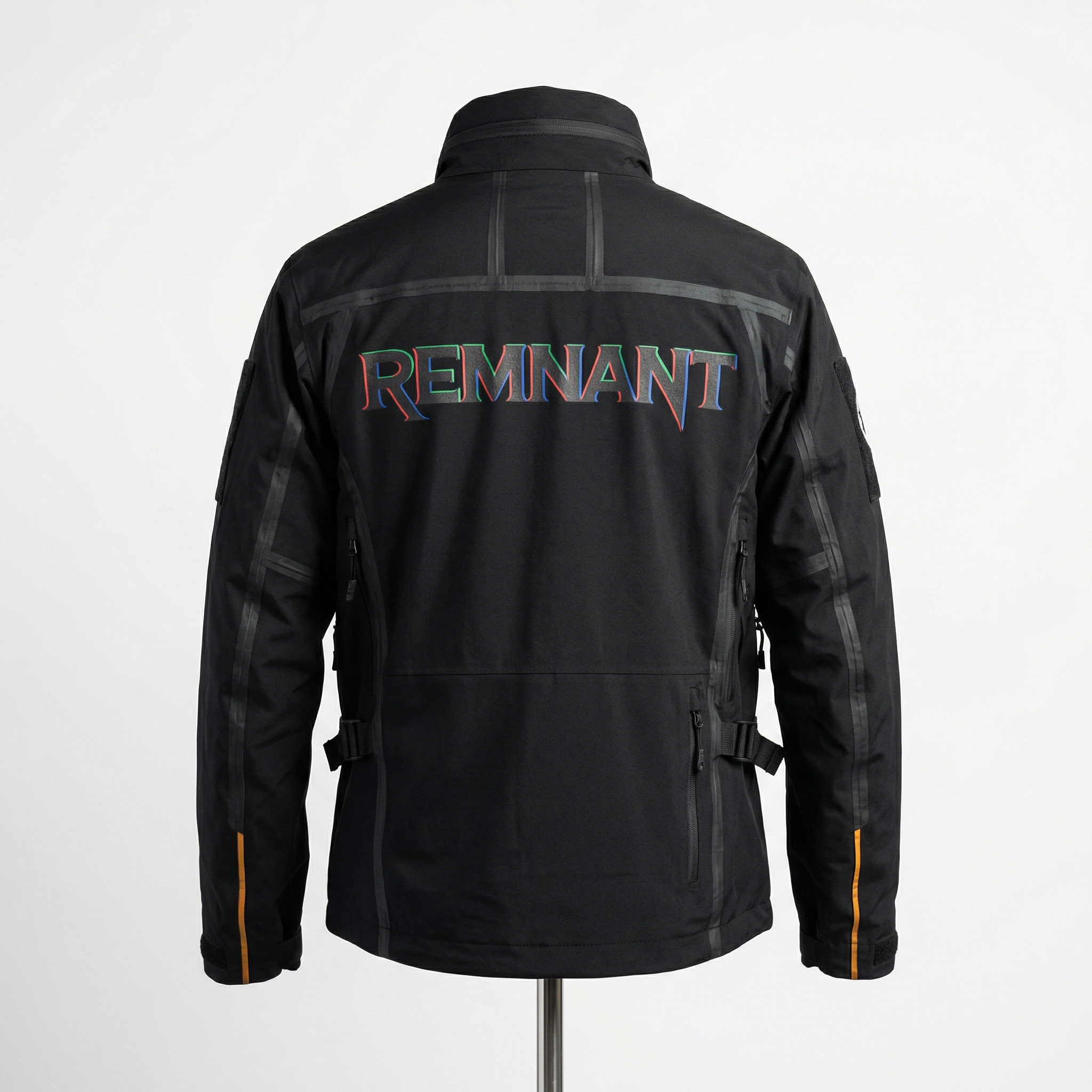
The Operator Jacket translated the chromatic aberration into a physical printing process — the ink applied twice, offset, the separation achieved through craft rather than post-production. The brand sits on the back of a black technical jacket; the tertiary reel-hub mark appears as an embroidered patch at the left chest; the amber stripe runs along both cuffs. The jacket could belong to a colourist, a camera operator, or a restorer. It makes no distinction between them.
The Archive Box placed the brand at rest on a pale oak shelf — a rigid archival box in aged white, the wordmark spanning the spine, the chromatic split legible even at the scale a spine occupies in a room. Behind it: VOLUME I, CHRONICLE, ARCHIVES, DOCUMENTATION, FRAGMENTS, HISTORY. A taxonomy that implies the studio has already been working for decades. The brand name is the largest thing on the nearest box, which means it is the first thing you see from across the room.
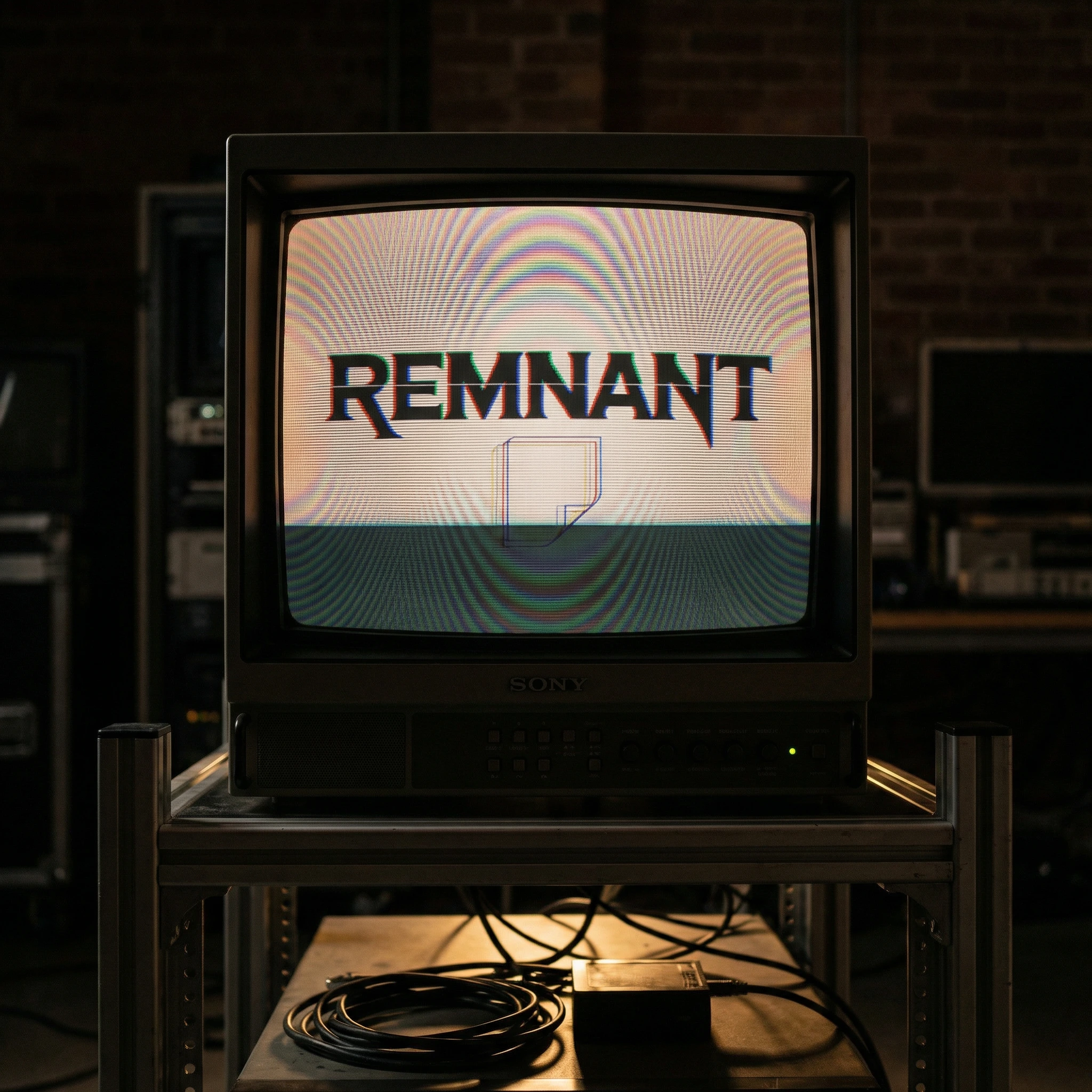
The Playback Screen is the brand meeting its own era. A vintage Sony CRT — the kind used in professional broadcast environments in the 1980s — displaying the motion logo mid-loop in a dark room. The scan lines of the monitor interact with the scan line in the logo design. The screen has a slight barrel distortion. The brand name is the only light source in the frame. The image was photographed, not rendered, which means the camera's shutter speed created a partial refresh line across the lower third of the screen by accident. It was kept.
The Title Card is the brand at its most extreme: 8px channel separation, scan line fully opaque, a vertical hold error pulling the bottom quarter of the frame 4px left. Printed at cinema aspect ratio on photographic paper, face-mounted to 5mm acrylic. The acrylic catches room light and produces its own chromatic split at certain angles. The brand completes its own effect.
The Negative Sleeve moved the brand into glassine — the translucent archival envelope used for storing processed 35mm strips. The wordmark printed onto the material, semi-visible through it, reading differently in transmitted light than reflected. The brand becomes part of the archival infrastructure it was designed to serve.
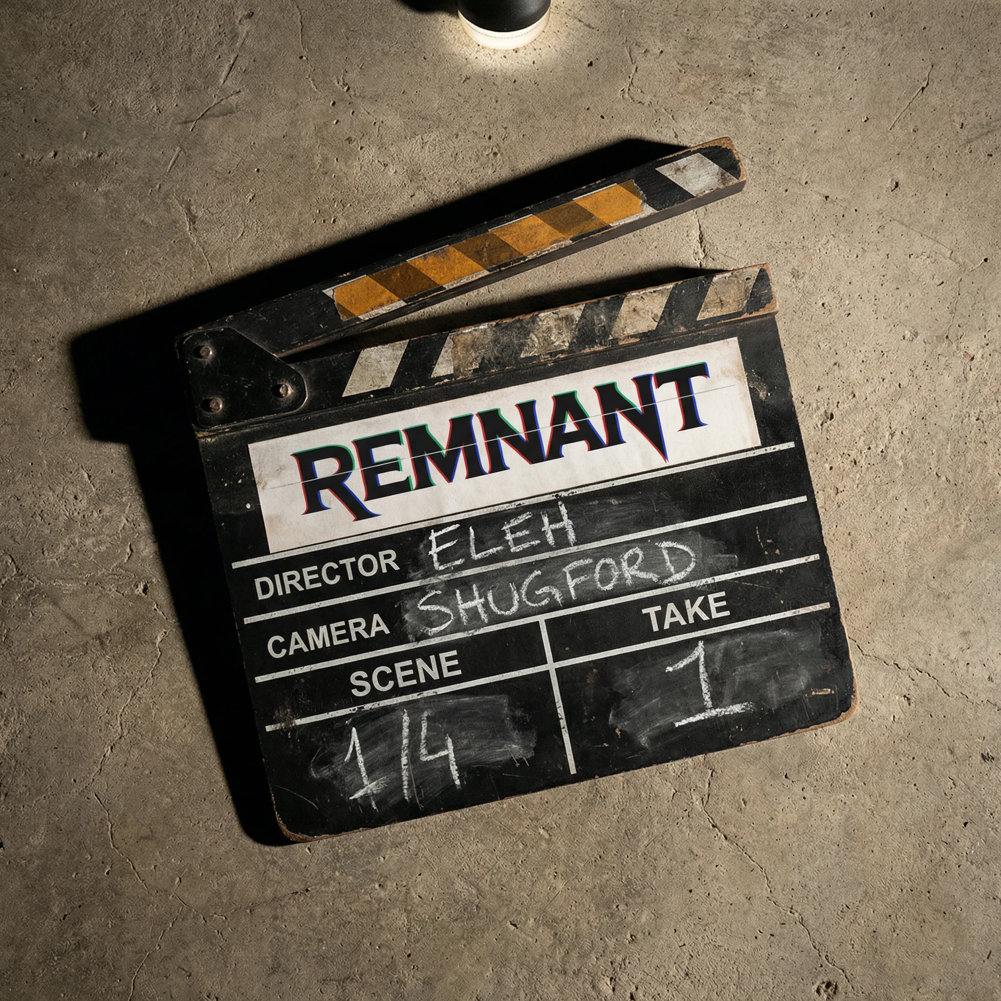
The Clapper Board placed the brand on set rather than in post: a worn, authentic slate on a concrete floor under a single overhead source, the wordmark occupying the production company field as a printed label, the amber stripe running along the clapper sticks. The chalk-filled fields below are sparse. No production title. The brand is the only fixed point.
The Light Leak Print documented a film projector in a darkened room — its beam the only light source — and set the wordmark reversed into the darkness of the lower third as if projected onto the floor. Hung on a wall with four black bulldog clips, no frame, paper bowing slightly at the lower edge. The image is evidence of something that happened, not a demonstration of something that was designed.
The Grading Monitor Close-Up zoomed to the pixel level — a single professional reference monitor displaying the wordmark full-bleed, its own pixel structure visible at this magnification, the waveform monitor and vectorscope in miniature in the corner showing the red and blue aberration channels as separate points of light. The image was shot slightly off-axis, creating a mild colour shift at the right edge.
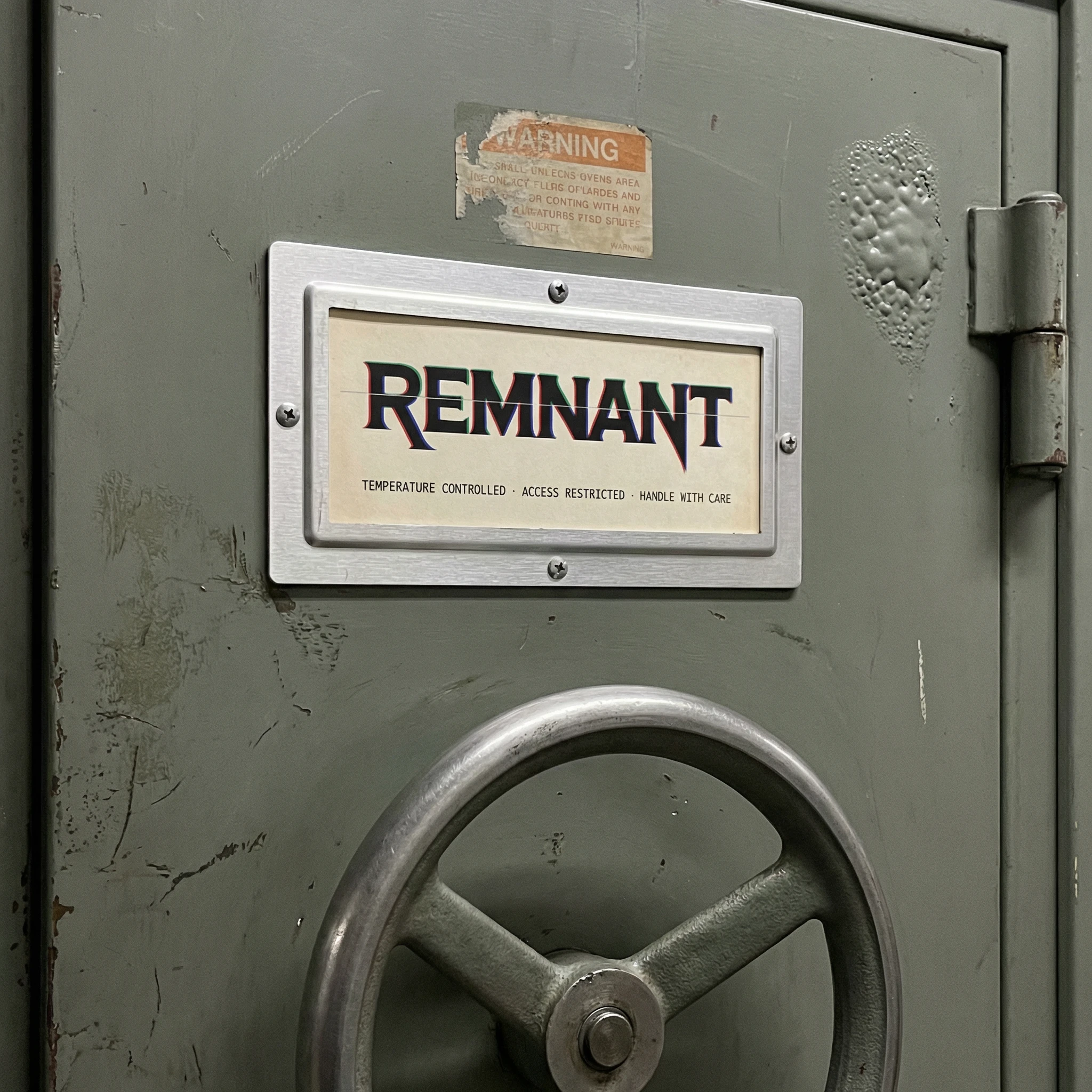
The Vault Door Label closed the system. A fire-rated archive vault door in institutional grey-green, decades of institutional use across its surface, and a single clean label in a brushed aluminium holder: the REMNANT wordmark, and below it in DM Mono at 8pt — TEMPERATURE CONTROLLED · ACCESS RESTRICTED · HANDLE WITH CARE. The label is the only new thing on the door. It looks like it has always been there.
HERO — THE SIGNAL THAT ALMOST DIDN'T MAKE IT
Format: Full-viewport, autoplay loop, no controls, no sound.
Behaviour: The hero is not a banner. It is a transmission. The page loads into the deteriorated state — the wordmark fully corrupted, channels maximally separated, horizontal tracking errors tearing across the frame in pink and magenta, the background a prismatic catastrophe of chromatic bleed. The first impression is damage. Then, over approximately four seconds, the signal stabilises: the aberration contracts toward its resting 2–3px offset, the tracking errors collapse, the background settles into its composed state — the abstracted swirl of colour-damaged film, deep reds and iridescent prismatic light. The wordmark resolves. a studio that handles things other people have given up on types in below it, character by character, with occasional dropped frames in the text rendering — a cursor that hesitates before committing to each word.
Then, after holding for three seconds at rest, the deterioration begins again. The loop is not seamless. The transition back into chaos is abrupt, like a tape head losing contact. The cycle repeats indefinitely.
Typography layers — reading order:
The tertiary reel-hub mark sits top-centre, small, present from the first frame — the one element that never deteriorates. Top-right carries a navigation compass mark in the same weight. These are the only stable objects in the frame across the full loop.
The wordmark — centre, large, the primary event — moves through its full deterioration arc as described above.
The tagline — a studio that handles things other people have given up on — sits bottom-left in DM Mono, small, appearing only during the resolved state and disappearing again as deterioration begins.
The ticker at the very bottom — black band, full-width — runs continuously regardless of the hero state: survives after everything scrolling left, in the brand's mixed chromatic rendering, each word in a slightly different colour state as if the text itself cannot agree on a single channel.
Scroll behaviour: As the user scrolls down, the hero does not fade — it compresses vertically, as if the frame is being squeezed by a tape transport under too much tension. The wordmark stays centred during this compression until it exits the viewport. The ticker persists as a sticky element for the first full section below.
Interaction: On cursor hover over the wordmark during the resolved state, the aberration spikes briefly — a single frame of maximum separation — then returns immediately to rest. The interaction is subtle enough that a user might not be certain it happened. That uncertainty is the point.
Mobile behaviour: The animation simplifies — the tracking errors are reduced to two horizontal glitch lines rather than full-frame tears, the background is a single static frame from the most composed moment of the loop rather than animated, and the wordmark runs its aberration arc at half speed. The ticker continues to scroll. The experience is calmer on mobile. The feeling is not.
The hero's job is to make the viewer feel, before they read a single word of copy, that REMNANT is obsessed with entropy — and that this obsession is entirely under control.
System
Across fifteen mockups and two hero compositions, the REMNANT identity demonstrated complete consistency while adapting to every surface, scale, and material it encountered. The chromatic aberration survived letterpress, screen-print, spot UV, embroidery, CRT phosphor, glassine, photographic paper, and acrylic face-mount. The scan line held its position in every environment. The secondary frame mark scaled from a 16px favicon to a two-metre wall installation without losing its meaning.
The brand did not arrive. It was already here, preserved under controlled conditions, waiting to be found.
REMNANT — a studio that handles things other people have given up on.
Like this project
Posted Mar 17, 2026
Created website and brand identity for REMNANT, highlighting preservation and beauty of deterioration.
Likes
1
Views
17
Timeline
Nov 10, 2025 - Nov 27, 2025