Built with Lovart
Creating Yáal's Brand Identity: Serpent & Smoke
Révolté
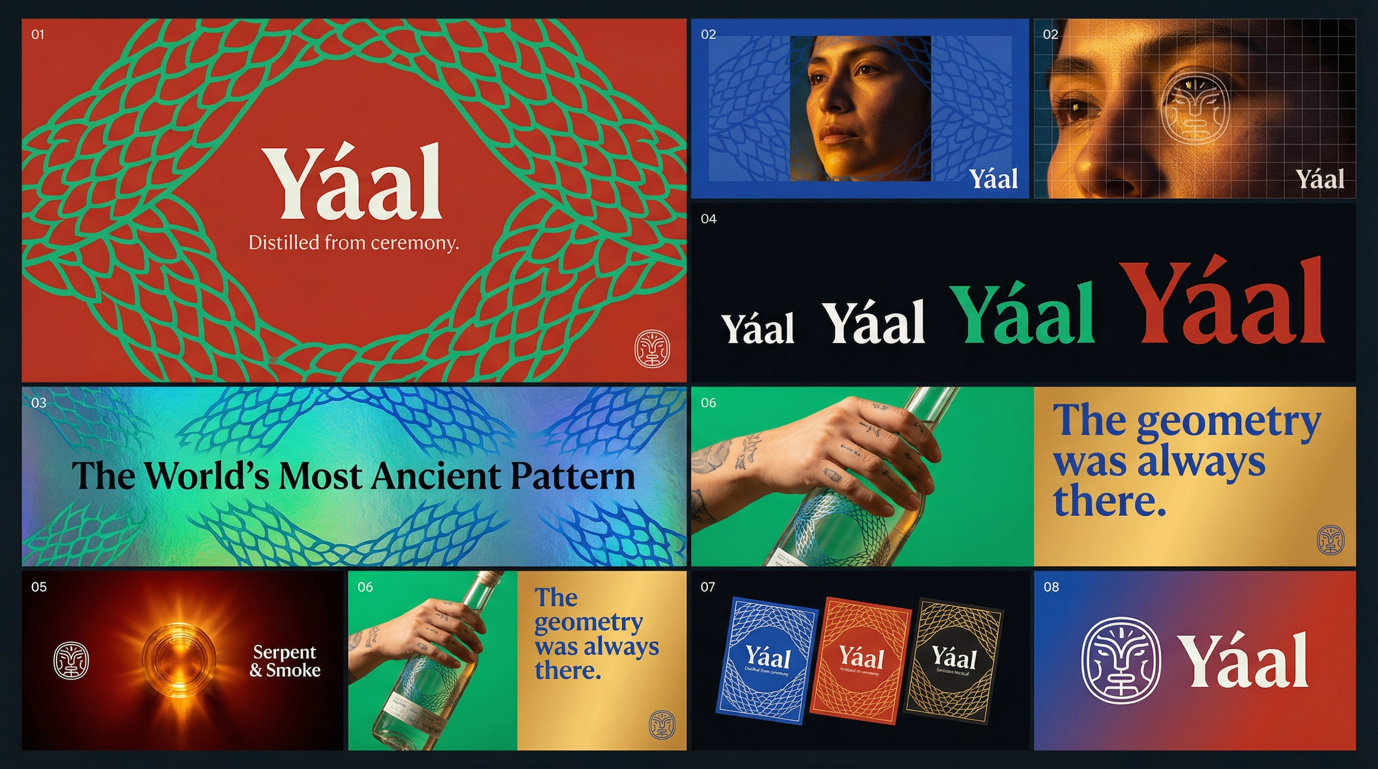
Yáal — Brand Identity Case Study
Artisan Mezcal · Serpent & Smoke · 2026
Overview
Yáal is an artisan mezcal brand built on a single visual argument: the geometry of pre-Columbian culture and the geometry of the natural world are the same system seen at different scales. The scale pattern on a quetzal feather and the scale pattern on the label are not a metaphor — they are structurally identical. The carved geometry on the bottle base and the geometry of a roasted agave piña are not a reference — they are the same radial logic, one made by human hands, one made by the plant itself.
The direction was named Serpent & Smoke from the first session. Quetzalcóatl as visual system, not illustration. Colour as ceremony, not decoration.
Naming
Yáal carries Zapotec-adjacent sound — two syllables, the acute accent giving it visual character on a label and typographic distinction in every application. It sounds like it belongs to the land where mezcal is made without being a direct linguistic appropriation. It is slightly unfamiliar to every audience, which keeps the name open rather than closed. The accent mark over the first a is not merely grammatical — in the logo system it becomes a floating diamond, the same geometric unit used throughout the scale and glyph system. The name and the pattern share the same basic shape.
Logo
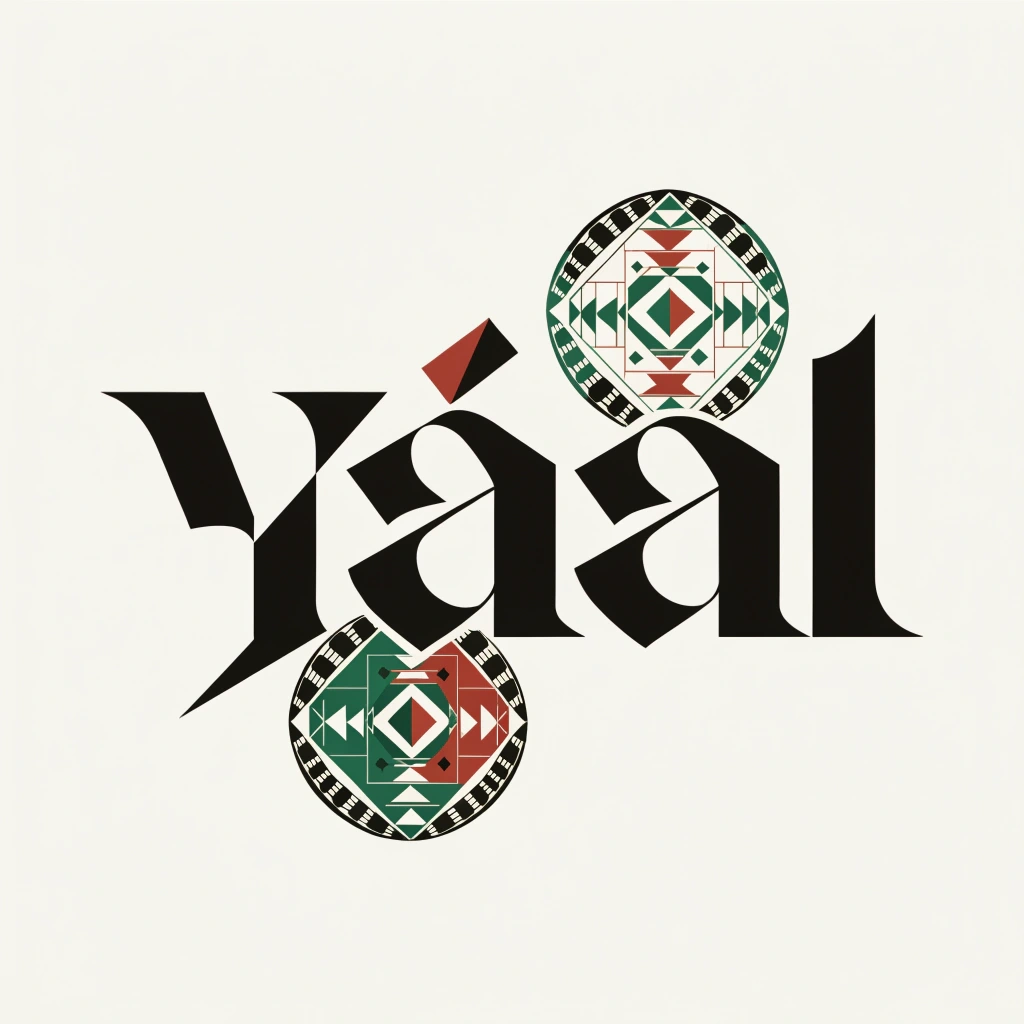
The Yáal wordmark operates at the intersection of two traditions: the geometric precision of pre-Columbian stone carving and the structural authority of contemporary premium spirits lettering. It is drawn, not set — every stroke has the logic of a chisel rather than a pen. The Y's asymmetric arms, the single-storey á with its diamond accent, the compressed second a, the l with its angled foot — each letterform connects to the geometry of the glyph seal and the scale pattern that covers every brand surface.
The acute accent over the á is drawn as a small elongated diamond — the same proportions as the scale unit in the Quetzalcóatl pattern. It sits high above the bowl, closer to a floating glyph than a grammatical mark. It is the first sign that this alphabet is operating under different rules.
The glyph seal — the circular mark visible across wax, cork, copita, and feather — is a geometric abstraction of the feathered serpent reduced to its essential components: a central diamond, four directional scale units at the cardinal points, a ring of alternating feather units at the outer edge. Held at arm's length it is pure geometry. Examined closely it resolves into something that breathes.
Colour: obsidian
#0f0d0b on pattern surfaces. Copal white #f5f0e8 on dark and ceremonial grounds. Electric quetzal #1a7a4a and cinnabar #c23b22 for expression-specific applications.Palette
Electric quetzal
#1a7a4a, cobalt blue #1b3a6b, cinnabar red #c23b22, obsidian #0f0d0b, copal white #f5f0e8, amber gold from the mezcal itself. Every colour is physically present in the source material — the iridescent green-to-blue shift of a quetzal feather, the red of cinnabar pigment used in pre-Columbian ritual, the near-black of volcanic obsidian, the warm off-white of copal smoke. The palette was observed, not designed.The scale pattern operates as iridescent surface — the label shifts from electric green to cobalt blue depending on the angle of light, the way a quetzal feather actually behaves. This is the brand's primary sensory signature: a bottle that changes colour as you turn it.
The Scale Pattern
The fundamental graphic element of the entire system is the scale unit — a slightly irregular hexagon with one longer edge, giving it directional bias when tiled. This single unit generates every surface the brand touches: the label background, the box exterior, the tissue wrap interior, the wax seal border. At small scale it reads as texture. At medium scale as pattern. At large scale as architecture.
The feather unit is its counterpart: an elongated teardrop with a central vein line, always implying upward movement. Where the scale pattern is dense and interlocking, the feather pattern is open and directional. Both systems derive from the same source — the actual structure of the quetzal's plumage.
Mockup Set
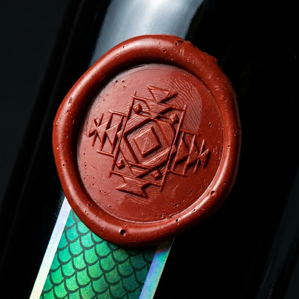
01 — The Wax Seal. Extreme macro of the cinnabar red wax seal on the bottle neck. The Yáal glyph seal pressed into the centre — the central diamond, the four directional scale units, the feather ring at the outer edge. The electric quetzal green scale pattern of the label visible at the frame's lower edge, catching the light against the near-black glass. The wax surface shows micro-texture: bubbles, the ghost of a fingerprint at the outer ring. Hand-poured, proof of human presence at the moment of sealing.
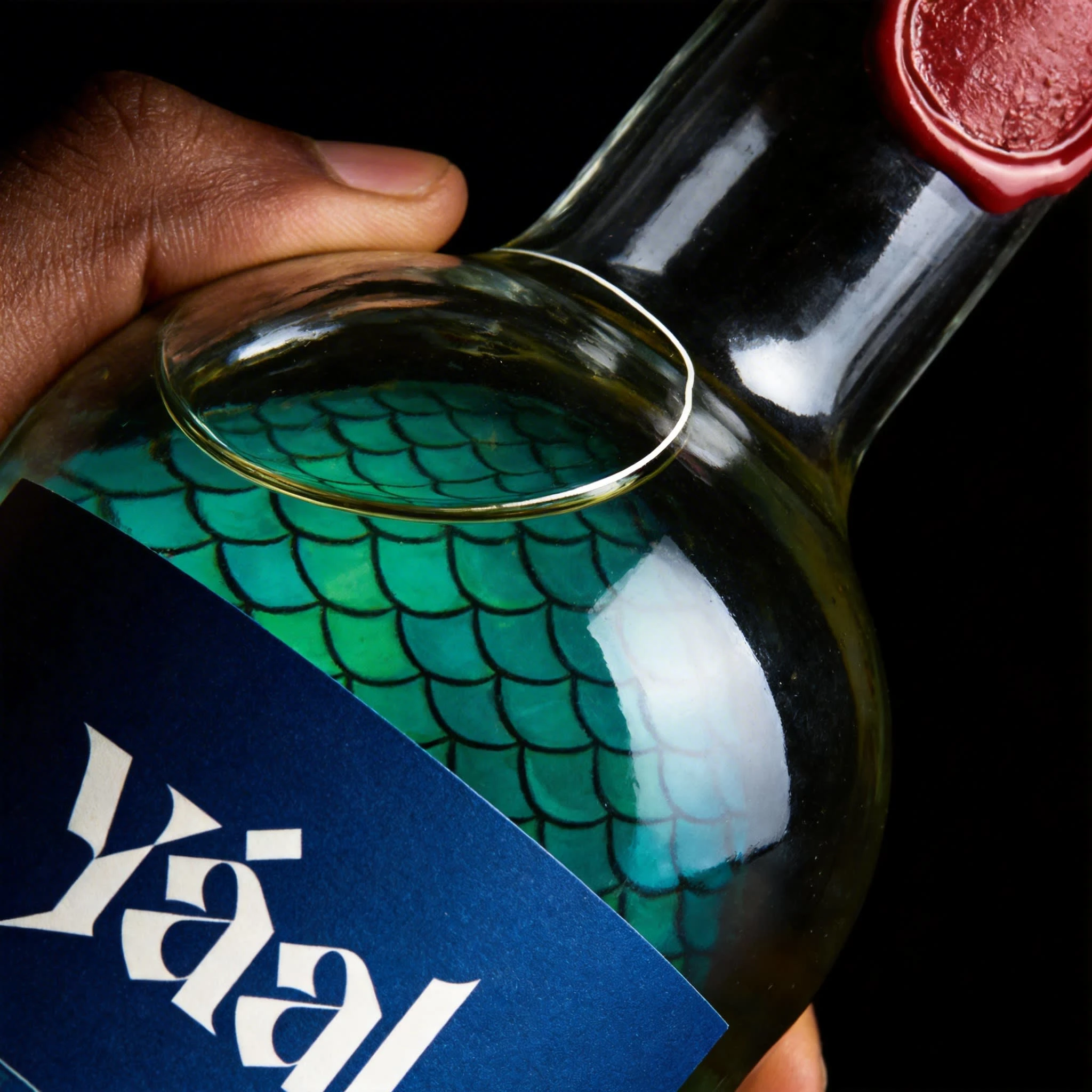
02 — The Label Surface. The label filling the entire frame edge to edge — the scale pattern in full iridescent treatment, cobalt blue ground, electric quetzal green scale units with cinnabar outlines. The transition zone where scale units give way to feather units visible in the upper portion, copal white feathers on the blue ground. The Yáal wordmark in obsidian at dead centre, the á accent diamond catching the raking light as a single point of warmth against the iridescent field. The pattern continues in every direction — no beginning, no end.
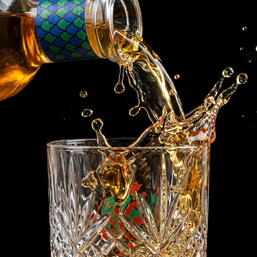
03 — The Pour. The liquid mid-air between bottle and crystal glass, the amber gold of the mezcal frozen at the moment of maximum turbulence. The bottle label's cobalt and quetzal green compressed into a narrow strip at the upper edge. The crystal glass facets refract the cinnabar and green of the label into the liquid as it fills. The glyph seal is visible through the glass in distorted form — the brand's geometry multiplied by the crystal's own geometry.
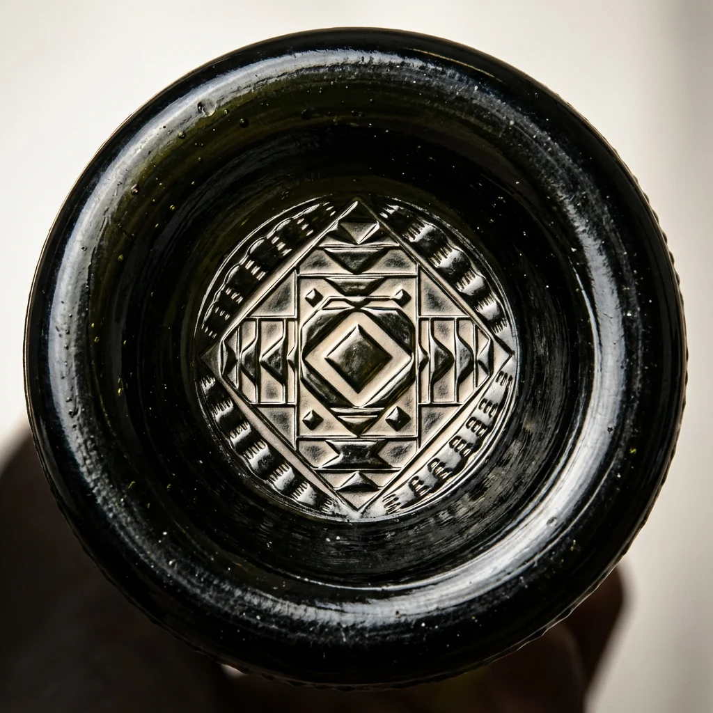
04 — The Bottle Base. The bottle inverted, shot from directly below. The glyph seal embossed into the punt of the near-black glass — the central diamond, scale units, feather ring pressed into the dark material. The raking light fills the recessed geometry with shadow and illuminates the ridges in copal white. Around the punt, the glass shows the micro-bubbles and slight spiral of hand-blown production. The seal in the glass is the same geometry as the seal in the wax is the same geometry as the pattern on the label.
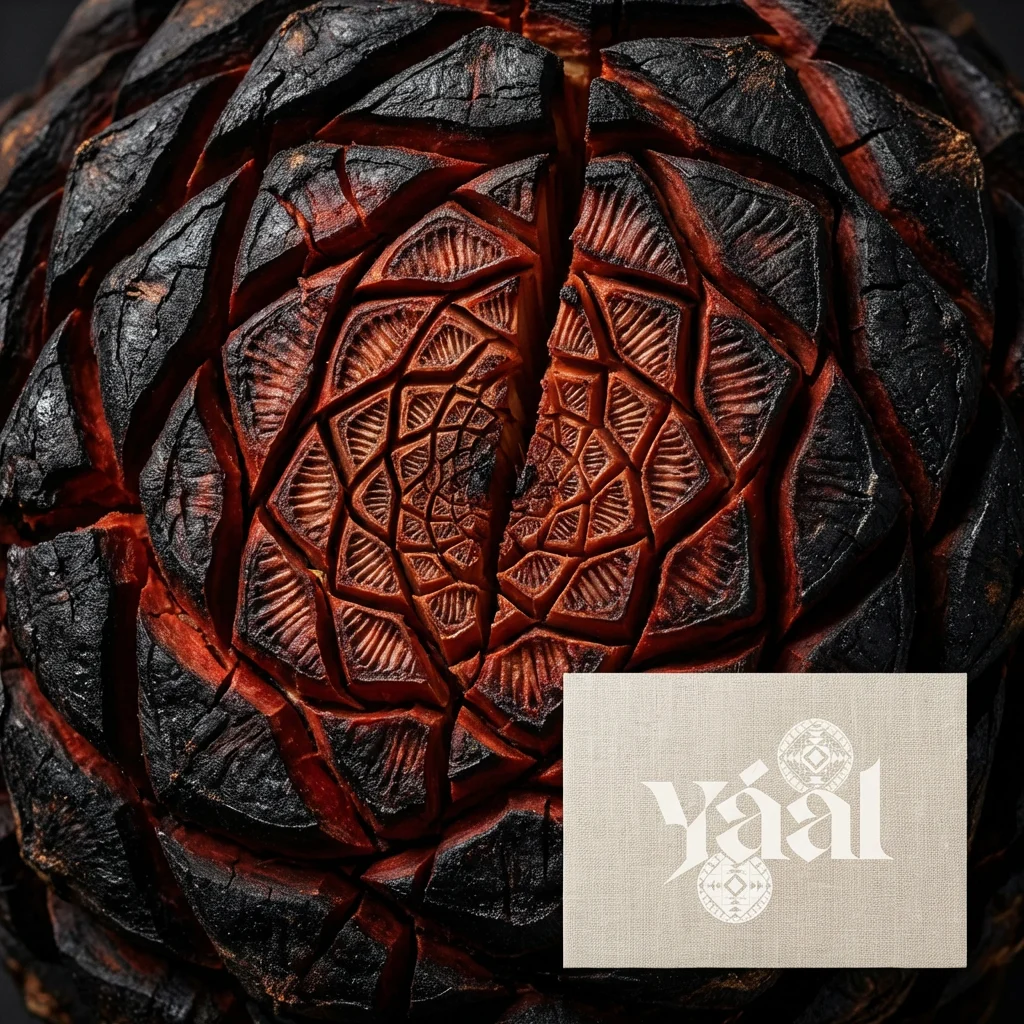
05 — The Agave. A roasted agave piña — carbon black with deep cinnabar cracks where the sugars caramelised and split the fibre. The natural cellular structure of the cross-section reveals radial geometry that mirrors the scale pattern exactly, as if the brand's visual system was derived from the plant rather than imposed upon it. The Yáal wordmark and glyph seal on a linen card in the lower right corner — the only finished object in an image of raw material.
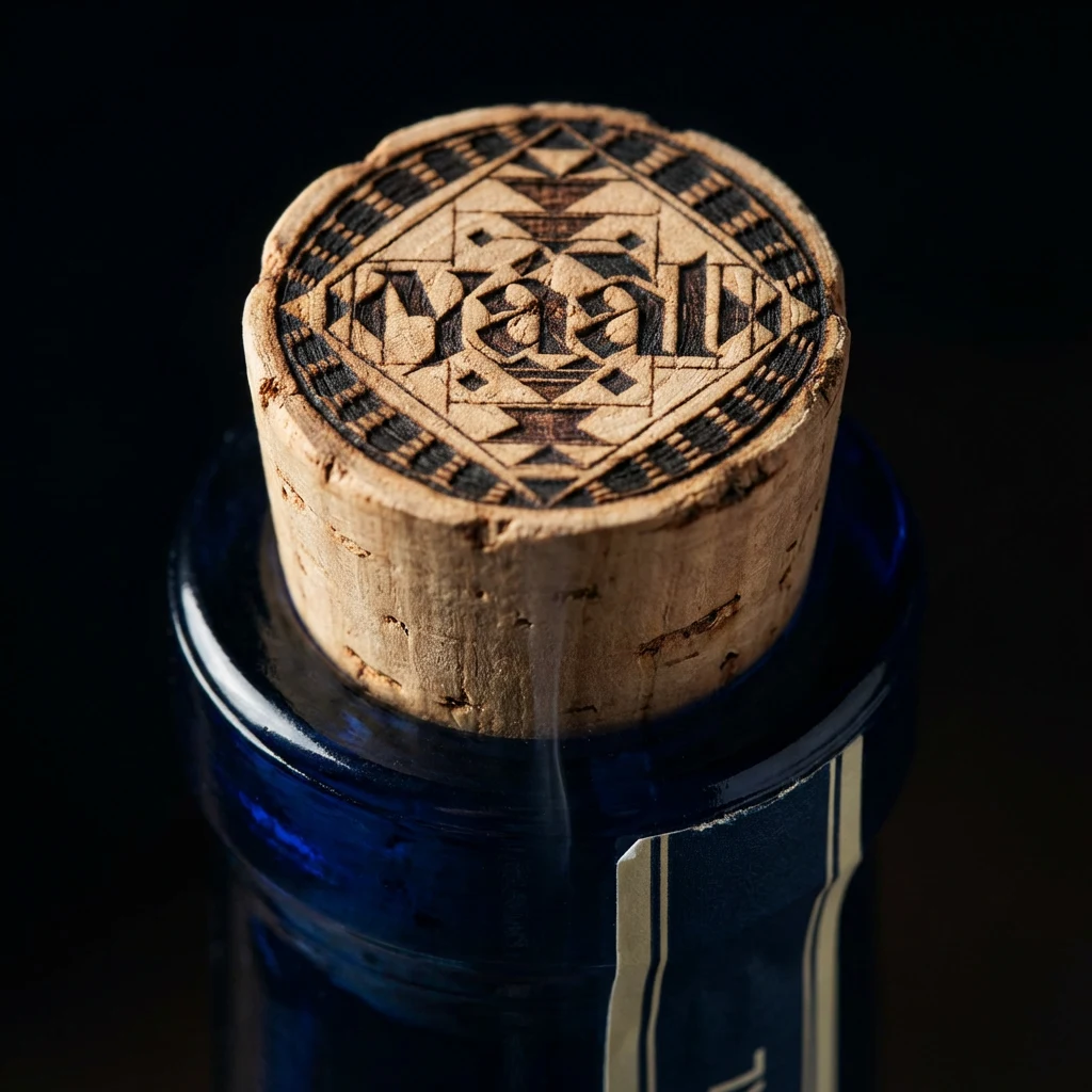
06 — The Cork. The Yáal wordmark and full glyph seal burned directly into the cork face — the complete geometric system: central diamond, scale units at cardinal points, feather ring, wordmark — all rendered in char against the natural cork. The blue glass bottle neck below, the label edge catching light. The burning is slightly uneven at the outer edge, proof of the human hand. The brand's most permanent mark on its most temporary surface.
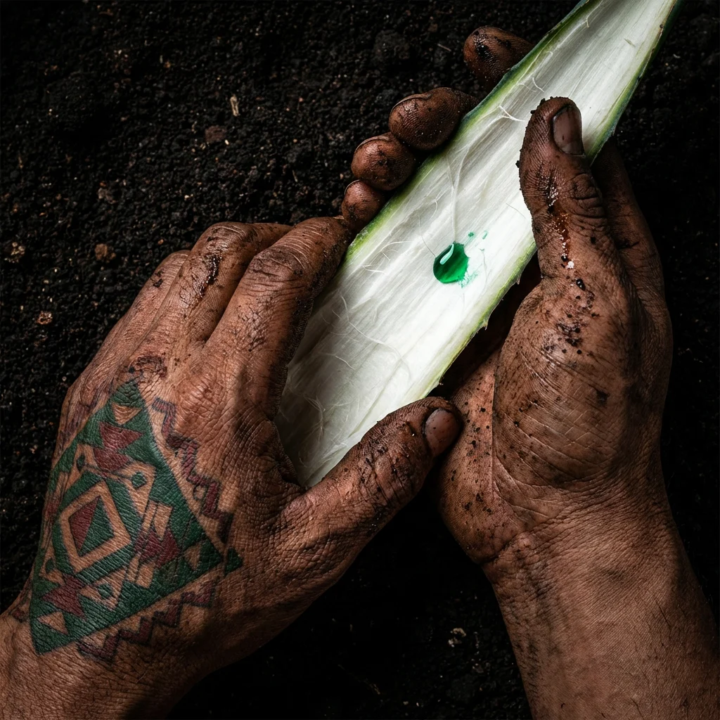
07 — Hands and Earth. Two hands stained with agave sap and volcanic earth hold a split agave leaf, shot from above on dark soil. On the back of one hand, a pre-Columbian geometric tattoo in the brand's full palette — cinnabar red, electric quetzal green, the diamond forms and step patterns of the glyph system rendered permanently in skin. A single drop of agave sap on the leaf surface catches light as electric green. The brand's geometry lives on the land, the plant, and the body of the person who works them.
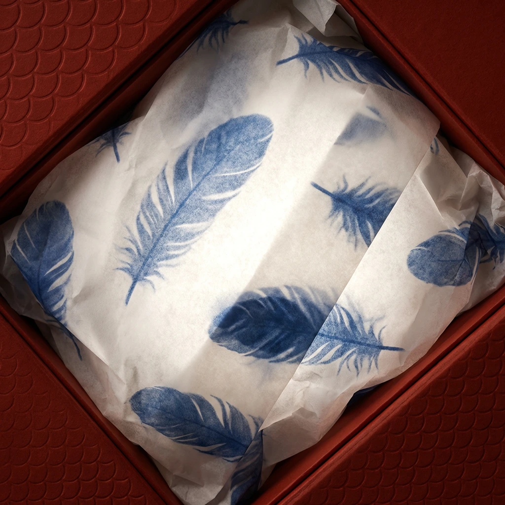
08 — The Tissue Interior. Looking down into the open box, bottle removed. Copal white tissue printed with the feather pattern in cobalt blue — individual quetzal feathers scattered across the surface at varying scales and opacities. The box interior lining visible at the edges: cinnabar red board with the scale pattern blind-embossed into it. A single overhead light makes the tissue glow from within. The bottle is gone. What remains is still entirely the brand.
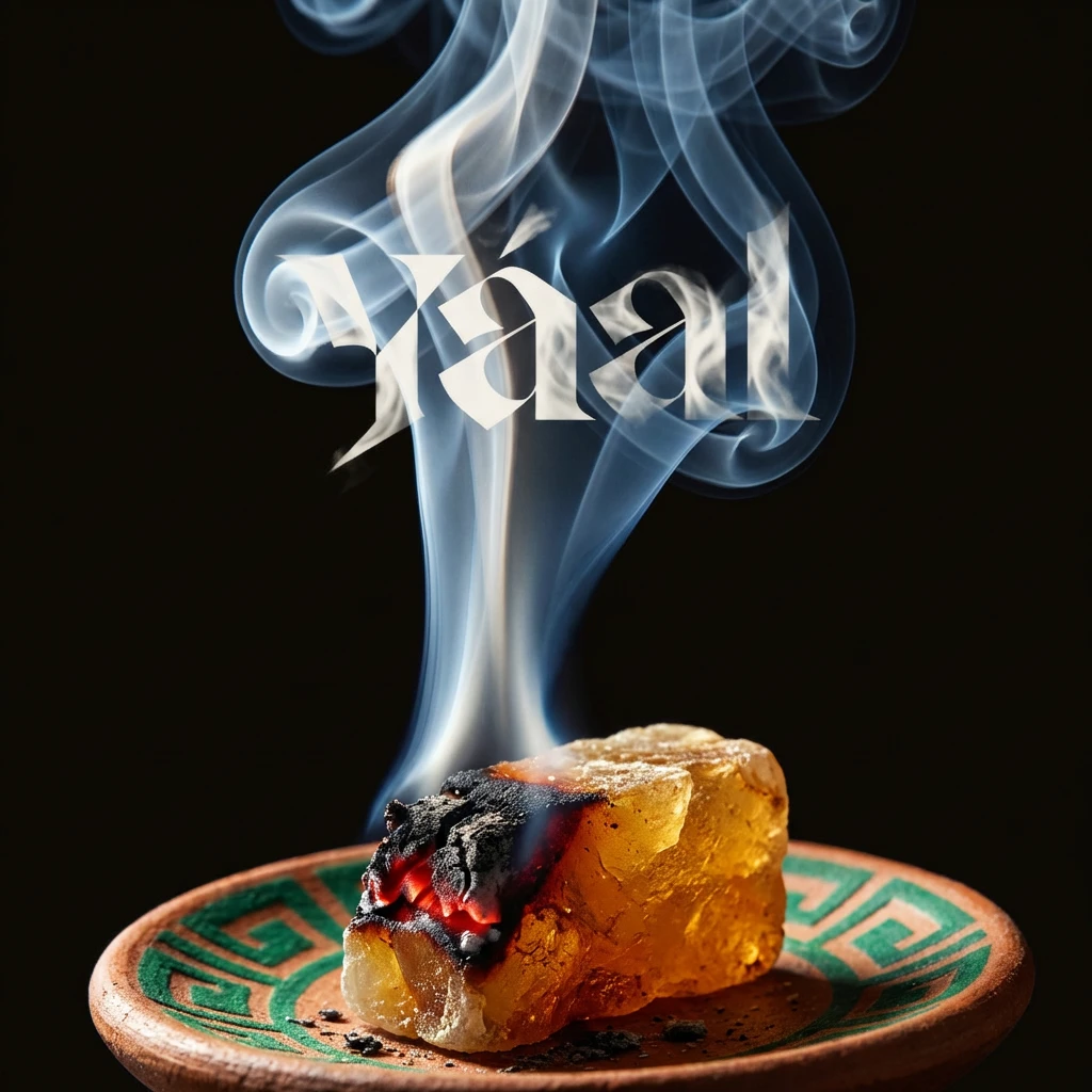
09 — The Smoke. Copal incense burning on a terracotta dish painted with the xicalcoliuhqui step-fret border in electric quetzal green. The smoke rises in a single coherent column, backlit, three-dimensional against the near-black background. The Yáal wordmark in copal white dissolves into the smoke column — present as if the letters formed themselves in the rising vapour before dispersing. The ceramic dish carries the brand's geometric vocabulary. The smoke carries the brand name. Ceremony before the first pour.
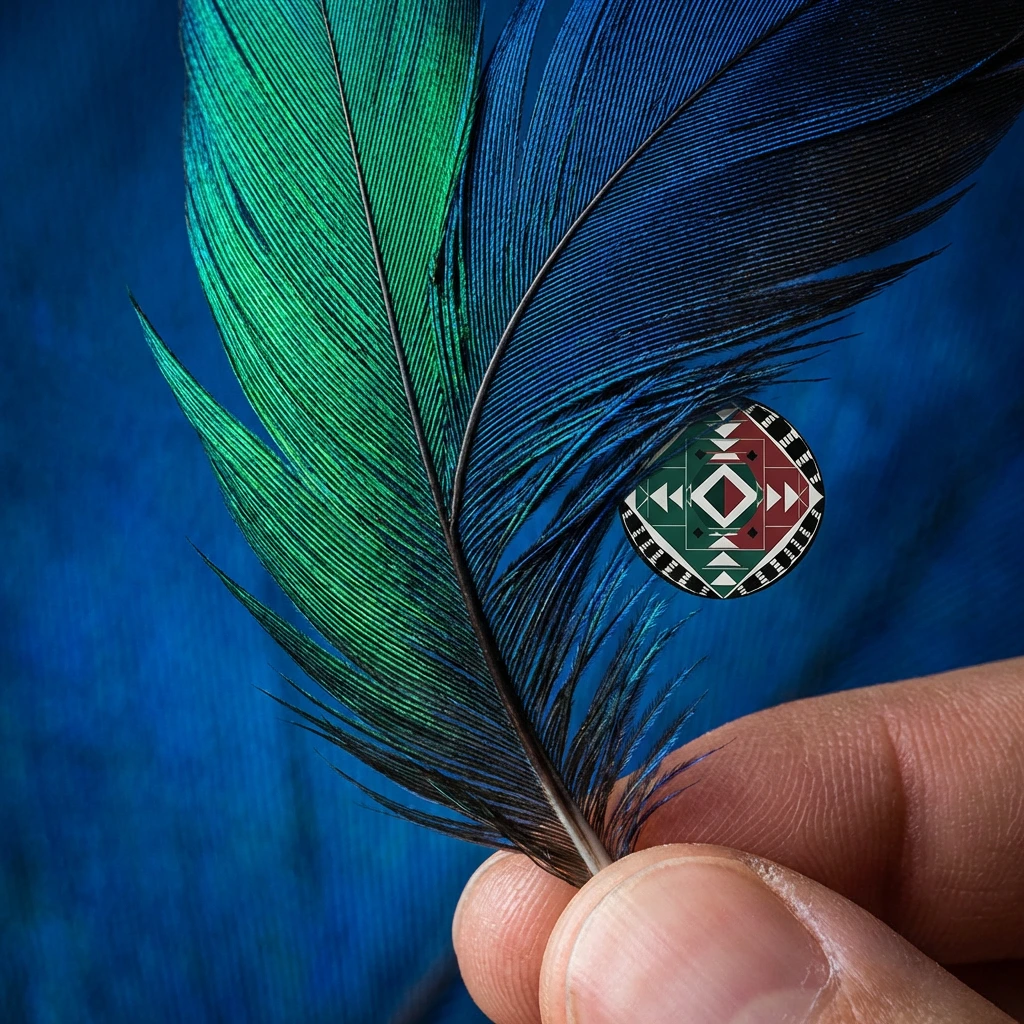
10 — The Feather. A quetzal feather held at the quill end against the cobalt blue label surface. The iridescent barbs shift from electric quetzal green to deep cobalt to near-black depending on the light angle — the same shift the label produces. The Yáal glyph seal on a small circular sticker held against the feather mid-shaft, the full palette visible in miniature: cinnabar, quetzal green, cobalt, copal white, obsidian. The brand's geometry and the bird's geometry at the same scale in the same frame.
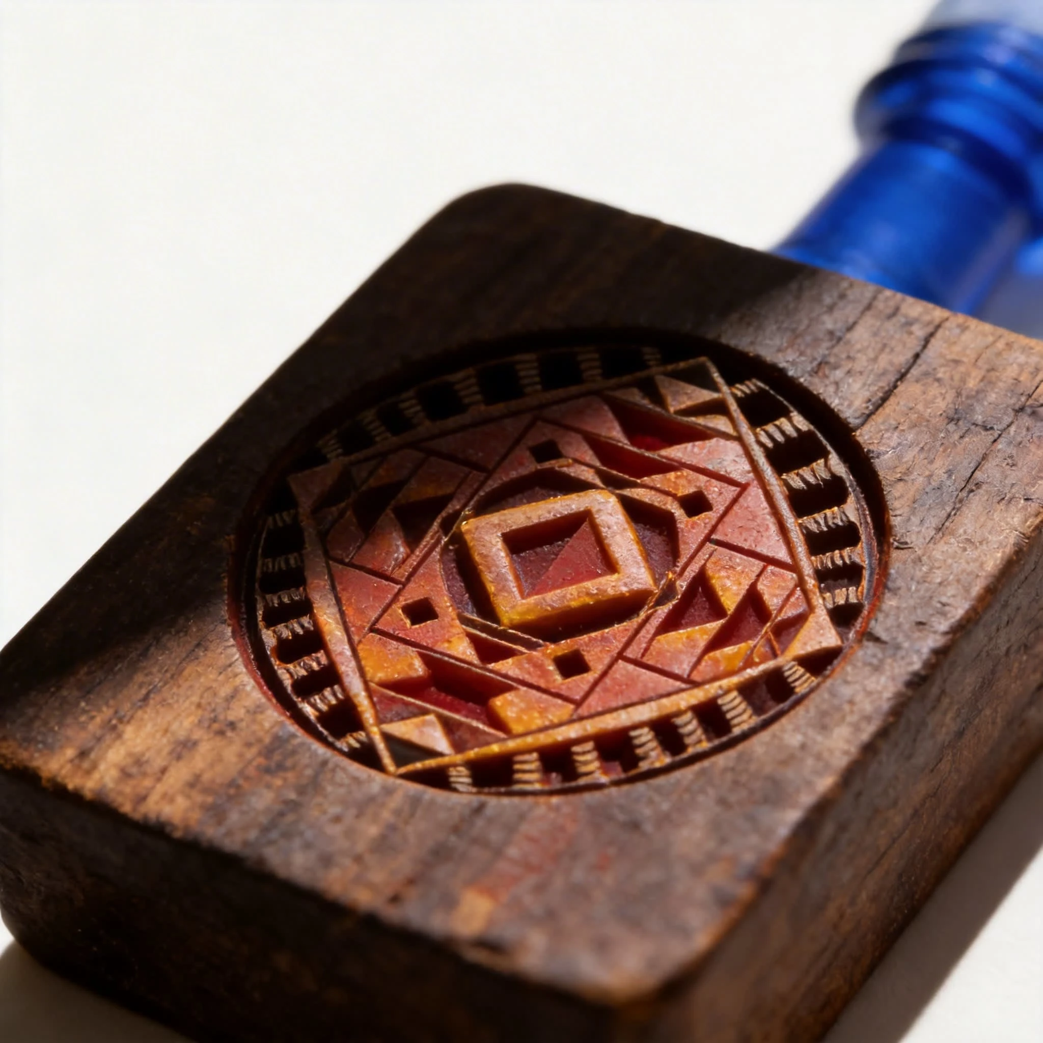
11 — The Mold and Press. Extreme macro of the wooden mold used to press the glyph seal into wax. The seal face in full relief: central diamond raised, scale units in stepped geometry, feather ring carved in alternating positive and negative. The wood darkened by years of use — wax residue staining the recesses deep cinnabar, the raised surfaces worn amber by heat. The blue glass bottle neck in soft focus at the upper right corner. The tool that makes the mark, not the mark itself.
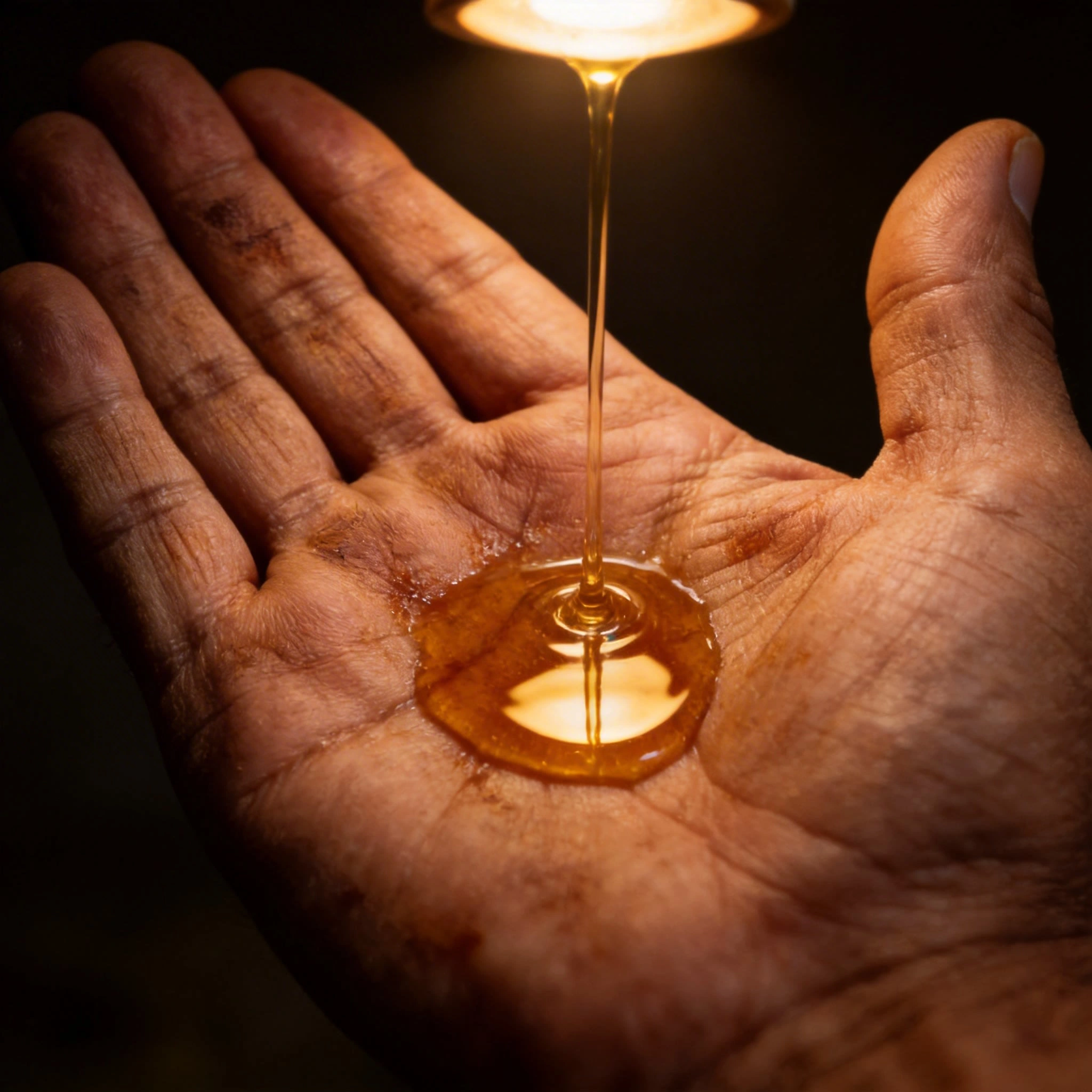
12 — The Maestro's Hand. A weathered palm held upward, the mezcal distillate caught mid-pour from above — the traditional venencia test. The liquid pools in the hollow of the hand as a perfect amber mirror, a strand still connecting palm to the light source above. The skin's permanent stain from decades of agave sap reads as topography, as map, as pattern. The hand is the credential. The pooled mezcal is the proof.
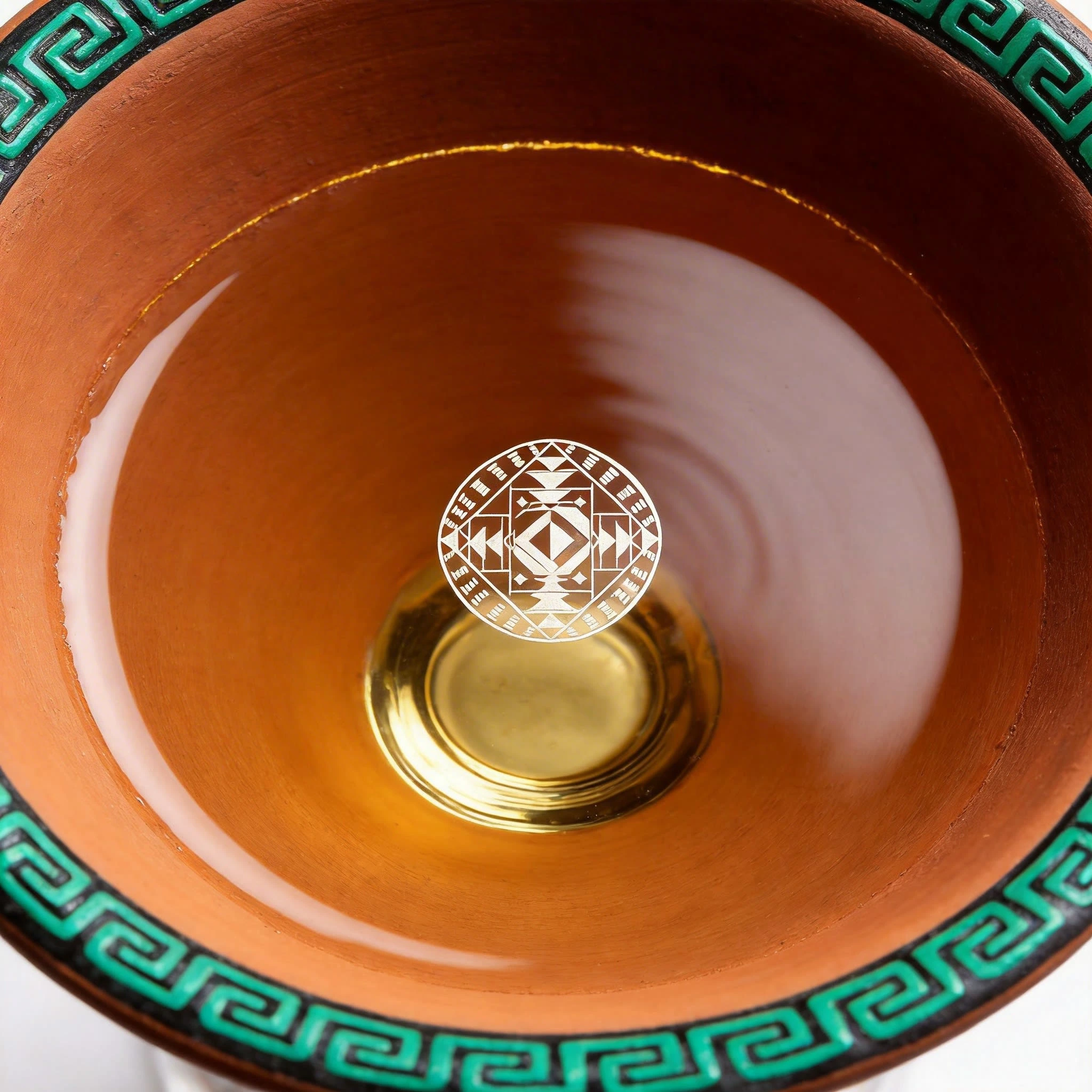
13 — The Glass Rim. Looking directly down into the terracotta copita. The rim carries a xicalcoliuhqui step-fret border in electric quetzal green — an unbroken geometric line running the full circumference. The interior glows warm terracotta and amber. At the centre of the liquid surface, the Yáal glyph seal reflected from a source above frame — floating on the mezcal, distorted by the liquid's tension, copal white on amber. The reflection is the brand mark. The ceremony has already begun.
14 — The Bottle Shoulder. The shoulder of the Yáal bottle held at an angle — dark glass, the iridescent scale pattern of the label visible through the glass wall, the cobalt and quetzal green compressed and warped by the thickness of the material. The cinnabar red wax seal edge visible at the upper right. The Yáal wordmark on the label reads through the glass as obsidian geometry against the iridescent field. The bottle shoulder as landscape.
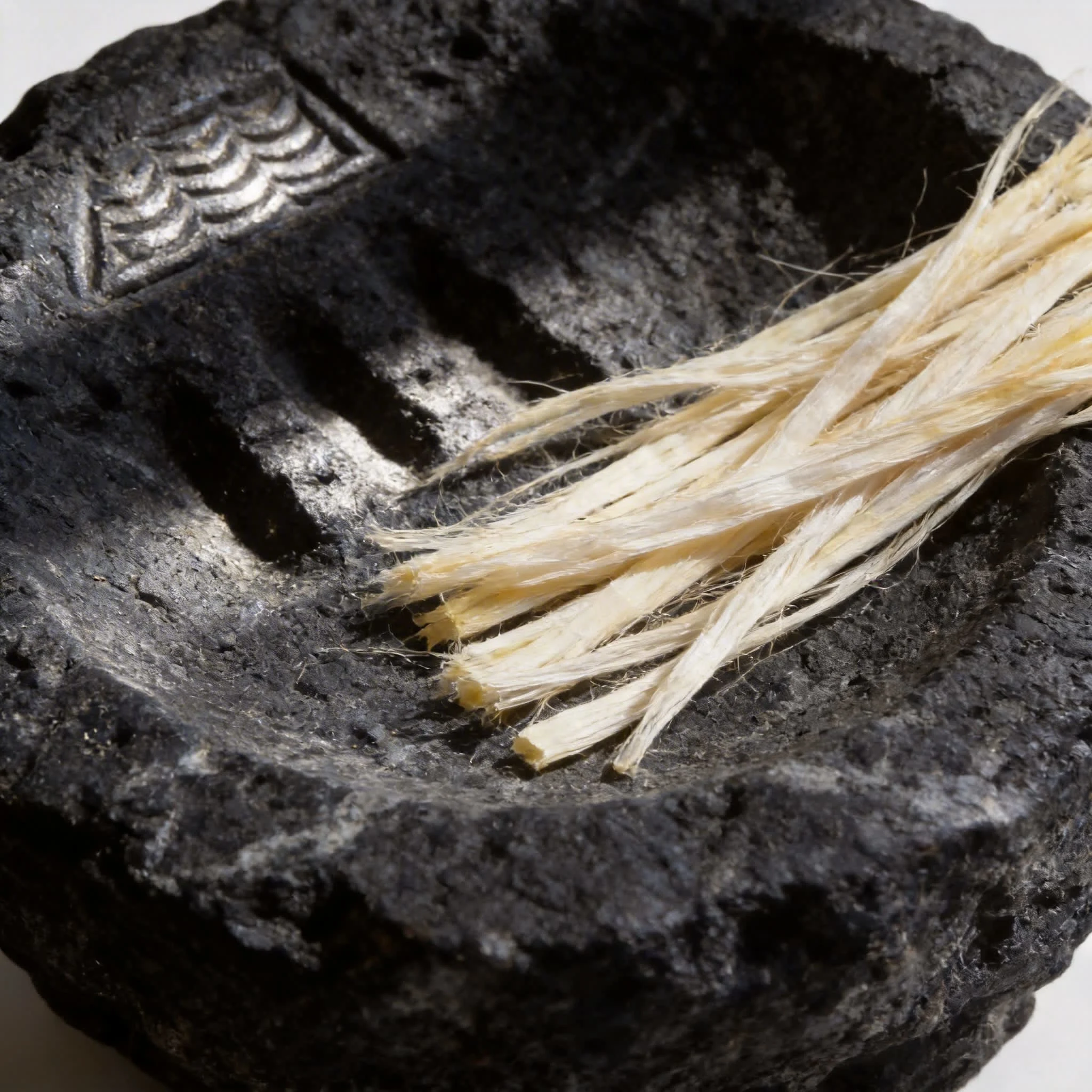
15 — The Stone Metate. A volcanic basalt mortar — near-black, hand-formed — with the Yáal scale pattern carved into its inner surface at the upper left: the geometric units cut at varying depths, raking light filling the recesses with shadow. Pale agave fibres rest in the bowl, almost copal white, their parallel alignment an unintentional pattern. The brand's geometry and the tool's geology sharing the same surface.
Design Decisions
Why the scale pattern as the system's DNA. A logo applied to a surface is decoration. A system that generates every surface from a single geometric unit is architecture. The scale unit appears at every scale from the microscopic texture of the wax seal to the full label surface — the same logic, different sizes. The brand cannot be separated from its pattern because the pattern is the brand.
Why iridescent. Mezcal is both fire and water, smoke and clarity. The iridescent label surface — shifting from green to blue as you turn the bottle — captures that duality in a material decision. It also references the quetzal feather directly: a surface that changes meaning depending on the light.
Why the palette from the bird not from the spirit. Amber and smoke are the obvious colours for a mezcal. Electric green and cobalt are not. The unexpected palette — the colours of the quetzal, of jade, of cinnabar — positions Yáal outside the category's earth-tone defaults. The bottle reads as different on the shelf before you understand why.
Why the glyph seal appears on every surface. The wax seal, the cork face, the bottle base, the copita, the feather, the tattooed hand — the glyph seal is the brand's most concentrated geometric statement. Appearing across materials, scales, and contexts, it behaves the way a codex glyph behaves: the same mark, the same meaning, regardless of what it is pressed or painted or burned into.
Why the maestro's hand is the credential. In a category saturated with provenance claims, the hand that has worked agave for decades needs no copy. The stain in the palm is the biography. The mezcal caught mid-pour in the venencia test is the proof of knowledge. The image argues quality without stating it.
Why the agave geometry and the brand geometry are the same. Mockup 05 — the roasted piña — and Mockup 02 — the label surface — show the same radial geometric logic in two different materials. One was grown over eight to twelve years in volcanic soil. One was drawn by a designer. The brand's argument is that these are not different things.
Outcome
Fifteen images that function simultaneously as product photography, brand argument, and cultural document. The palette, the pattern, the glyph seal, and the wordmark all derive from the same pre-Columbian geometric logic — the feathered serpent reduced to its structural minimum and applied to every surface the brand touches.
Yáal looks like one thing from every angle because every angle is the same system seen from a different distance.
The geometry was always there. We simply followed it.
Like this project
Posted Mar 14, 2026
Yáal, An artisan mezcal brand where every surface carries pre-Columbian geometry. Scale pattern, feathered serpent, copal smoke. 15 extreme close-up mockups.
Likes
1
Views
20
Timeline
Jan 12, 2026 - Jan 31, 2026