Built with Lovart
Velo Logo and Brand Identity Development
Révolté
Velo — Brand Identity Case Study
Health Performance Drink · 2026
Overview
Velo is a health performance drink built for athletes who train before the world wakes up. The brief was to develop a complete brand identity from naming through to a deployable visual system — covering logo selection, palette definition, a ten-mockup campaign spanning packaging, lifestyle, stationery, and environmental formats, and a four-second ad spot.
The creative challenge was not to make something that looked like a health drink. It was to make something that looked like the feeling of a 5AM track session in November.
Naming
The name Velo was selected from a shortlist of original concepts for its compression and dual resonance — velocity and vitality in four letters. It carries athletic credibility without leaning on the category's tired vocabulary of peaks, boosts, and extremes. It sounds like something already in motion.
Type System
The identity uses a deliberate two-typeface system built entirely on contrast.
Primary — Fluid Script (hand-lettered logotype). Single-weight, high-mass, all letters connected in one continuous stroke. Organic, kinetic, warm. This is the brand's personality made visible — it does not appear as set type anywhere in the system. It is always treated as artwork.
Secondary — Bebas Neue. Ultra-condensed, zero curves, mechanical in its precision. Every instance of secondary type in the system — flavor names, taglines, carrier copy, ad text, stationery callouts — is set in Bebas Neue, all caps, with generous tracking between +150 and +300 depending on hierarchy level. The font is free, widely supported, and structurally opposite to the script in every measurable way. That opposition is the system.
The logic is simple: the script says who Velo is. Bebas Neue says what Velo does. Fluid identity, rigid information. Neither typeface works as hard alone as they do together.
Colour application on type:
Logo / primary wordmark:
#f0f5e1 Flash Light on dark grounds. Never pure white — the warmth is intentionalTaglines and primary Bebas Neue:
#f0f5e1Flavor names and secondary callouts:
#8eaca5 BreathTechnical / nutritional copy:
#4f6764 Storm SlateThe hierarchy moves from warm to cold as the information becomes more functional
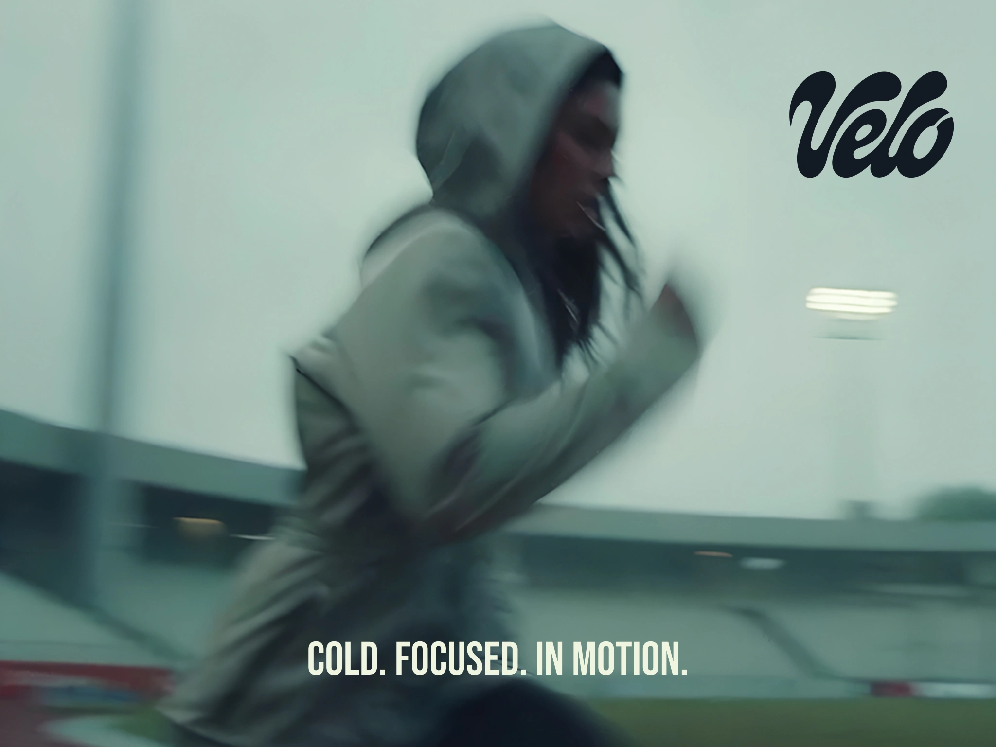
Visual Direction
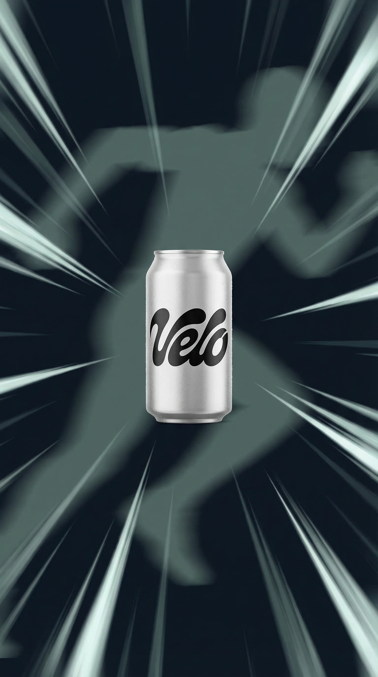
The reference image — a runner in full motion blur on a wet track under floodlights — was used not just as mood, but as a direct source. The colour palette was extracted algorithmically from the photograph, ensuring that every hex value in the system is literally present in the world the brand inhabits. Nothing was invented.
The resulting palette runs from near-black blue-greens (
#131a23, #273136) through a range of desaturated teal-greys (#4f6764, #61827b, #8eaca5, #b0c6bd) to a single warm off-white highlight (#f0f5e1). Seven colours. No primaries. No neon. The system is genuinely unusual on shelf, which is the point.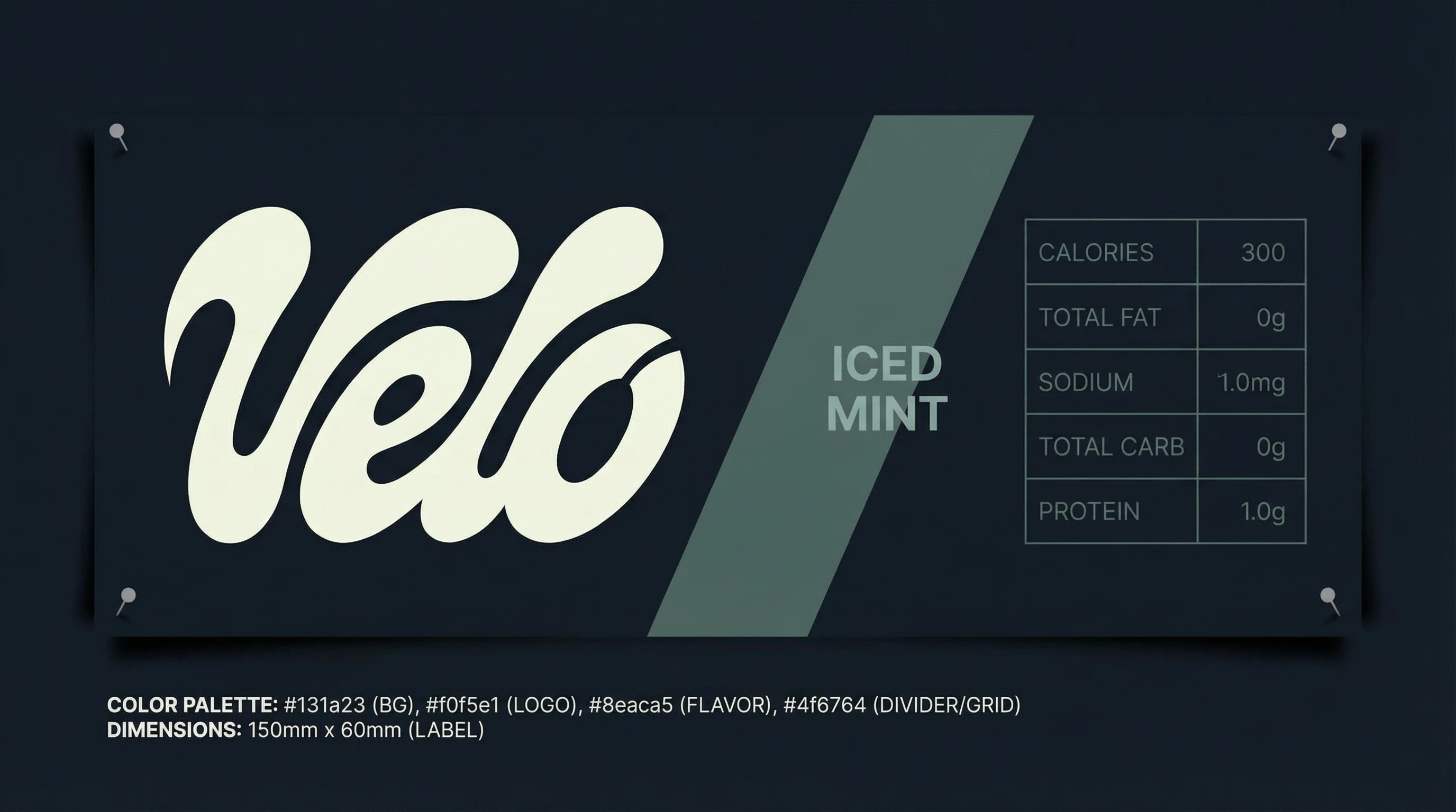
Logotype
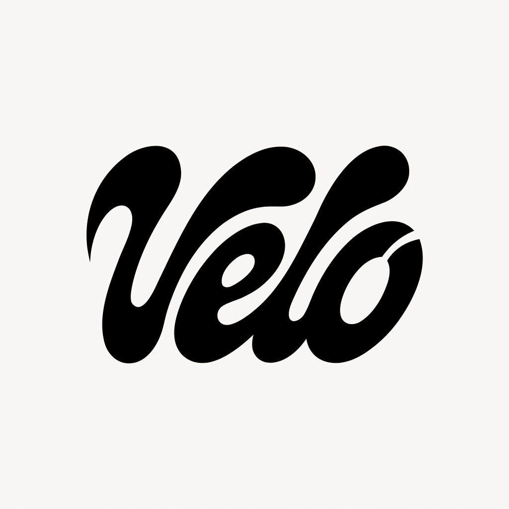
Direction 02 — Fluid Script — was selected. The diagonal cut through the counter of the 'o' is the most distinctive detail: it reads simultaneously as a slash of speed and a wheel spoke. This cut became the brand's primary graphic device — the slash motif — redeployed across the system as a label divider, a poster crop line, and a carrier angle. One detail, many applications.
The contrast between the fluid script and Bebas Neue's rigidity is structural and intentional throughout. Where the logotype breathes and curves, Bebas Neue holds the line.
Packaging System
Mockup 01 — The Can (Hero). 250ml slim aluminium can in
#273136, diagonal #4f6764 band at 8°, logo centred in #f0f5e1. The only Bebas Neue on the primary face is a single flavor descriptor below the logo — "ICED MINT" in #8eaca5, tracking +200. No illustration.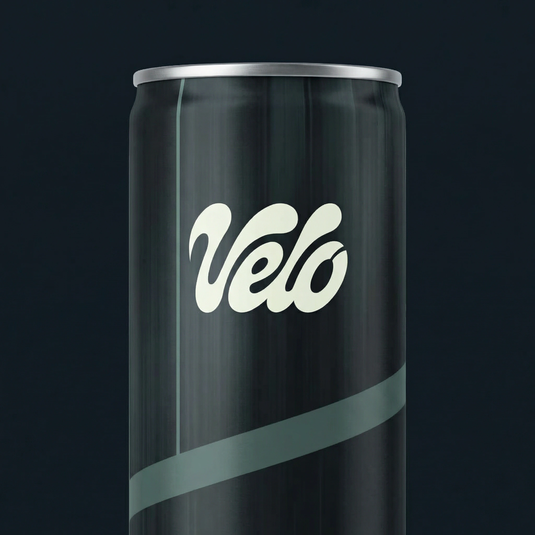
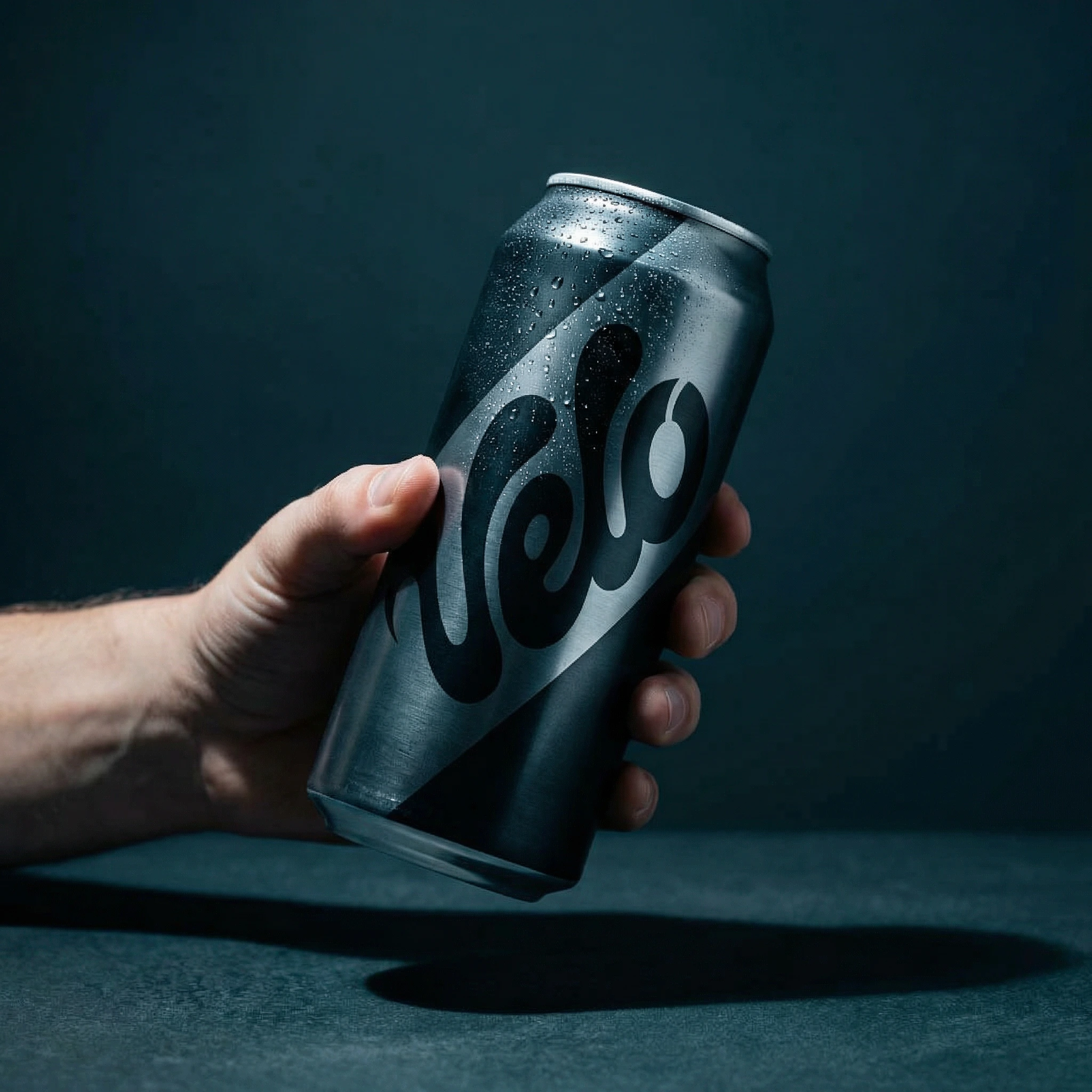
Mockup 02 — The Can in Hand. Shot 3/4, held from below frame, hard cold light from above-right, condensation on the upper surface. The logo commands the can. Bebas Neue is off-face on this shot — the image is about the object, not the information.
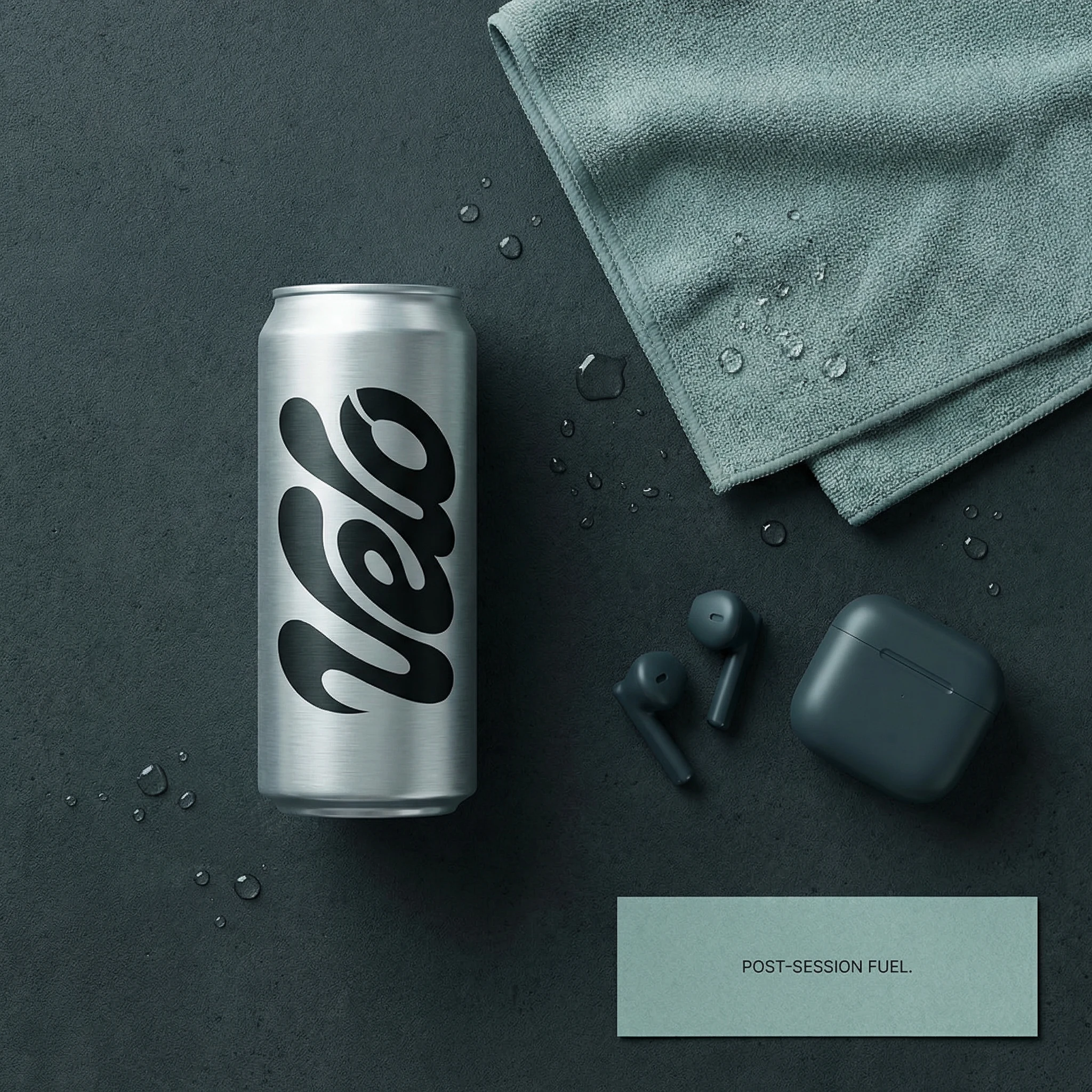
Mockup 03 — Flat Lay. Post-session context. The card in the lower-right reads "POST-SESSION FUEL." in Bebas Neue, tracking +150,
#273136 on #b0c6bd stock. First appearance of Bebas Neue as a standalone typographic object.Mockup 04 — Packaging Label Flat. The technical document. Logo large left, slash divider in
#4f6764, "ICED MINT" in Bebas Neue #8eaca5 at the centre zone, nutrition grid in Bebas Neue #4f6764 on the right. The font earns its utility here — at small sizes in a structured grid, Bebas Neue is clean and entirely readable. 150mm × 60mm.Mockup 05 — Refrigerator Shelf. Three cans, logos forward, frosted glass shelf with cold back-light halos. The
#b0c6bd and #f0f5e1 elements glow in the refrigerator light. Bebas Neue is present only on the can faces — the image does not need additional type.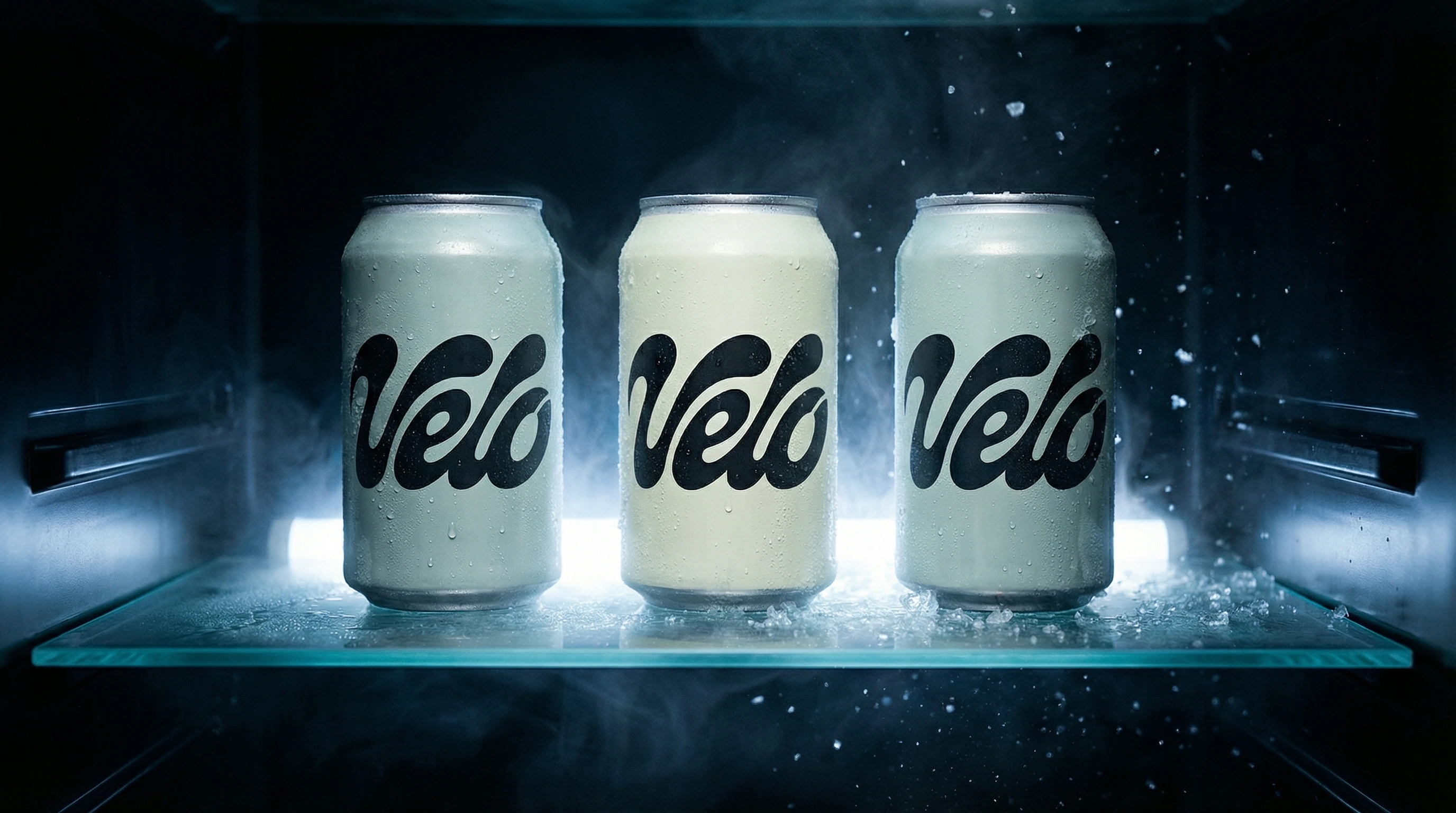
Campaign & Brand World Extensions
Mockup 06 — The Six-Pack. "VELO / ICED MINT × 6" on the carrier face in Bebas Neue, tracking +100,
#8eaca5. The script logo tiles across all can faces as texture. The two typefaces share the frame without competing — Bebas Neue handles the functional exterior, the script handles the brand surface.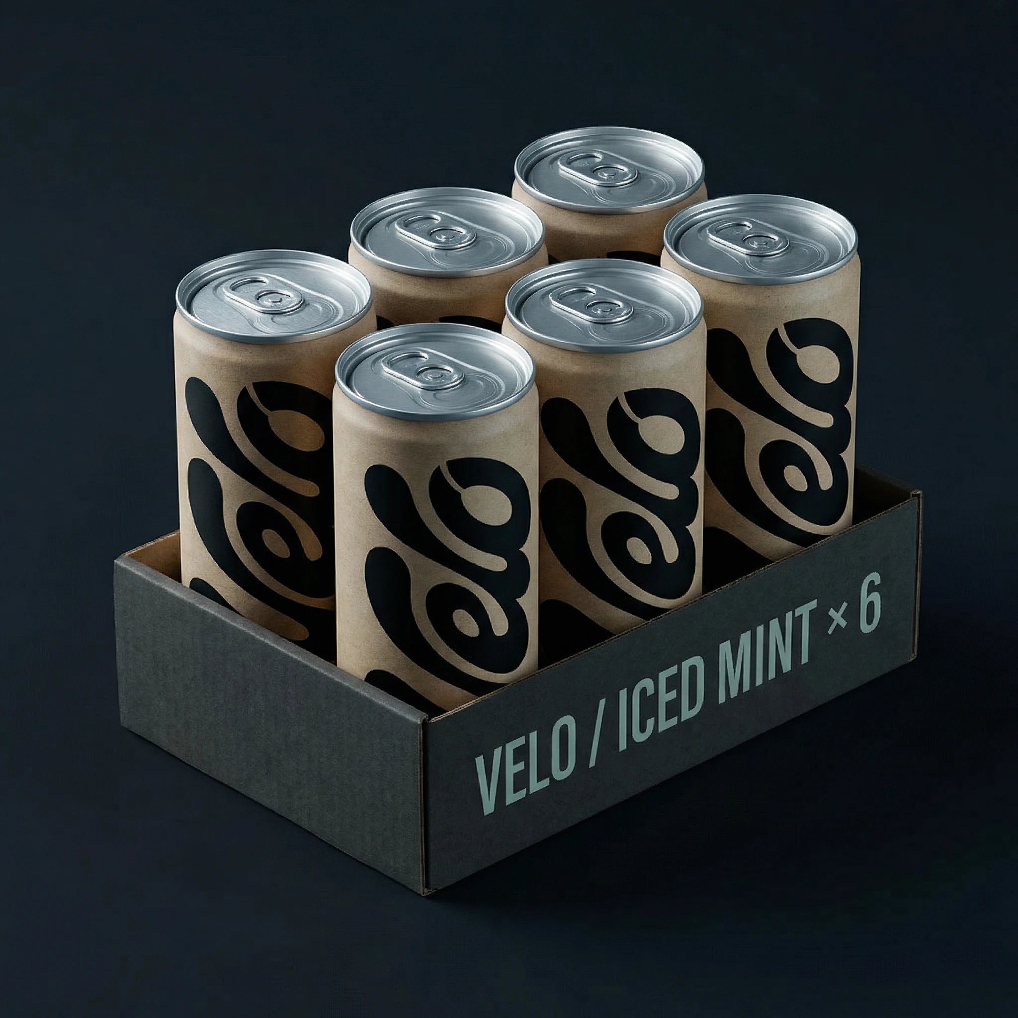
Mockup 07 — Motion Blur Campaign Poster. No Bebas Neue. The logo and the image alone. This is the only execution in the system with no secondary type — the restraint is the statement.
Mockup 08 — Brand Stationery Spread. The DL card carries "ICED MINT — COLD TEMPO" in Bebas Neue, tracking +80,
#f0f5e1 on #131a23. The business card is logo-only on the face. Bebas Neue on the reverse in small caps at 8pt for contact details.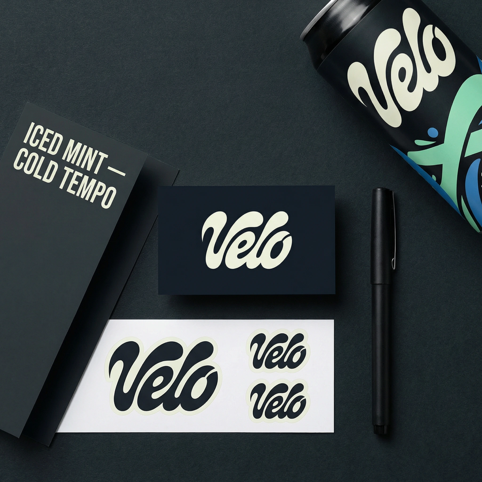
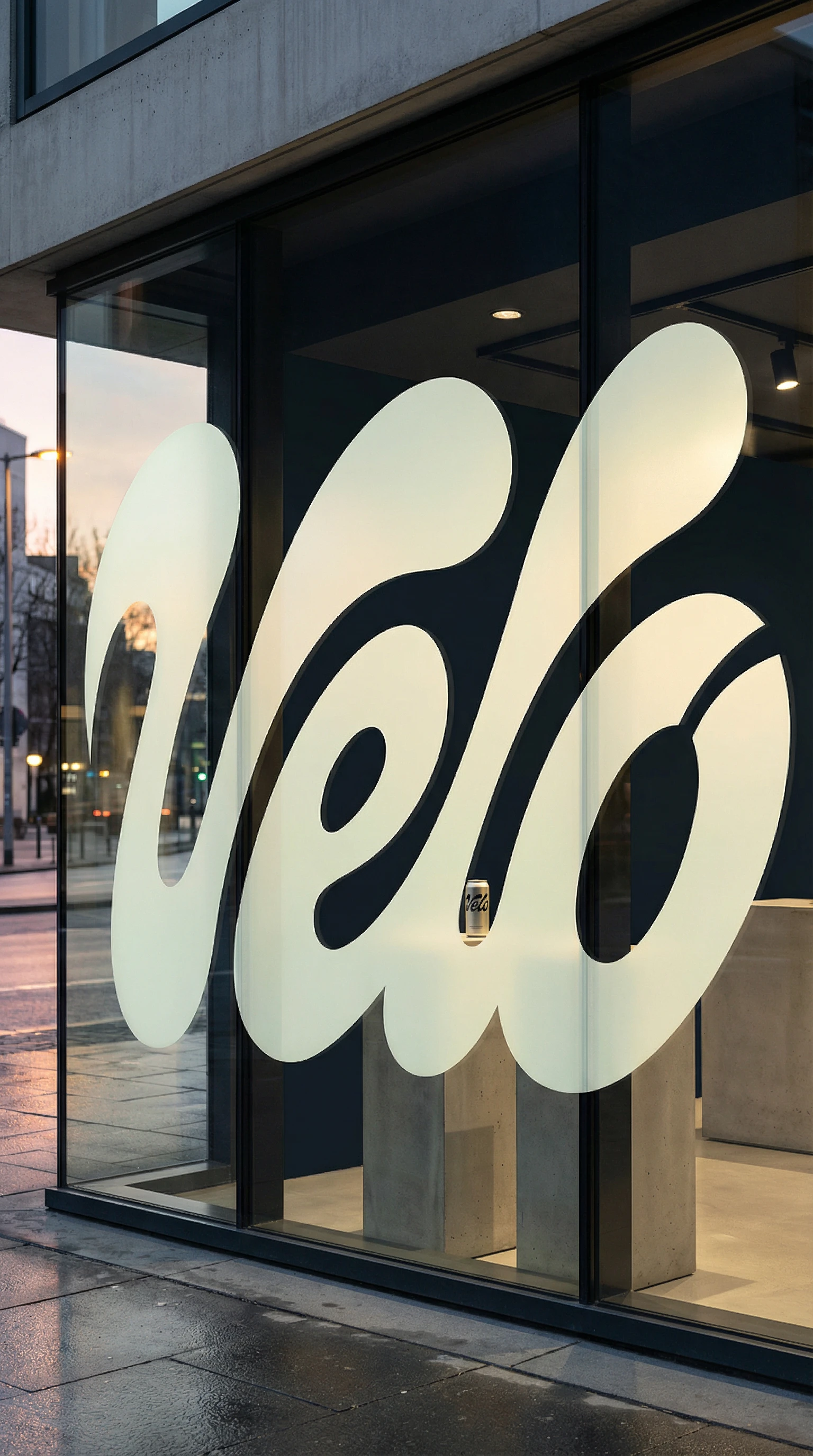
Mockup 09 — Window / Environmental Graphic. No secondary type in frame. The architectural scale of the logotype makes adding Bebas Neue unnecessary — the single can on the plinth inside does the product communication.
Mockup 10 — The Case Study Composite. "HEALTH DRINK — BRAND IDENTITY 2025" in Bebas Neue, tracking +200,
#4f6764, bottom-right alignment. The quietest instance of the typeface in the set — functional framing, not design statement.
Design Decisions
Why Bebas Neue over the premium alternatives. Druk and Owners Wide are more refined choices technically. But Bebas Neue has a directness that matches the brand's anti-hype position — it doesn't feel considered, it feels necessary. It is also free and universally available, which matters for a brand that will produce assets across multiple touchpoints and teams. The constraint becomes consistent.
Why fluid script and condensed sans, not two sans-serifs. Two geometric typefaces would have created a system that felt designed. The script-and-condensed pairing creates one that feels found — as if the brand's personality produced the logotype and the logotype demanded a specific counterpart. The logic runs in one direction.
Why the ad shows no product. The can has ten mockups. It does not need the ad. The ad's job is to establish the world the can lives in — cold, pre-dawn, unwitnessed effort. Showing the product in a four-second spot would reduce it to a cameo. Keeping it absent makes every can sighting elsewhere feel like a reward.
Why the palette from photography. Invented palettes feel designed. Extracted palettes feel true. Every colour in this system was physically present in the moment the reference image captured.
Why dark-dominant packaging. The shelf is bright. The competition shouts in citrus and electric blue. A near-black can with a warm off-white logo reads as different before the consumer even processes the brand name.
Why no illustration. The photography carries the emotional weight. The typography and geometry carry the structure. Adding illustration would dilute both.
Why the slash as the only motif. One graphic device, derived from the logo itself, is more ownable than a library of icons. Every time it appears it refers back to the letterform.
Outcome
A ten-piece identity set with a locked two-typeface system, a seven-colour palette sourced from a single photograph, and a four-second ad built from one static frame — all coherent, all traceable to the same source material. Velo looks like one thing from every angle.
Cold. Focused. In Motion.
Like this project
Posted Mar 10, 2026
Velo, Health drink identity. Dark palette, fluid script, Bebas Neue. Logo to ad in one system. Built from a single motion photograph.
Likes
2
Views
23
Timeline
Mar 3, 2026 - Mar 10, 2026