Veridian: Liturgy of Iron Collection brand, visuals


Case Study: Veridian – Liturgy of Iron (2026)
Executive Summary
Veridian is a luxury design house that launched its seminal collection, "Liturgy of Iron," in early 2026. The brand bridges the gap between biological elegance and industrial strength, a philosophy defined as "Prophetic Structuralism." The campaign moves beyond traditional jewelry into "functional architecture," utilizing brutalist aesthetics and "digital occult" motifs to redefine underground luxury.
1. Brand Philosophy: Form Follows Friction
The core of Veridian’s identity lies in the tension between the organic and the engineered.
The Liturgy: References a ritualistic, almost religious devotion to the craft.
The Iron: Symbolizes the cold, unyielding industrial foundation of the modern world.
Core Tagline: "Form Follows Friction"—a subversion of the modernist "form follows function," suggesting that beauty is born from resistance and struggle.
2. Visual Identity & Assets
The visual language is characterized by high-contrast monochrome palettes, sharp geometries, and "bio-electric" accents.
A. The Logomark: Corona di Spine
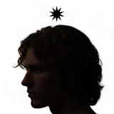
The "Crown of Thorns" serves as the primary icon. It is a minimalist, white-stroke graphic representing both a literal artifact and a symbolic halo. It appears as a physical headpiece in editorial photography and a floating digital asset in branding.
B. Typography

Logo mark
Primary Font: Grenze Gotisch. A blackletter typeface that provides a liturgical, ancient weight to the brand.

Secondary Font: Clean, modernist sans-serif for technical data and micro-copy.
C. Key Visual Motifs
The Glitch-Thorn: A line-art style where organic briars are "corrupted" by 90-degree digital angles.
Spectral Motion: High-shutter-speed photography capturing "light trails" from silver jewelry, representing energy in flux.
Industrial Hardware: A shift in v2 toward functional components, specifically the Thorn-Puller Zipper, treating garment hardware as standalone jewelry.

3. Editorial & Campaign Mockups


The campaign was executed through a series of "Sanctuary" shoots and industrial mockups:
Brutalist Cathedral Series: Models positioned within raw concrete archways, utilizing volumetric smoke and cold blue rim lighting to create a "modern religious" atmosphere.

The Relic Packaging: Jewelry housed in raw-cast concrete vaults or brushed stainless steel slabs, emphasizing the "artifact" nature of the pieces.

Urban Intervention: High-impact "Black Light" billboards where the crown logo glows intensely against dark cityscapes.

4. The Hero Website: "The Digital Sanctuary"
The website is designed not as a store, but as an immersive experience.
The Landing Page: A dark, minimalist void. A 3D-rendered "Corona di Spine" rotates in the center, reacting to the user's cursor.

Hero website
Navigation: Uses the Brutalist Grid System. Menu items are organized by coordinates rather than categories (e.g., Ritual instead of Shop, Manifesto instead of About).
The "Aura" Interface: As users scroll, the cursor leaves behind a faint emerald-teal motion trail, mimicking the campaign's "Abstract Motion" photography.
Audio Integration: A low-frequency industrial drone soundscape triggers upon entry, deepening the immersion.
The Lookbook: A vertical-scroll experience where imagery is broken by "glitch" transitions and technical blueprints of the hardware.
5. Conclusion
The "Liturgy of Iron" case study demonstrates how a cohesive narrative—Prophetic Structuralism—can be woven through every touchpoint, from a 1pt line-art thorn to a massive concrete storefront. Veridian has successfully created a "Subterranean Luxe" niche that feels both ancient and futuristic.
3 likes · 58 views · Feb 3, 2026
Developed Veridian, establishing a foothold in the competitive luxury market by subverting the traditional "minimalist" jewelry trend.
Timeline
Jan 1, 2026 - Mar 31, 2026