Blendworks Brand Identity Development
Révolté
Blendworks - Brand Identity & Guidelines
AI Media Generation Platform | 2026
Overview
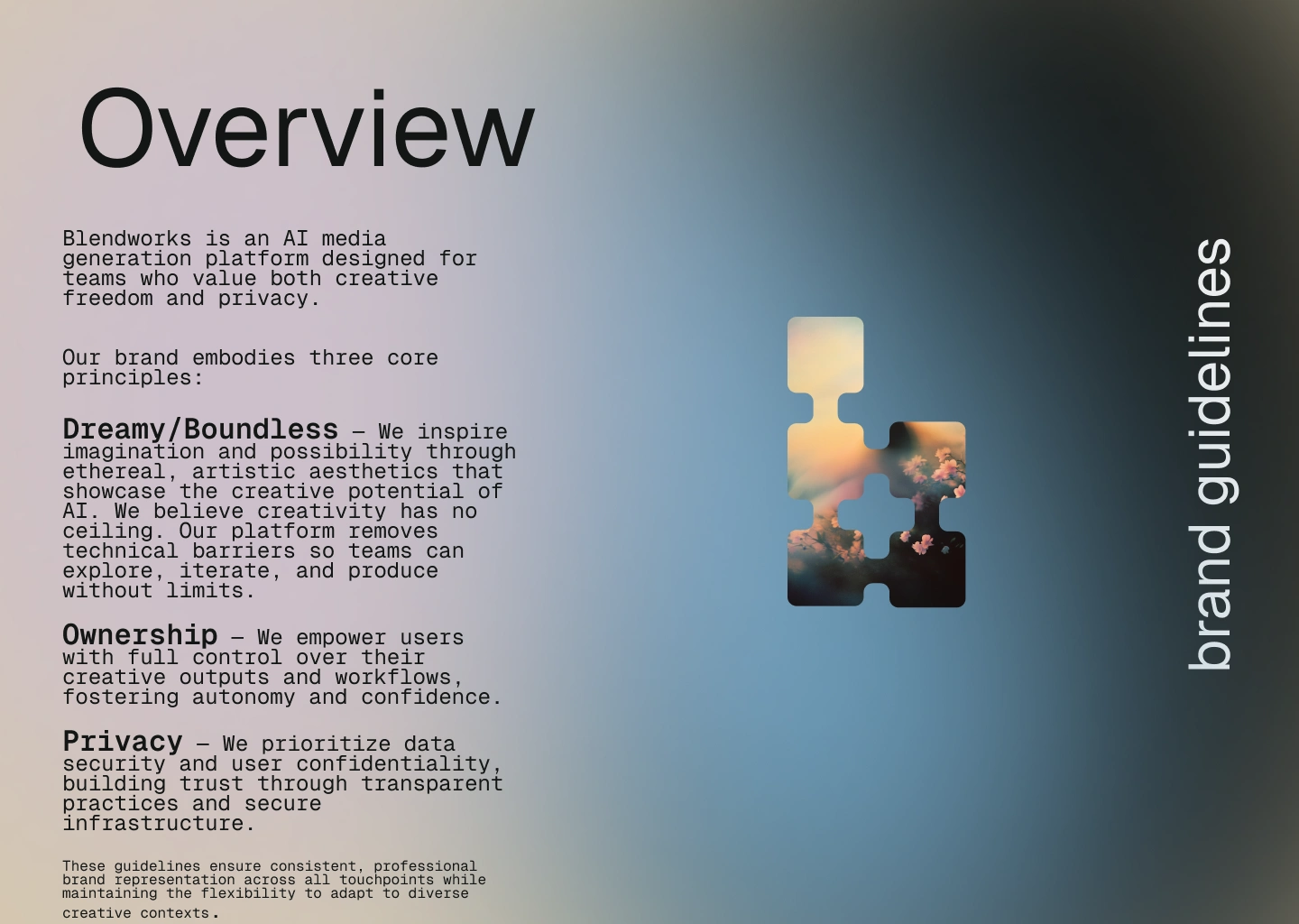
Blendworks is an AI media generation platform designed for creative teams who value boundless creativity, ownership, and privacy. I developed a complete brand identity system from the ground up, creating a distinctive visual language that balances technical credibility with creative aspiration.

The Challenge
Blendworks needed a brand identity that would:
Differentiate from the sea of blue-and-purple AI platforms
Appeal to creative professionals, not just developers
Communicate three core values: Dreamy/Boundless, Ownership, and Privacy
Work cohesively across digital platforms and marketing materials
Feel modern and approachable, not corporate or cold
The initial direction leaned too technical. The typography felt developer-focused, and the visual language needed to open up to express creative possibility without limits.
Process & Approach
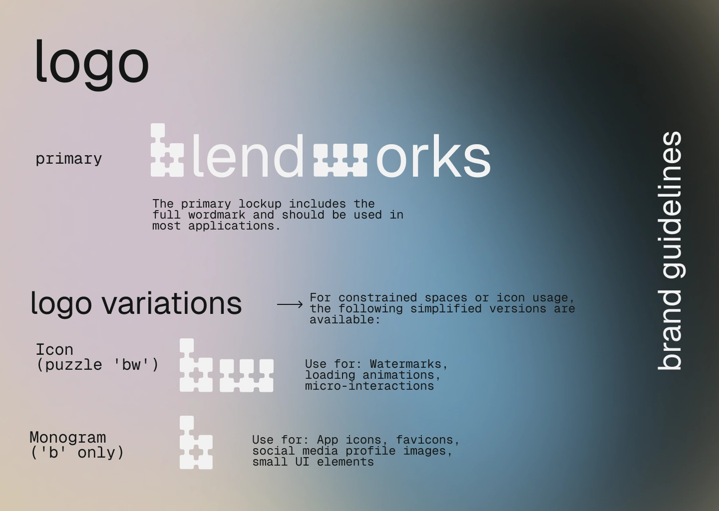
Logo Design
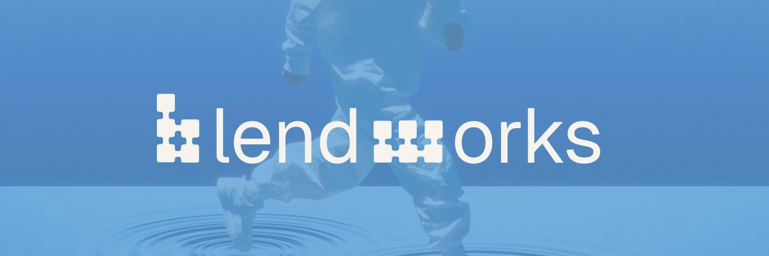
Created a custom wordmark featuring:
Puzzle piece motif representing modular workflows and collaborative creativity
Custom letterforms for 'b' and 'w' that integrate seamlessly with the puzzle concept
Clean, geometric construction that works at any scale
Three variations: full wordmark, 'bw' icon, and 'b' monogram for different applications
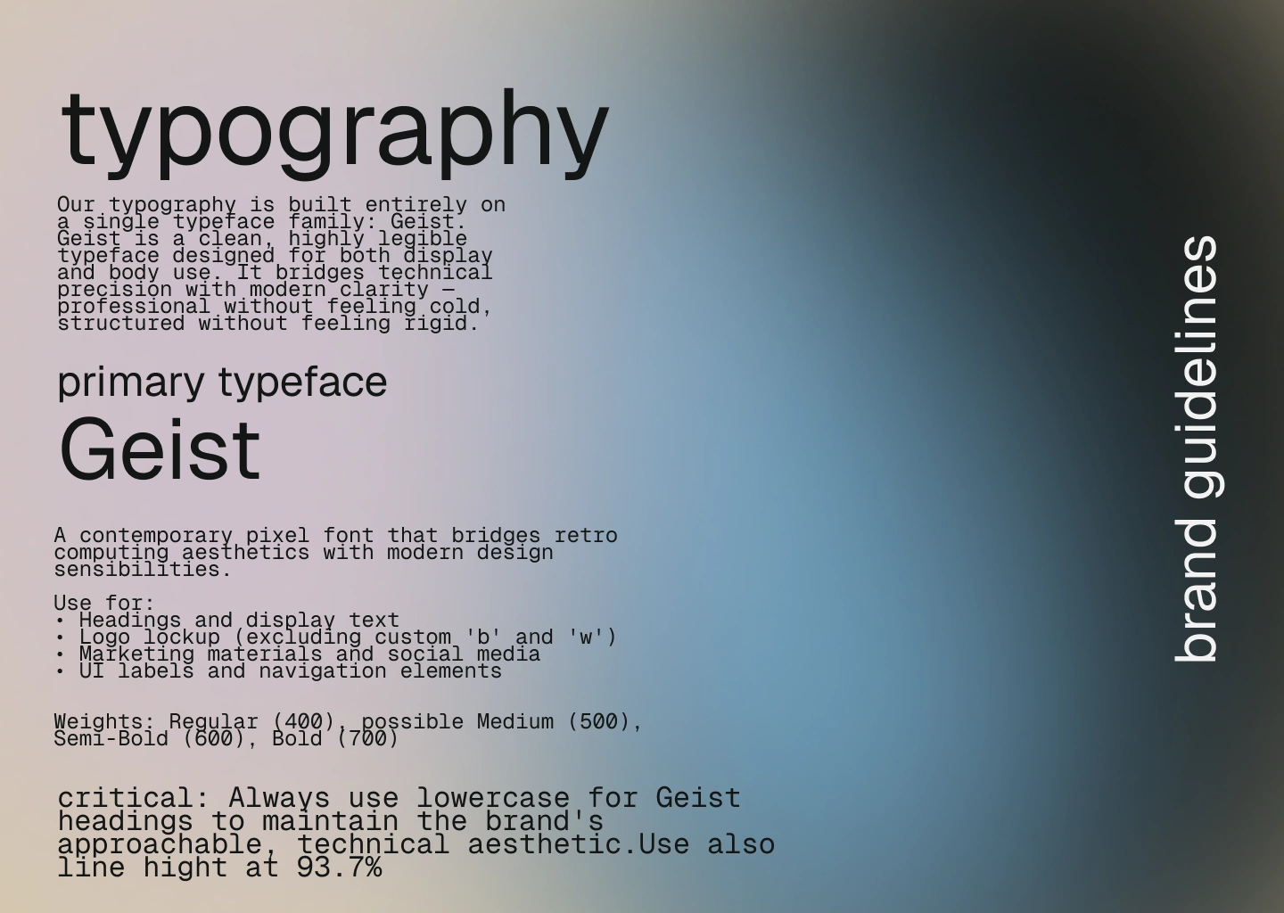
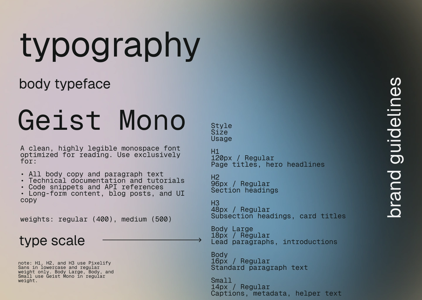
Typography System
After exploring multiple directions, simplified to a single typeface family for maximum cohesion:
Geist (regular weight only) for headings and display text
Geist Mono (regular and medium weights) for all body copy
Lowercase treatment for headings creates approachable, modern personality
This dual-system approach bridges technical precision with contemporary clarity
Critical brand rule: Headings must always be lowercase to maintain the brand's distinctive, approachable voice.
Color System
Developed two complementary palettes that work independently or together:
Palette 1 — Boundless Expansion
A brighter, more energetic palette communicating creative possibility and forward motion.
Sky Blue (
#5B9FD8) - Energy, optimism, creative possibilityDeep Charcoal (
#1A1F1E) - Grounded sophistication and privacyWarm Sand (
#D7C9A8) - Approachable warmthSupporting: Pearl (
#F7F3ED), Muted Taupe (#B7B5AD)Usage: Product launches, feature announcements, high-energy creative content
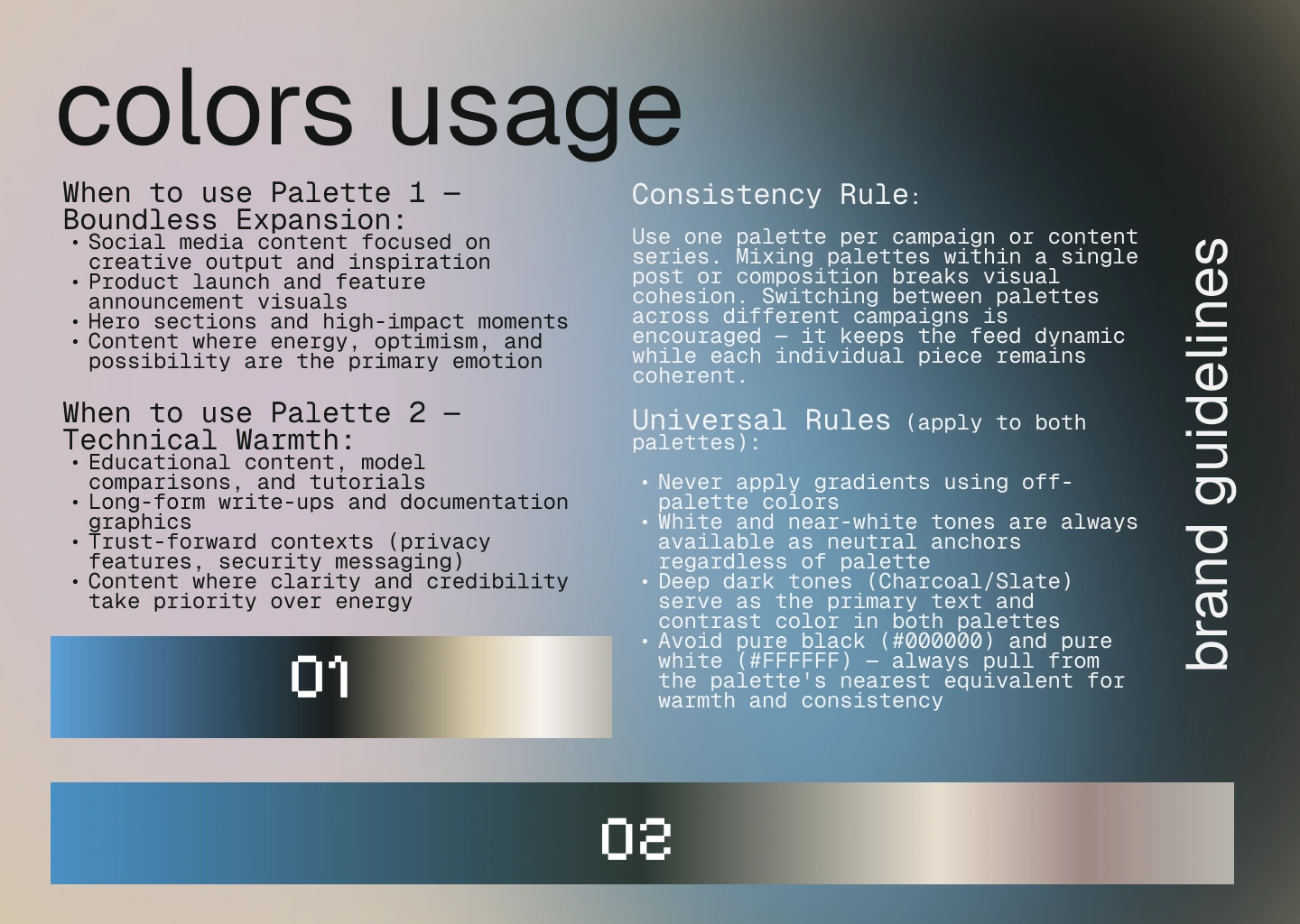
Palette 2 — Technical Warmth
A slightly more restrained palette balancing technical credibility with human approachability.
Code Blue (
#4A90C4) - Technical familiaritySlate Green (
#2C3832) - Stable, trustworthy foundationLinen (
#E8DED0) - Soft, inviting neutralitySupporting: Off-White (
#FAF9F6), Dusty Rose (#D4B5B0)Usage: Educational content, documentation, trust-forward messaging
Consistency rule: Use one palette per campaign or content series to maintain visual coherence.
Visual Language
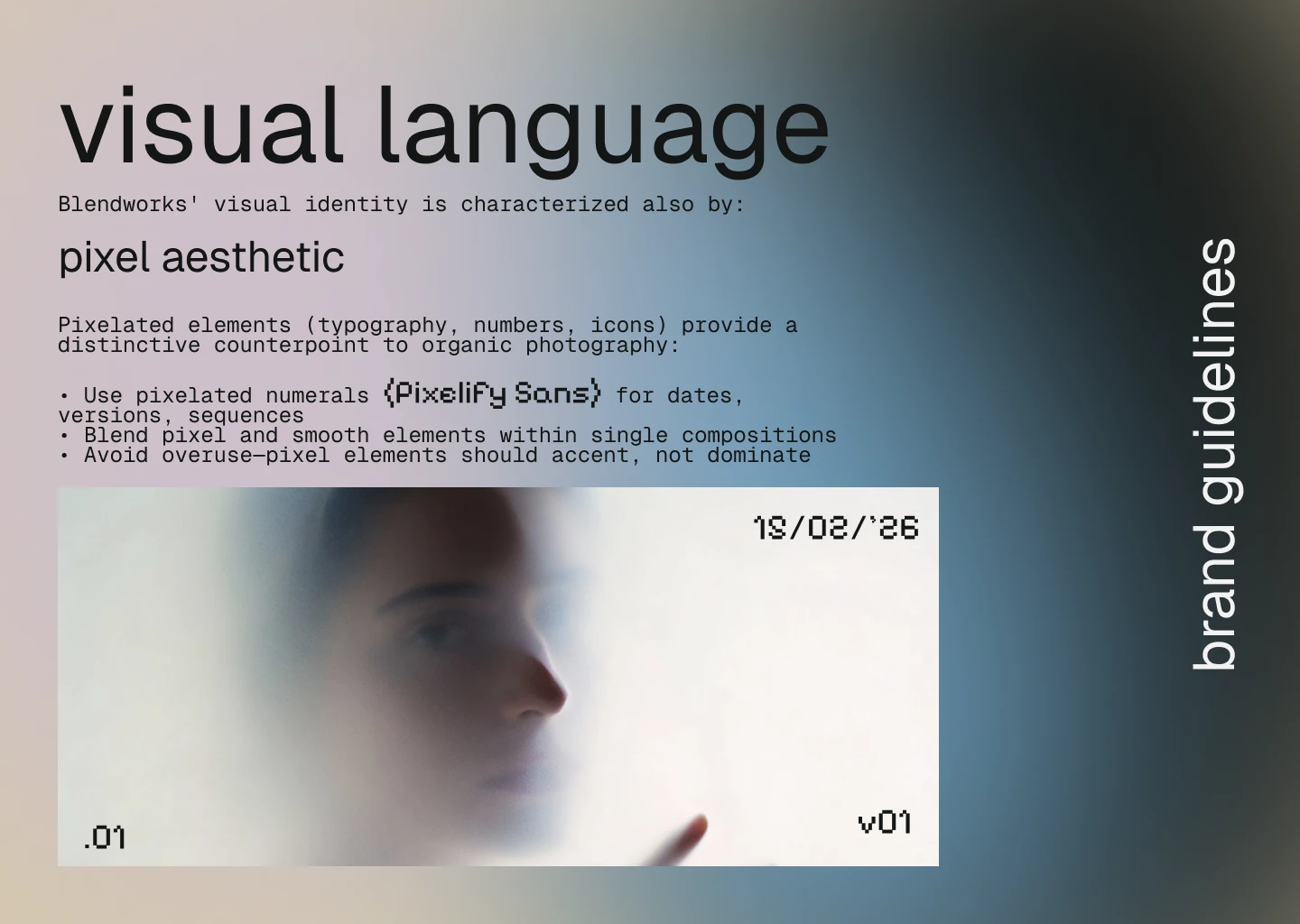
Established a distinctive aesthetic direction:
Photography style: Ethereal, dreamy aesthetic with soft focus and motion blur; double exposure effects suggesting layered creativity; muted atmospheric color grading; natural subjects over tech clichés
Puzzle piece motif: Flexible graphic device used as frame elements, interlocking compositions, subtle patterns, and UI transitions
Pixel aesthetic: Pixelated numerals using Pixelify Sans for dates, versions, and sequences; blend of pixel and smooth elements within compositions
Deliverables
Brand Guidelines Document (20+ pages)
Comprehensive system covering:
Brand overview with core principles (Dreamy/Boundless, Ownership, Privacy)
Logo usage, variations, safe space requirements, and don'ts
Complete typography system with specifications and hierarchy
Dual color palette system with detailed usage guidelines
Visual language and photography direction
Pixel aesthetic guidelines
Brand voice framework (approachable, empowering, trustworthy, inspired)
Social media layout system and content pillars
Application examples across contexts
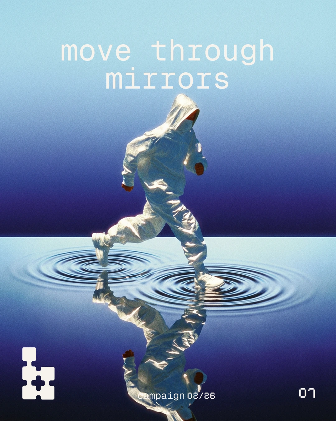
Social Media System
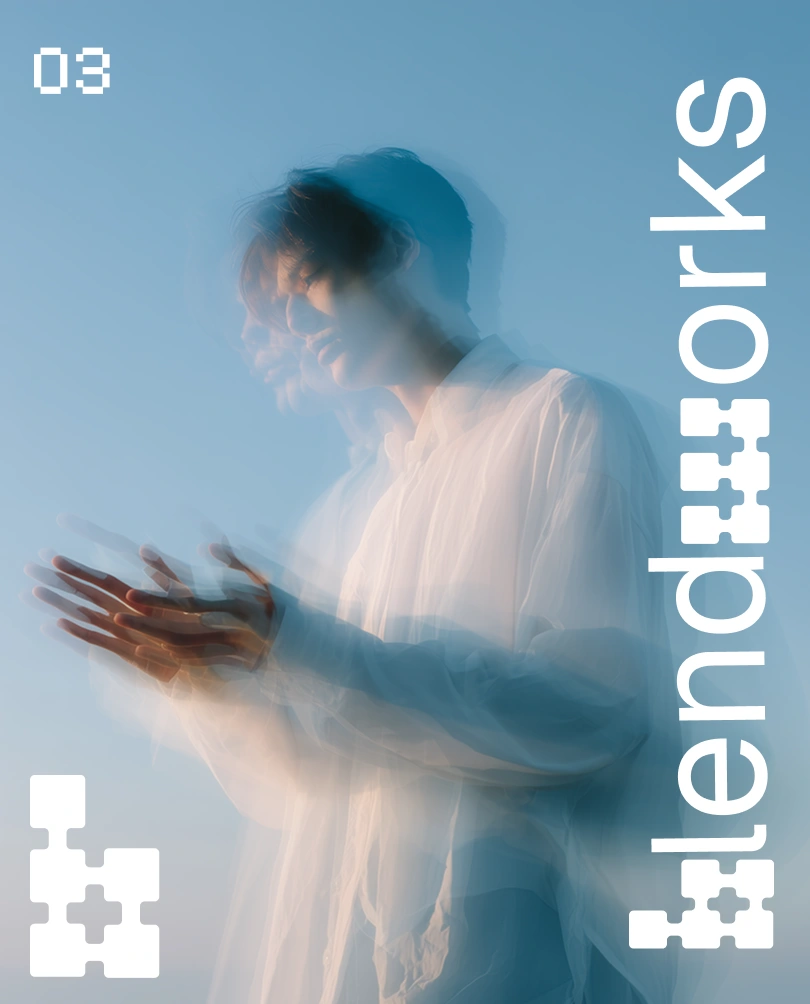
Designed a consistent, instantly recognizable layout framework:
Post number (top left, Geist lowercase, pixelated style)
Puzzle 'b' logo (bottom left)
'blendworks' wordmark (vertical, right side, rotated 90° clockwise reading bottom-to-top)
Template works across Instagram, Twitter/X, LinkedIn
Maintains brand recognition while allowing content variety
Content Pillars defined:
Product Updates — Features, model integrations, improvements
AI Model Education — Comparisons, tutorials, strengths/weaknesses
Community Showcase — User creations, case studies, workflows
Industry Insights — AI trends, creative techniques, thought leadership
Visual Campaign Exploration
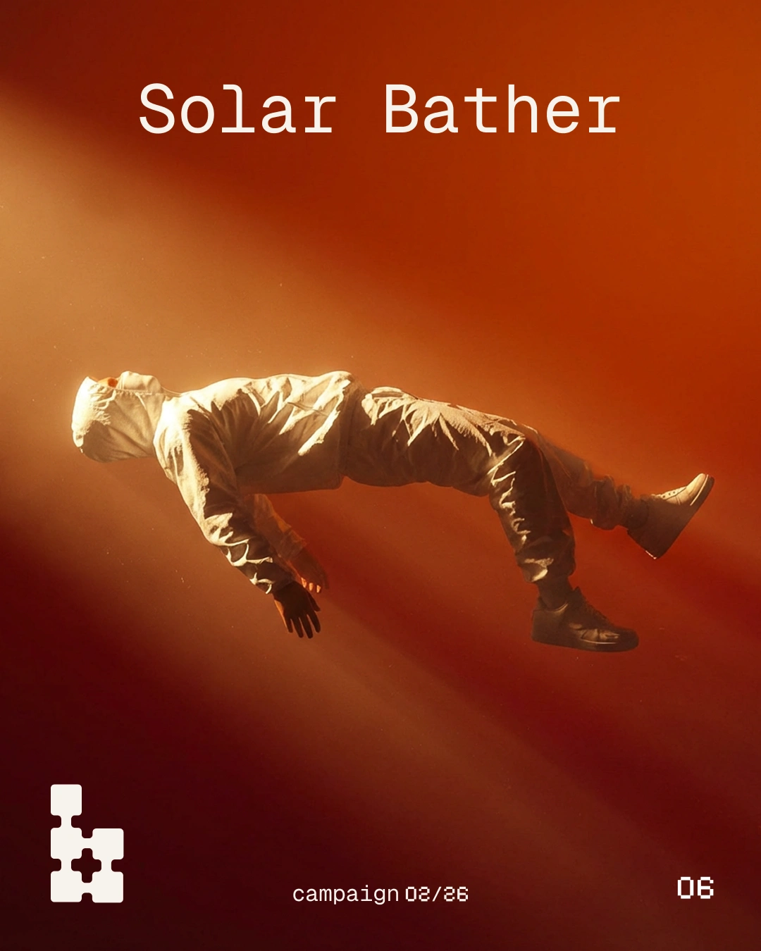
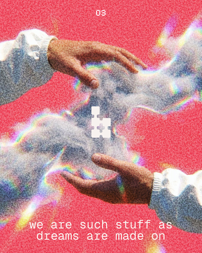
Developed concept campaign exploring "boundless" and "dreamy/ethereal" themes through retro-futuristic imagery:
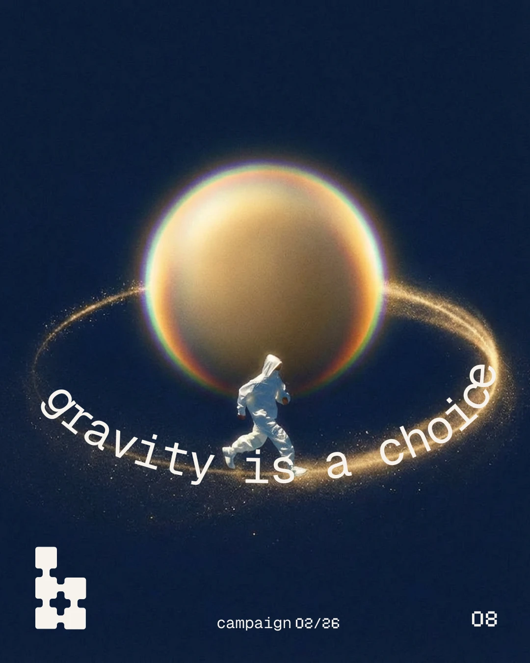
Figures in impossible physics scenarios
Bold saturated colors with chromatic aberration effects
Space-age optimism meets 1970s sci-fi editorial aesthetic
Weightless subjects, prismatic light effects, dreamlike compositions
This exploration helped define the visual boundaries and established the brand's distinctive aesthetic direction that differentiates it in the AI platform space.
Key Design Decisions
Single typeface system: Moved from multi-typeface approach (Pixelify Sans + Geist) to Geist family only, based on client feedback that the initial pixel font felt too developer-focused rather than creative-professional focused. This simplification created clarity and sophistication.
Dual palettes for strategic flexibility: Instead of one rigid color story, created two complementary palettes serving different emotional contexts (energetic launches vs. trust-building education) while maintaining overall cohesion.
Lowercase as non-negotiable brand signature: Consistent lowercase treatment across all headings and display text became a core brand rule, creating immediate recognition and reinforcing approachable, modern personality.
Puzzle motif as conceptual through-line: The puzzle piece represents how the platform connects different AI models into unified workflows—this metaphor runs throughout the visual system from logo to UI patterns.
Evolving core principles: Shifted from "Dreamy" to "Boundless" as a core value during the project, emphasizing limitless creative possibility over purely aesthetic qualities, better positioning the platform for growth.
Outcome
Delivered complete, production-ready brand identity system currently in use by Blendworks. The guidelines provide clear direction for maintaining consistency as the platform scales, while the flexible dual-palette system allows for visual variety without losing brand cohesion.
The system successfully:
Differentiates Blendworks in the crowded AI platform market
Appeals to creative professionals while maintaining technical credibility
Provides flexible structure that can adapt to various content needs
Establishes ownable visual language through puzzle motif and lowercase typography
Balances approachability with sophistication
Project Scope: 2-week engagement
Role: Brand Designer and Logo Designer
Deliverables: Complete logo system, comprehensive brand guidelines (20+ pages), dual color palette strategy, typography system, visual language direction, social media templates and content framework
Like this project
Posted Mar 1, 2026
Transformed AI platform from developer-focused to creatively-aspirational. Puzzle logo, dual palettes, 20-page guidelines, now live across all touchpoints.
Likes
1
Views
21
Timeline
Feb 13, 2026 - Mar 27, 2026
Clients
Blendworks