
pro
Révolté
Brand identity, web design & dev. Fast, precise, opinionated
- $5k+
- Earned
- 11x
- Hired
- 5.00
- Rating
- 717
- Followers
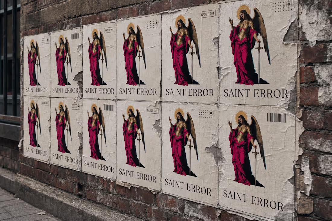
Saint Error Portfolio Brand System
0
0
Brutalist Brand Identity for LOAD Nutrition
1
9
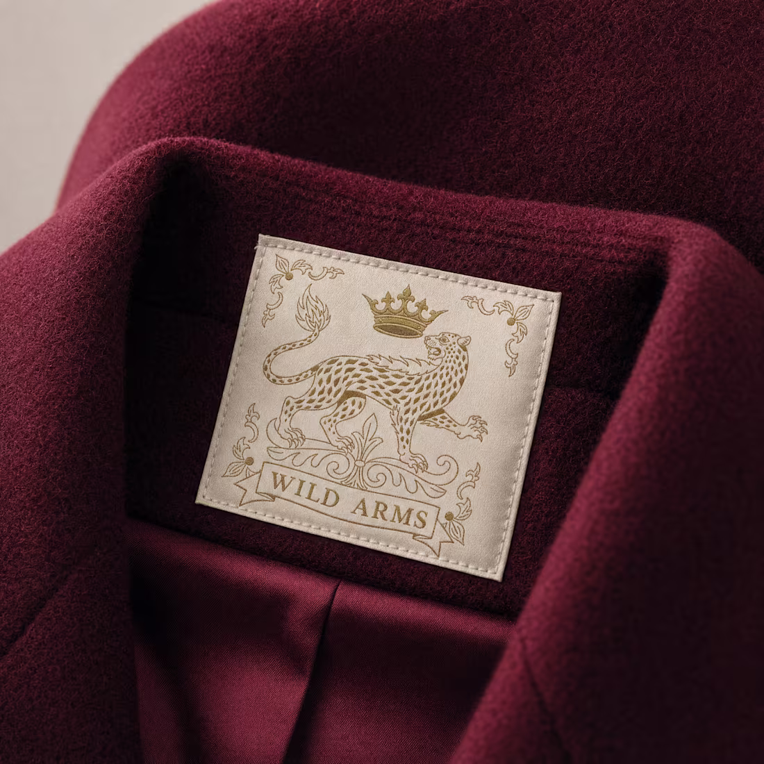
WILD ARMS: A Monarchy Overthrown by the Wild Itself
2
9
EXQUIS Brand and Campaign Development
1
4
Fracture Brand Identity & Visual System
2
25
Canopy Capital Brand Identity & Website
3
11
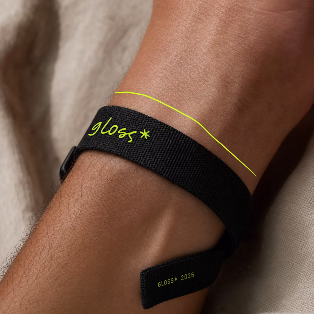
GLOSS* The World seen twice
2
25
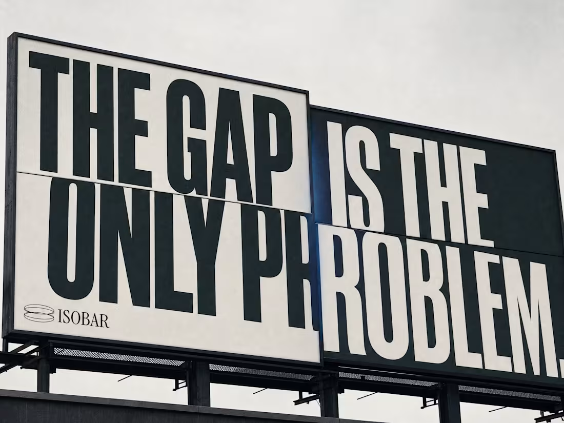
Isobar Brand Identity and Campaign Design
1
10
MUSCL: The Body as Evidence
2
15
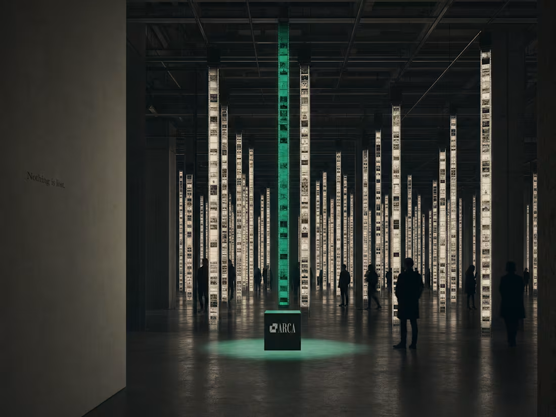
ARCA — The Archive Is Alive
1
18
FOVEA, Streetwear Brand Identity
2
10
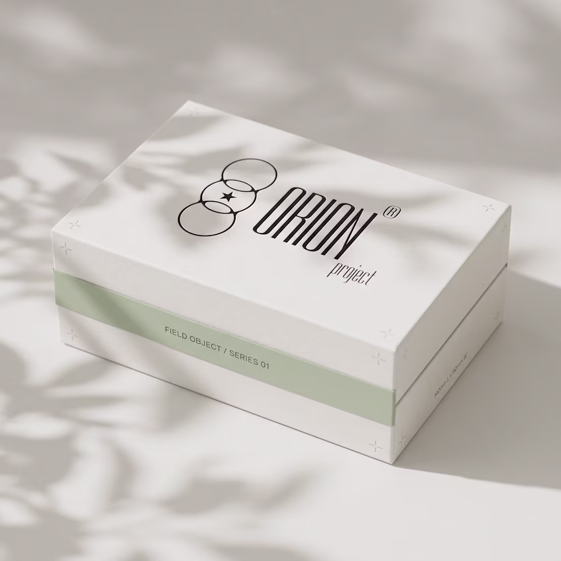
Orion Brand Identity Project
6
41
KATACHI: The Structure Beneath
4
14
YXNG - Idol Culture as Financial Infrastructure
0
12
RUÏNE: Demolished Luxury Brand Identity
0
15
PATINE: Beauty Brand Development
0
12
Tally Brand and Product Design Project
1
14
Last Known Location: A Fragrance Archive Identity
4
17
IRONGRADE: Brand Identity Development & Website
2
19
Creation of 3rd Floor Brand Universe
2
20
HELDER: Chrome in the Soil - A Speculative Brand Exploration
2
15
AZURA Brand Identity Development & Website
1
10
Yonk: Play Loud - A New Gaming Brand Identity
3
25
Helix Protocol Brand Identity for Bio-Futurism
3
30
SERAPH Brand Identity, Visual System & Website Development
6
34
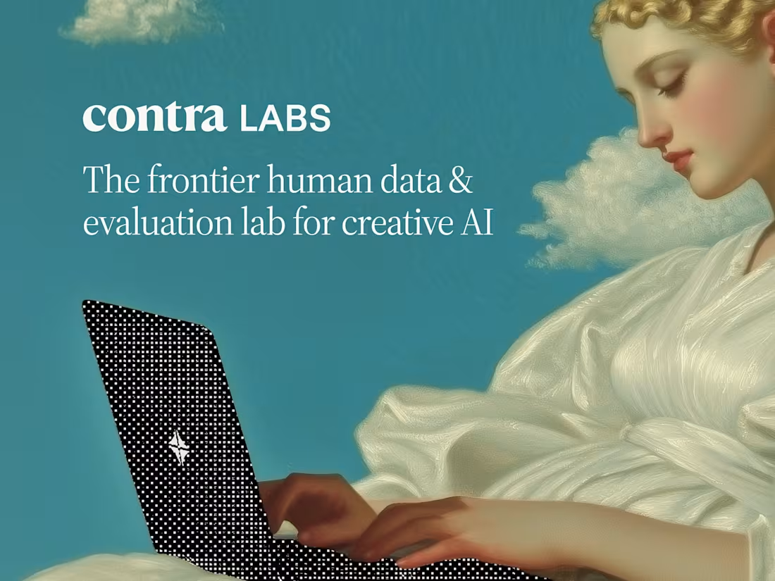
Visual Quality Assessment for AI Graphics
5
62
LATRO°: The City, Annotated Brand System
2
23
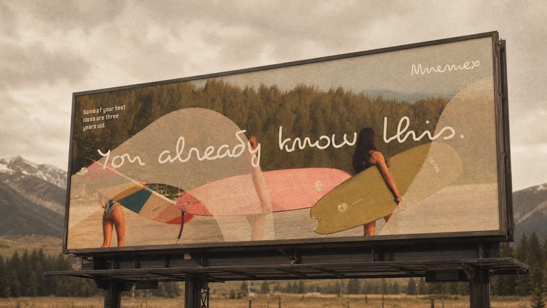
Mnemex Brand Identity and System Design
1
13
POLVERE Brand Identity Design & Website
3
21
Ziru Identity System Development
3
17
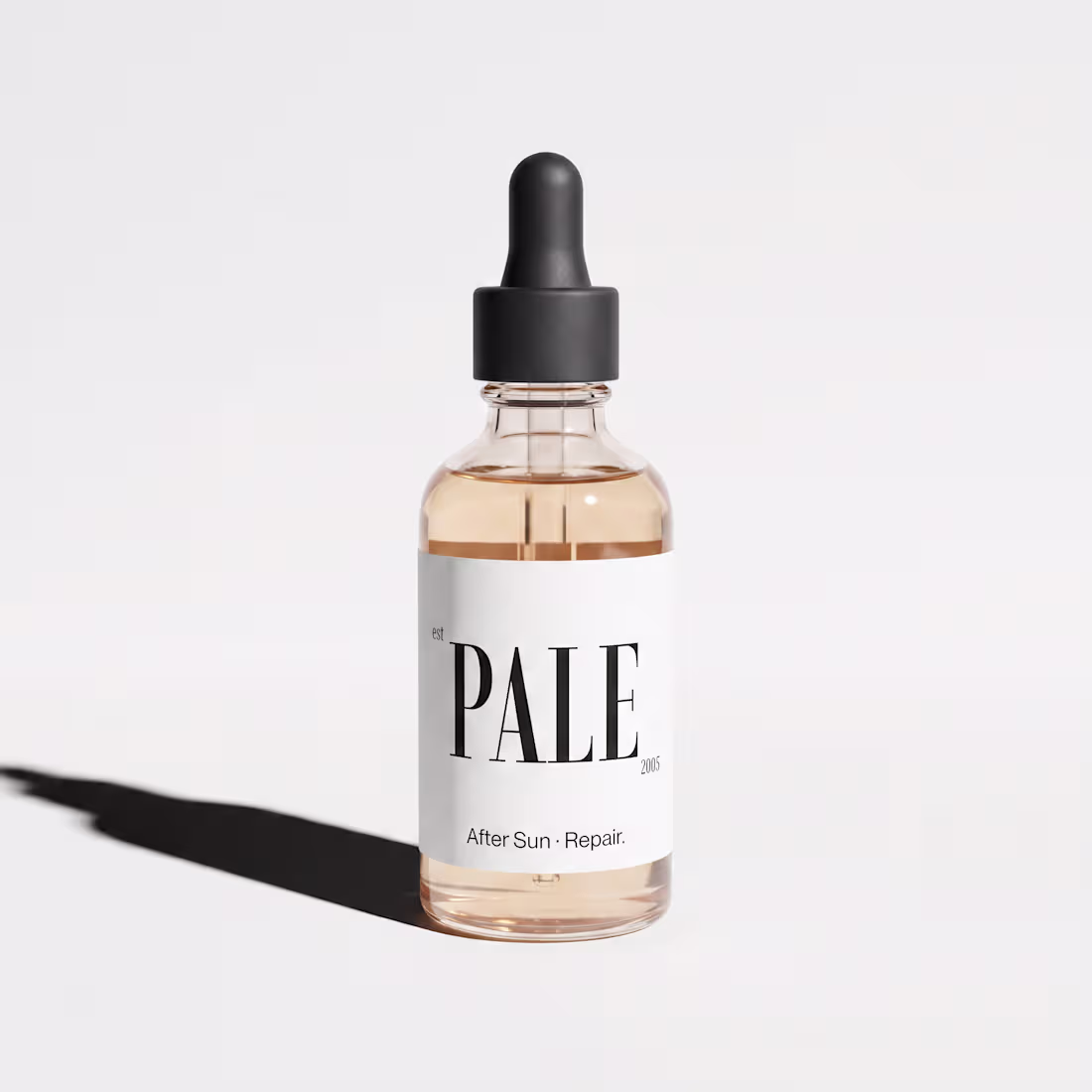
PALE Brand Identity Design
2
25
Onbrd Brand Identity & Brand Guidelines
4
32
SERO Brand Identity and Character System Development
5
15
Rogue Meridian Brand Identity Project
0
13
The Hawker Codex: Timeless Brand Identity
4
23
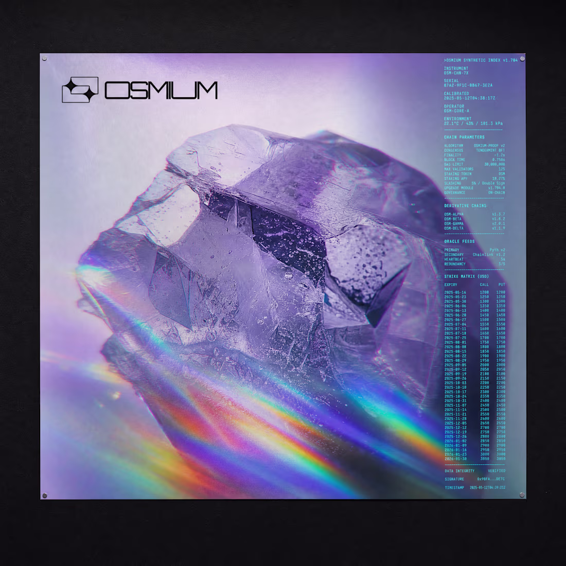
OSMIUM Brand Identity & Product Design Project
0
17
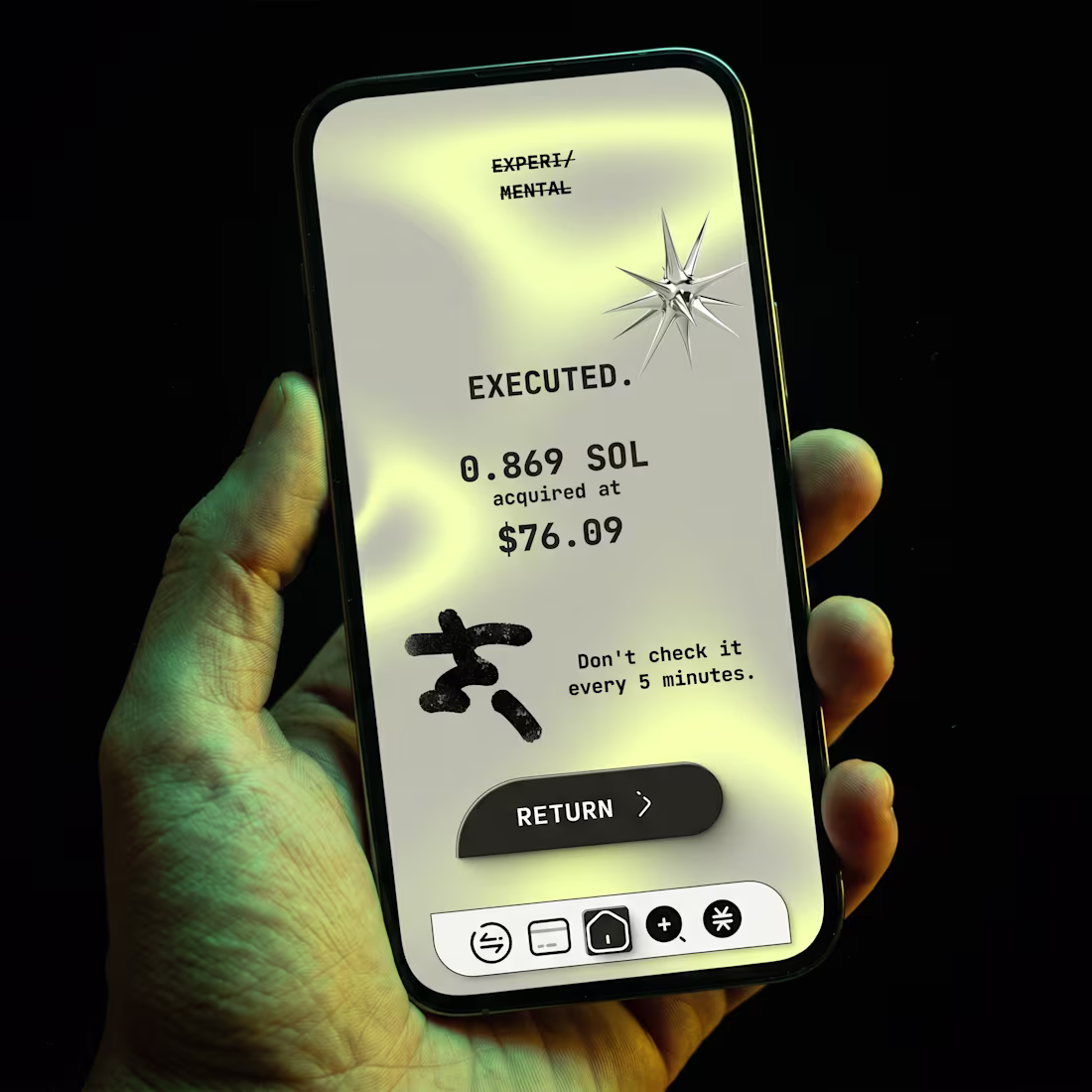
EXPERI/MENTAL Crypto Wallet Design
2
20
TOKAN Brand Identity Design
0
14
SOLEN Studio Visual Identity
1
19
PLNE Brand Identity, Mobile & Website Project
1
9
MRCRY: Brand & Website Design
3
24
Kairos UI and Brand Development
4
12
Tessler & Co. Brand Identity Design
4
16
Brand Identity for Still Here
3
17
Phlox Brand Identity Development
4
32
NOCTREF Brand Identity Design
0
15
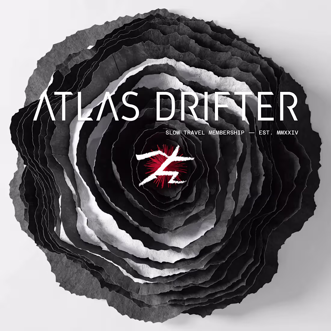
Atlas Drifter: Slow Travel Brand Identity
0
12
COSTA Visual interface & Brand Identity Creation
2
16
KŌRO: Brand Identity Design and Website for Japanese Whisky
2
17
PREST: Tennis Club Brand Identity & Website
1
29
Nightshift Website and Brand Identity Design
3
18
Grub Club Brand Identity, Website and System Design
2
18
Spore: A Biological Exploration in Branding
2
19
RELIQUARY: Ancient-Future Brand Identity Project
0
11
GRIMHEAT Brand Identity & Campaign
1
16
Avant People OS Branding Project
0
15
Kira Website & Brand Identity System Development
1
10
BLEEDLINE Website and Brand Identity Project
1
17
Faxlo Brand Identity Development
1
24
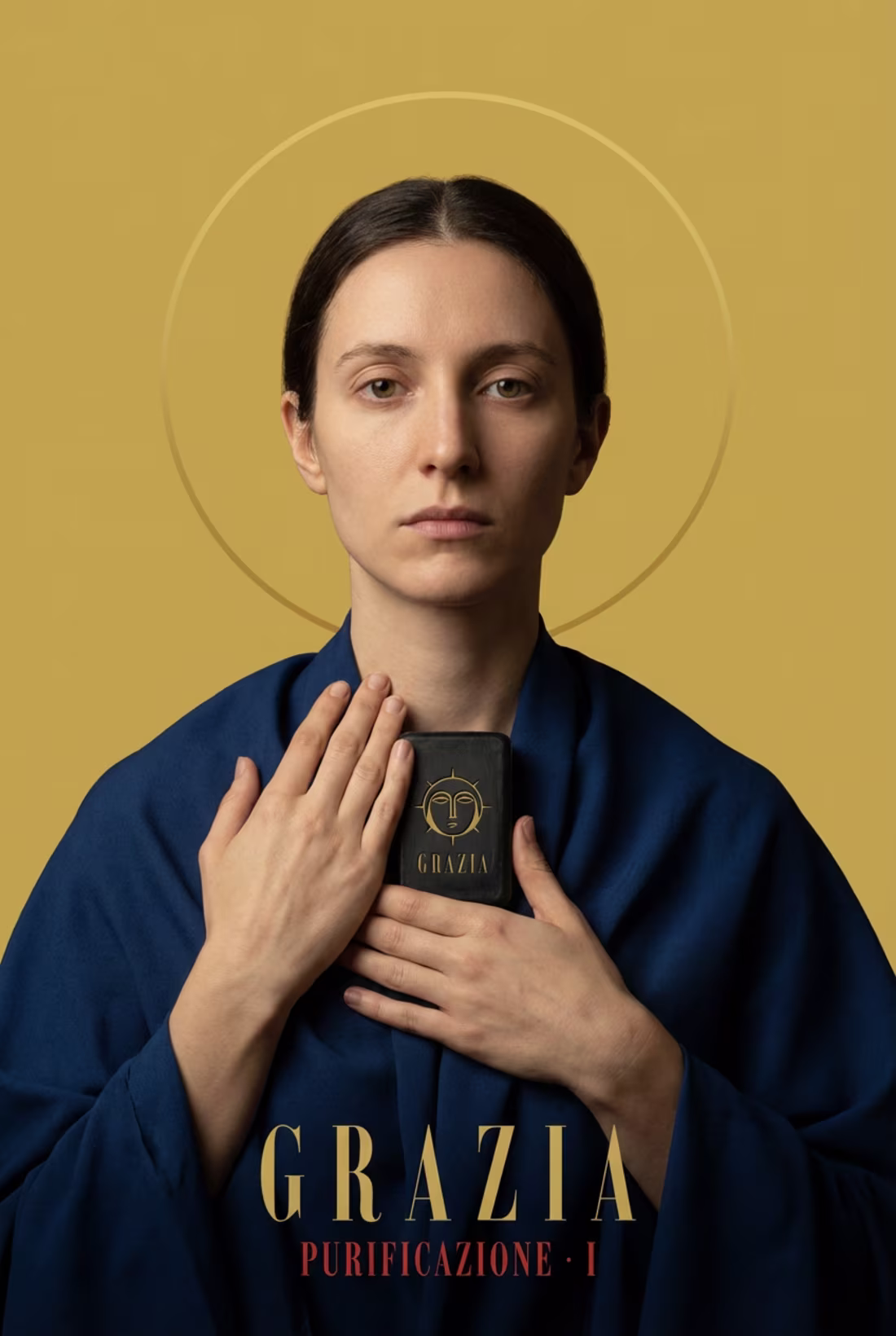
GRAZIA: A Byzantine-inspired Brand System
2
14
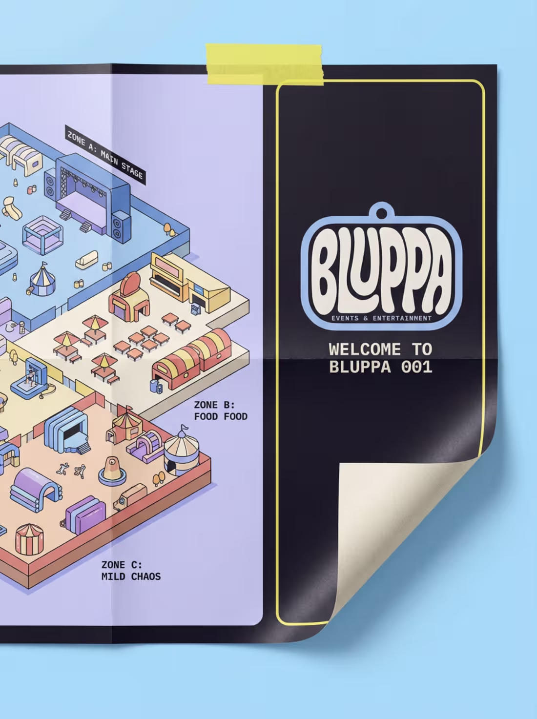
Bluppa Brand Identity & Website Design
0
29
VITRD, Threat Intelligence Platform Brand Identity
0
20
Abyssal Tide Brand Identity Creation
1
23
Auris Brand Identity Development
2
19
Caravan Brand Identity and Campaign Design
1
12
Nullhaus Website and Brand Identity
3
10
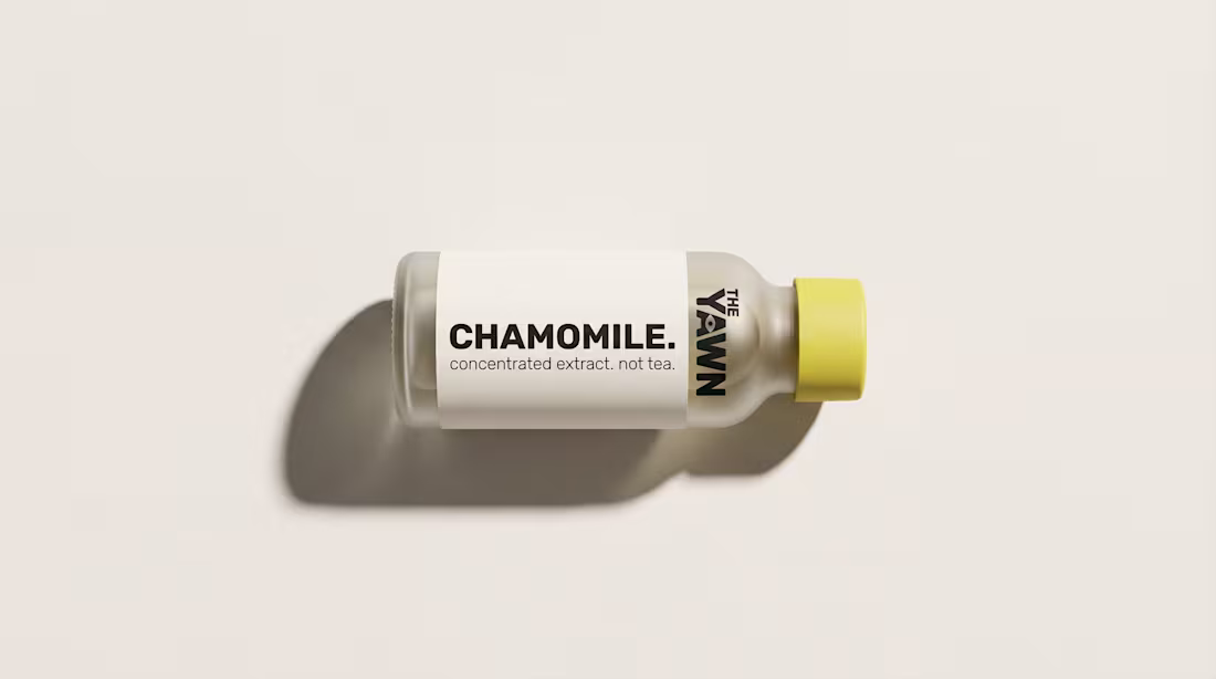
Minimalist Brand Identity for The Yawn
4
13
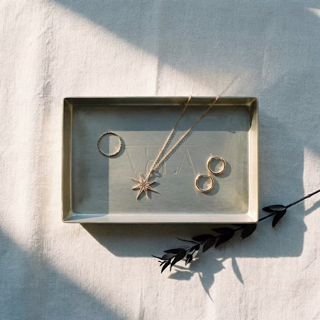
VELA Brand Identity and Website Design
2
18
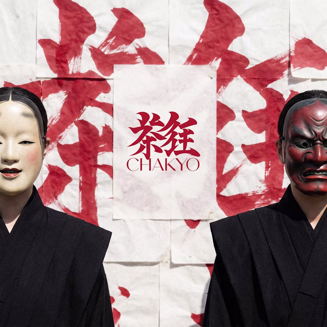
CHAKYŌ Brand Identity Design
4
24
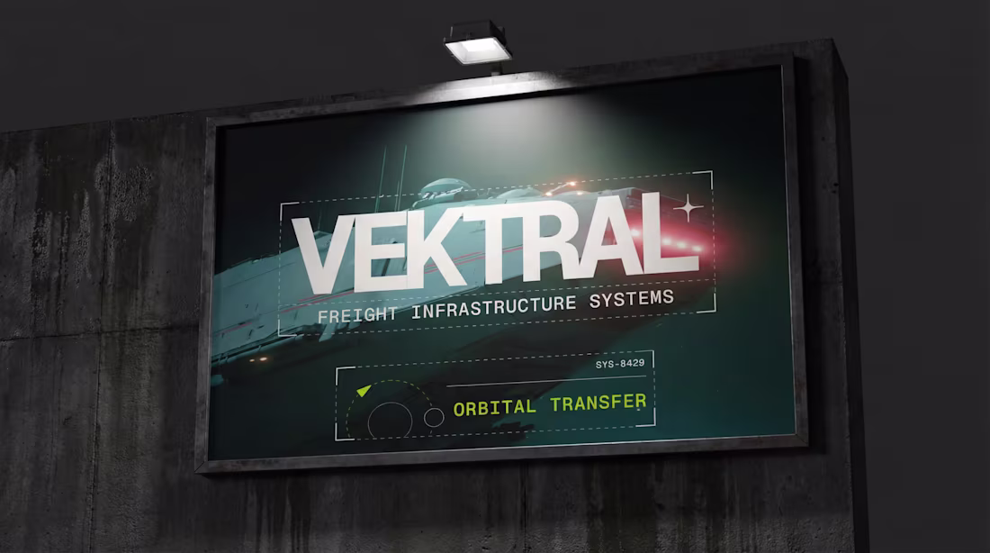
VEKTRAL Brand Identity Project
2
26
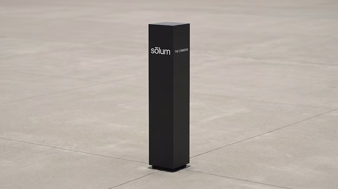
Sōlum Brand Identity & Website
2
29
MARE Brand Identity System Development
1
52
DPLY Brand Identity & Web Creation
1
15
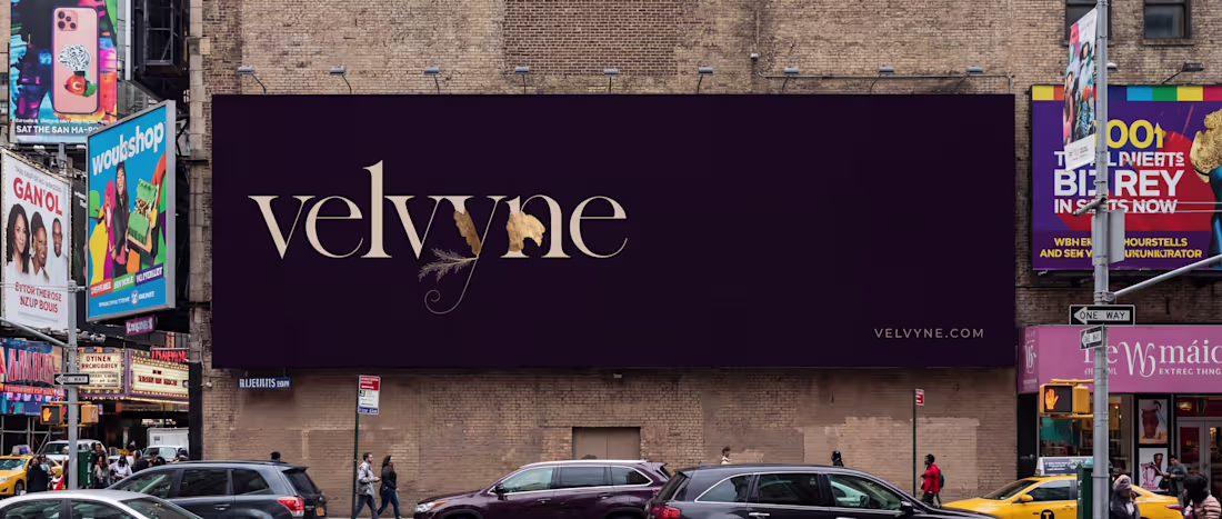
Velvyne Brand Identity & Website Development
0
36
Folio Brand Identity Development
1
22
Kipple Brand Identity Development
2
39
SLYK Brand Development
1
32
STROKE Brand Identity and Website Development
0
20
Dorure Website and Brand Identity Development
0
8
REMNANT Website and Brand identity
1
17
KORE Brand Identity Development
0
14
Creating Yáal's Brand Identity: Serpent & Smoke
1
20
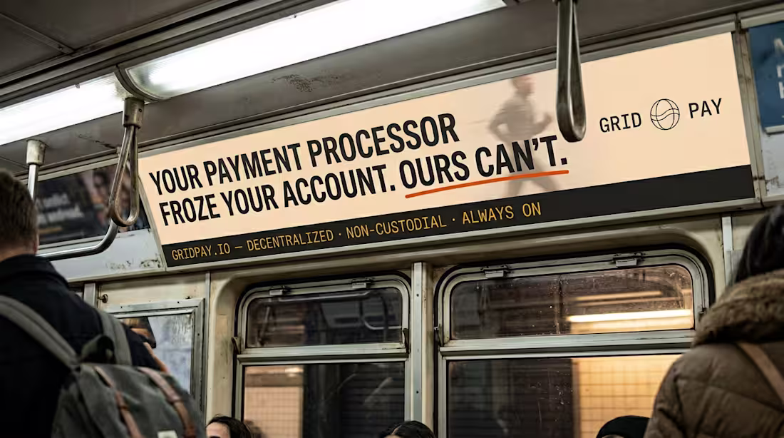
GRIDPAY Brand Identity and Web Design Project
0
17
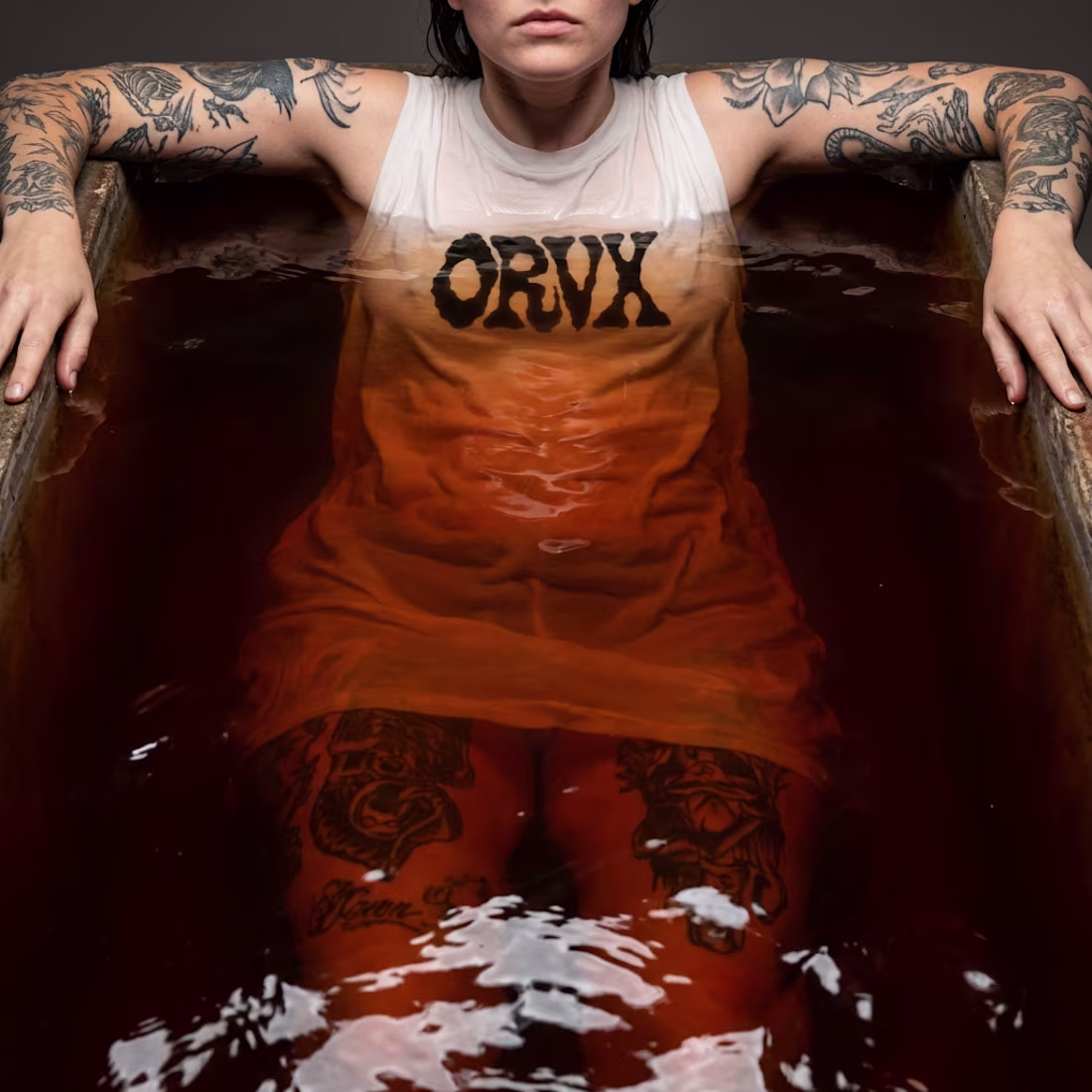
ORVX Brand Identity Development
4
43
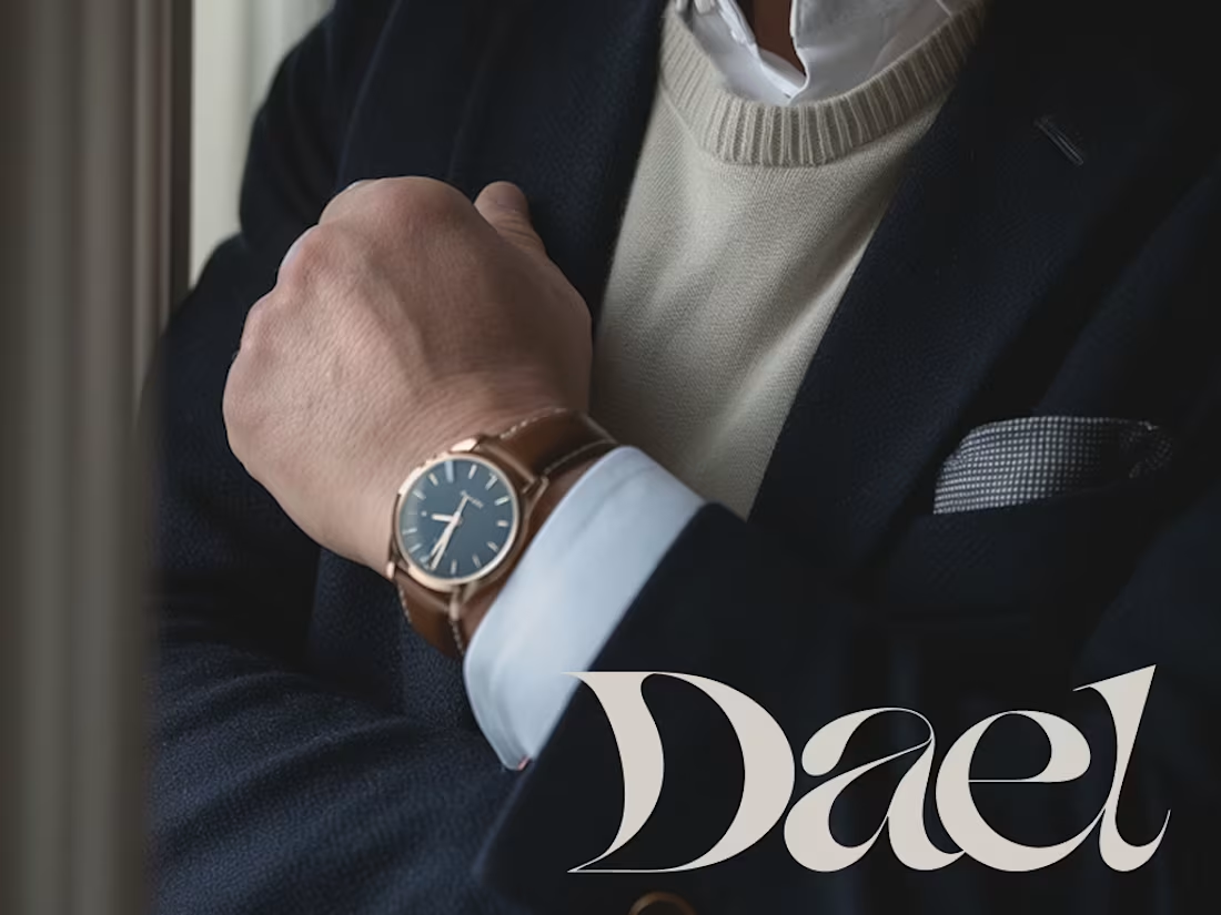
Dael Brand Identity Design
1
26
Velo Logo and Brand Identity Development
2
23
The Velvet Rabbit: Brand Identity & Campaign
4
23
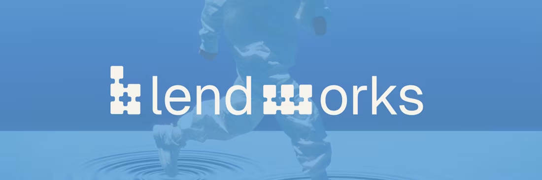
Blendworks Brand Identity Development
1
21
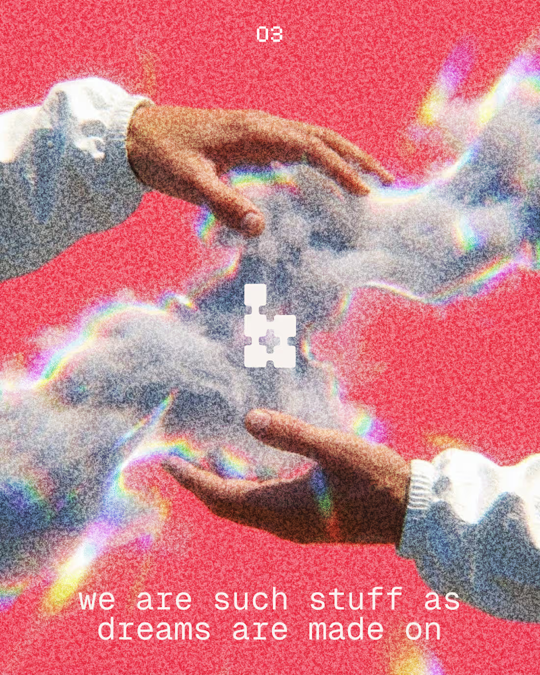
Blendworks - Brand Identity & Guidelines
AI Media Generation Platform
15
938
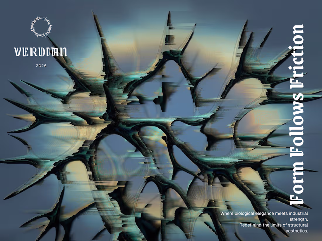
Veridian: Liturgy of Iron Collection brand, visuals
3
32
Canon — The Second After
I chose Canon because photography isn’t only about capturing the moment, it’s about what remains once it passes.
This short film explores the seconds after a moment ends: the quiet, the stillness, the traces left behind. Rather than focusing on action, the narrative lives in aftermath, empty spaces, lingering movement, and small details that hold emotional weight.
Visually, the direction is restrained and cinematic, prioritizing natural light, subtle motion, and minimal composition. The pacing is intentionally slow, allowing each frame to breathe and inviting the viewer to sit with the image rather than rush through it.
The entire film was created end-to-end using Morphic, with final sequencing and sound balance completed externally. All visuals and audio were generated specifically for this challenge.
3
20
1.3K
VOID-SPEC — The Architecture of Silence
1
34
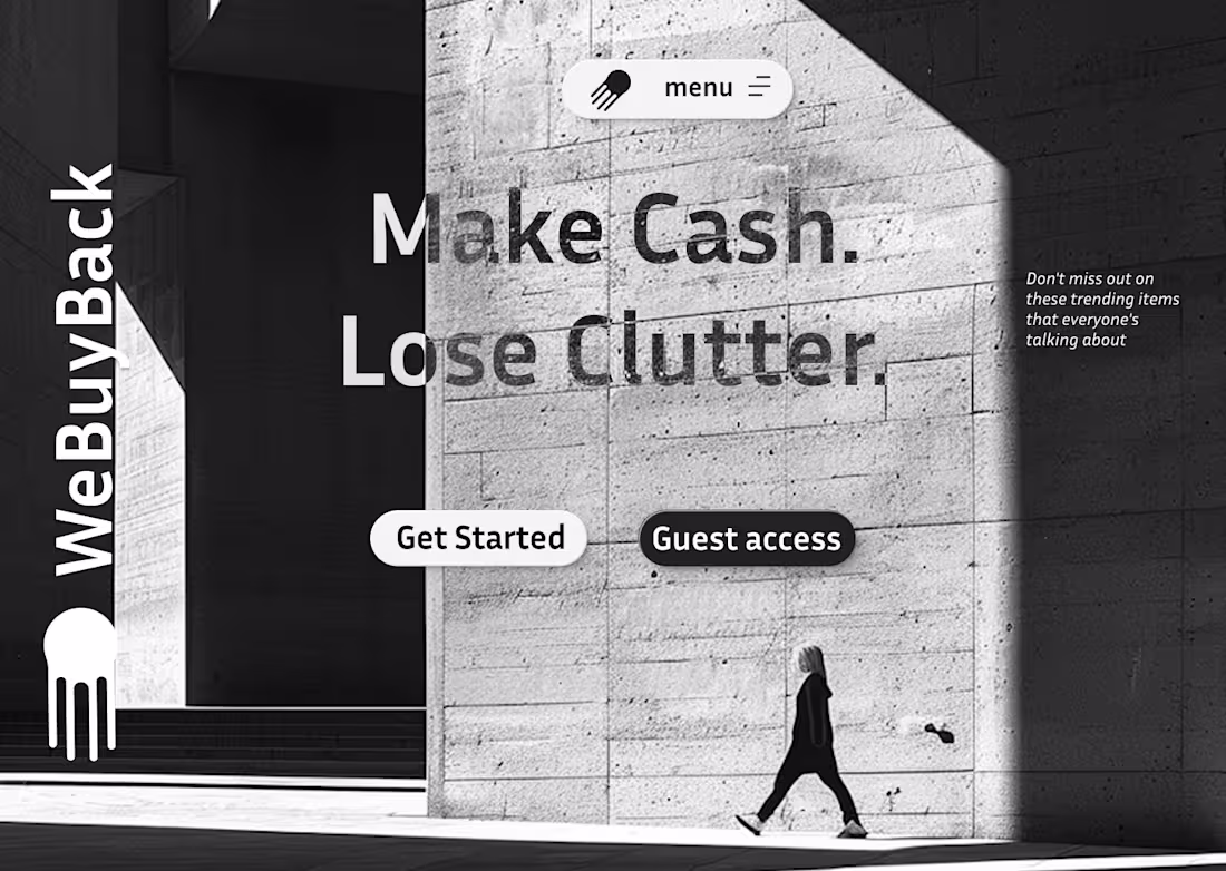
WeBuyBack Rebranding and Website Development
2
24
Velocity in every transaction.
Full rebrand for WeBuyBack( https://webuyback.in/) . The new logo utilizes a high-speed trailing effect to convey rapid movement. By blending industrial minimalism with atmospheric motion, the brand now feels as fast as the service it provides.
6
38
1.3K
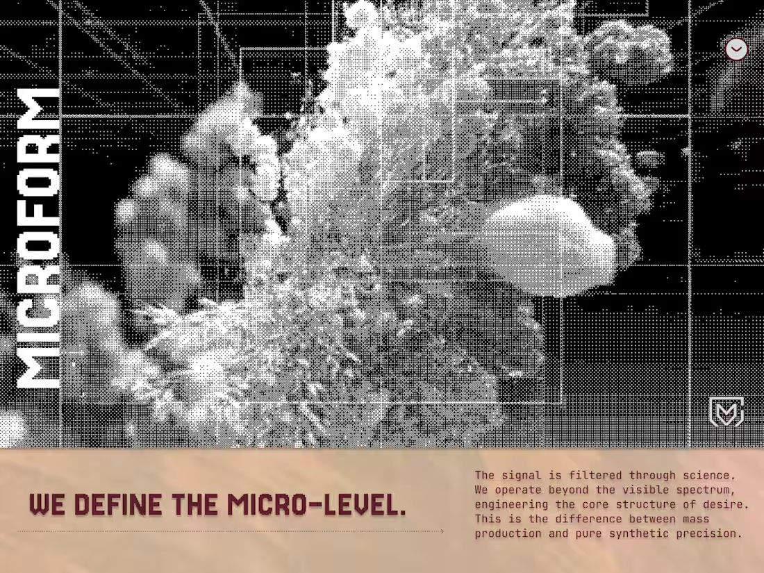
MICROFORM | The Structure Command
1
13
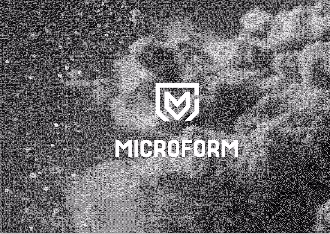
I started with designing this hero and the dithered abstract flower image, then I asked myself, why not build an entire visual system from scratch? It's all about the balance between data and nature. Guys, what are you working on?
3
39
1.2K
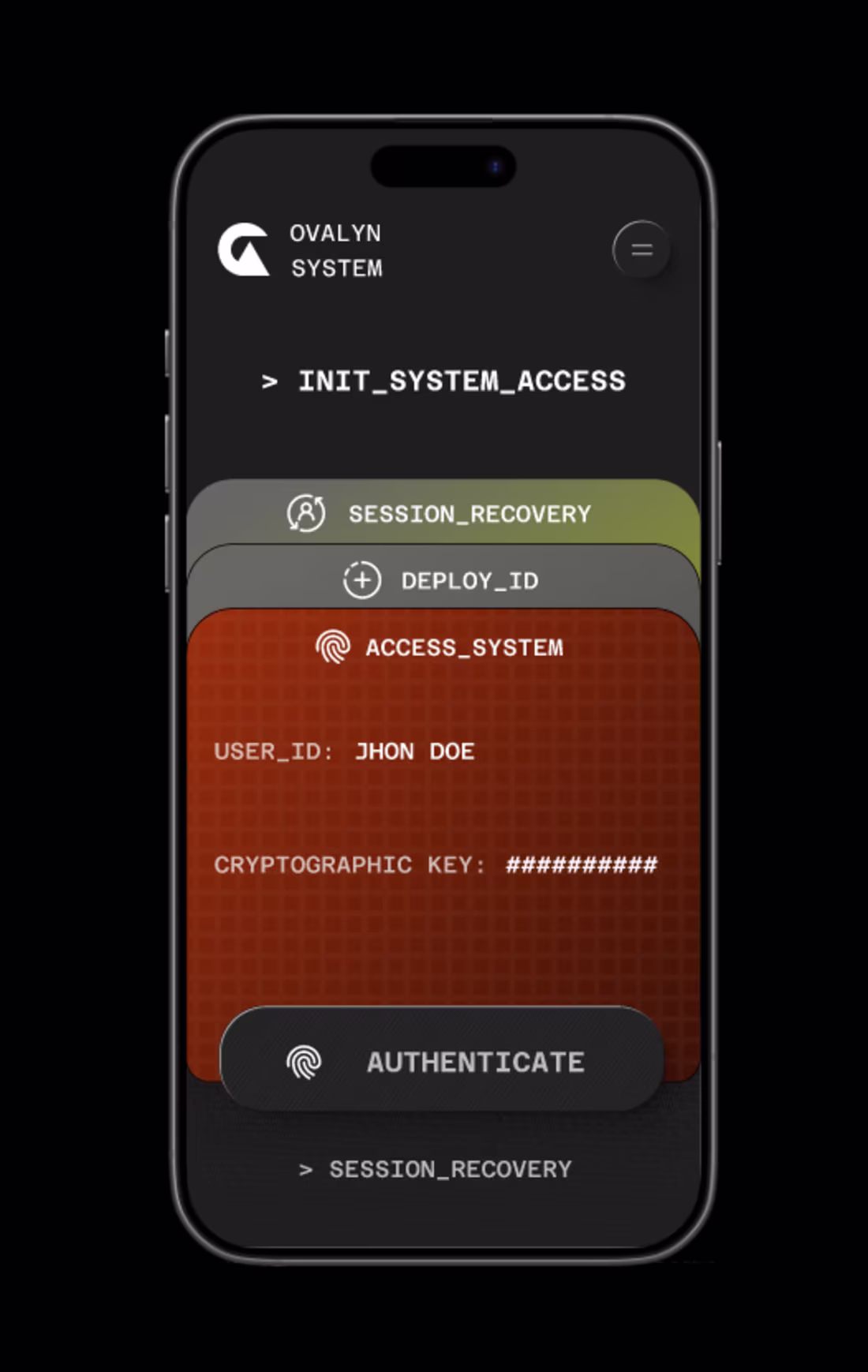
The OVALYN SYSTEM UI is a study in FinTech synthesis: high security meets premium access. We established a consistent visual language across all screens:
Aesthetic: Dark Mode / Terminal Console.
Hierarchy: [BOLD GREEN] for immediate asset status.
Language: System-log terminology (INITIATE PROTOCOL, DEPLOY ID).
The goal was to build trust through technical sophistication.
25
1.3K
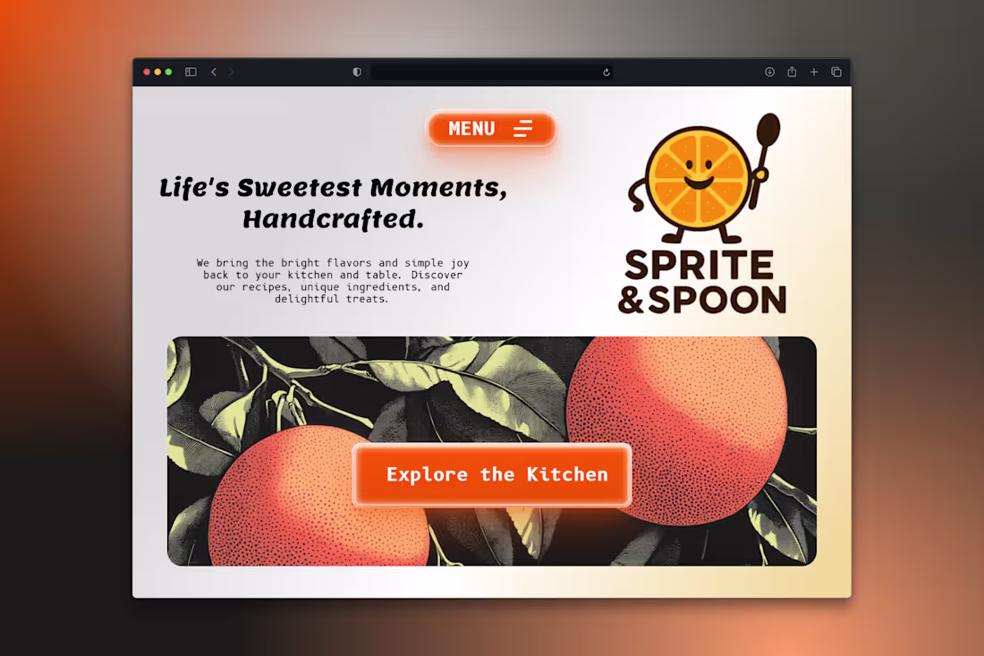
Designing the hero for Sprite & Spoon was all about contrast: marrying a minimalist, cartoon mascot with a rich, engraved citrus illustration. The goal was to keep the brand fun (friendly fonts, glowing buttons) while establishing a high-quality, editorial mood. Happy with the balance! 🍊🥄
22
1.2K
🔥 LUMINA: Master The Flow State.
Just finished the animation for the LUMINA Hero section. The design centers on the glowing, animated sun to represent the source of sustained energy and aligned output.
It's about movement beyond burnout: MOVE BEYOND BURNOUT. MASTER THE FLOW STATE. The slow, pulsing animation captures that sense of controlled, internal power.
3
25
1.2K
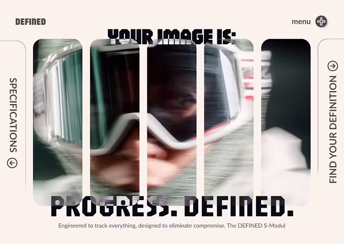
Analyzing the DEFINED S-Modul design. I used vertical slicing and subtle motion blur to fragment the focus, emphasizing the speed of the subject while using the bold, rigid text to ground the concept. A high-energy modular aesthetic.
2
29
1.2K
30/30: SUMMIT Hero. ☀️ Final piece of the challenge!
After the structural intensity of VORTEX, I wanted to end on calm: SUMMIT uses natural landscape to sell sustainable growth and perspective.
The design is about guidance, the clear path,not chaos. FIND THE CLEAR PATH TO THE SUMMIT. Thank you for following the journey!
2
30
1.2K
21/30: AuraSound Studios Hero.
I focused this dark-mode design on one core idea: quality over noise. The headline "Stop Sounding Average. Start Sounding Essential." immediately defines the client's high-value service. The CTA is direct: Free Sound Audit. Clear voice, clear impact. 🎙️
3
29
1K
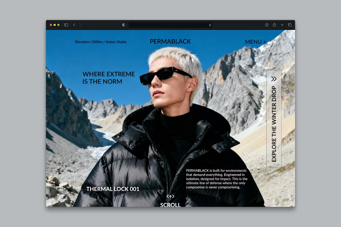
19 / 30: PERMABLACK Hero.
The challenge was translating technical luxury. I used the raw power of the mountain against the clean, uncompromising style of the jacket to define the brand: WHERE EXTREME IS THE NORM. It's about data-driven endurance and absolute aesthetic integrity.
6
34
1K
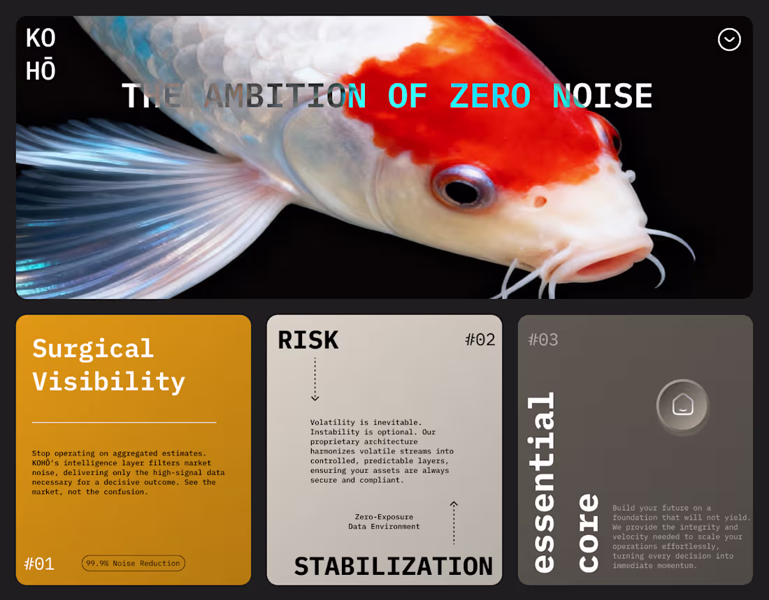
18 / 30: Finalizing the KOHŌ FinTech Hero.
The visual challenge was translating high-stakes finance into surgical clarity. I used the Koi as a symbol of unwavering ambition and built the experience around THE AMBITION OF ZERO NOISE. The bento layout and typography reinforce the precision required to move from data chaos to decisive action.
2
22
907
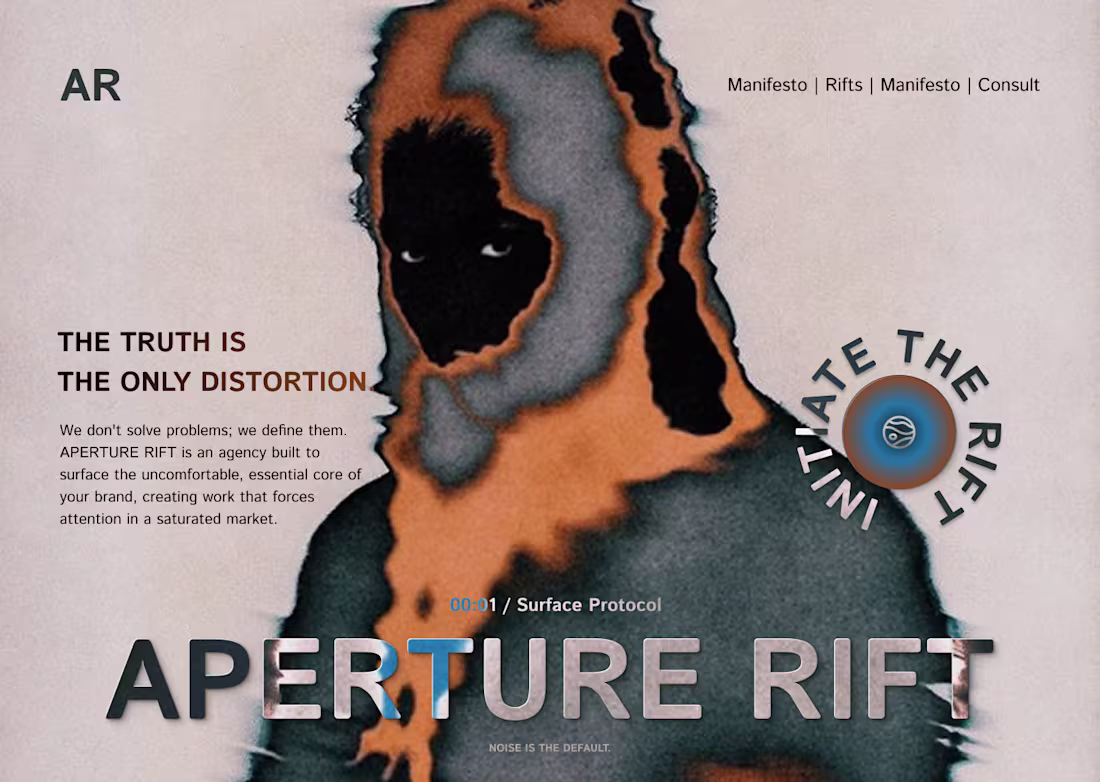
17/ 30: APERTURE RIFT Hero.
The challenge: Design a hero that feels unsettlingly essential. I used digital distortion and deep contrast to visualize the core belief: THE TRUTH IS THE ONLY DISTORTION. It’s not about finding comfort; it’s about forcing attention.
24
916
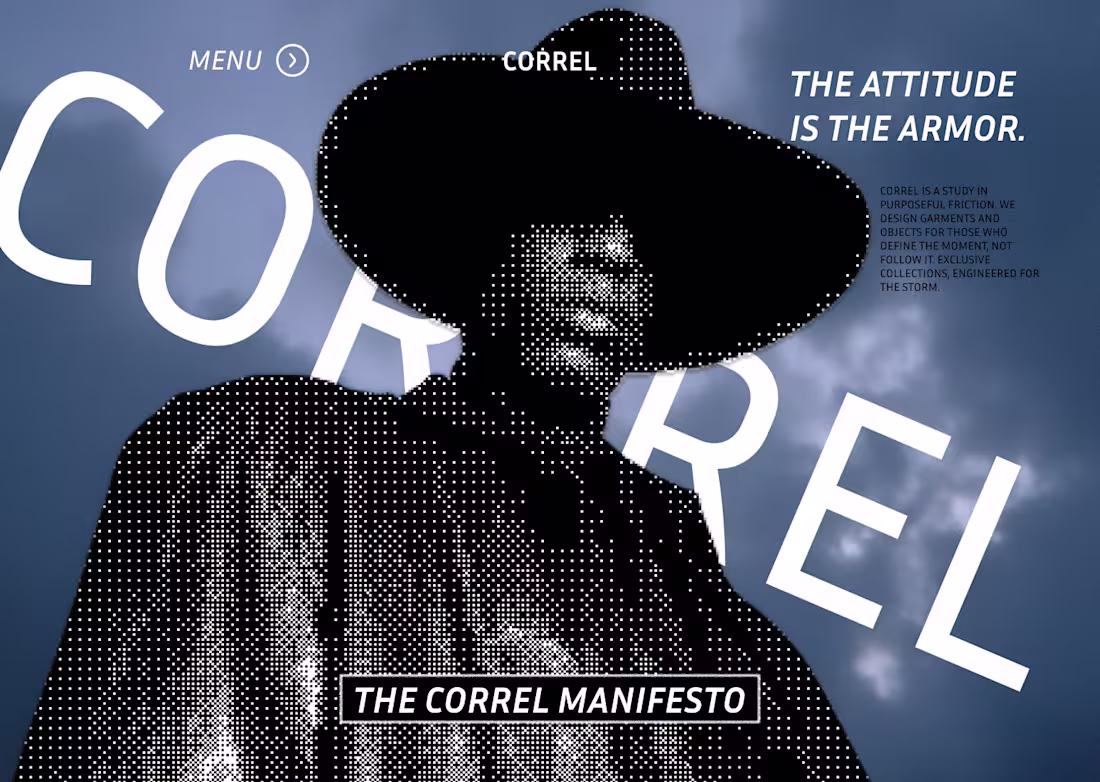
The CORREL Manifesto: The Attitude Is The Armor.
Swapping the expected minimalism for cinematic drama. This is the ultimate expression of the Editorial-Subversive style I develop for luxury brands. We used texture, pixelation, and aggressive typography to establish an identity of uncompromising presence.
What does your website say about your brand's authority?
1
33
944
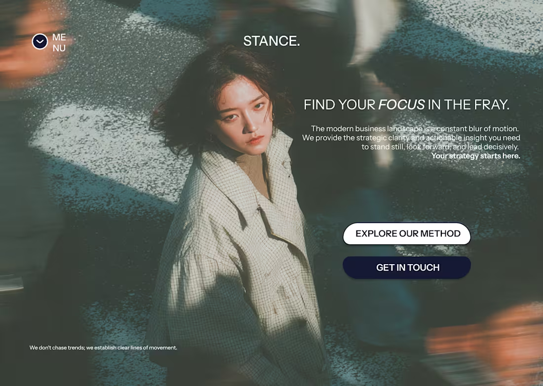
12/30: STANCE Hero Design.
This design illustrates my core approach: using powerful, editorial imagery and minimal type to convey complex strategy. Clients hire me to create this level of unique, conceptually-driven UI/UX that transforms a website into a statement.
4
23
855
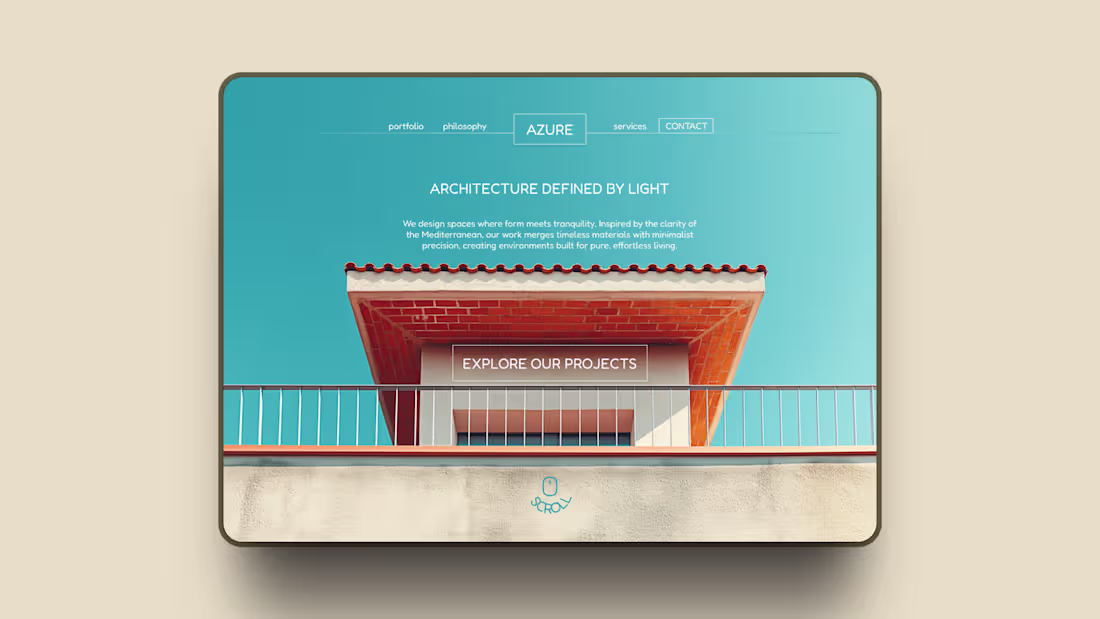
11/30: AZURE Architectural Hero.
Designing for tranquility. The challenge here was using minimal text to match the clean geometry of the architecture. I used Fredoka for its soft, rounded geometry, which subtly counters the harsh straight lines of the building. It adds necessary warmth and humanism to a very sharp design.
13
802
I may or may not have cooked a banger
2
788
Light or dark theme?
2
778
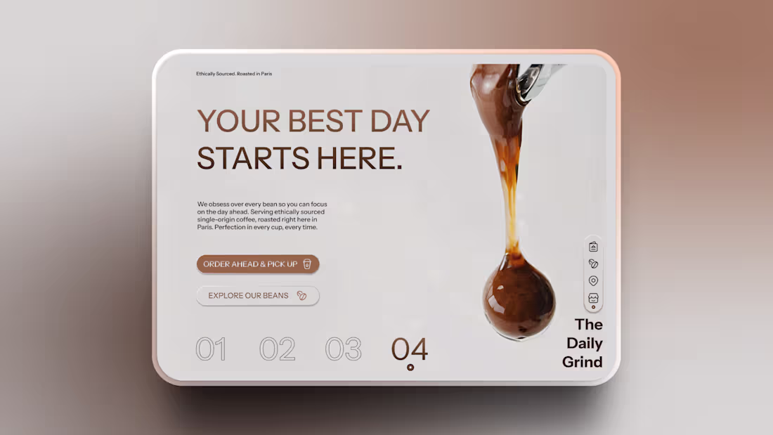
I really need a coffee, buti made this hero design for The Daily Grind that is all about visual anchors and trust.
Instead of relying on busy cafe shots, I used the single, perfect coffee droplet to represent quality and precision. I then grounded the design with subtle corner text (Ethically Sourced. Roasted in Paris.) to communicate vital trust signals without cluttering the main message.
What visual element are you using to anchor your current project? 👇
24
825
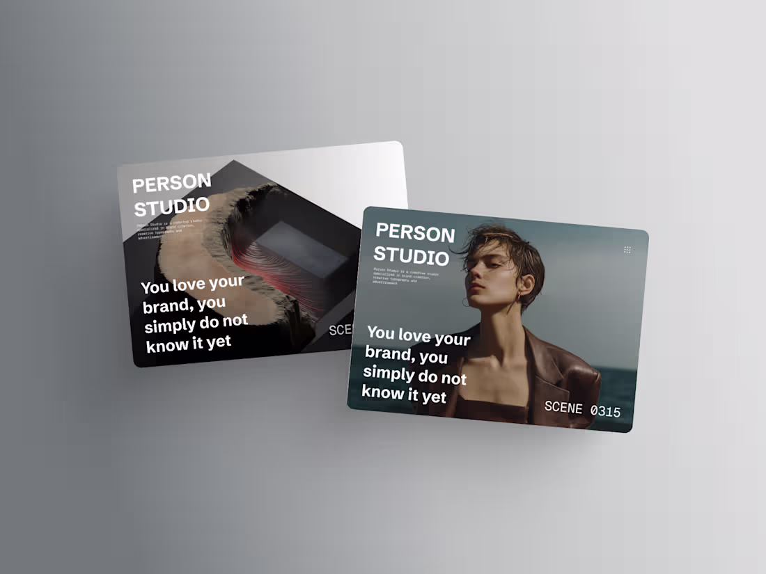
Same Studio project, two different vibes
1
742
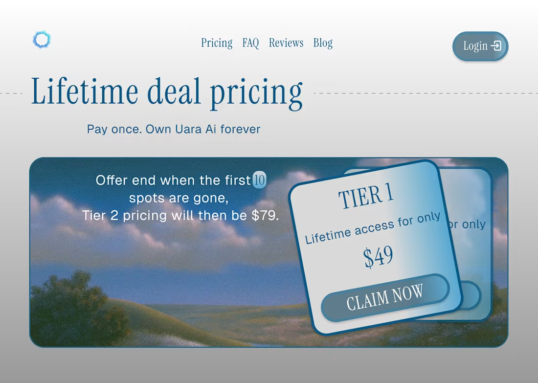
Uara, Health OS web design
2
15
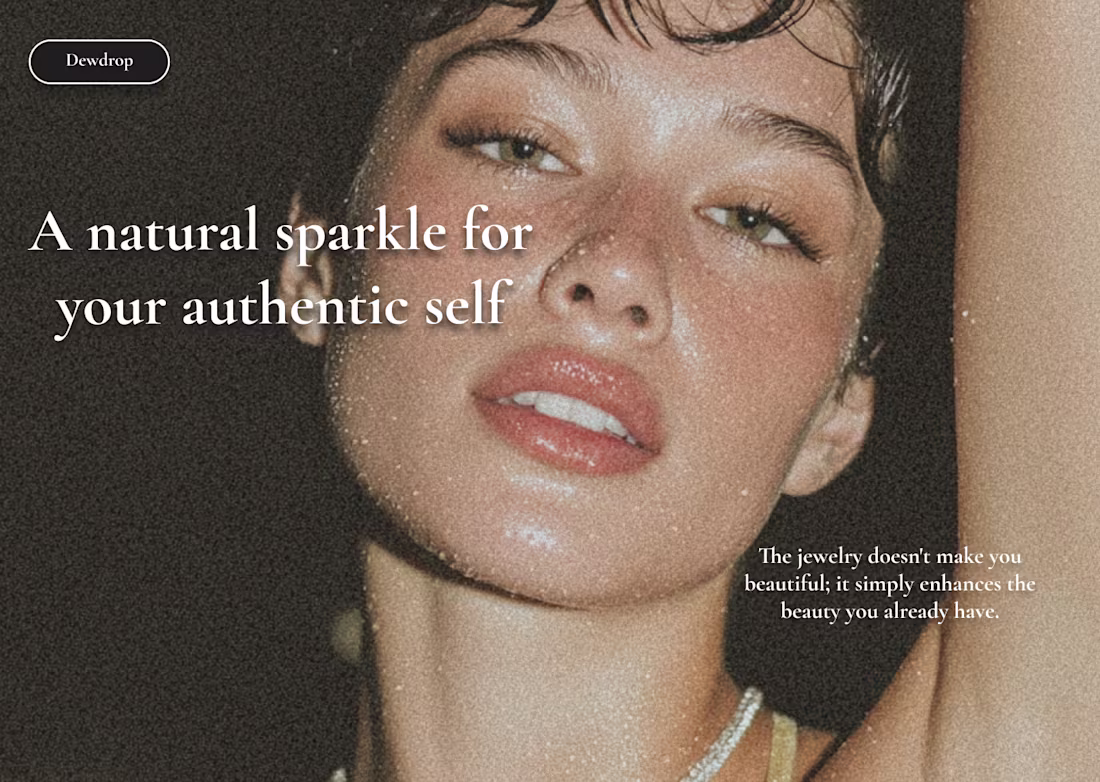
Typography as Brand Strategy: The Dewdrop Case Study
4
22
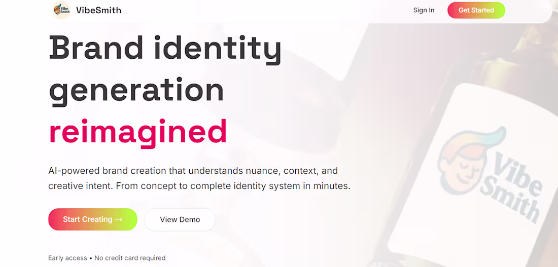
VibeSmith, AI-powered platform for brand identity generation
1
8
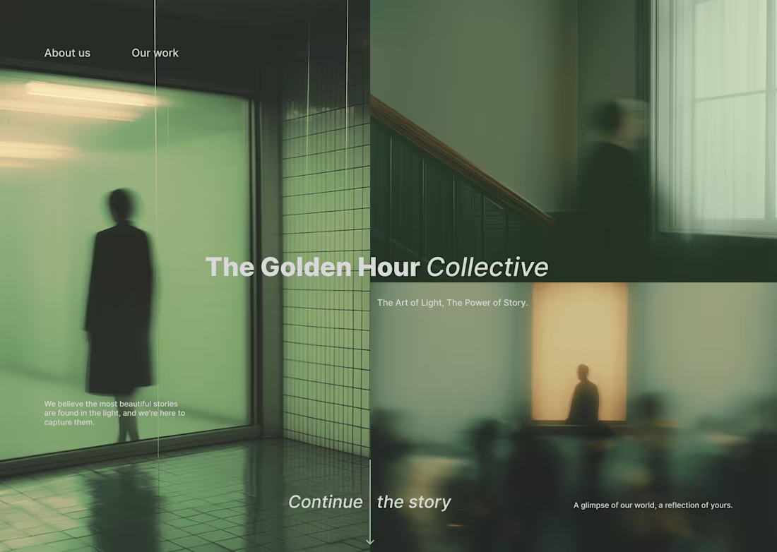
The Golden Hour Collective website and brand design
3
21
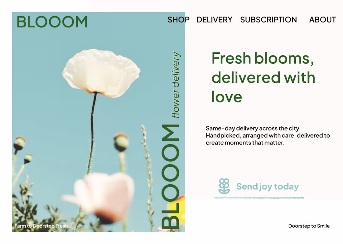
Blooom, flower delivery website, brand and logo
2
22
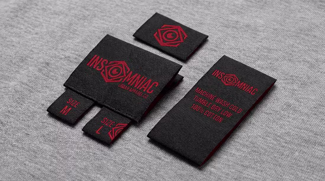
Insomniac - Urban Streetwear Brand website, logo and branding
3
18
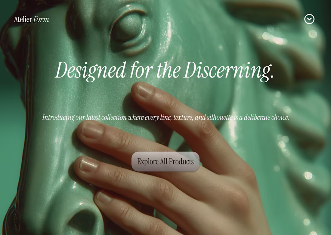
Atelier Form Luxury Interior design ecommerce and branding
2
13
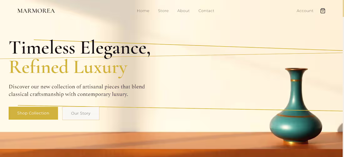
Marmorea: Crafting a Luxury E-commerce for Artisanal Goods
2
15
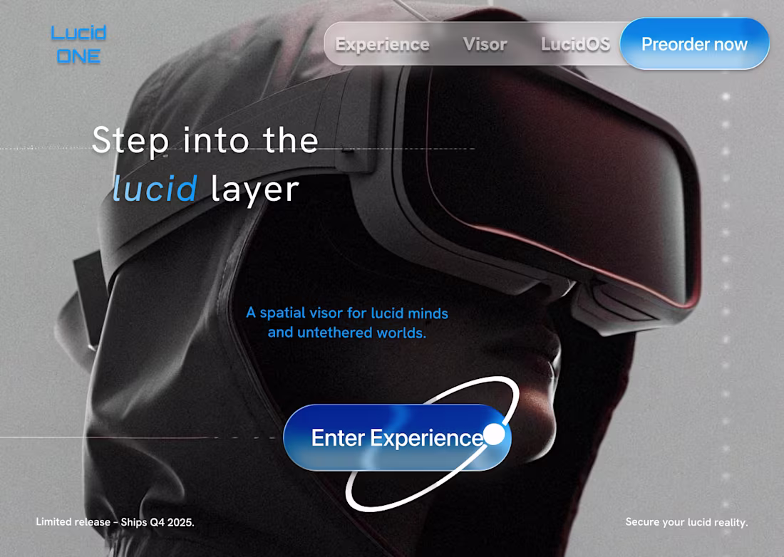
Lucid ONE - Spatial Computing VR Headset Landing and Branding
4
17

Eidos Studio, Creative studio branding and website
2
28