Built with Lovart
MICROFORM | The Structure Command
Révolté
Project Overview
I completed MICROFORM between December 1-5, 2025, as a comprehensive branding and website project that pushed my boundaries in creating cutting-edge design aesthetics combined with analytics-focused functionality. I built this using Figma for design, then brought it to life with Lovable and Lovart.
Visual Identity & Branding
Color Palette: I chose a bold, high-contrast color scheme dominated by deep blacks, vibrant electric blues, and strategic pops of neon pink/magenta. My goal was to create a futuristic, tech-forward aesthetic that immediately communicates sophistication and innovation to anyone who lands on the site.
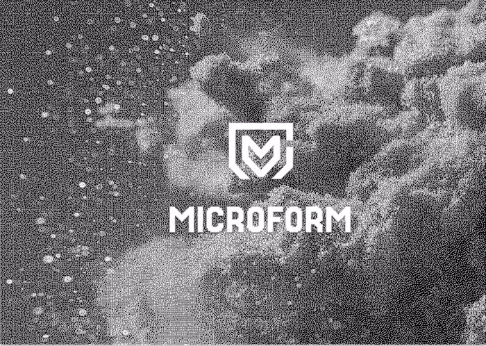
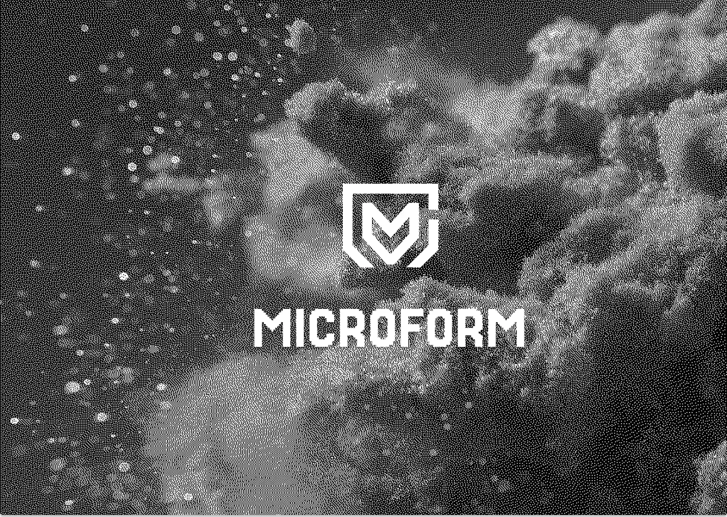
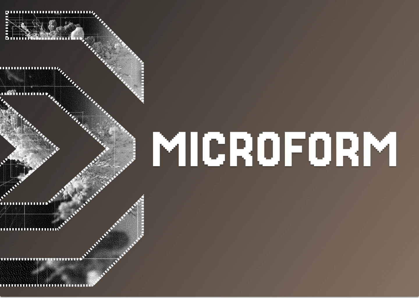
Typography: For the "MICROFORM" wordmark, I selected a strong, geometric sans-serif typeface with precise letterforms that emphasize structure and clarity—perfectly aligned with the "Structure Command" tagline I developed. I wanted the typography to convey both technical precision and modern minimalism.
Design Elements
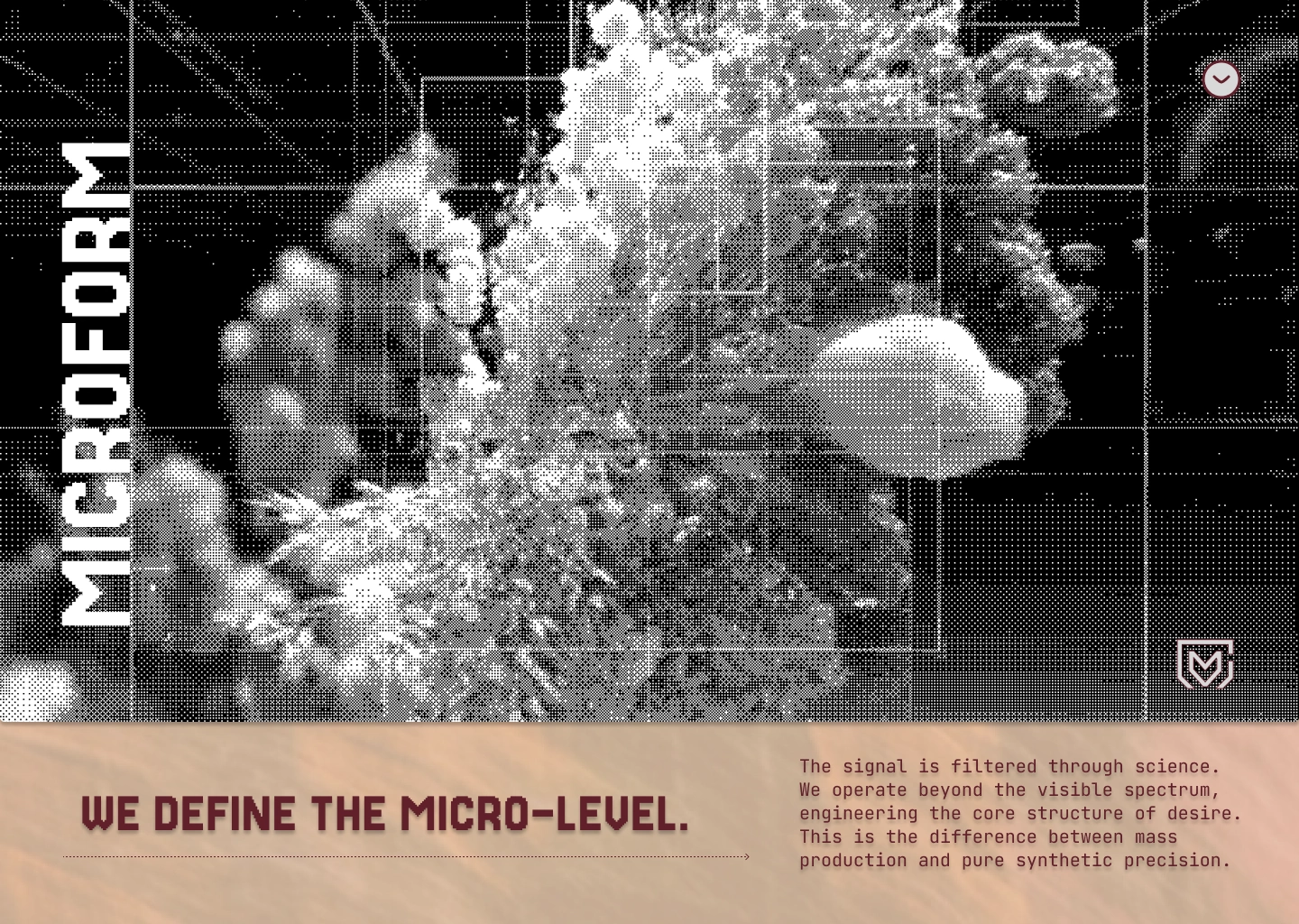
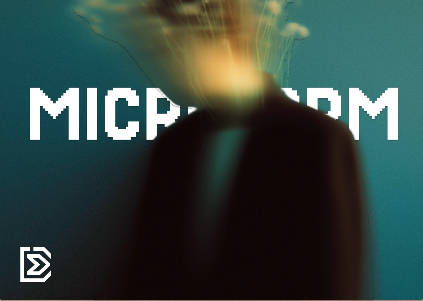
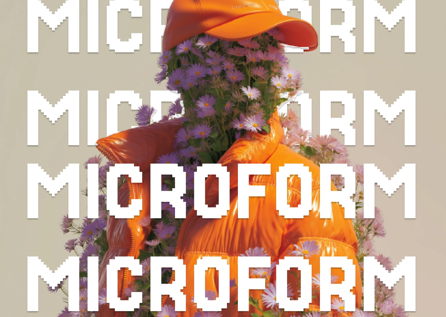
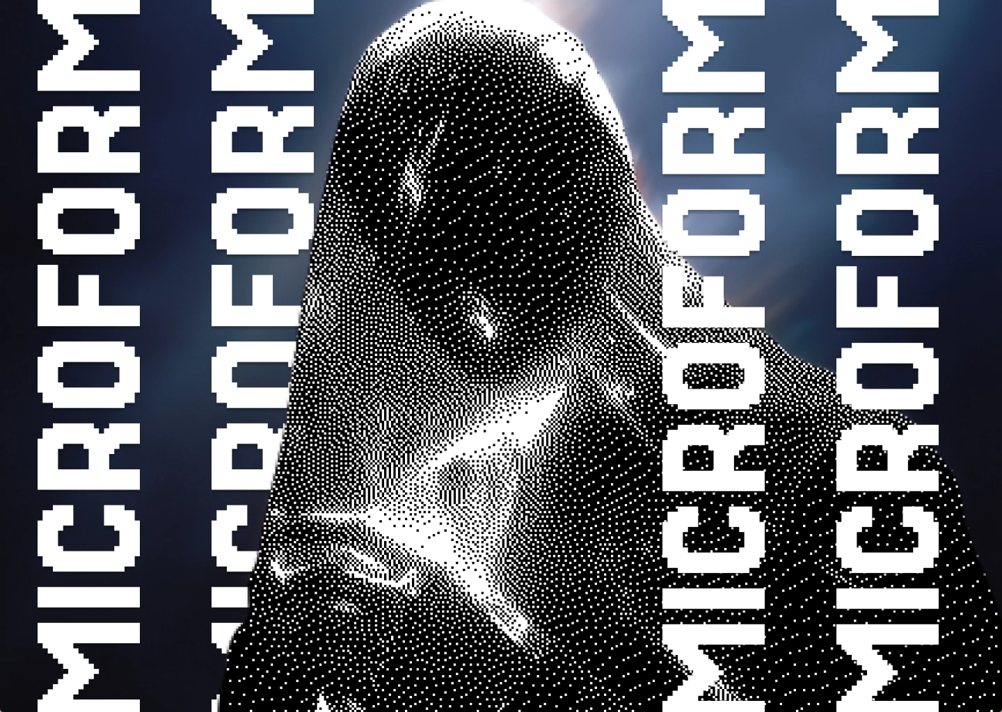
Dithered Abstract Textures: I started with designing the hero, incorporating dithered gradient effects and abstract textural elements that add depth and visual interest. These grain-like patterns create what I call an analog-meets-digital aesthetic that softens the otherwise sharp, geometric interface I built.
Geometric Patterns: Throughout the design, I used structured geometric compositions—grids, lines, and angular shapes that reinforce the "structure" theme. These elements create visual rhythm and guide the eye through the interface in a way that feels intentional and controlled.
Depth & Dimensionality: I added subtle layering, shadows, and depth effects to give the flat design elements a sense of space and hierarchy, making the interface feel both modern and tactile rather than completely flat.
Website Design
Hero Section: I designed the landing page hero to be a bold, immersive introduction featuring the MICROFORM branding with dramatic contrast. My intention was to emphasize the product's core value proposition immediately—you know what this is about the moment you arrive.
Layout Architecture: I created clean, structured layouts with clear information hierarchy, generous negative space, and purposeful sectioning that makes complex information digestible. The "Structure Command" concept I developed is reflected in my organized, systematic approach to content presentation throughout.
Analytics Focus: Since this project centers on analytics, I designed the website to showcase data visualization capabilities with sophisticated UI components that make complex data accessible and actionable. Every element serves the purpose of clarity and insight.
My Design Philosophy
With MICROFORM, I wanted to create a synthesis of brutalist precision and contemporary digital aesthetics. I balanced aggressive contrast with thoughtful detail work, creating a brand that feels both authoritative and innovative. The "Structure Command" concept I developed suggests a tool that brings order to complexity—a theme I visually reinforced through my careful use of geometry, hierarchy, and purposeful negative space.
This project demonstrates my ability to create cohesive brand systems that work across digital touchpoints while maintaining a distinctive, memorable visual identity that stands out in the analytics/tech space. I'm particularly proud of how the dithered textures and geometric precision work together to create something that feels both technical and artistic.
Landing page hero
Like this project
Posted Dec 16, 2025
With MICROFORM, I wanted to create a synthesis of brutalist precision and contemporary digital aesthetics.
Likes
1
Views
13
Timeline
Dec 1, 2025 - Dec 5, 2025