Built with Lovart
Dael Brand Identity Design
Révolté
Dael — Brand Identity Case Study
Watches & Eyewear · 2026
Overview
Dael is a watches and eyewear brand built for the buyer who finds most luxury exhausting. The brief was to develop a complete brand identity anchored in restraint — a calligraphic logotype, a palette drawn entirely from natural materials, and a visual system that never raises its voice. Ten mockups spanning product, lifestyle, packaging, materials, campaign, retail, and environmental formats, plus an animated spot built from a single held frame.
The direction was named Soft Power from the first session. Nothing shouts. The brand earns attention by withholding it.
Naming
Dael was selected for its brevity and its slight unfamiliarity — it sounds known without being placeable. Four letters, one syllable, no category signals. It carries no heritage it hasn't earned, which is precisely the point for a brand positioning itself outside the legacy watch and eyewear establishment.
Logotype

A calligraphic wordmark that feels discovered rather than designed. The D is the dominant element — a double counter created by the dramatic thick-to-thin contrast, the inner stroke becoming almost a second letterform inside the first. The a and e connect as a natural ligature, the bowl of the a anchoring the centre of the wordmark. The l exits with a controlled curl that grounds the whole piece without flourishing.
The thick-to-thin ratio is more dramatic than originally specified, pulling the logo closer to high-fashion editorial than Nordic watchmaker — Celine territory rather than Braun. This tension turned out to be the brand's most interesting quality. The calligraphic weight gives it warmth and humanity; the sharpness of the thin strokes gives it precision and edge. It operates in both worlds simultaneously, which is exactly where Dael lives.
Colour application:
#1a1a18 near-black on light grounds. #e8e2d9 undyed linen on dark grounds. #a8926a warm bronze for embossed and debossed applications on leather and packaging only. Never pure black, never pure white.Palette
Undyed wool
#e8e2d9, worn oak #8c6e4b, river stone #c4bdb4, morning fog #d4cfc8, deep shadow #1a1a18, warm bronze #a8926a. Every colour is physically present in the material study — the leather, the movement, the acetate, the stone surface. The palette was not invented. It was found in the objects themselves.Type System

Primary — Dael calligraphic wordmark. Always treated as artwork, never as set type.
Secondary — refined humanist sans at light weight. Low tracking, generous leading, used only for functional information: product names, care instructions, warranty copy, stationery details. It should be invisible as a typeface and present only as information. The logo does all the personality work. The secondary type simply holds the line.
The two never compete for the same space. On any surface where the logo is present at readable size, secondary type steps back to near-invisible scale. Where secondary type must carry the communication alone — the inside of a box lid, the reverse of a business card — the logo is absent entirely.
Mockup Set
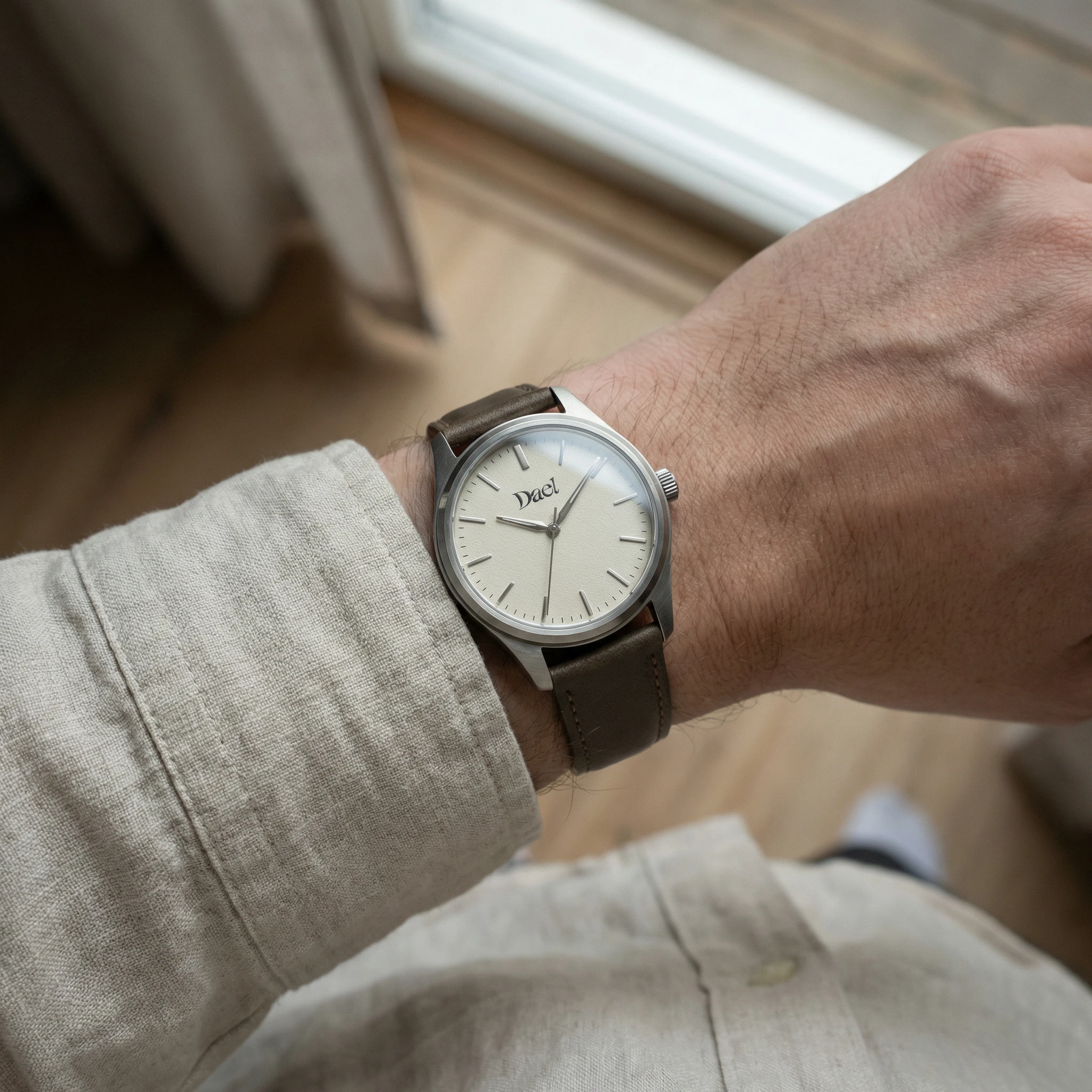
01 — The Watch Face. The dial in morning fog
#d4cfc8, applied indices only, no numerals. The Dael wordmark at 6 o'clock in #1a1a18, approximately 4mm wide on the physical dial. Undyed vegetable-tanned leather strap. The logo is the only information the dial offers.
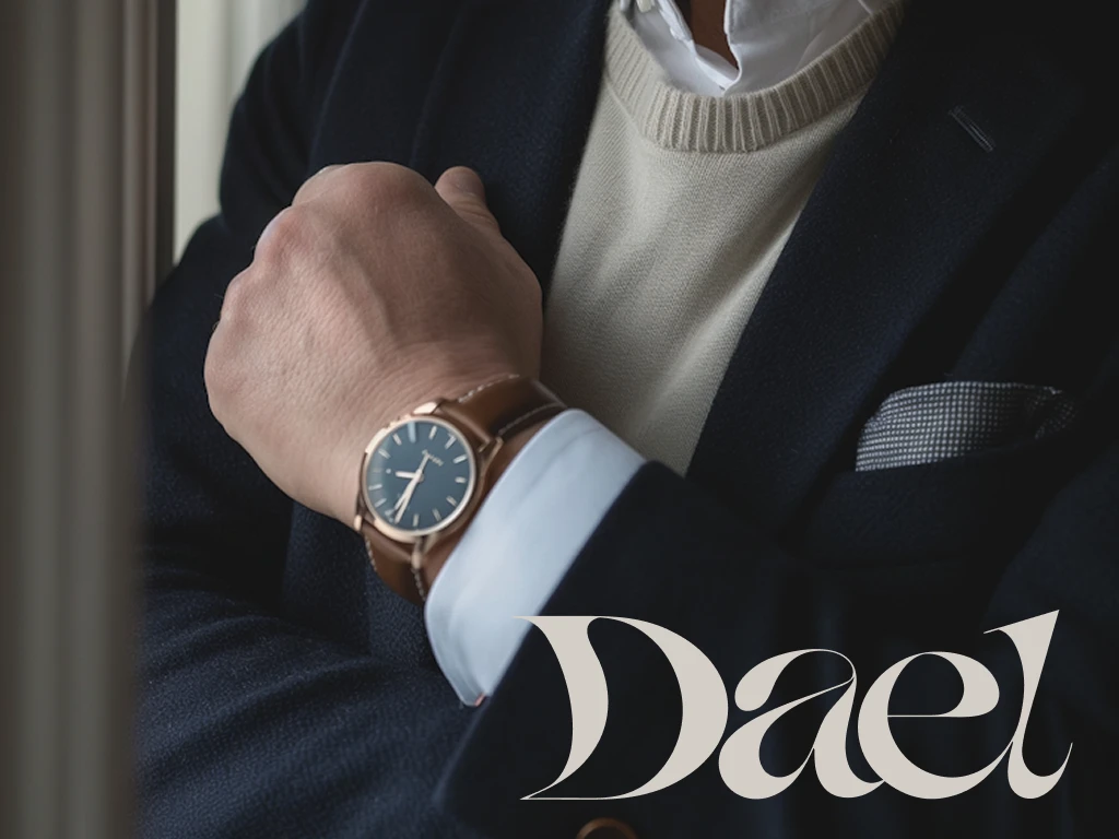
02 — The Wrist. Natural window light, overcast. Loose linen cuff. The watch sharp at centre, the wrist soft at both edges. No face, no context beyond skin and sleeve and the quality of the light. The anchor image of the system — and the basis for the animated spot.
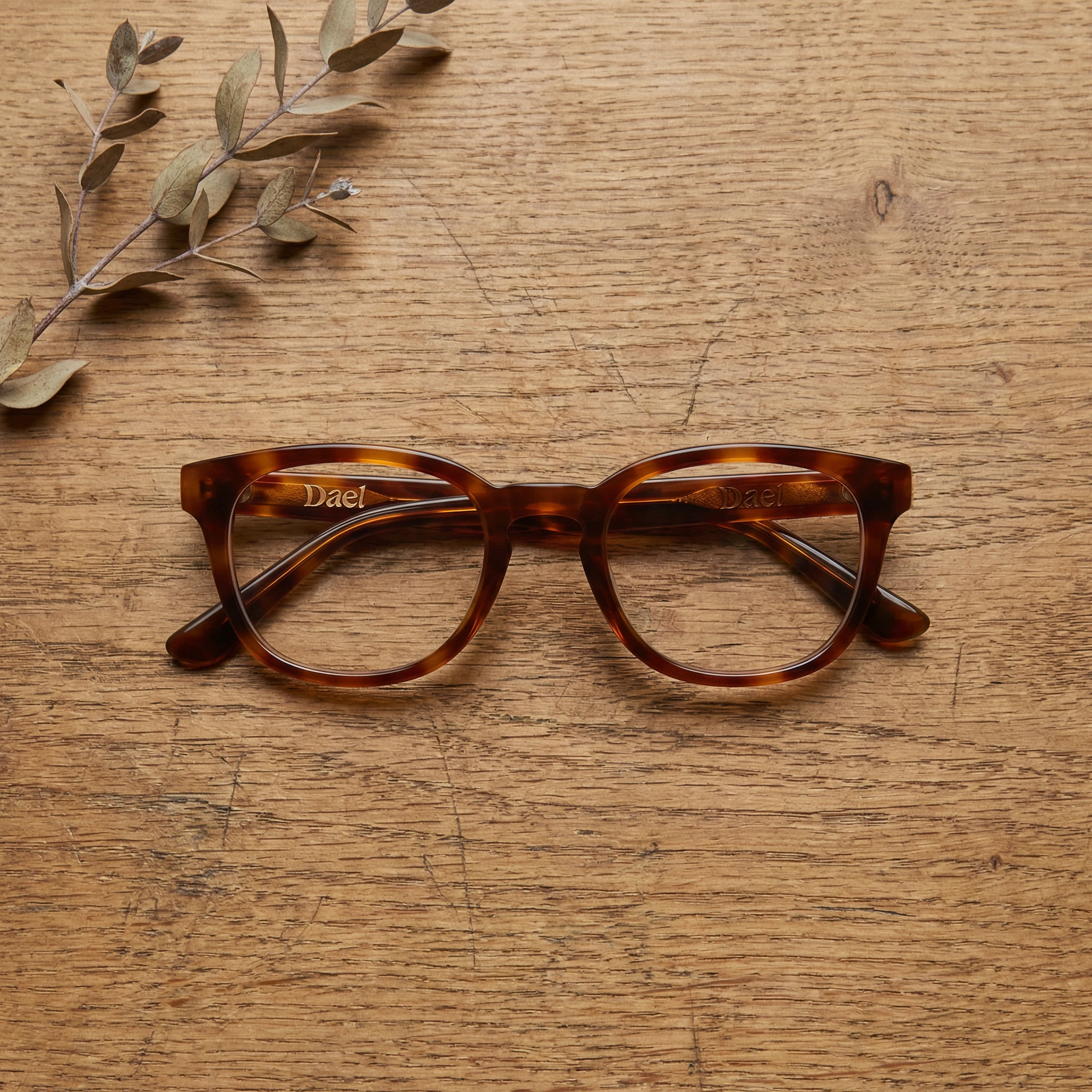
03 — The Eyewear Flatlay. Tortoiseshell acetate frames on worn oak, shot directly above. The Dael wordmark in warm bronze on the bridge, readable at this scale as a mark rather than a word. A dried botanical in the upper left, barely in focus. The surface grain of the oak does the compositional work.
04 — The Packaging. Rigid linen board box, debossed logo on the lid — no ink, no foil, impression only. The letterforms pressed into the material, the D and its double counter visible as relief. The
#1a1a18 interior lining revealed by the lifted lid. Restraint as luxury signal.05 — The Hand and Glasses. The campaign still that defines the brand's human register. Collarbone, shoulder, wrist. The tortoiseshell frames folded in one hand. The watch visible at the lower edge. No face. The skin is the subject. The Dael wordmark in the bottom-right corner, small,
#1a1a18.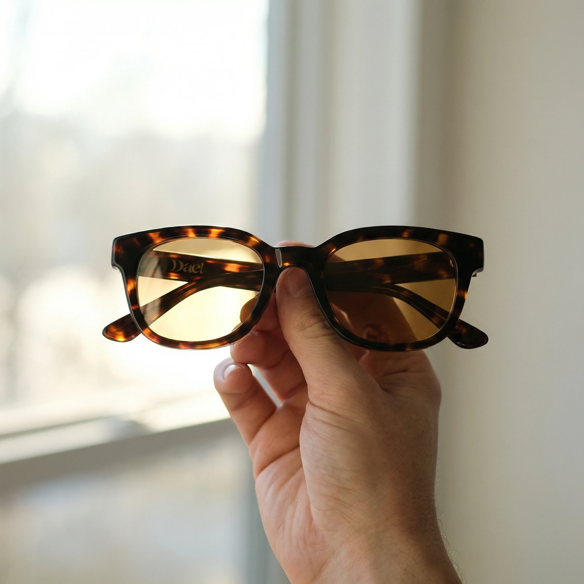
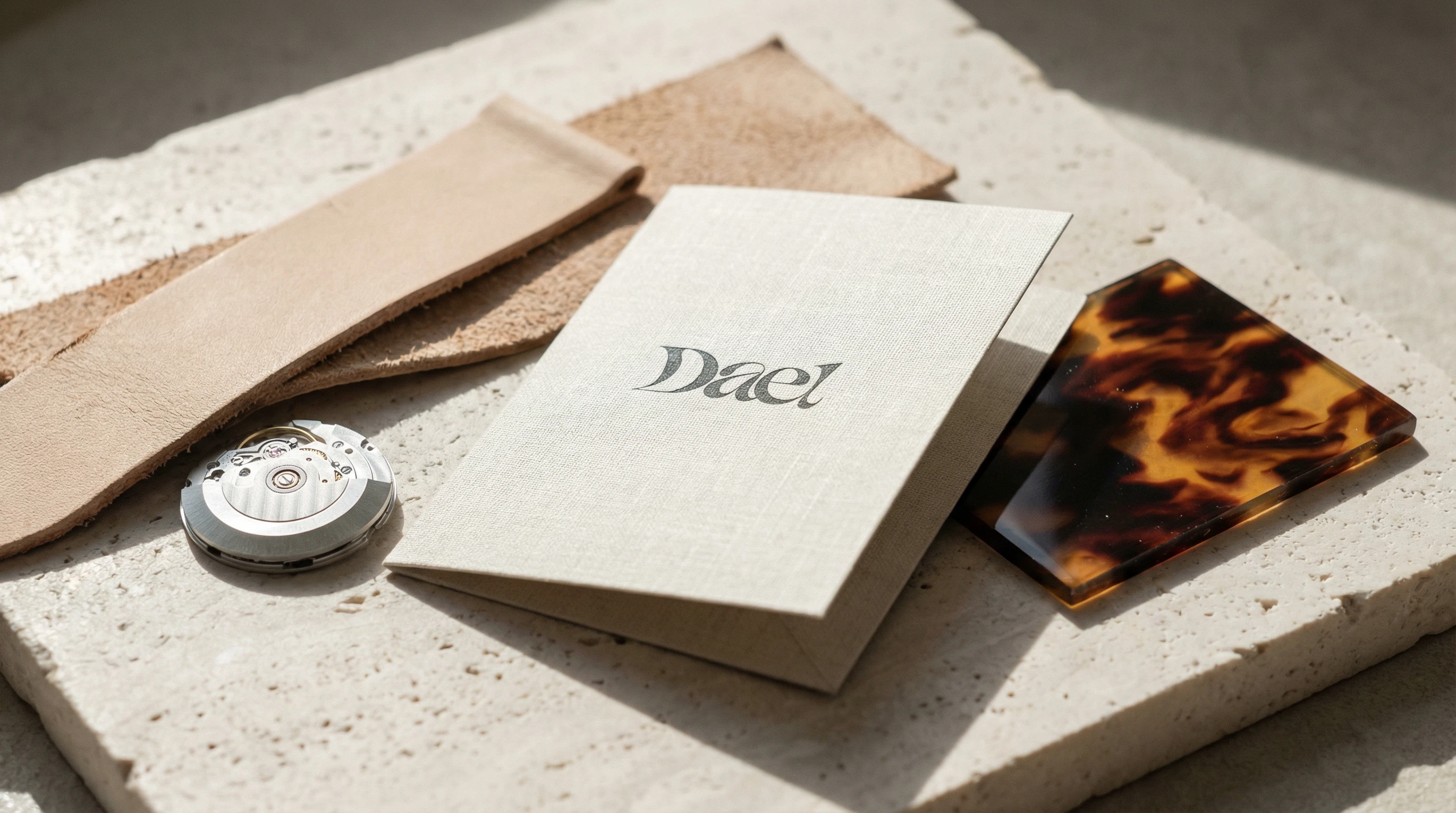
06 — The Material Study. Raw leather strap cut, exposed watch movement, linen card with the logo printed in
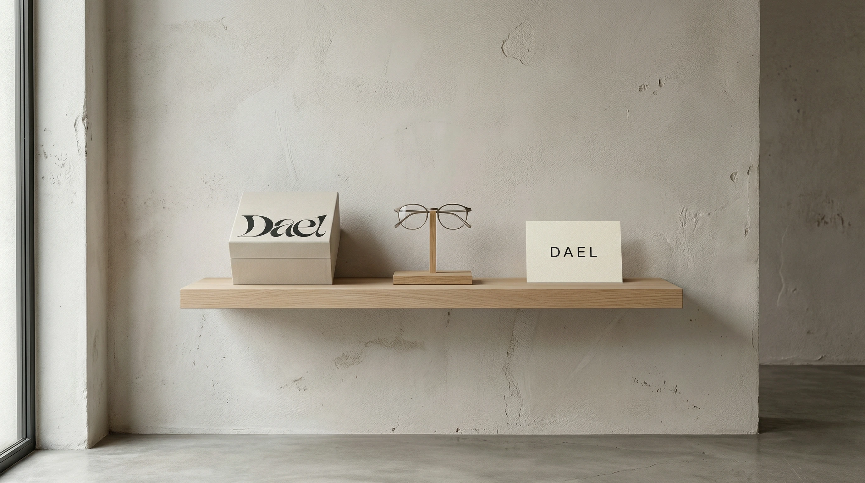
#1a1a18, raw tortoiseshell acetate sample. Arranged on pale stone with raking sunlight from the left. The card is the only finished object. The shot says: we know where these things come from.07 — The Retail Environment. A raw plaster wall. A single pale oak floating shelf. Three objects: the Dael box from Mockup 04, a pair of frames on a minimal oak stand, and a linen card reading "DAEL" in the secondary typeface. Natural side light entering from a floor-to-ceiling window at the left edge. Shot from slightly below eye level, the wall occupying the full background. The space is the brand — unfinished, considered, entirely unhurried. The logo appears once, on the box face, large enough to anchor without dominating. Everything else is material and light.
08 — The Campaign Still. The watch face filling the frame, fog dial, the Dael wordmark sharp below the hands. Shot almost flat, diffused light. Case and strap dissolving into soft focus at the edges. The watch's portrait.

09 — The Detail Shot. The standout image of the set. The Dael D as a physical bronze letterform, three-dimensional, occupying the foreground against the watch dial. The double counter of the D creates two apertures through which the dial indices are visible. Raking warm light on the brushed metal surface. The letterform has been given the same material weight as the product — the brand and the object are made of the same things.

10 — The Case Study Composite. All mockups in a wide-format asymmetric grid on
#e8e2d9. The Dael wordmark large in the top-right quadrant. "WATCHES · EYEWEAR · 2025" in the secondary typeface below. The composite demonstrates the range of the system across scales, surfaces, and contexts — from the 4mm logo on a watch dial to the architectural presence of Mockup 09.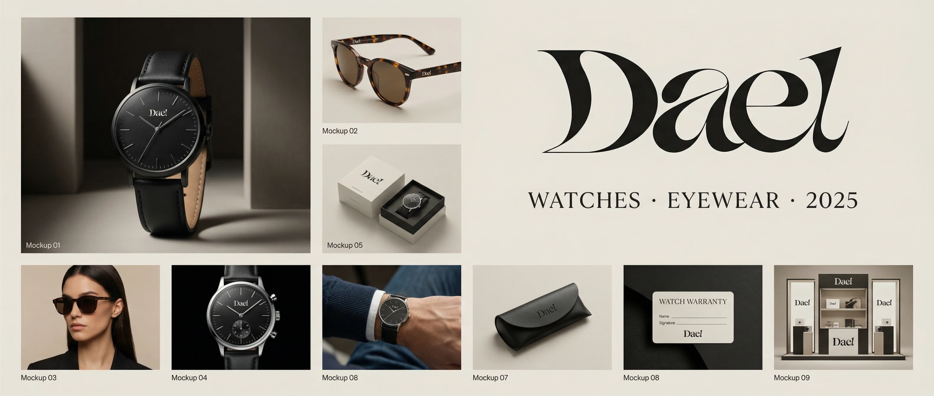
Design Decisions
Why calligraphic over geometric. Geometric logos for watches signal precision and function — already the entire category. A calligraphic mark signals that a human made this, which is rarer and more honest for a brand built around material craft.
Why the logo is always small. Luxury brands that place their logo prominently are communicating to people who need to be told what they're wearing. Dael's buyer already knows. The logo is sized for the person holding the object, not the person across the room.
Why no face in the campaign photography. A face creates a specific person. A wrist, a hand, a collarbone creates a possible self. The buyer projects into the image rather than comparing themselves to it.
Why the palette was found not invented. Every colour in the Dael system is physically present in the materials the products are made from. The palette is the product.
Why the D is the hero of Mockup 09. The letterform rendered in the same material as the watch collapses the distance between brand identity and product design. It argues that Dael's logo is not applied to its products — it is made of the same things.
Why the retail environment has three objects. One object is a product shot. Two objects are a collection. Three objects are a world. The shelf in Mockup 07 establishes that Dael has a point of view about space, not just about objects.
Outcome
A ten-piece identity set with a calligraphic wordmark, a natural material palette, a two-weight type system, and a six-second animated spot — all coherent, all traceable to the same position. Dael looks like one thing from every angle, at every scale, in every context.
Nothing shouts.
Like this project
Posted Mar 11, 2026
Dael, Watches & eyewear identity. Calligraphic logo, natural palette, no face in campaign. Soft power, total coherence. Made for people who already know.
Likes
1
Views
26
Timeline
Jan 13, 2026 - Jan 21, 2026