The Velvet Rabbit: Brand Identity & Campaign
Révolté
The Velvet Rabbit
Brand Identity & Campaign — Case Study
Overview
The Velvet Rabbit is a fictional speakeasy bar concept developed as a creative sprint. The brief was open-ended — a single phrase, "all roads lead to Rome" — and the challenge was to build a complete brand world from that starting point: name, identity, visual language, and a campaign that could live in the real world.
The result is a bar that feels like it has always existed somewhere. Warm, irreverent, slightly nocturnal. The kind of place you find by word of mouth and return to without needing a reason.
The Concept
The name came first. The Velvet Rabbit carries two registers simultaneously — velvet suggests luxury, sensuality, and underground exclusivity, while rabbit introduces the trickster, the Alice-in-Wonderland hole you fall into, the creature that leads you somewhere you didn't plan to go. Together they create a tension that feels exactly right for a speakeasy: refined but unpredictable, exclusive but never cold.
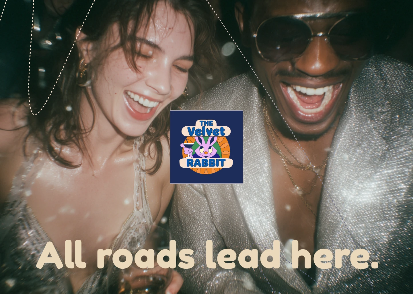
The tagline emerged naturally from the brief: "All roads lead here." A direct echo of the prompt, reframed as an invitation. Not Rome as empire, but Rome as destination — the place everyone eventually ends up.
Visual Identity
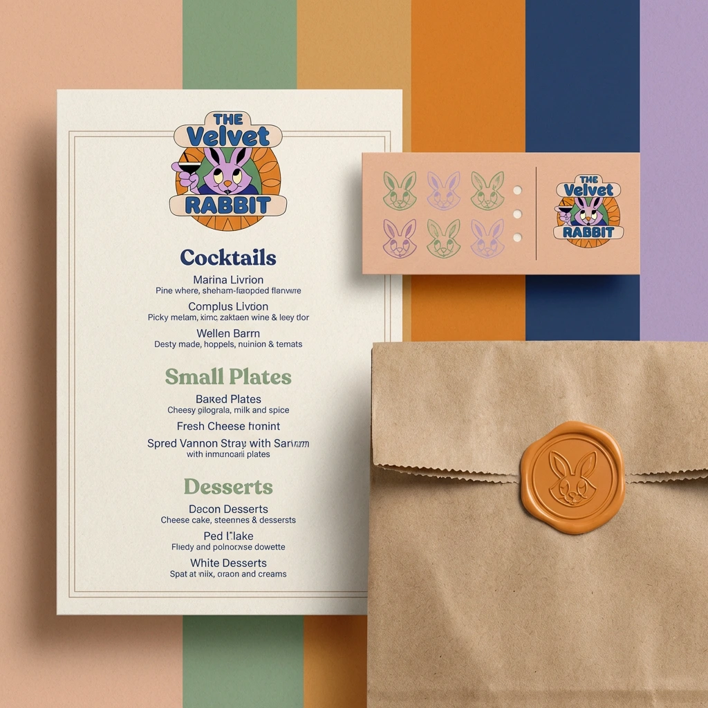
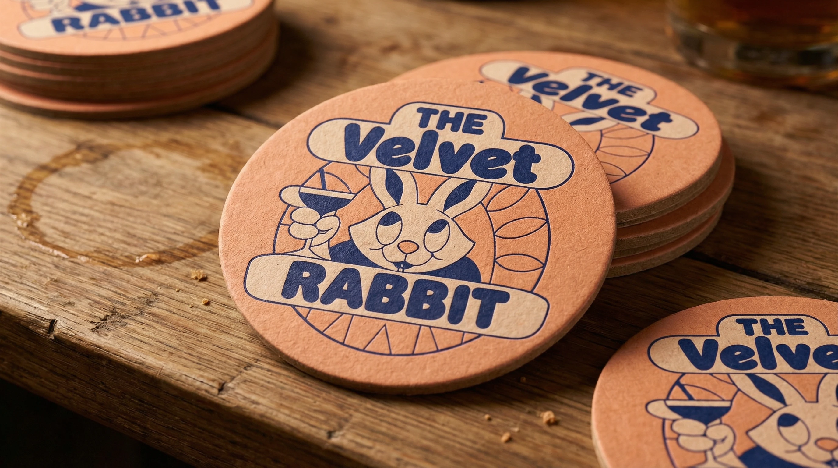
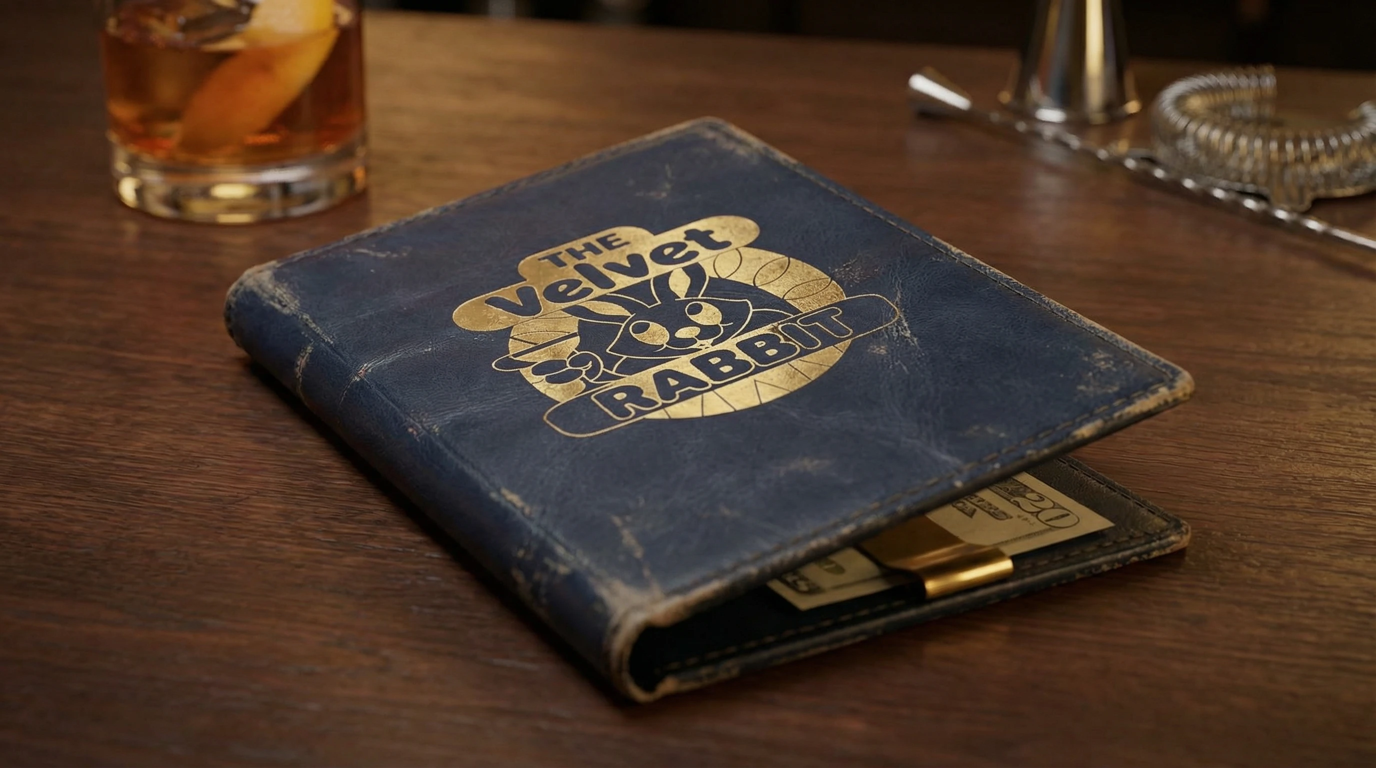
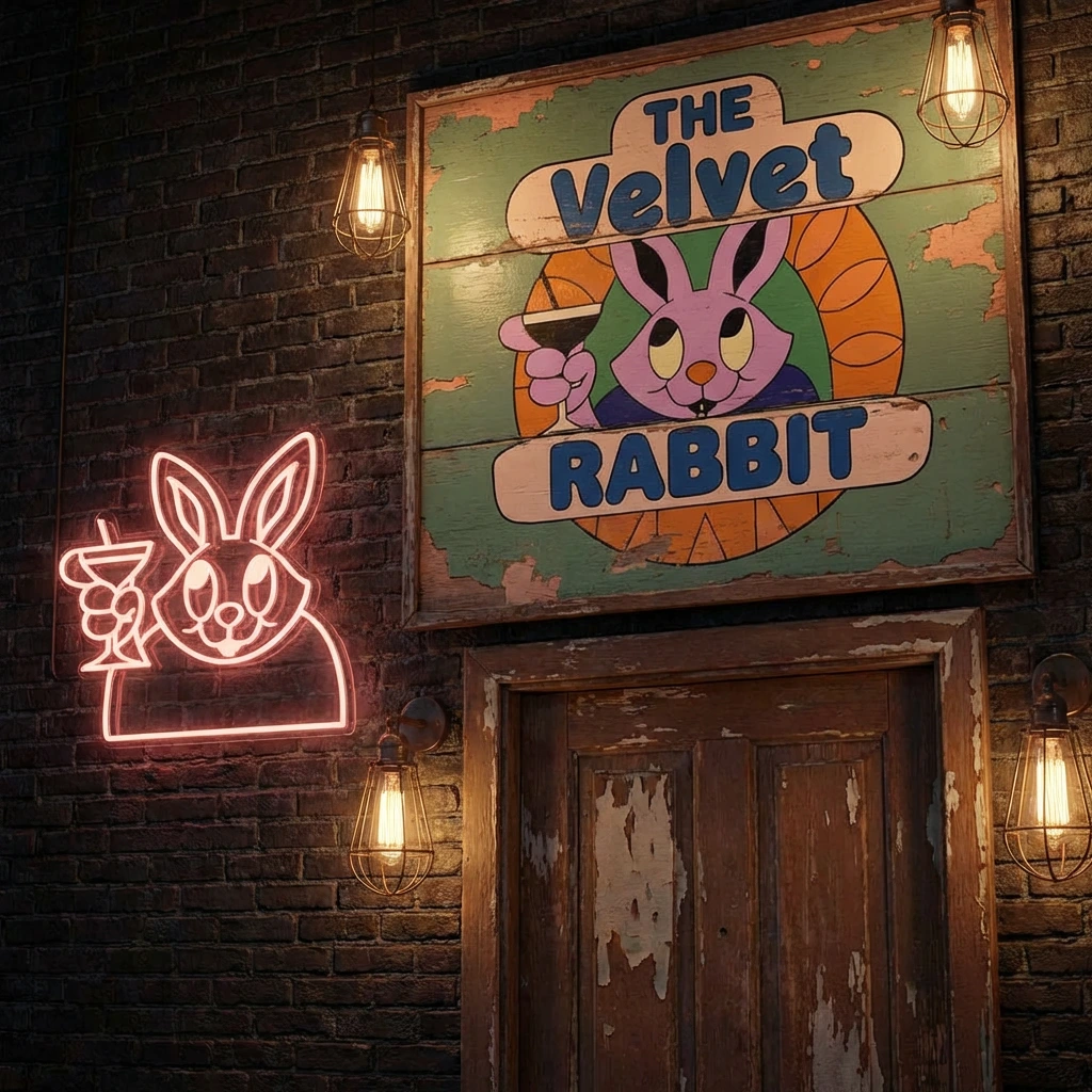
The logo is the brand's anchor. A circular badge format with the rabbit as mascot — slightly smug, martini in hand, dressed for the occasion. The stained glass circular backdrop references bar windows, church light, and the kind of rooms that feel both sacred and illicit. The banner ribbons carrying the name give it the permanence of an institution.
The visual language deliberately sits in the 1970s — not as nostalgia, but as a specific temperature. That era's color palette and illustration style carries warmth, permissiveness, and a certain analog humanity that digital-native aesthetics can't replicate.
Color Palette
Dusty Peach
#F2C9A8 — primary warmth, backgrounds, paper stockWarm Orange
#E8853D — energy, accent, stained glassSage Green
#7FA882 — secondary calm, contrastDeep Navy
#1E2D5A — authority, type, depthSoft Lavender
#C9A8D4 — the rabbit, the unexpected softnessCream White
#FAF3E8 — negative space, breathing roomMuted Gold
#C9A84C — premium touch points onlyTypography
Primary: Fredoka One — rounded, confident, warm. Close enough to the logo letterforms to feel like a system.
Secondary: DM Mono — cold contrast for utility text, addresses, dates, fine print.
Campaign
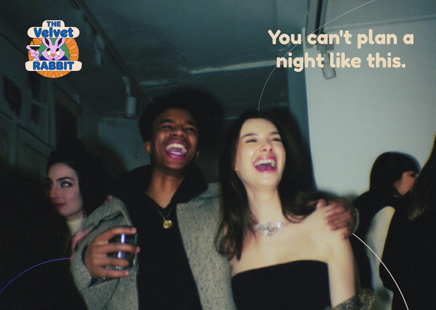
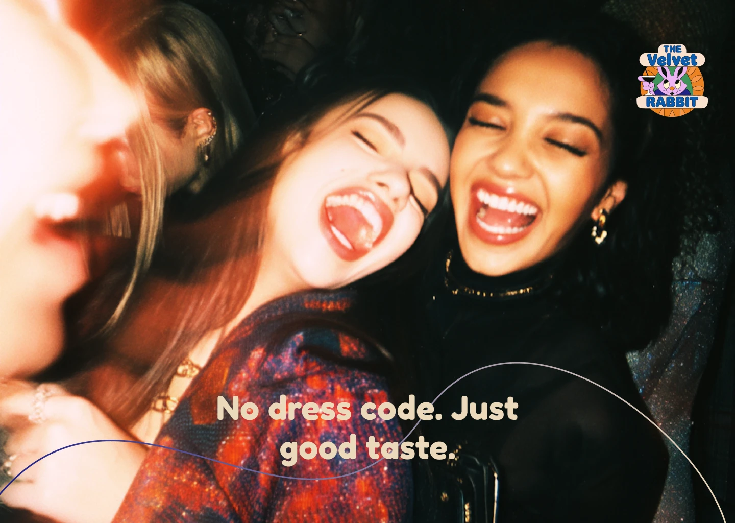
The campaign brief was simple: shoot real moments, not staged ones. Film grain, low light, unguarded laughter. The kind of photography that makes you feel like you missed something good.
Four executions, each with a single line of copy:
"Drink slowly. Stay longer." — The quiet one. A woman alone with a drink, direct gaze, fur coat. The copy is permission, not instruction.
"No dress code. Just good taste." — Three women laughing, completely unposed. The line subverts the speakeasy's historical exclusivity — this place has standards, but they're not about what you're wearing.
"You can't plan a night like this." — The blur, the motion, the bodies mid-laugh. A reminder that the best nights are accidents.
"All roads lead here." — The campaign line as a closer. The dashed path tracing the rabbit ears above the couple ties the visual back to the logo without being literal. It earns the line rather than just stating it.
Design Decisions
The curved line element running through the compositions is a graphic device drawn from the logo's circular form — it creates continuity across executions without repeating the logo in every position. In some frames it acts as a path, in others as a frame, in others as pure texture.
The logo placement varies intentionally. Top right for the intimate shots, centered for the campaign closer. It never dominates — it appears the way a good bar sign does, present when you look for it, invisible when you don't.
Deliverables
Brand identity and logo system
Color palette and typography guidelines
Campaign concept and copywriting
Four poster executions
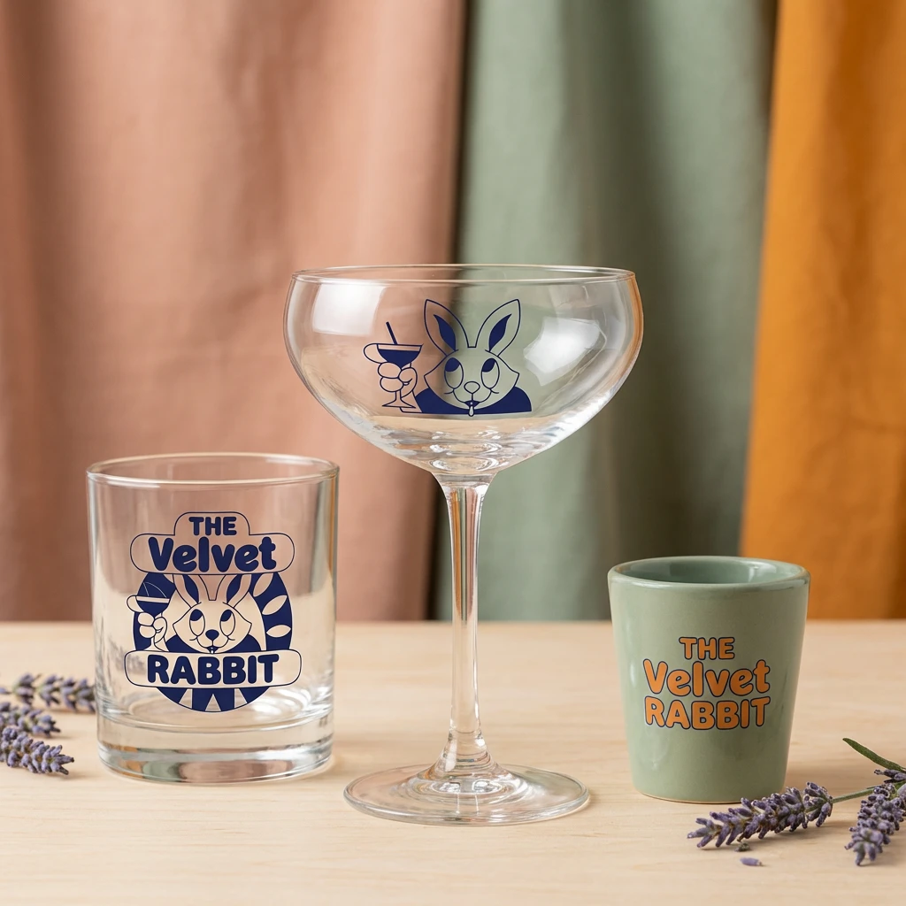
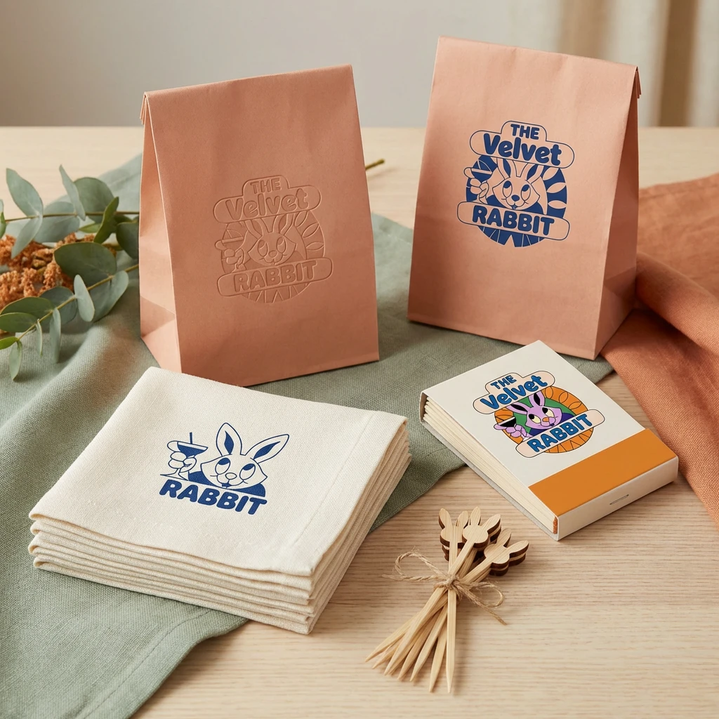
Mockup extensions: packaging, glassware, apparel, signage, stationery
Reflection
The Velvet Rabbit started as a response to a prompt and became a complete world. The constraint of a single phrase — "all roads lead to Rome" — was more generative than a full brief would have been. It forced a conceptual answer rather than a functional one.
The brand works because it has a point of view. It knows what kind of place it is, what kind of people it attracts, and how it wants to make them feel. That clarity is what separates a logo from an identity.
Designed by Révolté — revolte.design
Like this project
Posted Mar 9, 2026
Developed a brand identity and campaign for The Velvet Rabbit, a speakeasy born from a single phrase. One brief. One rabbit.
Likes
4
Views
23
Timeline
Mar 2, 2026 - Mar 9, 2026