Blooom, flower delivery website, brand and logo
Révolté
Blooom
Fresh blooms, delivered with love
Project Overview
BLOOOM is a modern flower delivery service that bridges the gap between traditional floristry and contemporary e-commerce. The brand was created to transform flower delivery from a transactional experience into an emotional, memorable journey that celebrates life's meaningful moments.
The Challenge
The flower delivery market was saturated with either impersonal corporate services or boutique shops lacking digital sophistication. Customers wanted the convenience of online ordering combined with the personal touch and quality of artisan florists. The challenge was to create a brand that felt:
Fresh and modern, not traditional or stuffy
Emotionally resonant without being overly sentimental
Premium yet accessible
Digitally native while honoring the craft of floristry
Brand Strategy
Brand Positioning
BLOOOM positions itself as the thoughtful alternative in flower delivery—where technology enables care rather than replaces it. We're for people who believe small gestures create meaningful moments.
Brand Values
Authenticity: Real care, honest communication, and genuine quality in every arrangement
Craft: Expert curation and artisanal approach to every bloom
Connection: Facilitating meaningful moments between people
Simplicity: Making beautiful gestures effortless
Target Audience
Primary: Urban professionals aged 28-45 who value quality and convenience, want to maintain meaningful connections despite busy lives, and appreciate thoughtful design.
Secondary: Small businesses seeking corporate gifting solutions and event planners looking for reliable, high-quality floral services.
Visual Identity
Color Palette
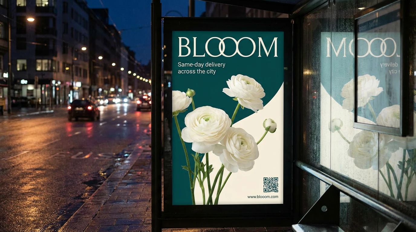
Primary Teal (#7FB3B3)
Calming, natural, fresh—evokes both water and plant life. Primary brand color used across hero sections and key touchpoints.
Cream (#F5F5F0)
Soft, warm neutral that provides breathing room and emphasizes the organic nature of the brand.
Deep Teal (#2C5F5F)
Rich, sophisticated accent used for typography and UI elements. Grounds the lighter palette.
Blush (#FFE5E5)
Secondary accent representing flowers themselves. Used sparingly for highlights and calls-to-action.
Typography
Primary Typeface: A modern geometric sans-serif (similar to Outfit or DM Sans) for headings and UI elements—clean, approachable, and contemporary
Body Typeface: A humanist sans-serif for body copy that ensures excellent readability while maintaining warmth
Brand Name
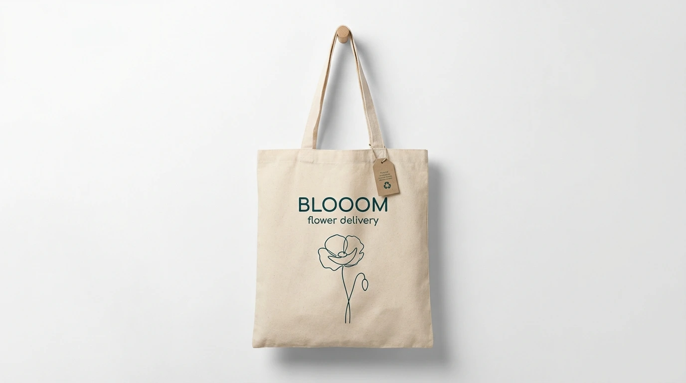
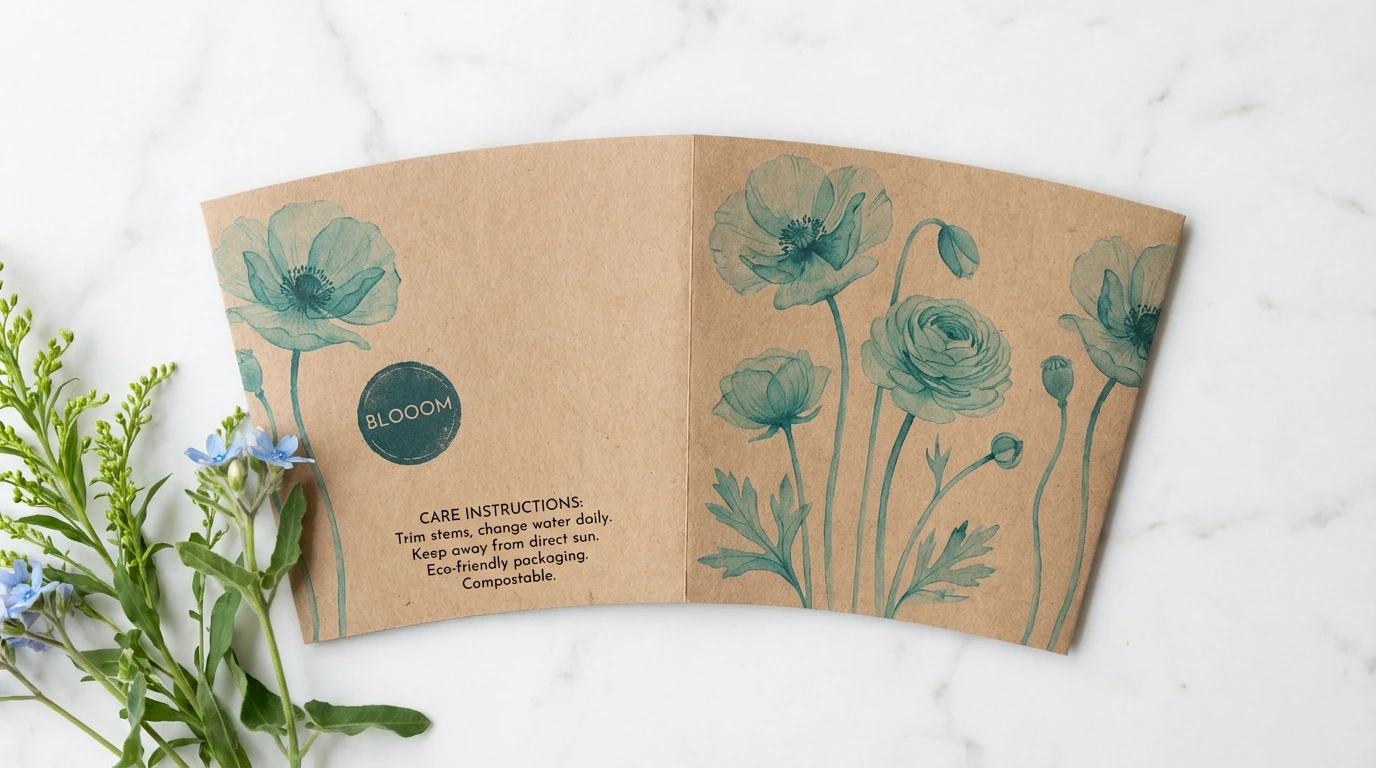
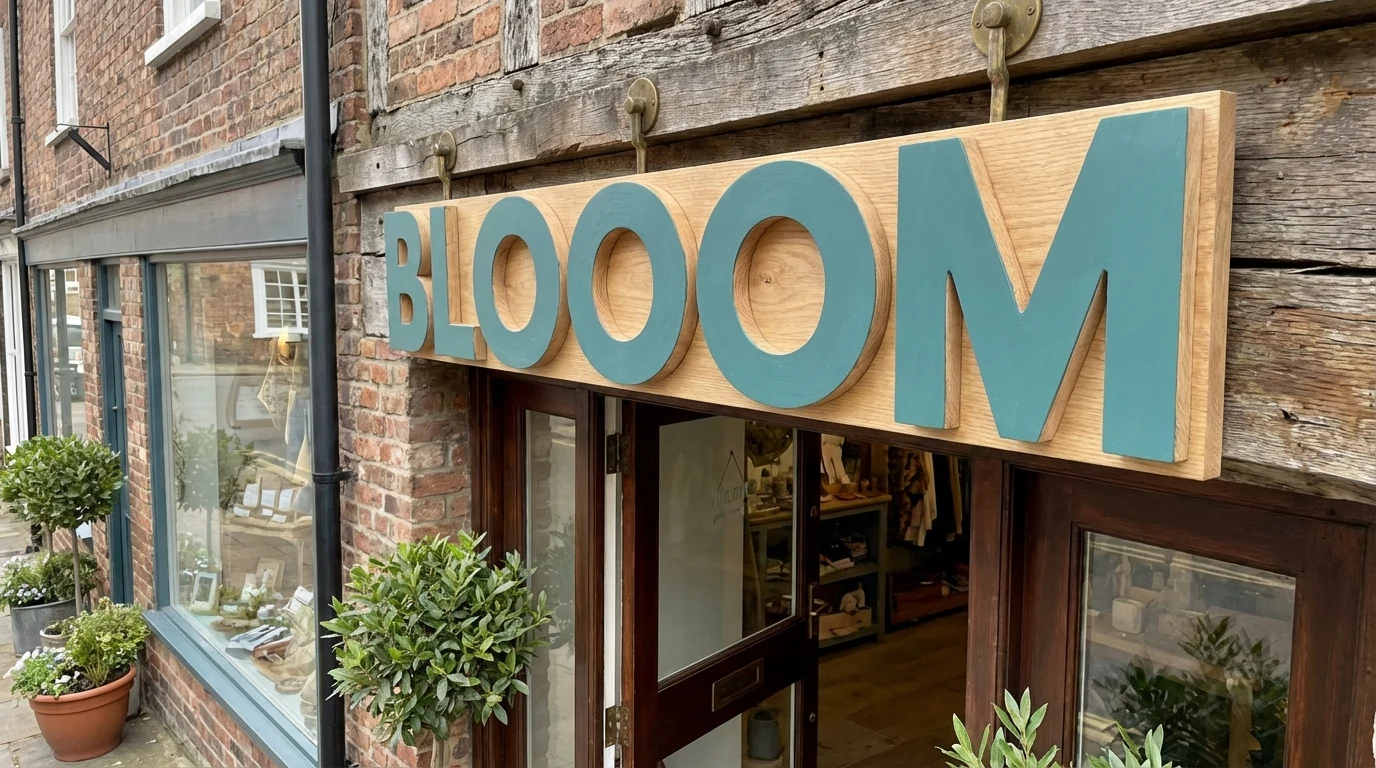
The triple 'O' in BLOOOM serves multiple purposes. It visually suggests flower blooms, creates a memorable and distinctive wordmark, conveys abundance and growth, and adds a playful, optimistic touch to balance the refined aesthetic.
Photography Style
Natural light, shallow depth of field, hero flowers in focus with soft bokeh backgrounds, color palette of whites, creams, and soft pinks against teal, minimal props focusing on the flowers themselves, and occasional lifestyle shots showing hands arranging or receiving blooms.
Website Design
Design Principles
Generous White Space: Let the flowers breathe and create a premium, uncluttered experience
Content-First: Beautiful photography takes center stage with minimal UI interference
Intuitive Flow: Clear user journeys from inspiration to checkout in 3 clicks or less
Emotional Connection: Copy that speaks to moments and feelings, not just products
Homepage Structure
Hero Section
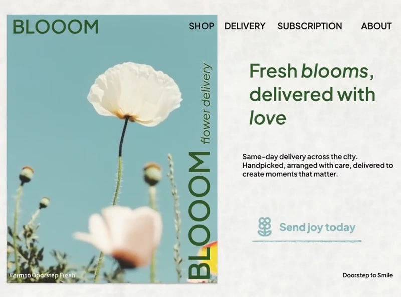
The hero immediately communicates the brand promise with stunning floral photography against the signature teal background. The vertical 'BLOOOM flower delivery' text reinforces brand identity while the primary headline 'Fresh blooms, delivered with love' is set in italics to add warmth and personality.
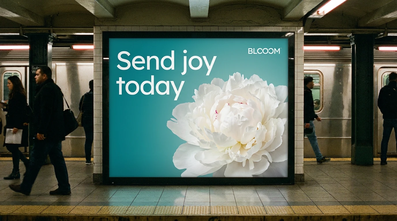
The supporting copy emphasizes service benefits: same-day delivery, handcrafted arrangements, and care that creates moments. The clear CTA 'Send joy today' frames the purchase as an emotional action rather than a transaction.
Key Features & Sections
Shop by Occasion: Pre-curated collections for birthdays, anniversaries, sympathy, celebrations, and just because
Seasonal Collections: Rotating selections highlighting what's fresh and in season
Subscription Service: Regular deliveries for homes and offices, emphasizing consistency and ease
About Our Process: Transparent look at sourcing, arrangement, and delivery—building trust
Delivery Promise: Clear explanation of same-day service areas and time windows
User Experience
Navigation: Clean top navigation with Shop, Delivery, Subscription, and About. Sticky on scroll for easy access.
Product Cards: Large images, clear pricing, quick-add functionality, and hover states revealing arrangement details
Checkout: Single-page checkout with delivery address verification, card message preview, and clear delivery window selection
Mobile Experience: Optimized for on-the-go ordering with thumb-friendly UI and streamlined checkout
Content Strategy
Voice & Tone
BLOOOM's voice is warm, thoughtful, and human. We write like a friend who genuinely cares—never corporate or overly promotional. The tone balances:
Emotional resonance without sentimentality
Professionalism without stuffiness
Confidence without pretension
Key Messages
Primary: Small gestures create meaningful moments
Supporting: Fresh flowers, thoughtfully arranged, delivered with care
Proof Points: Same-day delivery, expert florists, quality guarantee
Technical Implementation
Technology Stack
Frontend: React with Next.js for server-side rendering and optimal performance
Design System: Custom component library built with Tailwind CSS for consistency
CMS: Headless CMS for flexible content management and seasonal updates
E-commerce: Shopify backend for robust payment processing and inventory management
Performance: Progressive image loading, CDN delivery, and optimized assets for fast load times
Results & Impact
Brand Recognition
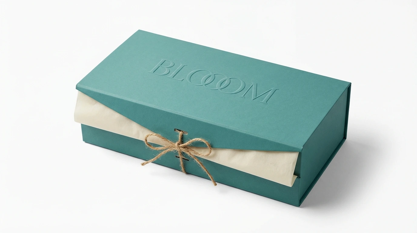
The distinctive triple-O wordmark and teal color palette created immediate brand recognition in a crowded market. Social media sharing of BLOOOM arrangements increased organically as customers appreciated the photogenic packaging and presentation.
User Engagement
The clean, intuitive website design reduced bounce rates and increased conversion. The emotional messaging resonated with the target audience, with 'Fresh blooms, delivered with love' becoming a memorable brand signature that customers referenced in reviews and social posts.
Business Growth
The subscription model proved particularly successful, creating predictable revenue while fostering ongoing customer relationships. Corporate gifting inquiries increased due to the professional aesthetic that worked equally well for personal and business contexts.
Lessons Learned
Balance is Everything
The most successful elements of BLOOOM came from careful balance—modern but timeless, emotional but not sappy, premium but accessible. Every design decision was tested against these tensions.
Simplicity Sells
Early iterations included more elaborate UI elements and design flourishes. Stripping back to the essentials—beautiful flowers, clear benefits, easy ordering—proved more effective than clever design tricks.
Photography is King
Investment in professional, consistent photography paid immediate dividends. The hero image alone communicated more about brand quality than any amount of copy could achieve.
Conclusion
BLOOOM successfully carved out a distinctive position in the flower delivery market by refusing to choose between craft and convenience, emotion and efficiency. The brand identity and website work together to create an experience that feels personal at scale—exactly what modern customers want.
The key to BLOOOM's success lies in its authentic commitment to its core promise: delivering not just flowers, but the joy and connection they represent. Every touchpoint—from the triple-O wordmark to the 'Send joy today' CTA—reinforces this emotional benefit while never losing sight of the practical value proposition.
As the brand continues to grow, the strong foundation of clear positioning, distinctive visual identity, and user-centered design will ensure BLOOOM remains both memorable and meaningful in customers' minds.
Fresh blooms, delivered with love
Like this project
Posted Aug 22, 2025
Transforming flower delivery from transaction to meaningful moment—a case study in balancing craft, emotion, and digital convenience. 🌸
Likes
2
Views
22
Timeline
Dec 4, 2025 - Dec 11, 2025