Insomniac - Urban Streetwear Brand website, logo and branding
Révolté
INSOMNIAC - Brand, Logo & Website Case Study
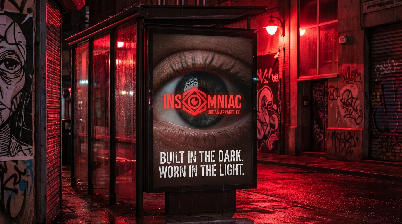
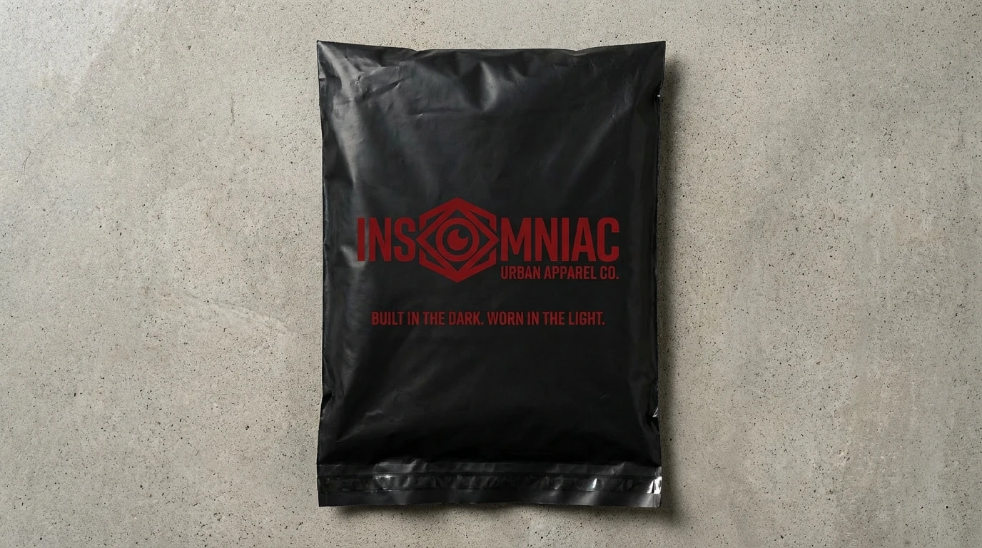
Build in the dark. Worn in the light.
Project Overview
Insomniac is a streetwear brand built for the relentless—the creators, hustlers, and minds that refuse to shut off. Born from the culture of late-night grind and urban grit, Insomniac represents those who build their dreams in the darkness and wear them proudly in the light. This case study explores the creation of a bold, unapologetic brand identity that speaks to the 3AM creator generation.
The Challenge
The streetwear market is oversaturated with brands that either mimic established aesthetics or try too hard to be edgy. The challenge was to create an authentic voice for a specific audience: the late-night creators, the hustlers who sacrifice sleep for their craft. The brand needed to:
Stand out in a crowded streetwear market without feeling derivative
Resonate with a specific mindset, not just an age demographic
Balance grit and darkness with wearability and style
Create a visual identity that works across digital and physical touchpoints
Brand Strategy
Brand Positioning
Insomniac isn't for everyone—and that's the point. We position the brand as a badge of honor for those who choose hustle over sleep, creation over rest. This is streetwear with substance, worn by people who have something to prove and the discipline to prove it.
Target Audience
Primary: Ages 18-32, creative professionals, entrepreneurs, artists, producers, developers—anyone who works when the world sleeps. They're building businesses, creating art, writing code, making beats. Sleep is optional; the grind is not.
Psychographic Profile: Self-motivated, ambitious, anti-establishment, values authenticity over polish, seeks community with like-minded hustlers, wears their work ethic as identity.
Brand Values
Relentlessness: The refusal to stop when others rest
Authenticity: Raw, unfiltered, real—no corporate polish
Community: A tribe of night owls recognizing each other in the daylight
Creation: Building something from nothing while others sleep
Brand Manifesto
"The streets don't sleep. Neither do we. While the world rests, we build. We create. We hustle. Insomniac isn't just what we wear—it's who we are. For the 3AM creators, the relentless minds, the ones who know that great things don't happen between 9 and 5. Built in the dark. Worn in the light. This is for those who run on grit, not rest."
Logo Design
Concept & Symbolism
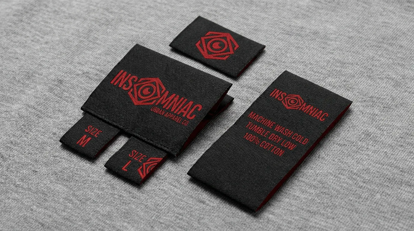
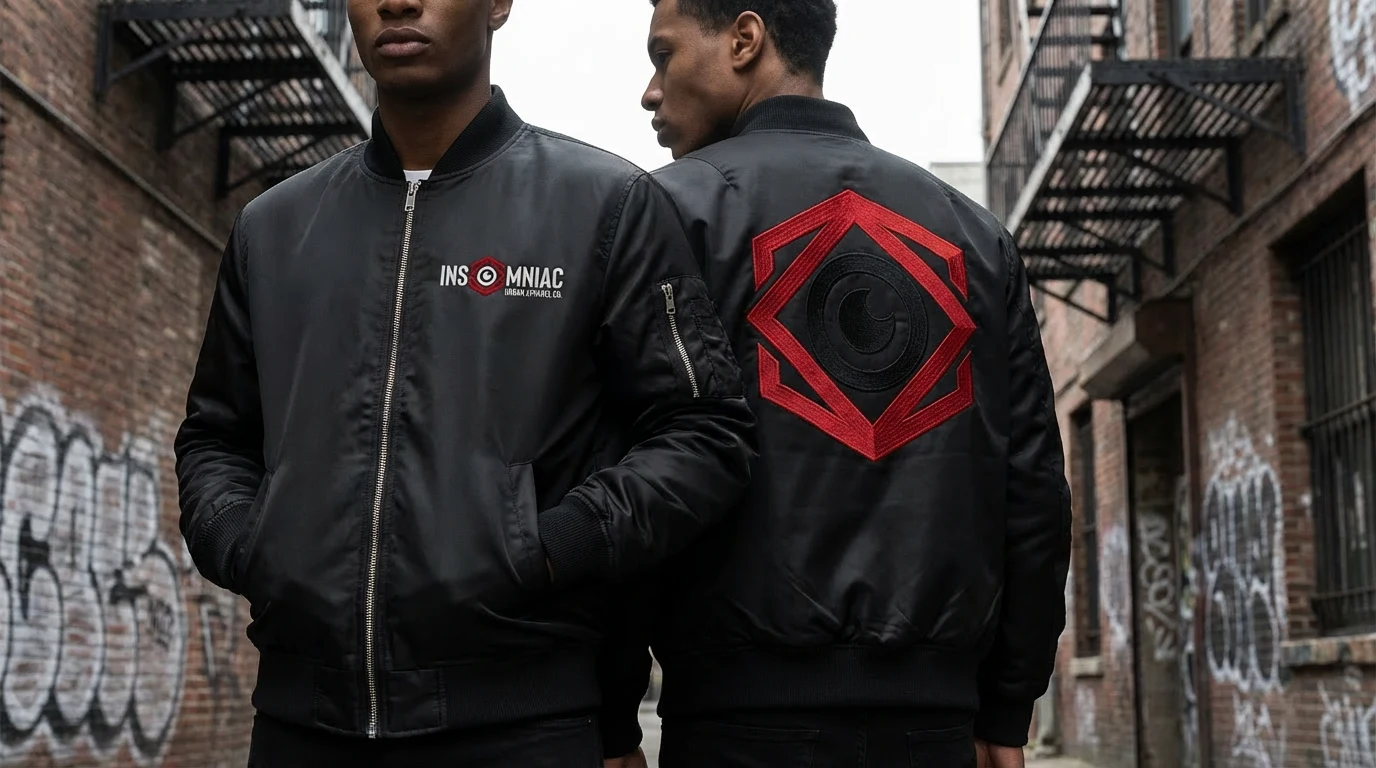
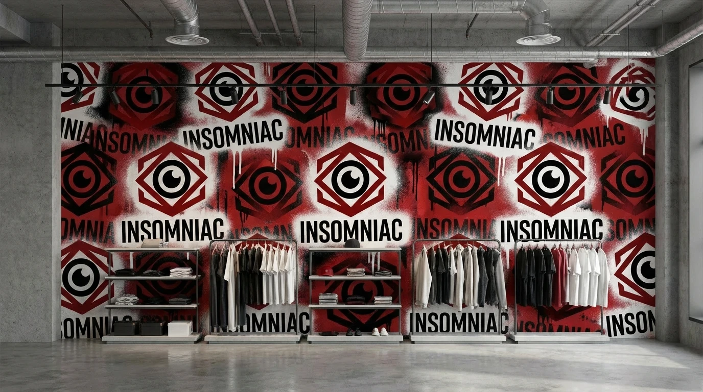
The Insomniac logo centers on a single powerful symbol: the open eye. This isn't just about being awake—it's about awareness, vision, and seeing opportunities others miss. The eye is both literal (staying awake) and metaphorical (seeing clearly, being woke to your purpose).
Logo System
Primary Wordmark
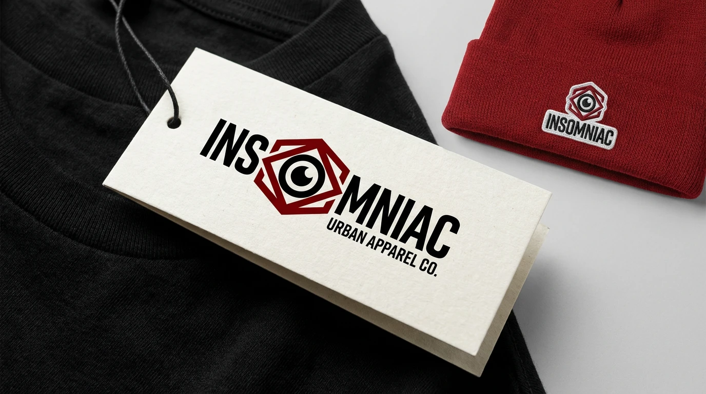
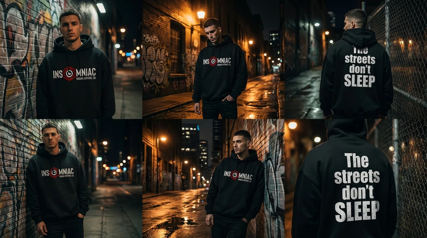
Bold, condensed sans-serif typography spelling 'Insomniac' with the eye icon integrated into or replacing the 'O'. The letterforms are slightly distressed or have rough edges, giving an urban, street-worn quality. The wordmark can stand alone or be paired with the tagline.
Icon Mark
A circular badge featuring the open eye symbol, surrounded by text that curves to read 'SHOP NOW' or 'INSOMNIAC'. This works as a social media profile picture, app icon, or standalone mark on products. The eye is stylized but recognizable, with a hand-drawn quality that feels organic, not corporate.
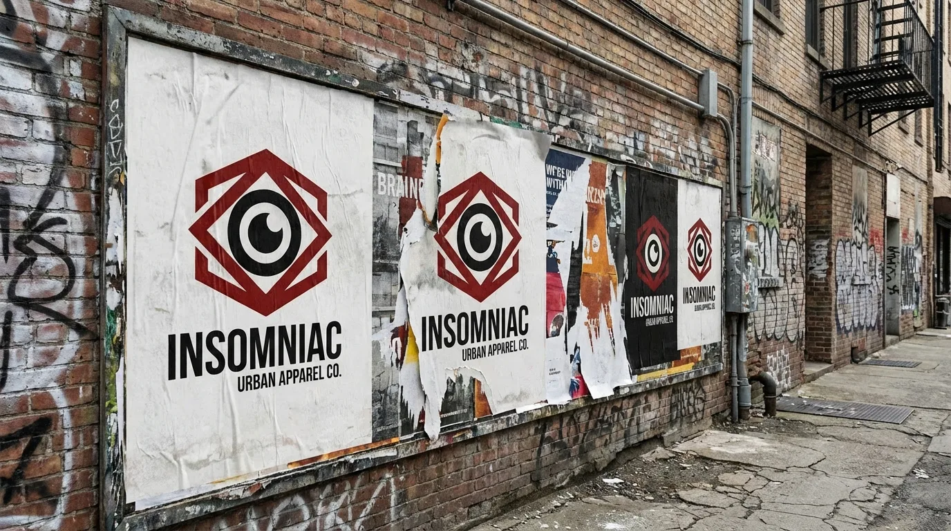
Secondary Elements
Abstract eye patterns, halftone textures, and distressed overlays that can be used as background elements. These add visual interest while maintaining brand consistency. The recurring eye motif becomes a signature element across all touchpoints.
Typography
Display/Logo Font: Heavy, condensed sans-serif (similar to Druk or Knockout) for maximum impact and street credibility
Headline Font: Bold sans-serif with tight spacing for headlines and key messaging
Body Font: Clean, legible sans-serif (Inter or similar) for product descriptions and longer copy
Visual Identity
Color Palette
Black (#000000)
Primary brand color. Represents the night, the darkness where creation happens. Used for backgrounds, apparel base, and dominant visual elements.
Deep Red (#8B0000)
Signature accent color. Intense, visceral, attention-grabbing. Represents passion, energy, and the fire that keeps insomniacs going. Used for logos, calls-to-action, and key messaging.
White (#FFFFFF)
The light. Used for typography, contrast, and 'worn in the light' moments. Provides necessary contrast against black and creates hierarchy.
Dark Red (#2B0000)
Secondary accent for depth and variation. Used in gradients, shadows, and to create visual interest without introducing new colors.
Visual Style
Texture & Grit: Halftone patterns, grain overlays, and distressed textures add urban authenticity
Photography: Dark, moody, high-contrast imagery. Night scenes, urban environments, close-ups of eyes and faces. Raw, unpolished aesthetic.
Composition: Bold, dramatic layouts with strong hierarchy. Large typography, negative space used purposefully, asymmetric balance.
Iconography: Custom icon set featuring eyes, urban symbols, abstract patterns. Hand-drawn quality with intentional imperfection.
Website Design
Design Philosophy
The Insomniac website is built like the audience it serves: dark, direct, and uncompromising. This isn't a polished corporate site—it's a digital extension of the streets. The experience is immersive, visceral, and unapologetically bold.
Homepage Structure
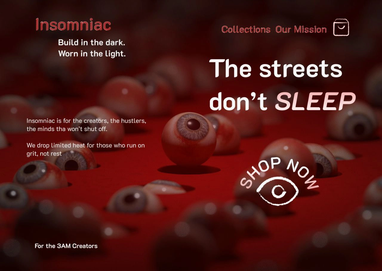
Hero Section
The hero immediately sets the tone with dramatic 3D-rendered imagery—eyeballs scattered across a blood-red landscape, creating an unsettling yet captivating visual. This isn't meant to be comfortable; it's meant to be memorable.
Key Elements:
Large-scale headline: 'The streets don't SLEEP' with 'SLEEP' in italics for emphasis
Tagline: 'Build in the dark. Worn in the light.' positioned prominently
Supporting copy about creators and hustlers who won't shut off
Circular 'SHOP NOW' CTA with eye icon—inviting but not desperate
Footer message: 'For the 3AM Creators'
Navigation
Minimal top navigation with 'Collections' and 'Our Mission' alongside the Insomniac logo. A shopping bag icon on the far right. Clean, functional, gets out of the way. The navigation is sticky but subtle—always accessible, never intrusive.
Collections Section
Product categories are presented with full-bleed imagery, each with its own mood and messaging. Hover states reveal additional details and quick-shop functionality. Categories might include:
Core Collection (everyday essentials)
Limited Drops (exclusive releases)
3AM Series (premium late-night collection)
Accessories (bags, hats, patches)
Product Pages
Large Product Images: Full-screen product photography with zoom functionality. Multiple angles and lifestyle shots showing the product in context.
Product Info: Clean typography with essential details—name, price, sizing, materials. No unnecessary clutter.
Storytelling: Each product has a brief narrative connecting it to the Insomniac ethos. 'Built for the 2AM session. Worn to the morning meeting.'
CTA: Bold 'ADD TO CART' button in red, impossible to miss.
User Experience
Speed: Fast load times are non-negotiable. The audience is impatient and constantly moving.
Mobile-First: Most browsing happens on phones, often late at night. The mobile experience is optimized for one-handed use.
Checkout: Streamlined, minimal friction. Guest checkout option. Apple Pay and other quick-pay integrations.
Community: Instagram feed integration, user-generated content section, hashtag #InsomniacCrew for community recognition.
Interactive Elements
Scroll Effects: Parallax scrolling, fade-ins, and scale animations that enhance the dark, immersive atmosphere
Hover States: Red glow effects, eye icons that blink or animate, subtle movements that add personality
Micro-interactions: Shopping bag icon animates when items are added, size selections have tactile feedback
Technical Implementation
Technology Stack
Frontend: Next.js with React for dynamic, fast-loading pages with SEO optimization
Styling: Custom CSS with Tailwind for rapid development and consistent design system
E-commerce: Shopify for inventory management, checkout, and payment processing
3D Rendering: Blender for hero imagery, with Three.js for any interactive 3D elements
Animations: Framer Motion for smooth, performant animations and transitions
Hosting: Vercel for edge deployment and optimal performance globally
Marketing Strategy
Launch Strategy
The launch would focus on authenticity and community over traditional advertising:
Organic Social: Instagram and TikTok content showing real late-night work sessions, studio time, coding marathons
Influencer Partnerships: Not traditional influencers, but respected creators, producers, and entrepreneurs who embody the hustle
Limited Drops: Scarcity-driven releases that create urgency and exclusivity
Street Presence: Pop-up shops in urban centers, guerrilla marketing, sticker campaigns
Content Marketing
3AM Chronicles: Blog/video series featuring stories from real creators about their late-night breakthroughs
Spotify Playlists: Curated playlists for late-night work sessions, branded as 'Insomniac Sessions'
Newsletter: Weekly 'Night Owl Report' with creator spotlights, productivity tips, and drop announcements
Expected Results & Impact
Brand Differentiation
Insomniac stands apart from generic streetwear brands through its specific positioning and unapologetic aesthetic. The dark, gritty visual identity and eye iconography create instant recognition. The brand doesn't try to appeal to everyone—it speaks directly to its tribe.
Community Building
The brand becomes more than clothing—it's a badge of identity. Customers aren't just buying apparel; they're joining a community of like-minded hustlers. The #InsomniacCrew hashtag becomes a space for connection, shared late-night work sessions, and mutual motivation.
Business Viability
The limited drop model creates urgency and allows for higher price points. The specific target audience, while niche, is highly engaged and willing to pay premium prices for quality and authenticity. Strong social proof and community will drive organic growth and reduce customer acquisition costs.
Key Lessons & Considerations
Authenticity Over Perfection
The rough edges, distressed textures, and raw aesthetic are intentional. This brand succeeds by being real, not polished. Every element should feel like it came from the streets, not a corporate boardroom.
Know Your Audience
This brand won't work if it tries to appeal to everyone. The power comes from speaking directly and specifically to the late-night creator mindset. Diluting the message to broaden appeal would undermine the entire concept.
Consistency Across Touchpoints
From the website to packaging to social media to the physical product, every interaction reinforces the same values and aesthetic. This consistency builds trust and strengthens brand recognition.
Conclusion
Insomniac is streetwear with soul—a brand built for a specific tribe with shared values and lifestyle. By refusing to compromise on its dark, gritty aesthetic and speaking directly to the late-night creator mindset, it carves out a distinctive position in the market.
The visual identity—centered on the open eye symbol and bold red-and-black palette—creates instant recognition. The website serves as an immersive digital experience that reflects the brand's values rather than just selling products. Every element, from typography to photography to copy, reinforces the core message: this is for those who build in the dark and wear it in the light.
Most importantly, Insomniac isn't trying to be the biggest streetwear brand—it's trying to be the most meaningful one to its audience. In a market saturated with brands chasing trends, Insomniac stands firm in its identity, creating something authentic for those who recognize themselves in it.
For the 3AM Creators
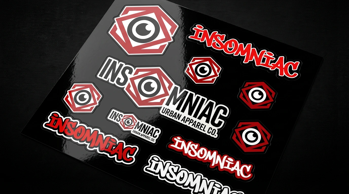
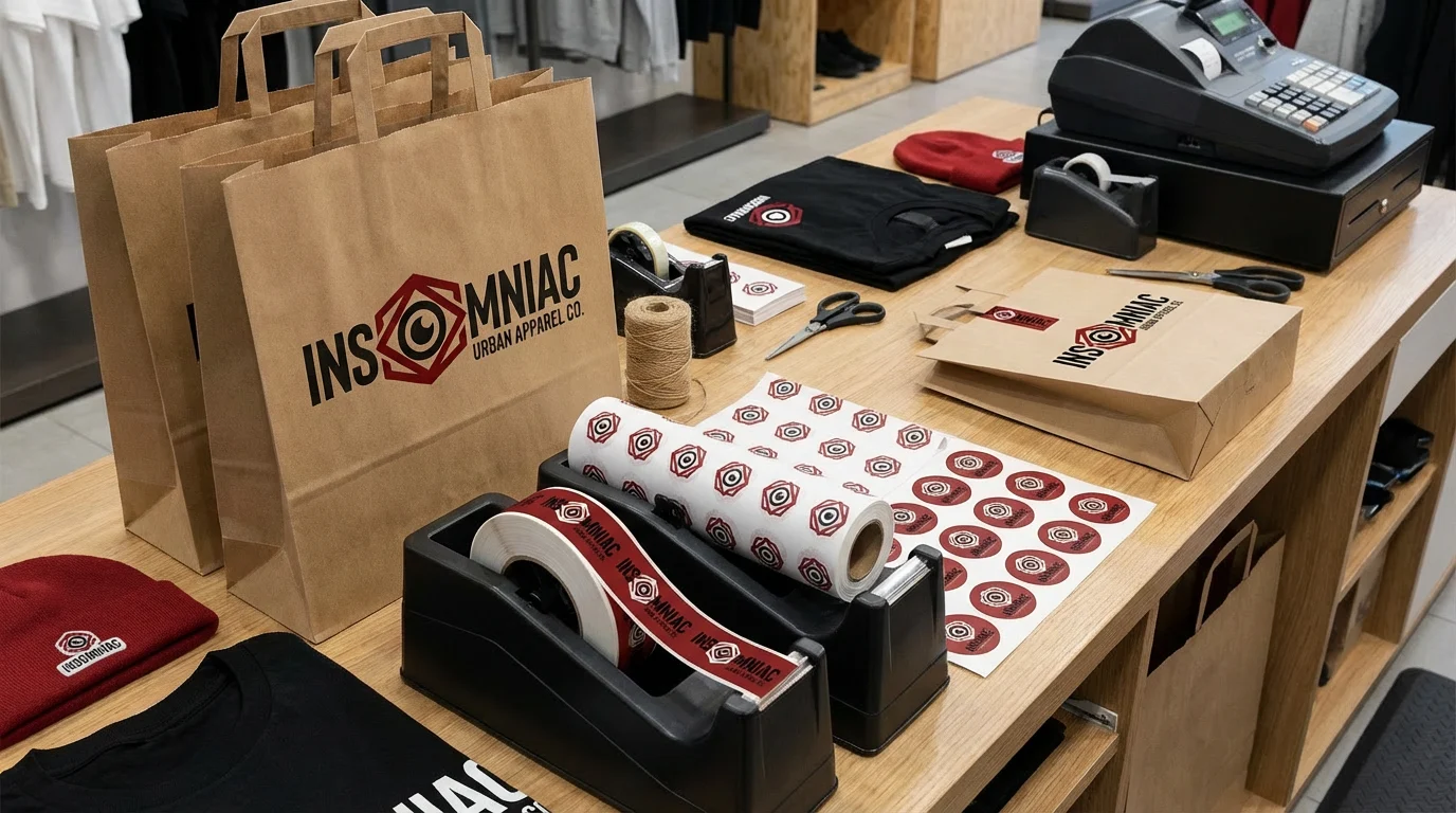
Stickers
Like this project
Posted Jul 30, 2025
Dark, gritty streetwear brand site targeting night creators and hustlers with surreal eyeball imagery and bold typography for urban fashion culture.
Likes
3
Views
18