The Golden Hour Collective website and brand design
Révolté
THE GOLDEN HOUR COLLECTIVE - Brand & Website Case Study
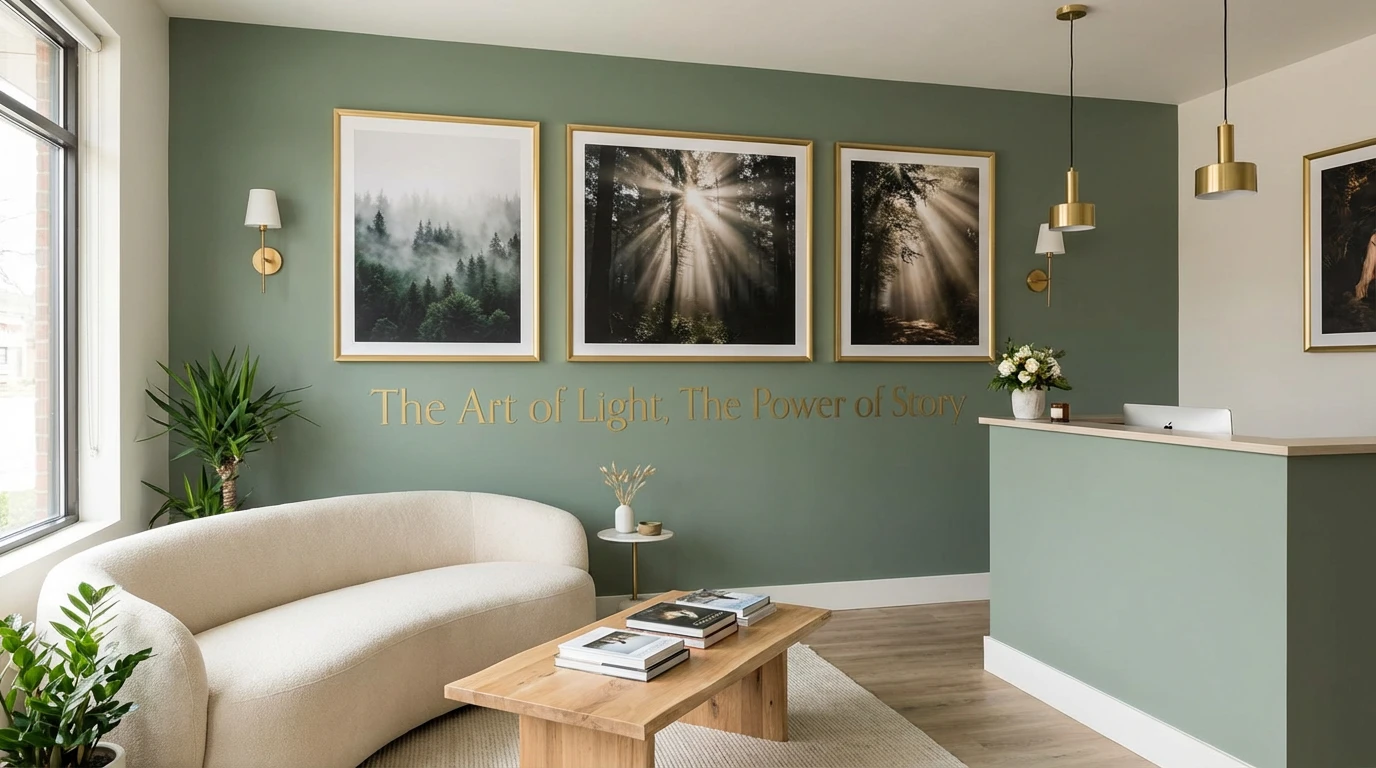
The Art of Light, The Power of Story.
Project Overview
The Golden Hour Collective is a boutique photography and cinematography studio that specializes in capturing the ephemeral beauty of natural light and authentic human moments. More than a photography service, it's a creative collective dedicated to the belief that the most beautiful stories are found in the light, and they're here to capture them. This case study explores the creation of a refined, artistic brand identity that elevates photography from a service to an art form.
The Challenge
The photography industry is saturated with studios offering similar services at various price points. High-end clients seeking artistic, cinematic photography want more than technical competence—they want a creative partner who understands the emotional weight of visual storytelling. The challenge was to create a brand that:
Communicates artistic sophistication without feeling pretentious or inaccessible
Stands out in a crowded market of photography studios and freelancers
Appeals to discerning clients who value quality and artistry over quick turnaround
Bridges the gap between commercial viability and artistic integrity
Works seamlessly across photography, cinematography, and creative direction services
Brand Strategy
Brand Positioning
The Golden Hour Collective positions itself at the intersection of fine art and commercial photography. We're not the cheapest option, nor the fastest—we're the choice for clients who understand that exceptional visual storytelling requires time, skill, and artistic vision. We serve those who want their moments captured with the same care and composition as a museum-quality photograph.
Target Audience
Primary: Ages 30-55, established professionals and creative directors seeking premium photography services for personal milestones (weddings, family portraits, editorial projects) or commercial work (brand campaigns, architectural photography, editorial content). They appreciate craftsmanship, have refined aesthetic sensibilities, and view photography as an investment rather than an expense.
Secondary: Creative agencies, luxury brands, and publications seeking high-quality visual content with a distinctive artistic point of view.
Psychographic Profile: Values authenticity over trends, appreciates subtlety and nuance, seeks timeless rather than trendy aesthetics, willing to invest in quality, drawn to natural beauty and honest storytelling.
Brand Values
Artistry: Every frame is composed with the care of a painter approaching a canvas
Authenticity: We capture real moments, real emotions, real light—nothing fabricated or forced
Patience: Great light can't be rushed; we wait for the perfect moment
Storytelling: Every image is part of a larger narrative about people, places, and moments
Excellence: Technical mastery in service of emotional resonance
Brand Philosophy
The "golden hour" in photography refers to the brief period after sunrise or before sunset when light is soft, warm, and extraordinarily beautiful. It's fleeting, magical, and requires patience to capture. This metaphor extends to our entire philosophy: the most beautiful moments in life are often brief and unrepeatable, and it takes skill, awareness, and presence to capture them before they're gone.
Visual Identity

Color Palette
Sage Green (#8B9B8E)
Primary brand color. Sophisticated, natural, calming—evokes the organic quality of natural light filtering through leaves. Represents growth, harmony, and connection to nature. Used for backgrounds, primary brand materials, and digital interfaces.
Warm Gold (#D4A574)
Signature accent representing the golden hour itself. Warm, precious, luminous. Used for highlights, calls-to-action, logo accents, and premium touchpoints. Conveys luxury without ostentation.
Cream (#F5F1E8)
Soft neutral that provides breathing room and represents the soft, diffused quality of golden hour light. Used for backgrounds, body text areas, and to create visual rest.
Charcoal (#2C2C2C)
Deep, rich dark tone for typography and contrast. Grounds the lighter palette and ensures readability. Sophisticated alternative to pure black.
Soft White (#FAFAF8)
Nearly white with slight warmth. Used for clean backgrounds and to create high contrast when needed.
Typography
Display/Headline Font: Elegant serif typeface (similar to Canela, Freight Display, or Garamond) for the brand name and major headlines. Sophisticated, timeless, with subtle personality. The mix of regular and italic weights adds visual rhythm.
Body Font: Clean, contemporary sans-serif (similar to Founders Grotesk or Söhne) for navigation, descriptions, and functional text. Ensures readability while maintaining refinement.
Accent Font: Light italic serif for quotes, taglines, and special callouts. Adds grace and movement.
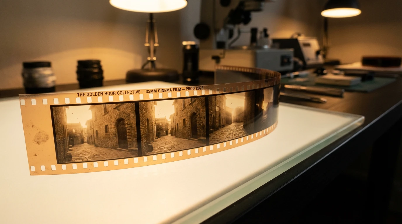
Photography Style
The visual content itself is part of the brand identity:
Lighting: Primarily natural light, soft and directional. Images captured during actual golden hours or in naturally lit spaces. Warm color temperature, gentle shadows, ethereal quality.
Composition: Thoughtful, often minimalist compositions. Use of negative space, rule of thirds, leading lines. Architectural elements and human figures in contemplative poses.
Color Grading: Consistent sage and gold color grading across portfolio. Muted, sophisticated palette. Slightly desaturated for timeless quality.
Subject Matter: Atmospheric interiors, architectural details, silhouettes, candid human moments, nature and light interplay, reflections and shadows.
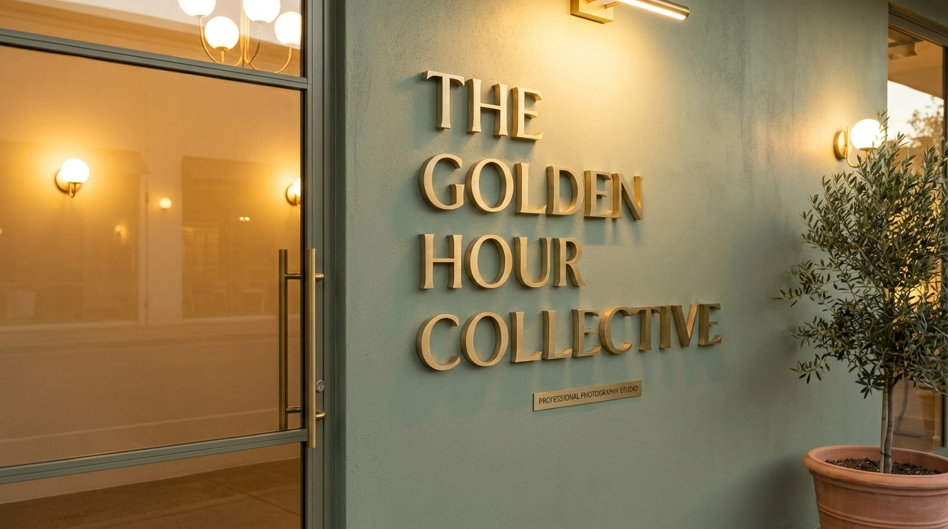
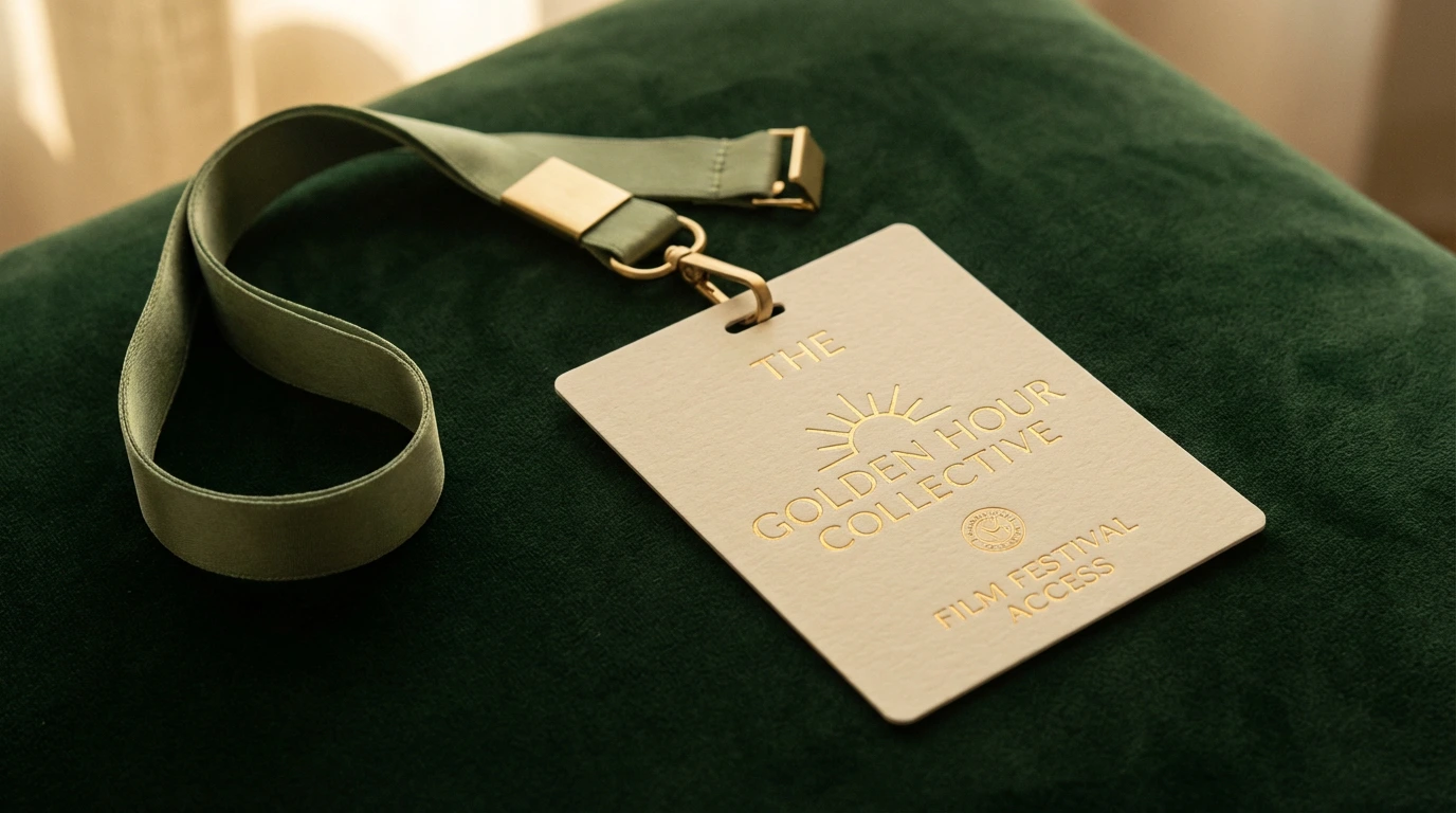
Logo & Brand Mark
Primary Wordmark: "The Golden Hour Collective" set in elegant serif type with "Collective" in italics to add movement and differentiate the collaborative nature of the studio.
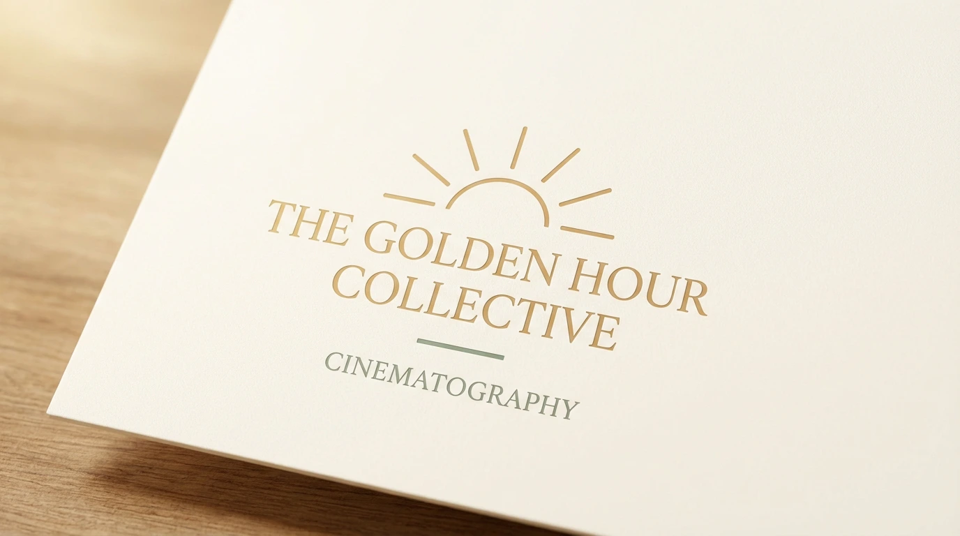
Icon: Subtle sun ray pattern or abstract light ray symbol that can stand alone or integrate with the wordmark. Minimalist, geometric, sophisticated—never literal or illustrative.
Lockup Variations: Horizontal, stacked, and icon-only versions for different applications. Consistent spacing and proportion rules maintain brand integrity.
Website Design

Design Philosophy
The website is designed as an immersive visual experience—a digital gallery where each image is given space to breathe and speak. The interface should never compete with the photography; it should frame it, like a gallery frames art. The experience should feel slow, intentional, contemplative—a deliberate contrast to the frenetic pace of most modern websites.
Homepage Structure
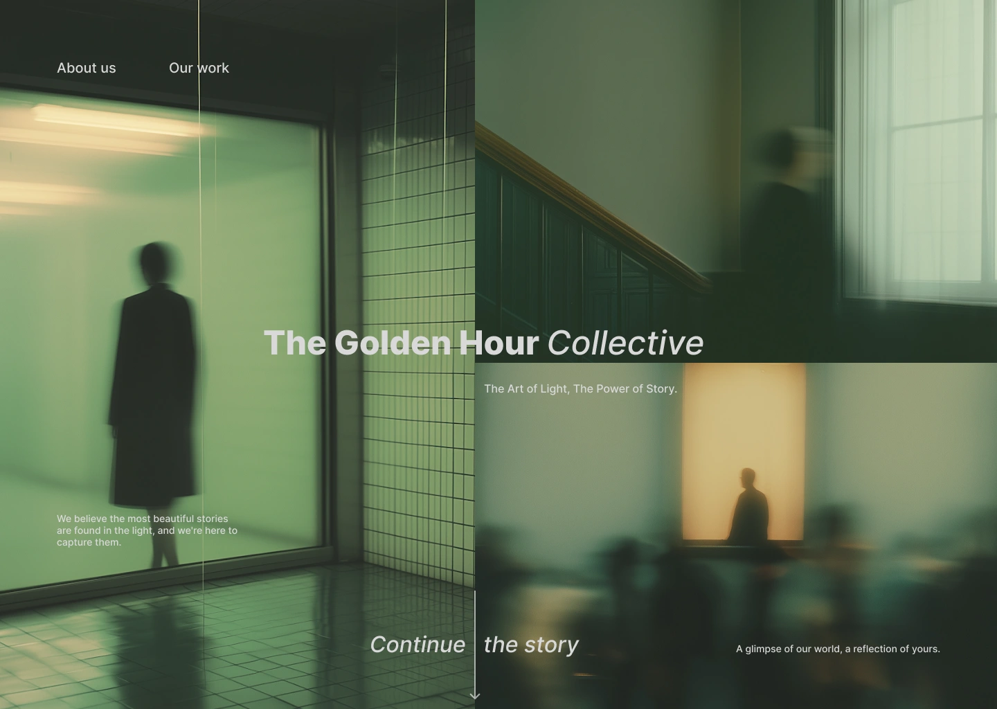
Hero Section
The homepage opens with a full-screen atmospheric photograph—likely an architectural interior with silhouetted figures, capturing the interplay of light and shadow. The image sets the mood immediately: sophisticated, artistic, slightly mysterious.
Key Elements:
Full-bleed background image with subtle parallax scroll
Clean navigation: "About us" and "Our work" in simple sans-serif
Centered headline: "The Golden Hour Collective" (with Collective in italics)
Subheadline: "The Art of Light, The Power of Story."
Minimal overlay text in bottom left: "We believe the most beautiful stories are found in the light, and we're here to capture them."
Scroll indicator: "Continue the story" with downward arrow
Philosophy Section
As users scroll, they encounter a manifesto-style section explaining the golden hour concept and the studio's approach to photography. This section uses generous white space, large serif typography, and pull quotes to create a contemplative reading experience.
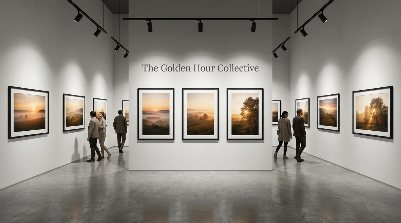
Portfolio Grid
The work is organized into categories (Weddings, Portraits, Commercial, Editorial, Architecture) presented in a clean, masonry-style grid. Each thumbnail is a window into a story. Hover states reveal project titles and brief descriptions.
Grid Characteristics:
Variable sizing to create visual interest while maintaining balance
Consistent sage green overlay on hover with gold "View Project" link
Ample padding between images—never crowded
Lazy loading for performance without sacrificing image quality
Services Section
Clearly defined service offerings with pricing transparency (ranges, not exact figures). Each service has a dedicated page with example work, process overview, and investment information.
Services Include:
Wedding Photography & Cinematography
Portrait Sessions
Commercial & Brand Photography
Editorial & Fine Art
Architectural Photography
About Section
Introduces the photographers/team with authentic, well-lit portraits. Shares the origin story of The Golden Hour Collective, the philosophy behind the work, and what makes this studio different. Written in first person to create connection.
Contact Section
Simple, elegant contact form with sage green accents. Option to schedule consultation calls. Clear expectations about response time and process. Gallery of client testimonials positioned nearby for social proof.
User Experience
Pacing: Intentionally slower scrolling experience. Animations are subtle and graceful. The site encourages users to slow down and appreciate each image.
Navigation: Minimal, sticky navigation that becomes transparent over light sections and solid over dark sections. No hamburger menu—all primary links always visible.
Image Quality: High-resolution images optimized for web. Progressive loading ensures detail without sacrificing performance. Users can click to view full-screen versions.
Mobile Experience: Fully responsive but maintains the gallery-like quality. Single-column layout on mobile with generous spacing. Images remain impactful even on smaller screens.
Interactions: Subtle animations—fade-ins, gentle parallax effects, smooth transitions. Nothing jarring or gimmicky. Every interaction feels intentional and refined.
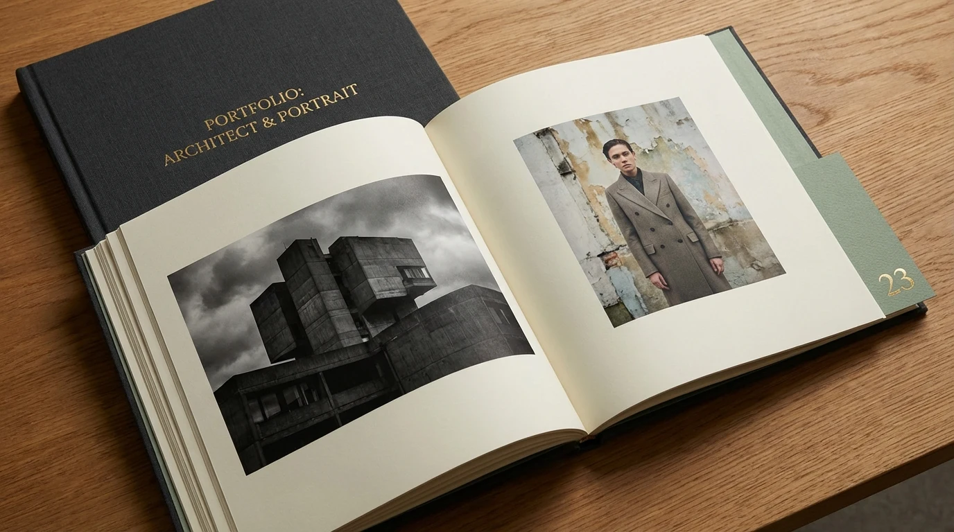
Project Pages
Individual project pages tell complete stories:
Structure:
Hero image with project title overlay
Client/project context (if appropriate)
Narrative text describing the story, the light, the moment
Full-width or side-by-side image layouts
Mix of portrait and landscape orientations
Concluding statement or client testimonial
"View Next Project" navigation
Content Strategy
Voice & Tone
The Golden Hour Collective speaks with quiet confidence—the voice of someone who doesn't need to convince you of their talent because the work speaks for itself. The tone is:
Reflective: Thoughtful, contemplative, never rushed
Authentic: Real stories about real moments, no marketing hyperbole
Artistic: Appreciates beauty, light, composition, but never pretentious
Warm: Approachable despite the sophistication, human and genuine
Confident: Assured without arrogance, established without being exclusive
Key Messages
Primary: A glimpse of our world, a reflection of yours.
Supporting Messages:
"The most beautiful stories are found in the light"
"We don't just capture moments—we reveal them"
"Timeless images for moments that matter"
"Where art meets authenticity"
Content Types
Portfolio Narratives: Each project includes written context—not just what we photographed, but why it mattered, what the light was doing, what story emerged.
Behind the Scenes: Occasional blog posts about technique, philosophy, inspiration, and the creative process. Educational but never academic.
Client Stories: Testimonials and case studies that focus on the relationship and experience as much as the final images.
Light Studies: Instagram content showing different qualities of light throughout seasons and times of day—educational and brand-building.
Technical Implementation
Technology Stack
Frontend: Next.js with React for fast, SEO-optimized performance with smooth client-side navigation
Image Management: Cloudinary or similar for optimized image delivery, responsive sizing, and progressive loading
CMS: Headless CMS (Contentful or Sanity) for easy portfolio updates and blog management
Animations: Framer Motion for smooth, performant animations and scroll-triggered effects
Forms: Custom contact forms with Formspree or similar for reliable email delivery
Hosting: Vercel for fast global CDN delivery and automatic deployments
Analytics: Privacy-focused analytics (Plausible or Fathom) to track engagement without compromising user privacy
Performance Optimization
Image Optimization: Next-gen formats (WebP, AVIF) with fallbacks, lazy loading, blur-up placeholders
Code Splitting: Route-based code splitting to minimize initial bundle size
Font Loading: System fonts with custom font loading strategy to prevent FOUT
Caching: Aggressive caching strategies for static assets, server-side rendering for fast initial load
Marketing Strategy
Launch Approach
The launch strategy focuses on organic growth through network effects and word-of-mouth rather than paid advertising:
Portfolio First: Launch with a curated collection of best work across all service categories. Quality over quantity.
Strategic Partnerships: Collaborate with wedding planners, interior designers, architects, and creative agencies who work with the target audience.
Editorial Features: Pitch work to photography blogs, wedding publications, architecture magazines for organic exposure.
Referral Program: Exceptional client experience that naturally generates word-of-mouth. Formal referral incentives for past clients.
Content Marketing
Instagram: Primary social platform with consistent aesthetic. Daily stories showing behind-the-scenes process, weekly grid posts featuring portfolio work.
Pinterest: Curated boards organized by style, location, season—highly discoverable for engaged couples and design professionals.
Blog: Monthly posts about photography philosophy, seasonal light qualities, location guides, and client stories.
Email Newsletter: Quarterly newsletter featuring recent work, upcoming availability, and thoughtful essays about light and storytelling.
SEO Strategy
Local SEO: Optimize for "[City] wedding photographer," "[City] portrait photographer," "[City] commercial photography"
Service Pages: Dedicated landing pages for each service with detailed descriptions and portfolio examples
Blog Content: Long-form content targeting informational searches related to photography, golden hour, and visual storytelling
Schema Markup: Implement local business, service, and review schema for enhanced search visibility
Expected Results & Impact
Brand Differentiation
In a market flooded with photographers, The Golden Hour Collective stands out through its sophisticated aesthetic and commitment to artistic excellence. The sage and gold color palette creates instant recognition, while the emphasis on natural light and storytelling attracts clients who value these qualities.
Premium Positioning
The refined brand identity supports premium pricing. Clients understand they're not just hiring a photographer—they're investing in an artist who will create timeless images. The brand attracts fewer inquiries but higher-quality leads who appreciate and can afford the level of service offered.
Client Experience
Every touchpoint reinforces the brand values. From the first website visit to the final image delivery, clients experience consistency, thoughtfulness, and excellence. This creates loyalty and generates organic referrals from delighted clients.
Business Sustainability
By focusing on a specific aesthetic and philosophy, the studio can work with fewer clients at higher rates, creating a sustainable business model that allows time for artistic development and maintains quality standards.
Key Lessons & Considerations
Consistency Creates Recognition
The consistent use of sage and gold across all touchpoints—from website to packaging to social media—creates a cohesive brand experience. This visual consistency helps potential clients immediately recognize The Golden Hour Collective's work, even without seeing the logo.
Let the Work Speak
In creative industries, the work is the best marketing. The website design intentionally steps back to let the photography be the hero. This requires confidence and restraint—but ultimately creates a more powerful impact.
Target Narrow, Appeal Wide
By focusing specifically on clients who value natural light and authentic storytelling, the brand attracts exactly the right audience. Interestingly, this narrow focus often appeals more broadly than trying to be everything to everyone.
Invest in Quality
Using high-resolution images, professional copywriting, and polished design signals quality before a potential client even contacts the studio. This attracts clients who are prepared to invest appropriately.
Slow Down
In an industry often characterized by quick shoots and fast turnaround, positioning around patience and intentionality differentiates the brand and sets appropriate expectations with clients.
Conclusion
The Golden Hour Collective succeeds by embracing what makes it different rather than competing on the same terms as every other photography studio. The sophisticated brand identity—centered on sage green and warm gold, refined typography, and atmospheric photography—creates a distinct visual language that attracts the right clients.
The website functions as a digital gallery, giving each image space to breathe and allowing the work to speak for itself. Every element, from the elegant serif headlines to the contemplative pacing of the user experience, reinforces the core message: this is artistry, not just photography.
Most importantly, The Golden Hour Collective represents a philosophy, not just a service. By positioning around the belief that "the most beautiful stories are found in the light," the brand creates emotional resonance that transcends typical service-provider relationships. Clients aren't just hiring a photographer—they're partnering with artists who see the world the same way they do.
In a crowded market, this clarity of vision and consistency of execution creates a brand that doesn't just stand out—it stands alone.
A glimpse of our world, a reflection of yours.
Like this project
Posted Aug 27, 2025
The Golden Hour Collective succeeds by embracing what makes it different rather than competing on the same terms as every other photography studio.
Likes
3
Views
21