GRIDPAY Brand Identity and Web Design Project
Révolté
GRIDPAY
Brand Identity, Web Design & Creative Direction
Case Study — 2026
OVERVIEW
GRIDPAY is a Web3 payment processor built for businesses that don't ask permission to operate globally. Multi-chain, non-custodial, always on.
This project covers the complete brand system from zero — naming shortlist, visual identity, copywriting, landing page design, physical mockups, and promotional materials. Every touchpoint was designed with a single brief in mind: build the brand that the infrastructure layer of crypto commerce actually deserves.
Scope: Brand Identity · Art Direction · Web Design · Copywriting · Motion · Physical Collateral
Tools: Figma · Jitter · ChatGPT · Claude
Timeline: 2 weeks
THE BRIEF
The brief started with three constraints.
No dark mode. No neon. No 3D coins.
Web3 design has a uniform problem. Every payment processor, every DeFi protocol, every crypto startup reaches for the same visual vocabulary — dark backgrounds, electric blue or purple gradients, glassmorphism cards, floating tokens in space. It signals the category but communicates nothing about the specific brand.
The opportunity was the opposite direction entirely: warm, industrial, editorial. Infrastructure that feels like it's been running for decades, not launched last Tuesday.
BRAND STRATEGY
Positioning:
GRIDPAY is not a crypto product that happens to process payments. It is payment infrastructure that happens to run on crypto rails. That distinction shapes every creative decision — the tone is more Stripe than MetaMask, more Bloomberg Terminal than CoinGecko.
Brand Idea:
Move Value. No Gatekeepers.
Two sentences. One promise. The brand idea captures both the functional benefit (moving money across chains, instantly, globally) and the philosophical stance (non-custodial, no intermediaries, no one can freeze your account).
Tone of Voice:
Direct. Technical without being cold. Confident without being arrogant. The copy reads like it was written by an engineer who also reads good books — precise language, no filler, occasional provocations. "Your payment processor froze your account. Ours can't." is the brand's voice at its sharpest.
VISUAL IDENTITY
Color System
The palette rejects the entire Web3 color canon deliberately.
Forge Orange
#E8611A — primary, energy, actionAmber Charge
#F0A500 — secondary, warmth, technical detailBone White
#EDE8DF — off-white surface, never pure whiteIron Black
#0F0E0C — dark base, never pure blackCarbon Gray
#1A1917 — primary dark surfaceRust Oxide
#4A3728 — borders, dividers, structural detailsEvery color has warmth baked in. There is no cool, no neon, no blue anywhere in the system.
Typography
Display headlines use a wide bold grotesque — uppercase, tracked, industrial. The contrast between all-caps display text and the mixed-case editorial body creates a typographic tension that runs through every section of the page.
Body and UI copy uses a clean humanist sans-serif. Monospace appears exclusively for technical elements — API endpoints, transaction hashes, version numbers, build strings — reinforcing the infrastructure credibility without making the whole page feel like a terminal.
Texture & Photography
Two texture layers define the brand surface: a fine dot-grid at 5-8% opacity on dark surfaces, and halftone overlays on photography.
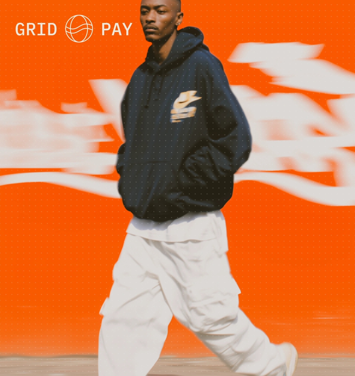
Photography direction rejects stock photography entirely. Every image is human, warm-toned, and in motion — blurred sprinting figures, a man crossing a city at dusk, hands working in warm amber light, a close face with eyes closed. The motion blur is intentional and consistent: value moves, people move, the infrastructure moves.
The Grid Mark
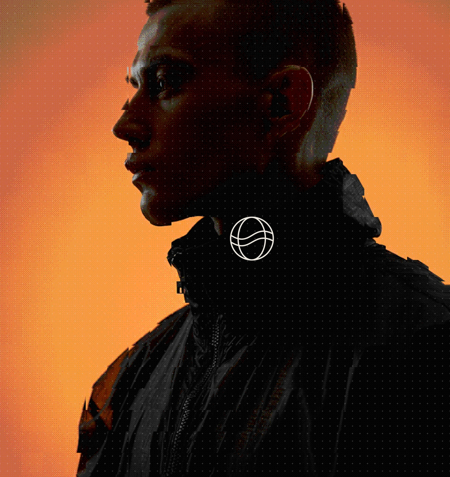
The GRIDPAY globe icon sits at the intersection of a world grid and a fluid line — mapping the tension between global infrastructure and the movement of value across it. Used at display scale in the footer. Used as a small mark in the nav. Used as an embossed foil stamp on physical collateral.
LANDING PAGE

The landing page is designed as a complete scroll experience — not a series of sections, but a single editorial piece with rhythm, contrast, and narrative progression.
Hero
Orange gradient. Dithered pixelated figure emerging from the warmth. "MOVE VALUE. NO GATEKEEPERS." in massive display type. A vertical stat ticker runs the entire right edge of every section —
$2.4B+ PROCESSED · 140+ COUNTRIES · 18 CHAINS · 99.98% UPTIME — becoming a persistent credibility layer that requires no dedicated section.Problem / Discovery
The halftone image treatment — a figure in a hoodie, color-split in orange and gray — introduces the editorial photography language. "The old payment rails weren't built for this." in mixed-weight display type. The copy below names the problem directly: freeze accounts, compliance theater, 3-5 business days, chargebacks weaponized against you.
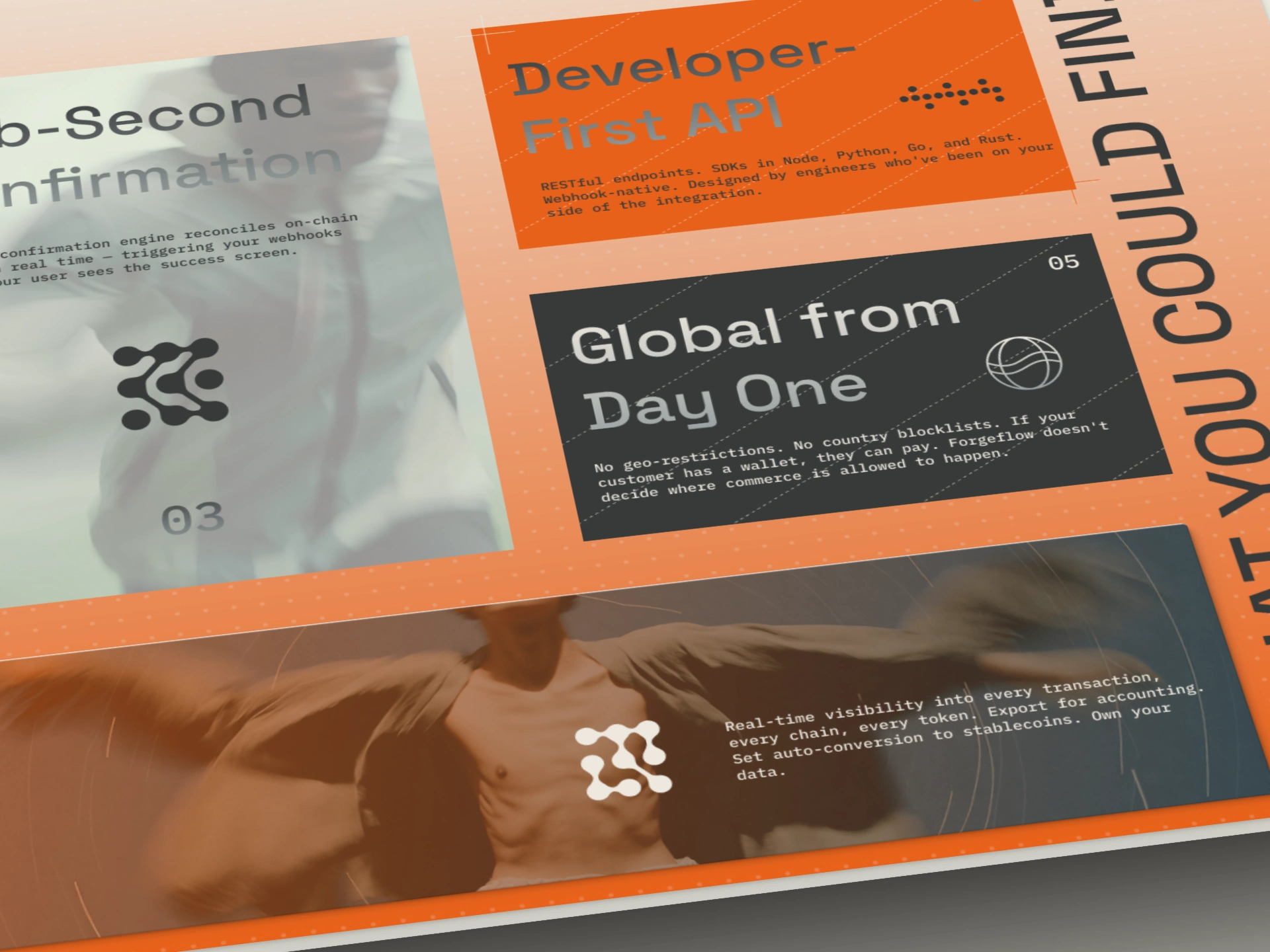
Stay in the Grid — Features
Six feature cards arranged in a staggered editorial grid across two scroll positions. Each card has its own visual identity — one uses the dotted-line border system, one is orange-filled, one is dark carbon, one bleeds warm human photography underneath. The "WHAT YOU COULD FIND" vertical text running the right edge provides decorative structure without cluttering the content.
A dark marquee divider strip with the GRIDPAY logo flanked by pixel-dot decorations creates a satisfying mid-page brand moment between feature frames.
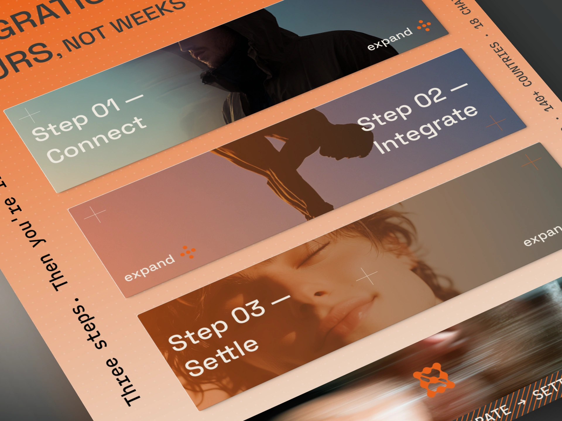
Integration in Hours
Three accordion step cards, each with full-bleed editorial photography inside. The image selection creates an intentional emotional arc: Step 01 Connect — a hooded figure in cool teal, mysterious, entering. Step 02 Integrate — warm mauve, a figure bent in concentration, building. Step 03 Settle — amber warmth, a face with eyes closed, peaceful. The journey of integration told entirely through photography temperature.
Docs / API
The page's darkest moment — carbon background, abstract light-streak photography, a clean code block in amber mono. "DOCS THAT DON'T WASTE YOUR TIME." in the brand's most confrontational headline.
STATUS: 200 OK · RESPONSE TIME: 38ms · CHAIN: BASE · TOKEN: USDC below the code block functions as decoration and technical credibility simultaneously.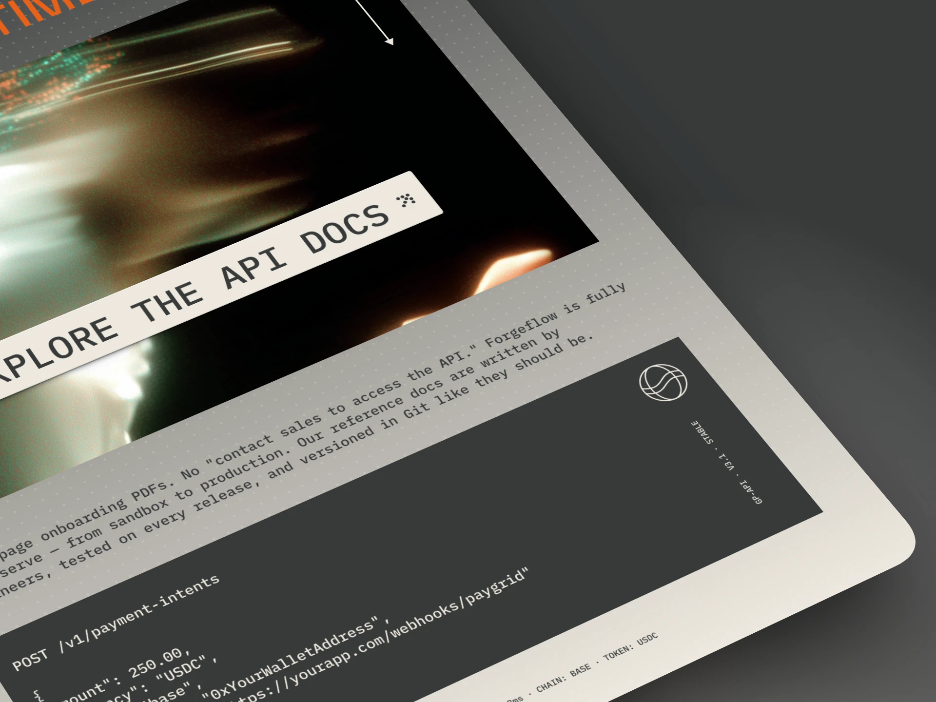
Pricing
Three cards arranged with deliberate personality differences. STARTER is cream with a halftone dot circle. GROWTH is Forge Orange with rotated vertical typography. ENTERPRISE is dark carbon with a motion-blurred city photograph bleeding through. The headline "NO HIDDEN SPREADS. NO SURPRISE FEES." is the strongest copy moment on the page.
Security
"AUDITED. NON-CUSTODIAL. TRANSPARENT." in massive stacked display type. Full-bleed earth-tone photography — a figure against a warm sandy ground — for a section that most fintech pages fill with padlock icons. The AUDITED BY badge in the top right, built from a dot-matrix texture, provides the certification credibility without becoming a design afterthought.
Testimonials
"TRUSTED BY THOSE WHO SHIP." A low-angle editorial photograph — a figure mid-jump, boots in the foreground, face in the background — as the section image. Three testimonials in an accordion treatment. The expanded quote is the most relatable: "the first dashboard in crypto I've actually shown our finance team without embarrassment."
Final CTA
A figure wrapped in translucent material, mid-motion, kicking up sand. Abstract, sculptural, unexpected for a payments page — and precisely right. "THE INFRASTRUCTURE IS READY. ARE YOU?" The page closes exactly as it opened: with a direct question and no apology for taking up space.
Footer
"PAYMENT INFRASTRUCTURE FOR THE OPEN ECONOMY." at display scale on the orange gradient. Motion photography of two blurred figures. Navigation panel. The GRIDPAY logo large at bottom right. And the single best detail on the page:
● NETWORK OPERATIONAL · 99.98% UPTIME · LAST INCIDENT: NONE — a live status indicator in the footer that functions as both decorative text and genuine trust signal.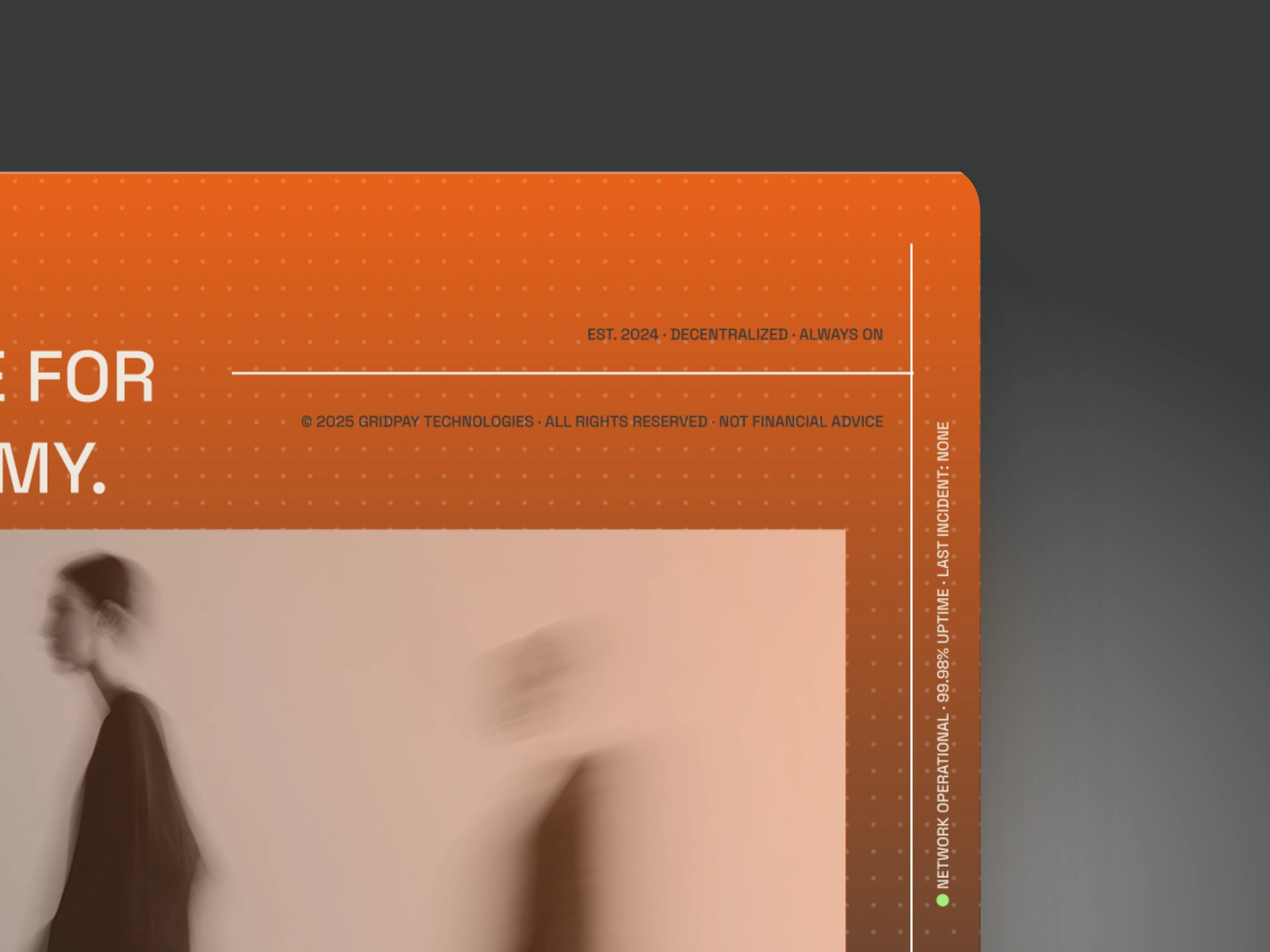
PHYSICAL COLLATERAL & PROMOTIONAL MATERIALS
The brand was extended across physical touchpoints to stress-test the identity and demonstrate its range.
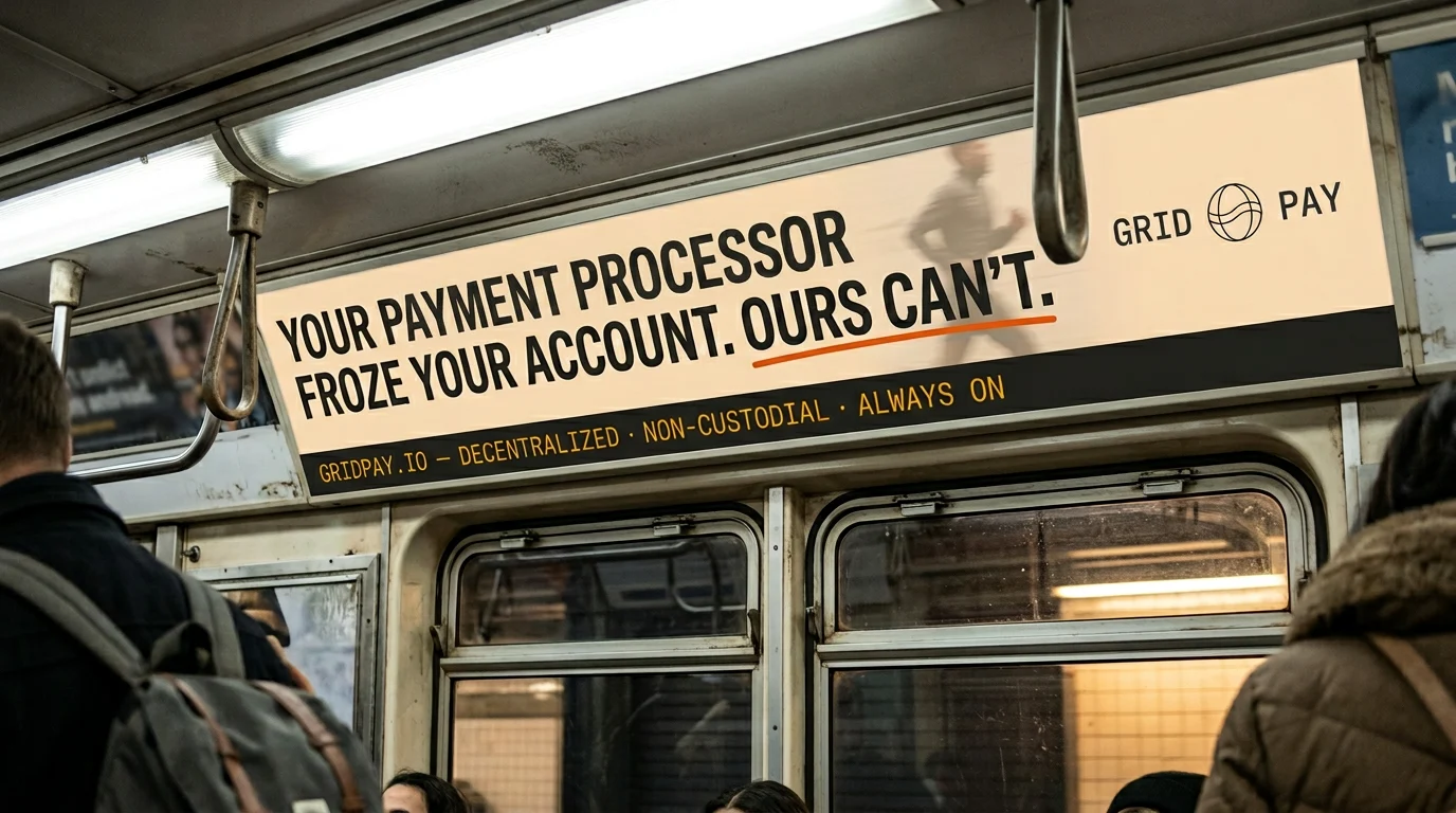
Transit Advertising
The subway car interior ad — "YOUR PAYMENT PROCESSOR FROZE YOUR ACCOUNT. OURS CAN'T." with "CAN'T" underlined in orange — is the sharpest single execution in the project. A financial argument made in the visual language of a protest sign, placed in the context of a daily commute.
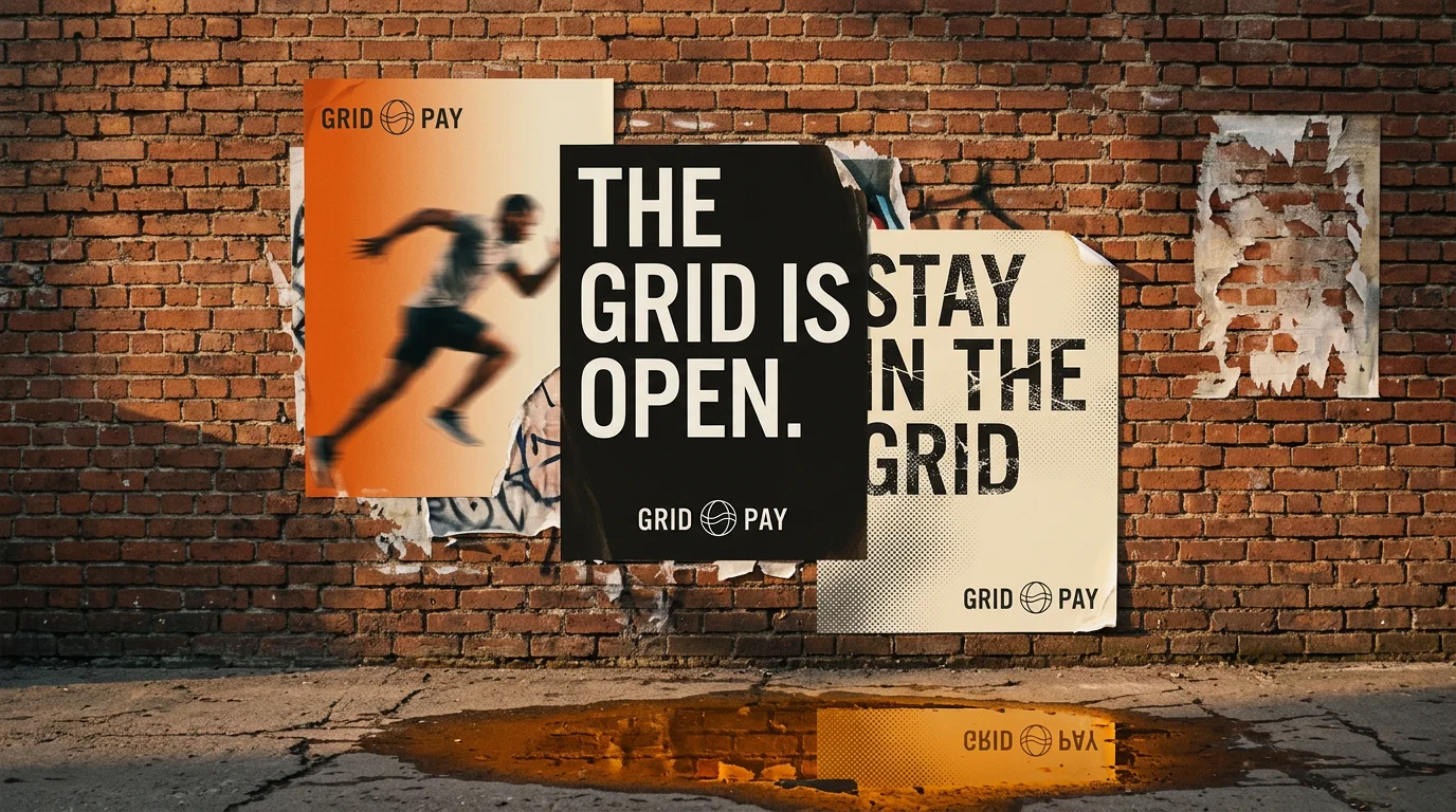
Street Wheat-Paste
Three overlapping posters on a brick wall, torn edges, puddle reflection catching the orange. The brand translated into the language of guerrilla culture without losing its premium positioning.
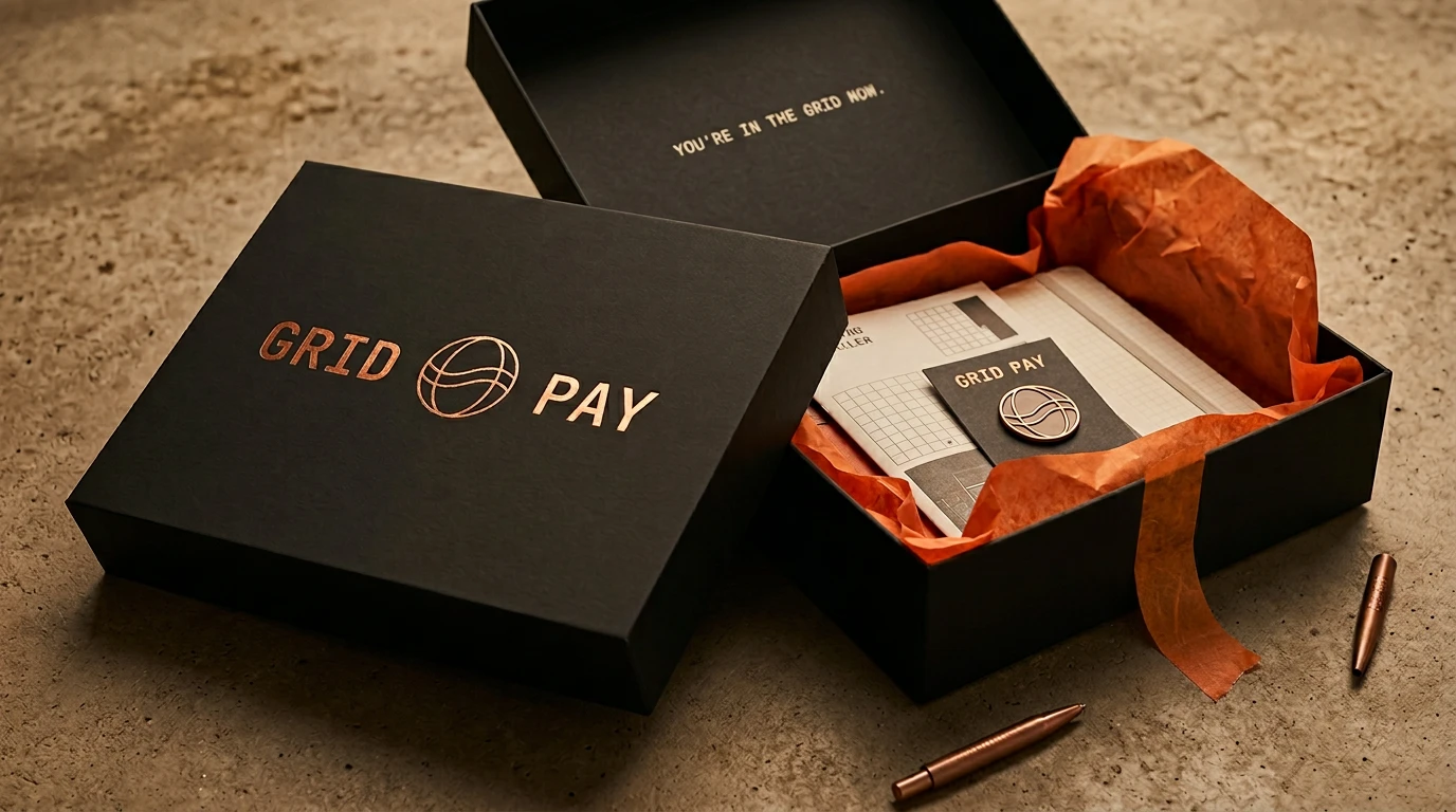
Onboarding Box
Matte black rigid box, copper foil-stamped logo, orange tissue paper inside, "YOU'RE IN THE GRID NOW." letterpress on the inner lid. The physical object that makes API access feel like an initiation.
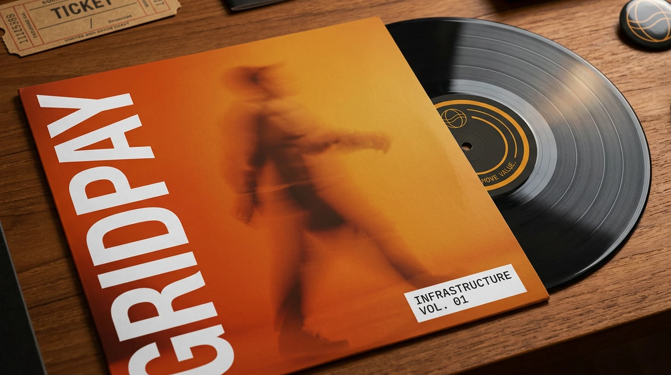
Vinyl Record — Infrastructure Vol. 01
The brand's most unexpected physical object. An orange full-bleed sleeve with the blurred motion figure, GRIDPAY running vertically in massive white type, "INFRASTRUCTURE VOL. 01" label in the corner. The record label reads "MOVE VALUE." along the innermost ring.
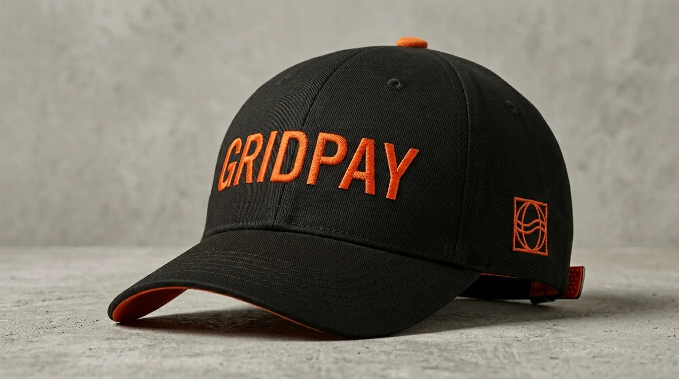
Baseball Cap
Carbon dark twill. "GRIDPAY" embroidered in Forge Orange across the full front panel. Orange underside on the brim — visible only when worn, invisible in the flat product shot. The detail that makes people pick it up and look twice.
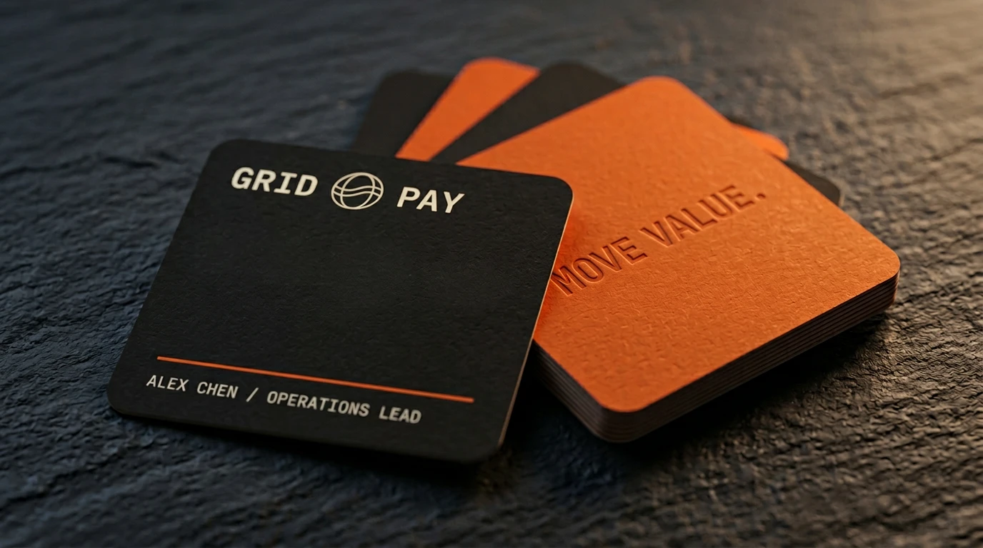
Business Cards
Square format. Thick matte carbon dark stock. Orange horizontal rule. "MOVE VALUE." embossed same-color on the back — readable only in light, invisible in shadow. The tactile equivalent of the brand's restraint.
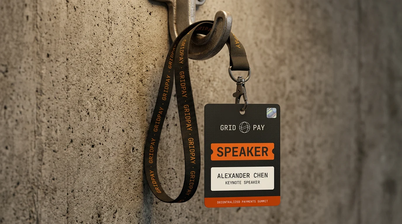
Conference Lanyard + Badge
Woven repeat-logo lanyard in dark olive. SPEAKER badge in carbon dark with orange fill — the Forge Orange SPEAKER block immediately readable at 10 meters. GRIDPAY logo and "DECENTRALIZED PAYMENTS SUMMIT" micro-text completing the system.
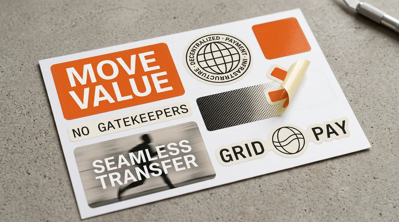
Enamel Pin Set — Hardware Series
Four hard enamel pins on a carbon dark backing card: grid pattern, circuit node, chain link, "NO GATEKEEPERS" bar pin. The physical articulation of the brand's icon system at 2cm scale.
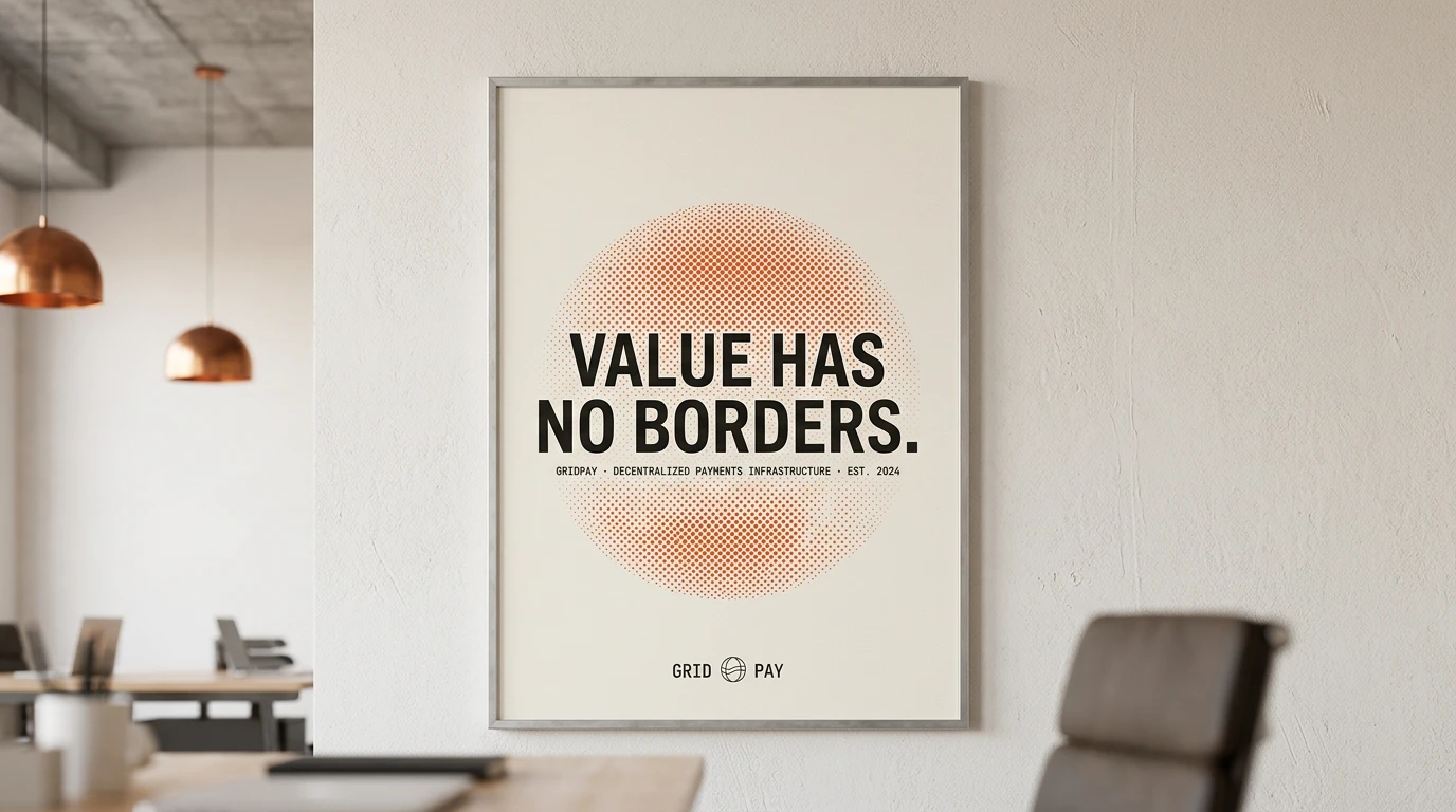
Art Print
"VALUE HAS NO BORDERS." over a halftone dot circle, framed in raw aluminum, hanging in a loft office with copper pendant lights. The brand's most minimal and durable single graphic — works as decoration, works as marketing, works as a statement of purpose.
LOGO MOTION
The logo reveal animation — GRID separating from PAY with the globe mark assembling in the space between them — was built in Jitter. No particles. No morphing. No 3D rotation. The timing is the entire design: the pause before the globe appears, the settle as the wordmark completes. Restraint as craft.
DESIGN PRINCIPLES EXTRACTED
Through this project, a set of principles emerged that could apply to any brand operating in a space dominated by visual clichés:
1. Reject the category palette first.
Every category has a default color. Web3 is dark blue and neon. SaaS is purple. Fintech is navy. The fastest way to be noticed is to refuse the default and commit fully to the alternative.
2. Warmth is a trust signal.
Cold, precise, clinical design communicates competence. Warm, tactile, human design communicates trustworthiness. For a payments product — where trust is the entire product — warmth is not aesthetic preference, it is strategy.
3. The details that nobody notices are the ones that matter.
The orange underside of the cap brim. The "MOVE VALUE." embossed same-color on the business card back. The SHA commit hash in the footer. The live uptime dot. None of these elements are visible in the hero. All of them are why people share the work.
4. Editorial photography over illustration.
Illustration dates. Photography ages. An editorial photograph of a human in motion will always feel more credible than a custom illustration of an abstract concept, and it will still look good in five years.
5. Copy is design.
"YOUR PAYMENT PROCESSOR FROZE YOUR ACCOUNT. OURS CAN'T." is not copywriting support for a visual. It is the visual. The hierarchy, the underline, the placement — typography made that sentence into design. Treat every word as a layout decision.
OUTCOME
GRIDPAY demonstrates that a Web3 brand can be warm, editorial, and human without sacrificing technical credibility — and that the visual language of industrial design, print editorial, and luxury goods translates powerfully into the crypto space precisely because nobody else is speaking that language.
The project exists as a speculative concept and complete brand system, available as a Figma template.
Designed by [Your Name] — 2025
Brand Identity · Web Design · Art Direction · Copywriting
Like this project
Posted Mar 13, 2026
Designed a full Web3 payments brand from scratch. Warm orange, editorial photography, grain texture. No dark mode. No neon. Just craft.
Likes
0
Views
17
Timeline
Feb 20, 2026 - Mar 15, 2026