Built with Lovart
ORVX Brand Identity Development
Révolté
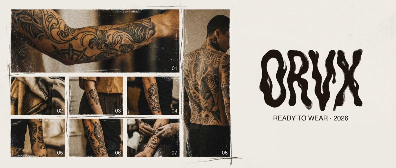
ORVX — Brand Identity Case Study
Ready to Wear · 2026
Overview
ORVX is a ready-to-wear fashion brand built on a single premise: the body wearing the garment is as important as the garment itself. Every campaign image treats skin, tattoo, and fabric as equivalent surfaces — none background, none foreground, all subject. The brief was to develop a complete visual identity for a brand that is bold through intimacy rather than volume. Fourteen mockups across product, campaign, detail, and environmental formats.
The direction was named Body as Canvas from the first session. The garment is secondary. The body is the medium.
Naming
ORVX has no meaning. Four letters, no vowels, no etymology, no language family that owns it. It cannot be translated, misappropriated, or reduced to a definition. It exists purely as sound and shape — the O opening wide, the RV cluster accelerating, the X stopping it dead. It registers as a mark before it registers as a word. The name was chosen because the brand it names should be the only definition it ever has.
Logo
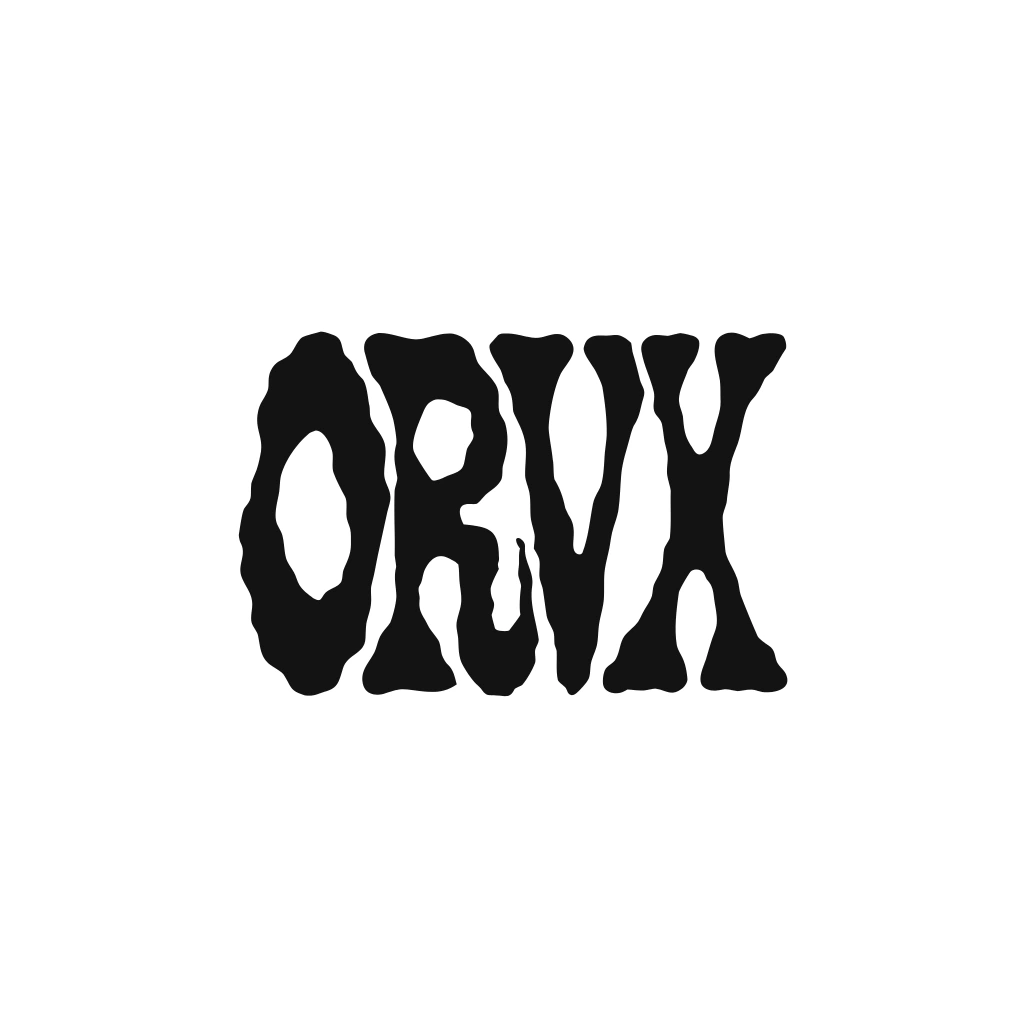
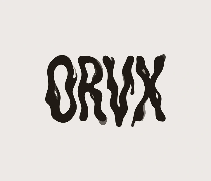
Drawn, not set. The letterforms sit between blackletter tradition and something more molten — the strokes have the weight of woodblock type and the irregularity of something pressed rather than printed. The O is the widest element, slightly asymmetric. The R kicks forward at the leg. The V holds the structural centre with precise symmetry — the only geometric point in the mark. The X terminates everything with equal-weight strokes that do not taper. It stops. It does not elaborate.
Across the fourteen mockups the logo appears in at least five distinct physical treatments: embossed into leather, printed on chalk stock, painted directly onto skin in white body paint, woven into a collar label in chalk on near-black, and applied as a campaign graphic in a dripping chalk treatment on ochre fabric. None of these treatments is the logo. All of them are. This behaviour mirrors tattoo culture — the same mark rendered differently across different surfaces means something each time.
Colour: near-black
#1c1410 on light grounds. Chalk #f2ede8 on dark grounds and directly on skin. Ochre #c8782a and burnt sienna #9e4a2e for campaign applications on heavily saturated surfaces.Palette
Deep ochre
#c8782a, burnt sienna #9e4a2e, near-black #1c1410, chalk #f2ede8. Every colour is either a skin tone pushed to its extreme or the colour of something permanent pressed into skin — tattoo ink black, the particular warmth of healed ink against pale flesh, the chalk of a flash sheet. The palette was not designed. It was observed.The Models
Every model in the ORVX system is heavily tattooed. This is not a styling decision. It is a casting brief and a brand position. The tattoos are not the subject of any image — they are part of the surface, present the way the garment is present, neither more nor less significant. The camera treats tattooed skin and fabric with identical attention. No image in the set zooms in on a specific piece of tattoo work as subject. The body is always the total thing, not a collection of individual marks.
Mockup Set
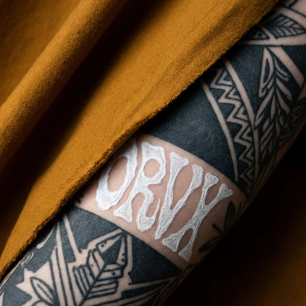
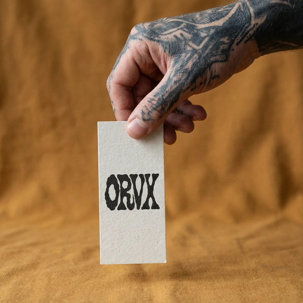
01 — The Mark. The anchor image of the system. A heavily tattooed forearm — dense geometric and botanical blackwork — with a length of deep ochre fabric draped diagonally across it. The ORVX logo pressed onto the skin in chalk body paint, partially obscured by the fabric edge. The concept is stated in one image: fabric and skin are the same surface, the brand mark belongs on both.
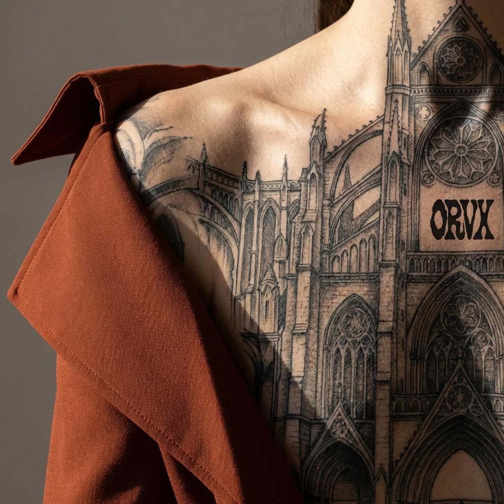
02 — Shoulder Architecture. A shoulder and upper back, a large-scale architectural cathedral tattoo covering the entire surface. A burnt sienna structured garment sits off one shoulder, occupying one third of the frame. The remaining two thirds is bare tattooed skin in raking side light that makes the ink topography physically visible. The ORVX wordmark sits within the tattoo work on the skin — present as just another mark in a field of marks.
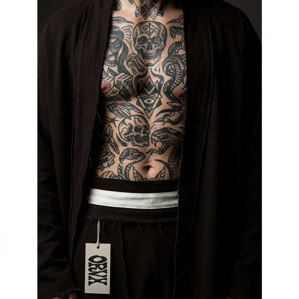
03 — Fabric Study. A torso shot, heavily tattooed chest and stomach visible through an open-front near-black garment. The tattoos — dense, full coverage, a life's worth of marks — read through and around the fabric simultaneously. A chalk stripe at the waist is the only light value in an otherwise dark composition. The ORVX swing tag hangs from a raw edge.
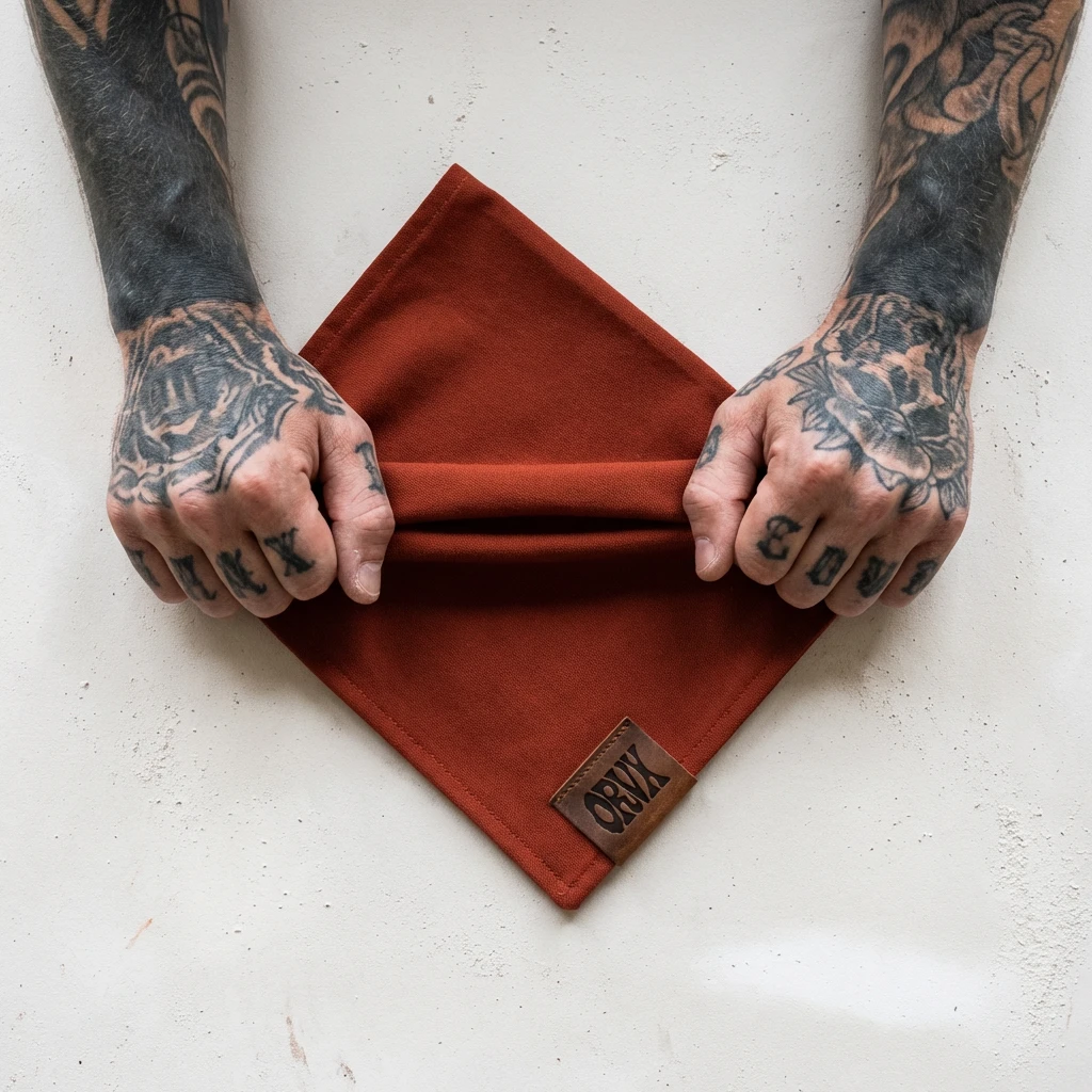
04 — The Hand. Two heavily tattooed hands hold a burnt sienna cloth pulled taut between them, shot from above on a chalk surface. The contrast between the dense blackwork on the hands and the vivid sienna of the fabric is the entire image. The brand exists only as a debossed leather tag on the fabric corner.
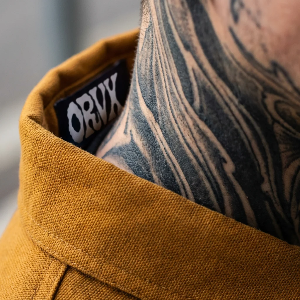
05 — Neck and Collar. Extreme close-up of the transition point between collar and tattooed neck. The ORVX woven label — chalk on near-black — is caught in the fold of the collar, partially visible. The tattoo work on the neck is the same visual weight as the fabric texture below it. Both are surfaces. Neither is background.
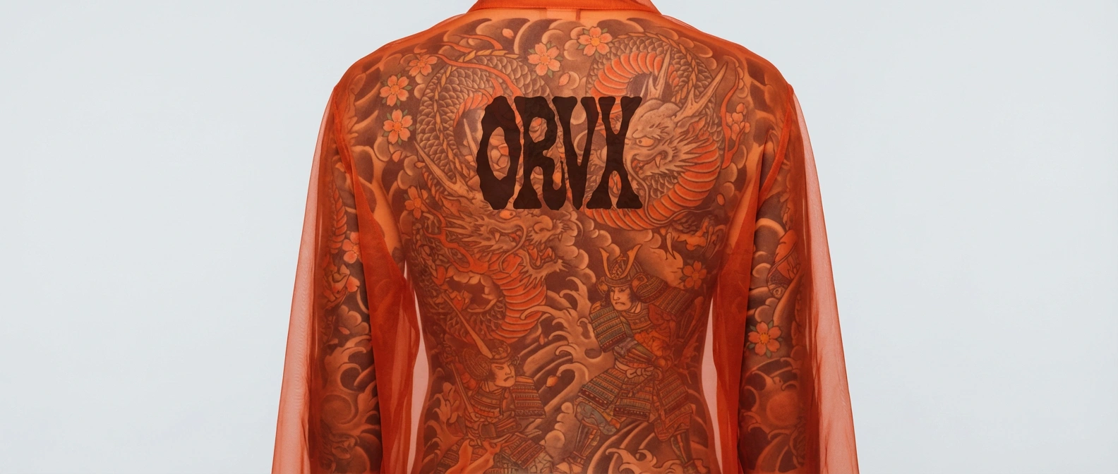
06 — The Back. The outstanding image of the set. A full Japanese back piece — dragon, samurai, sakura, cloud — covered by a sheer burnt sienna garment. The tattoo reads through the fabric completely, tinted by the colour above it, the ink work and the garment existing simultaneously as a single layered surface. The ORVX logo printed on the sheer fabric at centre back appears to float above the tattoo. This image is proof of the entire direction.
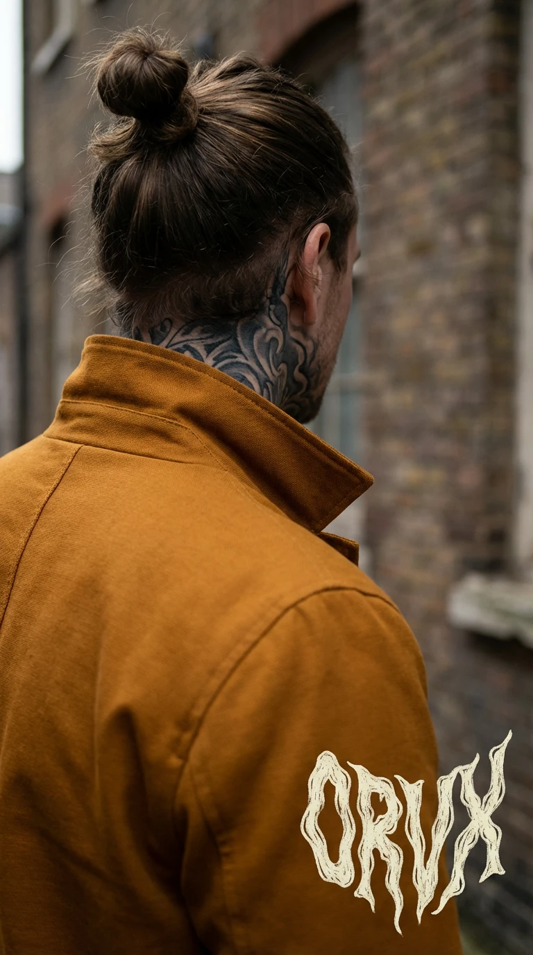
07 — The Campaign Still. Portrait format. A figure facing away — neck tattooed, hair up, ochre structured jacket. The ORVX logo in chalk at the lower right of the jacket back, large enough to read as a garment graphic rather than a brand application. Shot on location against a wet brick wall. The only outdoor image in the set — the world outside the studio treated with the same flat attention as the studio surfaces.
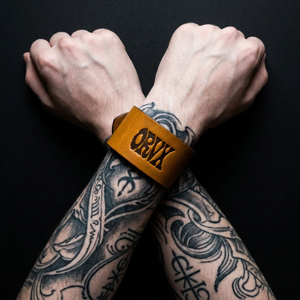
08 — The Wrist Stack. Two wrists crossed at the centre of the frame — both heavily tattooed, the ink work meeting and overlapping at the crossing point. One wrist wears a cuff in deep ochre, structured leather, sitting directly over the tattoo work. The other is bare.
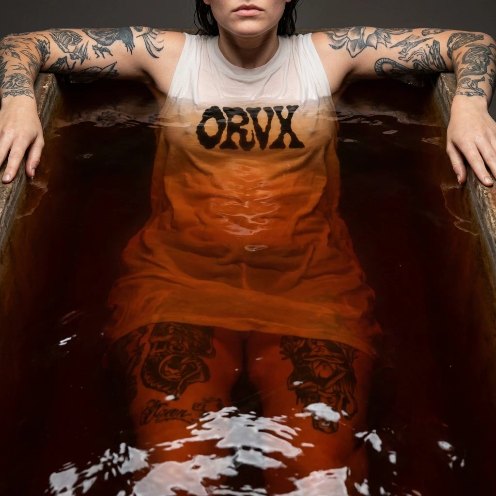
09 — Immersion. A figure submerged to the shoulders in burnt sienna-tinted water. Arms resting on the vessel edges, both tattooed — fine-line botanical and animal work visible above the waterline. A chalk garment submerged below, the ORVX logo visible through wet clinging fabric. The face partially visible above the frame — chin and lip only. The water is the brand colour. The body in it is the brand surface.
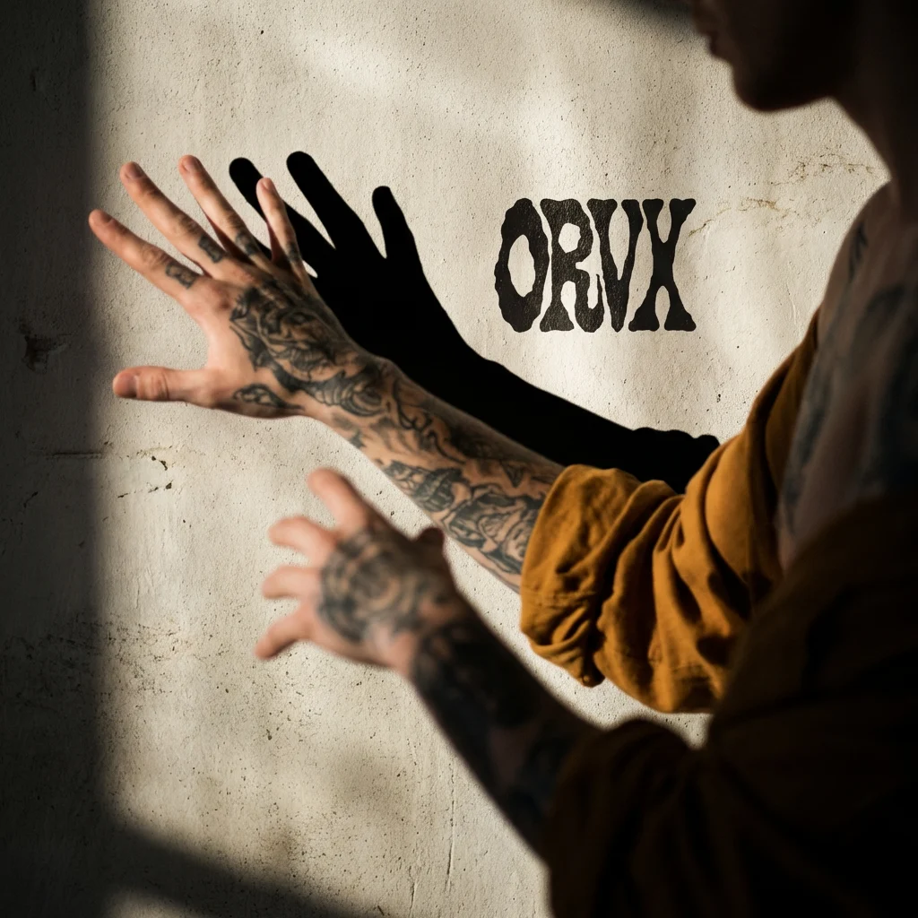
10 — Shadow Double. A tattooed hand extended against a chalk wall, casting a hard elongated shadow. The ORVX logo on the wall in near-black, positioned within the shadow — present as the same kind of mark. The ochre sleeve pushed to the elbow. The shadow and the logo occupy the same register: both applied to the surface, both two-dimensional, both made of dark on light.
11 — First and Last. A heavily tattooed hand holds the ORVX chalk swing tag between two fingers. The tag hangs at the bottom of the frame, the hand at the top. The ochre fabric from Mockup 01 fills the background out of focus, warm and present. The tag is the sharpest element in the image. It is the only thing the brand needs to say. Everything else is already said — permanently, on the skin of the person holding it.
Design Decisions
Why heavily tattooed models throughout. Tattoo culture and fashion have a long proximity but ORVX collapses the distance entirely. A tattooed body is a body that has already decided what it means. The brand operates in that space — alongside existing marks, not above them.
Why the logo appears differently across the set. The same mark rendered in leather, chalk paint, woven label, printed stock, and campaign graphic is not inconsistency — it is the brand behaving like the culture it belongs to. Tattooers work the same imagery across different skin, different scales, different contexts. The mark is constant. The surface changes.
Why no full looks. A full look is a costume. A cropped detail is a relationship. The brand is built on the second.
Why the palette comes from skin tones pushed to extremes. Deep ochre, burnt sienna, near-black, chalk — these are the colours of skin at its darkest and lightest, of ink healed into flesh, of flash sheets pinned to walls. The palette is the product and the body simultaneously.
Why Mockup 06 is the hero. The sheer orange garment over the Japanese back piece achieves what the entire direction was building toward — fabric and tattoo occupying the same visual plane, neither cancelling the other, the brand mark floating above both. It is the most complete statement of the Body as Canvas idea in the set.
Why the logo has no fixed treatment. The mark pressed into leather, painted on skin, dripping on fabric — each treatment is appropriate to its surface. The brand does not impose a single finish on every material. It belongs to the material it's on.
Outcome
Fourteen images that function as a unified campaign, a brand lookbook, and a design argument simultaneously. ORVX looks like one thing from every angle — not because everything is identical, but because everything operates from the same logic: skin and fabric are equal surfaces, permanent and temporary marks have equal weight, the body is always the subject.
The garment is secondary. The body is the medium.
Like this project
Posted Mar 13, 2026
Developed a visual identity for the fashion brand ORVX focusing on body art and garments as equal surfaces.
Likes
4
Views
43
Timeline
Mar 2, 2026 - Mar 13, 2026