Typography as Brand Strategy: The Dewdrop Case Study
Révolté

Typography as Brand Strategy: The Dewdrop Case Study
Fanzine like, version A
Luxury one, version B
The Experiment
What happens when you change only the typography and text treatment of a brand while keeping everything else identical? This case study explores how font choices can completely reposition a brand's perception, target audience, and market positioning.
The Setup
Brand: Dewdrop Jewelry
Constant Elements:
Same high-quality editorial photography
Identical tagline: "A natural sparkle for your authentic self"
Same product positioning around authenticity and natural beauty
Identical mobile interface design
Variable Elements:
Typography treatment
Text hierarchy
Visual texture/effects
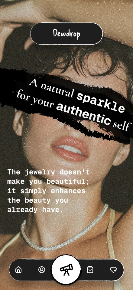
Version A: The Fanzine Approach
Design Choices:
Primary text: Cormorant Garamond with rough brush stroke overlay and torn edges
Secondary text: Geist Mono (monospace font)
Treatment: Raw, cut-and-paste aesthetic reminiscent of DIY magazines
Brand Perception Results:
Target Demographic: 18-28 years old
Psychographics: Values-driven, skeptical of traditional luxury, seeks authenticity over perfection
Price Perception: Mid-range, "accessible luxury" ($50-200)
Brand Personality: Rebellious, honest, relatable, counter-culture
Market Position: Anti-establishment luxury, "jewelry for real people"
Consumer Response Indicators:
Appeals to Gen Z's distrust of overly polished brands
Creates emotional connection through imperfection
Differentiates strongly in crowded jewelry market
Builds community around shared values vs. status
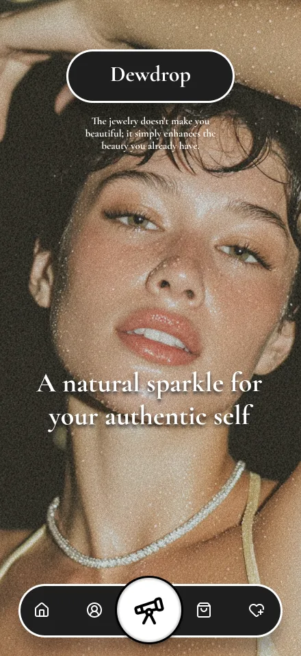
Version B: The Luxury Heritage Approach
Design Choices:
Primary text: Clean Cormorant Garamond serif typography
Secondary text: Refined Cormorant Garamond with proper hierarchy
Treatment: Polished, premium aesthetic with perfect alignment
Brand Perception Results:
Target Demographic: 25-45 years old
Psychographics: Established income, appreciates traditional luxury codes, seeks aspiration
Price Perception: Premium/high-end ($200-800)
Brand Personality: Sophisticated, timeless, prestigious, refined
Market Position: Contemporary luxury with classic sensibilities
Consumer Response Indicators:
Builds immediate trust through familiar luxury signals
Appeals to traditional luxury consumers
Commands higher price points more easily
Fits established jewelry market expectations
Key Insights
1. Typography Treatment Communicates Values, Not Just Font Choice
The same Cormorant Garamond serif becomes rebellious when paired with Geist Mono and brush stroke treatment, but sophisticated when used cleanly. The monospace Geist Mono signals authenticity, accessibility, and digital-native culture, while the clean serif alone signals heritage, refinement, and exclusivity.
2. Design Decisions Are Business Decisions
Version A: Smaller, passionate audience with strong brand loyalty
Version B: Broader market appeal with traditional luxury expectations
3. Font Choice Impacts Pricing Strategy
The same jewelry piece could be priced 40% higher in Version B purely based on perceived brand positioning communicated through typography.
4. Target Demographics Shift Dramatically
Typography alone moved the target age range, income level, and value system of the ideal customer.
Strategic Implications
For Version A (Fanzine):
Pros: Memorable, differentiated, builds cult following
Cons: Limited market appeal, may struggle with premium pricing
Best for: Brands seeking to disrupt traditional categories
For Version B (Luxury):
Pros: Immediate market credibility, supports premium pricing
Cons: Easily forgotten among similar brands, less differentiation
Best for: Brands seeking established market entry
The Bottom Line
Typography isn't decoration—it's strategic positioning. In this case study, font choice alone:
Shifted target demographics by 10+ years
Changed price perception by ~40%
Repositioned brand values and personality
Determined marketing channels and messaging strategy
Influenced product development direction
Takeaway for Designers and Marketers
Every typographic choice is a brand strategy decision. Before selecting fonts, ask:
Who is our target customer?
What values do we want to communicate?
How do we want to be positioned in the market?
What price point do we want to support?
The answer should guide your typography, not the other way around.
This case study demonstrates how strategic design thinking can completely reframe a brand's market position while maintaining product and core messaging consistency.
Like this project
Posted Sep 3, 2025
What happens when you change only the typography and text treatment of a brand while keeping everything else identical?