VibeSmith, AI-powered platform for brand identity generation
Révolté
VibeSmith - My AI-Powered Brand Identity Platform
Project Overview
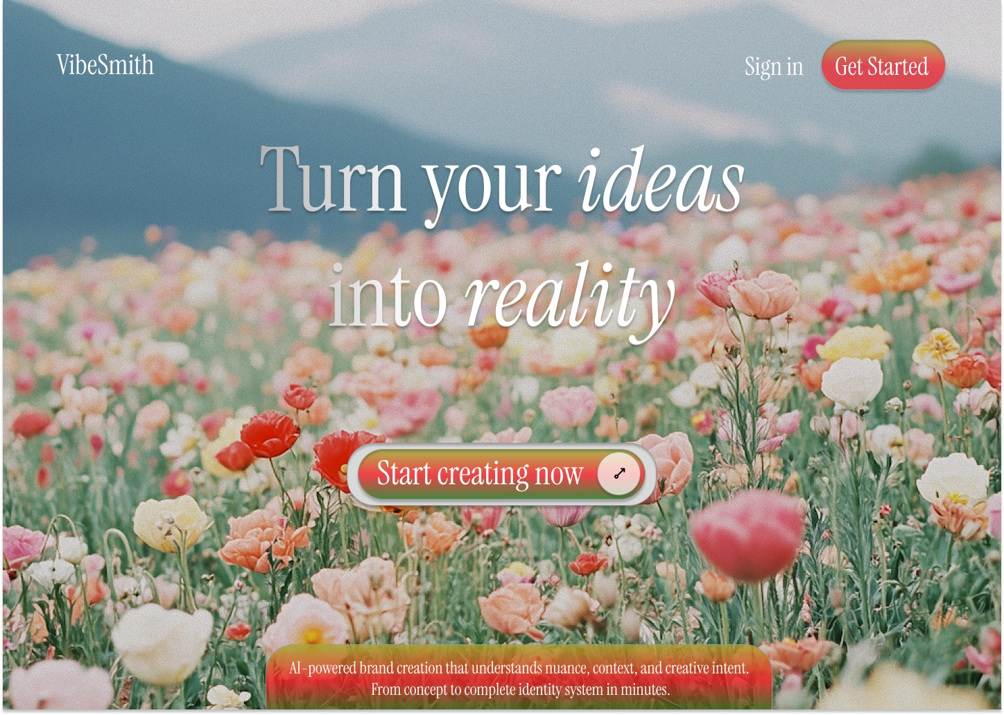
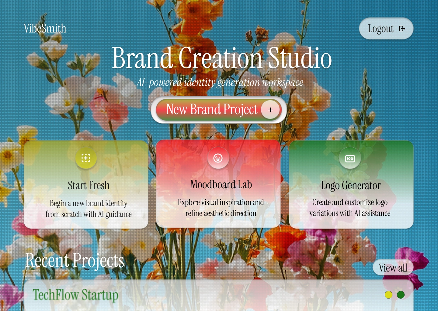
I worked on VibeSmith from August to September 2025 for a startup client, creating both the web design and development for an AI-powered brand identity generation platform. My goal was to create a clean, minimalist workspace that helps users create a complete brand identity system in minutes. I used Figma for design and then developed it with Next.js and v0, resulting in a live platform at v0-vibe-smith-styleguide.vercel.app.
The Design Challenge
I needed to design an interface for something incredibly ambitious—AI that generates entire brand identity systems. The challenge was making this complex technology feel effortless while maintaining the credibility and sophistication that brand designers would expect. I had to communicate "this is serious professional tooling" while also saying "this is incredibly easy to use."
Visual Identity & Branding
The VibeSmith Logo: I designed the VibeSmith logomark to be clean, modern, and memorable. The typography is crisp and professional—it needed to inspire confidence that this AI tool creates quality design work, not generic templates.
Color Palette: I chose a sophisticated, neutral foundation with strategic pops of color. The palette feels premium without being stuffy—approachable professionalism. I used deep blacks, crisp whites, and subtle grays as the backbone, letting the brand examples and generated work provide the color energy.
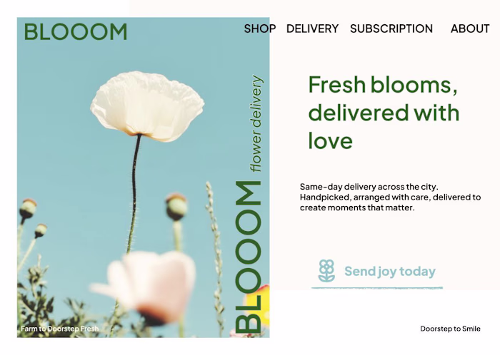
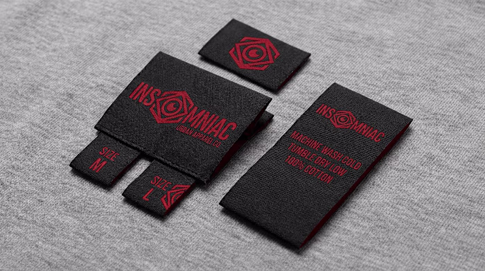
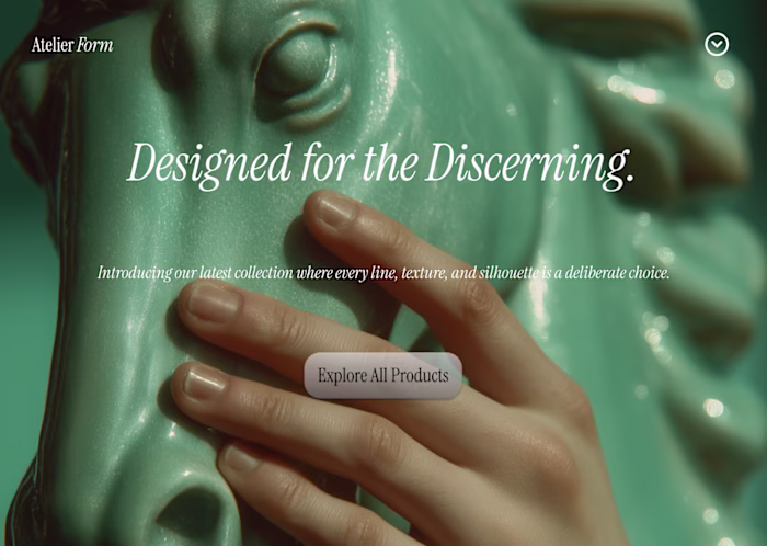
Photography & Imagery: I carefully curated a collection of high-end product photography and lifestyle imagery that showcases what VibeSmith creates. From craft beer displays to minimalist skincare bottles, elegant ice bottles to urban group portraits—each image I selected demonstrates different brand aesthetics and use cases. The imagery needed to feel premium, diverse, and aspirational.
Website Architecture
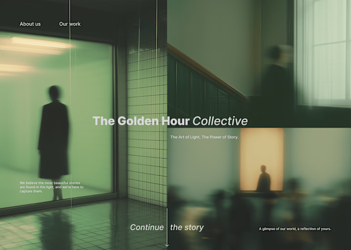
Hero Section: I designed the hero with a bold headline—"Brand identity generation reimagined"—paired with compelling product mockups. The VibeSmith bottles hero image I selected immediately shows the end result: professional, beautiful branding. I positioned the CTAs prominently: "Start Creating" and "View Demo" with "Early access • No credit card required" to reduce friction.
The Scrolling Marquee: I created an animated text marquee featuring key value propositions: "AI-POWERED BRAND CREATION • VECTOR LOGOS • COMPLETE IDENTITY SYSTEMS • PRODUCTION-READY FILES • CONTEXT-AWARE GENERATION." This scrolling element adds movement and reinforces the platform's capabilities without overwhelming the layout.
The Three-Step Process Section
I structured this section to demystify the AI process while building trust. Each step needed clear imagery and straightforward explanation:
01 - Input Analysis: I paired this with the urban group portrait to represent the human element and diverse target audiences. The copy I crafted explains how natural language processing works without getting technical.
02 - Generation Engine: For this, I selected the organic flat-lay image—natural, creative, process-oriented. It visualizes the creative synthesis happening behind the scenes.
03 - Asset Export: I used the stylized coffee cup to show a finished, production-ready brand application. This completes the narrative: from concept to final deliverable.
"Beyond Template Generation" Section
This section was crucial for positioning. I needed to differentiate VibeSmith from basic logo generators. I designed three benefit cards:
Semantic Brand Analysis - Understanding context, not just aesthetics
Coherent System Generation - Complete visual languages
Production-Grade Output - Professional deliverables
I paired this with the minimalist skincare bottle image to show sophistication and completeness.
Social Proof Metrics
I designed a stats section with key numbers that build confidence:
"Less than 5 minutes" - Speed
"Vector" - Quality
"AI-First" - Innovation
These are accompanied by craft beer and minimalist packaging examples I curated to show diversity of output.
Final CTA Section
I closed with the elegant ice bottle—premium, refined, perfectly branded. The dual CTAs "Get Early Access" and "Request Demo" give users choice, while "Early access • Feedback welcome • No long-term commitments" reduces anxiety.
Design Philosophy
My approach to VibeSmith was about creating a sense of possibility. Every image I curated needed to whisper "you could create this." I wanted the website to feel like a creative studio—clean, inspiring, professional—not a SaaS dashboard.
I focused on generous whitespace, letting the brand examples breathe. The minimalist aesthetic serves a purpose: it lets the generated brand work be the hero, not the interface.
Typography & Hierarchy
I implemented a clear typographic system with bold headlines that command attention and body copy that's comfortable to read. The hierarchy guides you effortlessly through the value proposition, process, and benefits.
Development Considerations
Working with Next.js and v0, I built this to be fast, responsive, and performant. The smooth scrolling, the marquee animation, the image optimization—all of these technical details contribute to the premium feel I was after.
The Result
VibeSmith represents my ability to design for complex AI products while keeping the user experience elegant and intuitive. I created a platform that feels simultaneously powerful and approachable—exactly what's needed to democratize professional brand creation. The image curation, the layout decisions, the messaging architecture—everything works together to position VibeSmith as the future of brand identity generation.
Like this project
Posted Sep 1, 2025
The goal was to create a clean, minimalist workspace that helps users create a complete brand identity system in minutes.
Likes
1
Views
8
Timeline
Aug 1, 2025 - Sep 26, 2025
Clients
Start-up