Built with Lovart
KORE Brand Identity Development
Révolté
KORE — Autonomous Precision Systems
Brand Identity Case Study 2026
SECTOR
Aerospace / Defence-Tech
DELIVERABLES
Brand Identity, Motion, Print, Digital, Environmental, Apparel, Packaging, Hardware
YEAR
2026
01 — BRIEF
The Challenge
KORE needed an identity that could exist across two worlds simultaneously: the sterile precision of aerospace engineering and the raw authority of field operations. The brand had to feel at home on a government operations screen and equally at home on the side of a shipping container in hostile terrain.
The name itself — KORE — demanded to become a visual system, not just a wordmark. Every touchpoint needed to radiate the same signal: control from the core outward.
The brief was unambiguous: no softness, no decoration, no compromise. Build something that looks like it was engineered, not designed.
02 — STRATEGY
Brand Principles
Core Signal
Every visual element radiates from a single green diamond — a targeting reticle, a GPS pin, a live status indicator. The brand is always alive, always locked on. The green is not a colour choice. It is a frequency.
Geometric Precision
The icon system uses nested geometry — octagon, square, circle, diamond — each layer encoding a different scale of control. Macro to micro. The outer shell is the perimeter. The inner diamond is the objective. Everything in between is the system working.
Operational Legibility
The brand works at 8px and at 8 metres. Crosshair logic means the identity scales without losing coherence — from a firmware installation screen to a three-metre brand wall. If a mark cannot survive reduction to a motor cap, it has no business appearing anywhere else.
Field Authority
Black is not a style choice — it is a tactical requirement. The brand lives in dark environments by design, lit only by the signal green of active systems. The palette is a night-operation palette: high contrast, zero noise, single accent.
03 — VISUAL IDENTITY
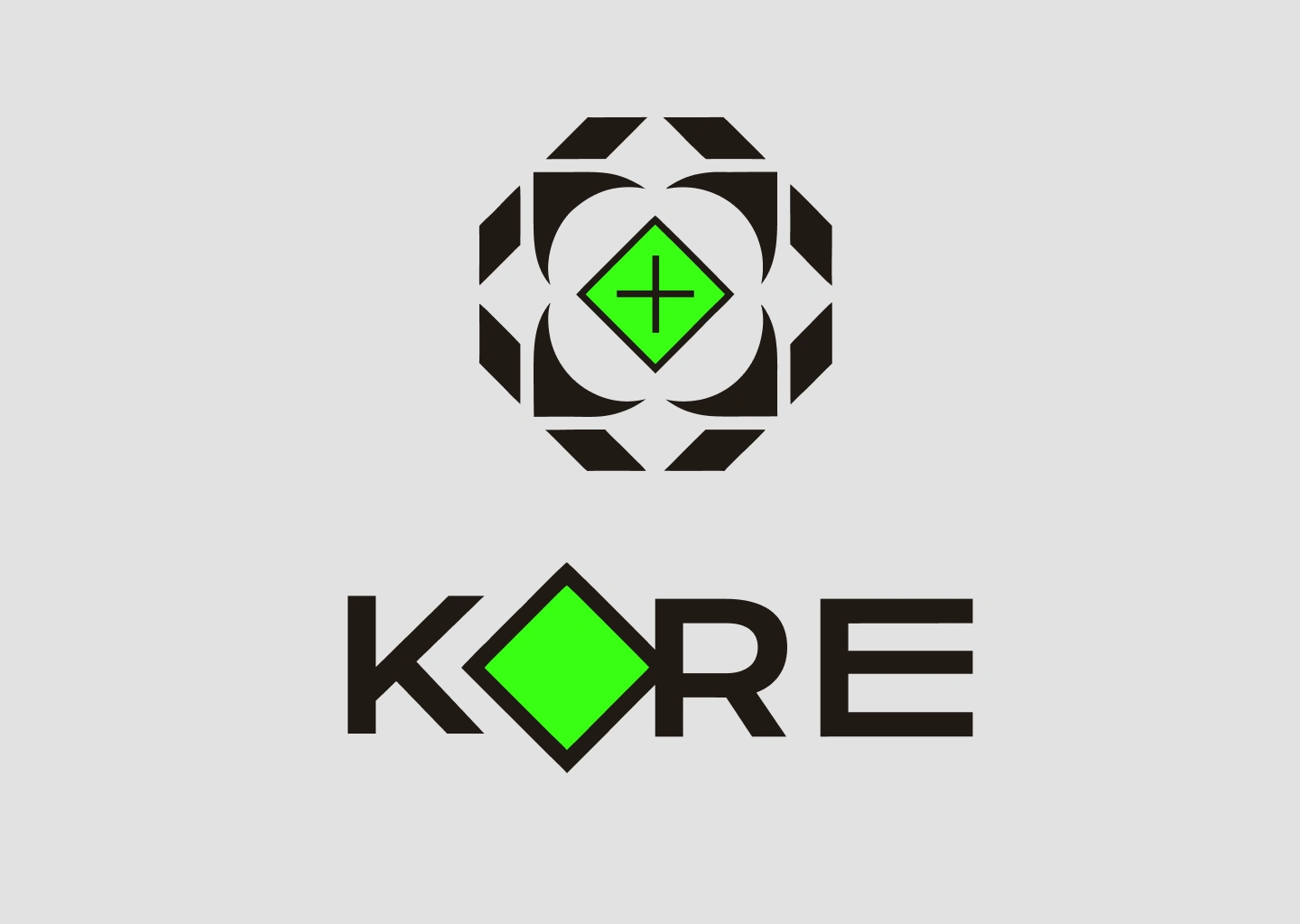
Logo System
The KORE wordmark integrates the brand icon directly into the letterforms. The letter O is replaced by the diamond mark, creating a single unified glyph that functions simultaneously as logotype and icon. At large sizes, the diamond reads as a geometric form. At small sizes, it reads as punctuation. At every size, it reads as KORE.
The full icon — a diamond nested within concentric circles, contained within an octagonal frame — is the brand's primary mark. It draws from the visual language of targeting systems, navigation instruments, and precision optics. It is a mark that looks like it was designed to appear on equipment, not on packaging.
Colour System
Signal Green — #39FF14
The only warm colour in the system. Used exclusively for active states, status indicators, and primary brand moments. It is the colour of a live signal, a charged battery, a confirmed lock.
Core Black — #0A0A0A
The default environment. Everything operates against this ground.
Ops Grey — #1A1A1A
Secondary surfaces, card backgrounds, and layered depth.
Clean White — #FFFFFF
Used for wordmark and typography on dark surfaces. Never used as a background.
Typography
Primary: Bebas Neue — headlines, callouts, environmental signage
Secondary: Space Grotesk — body copy, UI labels, operational text
Monospace: DM Mono — technical specifications, coordinates, system data
04 — ENVIRONMENTAL
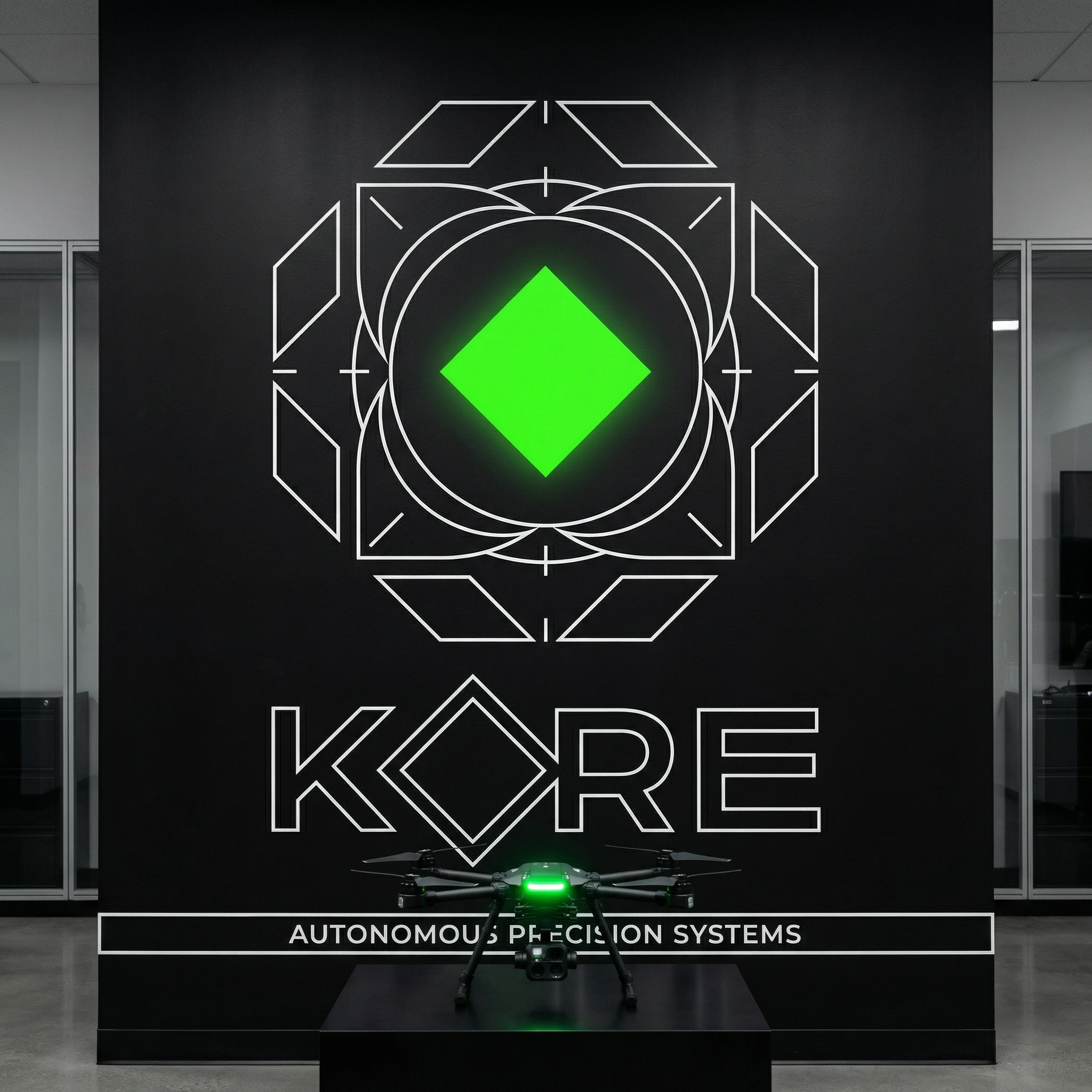
Brand Wall
The flagship environmental installation uses the full geometric icon at monumental scale across a floor-to-ceiling black wall. The outer ring of the icon becomes a target reticle — a landing zone. A physical drone sits on a plinth at the base, activating the space as a live demonstration environment rather than a static display.
The KORE wordmark sits below the icon at approximately one-third the icon's height, with the tagline AUTONOMOUS PRECISION SYSTEMS in the monospaced type at the base, framed within a thin-line technical border.
The installation reads as both headquarters branding and operational infrastructure. A visitor cannot tell where the brand ends and the technology begins. That is the intention.
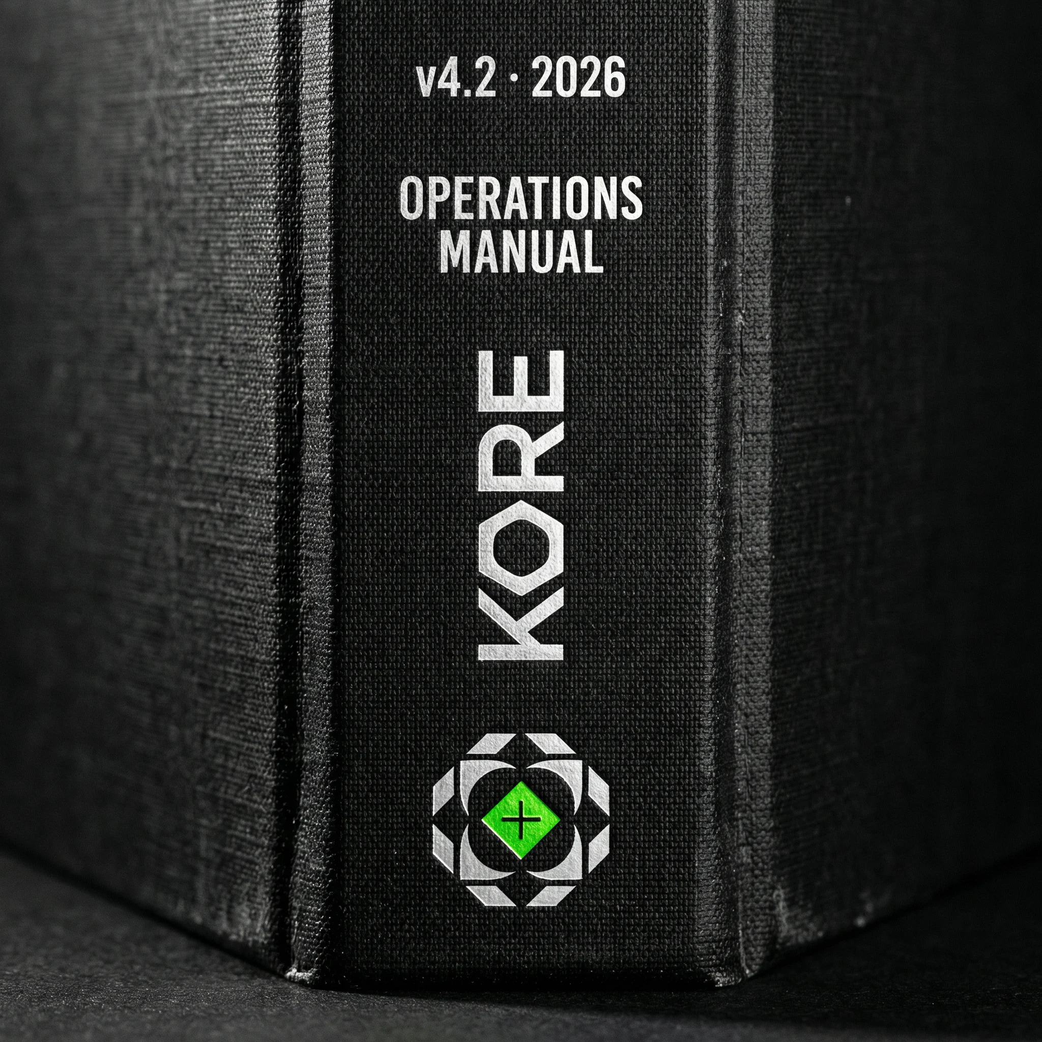
05 — OPERATIONAL PRINT
Field Materials
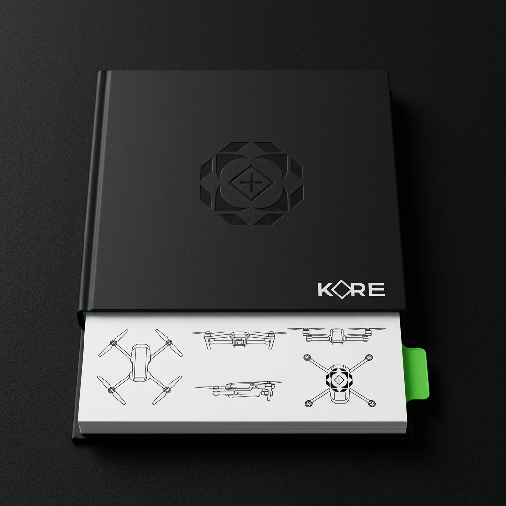
Every print touchpoint is designed under the same operational logic. The Operations Manual is treated as critical equipment — not marketing collateral.
The manual cover uses a blind-embossed icon on black cloth binding, with the KORE wordmark positioned at the lower right. The pages contain technical schematics, drone variants in orthographic line-art, and operational diagrams — all produced in the same visual language as the brand identity.
The Manual Spine is designed as a separate study. Viewed from the shelf, the reader sees: version number (v4.2 · 2026), title (OPERATIONS MANUAL), the KORE wordmark, and the full icon in a foil finish — embossed into the spine fabric. It is designed to sit alongside aerospace technical documentation and be mistaken for the real thing. That is the highest compliment.
The green bookmark tab is the only colour on the exterior. It marks the section currently in operation.
06 — DIGITAL AND SCREEN
Interface Language
KORE's digital presence extends the brand into functional UI environments.
The firmware update screen uses the brand icon as a live progress indicator. The diamond at the centre fills with green from base to apex as installation progresses — the percentage displayed inside the diamond in white monospace type. The icon's outer geometric segments illuminate sequentially as each module installs. The screen reads: KORE OS v4.2.1 — INSTALLING. The brand and the system are the same object.
The operations room applies the identity to mission-critical display environments at wall scale. Multiple operators face a bank of screens carrying radar displays, flight path overlays, and telemetry panels — all in the KORE interface language. The illuminated wordmark above the main display functions as both identity and operational header.
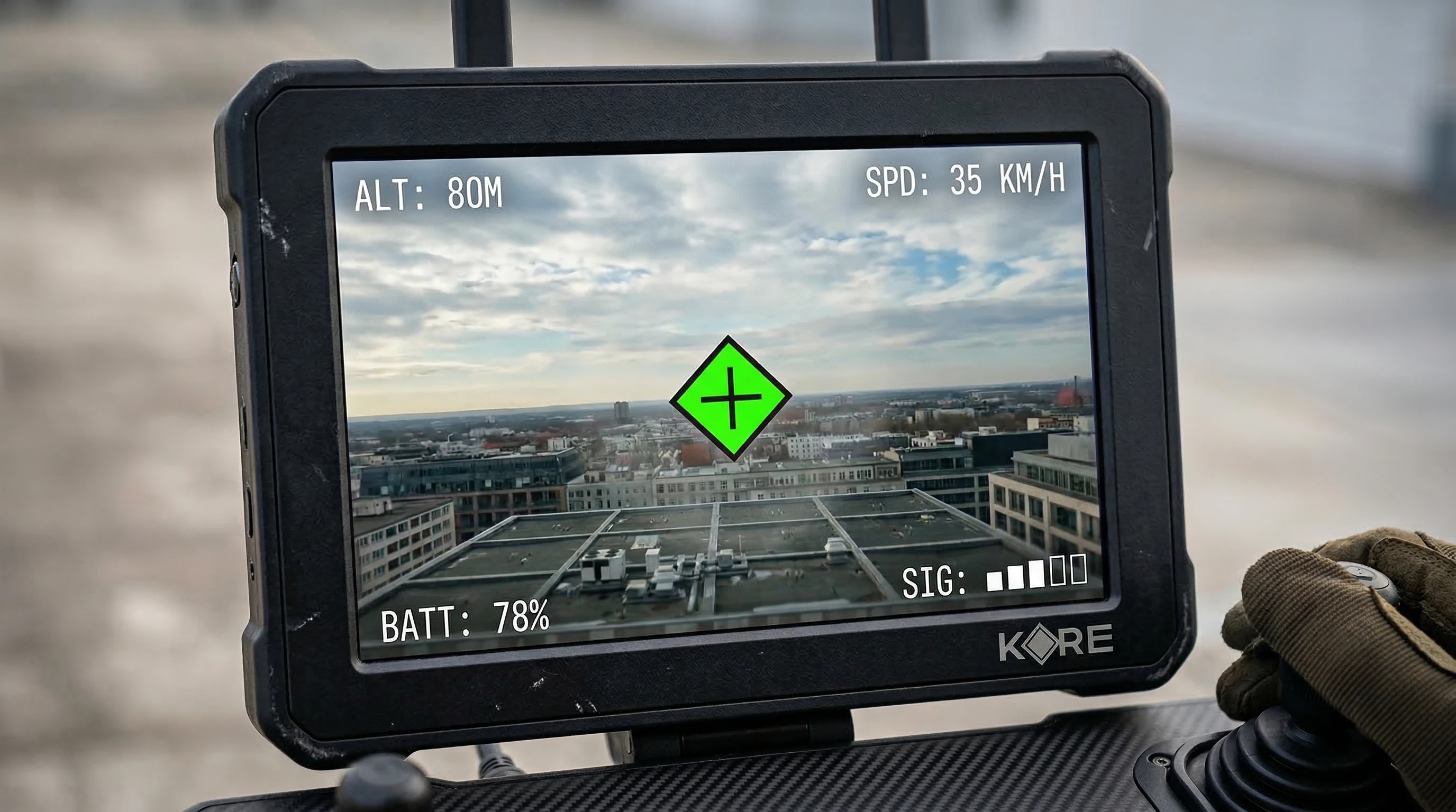
The pilot controller display applies the brand's visual logic to live FPV field data. The diamond crosshair functions as a targeting reticle overlaid on the live feed. ALT, SPD, BATT, and SIG telemetry frames the screen in monospaced type. The brand mark is a persistent anchor, bottom-right. In the field, the brand and the mission are the same interface.
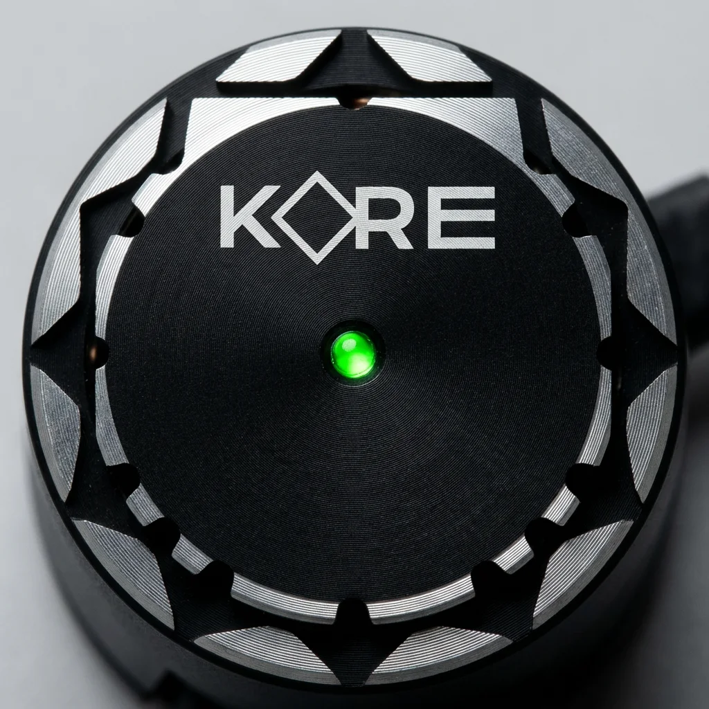
07 — HARDWARE IDENTITY
Component Detail and Apparel
The brand identity is machined directly into hardware.
The motor cap features the KORE wordmark CNC-milled into anodised aluminium with concentric groove patterns radiating outward from a single green status LED at the centrepoint. The LED is not decorative — it indicates motor operational status. The brand mark is not decorative either. Both are functional. Both happen to be beautiful.
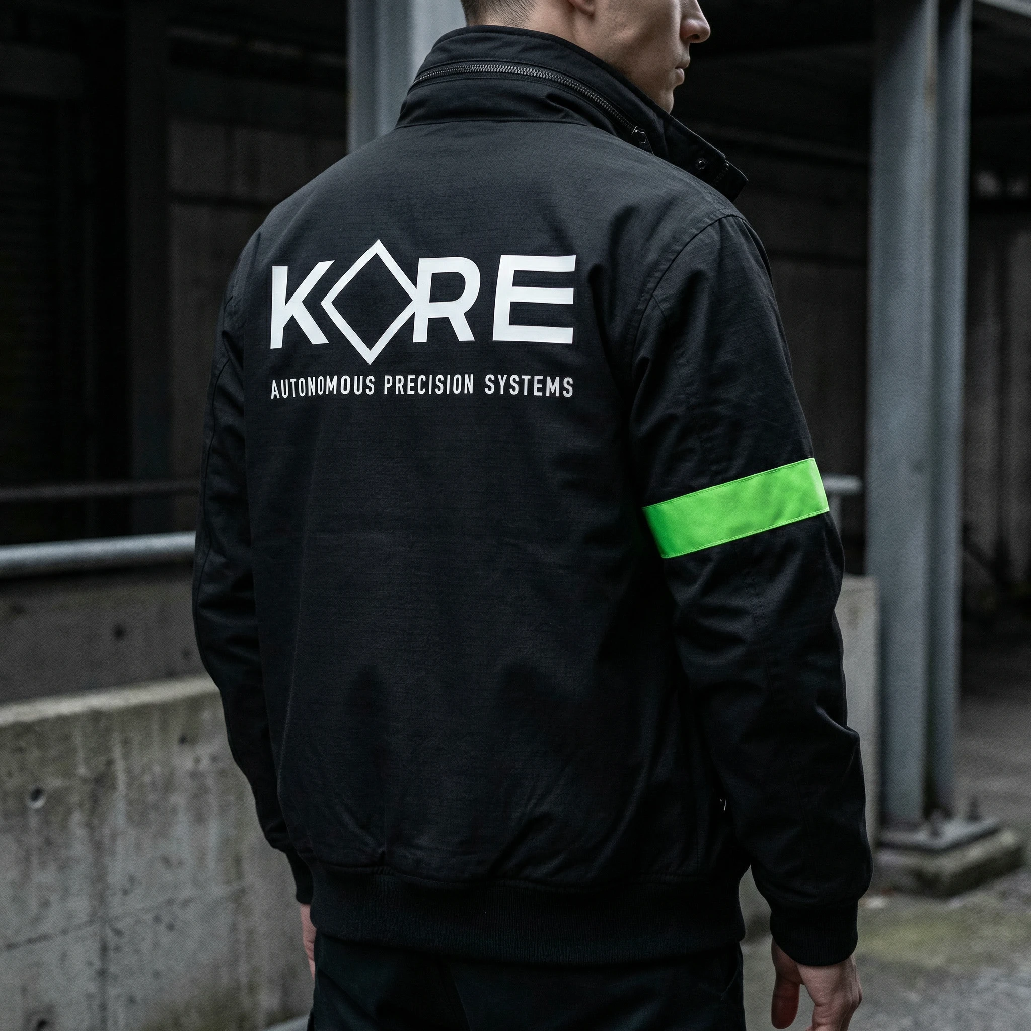
The work jacket is all-black technical fabric with the KORE wordmark and tagline printed large across the back. The only colour on the entire garment is a single high-visibility green armband — matching the brand's signal green exactly. In a field environment, the jacket reads as operational equipment. In any other environment, it reads as a considered design object. The armband does both jobs with one stripe.
08 — LOGISTICS AND PACKAGING
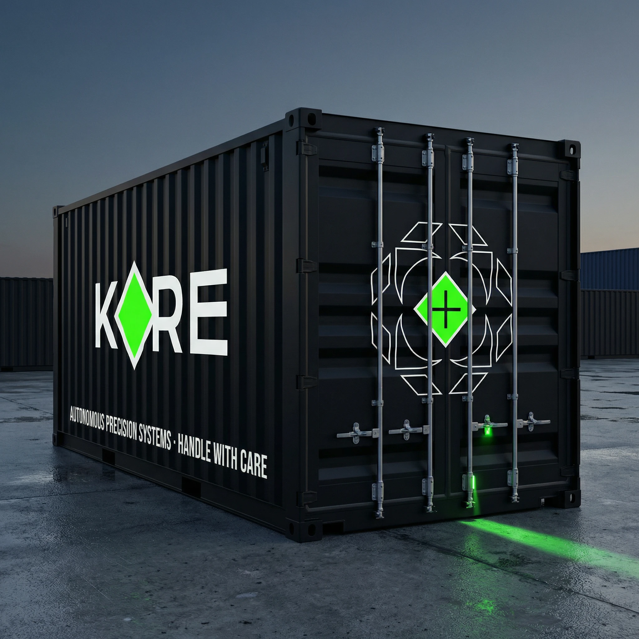
Shipping Container and Flight Case
At logistics scale, KORE becomes unmistakable.
The shipping container application uses maximum contrast: white wordmark on matte black steel, with the geometric icon at half-panel scale on the container end. The tagline AUTONOMOUS PRECISION SYSTEMS · HANDLE WITH CARE runs along the base. A single green LED at the door seam indicates container seal integrity. The brand at this scale does not need to announce itself. It simply occupies territory.
The flight case uses a tactile emboss of the icon into carbon-fibre composite material with a white label strip carrying the KORE wordmark and two green status LEDs indicating charge and connectivity state. The case reads as mission-critical transport equipment — which it is. The design adds nothing beyond what the object requires to function. That constraint produces the best result.
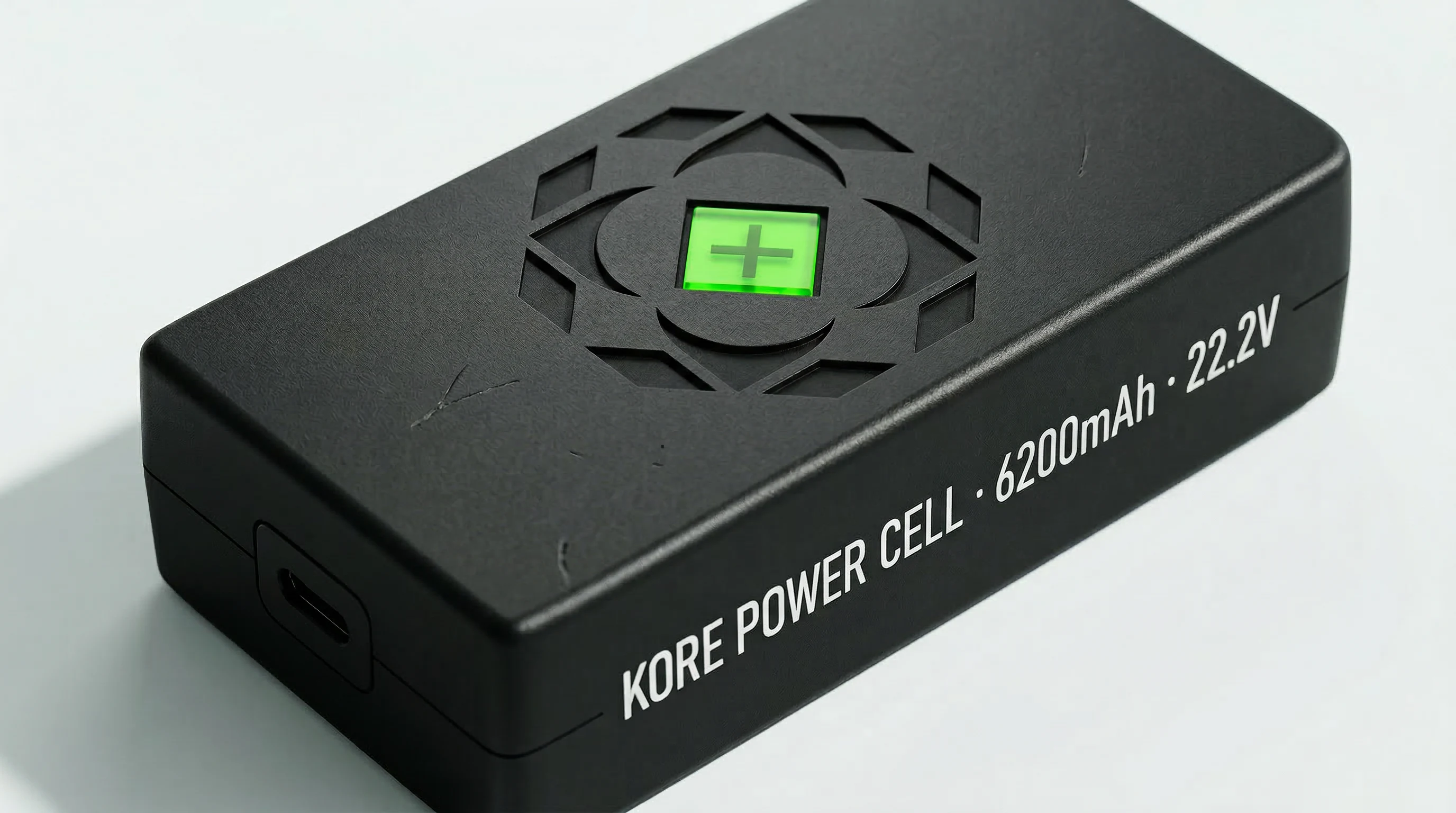
09 — POWER SYSTEMS
Hardware Identity Extended
The Power Cell — 6200mAh, 22.2V — carries the full icon system as a physical relief on its anodised housing, with a green LED window as the charge indicator. The icon doubles as a ventilation pattern. The crosshair doubles as a charge status window. Form and identity are the same object. Brand as engineering specification.
10 — INFRASTRUCTURE
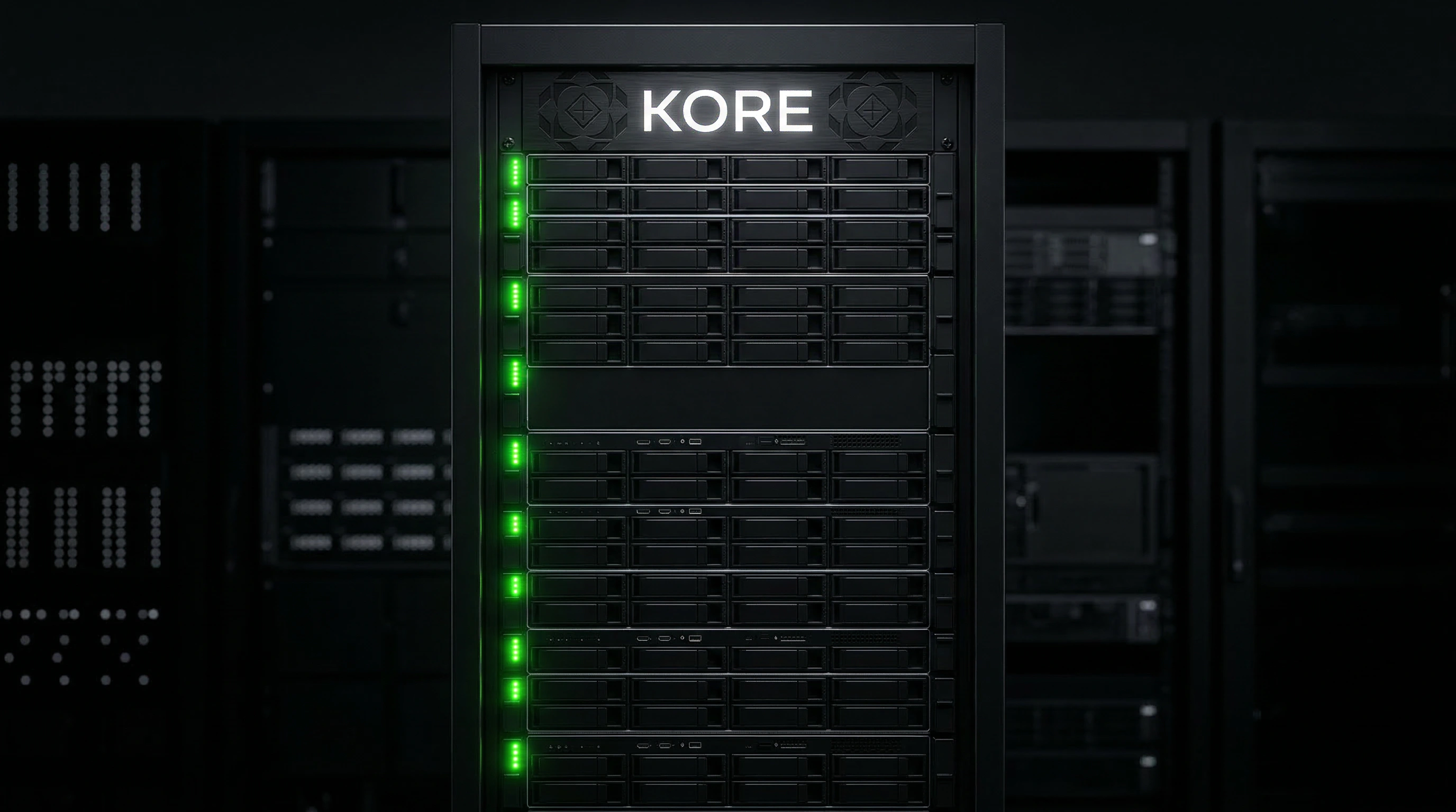
The Data Centre
At rack scale, KORE signals operational dominance through restraint. The server infrastructure uses only the wordmark — illuminated white on black — with green status LEDs running vertically down the rack face as the only colour. The result reads less like branded hardware and more like a mission-critical system that happens to carry a name.
11 — FACILITY IDENTITY
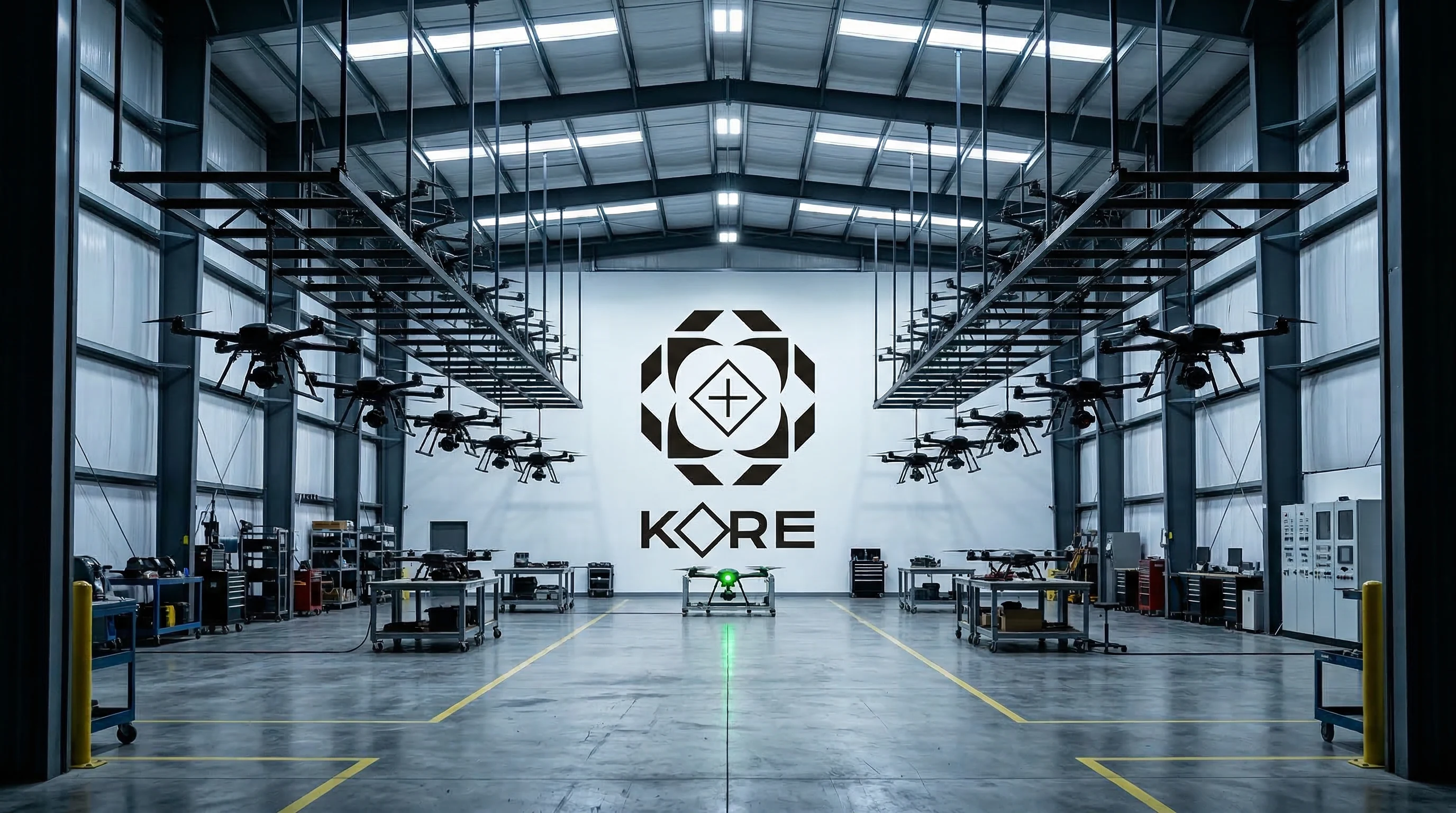
The Hangar
The testing and assembly facility inverts the brand palette entirely — white wall, black mark — demonstrating the identity's full range. At hangar scale, the icon reads as architecture. A fleet of active units in the air frames the brand wall, turning the facility itself into a product shot. The brand is the environment.
12 — MOTION IDENTITY
Brand Wall — Animated
The brand wall animation is the identity in its most kinetic state.
The geometric icon assembles from its component layers — octagon, circle arcs, square, diamond — each element drawing in sequence before the green core illuminates and the full KORE wordmark locks into position below. The sequence takes 4.2 seconds and is calibrated to feel like a system initialising, not a logo animating.
The motion language follows a strict rule: no easing that reads as decorative. Every movement has a mechanical logic — lines extend at constant velocity, elements snap to grid positions, the green fill pulses once on completion to confirm lock. The animation functions as both a brand reveal and a boot sequence. It is designed to loop silently on environmental screens without ever feeling like an advertisement.
13 — PRODUCT PHOTOGRAPHY
Visual Direction
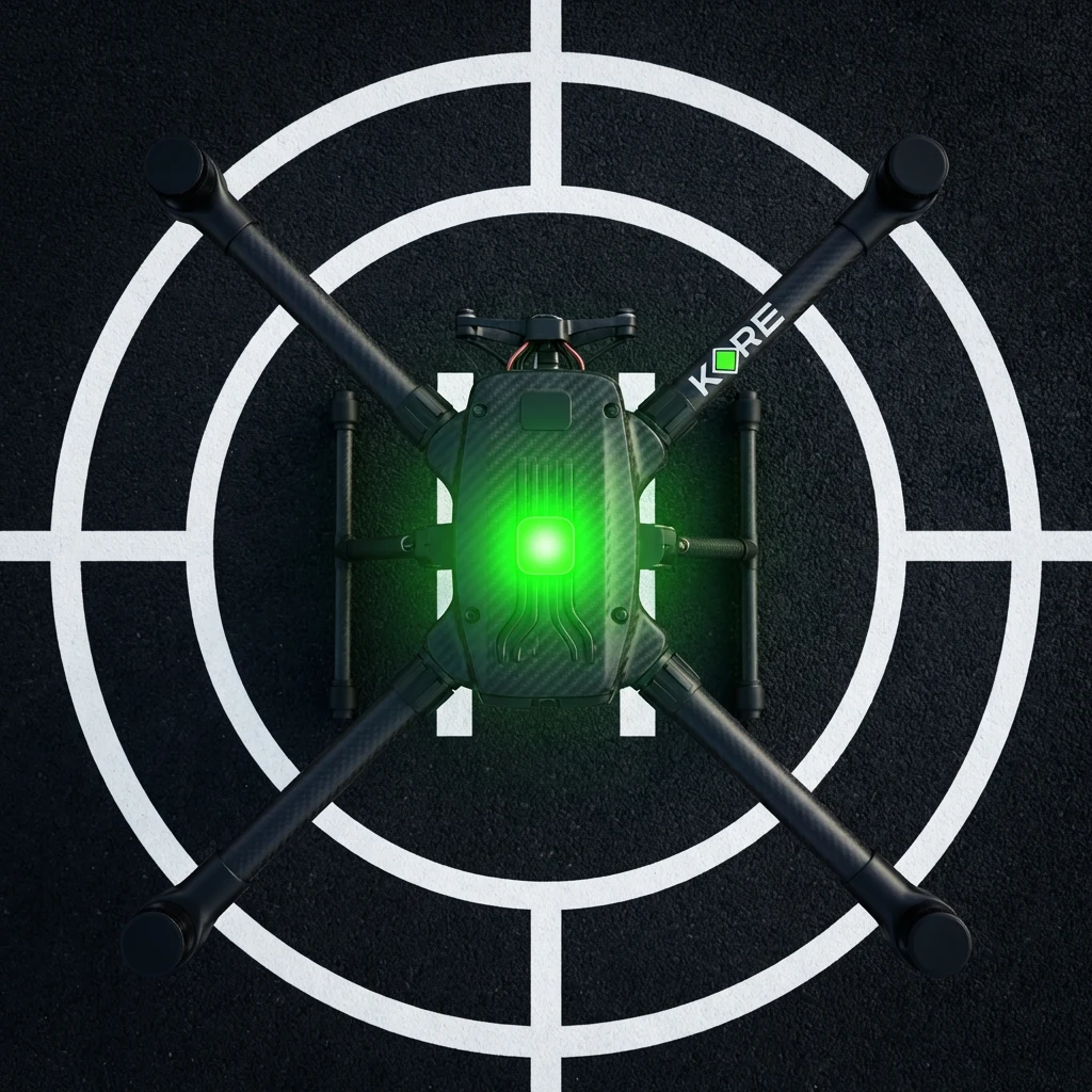
The product photography direction treats every drone as a precision instrument rather than a consumer product.
Overhead crosshair compositions place the drone at the centre of a painted landing target — the brand geometry and the operational geometry becoming the same image. Night launch imagery captures the four green motor LEDs against total darkness, with the city grid below providing scale. Propeller blur studies hold the KORE wordmark sharp while the rotors dissolve into motion — brand clarity maintained at full operational speed.
Every frame is designed as a targeting solution. The camera is always overhead, always perpendicular, always locked. The drone is always the objective.
CLOSING
System Integrity
What makes KORE work as a brand is the same thing that makes it work as a product: every part knows its role and executes it with zero redundancy.
The diamond is a charge indicator.
The diamond is a targeting reticle.
The diamond is the letter O.
The diamond is a landing zone painted on a rooftop.
The diamond is a progress bar.
The diamond is a motor vent.
The diamond is an emboss on a flight case.
The diamond is the centre of a three-metre wall installation.
One mark. Seventeen contexts. No dilution.
That is what a precision system looks like.
KORE Autonomous Precision Systems — Identity System v4.2 — 2026
Like this project
Posted Mar 16, 2026
Autonomous drone brand. One slime green signal means live. From motor housing to server rack, the same geometry at every scale.
Likes
0
Views
14
Timeline
Jan 21, 2026 - Mar 13, 2026