Built with Lovart
Dorure Website and Brand Identity Development
Révolté
Dorure — Website and Brand Identity Case Study
Year: 2025
Scope: Naming, Identity, Typography, Packaging, Copywriting, Digital
The Brief
A new boulangerie opening in the 7ème arrondissement of Paris. The founders — a third-generation baker from Lyon and a former luxury hospitality director — wanted something that felt neither nostalgic nor trend-chasing. Not the rustic warmth of a village bakery, not the cold minimalism of a concept café. Something that felt like Paris actually feels at 6h00 in the morning — precise, unhurried, quietly magnificent.
The ask was simple and almost impossible: build a brand that makes people feel, before they have tasted anything, that this is the best croissant they will ever eat.
The Insight
Every luxury bakery in Paris competes on heritage. Decades of tradition, generations of technique, walls covered in certificates and photographs of grandmothers. Dorure had none of that yet.
So instead of manufacturing history, we built around the moment — the specific, unrepeatable, sensory instant when laminated dough meets oven heat and becomes something golden. That moment has a name in French pastry: la dorure. The egg wash. The thing that makes it shine.
It is the last gesture before the oven. The signature the baker leaves on every piece. Invisible in the ingredient list, everything in the result.
The brand is named after that gesture.
Naming
Dorure is a word that works on three levels simultaneously.
Technically, it is the egg wash applied to viennoiserie before baking — the thing that creates the amber glaze and the shine. Visually, it describes the color of the product, the palette of the brand, the warmth of the marble counter at golden hour. Philosophically, it is the final act of care. The unnecessary step that separates competence from excellence.
It is also, simply, a beautiful word. Six letters. It sounds like what it does.
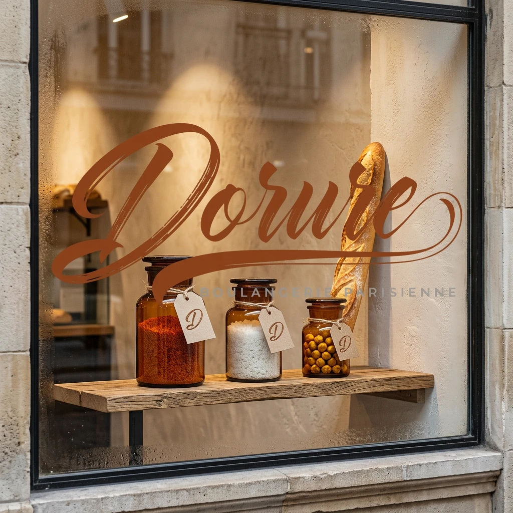
Logo
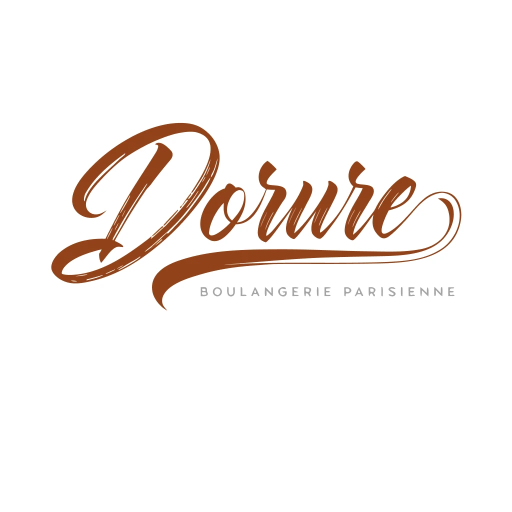
The identity is built around a single script wordmark — Dorure written in high-contrast calligraphic script, as if signed with a broad-nib pen held at 45 degrees.
The construction follows the logic of the product itself: thick downstrokes, hairline upstrokes. Maximum pressure where the hand descends, minimum where it lifts. The same physical logic as laminated dough — layers of tension and release, alternating weight and lightness, the whole thing held together by temperature and time.
The D opens with a dramatic looping ascender — the defining gesture of the mark, the visual equivalent of a baker's first movement before shaping. The word flows continuously to a curling terminal on the e that lifts like a brushstroke leaving the page.
Beneath the wordmark: a single thick-to-thin underline flourish that grounds the signature without framing it. Below that, in Jost Light at wide tracking: BOULANGERIE PARISIENNE. The contrast between the flowing script and the geometric sans is the brand in miniature — the handmade and the precise, inseparable.
Palette
Extracted directly from the product itself. The brand was photographed first, designed second.
Amber Deep — #7A3F10 — The darkest crust edge
Amber Mid — #C47A2B — The body of the glaze
Honey — #E8A030 — The highlight on the layers
Ivory — #F5E6C8 — The raw dough interior
Ivory Light — #FAF3E8 — The marble counter at dawn
Marble — #F0EEEB — The Carrara surface, in shadow
Stone — #3A3530 — The text, the details
Muted — #7A7268 — Secondary information
No color in this palette was chosen. Every color was found.
Typography
Four typefaces, one logic — the tension between the historic and the geometric, the handmade and the exact.
Cormorant Garamond Light carries the brand voice. Its extreme thick/thin contrast echoes the logo's own calligraphic construction. Used at 300 weight only — never bold, never regular. The lighter it sits on the page, the more authority it carries.
Jost Light provides the functional voice. Geometric, warm, invisible when working correctly. The optical contrast between Cormorant and Jost — one rooted in the 16th century, one in the 21st — is the typographic equivalent of the marble counter and the kraft bag existing on the same surface.
IM Fell English Italic appears rarely — a single word, a pull quote, an ingredient note. It has genuine historical irregularity, slightly breathless, as if set by hand. It is the brand's whisper.
DM Mono Light handles all precision data — prices, dates, hours, order numbers. Its orthogonal exactness against the flowing script creates productive tension. The artisanal and the accurate, sharing the page without compromise.
Copywriting Voice
The brand speaks in restraint and sensation. It never explains what it does. It never lists its credentials. It trusts the reader to understand that specificity is a form of quality.
The hero line:
The best part of waking up has no alarm.
Subline: Fresh from 7h00. Every morning, without exception.
Supporting lines follow the same logic: short, imagistic, never promotional. The navigation is entirely in French — not for affectation but because language is environment, and environment is product.
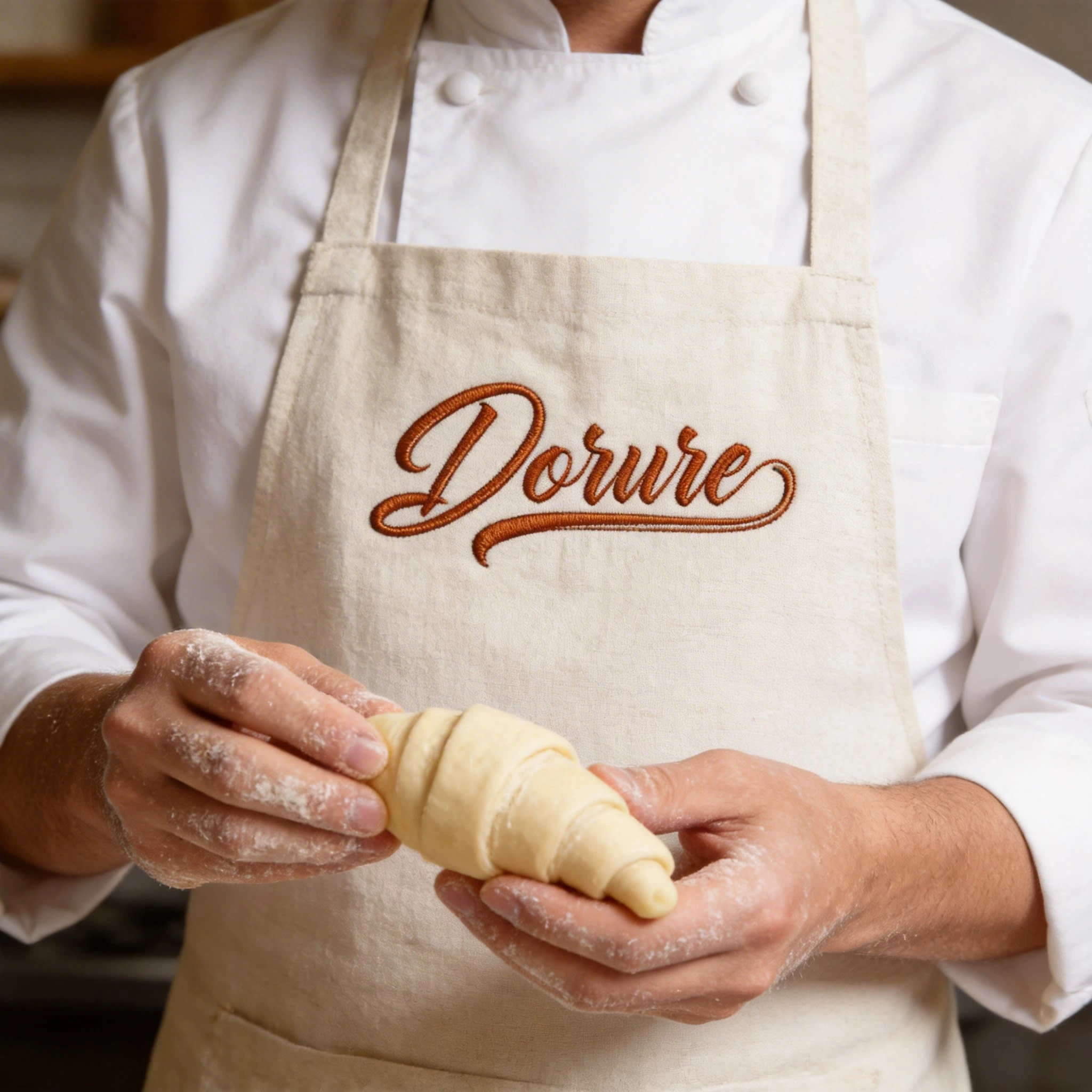
Packaging System
The packaging was designed as a coherent material world — every object a variation on the same set of values: natural substrates, amber applied with restraint, the logo always stamped or pressed rather than printed.
Le Sac Kraft — Unbleached natural kraft, the logo hot-foil stamped directly into the paper. No label. The surface is the label.
La Boîte Scellée — Rigid ivory board, cognac grosgrain ribbon, a round amber wax seal with the D monogram pressed into it. The seal is the closure.
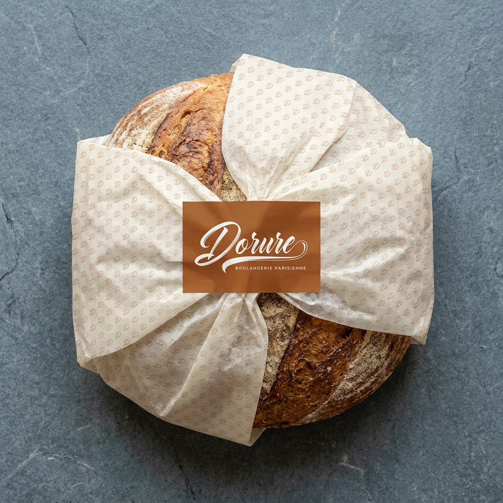
Le Papier d'Emballage — Ivory tissue paper with an all-over tone-on-tone D monogram pattern, sealed with a full-lockup amber sticker. The wrap communicates before it is unwrapped.
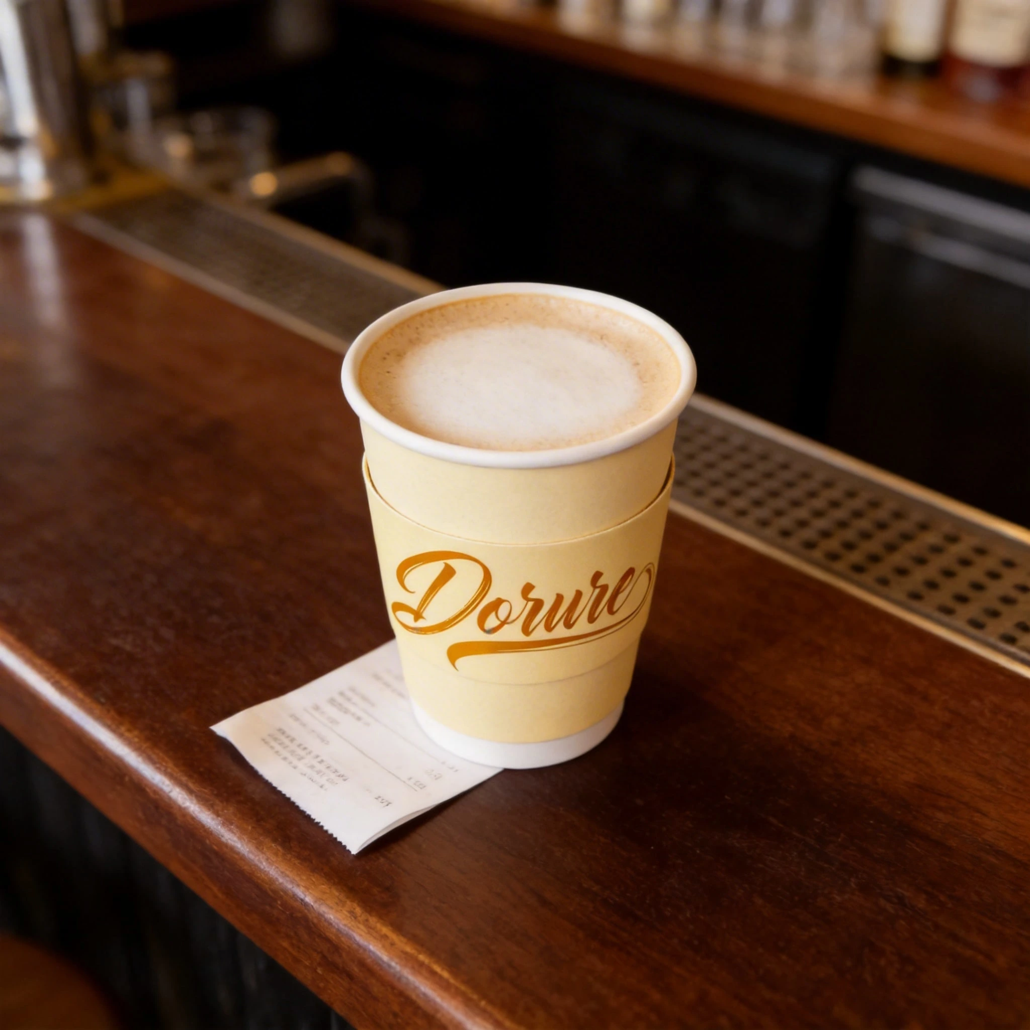
Le Gobelet — Ivory stock, the wordmark wrapping the circumference. The D flourish nearly meets itself on the far side — a loop completed by the act of holding.
La Carte Fidélité — 600gsm cotton stock, ivory. The logo blind-debossed only. No ink, no color. Visible only where light catches it at an angle. The most understated object in the system is also the most intimate.
Every packaging decision follows the same rule: the material does the work, the logo signs it.
Retail Identity
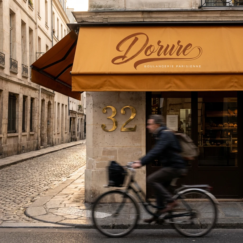
The awning: deep amber canvas, the Dorure script silk-screened in ivory across the valance. The color of the awning is the color of the glaze — the shop front is the product, seen from the street.
The window: the logo etched in frosted vinyl on the glass. At dawn, the warm interior light glows through the letters — the brand illuminated from within, amber against blue morning air.
The number 32 mounted in brass numerals on pale limestone beside the door. Brass because it patinas. Because a brand that intends to be here in thirty years chooses materials that age.
Digital
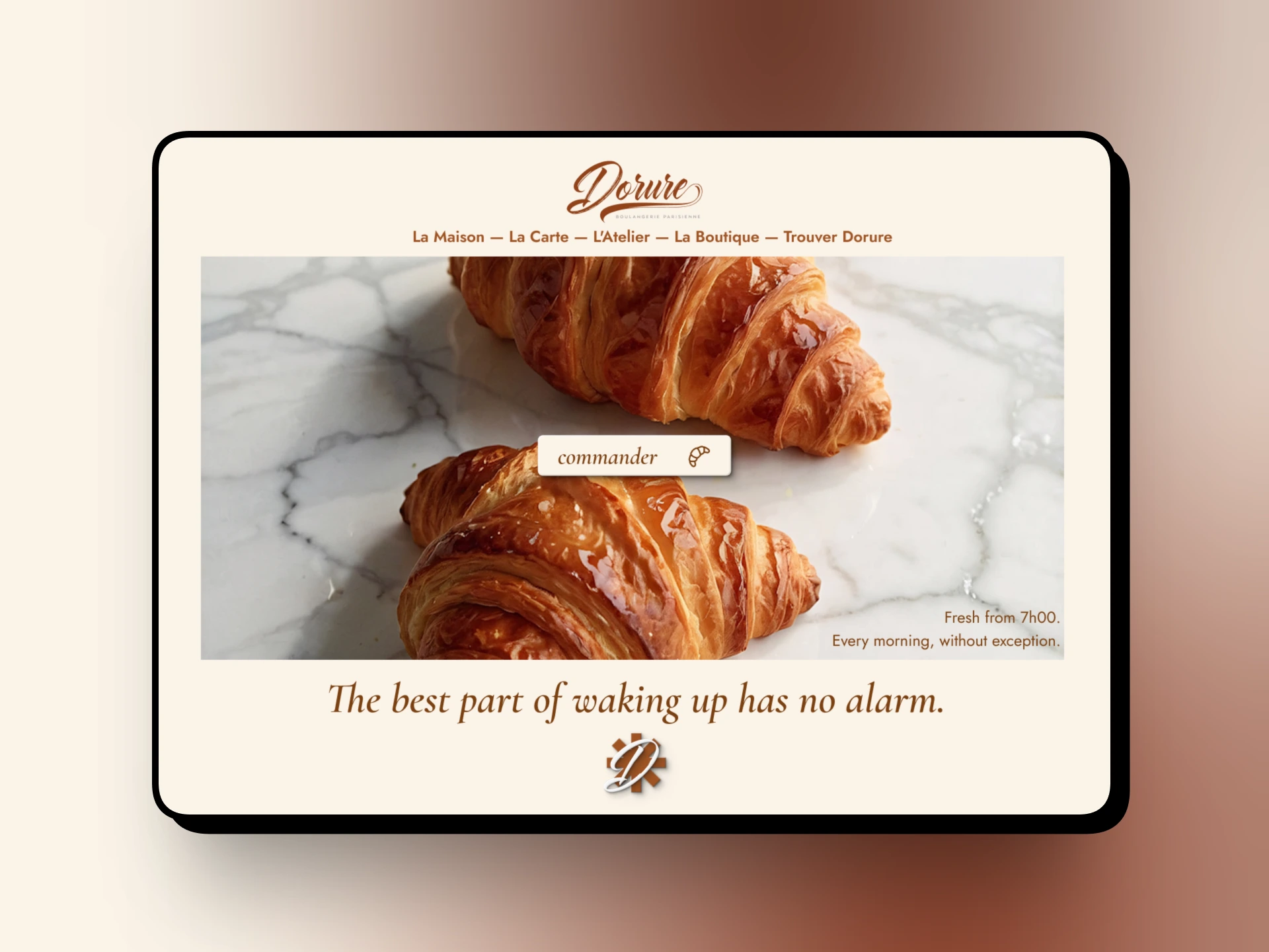
The website is a single continuous editorial experience. The nav floats in Jost Light, all in French, maximum restraint. The hero is full-bleed photography of the croissants on marble, the copy in Cormorant Garamond Light italic, ivory.
The hero line sits below the image — large, unhurried, giving the photograph room to breathe before the words arrive. The CTA is a single word: commander. Lowercase. Italic. It does not shout.
There are no popups. No chat widget. No countdown timers. The site moves at the pace the brand wants the customer to inhabit.
Result
A brand that feels like it has existed for twenty years on its first day of trading.
Not because it mimics heritage — but because every decision, from the name to the wax seal to the weight of the loyalty card stock, was made with the same care the baker applies to the lamination. Seventy-two hours of patience, expressed in every touchpoint.
Dorure doesn't ask to be noticed. It simply makes everything around it look like it isn't trying hard enough.
Case study compiled March 2026.
Like this project
Posted Mar 18, 2026
A Parisian bakery named after the last gesture a baker makes before the oven. The egg wash. The thing that makes it shine.
Likes
0
Views
8
Timeline
Oct 6, 2025 - Oct 21, 2025