Built with Lovart
SLYK Brand Development
Révolté
SLYK — Brand Case Study
Overview
Brand: SLYK
Category: Consumer wearable technology
Positioning: Gen Z smartwatch brand. Customizable, drop-culture native, unapologetically loud.
Tagline: loud by design.
Deliverables: Brand identity, visual system, product design language, OS interface, packaging, campaign materials, digital touchpoints.
The Brief
The wearable technology market in 2025 is a study in conformity. Apple Watch offers aspirational minimalism for the professional class. Samsung offers functional competence for the pragmatic. Garmin serves the athlete. Fitbit serves the anxious. Every major player is designing for the same imaginary person: someone who wants technology to disappear into their life, to be invisible, to whisper.
Nobody was designing for the person who wants their wrist to scream.
The brief was to build a smartwatch brand from zero — identity, product language, OS, packaging, campaign — for a generation that customizes everything, distrusts polish, and makes purchasing decisions based on cultural resonance rather than spec sheets. A brand that operates like a streetwear label, drops like a record release, and looks like nothing currently on the market.
The reference was Nothing — a company that proved you could build a consumer tech brand with genuine aesthetic conviction and cultural credibility. The challenge was to go further. Nothing whispers transparency. SLYK needed to shout color.
Naming
The name arrived through a process of elimination and instinct. The criteria were simple: four letters maximum, no existing brand association, phonetically aggressive, visually interesting as a wordmark, ownable as a trademark.
Ten candidates were developed. VÖRM, KRAUL, GRYX, NOXL, FERRU, ZLUR, VEKTOR, KRUD, PULSR, SLYK.
SLYK won on three counts. First, the deliberate misspelling of "slick" — it carries the meaning of the word while visually distancing from it, creating the productive tension between polish and rawness that the brand needed. Second, the four letters are typographically extraordinary — S, L, Y, K offer wildly different geometric personalities that reward treatment. Third, it sounds like something that moves. You don't say SLYK slowly.
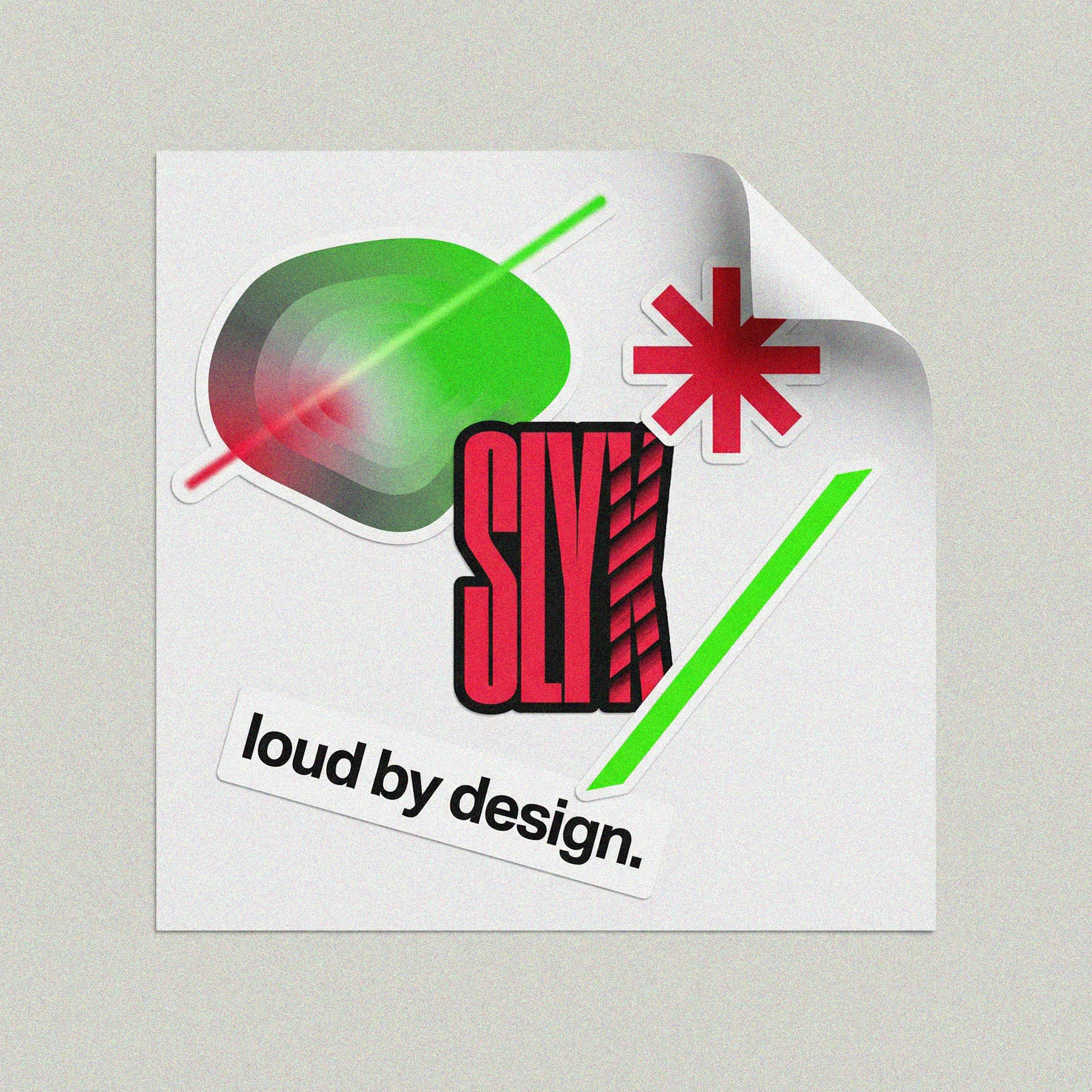
Logo
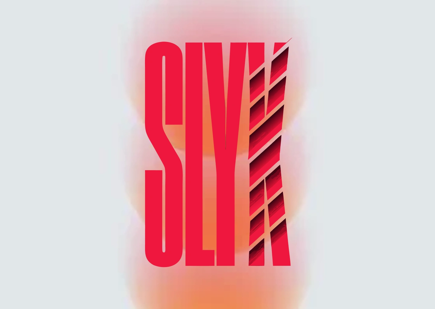
The wordmark is the entire identity. No icon, no symbol, no abstract mark. The letters are the brand.
The first AI interpretation of the brief produced something better than the brief: a vertical stack rather than horizontal, and a shattered K rather than a simply rotated one. Both decisions were adopted immediately and locked.
The vertical stack — S above L above Y above K — gives the wordmark a monumental, totemic quality. It reads as a single rectangular mass from a distance and resolves into four letters up close. This two-stage reading is a signature behavior that no other tech brand wordmark shares.
The shattered K — five diagonal parallel cuts tearing through the letterform from upper-right to lower-left — is the brand's defining visual gesture. The cuts are not decorative. They expose the layer beneath: SLYK RED bleeding through the gaps as if the letter is on fire underneath. The K didn't break. It was broken into. It's still standing. That's the whole brand in one letterform.
The slash — a single diagonal line at 20 degrees crossing the full wordmark — completes the system. It is the brand's recurring gesture, appearing identically across every touchpoint: logo, layout, packaging, OS, billboard, sticker.
Typography system: Geist Mono as the brand's secondary typeface — monospaced, mechanical, technical. Used for all campaign headlines, body copy, and OS text. Its monospaced geometry against the compressed grotesque of the logo creates a productive contrast: the logo is compressed and intense, the supporting type is measured and precise.
Visual Language
The system resolved into four non-negotiable recurring elements:
01 — The Blob
An organic, irregular amorphous shape carrying a mesh gradient from SLYK RED to SLIME GREEN. It is the brand's primary graphic device — appearing in hero posters, watch faces, phone lock screens, browser UIs, and zine spreads. The blob is never perfectly circular, never symmetrical, always slightly heavier at the bottom. It behaves like something alive. It is the visual embodiment of the brand's core metaphor: data made biological, technology made organic.
02 — The Laser
A 3px hard-edged beam — neon green
#39FF14 — crossing every composition diagonally at 20 degrees. In the canonical system there are two lasers: a red beam entering from bottom-left, a green beam exiting top-right. The beams transform inside the blob — red enters, something happens inside, green exits. The laser is the brand's most cinematic element. On the billboard it physically bleeds green light onto the surrounding concrete wall. On the phone lock screen it crosses the notification pill. In the zine it jumps the gutter between pages. It ignores physical boundaries. This is intentional.03 — The Grain
Film grain at 15–20% opacity across every composition. Not as texture for its own sake but as a unifier — it makes every element belong to the same surface. Digital renders, photography, typography, and gradient blobs become one physical thing when grain runs over all of them simultaneously. The grain is what makes SLYK look printed rather than rendered.
04 — The Background
Warm light grey
#E0E0DC as the canonical background for print and physical touchpoints. The grey is not neutral — it is specific, warm, slightly off. It makes the SLYK RED more aggressive, the SLIME GREEN more radioactive, and the black of the watch case more absolute. The black background version exists for digital-native contexts but the grey is the brand's true home.Color System
SLYK RED
#E8190A
The primary. Not Ferrari red, not Coca-Cola red. More aggressive than one, rawer than the other. It is the red of something that just happened. It appears on every touchpoint without exception.SLIME GREEN
#39FF14
The secondary. Neon, biological, slightly wrong. It should not coexist with red as comfortably as it does — and yet the combination never reads as Christmas because the specific values are too saturated and too strange. The green is the brand's surprise. You notice the red first. The green is what you remember.VOID BLACK
#0A0A0A
The watch case, the packaging exterior, the watch OS background. Not pure black — just dark enough to be total, just warm enough to not be cold.STATIC WHITE
#F2F2EF
Off-white. Used for text on dark backgrounds. Never pure white, which would create a harshness that conflicts with the grain system.Product Design
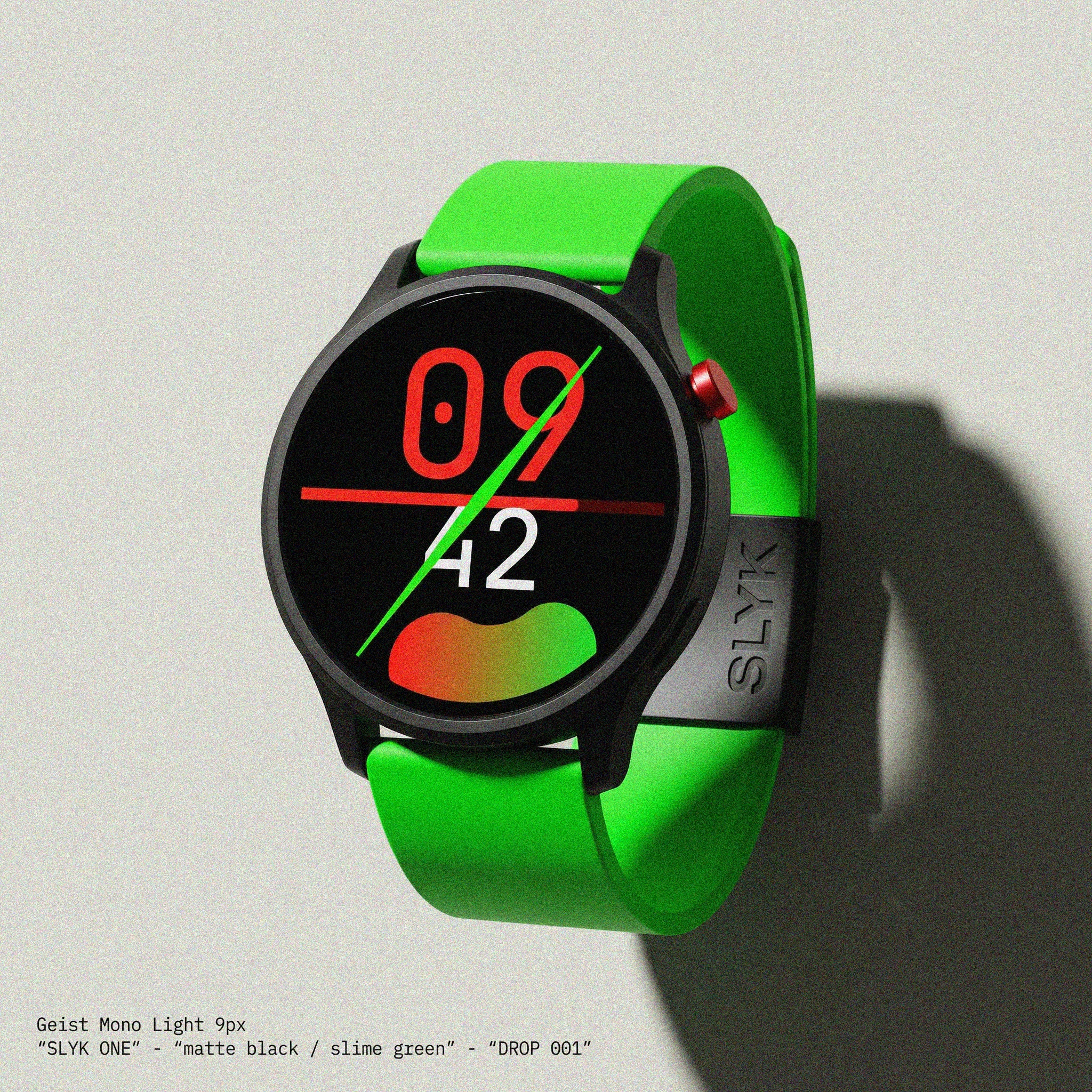
SLYK ONE is the hardware. A circular smartwatch in matte black anodized aluminum — thin 2mm bezel, near edge-to-edge AMOLED display, one physical button at 2 o'clock in SLYK RED anodized aluminum. The only color on the case exterior is that single red button. Everything else is void black. The case back carries the debossed SLYK vertical wordmark — visible only at close range, only in specific light.
The SKIN system is the product's cultural proposition. Interchangeable case covers — matte rubber, hard shell, translucent — sold in drops, designed by the brand and by community artists. The watch is the platform. The SKIN is the expression. Every owner has a different watch. No two wrists are the same.
The SLIME GREEN rubber strap is the default configuration. It is deliberately oversized — it spills beyond the case width on both sides, creating a silhouette where the strap is wider than the case. The green strap against the black case is the product's primary visual identity from a distance. Before you read the logo, you see the green.
The OS — SLYK Face System v1
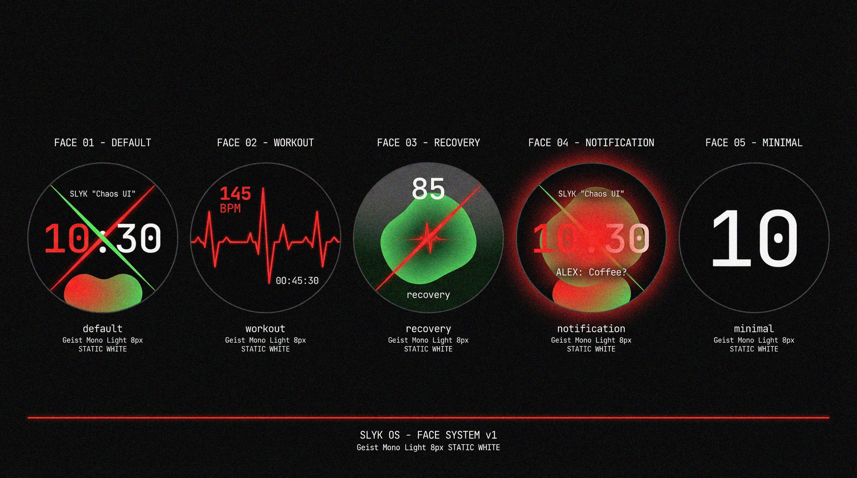
Five face states were designed, each serving a distinct behavioral moment:
DEFAULT — Chaos UI: Large SLYK RED hour numerals in Geist Mono Black filling 55% of the face. White minutes below. The brand blob in the lower quadrant, pulsing on a 4-second cycle, shifting in color with biometric data — red expands with heart rate, green dominates in recovery. The 1px SLIME GREEN slash crosses the face permanently. The 1px red second beam crosses horizontally left-to-right once per second — linear, not circular, resetting each time.
WORKOUT: The blob disappears. A single red biometric waveform crosses the full face. Current BPM large and red. Elapsed time small and white. Pure data, maximum legibility.
RECOVERY: Dark green bleeds into the background. The blob dominates 60% of the face. A recovery score — 0 to 100 — floats above it. The slash inverts to red. Green is winning.
NOTIFICATION: The blob flares — 15% larger, red zone fully expanded, a soft bloom. The time remains visible behind it. One line of Geist Mono Light: sender name only. The blob tells you something arrived. You swipe to find out what.
MINIMAL: Nothing but the hour. One number. 70% of the face. No blob, no slash, no beam. The held breath.
Campaign Materials
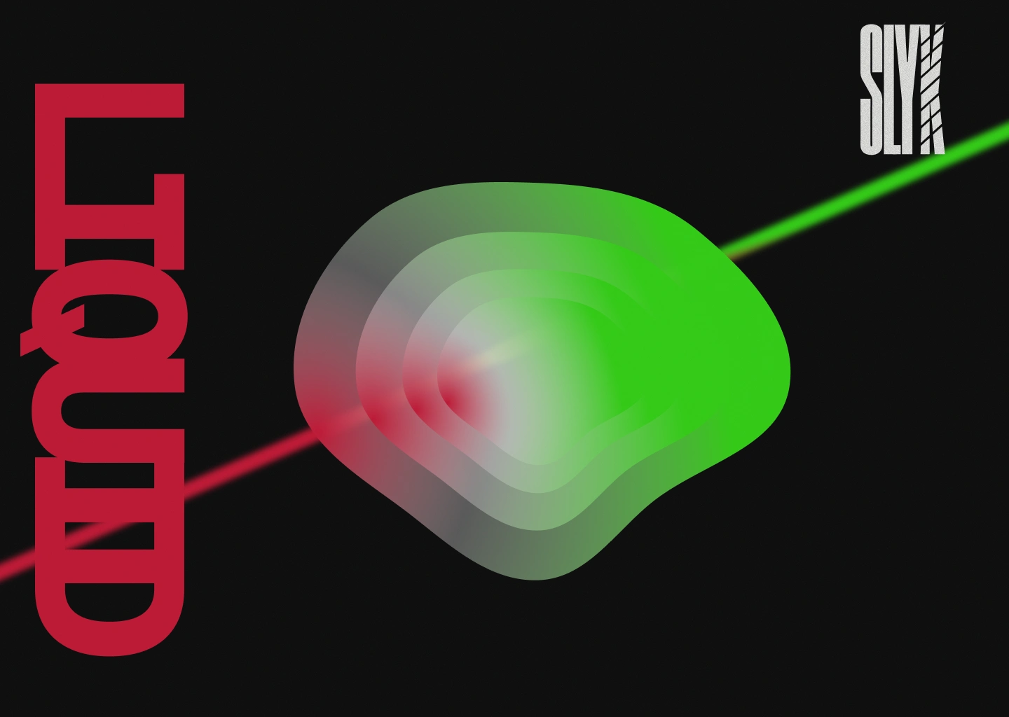
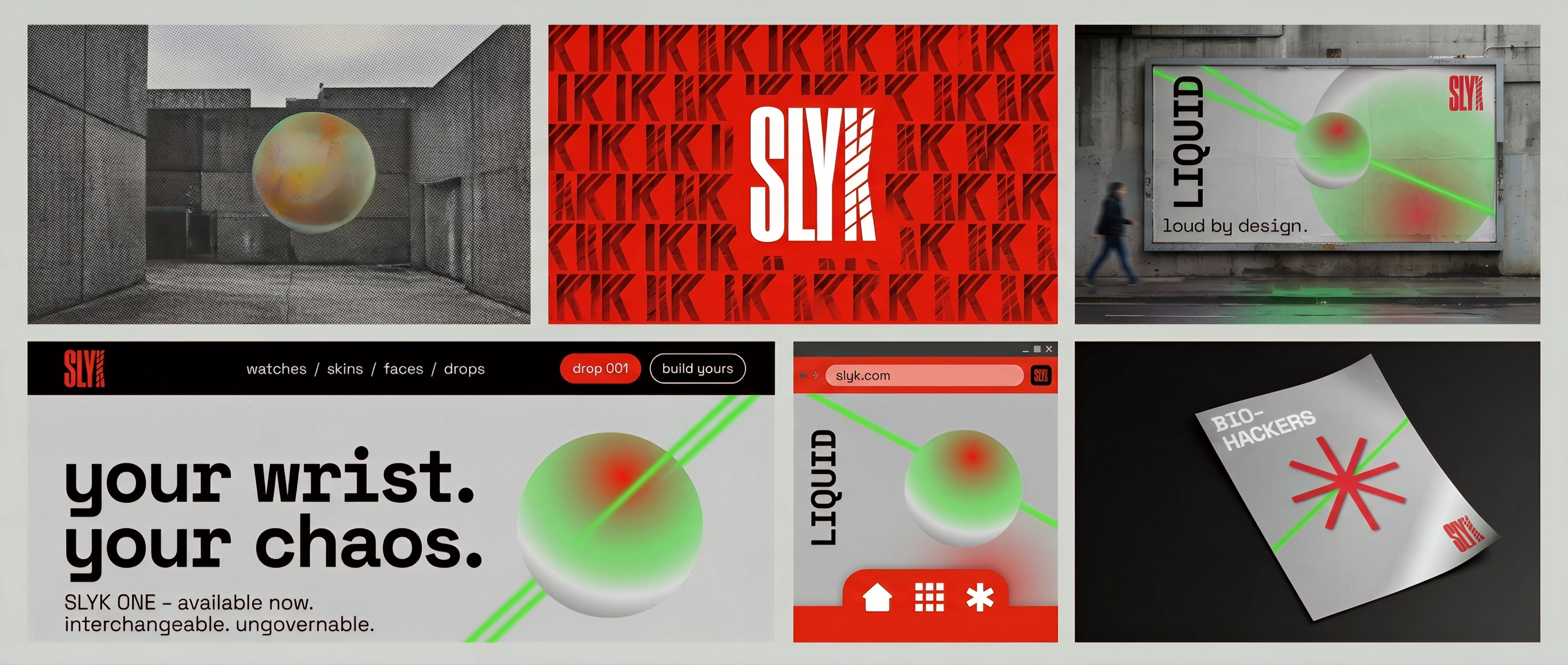
LIQUID — Hero Poster
The canonical brand image. The blob center-frame, the dual lasers transforming through it, LIQUID vertical left in Geist Mono Black SLYK RED, SLYK logo top-right. Grain across everything. This image functions as poster, billboard, wallpaper, and lockscreen simultaneously — the same composition adapts to every format without modification.
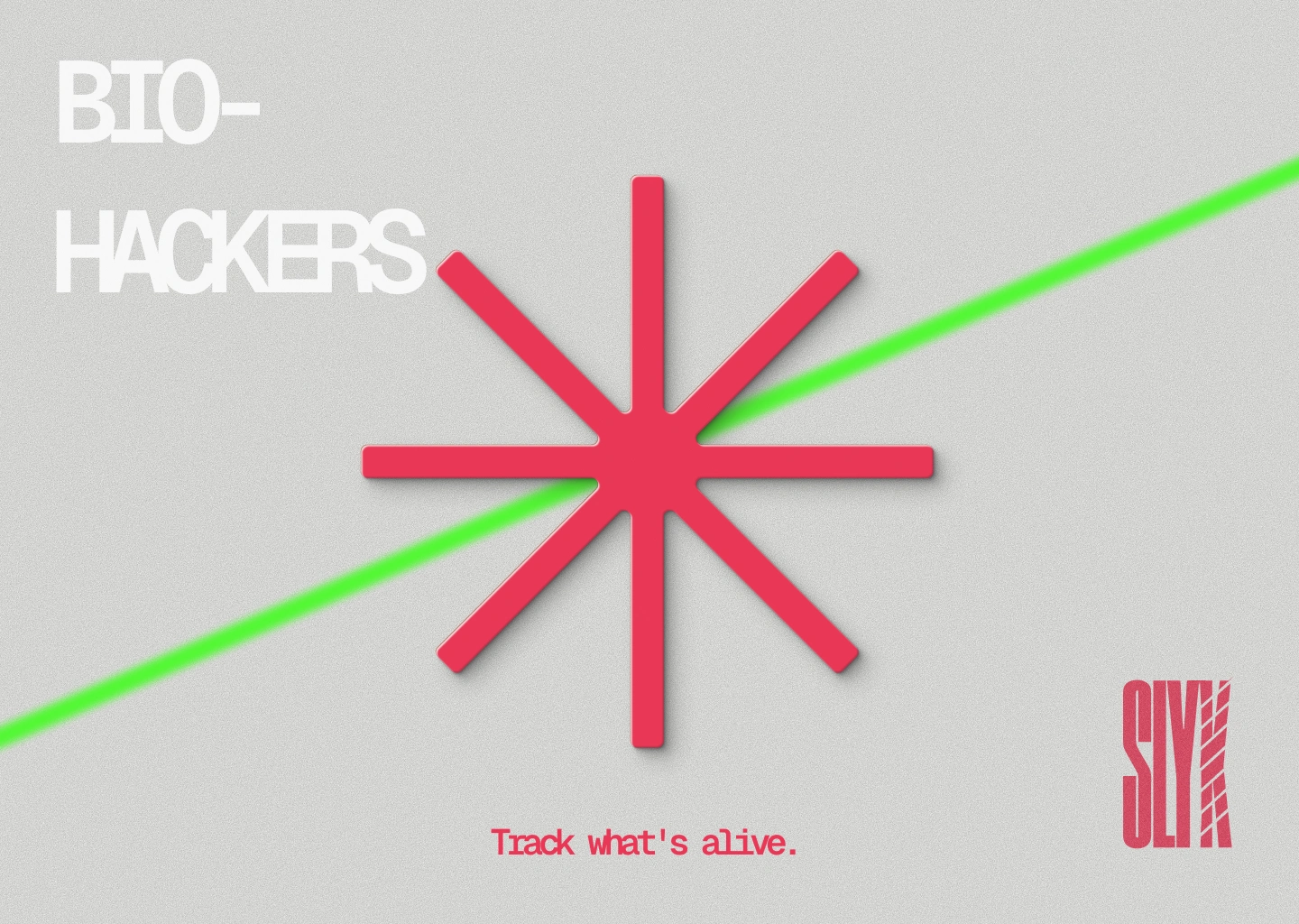
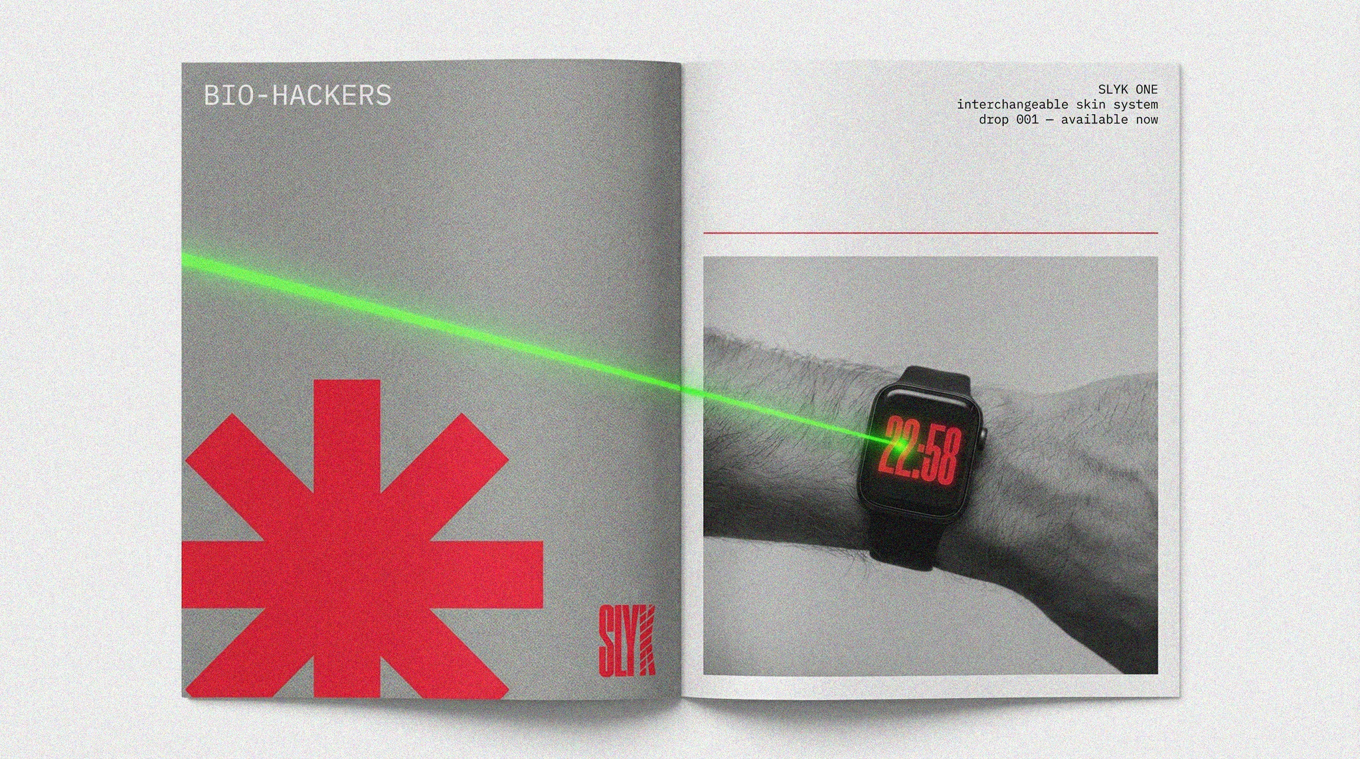
BIO-HACKERS
The brand's secondary campaign concept. A SLYK RED asterisk — eight arms, hard edges, no blur — centered on the grey grain background. The green laser crossing at 20 degrees. The word BIO-HACKERS top-left in Geist Mono Black. The asterisk is the biometric symbol, the health signal, the brand's second recurring graphic element after the blob. This campaign targets the health-data obsessed subset of the audience — the people who check their HRV before they check their messages.
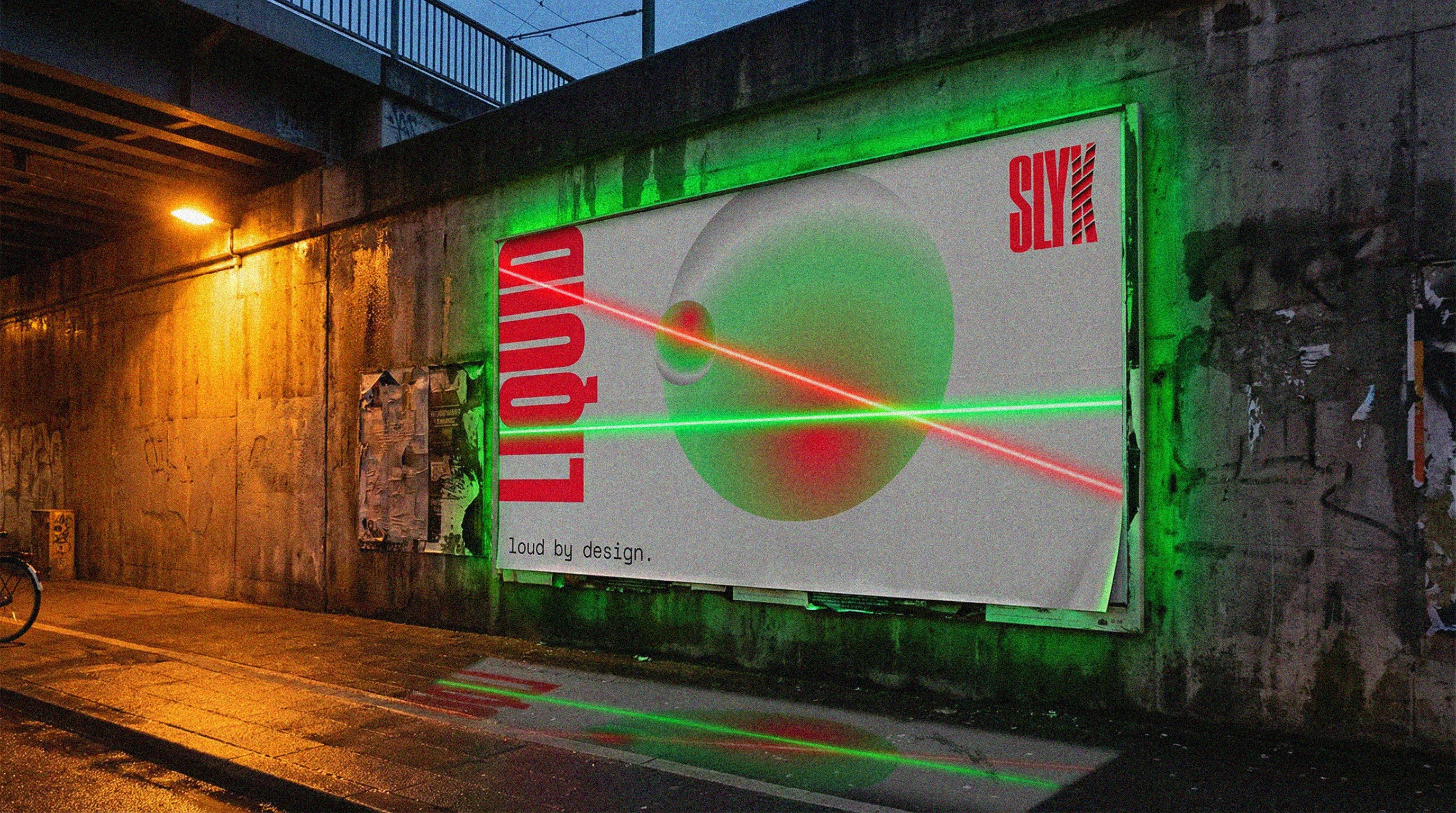
Billboard
The LIQUID composition at maximum physical scale — mounted on a concrete underpass wall at dusk. The green laser bleeds beyond the billboard's physical edges, casting real green light on the surrounding concrete. The wet pavement reflects a broken vertical smear of neon green. The brand's most impossible visual claim — a printed poster that appears to emit light — is also its most memorable urban moment.
Zine / Lookbook Spread
Two A5 pages. Left: BIO-HACKERS. Right: wrist shot with product copy. The green laser from the left page crosses the physical gutter and lands on the watch face of the right page — the brand's laser ignores the boundary between pages exactly as it ignores every other boundary in the system.
Packaging
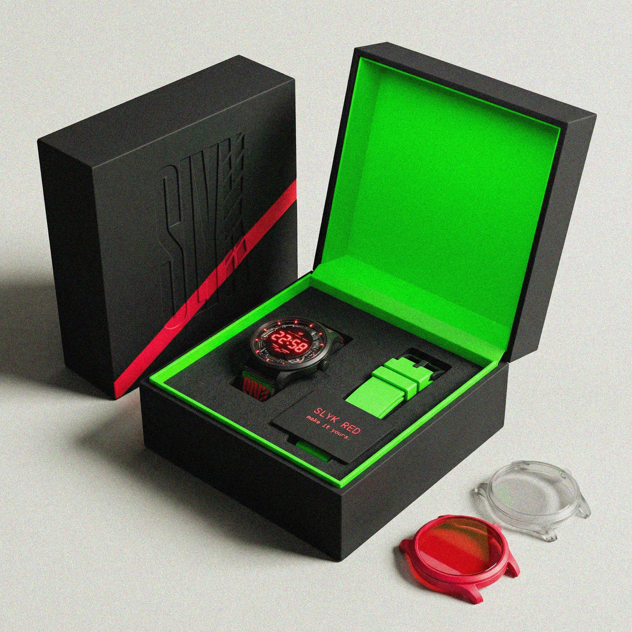
A rigid matte black box. The exterior is entirely black except for one diagonal SLYK RED stripe — 8mm wide, 20 degrees — crossing the top face. The SLYK vertical wordmark is debossed into the top. No color on the exterior. No print. The stripe is the only announcement.
Inside: SLIME GREEN. Fully saturated, fully matte. The violence of opening a void black box to find a slime green interior is the unboxing moment the brand was built around. Everything in the box sits in black foam cut precisely to each object's silhouette. The card reads: "make it yours." Nothing else.
Outside the box, beside it: the interchangeable SKINs — transparent, red tinted, laid casually as if just removed. The system is immediately legible. This is not a product. It is a starting point.
Touchpoints Summary
The brand system was realized across the following touchpoints:
Wordmark and logo system — Brand poster series (LIQUID, BIO-HACKERS) — Billboard campaign — Collage brand sheet — Smartwatch hardware render — OS face system (5 states) — Phone lock screen — Packaging (box, insert, SKINs) — Sticker sheet — Zine/lookbook spread — Website UI — Browser app icon
What SLYK Proves
Every decision in this system comes back to one idea: loudness is a design philosophy, not a volume setting.
SLYK is loud in its color — red and neon green should not work together this well. It is loud in its typography — a vertical wordmark with a shattered letter is not a safe choice. It is loud in its product — a strap wider than the case, a button that is the only red thing on the hardware. It is loud in its campaign — a poster that appears to emit real light when placed on a wall.
But loudness without precision is noise. Every element in this system is controlled. The slash is always 20 degrees. The grain is always 15–20%. The blob is always heavier at the bottom. The laser always transforms inside the blob. These rules are as strict as any luxury brand's guidelines — they're just pointed in a completely different direction.
The result is a brand that looks genuinely new. Not new like a startup that hired a good design agency. New like something that came from somewhere specific — from a generation that grew up with algorithmic identity, that customizes everything, that distrusts anything that tries too hard to be calm.
SLYK doesn't try to be calm. That's the whole point.
SLYK — Brand Case Study
loud by design.
Like this project
Posted Mar 20, 2026
Didn't design a smartwatch. Designed a wrist that refuses to shut up. Red, chaos, slime green. SLYK, loud by design.
Likes
1
Views
31
Timeline
Mar 9, 2026 - Mar 20, 2026